10,000 search results
(0.112 seconds)
- Mello by J Foundry,
$25.00 Mello is a bold, easy going Grotesque. It was designed for display, branding, advertising, packaging or anywhere a strong but friendly voice is needed. Mello features soft curves and rounded corners; set in 4 widths and 8 weights. The character set is robust, covering extended Latin. The default forms are contemporary with alternates including: single-story a, two-story g, rounded top A, traditional G, rounded leg R, rounded K, and rounded form y in both uppercase and lowercase, all separated into individual style sets for control and customization. A set of icons rounds out the character set, with hand signs and shapes.
 - Magasin by Type-Ø-Tones,
$50.00 Magasin is a high contrast display typeface inspired by the pointed pen calligraphy, yet with a retro-chic twist. It combines a sense of script with geometric and slightly condensed structure resulting in idiosyncratic curves softly connecting the vertical elegance of its forms, ideally suited to use at large sizes in headlines for magazines, posters or packaging. Magasin boasts a rich set of OpenType features that provide a better flow such as Ligatures, Stylistic Alternates, Contextual Alternates, and Final Forms. It also includes a set of capital Swashes. Please check the ‘Read me’ file located in the gallery for more specifications.
 - Maxtield by Garisman Studio,
$15.00 Maxtield combines attractive curves with a fresh urban edge; delivering a stylish which is guaranteed to add an eye-catching appeal to your logo designs, brand imagery, handwritten quotes, product packaging, merchandise, social media post, or website font.
 - Mi Negra by Letritas,
$25.00 Mi negra is a funny and hilarious typography designed especially for children, thought and created by Isabel de Gregorio. It could be described as an original combination between a semi-handwright and semi sans-serif font. Thanks to its structure and nice endings "Mi Negra" is recommended for composing short texts (logotypes, packing, posters, etc.). It may similarly be used for illustrations and comics, as well as in printing press works for children from 6 to 13 years old for instance. Mi Negra has been conceived to be a useful support in all kinds of illustrations works (please note that Isabel, the type designer, considers herself primarily an illustrator). The font designer of Mi Negra tells that every time she needed to provide some text data (i.e. in children infographies) and needed to make them more understandable and suitable for children, she used this typography. The former idea was than to create a font who could be a second option to comic sans, but as the project started to reveal its forms, it was clear that it was revealing another connotation and its own character. In this way, Mi Negra went on modifying its forms and the more it developed, the more it was showing its new characteristics and concepts. The family is composed of three weighs: Light, regular and black. It provides also interesting functional ligatures. It also includes a dingbat with nice doggies. It has 434 characters and can work with 208 languages.
 - Emoticons - Personal use only

- Clockwork Lemon by IKIIKOWRK,
$19.00 Proudly present Clockwork Lemon - Fat Type, created by ikiiko. This typeface is adapted from one of Stanley Kubrick's masterpiece films, Clockwork Orange. Clockwork Lemon has a similar character shape to the movie logo but is more raw, rougher and is a hand-drawn style font. A wilder impression is shown in the curves of the letters, with alternates in the form of a dirty texture. You can play with this font with 2 alternative styles : solid and rough. Clockwork Lemon is very suitable for making a poster or magazine layout, quotes, or simply as a stylish text overlay to any background image. What's Included? 2 Styles : Solid & Rough Uppercase & Lowercase Numbers & Punctuation Alternates Multilingual Support Works on PC & Mac Enjoy our font and if you have any questions, you can contact us by email
 - Univers by Linotype,
$42.99 The font family Univers? is one of the greatest typographic achievements of the second half of the 20th century. The family has the advantage of having a variety of weights and styles, which, even when combined, give an impression of steadiness and homogeneity. The clear, objective forms of Univers make this a legible font suitable for almost any typographic need. In 1954 the French type foundry Deberny & Peignot wanted to add a linear sans serif type in several weights to the range of the Lumitype fonts. Adrian Frutiger, the foundry's art director, suggested refraining from adapting an existing alphabet. He wanted to instead make a new font that would, above all, be suitable for the typesetting of longer texts - quite an exciting challenge for a sans-serif font at that time. Starting with his old sketches from his student days at the School for the Applied Arts in Zurich, he created the Univers type family. In 1957, the family was released by Deberny & Piegnot, and afterwards, it was produced by Linotype. The Deberny & Peignot type library was acquired in 1972 by Haas, and the Haas'sche Schriftgiesserei (Haas Type Foundry) was folded into the D. Stempel AG/Linotype collection in 1985/1989. Adrian Frutiger continues to do design work with Linotype right up to the present day. In 1997, Frutiger and the design staff at Linotype completed a large joint project of completely re-designing and updating the Univers family. The result: Univers Next - available with 59 weights and 4 Linotype Univers Typewriter weights. With its sturdy, clean forms Univers can facilitate an expression of cool elegance and rational competence. Univers has the uncanny ability to combine well with fonts of many different styles and origins: Old style fonts such as: Janson Text, Meridien, Sabon, Wilke. Modern-stressed fonts such as: Linotype Centennial, Walbaum. Slab serif fonts such as Egyptienne F, Serifa. Script and brush fonts such as: Brush Script, Mistral, Ruling Script. Blackletter fonts such as: Duc De Berry, Grace, San Marco. Even fun fonts such as F2F OCRAlexczyk, Linotype Red Babe, Linotype Seven."
 - Arsenale Blue - 100% free

- Albertina by Monotype,
$29.99Albertina was a typeface ahead of its time. It was in the early 1960s when designer Chris Brand, an accomplished calligrapher, aspired to draw a typeface based on the principles of calligraphy. Unfortunately, typesetting machines of that era put many restrictions on designers. Characters had to be drawn within a very coarse grid, which also defined their spacing. Technological limitations meant that italic designs often had to share the same character widths as the romans. Designers were forced to draw italic faces much wider and with more open spacing than what would be typical in calligraphic lettering or hand-set type. Not surprisingly, production of the first Albertina fonts went very slowly. Brand would submit his character drawings, and the Monotype Drawing Office would modify them to be compatible with the company's typesetting equipment. The new drawings would then be sent back to Brand for approval or rework. Most were reworked. The process took so long, in fact, that by the time the face was completed it was once again out of phase with the times: instead of being released as metal type for the Monotype composing machines it had been tailored for, Albertina debuted as phototype fonts for the Monophoto typesetter. The design's first use was for a catalog of the work of Stanley Morison, exhibited at the Albertina Library in Brussels in 1966. Sales of the design were not remarkable. With the advent of digital type technology, Albertina's story took a far happier turn. Frank E. Blokland, of the Dutch Type Library, used Brand's original, uncompromised drawings as the foundation of a digital revival. The Monophoto version had taken a considerable battering from the limitations of Monotype's unit system," recalls Blokland, "but there was no need for me to incorporate these restrictions in the digital version." With the full backing of Monotype and original designer Brand looking over Blokland's shoulder, a new design for Albertina emerged, displaying all the grace and verve of Brand's original drawings. The basic family drawn by Brand also grew into three weights, each with an italic complement and a suite of small caps and old style figures." - HWT Bon Air by Hamilton Wood Type Collection,
$24.95 Bon Air was one of a series of script typefaces cut into wood by the Hamilton Manufacturing Company for the Morgan Sign Machine Co. (makers of the Line-o-Scribe showcard press) in the mid 20th Century. These were some of the last new designs cut into wood by Hamilton until the museum revival in the early 2000s. Bon Air was created in 1958 and trademarked in 1961. The wood type made for Morgan was used largely in department stores to make their own signage. The script styles are reminiscent of sign painters alphabets and evoke a Mad Men era advertising aesthetic. The font was only cut in four sizes: 12, 18, 36 and 72 line. It was distributed by Morgan for use in their presses, but as type high wood type, it could be used on any press. The font was issued with several alternate letters and ligatures to simulate the effect of hand lettering. Its lively strokes and odd details give it an exotic flavor suitable for advertising display work. The digital version includes all of the original alternates plus new characters to fill out a full European character set.
 - Bolsettona by Krakenbox Studio,
$15.00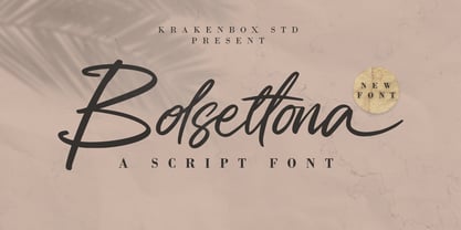 Bolsettona is a fashionable sophisticated signature-style script with its own unique curves and an elegant inky flow. Its elegant, classy, and modern look makes it a fantastic choice for fashion, signature, album covers logos and more. This font is PUA encoded which means you can access all of the amazing glyphs and ligatures with ease!
 - Rezpector by Garisman Studio,
$5.00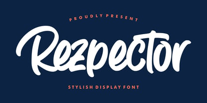 Introducing Rezpector - Stylish Display Font Rezpector combines attractive curves with a fresh urban edge; delivering a stylish script which is guaranteed to add an eye-catching appeal to your logo designs, brand imagery, quotes, product packaging, merchandise, social media posts and more. Uppercase & Lowercase letters Numbers & Punctuation Ligature Simple installation Work for PC and MAC PUA Encoded Open
 - Kali Maya by Creativemedialab,
$20.00 Kali Maya is a modern variable gothic font consisting of 5 weights and 2 types, regular and sharp. Simple and Plain Gothic combined with a square curve stylistic alternates is ideal for use as title, logo text, t-shirt designs, posters, and more. Comes with a variable format as well as multilingual support, numbers, and currency symbols.
 - Keynote Speaker NF by Nick's Fonts,
$10.00This curious little gem is patterned after a typeface named "Bloomsbury", released by P. M. Shanks & Sons, Ltd. of London in the 1920s. Its gentle curves and somewhat quirky construction combine to create a warm and friendly, if slightly offbeat, antique charm. Both versions of the font include 1252 Latin, 1250 CE (with localization for Romanian and Moldovan). - Chopsee Softee by TypeUnion,
$35.00 Chopsee Softee is the marshmallowy version of our 2017 release Chopsee. It's fun and curvaceous and comes in 8 weights with matching italics. Just like Chopsee the soft version maintains the fluidity and movement with the accentuated curves and terminals, but with added fun and freedom. Chopsee Softee is perfect font for packaging to branding and everything in between.
 - Brumers by Trustha,
$17.00 Brumers is a fun sans serif font. Inspired by the curves of a bear. The basic concept is actually hand-drawn. Then, I developed and improved it in the next process. It comes in six styles, which makes it easy to choose according to the project you are working on. Brumers is perfect for headlines, branding, and many more.
 - Teletex by The Northern Block,
$16.70 A typewriter style slab serif typeface. The design is influenced by the font Rockwell and uses a combination of precise geometry with subtle elliptical curves. The harmony of these elements creates a distinctive and functional typeface suitable for a variety of graphic design applications. Details include 4 weights, a complete character set, manually edited kerning and Euro symbol.
 - Elaya Script by Mans Greback,
$59.00 Elaya Script is a formal and flowing script typeface. Silky and smooth curves, but with a straight and rigid backbone. Perfect for logotypes and titles of a project to emit friendly earnestness. The font contains OpenType functions such as alternates and ligatures. It supports all European Latin-based languages and has all necessary punctuation and symbols.
 - Medyson by Reyrey Blue Std,
$19.00 Medyson is an elegant and bold serif font. It is defined by smooth curves. It is perfect for branding projects, Logo design, Clothing Branding, packaging, magazine headings, advertising, T-shirts, postcards and much more. Add it confidently to your projects, and you won’t be disappointed. ? Features · All Uppercase and Lowercase · Number & Symbol · Supported Languages · Alternates and Ligatures · PUA Encoded
 - Mushin by Satori TF,
$16.99 Mushin is a typeface, that comes with 14 fonts, roman and the matching italics, which draws inspiration from the grotesques of the beginning of the 20th century. However, its humanistic details and endings, remove the coldness so characteristic of this style, making Mushin a typeface of lively and dynamic curves, which can be used for various purposes.
 - Beriot by Boyanurd,
$19.00 Beriot is a sans serif whose basics are condensed in Regular (Normal) weight, getting a lot of form inspiration from the topic also known as Steile Futura which is a letterform that Paul Renner himself explored in the mid-1950s, where shapes are constructed with little stress on modular squares but there are changes in certain parts so they become less modular. The Beriot family is available in 42 weights with matching slanted cuts, divided into 3 subfamilies: Condensed, Normal and Expanded. Each has been designed for a range of text sizes each, and already variable, allowing you to choose and make your own type of weight you like. OpenType Features are available in each of these font styles, including alternative characters, different numbers set and case-sensitive and there are additional symbols that make it the perfect choice for professional types of branding, digital design and editorial.
 - Terrapin by Missy Meyer,
$12.00 Introducing Terrapin! I named this after listening to a song called "Terrapin on a Tightrope." Considering the fact that a terrapin is a kind of turtle, it makes that song title seem pretty harrowing! This font has heavy roots in one of my favorite lettering styles. It's rough, scrappy, and likes to do its own thing. It has a full uppercase and lowercase set, numbers, punctuation, and lots of extended Latin characters for language support. It also includes alternate versions of 17 lowercase letters. Where Terrapin really shines is in the ligatures. I've written separate two- and three-letter combined forms for some of the most common letter combinations, and a few uncommon ones to boot. There are almost 100 ligatures in here, all PUA-encoded so everyone can access them (and also coded so if your software does automatic ligature replacement, they'll pop right in).
 - Coreta by Wasabib Type Foundry,
$13.00 Coreta is an elegant serif font that combines classic charm with modern flexibility. With its smooth curves, this font creates stunning visual harmony. Perfect for a variety of projects, from wedding invitations to corporate designs. Thoughtful letter proportions ensure optimal readability at any size. Coreta is not just a font, it's an impressive statement of art. With its unique capabilities, it elevates the appeal of every design with a versatile touch of elegance.
 - Zold by EMME grafica,
$9.90 Zold is the first font designed by EMME Grafica. It's a simple, statuesque, architectural, eye-catcher, tough yet elegant font, particularly suitable for titling, subtitling, branding and typographic amusements. The solemnity of Zold does not affect the the elegance of the curves of the font, but gives it the right visibility and temper, like that of Zold, the surly character who will be the antagonist of a multimedia project currently under development at EMME Grafica.
 - Breakdance Reborn by Trustha,
$15.00 Breakdance is inspired by dance moves, the first font created with this concept is sans serif with a curved shape in one direction. Curves are made not too extreme, so that they maintain the shape balance. And now Breakdance comes in several styles and is divided into three typesface, namely script, sans and serif. Each typeface has several different styles and the total is 18 fonts.
 - Caslon Old Face by Bitstream,
$29.99William Caslon established the first major English typefoundry, re-creating earlier Dutch designs with excellent craftsmanship, color and rhythm. Caslon Old Face is one of many faithful revivals; the original matrices (from many hands; the lowercase of the 48 point is Moxon’s 1669 Great Canon) survive at Stephenson Blake. George Ostrochulski adapted this design for photocomposition at Mergenthaler with skill and understanding. - LHF Centennial Panels 1 by Letterhead Fonts,
$46.00 One of four fonts consisting of the best old fashioned panels from Golden Era Studios. Each font contains 36 expertly drawn panels. Each letter generates a different design. Special Note: Due to the large file size of these fonts, they will not convert for use in Gerber Omega. Instead, Omega users may wish to use an alternate program to type the characters and import them into Omega as .eps files. CorelDraw users should use the "Weld" command rather than "Convert to Curves" command to convert these fonts to vector outlines. Otherwise, the program may crash due to the sheer number of points in each panel.
 - Guerrilla Handshake by Hanoded,
$15.00 Shaking hands is quite a complicated process: do it too lightly and you appear weak, grab too hard and you’re too eager. There are also those with a ‘Guerrilla Handshake’ - grabbing your hand unexpectedly, shaking it vigorously and yanking it toward them. Guerrilla Handshake font was actually made by hand, using Chinese ink and a brush. I did use the brush vigorously, but I made sure not to shake or yank it too much! Guerrilla Handshake comes in a slightly backslanted ‘regular’ version and an italic version.
 - Javiera by Latinotype,
$29.00 Javiera is a geometric sans-serif typeface with humanist attributes. One of its main features is its small x-height, which makes ascenders and descenders look longer. The contrast gives the font a more stylised look, typical of humanist fonts. Curves and rounded terminals make Javiera a smooth, friendly and versatile typeface, well-suited for branding, magazines and publishing projects. User can take more advantage of the versatility of the font by enabling alternative characters included in the set. Javiera comes in 6 styles—from Thin to Black—plus matching italics, giving a total of 12 fonts. The font’s extreme weights are perfect for display use. Javiera family contains a set of more than 400 characters and supports over 200 different languages.
 - MGT Vallery Hills by Magetype,
$15.00 When I was surfing the internet, with rock n 'roll music. I accidentally found a picture of a hotel sign with a very unique style, namely: Mid-century Modern (MCM). It looks very pretty and charming to me. And inspired me to create Font Family. And I am proud to present the Vallery Hills Font Family. This font is in the Retro style of the 50s to 60s. Okay, here are the specifications. 1. Vallery Hills Schrift There is one unique thing about this font. Usually, script fonts with Retro style always have an angled anatomical shape, but I made this font upright. The goal is to make a difference with other script fonts I've seen. By the way, this font comes in two styles, namely: Regular and Bouncy. Why do I make it like that? Because I want to make this font into two different functions, namely: If you want to make it a Display Font, which is usually used for Headings, then use the Bouncy style. And if you want to use it as Bodytext, then use Regular. 2. Vallery Hills Sherift This second font is a font that is very synonymous with the Mid-century Modern (MCM) era. A very distinctive form of the serif font of that era. Similar to the first font, this font also has 2 styles, namely: Regular and Bouncy. You can combine this font with the other two fonts in Vallery Hills. It could be Title, or Bodytext. And you can also combine two styles, namely: Regular and Bouncy. Try! 3. Vallery Hills Suns Sherift This last font is Sans Serif. Also has 2 styles like his two brothers, namely: Regular and Bouncy. The goal is actually the same. I am sure you are cooler to create a design that uses this font family. Well, there is one advantage of this font from its two siblings, which is that it has a feature, namely: SMALLCAPS. Which will be an option when you are bored with the mediocre shape or style of Lowercase. Try combining the Smallcaps with Uppercase or Lowercase. Must be cool! : D Oops, almost forgot. This font consists of several font formats, namely: OTF, TTF, and Webfonts. And of course everything is MULTILANGUAGE. OK, friends. That's all I can describe about the Vallery Hills Family. Hopefully it will please all of you. Cheers!
 - Bleck Stome by Malindo Creative,
$10.00 Introducing Bleck Stome Is a Layered fonts of retro style, with Bleck Stome Give your typography design a touch of retro style, Bleck Stome is one of hand lettering project. It was very inspired from the famous retro typography designs, Bleck Stome also comes with extra Extruded Font version. So you don’t need extra effort for create an extrude effect for this font. This mean it will saves your time. With Bleck Stome Font it suitable for Logotype, posters, business cards, merchandise, wedding invitations, greeting cards, banners blogs, clothing, water-based paint designs / prints, correspondence, quotes and more! . Bleck Stome Comes With 480+ Glyphs and OpenType Features are also added to this font. The Features includes: Stylistic Alternates, Swashes, Ligatures, and Stylistic Set. You can pick the alternate for all style Bleck Stome has given PUA encoded (fonts with special code). If you have any questions,please contact me at: malindocreative@gmail.com. Feel free to contact me, I am happy to help you. To enable the OpenType Stylistic alternates, you need a program that supports OpenType features such as, Adobe Indesign ,Adobe Illustrator CS & CorelDraw X6-X7, Microsoft Word 2010 or later versions. How to access alternate glyphs? you can see it on this link goo.gl/1vy2fv Thank you for your kindness and support,it’s not hidden,what you see in preview is what it contains, Hopefully Useful, Good Luck For You, And Love You All.
 - Ciseaux Matisse by Harald Geisler,
$65.74 Ciseaux Matisse was inspired by the exhibition Drawing With Scissors, which I visited at the Kunsthalle Schirn in my hometown of Frankfurt am Main in 2003 and the book Jazz published in 1947 by Henri Matisse. Admittedly, before that time I wasn’t a fan of Matisse’s work, neither his late nor the early work. That definitely changed after the exhibition. While his motifs have been overused on postcards and mouspads, in front of the originals you forget those tiny pictures. Some of the works were massive—larger than 24ft. By cutting directly into the color Matisse created shapes with strong dynamics. Years later, in 2007, I used that inspiration to cut an exclusive font for a newspaper that I designed at that time (see Gallery Pictures). Later I developed that font into the four styles featured here. The cut-out style is a paper cutout; boxed is the paper background. Both linear and boxed linear have no curved outlines, so they are more aggressive. As drawing with scissors implies, all characters are cut by hand. With only uppercase letters, this font is designed for editorial use: headlines, slogans in ads, or musical usage in posters and flyers that need the little touch of the jazz scissors. In special cases the lowercase letters contain alternate shapes to the uppercase forms.
 - Kisik by Kisla,
$19.99 Kisik is a handwritten font. I got a request to put my handwriting into a font, so I decided to take the challenge and design a whole typeface with three different weights (light, regular, bold) and 638 glyphs to cover all 104 Latin languages. This is my first time making a font. Hope you'll enjoy it. I sure did making it. Check out the listing of glyphs if you can use this font in your work. Otherwise don’t hold back writing to tanjagawish@gmail.com and I’ll create them.
 - Jet by Brownfox,
$39.99 Jet is an assertive italic sans that anticipates the return of the simpler, optimistic times when progress was considered positive and forward seemed to be the only way to go. It may have felt right at home in the mid-1970s, the time of Sc-Fi, synthetics and disco, yet it unmistakably belongs to the present. Its dynamic sturdy forms and angular tapering of some horizontal forms convey movement and edgy impatience for change, with a few re-imagined details, like the reversed slant on top of the lowercase t and the atypical round counter of the lowercase a, showing a new hope for the bygone optimism. Available in five weights in Latin and Cyrillic, supporting many languages, with stylistic alternates and two sets of figures. Designed by Gayaneh Bagdasaryan and Vyacheslav Kirilenko, 2020
 - Floralscript by Wiescher Design,
$29.00 »Floralscript« is an english copperplate script decorated with flowers and curly leaves.
 - Waba by Lewis McGuffie Type,
$40.00 Waba Pronounced ‘Vah-bah’, is a font family that I designed. The name comes from a historical variation on the Estonian word ‘vaba’ – meaning ‘free’, or 'at liberty'. Back in 2017 I visited the Estonian Print & Paper Museum in Tartu to see its great collection of type (well worth a visit!). While I was there I saw some big woodcut blocks of Reklameschrift Herold - a super Art Nouveau/Jugendstil style display font. The Print & Paper Museum's collection covers both Latin and Cyrillic faces and as a foreigner in these parts I'm kind of fascinated by the exoticism of Cyrillic. How it is different but the same to the Latin letters I take for granted (as a humble Englander – no excuses). Not to mention, Jugendstil with its imitation of natural form, reverse-weights and looping-delicious curves (like you've left the window open all summer and the garden plants are climbing in). This mix of Jugendstil, Cyrillic letters and the beautiful historical border town of Tartu inspired me to start drawing Waba. Trimming the serifs from Herold, simplifying those angles and expanding the category of weights, then taking look at the magical logic of Berthold Block and doing a few things that just seemed right at the time – Waba is a bit of love letter to Estonia, the Baltics and the visual history of Eastern Europe. Waba Monogram Waba also contains a monogram face, which allows you to create any monogramming latin and cyrillic. Simply type out your 2-3-4 characters in Waba Monogram, making sure Contextual Alternates is turned on them voila! Monograms can be customised manually using the OpenType select-pop-up in Adobe. Also included are a few Discretionary Ligatures for Mc, De, Von etc. Monograms work best when Contextual Alternates is turned on.
 - Stepford by Joanne Marie,
$10.00 A typographic playground Stepford is a versatile semi-serif boasting 6 styles - regular and italic, sketch and italic and outline and italic. It includes 231 glyphs, ligatures and multilingual support. These six styles make it the perfect display typeface for any kind of project. Absolutely sweet for editorial design - mainly headers and sub-headers but can also be used for body text too. This typographic trio is based on the vintage 50’s and 60’s style scripts and modernised for the present day. It’s another powerful typeface to add to your arsenal of design assets that command attention. That’s what design is all about! For regular updates and freebies follow me on Instagram at joannemarie_cm
 - Andes Neue by Latinotype,
$29.00 Unlike its predecessor, Andes Neue contains a larger character set of 759 glyphs which support 219 Latin-based languages from 212 countries. The font comes in 4 variants that provide a wide stylistic range. Andes Neue is the most similar to the original Andes design. The Alt1 character set bears some similarity to the old Andes's (yet cleaner); Alt2 uses the alternates in the font as default glyphs; and Alt3 is a mixture of the other three variants that offers a balanced set of characters. Andes Neue also includes new accents and glyphs for a wider language support, and a set of small caps (in each variant). All of these features give the font a strong personality that helps make text look more appealing. Andes Neue varied weights work well with both short and mid-length text sections, providing a wide range of choices for any design project.
 - The Serif Hand by S&C Type,
$8.00 The Serif Hand is a handwritten font designed by Fanny Coulez and Julien Saurin in Paris. We wanted to create the most generic, readable and balanced serif handwritten font, to work well in every kind of design. It’s an all-caps font with 5 finely balanced weights with alternates: all the uppercase letters are a bit different from the lowercase letters. We also designed a playful dotted weight, to add a fancy touch if needed. We hope you will enjoy our work. Merci beaucoup!
 - Coranto 2 by TypeTogether,
$49.00 Now available as Opentype font with extended character set, Coranto 2. It is originally based on Unger’s typeface Paradox, and arose from a desire to transfer the elegance and refinement of that type to newsprint. Coranto 2 has a larger x-height and in many places has been made more robust. Over the past 25 years newspaper production has seen spectacular improvements in paper and print quality, the introduction of colour printing, and vastly better register. Newspaper production still demands a lot of letter forms, but advanced printing brings out details better and makes typography more appealing to readers. For text type the newspaper is no longer an environment in which survival is the chief assignment. Today, newspapers are not merely a matter of cheap grey paper, thin ink and super-fast rotary printing, and type design no longer has to focus on surviving the mechanical technology and providing elementary legibility. Now there is also room to create an ambience, to give a paper a clearer identity of its own; there is scope for precision and refinement. One consequence of this is that newspaper designers can now look beyond the traditional group of newsfaces. Conversely, a newsface can be used outside the newspaper — not an uncommon occurrence. The update to this beautiful font family, Coranto 2, includes the addition of over 250 glyphs featuring full Latin A language support, new ligatures, 4 sets of numerals, arbitrary fractions and superiors/inferiors. Furthermore, kerning was added and fine tuned for better performance.

