10,000 search results
(0.035 seconds)
- Curly Millie by Typesthetic Studio,
$12.00 Curly Millie is modern & fresh signature style script font. This font looks natural, classy and perfect for any awesome projects that needs a handwriting taste. With exaggerated strokes and a bouncy baseline, Curly Millie has an unmistakable charm; perfect for logos, wedding stationery, cards, gift designs, photography, watermark, product packaging and handwritten quotes.
 - Curly Q by Outside the Line,
$19.00 CurlyQ new from Rae Kaiser and Outside the Line. A curly, swirly, girly kind of font. A delightful headline font for your next garden party or note to the kids from the tooth fairy.
 - Curly Keken by Putracetol,
$15.00 Introducing a new retro font called “Curly Keken“. Inspired from retro typography and lettering in the 70’s and 80’s combine with bold typography style. With a total of 534 glyphs with 359 alternate, you can make letter combinations for lettering with a lot of options. Come with open type feature ( a lot of alternates and end swash), its help you to make great lettering. Curly Keken best uses for Logotype, heading,cover, poster, logos, quotes, product packaging, header, merchandise, social media & greeting cards and many more. This font is also support multi language. To access the alternate glyphs, you need a program that supports OpenType features such as Adobe Illustrator CS, Adobe Photoshop CC, Adobe Indesign and Corel Draw.
 - Sweet Curly by Inumocca,
$19.00 Sweet Curly inspired from Girls handlettering, more unique character decorative, fancy, powerfull and beautiful. Really Beautiful font to covering your Project, like For logos, Poster art, Magazine, Branding, Sticker and more your project design. - Unique glyphs - Multilingual Characters - UPPERCASE - Lowercase - Numeric - Symbol - Punctuation Character - PUA encoded inumoccatype
 - Curly Jane by Deniart Systems,
$20.00 Curly Jane is a whimsical typeface combining straight lines with a little curl at the ends. Great for headlines, humorous notes, greetings, whatever hits your whimsy because simply said, it's simply Curly. Curly Jane includes a large assortment of extended characters to support many of Europe's languages, including Czech, Danish, Dutch, Esperanto, Finnish, French, German, Italian, Hungarian, Polish, Portuguese, Romanian, Spanish, Swedish, Turkish & Welsh.
 - Curly Babe by Forberas Club,
$16.00 Curly Babe is handwritten font. Recommended to use for children theme, funny theme, comics, cartoon, simple write, poster and display.
 - Curly Gloom by Heyfonts,
$15.00 Curly gloom is an experimental font adapted from a combined groovy font and graffiti that makes its unique character as a display font, this font is very suitable to use as your project design such as a graphic template or clothing.
 - Curly Lady by URW Type Foundry,
$39.99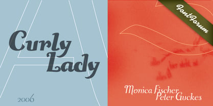
- Curvi Technocrat by Mans Greback,
$39.00 Curvi Technocrat is a rounded, geometric font that captures the essence of speed and forward movement. Inspired by the smooth curves of race cars and the energy of urban graffiti, this heavy, slanted font family adds a touch of dynamism and softness to your designs. The Curvi Technocrat font family offers five weights: Thin, Light, Regular, Bold, and Black, making it a versatile choice for a wide range of design projects that require a modern, geometric touch. The font is built with advanced OpenType functionality and has a guaranteed top-notch quality, containing stylistic and contextual alternates, ligatures, and more features; all to give you full control and customizability. It has extensive lingual support, covering all Latin-based languages, from Northern Europe to South Africa, from America to South-East Asia. It contains all characters and symbols you'll ever need, including all punctuation and numbers.
 - Love Curly by Goodigital13,
$20.00 Perfect use for a logo for branding, typography design, christmas card, product packaging, invitation, quotes, t-shirt design, label poster, special events and anything that need elegant taste. great for Logotype, Branding Design, Logo Design, Digital Lettering Arts, T-Shirt/Apparel, Poster, Magazine, Signs, Advertising Design, and any vintage design needs. Caps only Fonts
 - Curly Luly by FontHaus,
$19.95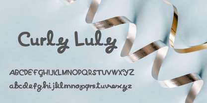
- Curly Valentine by Yoga Letter,
$20.00 "Curly Valentine" is a beautiful and unique curly display font. Equipped with uppercase letters, lowercase letters, numerals, punctuation, and multilingual support. Very suitable for posters, banners, valentines, weddings, gifts, invitations, branding, stickers, Christmas, spring, winter, and others.
 - Jayne Print YOFF - Personal use only

- Print Clearly OT - Unknown license

- Pea Karen's Print - Unknown license

- Pea Gretchie Print - Unknown license

- 101 Zebra Print - Unknown license

- Print Clearly Dashed - Unknown license

- Pea Sue's Print - Unknown license

- Plz Print Brush by Outside the Line,
$19.00 Plz Print Brush is a good solid font for posters, headlines and accent words like - SALE! It gives the slightly irregular look of handlettering.
 - Print Embellishments JNL by Jeff Levine,
$29.00 Print Embellishments JNL gathers together a number of vintage typographic enhancements that can be used as simple spot decorations, rule lines or borders, adding a bit of design elegance to any project.
 - Print Damosel JNL by Jeff Levine,
$29.00 Kevin Curtis runs a site called Damosel's Printer's Blocks, specializing in rare an unusual examples from the years when letterpress was the main source of printed material. He graciously provided the source material for Print Damosel JNL. The collected images represent a varied cross-section of ornamentation, embellishments, attention getters, decorations and whimsical illustrations.
 - Sainted Extra Bold by Wooden Type Fonts,
$15.00 Extra Bold Serif
 - 4 Point Florals by Deniart Systems,
$20.00 A whimsical array of floral pointers (up/down/left/right) - great for adding directions or pointers to documents, maps, posters, greetings, or simply used as decorative elements. See also 4Point Deco and 4Point GreekFret.
 - Print Sellers JNL by Jeff Levine,
$29.00 Another batch of vintage letterpress cartoons, cuts, dingbats and embellishments is offered in Print Sellers JNL.
 - Print Partners JNL by Jeff Levine,
$29.00 The vast variety of vintage letterpress illustrations representing many different eras and art styles allows for yet another volume of cartoons, embellishments, ornaments and stock cuts contained within Print Partners JNL.
 - Rough Print JNL by Jeff Levine,
$29.00 The Superior Marking Equipment Company was originally located in Chicago, Illinois and over the years produced a line of both commercial and toy rubber stamp printing sets which were used for making signs, posters, tickets and other printed items. Rough Print JNL reproduces the scanned images printed from one of the toy rubber stamp sets. The sample characters were smaller than one half inch in height and were further reduced during scanning. This gives the end result of a typeface which looks like rubber stamp imprints at small sizes, and very angular, distorted, somewhat grunge type when printed at larger sizes. There is a limited character set consisting of alphabet, numerals, some punctuation and currency symbols. No kerning was added to keep the hand-made appeal. Rough Print JNL is an all caps font with the letters and numbers jogged randomly on both the caps and lower case keystrokes. For a similar design with lower case, Amateur Printer JNL is recommended.
 - Print Helpers JNL by Jeff Levine,
$29.00 Print Helpers JNL is a compact little assortment of vintage cartoons, ornaments, arrows, words, phrases and other decorative illustrations used to enhance ads, print projects and fliers.
 - Pilot Point NF by Nick's Fonts,
$10.00One in the series of fonts called Whiz-Bang Wood Type, intended to be set large and tight. Pilot Point is based on an older font found in Dan X. Solo’s book on Circus Type; the designation fits perfectly. The font gets its name from a small town in Northeast Texas, where several scenes from Arthur Penn’s Bonnie and Clyde were filmed. Both versions of this font contain the Unicode 1252 Latin and Unicode 1250 Central European character sets, with localization for Romanian and Moldovan. - Hand Printing Press by Fontscafe,
$39.00 Hand printing typography revolutionized the way books were published. The earliest printing presses made it possible for newspapers to reach the doorstep every morning, for information to freely be shared among the masses for the first time on a large scale…and the fonts that were used in those classic times are forever embedded within the collective memories of societies across the planet. It is to this collective memory that we give a visual form with our new Hand Printing Press Pack. Up for grabs are a set of 10 Hand Printing fonts plus one "Stamps" elements font. The fonts are: the Normal, the Stencil, the Eroded, the Meshed and the Scraped in REGULAR and BOLD versions; each of them displaying a simplistic yet classic printing style and as often happens lately, we are also offering you an "elements" pack, the "Stamps" font, to go with these to create your customized stamp giving to your creations a touch of "official documentation".
 - Print Oddities JNL by Jeff Levine,
$29.00 Print Oddities JNL gathers various cartoons, embellishments, spot illustrations, border elements and arrows into one nostalgic collection; all re-drawn from vintage source material.
 - Dallas Print Shop by Fenotype,
$20.00 Dallas Print Shop is a refined display collection of five styles and eight fonts. The fonts are designed to act together. They not only work great in pairs, all together, or even alone. Dallas Print Shop Sans is a sturdy Sans with soft edges and two weights - Regular and Heavy Dallas Print Shop Serif is a sturdy Serif with straight forms and just slightly rounded corners. Serif has three weights: Regular, Heavy and Inline which is same as Heavy but with ornate inlines. Dallas Print Shop Brush is a Brush Script with soft and bold classic script forms. Brush is equipped with Standard Ligatures and Stylistic Alternates. Dallas Print Shop Pen is a flashy Monoline Script with a clear character. Pen is equipped with Contextual and Swash Alternates. Dallas Print Shop Script is a curly upright Script with a feminine character. Script is equipped with Standard Ligatures and Swash Alternates. Enjoy!
 - Printing Sorts JNL by Jeff Levine,
$29.00Over 75 images from the past and present comprise Printing Sorts JNL, another dingbat font from Jeff Levine paying tribute to the days of metal type and stock cuts. A PDF file is included with the font, showcasing the special feature that allows you to create arrows in varying lengths with just a few simple keystrokes. - Print Illustrations JNL by Jeff Levine,
$29.00 Print Illustrations JNL gathers a number of charming and functional designs redrawn from vintage sources. There are attention getters, spot illustrations, catch words and decorative embellishments all in one digital file.
 - Print Assistants JNL by Jeff Levine,
$29.00 For those who can't get enough of the wonderful illustrations, embellishments and dingbats of days gone by, Print Assistants JNL collects more of them in one handy font file.
 - Printed Letters JNL by Jeff Levine,
$29.00Printed Letters JNL is from stamped impressions made by a children's sign making set by the Superior Marking Equipment Company of Chicago - circa the 1940's. The set consisted of individually mounted rubber stamps - easy enough for happy kiddies to print signs, name plates or (unfortunately for their parents) on the walls... Limited character set. - Point Made JNL by Jeff Levine,
$29.00 Point Made JNL is a varied assortment of pointing hands and arrows used for embellishing word copy, drawing attention to key points or simply adding some retro flair to your print or web project. Twenty six designs in varying styles offer a wide range of visual diversity. The images point to the right on the capital keys and to the left on the lower case keys. This font is a companion to Point Taken JNL, which offers twenty-six more pointing hands and arrows.
 - 1790 Royal Printing by GLC,
$38.00 From 1702 to 1811 the French "Royal", then "Imperial", Printers, neglected Garamond and Fournier's designs and used only the font called "Romain du Roy", carved (1693 to 1723) by Philippe Grandjean by order of the king Louis XIV. 1790 Royal Printing was inspired by various variants of Romain du Roy that were in use during this period. Our sources were mainly official and legal documents printed in the late royal period, and in the beginning of the French revolution. There was no bold style. The 1790 Royal Printing Caps fonts contain small caps, plus titling caps for headlines as 1790 Royal Printing capitals are intended to be used preferably for text.
 - Print Spots JNL by Jeff Levine,
$29.00 Print Spots JNL once again gathers together various and sundry vintage letterpress ornaments, embellishments, borders and spot illustrations from various sources.
 - Point Taken JNL by Jeff Levine,
$29.00For those seeking pointing hands or arrows for project embellishment, Point Taken JNL offers an assortment sure to please.


