10,000 search results
(0.027 seconds)
- Shortline by Qwrtype Foundry,
$14.00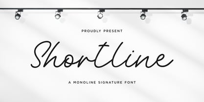 Proudly Present, Shortline Shortline is a Monoline Signature Font Shortline is perfect for product packaging, branding project, megazine, social media, wedding, or just used to express words above the background. Shortline also come with Multi-Lingual support. Enjoy the font, feel free to comment or feedback, send me PM or email. Thank you!
 - Groovy Boss by Eu Iturria Morante,
$36.00 Groovy Boss is a decorative type, inspired by the playful aesthetics from the 60s and 70s. Groovy and Boss were words used in those decades to refer to something as cool or trendy. Great for titles or short phrases, the curves and psychedelic forms of each letter will contribute to creating amazing compositions.
 - Winterlady by Balpirick,
$15.00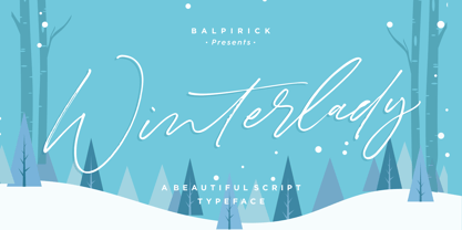 Proudly Present, Winterlady Font. Winterlady is a Beautiful Script Font. Winterlady is perfect for product packaging, branding project, business card, megazine, social media, wedding, or just used to express words above the background. Winterlady also multilingual support. Enjoy the font, feel free to comment or feedback, send me PM or email. Thank you!
 - Westbum by Allouse Studio,
$16.00 Proudly Presenting, Westbum A Bold Handbrush Font. Westbum is perfect for any titles, logo, product packaging, branding project, megazine, social media, wedding, or just used to express words above the background. Westbum also come with Multi-Lingual Support. Enjoy the font, feel free to comment or feedback, send me PM or email.
 - Timegoing by Allouse Studio,
$16.00 Proudly Presenting, Timegoing a Graffiti Street Font. Timegoing is perfect for any titles, logo, product packaging, branding project, megazine, social media, wedding, or just used to express words above the background. Timegoing come with Multi-Lingual Support. Enjoy the font, feel free to comment or feedback, send me PM or email. Thank You!
 - Mothenary by Adante Creative,
$23.00 Introducing by Adante Creative Proudly Present, Mothenary Mothenary is A Beautiful Calligraphy Font Mothenary is perfect for product packaging, branding project, magazine, social media, wedding, or just used to express words above the background. Mothenary also multilingual support. Enjoy the font, feel free to comment or feedback, send me PM or email.
 - YrBkMess - Unknown license

- Sqsville - Unknown license

- Animated Gothic by BA Graphics,
$45.00 A great animated fun design. Works really well for kid's stuff and children's books.
 - Hagedi MF by Masterfont,
$59.00 Tattoo? Crazy look? this naughty, works best for wild and crazy headlines or signage.
 - Westkreep by Pedro Teixeira,
$25.00 Westkreep is based on wood type with characters extremely wide relative to their height.
 - Alons Antique by BA Graphics,
$45.00Created as a Headline Face Alons Antique works amazingly well as a text face. - Fuller Sans DT by DTP Types,
$49.00An original design by Malcolm Wooden inspired by the works of Morris Fuller Benton. - American Advertise 016 by Intellecta Design,
$15.95a classic decorative caps font digitized from the wood type classics heritage from America's - Summer Nights by BA Graphics,
$45.00 A very readable script, simple yet elegant. Works great in a multitude of applications.
 - Phanitalian by Intellecta Design,
$9.00Phanitalian in an exercise whith many styles from a classic victorian wood type font. - Montada by BRtype,
$18.00 The design of Montada was inspired by the manual printing of mixed wood types.
 - Payson JNL by Jeff Levine,
$29.00Payson JNL is based on a vintage sans serif wood type from the 1800s. - Birac DT by DTP Types,
$49.00This design is based on custom design work by DTP Types Limited in 1990. - Zing Sans Rust by Fontfabric,
$29.00 Zing Sans Rust is a textured handmade typeface with wide and calm proportions perfect for short text in small sizes, but also pleasant enough to use as an isolated display headline. It has a distinctive geometric spirit, smoothed with handmade details such as a slightly slanted axis visible in the terminals. The combination of Zing Script TM and Zing Sans TM brings a balanced completeness. Zing Goodies As a dessert, we serve you Zing GoodiesTM that tops off the whole package, making it an extraordinary delicacy! It has 4 basic forms — Bakery, BBQ, Banners, and Words — with two styles each, which contain plenty of adorable icons for any food and taste, elaborate banners, ribbons, and ornaments, and even a beautiful selection of useful words to accentuate your design.
 - Scriptissimo by Wiescher Design,
$39.50 Scriptissimo is, as the name says, very much of a script! It is in the best American tradition. A script that could have served for writing the Constitution with, if only they would have had computers at that time. Scriptissimo consists of three different scripts that are meant to be used together. One is the script with the more or less plain characters. Two is the version for characters to start a word with. Three is the cut that has the characters for the end of a word. Ligatures is used for, well, ligatures and some glyphs like Ltd., GmbH, and so on. Scriptissimo is a very elegant and versatile script. It can be used for chocolate bars as well as stock certificates. I really enjoyed designing it. Yours scriptissimo, Gert Wiescher
 - Suited Horse PB by Pink Broccoli,
$19.00 An offbeat alternate caps typestyle inspired by the title screen of a 1968 Walt Disney film titled, The Horse in the Gray Flannel Suit. This playful and childish font comes with an extensive language set, a stylistic alternates feature that auto-alternates between capitals & lowercase (alt caps), as well as a contextual alternates feature that auto-alternates between sets only where double characters are typed like SS, TT, etc. The contextual alternate feature also enables a few titling word options like " the " " in " and " in the ". As noted in the quotes, when these word sets are typed with a space before and after them, it will trigger the swap when contextual alternates is on. Switching on Contextual Alternates enables automatic alternations between caps and alt caps like AlTeRnAtIoNs to create a more randomized look.
 - Ultra System by Set Sail Studios,
$14.00 Introducing Ultra System; A modern exploration of 8 fonts, each carefully designed to naturally compliment one another. With 6 clean sans fonts and 2 textured script fonts, Ultra System gives you a variety of ways to combine and arrange each font, allowing you to create striking & modern typographic designs. This typeface collection consists of 8 fonts; Ultra System Script • A textured, bouncy & flowing marker script font containing upper & lowercase characters, numerals, and a large range of punctuation. Ultra System Script Alt • This is a second version of Ultra System Script, with a completely new set of both upper and lowercase characters. If you wanted to avoid letters looking the same each time to recreate a custom-made style, or try a different word shape, simply switch to this font for an additional layout option. Ultra System Sans • A wide, bold sans font containing uppercase only characters, numerals, and a large range of punctuation. Ultra System Sans Line One • A thick outlined version of Ultra System Sans, pair this with other Ultra System Sans fonts to add emphasis to words or phrases. Ultra System Sans Line Two • A thin outlined version of Ultra System Sans, pair this with other Ultra System Sans fonts to add emphasis to words or phrases. Ultra System Sans Italic • Italic variations are included for all 3 Ultra System Sans fonts. FAQs; Accessing Ligatures • Ligatures are supported by most desktop graphics & text software (not just the fancy ones!), including Photoshop, Illustrator, InDesign, Word, Pages & Keynote. Many programs will automatically have this feature switched on for you, but if you need any help accessing then please feel free to drop me a message. Language Support • All Ultra System fonts support the following languages; English, French, Italian, Spanish, Portuguese, German, Swedish, Norwegian, Danish, Dutch, Finnish, Indonesian, Malay, Hungarian, Polish, Croatian, Turkish, Romanian, Czech, Latvian, Lithuanian, Slovak, Slovenian
 - RAN by URW Type Foundry,
$35.99 RAN Reformed Typeface for Beginners by Georg Salden - a headstrong and courageous approach to an improved handling of handwriting. Diverse and sometimes irreconcilable theories exist about how beginners are supposed to learn writing and reading. This has led to fierce discussions among experts already. We don’t want to pour more oil on the fire, but hope to create a new awareness for this topic, which is important to everyone of us. For beginners the combination of single characters (sounds) to whole words is essential during the acquirement of reading and writing. In this process they develop the skill to recall entire terms from memory. Therefore, after current practice, every word shall be written in a single stroke without lifting the pen in between. Georg Salden contradicts this postulate and warns, that coercively holding the pen down within a word can easily lead to exaggerated loop formations and a general meandering of the written text. The intellectual process in connecting single sounds to words while writing would happen anyway and the prohibition to lift the pen would often lead to tensions. To still support the necessary connections in general and to simplify the connecting, he teaches to write all round letters like a, e, g, o with inclusion of the connecting stroke, so that the spacing and combining with the next character arise by themselves. By settling the stroke at certain points and with a clear and logical writing method, a conscious and careful contact with the various strokes arises. All this automatically leads, together with a certain deceleration, to an increase of beauty and readability in the handwriting. The repeatedly discussed topic »connected or unconnected« appears to be solved in the most comfortable way as, depending on the particular character combination, both solutions are possible.
 - PB Capitalis Rustica IVc by Paweł Burgiel,
$32.00 PB Capitalis Rustica IVc is a font face designed for imitate latin writing style found in manuscripts from 1st to 9th century. All characters are handwritten by use ink and reed pen (calamus), scanned, digitized and optimized for best quality without lost its handwritten visual appearance. Character set support codepages: 1250 Central (Eastern) European, 1252 Western (ANSI), 1254 Turkish, 1257 Baltic. Include also additional characters for Cornish, Danish, Dutch and Welsh language, spaces (M/1, M/2, M/3, M/4, M/6, thin, hair, zero width space etc.) and historical characters (overlined Roman numerals, I-longa, historical ligatures for "nomina sacra" and "notae communes"). OpenType TrueType TTF (.ttf) font file include installed OpenType features: Access All Alternates, Localized Forms, Fractions, Ordinals, Superscript, Tabular Figures, Proportional Figures, Stylistic Alternates, Stylistic Set 1, Historical Forms, Historical Ligatures. Include also kerning as single 'kern' table for maximum possible backwards compatibility with older software. Historical ligatures for "nomina sacra" and "notae communes" are mapped to Private Use Area codepoints. Use of OpenType features to get historical characters: ïTo get "I-longa" use Stylistic Alternates for: "I"(U+0049), "i"(U+0069), "dotless i"(U+0131). ïTo get "nomina sacra" use Historical Ligatures and write uppercase letters: DS for: "Deus", DMS or DNS for: "Dominus" EPS for: "Episcopus", IHS for: "Iesus", PBR for: "Presbiter", SCS for: "Sanctus", SPS for: "Spiritus", XPS for: "Christus". ïTo get "notae communes" use Historical Ligatures and write: B(U+0042) + "middle dot"(U+00B7) for: "-BUS", Q(U+0051) + "middle dot"(U+00B7) for: "-QUE". ïTo get "scriptio continua" (writing without words separation) use Historical Forms (regular spaces are replaced by zero width spaces between words). ïTo get "middle dot" for separate words use Stylistic Set 1 (regular spaces are replaced by middle dot between words).
 - Boxer Machine by Create Big Supply,
$15.00 Introducing Boxer Machine, a powerful brush font that captures the essence of handcrafted strokes. With its strong and natural style, this font brings an authentic and dynamic feel to your designs. It is the perfect choice for logos and various formal applications such as labels, magazines, books, greeting cards, packaging, novels, and advertising materials. Boxer Machine exudes confidence and impact with its combination of uppercase and lowercase letters. The brush-inspired strokes add a touch of ruggedness and artistic flair to your typography, making it stand out from the crowd. Whether you're creating a bold logo or designing eye-catching headlines, this font is sure to leave a lasting impression. In addition to its aesthetic appeal, Boxer Machine offers functionality. It includes numbers and punctuation marks, ensuring versatility across different design projects. With multilingual support, you can effectively communicate your message to a global audience. The font also features PUA (Private Use Area) Encoding, granting you access to special characters and glyphs. Take your creativity to the next level and personalize your designs with unique elements.
 - Another Grotesk by Aleksandrs Golubovs,
$32.00 Another Grotesk is a contemporary typeface that was inspired by the early grotesques. Upon closer inspection you will notice the terminals of some of the characters are slightly turned inwards, this detail gives Another Grotesk its distinctive and friendly personality. Another Grotesk is functional and has been crafted with a great attention to detail. It is available in 9 weights and two optical sizes with matching italics which adds up to 36 styles. Another Grotesk Text family has been carefully redesigned some of the details were removed and simplified, x-height increased, and ink traps added, but preserved the overall look and feel of the display version, to ensure a greater legibility and clarity in running text. The extensive language support allows type setting in more than 200 languages across Latin, Cyrillic and Greek scripts. Another Grotesk also includes small caps and punctuation, tabular and old-style figures, as well as case sensitive feature and offers stylistic alternates for K, a, g, and y to fulfil any creative need of a designer.
 - Mr Gabe by Leksen Design,
$- Check out Mr Gabe in motion! Mr Gabe is a typeface designed to dance. Not that it’s a flamboyant display face, but that it has a liveliness, especially in its heavier weights, that dances across the page. And the letters include a selection of exuberant flourishes that can be used to kick up a ruckus or make a sweeping gesture. Mr Gabe is a high-contrast serif typeface with vertical stress, a “modern” face in traditional type terms. Even in the regular weight, the contrast between thick and thin strokes is very obvious. Designer Andrea Leksen has given many of the lowercase letters ball terminals, teardrop shapes that make Mr Gabe seem decorated even when most of its letter forms are conservative. If you need more bells and whistles, or perhaps revolving mirror balls and dancing shoes, you can explore the font’s collection of ornaments and decorative borders. Mr Gabe comes in four weights, from Regular to Black, with italics for each. Each font includes over 57 ligatures, 31 illustrations and borders, small caps and proportional oldstyle numerals.
 - Broadside by Device,
$39.00 Broadside is a versatile, authoritative and functional family inspired by the sans serifs seen on ’40s and ’50s patriotic posters and period advertising. It is available in seven weights across condensed, normal and extended widths, each with reweighed italics. The type from this period was very often hand-drawn, and so differs considerably from poster to poster. Many American examples of this period use a Photo-Lettering style called Murray Hill and its derivatives, although their UK counterparts, designed by such luminaries as Abram Games or Tom Eckersley, are more stylistically diverse. Even though no single model is available to base a digitisation on, there are certain recurring stylistic quirks that give the type its unique flavour, and so the most interesting examples from several sources were be combined for the final family. Alternate short descenders, allowing for tighter line spacing, can be toggled on or off in the Opentype panel of Indesign or Illustrator. Tabular and lining numerals and a single-story ‘a’ are also available in all weights and styles.
 - Xpress by Wiescher Design,
$12.00 »XPress« is a very distinct, expressive, typical new Sans. »XPress« is my new Sans-Serif that impresses – especially in small sizes – with its outstanding readability. Seven precisely calibrated weights from »Thin« to »Heavy« and its corresponding italics make this font-family universally usable. »XPress« got its bearings from the fabulous American »Gothic« fonts of the twenties of last century. Modern, present day elements, high lowercase letters and infinitesimal elegant slight curves in start- and end strokes make the font family not only great for body copy, but also very useful in advertising. »XPress« ist eine individuelle, expressive, typische neue Sans. »XPress« ist meine neue Serifenlose die – speziell in kleinen Schriftgraden – durch aussergewöhnliche Lesbarkeit auffällt. Sieben präzise aufeinander abgestimmte Schnitte von »Thin« bis »Heavy« und dazu passende Kursive machen die Schriftfamilie vielseitig einsatzfähig. »XPress« orientiert sich bewusst an den grossen amerikanischen Groteskschriften der zwanziger Jahre des letzten Jahrhunderts. Durch moderne Formelemente, große Mittellängen und unendlich leichte, elegante An- und Abstriche ist die Schrift jedoch nicht nur als Textschrift, sondern auch im gesamten Bereich der Werbung vielseitig einsetzbar.
 - Gulmer Cottage by Jinan Studio,
$12.00 Gulmer Cottage Font Duo embodies the essence of charm and whimsy, designed to infuse your creations with a delightful touch. This font duo features both a regular and slanted version, offering versatility for a myriad of designs. The script version boasts engaging ligatures while the display version is adorned with playful swashes, allowing for endless creative possibilities. Perfectly suited for quote designs, celebrations like Christmas and birthdays, heartfelt valentines, as well as branding endeavors and product packaging, Gulmer Cottage Font Duo radiates love, cute, and joy. Its multi-language support ensures its usability across diverse cultural landscapes, while its inherent cuteness and fun-loving nature elevate any project it graces. Infuse your designs with a dash of affectionate personality and spirited vibes using this endearing font duo." Features A set of uppercase and lowercase glyphs, Allcaps (display version) Number, symbol, and punctuation Multilingual Support Ligatures (script version) Swashes (display version) Slanted Version Type j_1 until j_12 to features swash, ligatures will automatically replace the standard letter pairs whenever available, when using any OpenType capable software.
 - Adriane Text by Typefolio,
$49.00 Adriane Text was designed between 2006 and 2007 with additional production completed by Silas Dilworth for this 2008 release [v1.002]. Focusing on text composition and unique typographic characteristics, details within the characters provide both personality and excellent legibility at small sizes. With a medium contrast, a predominantly vertical axis, and a generous x-height, it can be classified as a transitional typeface. This package of advanced OpenType fonts consists of the style-linked quartet of Regular and Bold weights accompanied by corresponding Italics, each of which include small caps and full support for Extended Latin character sets - now including Central European diacritics. Old style and lining figures are provided in both proportional and tabular spacing, and an extensive set of ligatures, ornaments, dingbats, and alternate ampersands are available across the family. The Italics possess a fluidity that contrasts with the staid posture of the Roman styles. The degree of inclination for the uppercase and lowercase characters are slightly different, offering an enhanced visual rhythm in the text settings.
 - Huckleberry by Canada Type,
$24.95Huckleberry is a revival and expansion of a 1973 typeface called Mark Twain, which was G. Jaeger's reaction to the popularity of VGC's Eightball (also digitized and expanded as Orotund by Canada Type) from across the ocean. Jaeger's reaction was typical German efficacy, with majuscules that surpass their inspiration in art and humour, and minuscules that could have been just the thing if one wanted to make the Eightball lowercase friendlier. Back in its day, this font reached its own heights of popularity in Western Europe, but in the Americas it was less known because art nouveau faces were being made by the hundreds in the 1970s. Round, happy and bouncy, Huckleberry comes as a timely response to public demand for big and cheerful letters. Huckleberry is also very effect-friendly. Stretch it a bit, drop-shadow it, warp it, and it will still keep its cheer and communicate the message with a smile. Huckleberry comes in all popular formats, and contains plenty of alternates sprinkled throughout the character set. - Compita by Studio Buchanan,
$12.00 Compita is a Neo-Grotesk(ish) typeface that started life as a love-letter to Berthold's classic. But for every rigid, Neue-Haasism, there exists an equal and opposite amount of humanist attributes – along with a deliberate dose of creative license. It has some over-emphasised features and terminal endings which help to create its friendly personality, but sits them on a slightly condensed overall width. Together they help balance each other out, creating a face that feels both affable and professional. Aff-essional perhaps? The character set contains everything the modern day designer needs, including diacritic support for over 30 languages. And It’s packed full of the usual opentype features (that most will probably ignore) – Small caps, multiple number sets, and discretionary ligatures, to name just a few. Whether it’s deployed as a display face, or as the dependable choice for text, Compita is useable across multiple disciplines. Set in online, on screen or in print – it’s proof that not everything has to be Montserrat or Raleway...
 - Kolaron by IbraCreative,
$17.00 Kolaron – A Modern Condensed Sans Serif Font Kolaron is a contemporary condensed sans-serif font that effortlessly blends sophistication with modernity. Its sleek and streamlined design features condensed letterforms that exude a sense of efficiency and space optimization, making it an ideal choice for projects where legibility and style are paramount. The font’s clean lines and geometric shapes contribute to a polished and professional appearance, making it versatile for a range of applications, from corporate branding to editorial design. Kolaron’s balanced letter spacing and subtle yet distinctive details showcase a meticulous attention to typographic detail, ensuring a harmonious and eye-catching visual experience across various mediums. Whether used for headlines, signage, or digital interfaces, Kolaron stands as a testament to the elegance achievable in contemporary typography. Kolaron is perfect for branding projects, logo, wedding designs, social media posts, advertisements, product packaging, product designs, label, photography, watermark, invitation, stationery, game, fashion and any projects. Fonts include multilingual support for; Afrikaans, Albanian, Czech, Danish, Dutch, English, Estonian, Finnish, French, German, Hungarian, Italian, Latvian, Lithuanian, Norwegian, Polish, Portuguese, Slovak, Slovenian, Spanish, Swedish.
 - Andriani by Hatftype,
$15.00 Andriani is an elegant display typeface. It is characterized by its sleek and sophisticated appearance, making it suitable for use in headlines, headings and other prominent design elements. The elegant display typeface exudes timeless charm with its graceful, thoughtfully crafted letterforms. Each character is imbued with a sense of sophistication, featuring subtle serifs or exquisite details that enhance the overall aesthetic. The typeface features a harmonious balance between sleek strokes and subtle ornate elements, contributing to a refined and luxurious appearance. The design of this typeface reflects attention to detail, with curves and lines seamlessly intertwining to create a seamless flow. The letterform conveys a sense of luxury and refinement, making it an ideal choice for high-end branding, invitations and editorial designs that desire a touch of class. Whether used in large headlines or smaller display settings, elegant display typefaces attract attention and leave a lasting impression. Its timeless appeal ensures versatility across a wide range of design applications, adding a touch of sophistication and refinement to any project.
 - Generous Hospitality by Dear Alison,
$19.00 While there can be similar handwriting styles out there, no two handwritings are exactly the same. I like to think that I have the same handwriting style as my father, but I had never seen him write with lowercase letters, only in all capitals, except when signing his name on something in cursive. I recently came across a letter my father had written long ago to a friend. It was returned to sender, yet he kept it intact. The letter primarily thanked his friend for his hospitality when my father unexpectedly dropped in for a visit while traveling. I was so taken by the handwriting, that I decided to make it into a font, not only to remember my father, but also to forever preserve his handwriting. Generous Hospitality not only taps into the character of the person the letter was written to, it also reflects the personality of my father. If you are looking for a masculine handwriting type style for your designs, I think this font could be a nice fit.
 - Ansage by Sudtipos,
$49.00 Ansage does not claim to be neutral; it escapes from the rationalist sans of closed strokes and regular forms. Meaning Announcement in German, Ansage is versatile and communicates effectively across a broad range of media and formats such as branding, posters, websites, apps, titles and compositions with little spacing). Ansage is a sans serif font with a strong personality that emerges from an interest in and the study of a wide variety of typographic specimens of Gothic fonts from the nineteenth century. The design process behind Ansage brought about constant transformations in form; the result is a compact and robust font, with a large x-height, small ascenders and descenders, and open terminals that grow in expressiveness as it increases in weight. It is available in 10 weights, ranging from Hairline to Black, and 3 widths – Condensed, Regular and Expanded – plus italics, which make a total of 60 perfect variables to combine and contrast with each other. In addition, it also includes multiple open-type functions such as alternative styles, Old Style Figures, Tabular Forms, fractions, case sensitive, ligatures and more.
 - Wolpe Fanfare by Monotype,
$50.99 “Fanfare is such a fun typeface,” says Toshi Omagari, who revived the design for The Wolpe Collection. “It was my happiest discovery when I was digging through the Monotype archive. I came across it and had to check the designer’s name.” No wonder: Fanfare is modern, light and playful – not what you’d expect from an 80-year old design. From the original, very heavy weight design, Omagari started by creating a black weight, followed by four lighter weights for Wolpe Fanfare, preserving the character of the letterforms all the way down to a thin version. “I wanted to do more than digitize the original weight,” he says. “It’s surprisingly modern, and its skeleton, its basic structure, is so beautiful.” The new design packs more into a small space than most typefaces. It’s a natural for publication and advertising design. With displays capable of revealing fine details such as Fanfare’s subtly slanted baseline, its lovely forms will easily translate to mobile devices. With an extended European character set that includes Greek and Cyrillic language support, Wolpe Fanfare can speak in many languages.
 - Strateen by IbraCreative,
$17.00 Strateen – a Futurism Sans Serif Font Strateen, a Futurism Sans Serif font, encapsulates the essence of contemporary design with its sleek and progressive aesthetic. Its clean, geometric lines and minimalistic strokes evoke a sense of modernity, making it ideal for projects that seek a futuristic and cutting-edge look. The typeface’s letterforms boast a harmonious balance between simplicity and sophistication, enhancing legibility while maintaining a distinctive personality. Strateen’s sans serif nature contributes to its versatility, enabling seamless integration across various mediums, from digital interfaces to print materials. The font’s forward-thinking design not only aligns with the visual trends of the future but also ensures a timeless appeal, making Strateen a compelling choice for those in pursuit of a dynamic and forward-looking typographic solution. Strateen is perfect for branding projects, logo, wedding designs, social media posts, advertisements, product packaging, product designs, label, photography, watermark, invitation, stationery, game, fashion and any projects. Fonts include multilingual support for; Afrikaans, Albanian, Czech, Danish, Dutch, English, Estonian, Finnish, French, German, Hungarian, Italian, Latvian, Lithuanian, Norwegian, Polish, Portuguese, Slovak, Slovenian, Spanish, Swedish.

