7,411 search results
(0.031 seconds)
- Soundtrack by PintassilgoPrints,
$24.00 Simple and charming, Soundtrack is a lively all-caps font that brings two versions for each letter. Make your choices by simply typing the upper or lower case keys or switch on the Contextual Alternates feature on any OpenType savvy program to instantly alternate between lettershapes. Versatile, Soundtrack comes in two weights and is suited for a wide range of display applications, doing great also for small chunks of text. Handy dingbats are included in both versions. Pick them using a glyphs palette or character map or just turn on the OpenType ornaments feature for accessing them directly from your keyboard. Let music sound!
 - Saussa by Linotype,
$29.99Patricia Pothin-Roesch's Saussa typeface began life as brush-lettered artwork for fruit salad packaging in France. After the key letters had been painted, Patricia Pothin-Roesch switched to digital tools to create the final font. True to its roots, Saussa is a real advertising face, perfect for point-of-purchase displays. Even its name is consistent with its intended area of application: Saussa sounds a lot like the word “sauce.” Saussa is an informal script; its outstrokes function almost like serifs, and the capitals have a lowercase structure. The feelings this typeface conveys are due to the hand of its creator, Patricia Pothin-Roesch, an experienced brush-letterer. - Cartooner by FansyType,
$15.00 Looking to add some playful charm to a dull project? Look no further than Cartooner typeface! This whimsical, childlike font is perfect for a variety of applications, from children's books and web pages to fun logo designs. Cartooner captures the delightful essence of cartoons, with 804 characters available in each font to help you craft messages in 334 different languages. This includes basic Latin, punctuation, extended Latin, Hebrew, and diacritical marks. Plus, with customised opentype features, you can easily switch up characters and add some lively flair to your typing. Don't settle for boring—let the Cartooner bring some fun to your next project!
 - Univers Next Variable by Linotype,
$259.99 Univers Next Variable Set is a single font file that features three axes: Weight, Width and Italic. The Weight axis has a range from Light to Extra Black. The Width axis provides a range of condensed and extended values. The Italic axis is a switch between upright and italic. Variable fonts act as a complete family of fonts in a single file. The new Variation font feature is supported by a growing number of desktop design applications, and more importantly by all the major web browsers. Variable fonts provide a variety of benefits to web and print designers and developers including flexible, responsive typography.
 - Clay Handwriting Pro by SoftMaker,
$7.99 Digitized handwriting fonts are a perfect way to give documents the “very special touch”. Invitations look simply better when handwritten than when printed in bland Arial or Times New Roman. Short handwritten notes look authentic and appealing. There are numerous occasions where handwritten text makes a better impression. Clay Handwriting Pro is a beautiful typeface that mimics true handwriting closely. Use Clay Handwriting Pro to create stunningly beautiful designs easily. This typeface comes with alternative characters for sophisticated typography – all easily accessible as OpenType features. A “random” feature even allows for automated random switching between variations of the same character, resulting in type that looks authentically handwritten.
 - FS Joey Paneuropean by Fontsmith,
$90.00Kangaroo FS Joey was the offspring of a project with Rudd Studio to develop a logotype for an online streaming TV service, in 2008. While under wraps, the secret project was code-named Kangaroo. The logotype led to a second project, to design a corporate typeface for the service. It was the first big project Fernando Mello had worked on with Jason Smith. “Like any designer who just joined a team, I was very excited about it, drawing and sketching lots of ideas. I remember Jason and I experimenting with lots of possibilities, for both the logo and the typeface.” Online As the font for a Spotify-style, internet-based service, FS Joey needed to be highly legible on-screen, including at very small sizes. There had to be a range of weights, and they’d have to work well in print, too. It was also important that it felt corporate, not too quirky, while still having a strong character of its own. Quirkiest “We designed three weights specifically for use on the Web,” says Jason Smith. “There was the usual fight between me and my team. I wanted at least one identifiable letter that was a quirk. As always I went straight for the lowercase ‘g’, and it was drawn numerous times with lots of variation. I got the quirkiest one accepted by the client.” But, later in 2009, the Competition Commission blocked Project Kangaroo, and Fontsmith were left with a couple of weights of an as yet unused font. From Kangaroo, Joey was born. A favourite “Straight away, people started to notice the typeface,” says Jason. “I can take the credit for pushing the art direction and standing up for the quirks. But it was Fernando who was the key to pulling it all together and adding his own distinct flavour. Now it’s one of my favourite designs in our library.” Fresh and friendly, geometric and energetic, Joey is available in five weights, all with italics, all finely-tuned for both screen and print. - FS Joey by Fontsmith,
$80.00 Kangaroo FS Joey was the offspring of a project with Rudd Studio to develop a logotype for an online streaming TV service, in 2008. While under wraps, the secret project was code-named Kangaroo. The logotype led to a second project, to design a corporate typeface for the service. It was the first big project Fernando Mello had worked on with Jason Smith. “Like any designer who just joined a team, I was very excited about it, drawing and sketching lots of ideas. I remember Jason and I experimenting with lots of possibilities, for both the logo and the typeface.” Online As the font for a Spotify-style, internet-based service, FS Joey needed to be highly legible on-screen, including at very small sizes. There had to be a range of weights, and they’d have to work well in print, too. It was also important that it felt corporate, not too quirky, while still having a strong character of its own. Quirkiest “We designed three weights specifically for use on the Web,” says Jason Smith. “There was the usual fight between me and my team. I wanted at least one identifiable letter that was a quirk. As always I went straight for the lowercase ‘g’, and it was drawn numerous times with lots of variation. I got the quirkiest one accepted by the client.” But, later in 2009, the Competition Commission blocked Project Kangaroo, and Fontsmith were left with a couple of weights of an as yet unused font. From Kangaroo, Joey was born. A favourite “Straight away, people started to notice the typeface,” says Jason. “I can take the credit for pushing the art direction and standing up for the quirks. But it was Fernando who was the key to pulling it all together and adding his own distinct flavour. Now it’s one of my favourite designs in our library.” Fresh and friendly, geometric and energetic, Joey is available in five weights, all with italics, all finely-tuned for both screen and print.
 - Red Klin by ParaType,
$25.00 A decorative сaps-only typeface designed for ParaType in 2004 by Gayaneh Bagdasaryan. Inspired by Russian fine art from the beginning of the 20th century - lettering by Sergey Chekhonin (1878-1936), graphic design by El Lissitzky (1890-1941) and the Suprematism painting. Sketch design of the font (under the name Klin) was awarded a TDC2 2000 diploma. For use in advertising and display typography.
 - Roman Ionic by Jawher Matmati,
$25.00 Roman Ionic is a unique revival of a typeface that was once popular and used in many late 19th century and early 20th century music publishing houses, such as Durand et fils. It displays a happy marriage between the beautiful features of the Clarendon type and the legibility of the Scotch roman class and is thus aimed to work for titling and body text.
 - PR Sprucewood 01 by PR Fonts,
$5.00 This font is a collection of sketched spruce trees. Some are filled outlines, some are bare trunks and branches, and some are rough squiggles. Each can be used individually to suggest a tree, and the different shapes can be layered in different colors, to suggest texture, or snow cover. There is also a glyph of a mountain range, for a horizon behind your forest.
 - Voix by Wilton Foundry,
$9.00 VOIX Regular and Italic is a stylish, modern & monospaced font ready to make your work hard for you! It has several unique glyphs that create a unique style. VOIX is not your typical monospaced boring font - from the outset the goal was to develop an exuberant, dynamic and contemporary mono-spaced font. Ideal for coding, writing and has plenty of attitude to stretch into display formats!
 - Sketchzone by Mozatype,
$13.00 Sketch Zone is a unique and interesting display font. Incredibly versatile, this font fits a wide pool of designs. Fall in love with its quirky style and use it to create spectacular projects! What’s Included : – Works on PC & Mac – Easy to use ( Installations ) – Easy Convert to webfont – Compabilty Windows, Apple, Linux, Cricut, Silhouette and Other cutting machines Thanks for downloading, and I hope you enjoy it!
 - ALS Zheldor by Art. Lebedev Studio,
$63.00 The Zheldor typeface was designed specially for the Railroad movie credits, but wasn’t used there. As a result, here comes an original type product that fits nicely into the urban environment. This vigorous, twitching and deconstructive font works well for emotional large-letter designs and non-too-serious teenage style headings. But however extreme it may seem, Zheldor also has a simple and friendly feel to it.
 - PM Eckmannschrift by Paper Moon Type & Graphic Supply,
$15.00 Eckmannschrift is a redrawing based on original sketches and type specimens of the original 1900 Otto Eckmann typeface Eckmannschrift. It includes the original characters designed by Otto Eckmann not included in most modern releases of the font. Though it is a vintage typeface, it has found several popular resurgences of use over its 100 years in existence, including today's retro styles and psychedelic posters from the 1960s.
 - Milan In Paris by Mevstory Studio,
$25.00 Milan in Paris is a powerful and elegant display typeface, constructed to maximize use of horizontal space. Built from hand sketches drawn over several years, Milan in Paris eight weights span an elegant Thin to a vibrant Heavy, with accompanying obliques.Milan in Paris makes a strong impression in print, headlines, video, and social media – whether paired with a contrasting typeface or on its own.
 - Zenon by CAST,
$50.00 Zenon is a compact text font in four weights. Zenon is a sum of different styles, from Francesco Griffo to Granjon, from modern typefaces to the first sketches of Times New Roman. Zenon is an apparently Renaissance revival with modernish proportions. A closer look reveals that it is a typographic potpourri. Zenon was design as part of the MATD program at the University of Reading.
 - P22 Monet by P22 Type Foundry,
$24.95 This font set was developed for the Albright-Knox Art Gallery and their 1999 Monet exhibition, Monet at Giverny: Masterpieces from the Musée Marmattan. Monet Regular is a fairly straightforward script font with an undulating thick and thin stroke. Monet Impressionist is a semi-legible script which can be used for decorative rather than communicative purposes. Monet Sketches features 26 icons related to Monet's imagery.
 - Milano Traffic by Roland Hüse Design,
$13.00 This is a hand drawn quick-sketch font. I wanted to create a high contrast serif in a cartoonish, kid style. It contains basic latin western and central european language extensions and accents. Looks natural and playful, and really nice on chalkboard texture as you can see on the example above. It comes with the classic default ligatures of fi, fl, ffi and ffl.
 - So Prolix by Sudtipos,
$29.00 A tribute to calligraphy, with the thinness of modern times. So Prolix is presented as a calligraphic typography with uniform sketches and very particular features. Its harmonious and soft rhythm will impregnate every word with a great personality. Elegant, strong and harmonious, So Prolix irradiate its own style on every character. Rescuing particular features, So Prolix is even a modern typography and useful, giving distinction to words.
 - CCS Neue Rinjani by Creative Corner Studio,
$29.00 Neue Rinjani is a all-caps sans serif with Wide Stretch contemporary typographic, vintage futuristic art-deco touch Streamline influence of the 1930s and 1940s. A mix from the old Euro-American signage/advertising letters and modern clean sans serif, carefully mousecrafted to bring you the genuine feel of the era. If you're into classic/vintage letter designs, then this typeface suits best for you.
 - Altemus Rules by Altemus Creative,
$11.00 Rules is a collection of 174 geometric and shape rule designs including all flips and flops. Rules Two is a collection of 174 underlined geometric and shape rule designs including all flips and flops. Rules Three is a collection of 174 loop rule designs including all flips and flops. Rules Four is a collection of 174 classic and scotch rule designs including all flips and flops.
 - Something Fishy by Kate Brankin,
$17.00 A recent walk down memory lane through old college sketchbooks revealed a collection of caricature fish doodles. Then the sketches were discovered by my son who, being a marine life enthusiast, promptly demanded that I draw more fish. Thus, a collection of 71 fish-inspired drawings and bubbly numbers was born. There is even a lemon, since no fish is really complete without one.
 - Adobe Bengali by Adobe,
$29.00The Adobe Bengali typeface was designed by Neelakash Kshetrimayum, with Bengali script expert Fiona Ross consulting on the design. This type family was designed to harmonize with Adobe?s other Brahmic fonts, both in terms of apparent size and style, to ensure that this suite of typefaces families can be typeset together as a system. The primary intended usage ? for printed outputs, particularly continuous text settings ? guided the design direction. - Finura by DSType,
$26.00 Finura was inspired by American lettering from the 60s, specially the Stunt Roman for ruling pen and compass presented in the Speedball Textbook for Pen & Brush Lettering by Ross F. George, but also by looking carefully to University Roman characteristics. Finura is an experience on very thin poster typefaces and the possibilities to design extreme delicate typefaces, with plenty details, that sheer simplicity and readability to the classic forms.
 - Adobe Kannada by Adobe,
$29.00The Adobe Kannada typeface was designed by Erin McLaughlin, with Brahmic script expert Fiona Ross consulting on the design. This type family was designed to harmonize with Adobe?s other Brahmic fonts, both in terms of apparent size and style, to ensure that this suite of typeface families can be typeset together as a system. The primary intended usage ? for printed outputs, particularly continuous text settings ? guided the design direction. - FranklinGothicHandCond by Wiescher Design,
$39.50 FranklinGothicHandCond is another part of a series of hand-drawn fonts from way back in time – before computers changed the way we worked in advertising. When I was in advertising – before computers – a very time consuming part of my daily work was sketching headlines. I used to be able to sketch headlines in Franklin Gothic, Times, Futura, Helvetica and several scripts. We had a kind of huge inverted camera – which we called Lucy. We projected the alphabet onto a sheet of transparent paper, outlined the letters with a fineliner and then filled them in. It was very tedious work, but the resulting headline had its own charm and we had a permanent race going on who was best and fastest. I won most of the time! They used to call me the fastest "Magic Marker" this side of the Atlantic. Great days, just like today! Your sentimental type designer from the past, Gert Wiescher.
 - Dancin' Pixel by LomoHiber,
$19.00 Why is this typeface 'Dancin'? Because It consists of 3 styles each represents one frame of animation. And you can easily create a nice pixel typography animation using Dancin' Pixel. Animation preview: https://www.behance.net/gallery/85743031/Dancin-Pixel-animated-typeface How to make the animation and add a sharp corner stroke in Photoshop: https://youtu.be/ZbVFzvXwqkw If you are not interested in making animation, you can also use Dancin' Pixel as a regular font. I combined hand-drawn bold letters with pixel style, and it perfectly fits for stylish pixel game headers, prints, posters, websites, and anything connected with pixel art. The Frame Three is great for glitched pixel designs, it has distorted shapes. Dancin' Pixel Features: Pixelated letterforms 3 Styles each representing one frame of animation 3rd and 2nd frame may be used as glitched pixel typeface Wide language support (Western European, Central European South Eastern European) If you have some issues, questions, please let me know: lhfonts@gmail.com Hope you'll enjoy using Dancin' Pixel!
 - Brocha by Latinotype,
$26.00 I made the first sketches for Brocha when I first visited Easter Island in 2011. I took inspiration from pre-Columbian art for such sketches, but I must say that they were kind of rough and clumsy; it was an experimental and limited-use typeface. It took a long time, but thanks to my learning about type design gained over the years, I have finally been able to complete my project. I have made sure to preserve the Latin American spirit of my original designs in order to give my final typeface an expressively handmade, highly humanist look. Brocha is a display sans with friendly design ideal for high-impact headlines, logotypes or use on cookies packaging designs. Brocha consists of 2 subfamilies: one basic and one alternative. Each subfamily comes in 8 weights plus italics. The Alt version is highly recommended for those art directors who look for more varied fonts when designing.
 - ITC Hedera by ITC,
$29.99ITC Hedera's roots can be traced to a suite of initials intended for book design. Olivera Stojadinovic, the face's designer, made the first sketches for the initials with a handmade tool consisting of two flexible metal strips tied to a wooden handle. This makeshift pen created the distinctive uneven double strokes of the letterforms. Stojadinovic says that she tried to keep the original flavor of the sketches in the finished font. Stroke roughness has been preserved in final execution, though the characters had some cleaning and polishing," she notes. Based on Renaissance letterforms, ITC Hedera has a classical quality that complements its calligraphic exuberance. The name Hedera? According to Stojadinovic, "It's the name of a common ivy. I chose it because of the organic image of the character strokes, which, to me, resemble shapes from nature's leaves or stems of plants." Rough-hewn yet elegant, ITC Hedera is an exceptional display design." - FranklinGothicHandBold by Wiescher Design,
$39.50 FranklinGothicHandBold is another part of a series of hand-drawn fonts from way back in time – before computers changed the way we worked in advertising. When I was in advertising – before computers – a very time consuming part of my daily work was sketching headlines. I used to be able to sketch headlines in Franklin Gothic, Times, Futura, Helvetica and several scripts. We had a kind of huge inverted camera – which we called Lucy. We projected the alphabet onto a sheet of transparent paper, outlined the letters with a fineliner and then filled them in. It was very tedious work, but the resulting headline had its own charm and we had a permanent race going on who was best and fastest. I won most of the time! They used to call me the fastest "Magic Marker" this side of the Atlantic. Great days, just like today! Your sentimental type designer from the past Gert Wiescher
 - Monotype Courier 12 by Monotype,
$29.99Designed as a typewriter face for IBM, Courier was redrawn by Adrian Frutiger for the IBM Selectric series. Courier is a typical fixed pitch design, monotone in weight and slab serif in concept. The Courier font is used to emulate typewriter output for reports, tabular work and technical documentation. - Cirque by Matt Frost,
$25.00 Cirque is a lively Western/Circus/Victorian/Whatever font—it'll fit in wherever you want to stick it to old Tschichold and make something cool instead. Mix up caps and lower case for curious results. To see more check out the Frost Foundry page at http://facebook.com/frostfoundry
 - Courier Line Draw by Monotype,
$29.99Designed as a typewriter face for IBM, Courier was redrawn by Adrian Frutiger for the IBM Selectric series. Courier is a typical fixed pitch design, monotone in weight and slab serif in concept. The Courier font is used to emulate typewriter output for reports, tabular work and technical documentation. - Blitzplakat by FaceType,
$12.00 Unearthed by our friend Dimitris Karaiskos in an antique shop in Vienna, we digitized it and added more glyphs. Blitzplakat is the name of this pre-Letraset system, where you could make your own little advertising posters by cutting out these letters and sticking them on paper like stamps.
 - South Paradise by Fikryal,
$18.00 South Paradise is a beautiful script font perfect for crafting, branding, invitation, stationery, wedding designs, social media posts, advertisements, product packaging, product designs, label, photography, watermark, special events, or anything. South Paradise with a full set of uppercase and lowercase letters, ligatures, multilingual symbols, numerals, and punctuation.
 - FF Rian's Dingbats by FontFont,
$41.99 British type designer Rian Hughes created this pi and symbols FontFont in 1993. The family has 5 weights, and is ideally suited for poster and billboards.It provides an extensive collection of wonderful dingbats and expressive graphic cartoons. It comes with tabular lining and proportional lining figures.
 - Chriselda by Fikryal,
$15.00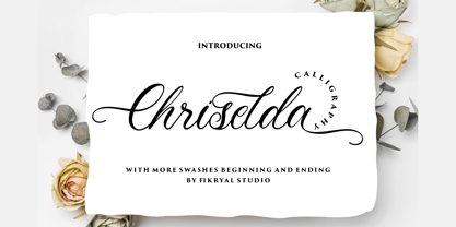 Chriselda is a beautiful calligraphy font perfect for crafting, branding, invitation, stationery, wedding designs, social media posts, advertisements, product packaging, product designs, label, photography, watermark, special events or anything. Chriselda comes with full set of uppercase and lowercase letters, swash alternates, ligatures,multilingual symbols, numerals and punctuation.
 - Amartha by Fikryal,
$15.00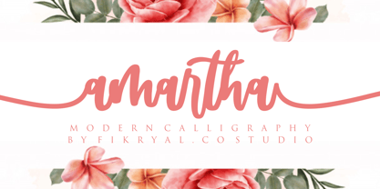 Amartha is a natural script font perfect for crafting, branding, invitation, stationery, wedding designs, social media posts, advertisements, product packaging, product designs, label, photography, watermark, special events, or anything. Amartha comes with full set of uppercase and lowercase letters, swash alternates, ligatures,multilingual symbols, numerals and punctuation.
 - Bosko by The Northern Block,
$16.70 A robust slab serif typeface that combines classic proportions with contemporary styling. These carefully crafted letterforms are best suited for use on book jackets, news headlines, packaging, posters and t-shirts. Details include four distinct styles, a full character set, manually edited kerning and Euro symbol.
 - Loose Jeans by Epiclinez,
$18.00 Loose Jeans is a fun, playful, and quirky display font. It has a modern yet whimsical style an it will undoubtedly immerse your designs into a magical world. So what's included : Basic Latin A-Z & a-z Numbers, symbols, and punctuations Accented Characters : ÀÁÂÃÄÅÆÇÈÉÊËÌÍÎÏÑÒÓÔÕÖØŒŠÙÚÛÜŸÝŽàáâãäåæçèéêëìíîïñòóôõöøœšùúûüýÿžß Thank you