8,889 search results
(0.026 seconds)
- St Friska by Stereotypes,
$34.00 St Friska, based on old movie title lettering, is made just for headlines. It comes with a slight touch and feeling of art deco but it’s designed to be contemporary in 2010 and beyond. Friska comes with a big bunch of OpenType features, so a designer can play with it like Lego, using it alongside old or new typefaces. It has stylistic sets and lots of ligatures.
 - Invertida St by Vanarchiv,
$35.00 This stencil display decorative slab-serif typeface, contain reverse contrast which remind the old western style. Invertida St font family contain Latin and Cyrillic encoding characters and also italic versions are available too. Open type features can provide more options (stylistic alternates, ligatures, swash, figures).
 - ST Agitaciya by ShimanovTypes,
$9.00 Introducing a retro narrow grotesque called "Agitaciya" (Agitation). Bring back to the Soviet Era Agitation inspired by Soviet posters, movie titles and book covers. The letterforms are straight and condensed and come in 2 styles: uppercase and small caps alternatives. It has Extended LATIN and Extended CYRILLIC letters. "Agitaciya"created for titles, poster design, web design, branding and packaging works, illustrations, badges and other typography works. *ST Agitaciya supports 15+ languages: English, German, Spanish, Belarusian, Bosnian, Bulgarian, Croatian, Dutch, Norsk, Dannish, Macedonian, Polish, Russian, Serbian, Slovenian, Swedish, Ukrainian, Kazakh, and probably others )
 - St Transmission by Stereotypes,
$19.00 St Transmission was one of the first ambitious projects for Stereotypes. Building a complete family with a lot of weights along with the italics. Transmission supports extended Latin character set, plus Cyrillic and Greek.
 - St. Nicholas by Scriptorium,
$12.00 - TD Beta by Inusentes Catapusan,
$9.00 TD Beta is a bold and light sans serif typeface inspired by Futura and Helvetica. It is best used for headlines, titles, display, and even long paragraphs on digital collaterals.
 - TD Tinda by Tribox Design,
$9.00 TD Tinda is a display typeface classified by its hand-lettered style infused with a pronounced calligraphic influence. Each glyph carries an organic unevenness, imparting a playful and expressive quality. TD Tinda is particularly well-suited for label and packaging design, posters, and headlines. Typeface Designer/Copywriter: Inu Catapusan Art Director/Copy Editor: Regine Ylaya Foundry: Tribox Design
 - Magazin ST by siquot'types,
$39.99 Magazin ST is powerful but delicate. What fascinated me seeing, a couple of letters, in Bob Roy Kelly's book (American Wood Type:1828-1900) were the little squares in the corners that represent a glow from lighting coming from below and from the right. Such ambiguity excited me and I thought that today with digital resources it wouldn't take long to do it. Seeing it working is excellent. Look In the posters what it is for and the effects it produces, including the sensation of relief.- L.S.
 - ST Stengazeta by ShimanovTypes,
$3.00 Introducing a retro grotesque called "Stengazeta". The name means "wall newspaper" - this is very popular in USSR genre of handmade artwork that is actually a mix of newspaper and poster. During the Soviet era you could find it everywhere - in factories, schools, research labs, and even in army and police. Sometimes it was a kind of official propaganda, but often just a way of expressing of creativity of co-workers. The letterforms are bold and grotesque with strong handmade feeling. It has Extended Eastern Europe Cyrillic and some of Extended Eastern Europe Latin letters. "Stengazeta" created for titles, poster design, web design, branding and packaging works, illustrations, badges and other typography works. ST-Stengazeta supports languages: Belarusian, Bosnian, Bulgarian, Croatian, Czech, Danish, English, Russian, Serbian, Slovenian, Spanish, Ukrainian, and probably others ) WHAT YOU GET Uppercase, numbers, punctuation, international characters.
 - St Mika by Stereotypes,
$25.90 St Mika is big, black and beautiful. A little bit clumsy, Mika has his very own style of serifs and letterforms, making him very unique. If you want to yell or scream at someone, Mika is not your partner. This typeface is more about harmony and big letters.
 - Habano ST by Sudtipos,
$39.00 Habano is an eleganty flowing bold script with some very surprising traits. Taking its roots in both the art deco style and the kind of lettering used for pop culture, its minuscules are classy yet obedient, and its majuscules and figures are playfully round and memorable. This contrast in character between cases makes for an appealing display face that can turn simple words into images that are hard to forget. Once again, the unique lettering talent of Angel Koziupa makes itself evident through an alphabet that leaves the memory of its soft touch for long after it is initially perceived.
 - Roos ST by Canada Type,
$39.95 Roos ST is a special version of the Roos family, engineered specifically for science writing. It is equipped with SciType, a combination of additional characters and OpenType programming included in the fonts to help with typesetting science text. For more information about SciType, please consult the SciType FAQ available in the Gallery section of this page. The Roos design is the Dutch classic made by S. H. de Roos during the years of the second World War, and subsequently used for a special edition of the Dutch Constitution on which Juliana took the oath during her inauguration as the Queen of the Netherlands. This design is widely regarded as de Roos's finest, and has one of the most beautiful italics ever drawn. Aside from the SciType additions, all the Roos ST fonts contain OpenType features for ligatures, ordinals, automatic fractions, and seven kinds of figures. For details about the functionality of Roos ST, please consult its Access Chart PDF available in the Gallery section of this page.
 - ST Titan by ShimanovTypes,
$20.00 ST Titan is a retro futuristic display font with vintage vibes, inspirated by old sci-fi book's headers and posters. It's good for social media, headlines, large-format print, branding, posters, fashion designs and websites. Extended Latin and Cyrillic support. 30+ languages
 - Aragon ST by Canada Type,
$39.95 Aragon ST is a special version of Hans van Maanen’s Aragon family. It was developed for science writing, and it serves as the very first introduction of SciType, an innovative new way of building fonts specifically for typesetting science text. For more information about SciType, please consult the SciType FAQ PDF in the Gallery section. The Aragon design is a remodelling of the classic mid-1500s Garamond forms through a modern lens. It is a text workhorse that performs very well in a variety of sizes, from footnotes and legal copy to lengthy, immersive-reading body sets. Its efficient and legibility-asserting traits are wedge serifs and uniquely tapered stems that slightly shift the weight stress to the top half of the forms while maintaining the clarity and synergy of the counterspace’s sequence. Aragon ST takes all that a step further for science writers. For details about the functionality of Aragon ST, please consult the Aragon ST Access Chart PDF in the Gallery section.
 - St Lorie by Stereotypes,
$29.00 St Lorie is inspired by handmade lettering in logos, but it was drawn completely by the digital method.
 - Antique Borders & Corners 2 by Aerotype,
$29.00 Hand selected from multiple sources, the 60+ glyphs of Antique Borders & Corners 2 can be mixed and matched to make authentic 18th and 19th century borders of any length. Flip the orientation for 'bottom' borders with the shift key.
 - MFC Bruce Corners One by Monogram Fonts Co.,
$19.95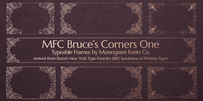
- MFC Franklin Corners Four by Monogram Fonts Co.,
$19.95
- Just Around The Corner by Armandop,
$10.00 - MFC Franklin Corners Two by Monogram Fonts Co.,
$19.95
- Antique Borders & Corners 1 by Aerotype,
$29.00 Hand selected from multiple sources, the 60+ glyphs of Antique Borders & Corners 1 can be mixed and matched to make authentic 18th and 19th century borders of any length. Flip the orientation for 'bottom' borders with the shift key.
 - MFC Franklin Corners One by Monogram Fonts Co.,
$19.95
- MFC Franklin Corners Five by Monogram Fonts Co.,
$19.95
- MFC Bruce Corners Three by Monogram Fonts Co.,
$19.95
- MFC Bruce Corners Two by Monogram Fonts Co.,
$19.95
- MFC Franklin Corners Six by Monogram Fonts Co.,
$19.95
- MFC Franklin Corners Three by Monogram Fonts Co.,
$19.95
- Ransom - Unknown license

- KG Corner Of The Sky by Kimberly Geswein,
$5.00 A fatter, more kid-friendly version of KG Lego House, this font is designed specifically for elementary teachers who requested a neat, legible font with a thicker outline.
 - ST Remona Neue by Skinny Type,
$18.00 ST Remona Neue is a confident serif. Designed to reflect nature, it creates a sense of softness and natural expression. We pushed the concept in a usability-focused direction, to work as a bold tool and a beautiful communicator. ST Remona Neue allows for fluid designs in 3 styles. Regular, Italic, Outline and Latin based main language. The right slant advances aesthetics, brings energy and makes it suitable for modern design. The type family blends organic curves and soft repetition into strong and harmonious types. At large dot sizes you can appreciate the shape of the letters, while the same control and focus creates an even texture for small dot sizes and long reads. Fonts extend their use by providing a variety of unique language and style supports. The ST Remona Neue character set combines additional symbols, style alternatives, unique binding, and case sensitive punctuation - resulting in a stable, hardworking family ready to tackle projects of any size. Happy Designing
 - TD Alpha Pro by Tribox Design,
$9.00 Alpha is an intuitive, clean and modern sans serif typeface crafted to depict change, the new normal, and unbridled opportunities. It has excellent legibility and is ideal for usage in displays, headlines, labels, and website design.
 - Soest St Mary by New Renaissance Fonts,
$10.00Unusual decorative capitals from embroidery work in a German church. Upper case has a diamond-shaped frame around each letter; lower case is just the letters without the diamond frame; and the ampersand gives just the diamond frame so you can use a different colour from the letter. - St Croce Pro by Storm Type Foundry,
$29.00 Our eye is able to join missing parts of worn letters back into undisturbed shapes. We tend to see things better than they really are. Thanks to this ability we ignore faults of those close to us as we can’t accept the fact that every once in a while we convene with an impaired entity. Typography is merely a man’s invention, hence imperfection and transience, albeit overlooked, are its key features. This typeface is based on worn-out letterings on tombstones in the St. Croce basilica in Florence. For hundreds of years, microscopic particles of marble are being taken away on the soles of visitors: the embossed figures become fossilised white clouds, fragments of inscriptions are nearing the limits of legibility. First missing are thin joins and serifs, then the main strokes finally slowly diminish into nothingness over time. Unlike an archaeologist, for whom even completely featureless stele is valuable, the typographer must capture the proper moment of wear, when the type is not too “new” but also not too much decimated. Such typeface is usable for catalogue jackets, invitations and posters. Calligraphy is a natural human trait. To write is to create characters of reasonable beauty and content, according to the nature of the writer. A natural characteristic of architecture is to create an aesthetic message very similar to the alphabet. A doric column, the gabled roof, the circle of the well plan: these are the basic shapes from which all text typeface is derived.
 - btd Cart-O-Grapher (bitmap) - Unknown license

- KR Belated St Patricks - Unknown license

- KR St Patricks Frames - Unknown license

- Dutch Mediaeval Book ST by Canada Type,
$39.95 Dutch Mediaeval Book ST is a special version of the popular Dutch Mediaeval Book text fonts, engineered specifically for science writing. It is equipped with SciType, a combination of additional characters and OpenType programming included in the fonts to help in typesetting science text. For more information about SciType, please consult the SciType FAQ available in the Gallery section of this page. The Dutch Mediæval design is the historically renowned one made in 1912 by S. H. de Roos. It stands out as one of the most classic Dutch text faces. This Book version comes in two weights and an italic, optimized for body copy use between 8 and 12 pt. Aside from the SciType additions, all the fonts contain OpenType features for ligatures, ordinals, automatic fractions, eight kinds of figures, and a few ornaments. For details about the functionality of Dutch Mediaeval Book ST, please consult its Access Chart PDF available in the Gallery section of this page.
 - Rennie Mackintosh Scotland St by CRMFontCo,
$20.00Derived from the world famous Rennie Mackintosh Font, the Scotland St. version gives an outline form of the genius of Charles Rennie Mackintosh. The "Scotland St." name comes from one of Mackintosh's most famous architectural works - the Scotland St. School in Glasgow, Scotland. This wonderful legacy of Mackintosh's genius can be visited daily FREE OF CHARGE, as it has been classed as a museum by Glasgow City Council. - Dutch Mediaeval Pro ST by Canada Type,
$49.95 Dutch Mediaeval Pro ST is a special version of the popular Dutch Mediaeval Pro family, engineered specifically for science writing. It is equipped with SciType, a combination of additional characters and OpenType programming included in the fonts to help in typesetting science text. For more information about SciType, please consult the SciType FAQ available in the Gallery section of this page. The Dutch Mediaeval design is the historically renown one made in 1912 by S. H. de Roos. It stands out as one of the most classic Dutch text faces. This digital version comes in two weights and their italic counterparts. Aside from the SciType additions, all the fonts contain OpenType features for small caps and caps-to-small-caps, ligatures, ordinals, automatic fractions, seven kinds of figures, and a few ornaments. For details about the functionality of Dutch Mediaeval Pro ST, please consult its Access Chart PDF available in the Gallery section of this page.
 - P22 St G Schrift by IHOF,
$39.95 P22 ST.G Shrift is a font series based on the type designs of Stefan George with an italic version designed by Colin Kahn. Stefan George (1868-1933) was a German poet who led the revolt against realism in German literature. All of his works were privately published and the typefaces that were used reflected his neo-classic and anti-industrial (progessive) aesthetics; oftentimes consisting of his own hand lettering designs. The original font was cast in 1907 by a small foundry in Germany and was used primarily for the works of George as well as other books including a monumental edition of Dante's Divine Comedy. The ST.G Shrift Fonts contained in this set are derived from 3 known variations of the original roman typeface, St.G., found in various books published in Berlin in the early 20th century. ST.G Shrift One contains the most idiosyncratic characters, while ST.G Shrift Two uses more familiar characters as well as a redesign of characters including the t and the k to be more in keeping with modern san-serif designs. The OpenType version of the roman contains both one and two and expands on them by including central European characters, small caps, and small caps titling figures. The Small Caps titling figures are derived from the first version of the typeface. Below is a features list (accessible through the type palette in Adobe programs) and their functions: ST.G Shrift Opentype Features: Small Caps: Changes Lowercase to Small Caps Titling Figures: Changes Uppercase to Titling Caps, and Small Caps to Small Caps Titling Figures Contextual Alternates: Changes Character Set to match ST.G One and changes Small Caps to Titling Small Caps Ornaments: Changes < > and ? (greater, less and bullet) to ornaments ST.G Shrift Italic is an art nouveau version of the roman. The OpenType version includes central European characters, small caps, titling caps, titling small caps and ornaments.


