10,000 search results
(0.037 seconds)
- Chibaraki Now - Unknown license

- Negative 24 - Unknown license

- Typo Negative - Unknown license

- Brown Now by Studio Fat Cat,
$15.00 Brown Now is a handwritten font family that is designed directly on paper so that it provides a unique experience when you type using it, this font also has alternative characters that also have a different feel when using it.
 - Neo Contact by URW Type Foundry,
$35.00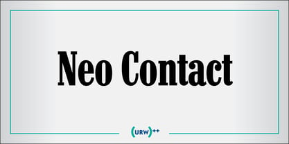
- Big Neo by Olivetype,
$18.00 Big Neo is a carefree and colorful typeface with a youthful and fun vibe. It's great for creating a happy mood in your designs. You can use it for logos, business cards, posters, headlines, T-shirts, blogs, product packaging, and more. Make your design stand out with Big Neo! So what’s included : Basic Latin Uppercase and Lowercase Numbers, symbols, and punctuations Multilingual Support. Accented Characters : ÀÁÂÃÄÅÆÇÈÉÊËÌÍÎÏÑÒÓÔÕÖØŒŠÙÚÛÜŸÝŽàáâãäåæçèéêëìíîïñòóôõöøœšùúûüýÿžß PUA Encoded and fully accessible without additional design software Simple Installations works on PC & Mac Thank You and Happy Designing!
 - Vekta Neo by Positype,
$22.00 The Vekta Type System is part of a larger, interconnected grouping of 3 families: Neo, Sans and Serif. The goal was to develop a family designed along a common skeleton and matrix that would allow for interchangeable usage along a cohesive visual system. It's About The Personality. Interchange type families to be as expressive as you want to be. Let the piece you are designing constrain your usage and not the typeface.
 - Neo Sans by Monotype,
$34.99 Designer Sebastian Lester describes his Neo Sans type collection as “legible without being neutral, nuanced without being fussy, and expressive without being distracting.” Featuring rounded, square sans letterforms, the Neo Sans family is available in six weights, ranging from light to ultra, with companion italics. Its forward-looking personality makes it an excellent choice for branding projects, as well as for editorial or publication design. Pair the Neo Sans collection with a serif design for interesting typographic contrast; for more direct continuity, consider the typeface's sister design—the Neo Tech family also from Lester, available in six weights with matching italics.
 - Neo Alcatraz by Sign Studio,
$15.00 Neo Alcatraz will help you to create futuristic and sporty designs. Perfect for branding, posters, book covers, magazines, trademarks, landing pages, mobile apps and more. This font has a simple yet strong form in its character. Minimalism, futuristic, sporty, that's the theme of Neo Alcatraz.
 - Virginia Neo by Type Associates,
$39.00 Virginia Neo is more than an update to the original Virginia family, designed in 1970 and strongly influenced by the popularity of Futura and Kabel in that era. Virginia Neo is a completely redrawn version based on the original design which won its designer first place ahead of 5,000 other submissions to the Lettergraphics International Typeface Design Competition in the same year. The original typeface family comprised 5 weights, the lightest of which was omitted from the initial 2008 digital offering but has now been included in the Neo version, along with a new Heavy weight rounding out a family of 6. Each typeface includes more than 450 glyphs, enough to satisfy more than 80 languages plus a smattering of ligatures, useful geometric ornaments and arrows. Virginia Neo fits the compact, comfortable-tightness of seventies-retro typography currently re-emerging in today’s advertising. Its high readability, femininity and elegance makes it suitable for subheads, headlines, posters, branding and the web.
 - Neo Contact by Linotype,
$40.99Neo Contact is the typeface used on the packaging of Marlboro cigarettes (Marlboro “Reds,” the main line of the brand). The typeface is bold and condensed, designed in the Egyptienne style. Egyptienne types were first designed in the 1800s, as type founders - especially in the westward-expanding United States - began to dream up newer, bolder styles of letters for advertising usage. During the 1800s, it became increasingly important for businesses to set themselves, and their products, apart from competitors. This desire has remained with corporations, as well as with advertisers and designers, into the 21st century. In addition to cigarette packaging, Neo Contact (as part of Marlboro’s branding efforts) can be seen on numerous items, including Ferrari’s F1 racers, and at Formula 1 race tracks. The letters in Neo Contact are filled with personality. Their forms display two distinct weights of line, and the serifs are made up of tiny, strict slabs. Ball terminals round out the design. Neo Contact is a complete font, with a complete western character set. Typefaces in the Egyptienne style preceded the development and distribution of larger, crazier wood typefaces, but also share many similarities with these descendents. More traditional, text faces in the Egyptienne manner are also available from Linotype GmbH (e.g., Adrian Frutiger’s Egyptienne F). On the opposite end of the spectrum, we offer interesting, personality-filled wood display types, like Ponderosa as well. - Net Hunt by Putracetol,
$28.00 NetHunt - Spider Display Sans Font Introducing NetHunt, a spider display sans font that is perfect for any design that requires a horror or scary look. The font is inspired by an old embossed nameplate with cobwebs in it, and the designer made it into a display font. NetHunt features both uppercase and lowercase versions, with the lowercase version not having the cobweb design. The font also includes a sans ligature feature that makes the cobwebs of each word even cooler. If you are looking for a font that will give your designs a spooky and eerie vibe, NetHunt is the perfect choice. Use it for logos, titles, logotypes, covers, headlines, apparel, comics, cover books, cards, posters, or anything else that requires a horror or scary look. NetHunt comes with a variety of features that make it a versatile font. The font includes uppercase and lowercase letters, opentype alternates and ligatures, and multilingual support for a wide range of languages. The font also includes number, punctuation, and symbol glyphs. The font can be used on both Windows and Mac operating systems and is compatible with most design software, including Adobe Photoshop, Illustrator, InDesign, and more. If you want to add a spooky and horror touch to your designs, NetHunt is the font for you. It is perfect for Halloween designs, horror movie posters, or any design project that requires a unique and scary font. Use it for your next project and see the difference it makes! In summary, NetHunt is a spider display sans font that is perfect for horror and scary designs. It is inspired by an old embossed nameplate with cobwebs and features both uppercase and lowercase versions. The font includes opentype alternates and ligatures, multilingual support, and number, punctuation, and symbol glyphs. Use NetHunt for your next design project and add a spooky and eerie vibe to your designs. Tags: spider, display, sans, horror, scary, Halloween, movie poster, logo, title, logotype, cover, headline, apparel, comic, books, cards, posters, opentype, ligatures, multilingual, glyphs.
 - Sewing Patterns by Lauren Ashpole,
$15.00 When I created my first website, I loved using vintage sewing pattern illustrations in my designs. Thinking back on it, I wanted to create a dingbat inspired by those images and Sewing Patterns is the result. The font features ladies-fashions in silhouette form for uppercase and lowercase letters and childrens- styles for the numbers.
 - Etrusco Now by Italiantype,
$39.00 Etrusco Now is the revival of a lead typeface originally cast in lead by Italian foundry Nebiolo in the early 1920s. Heavily inspired by the design of the Medium weight of Schelter & Giesecke's Grotesk, Etrusco was, like Cairoli, an early precursor of the modernist grotesque superfamilies: a solid, multi-purpose "work-horse" typeface family that could solve a wide range of design problems with its range of widths and weights. When designing the new incarnation of Nebiolo's Etrusco, the Italiantype team directed by Cosimo Lorenzo Pancini and Mario de Libero decided to extend the original weight and width range to keep this "superfamily" approach. Etrusco Now has twenty-one styles widths in three widths of seven weights each, with matching italics; the original weights for the typeface have been collected in the Etrusco Classic subfamily. Etrusco Now new widths allowed the team to include in the design many nods and homages to other vintage classics of Nebiolo. The lighter weights of the normal width have been heavily influenced by the modernist look of Recta, while the heavy condensed and compressed widths refer to the black vertical texture of Aldo Novarese's Metropol. This infuses the typeface with a slightly vintage mood, making Etrusco at the same time warmly familiar and unexpected to eyes accustomed to the formal and cold look of late modernist grotesques like Helvetica. Contemporary but rich in slight historical quirks, Etrusco Now is perfect for any editorial and branding project that aims to be different in a subtle way. Etrusco Now's deviations from the norm are small enough to give it personality without affecting readability, while its wide range of open type features (alternates, stylistic sets, positional numbers) and language coverage make it a problem solver for any situation. Like its cousin Cairoli, Etrusco is born out of love for lost letterforms and stands like its lead ancestor from a century ago, at the crossroads between artsy craftsmanship and industrial needs.
 - Anytime Now by Device,
$29.00
- Neo Brushly by IbraCreative,
$17.00 Neo Brushly is an enchanting handlettered brush font that encapsulates the artistry of free-flowing strokes and the warmth of handcrafted expression. With each character meticulously crafted, the font exudes a genuine, human touch, reminiscent of brush strokes on canvas. The letters dance dynamically, creating a harmonious rhythm that lends a unique, personalized flair to any project. Neo Brushly captures the essence of spontaneity, making it an ideal choice for designs that seek a balance between casual elegance and a hint of playful sophistication. The organic, brush-inspired design imparts a sense of authenticity, making Neo Brushly an inviting and versatile choice for a wide range of creative endeavors, from branding to invitations, infusing a touch of handmade charm into every typographic creation.
 - Neo Phalanx by Zenmurai,
$18.00 Neo Phalanx is a rectangular, circular & curvy modern display sans inspired by Ancient Greek mass military formation. The difficulty of make this font is balancing rounded corner & sharp edge. There are letters like "M W A H R N K S Z" provides a unique personality in the title display. Numbering and punctuations also designed in unique styles to deliver different visual language. This font is suited for variety of applications from poster to branding, advertising, digital.
 - Neo Bulletin by Intellecta Design,
$28.90
- PT Sewed by Volcano Type,
$19.00 PT Sewed is based on a set of monoline vectors/ letters. Designed for a cultural project. The sewed look was generated for an encyclopedia about jeans. Recommended only for T-shirt Designs and Headlines.
 - Neo Osaka by Bejeletter,
$12.00 Neo Osaka is a lovely neo script with stylistic features. Neo Osaka is perfect for product packaging, branding project, megazine, social media, wedding, sport jersey design number or just used to express words above the background (interior). Built with OpenType features and includes beginning and ending swashes, alternate characters for both lowercase and uppercase letters, loads of different swash alternates for lowercase letters, numbers, punctuation, alternates, ligatures and it also supports other languages. Enjoy the font, feel free to comment or feedback, send me PM or email. Thank you!
 - Heading Now by Zetafonts,
$39.00 Heading Now is the new incarnation of Heading Pro, developing the original typeface family designed by Francesco Canovaro for Zetafonts into a superfamily with 160 variant combinations. Built around 10 different widths, ranging from ultra-compressed to ultra-wide, and eight weights from thin to heavy, Heading Now provides a full spectrum of sans serif type solutions to your design problems. Born as a space-optimizing typeface for headers and titles, Heading Now can be used in its compressed widths to manage space on the printed page and on the screen. In these widths Heading Now excels in titles and subheadings, timetables, infographics and in situations of exuberant and excessive copywriting. On the other side of the width spectrum, you can find extended width variants, ready to be used for titling where style and energy matter more than pixel or paper economy. Heading family is not only made of extreme widths: you can use the medium width range to design body text. Matching italics provide versatility in text use, as well as a dynamic display alternate to the bolder weights. Heading Now keeps the original design of Heading, but extends the width and weight range while keeping its (post) modernist attention to readability and details. Each Heading Now font includes over 1100 characters with coverage for 200+ languages using Latin, Cyrillic and Greek alphabets. A full array of open-type features is included in each weight featuring also stylistic alternates, small caps, old-style and tabular numerals and positional figures. • Suggested uses: born as a space-optimizing typeface for headers and titles, Heading Now can be used in its compressed widths to manage space on the printed page and on the screen. Perfect for contemporary branding, web design, packaging and countless other projects; • 162 styles: 8 weights + 8 italics x 10 different widths + 2 variable fonts; • 1100 glyphs in each weight; • Useful OpenType features: Access All Alternates, Small Capitals From Capitals, Case-Sensitive Forms, Glyph Composition / Decomposition, Denominators, Fractions, Kerning, Standard Ligatures, Lining Figures, Localized Forms, Mark Positioning, Mark to Mark Positioning, Numerators, Oldstyle Figures, Ordinals, Proportional Figures, Stylistic Alternates, Scientific Inferiors, Small Capitals, Stylistic Set 1, Stylistic Set 2, Stylistic Set 3, Stylistic Set 4, Subscript, Superscript, Tabular Figures, Slashed Zero; • 220 languages supported (extended Latin, Cyrillic, Greek alphabets): English, Spanish, Portuguese, French, Russian, German, Javanese (Latin), Vietnamese, Turkish, Italian, Polish, Afaan Oromo, Azeri, Tagalog, Sundanese (Latin), Filipino, Moldovan, Romanian, Indonesian, Dutch, Cebuano, Igbo, Malay, Uzbek (Latin), Kurdish (Latin), Swahili, Greek, Hungarian, Czech, Haitian Creole, Hiligaynon, Afrikaans, Somali, Zulu, Serbian, Swedish, Bulgarian, Shona, Quechua, Albanian, Catalan, Chichewa, Ilocano, Kikongo, Kinyarwanda, Neapolitan, Xhosa, Tshiluba, Slovak, Danish, Gikuyu, Finnish, Norwegian, Sicilian, Sotho (Southern), Kirundi, Tswana, Sotho (Northern), Belarusian (Latin), Turkmen (Latin), Bemba, Lombard, Lithuanian, Tsonga, Wolof, Jamaican, Dholuo, Galician, Ganda, Low Saxon, Waray-Waray, Makhuwa, Bikol, Kapampangan (Latin), Aymara, Zarma, Ndebele, Slovenian, Tumbuka, Venetian, Genoese, Piedmontese, Swazi, Zazaki, Latvian, Nahuatl, Silesian, Bashkir (Latin), Sardinian, Estonian, Afar, Cape Verdean Creole, Maasai, Occitan, Tetum, Oshiwambo, Basque, Welsh, Chavacano, Dawan, Montenegrin, Walloon, Asturian, Kaqchikel, Ossetian (Latin), Zapotec, Frisian, Guadeloupean Creole, Q’eqchi’, Karakalpak (Latin), Crimean Tatar (Latin), Sango, Luxembourgish, Samoan, Irish, Maltese, Tzotzil, Fijian, Friulian, Icelandic, Sranan, Wayuu, Papiamento, Aromanian, Corsican, Breton, Amis, Gagauz (Latin), Māori, Tok Pisin, Tongan, Alsatian, Atayal, Kiribati, Seychellois Creole, Võro, Tahitian, Scottish Gaelic, Chamorro, Greenlandic (Kalaallisut), Kashubian, Faroese, Rarotongan, Sorbian (Upper Sorbian), Karelian (Latin), Romansh, Chickasaw, Arvanitic (Latin), Nagamese Creole, Saramaccan, Ladin, Kaingang, Palauan, Sami (Northern Sami), Sorbian (Lower Sorbian), Drehu, Wallisian, Aragonese, Mirandese, Tuvaluan, Xavante, Zuni, Montagnais, Hawaiian, Marquesan, Niuean, Yapese, Vepsian, Bislama, Hopi, Megleno-Romanian, Creek, Aranese, Rotokas, Tokelauan, Mohawk, Onĕipŏt, Warlpiri, Cimbrian, Sami (Lule Sami), Jèrriais, Arrernte, Murrinh-Patha, Kala Lagaw Ya, Cofán, Gwich’in, Seri, Sami (Southern Sami), Istro-Romanian, Wik-Mungkan, Anuta, Cornish, Sami (Inari Sami), Yindjibarndi, Noongar, Hotcąk (Latin), Meriam Mir, Manx, Shawnee, Gooniyandi, Ido, Wiradjuri, Hän, Ngiyambaa, Delaware, Potawatomi, Abenaki, Esperanto, Folkspraak, Interglossa, Interlingua, Latin, Latino sine Flexione, Lojban, Novial, Occidental, Old Icelandic, Old Norse, Slovio (Latin), Volapük;
 - Linked Now by Jehoo Creative,
$16.00 Linked Now is so named because this Typeface has Multiple Discreationary Ligatures that unite two different letters to make a striking shape. Is a powerful grotesque typeface designed to be versatile in a wide range of contexts. Having more than 50 stylish Dsicreationary Ligatures on Uppercase letters and unique Alternate on certain letters makes it seem like they have various shapes, so they are great to use as display fonts. To complete it, Linked Now typeface is equipped with 8 weights from Extralight to black and each includes italic. More than 485 glyphs on each and support most European languages .
 - Neo mameo by Kaidosan,
$10.00 Neo mameo is a Japanese Style typeface that is ideal for projects that require a distinctly Japanese touch. This typeface will add uniqueness and creativity to your work with a beautiful style and eye-catching look. This font character is taken from Japanese traditional Japanese style. This font will leave a lasting impact and quickly grab the attention of potential customers. This font provides a vivid visual effect. I hope this font can provide solutions in your business and activities.
 - Cairoli Now by Italiantype,
$39.00 Cairoli was originally cast by Italian foundry Nebiolo in 1928, as a license of a design by Wagner & Schmidt, known as Neue moderne Grotesk. Its solid grotesque design (later developed as Aurora by Weber and Akzidenz-Grotesk by Haas) was extremely successful: it anticipated the versatility of sans serif superfamilies thanks to its range of weights and widths, while still retaining some eccentricities from end-of the century lead and wood type. In 2020 the Italiantype team directed by Cosimo Lorenzo Pancini and Mario De Libero decided to produce a revival of Cairoli, extending the original weight and width range and developing both a faithful Classic version and a Now variant. The Cairoli Classic family keeps the original low x-height range, very display-oriented, and normalizes the design while emphasizing the original peculiarities like the hook cuts in curved letters, the high-waisted uppercase R and the squared ovals of the letterforms. Cairoli Now is developed with an higher x-height, more suited for text and digital use, and adds to the original design deeper ink-traps and round punctuation, while slightly correcting the curves for a more contemporary look. Born as an exercise in subtlety and love for lost letterforms, Cairoli stands, like its lead ancestor from a century ago, at the crossroads between artsy craftsmanship and industrial needs. Its deviations from the norm are small enough to give it personality without affecting readability, and the expanded weight and width range make it into a workhorse superfamily with open type features (alternates, stylistic sets, positional numbers) and coverage of over two hundred languages using the latin extended alphabet.
 - Snow Now by Morganismi,
$12.00 Snow Now is a frisky, frosty, and snowy font family for active winter use. It includes two text fonts plus great pictures of snowflakes, tools, sculpture, animals and more.
 - PGF Now by PeGGO Fonts,
$24.00 Geometric Sans with Humanistic proportions Typeface (Roman a.k.a. ‘Capitalis Monumentalis’), Inspired on vintage minimalism, with a subtle Art Déco air, where the configuration of the basic and open shape (long ascenders/descenders and a moderate ‘x’ height) star a crisp and luminous look, manufactured under an analytical and handmade process as used to be in ancient times. Among its graphic virtues are a special focus on relaxed and fluid reading rhythm while looking clear and sophisticated, an upright version representing a formal voice paired with an Italic with a more expressive vocal tone, easily distinguished as a second quoted content in Editorial and Branding communicational contexts. Equipped with generous stylistic options controlled by OpenType features as: 17 glyphs variations stored as stylistic sets Standard and Discretionary Ligatures Lining and Old Style Numeral forms Tabular forms Superior and Inferior Scientific Numeric Notation Numerators and Denominators for fractional compositions Pre-Composed Fractions, ordinals Dotted Zero for alphanumeric contexts Circled numbers An Art Déco style Border Set Bullets set for multiple levels ordered list Arrow set Monetary Symbols Mathematical Operators Publishing and Social Media Markers Wide range of Diacritics allowing you to set contents in more than 200 Latin base languages. The access to all these options is also possible via character set panel. With no hesitation, PGF Now is a highly valuable publishing and Branding tool that deserves to flaunt in the more elegant contexts but also daily situations that need a clear and modern voice.
 - Few Grotesk by Studio Few,
$24.00 Tall X-Height, Angled Terminals and Medium Contrast, Few Grotesk is a UI font designed with personality. Originally conceived as a hybrid between Grotesque & Humanist, Few Grotesk pairs legibility with character.
 - Honey Dew by Hanoded,
$15.00 Right now it is melon time: the supermarkets are full of them: Galia, Honey Dew, Piel de Sapo… Back in Casa Hanoded we're quite happy with the abundance of melons! So, when I created this cute little font, naming it was easy. Honey Dew is a shaky all caps font with different upper and lower case glyphs. I created alternate letters for both upper and lower case closed glyphs (like a, b, d, o, etc.) - including their accented brethren (aacute, abreve, acircumflex), etc. There is an alternate & and @, plus the Æ, Œ, Ø, æ, œ, ø, þ and Þ. You should have guessed by now that Honey Dew comes with a whole stack of diacritics.
 - WBP Nel by Studio Jasper Nijssen,
$30.00 This typeface family is developed with the designer in mind. WBP Nel is a narrow sans serif with lots of options. The Regular consists of UPPERCASE and lowercase glyphs, beautiful kerning and a nice ampersand. All other styles are just uppercase and made to give your designs some extra flair. The Brickbuild is a playful, stencil version and the Dots (freebie) is a dotted typeface. The Light and Heavy version complement the Regular beautifully. These two also come with a display variant, the WBP Nel Stamped and WBP Nel Hypno. So you get lots of options to mix and match while designing awesome prints, posters, logo's, websites or identities.
 - Neo Strada by Differentialtype,
$10.00 Neo Strada is a bold geometric sans serif font that comes in many weights and several alternates. It's perfect for documents, font logos, blogs, social media, marketing campaigns and many other projects!
 - Write Now by Scholtz Fonts,
$15.00 Write Now: Write Now is an elegant, informal, handwritten script font, developed from the designer's handwriting, and carefully crafted to create a flowing, legible image. The large, opulent capitals, with their loose loops and curves create a perfect foil for the more subdued lower case characters, presenting a strong but gentle message . Write Now is perfect for: -- invitations -- advertising material where an informal and personal mood is required -- greeting cards -- menus -- book covers Write Now comes in two styles, Write Now Regular and the delicate Write Now Thin. The font has been carefully letterspaced and kerned. A full character set (all upper and lower case characters, punctuation, numerals and accented characters) is present.
 - Captura Now by TypeThis!Studio,
$54.00 Carefully refined shapes and sensitively balanced spacing and kerning create the gentle rythm that grants Captura Now its warm-hearted face, perfect in form and shape. Expanded with an enormous character set, Captura Now offers the freedom to transform your design into the Cyrillic-language world, as well as into any Latin based language — including Vietnamese. *Variable fonts work well in software that supports variable font technology.
 - Neo MF by Masterfont,
$59.00 - Logopedia Now by Bülent Yüksel,
$19.00 What makes "Logopedia Now" unique is that it has a strong body, upper and lower case letters are the same size and work in perfect harmony. All letters in the character have "alternatives" in various numbers. This feature provides you variety in your designs. It is possible to take your designs to the next level by using "Logopedia Now". "Logopedia Now" is ideal for especially logo design, advertising and packaging, branding and creative industries, banners and billboards and signage as well as web and screen design. "Logopedia Now" provides advanced typographical support for Latin-based languages. An extended character set, supporting Central, Western and Eastern European languages, rounds up the family. The designation “Logopedia Now 500 Regular” forms the central point. "Logopedia Now" comes 3 weights and italics total 6 types. The family contains a set of 543 glyphs. Classes and Features, Stilistic Style, Fractions and Old Style Numerator just one touch easy In all graphic programs. "Logopedia Now" is the perfect font for web use. Be sure to check out the other siblings of "Logopedia". - Logopedia Now - Logopedia Now Soft - Logopedia Next - Logopedia Next Soft You can enjoy using it.
 - Neo Tech by Monotype,
$29.00 Neo Sans began as an intriguing assignment from a branding agency. The agency’s client wanted an “ultra modern” type family that was "futuristic without being gimmicky or ephemeral.” When a bureaucratic decision cancelled the project, Monotype staff designer Sebastian Lester decided to finish the design on his own. “I was left with a sketchbook full of ideas,” he said, “and thought it would be a shame not to see what came of them.” Lester decided that the principal ingredient of an "ultra modern" typeface was simplicity of character structure: a carefully drawn, monoline form, open letter shapes and smooth, strong curves. By further amplifying these qualities, he crossed the line from modern to futuristic. Two highly functional and versatile typefaces emerged. These are Neo Sans and Neo Tech, designs Lester describes as "legible without being neutral, nuanced without being fussy, and expressive without being distracting." Both the Neo Sans and the more minimalist Neo Tech families are available in six weights, ranging from Light to Ultra, with companion italics. Neo Tech offers a suite of alternate characters.
 - Neo Paralletter by Tural Alisoy,
$34.00 Neo Paralletter is a geometric modern blackletter typeface. Neo Paralletter is a combination the boundaries between old and new, tradition and contemporary, that is an art form combines calligraphy, typography, and graffiti. You can use it as a logo, badge, packaging, headline, poster, t-shirt/apparel and wedding invitation.
 - Helvetica Now by Monotype,
$42.99 Every single glyph of Helvetica has been redrawn and redesigned for this expansive new edition – which preserves the typeface's Swiss mantra of clarity, simplicity and neutrality, while updating it for the demands of contemporary design and branding. Helvetica Now comprises 96 fonts, consisting of three distinct optical sizes: Micro, Text and Display, all in two widths. Each one has been carefully tailored to the demands of its size. The larger Display versions are drawn to show off the subtlety of Helvetica and spaced with headlines in mind, while the Text sizes focus on legibility, using robust strokes and comfortably loose spaces. The Micro sizes address an issue Helvetica has long faced – that of being 'micro type challenged'. In the past, the typeface struggled to be legible at tiny sizes because of its compactness and closed apertures. Helvetica Now's Micro designs are simplified and exaggerated to maintain the impression of Helvetica in tiny type, and their spacing is loose, providing remarkable legibility at microscopic sizes and in low-res environments. There's also an extensive set of alternates, which allow designers the opportunity to experiment with and adapt Helvetica's tone of voice. This includes a hooked version of the lowercase l (addressing a common complaint that the capital I and lowercase l are indistinguishable) as well as a rounded G, and a straight-legged R, a single storey a and a lowercase u without a trailing serif. In the past, designers had to nudge, trim and contort the design to create stylish display-type lockups with Helvetica. Helvetica Now Display was designed and spaced with those modifications in mind—saving effort and providing more consistent (and more stylish) results. “Helvetica is the gold standard,' says Monotype Type Director Charles Nix. “To use it is to claim that you are the ultimate expression of whatever your brand aspires to be. Its blankness is its power.” Helvetica Now User Guide PDF. Featured in: Best Fonts for Resumes, Best Fonts for Websites, Best Fonts for PowerPoints
 - Baskerville Neo by Storm Type Foundry,
$69.00 One of the most widely used typefaces in the world is actually a legacy of 18th century aesthetics, representing the spirit of late Baroque design, architecture, fashion and society. It has been created and printed for millions of readers around the world for more than two and a half centuries. It influenced many modern typographers. It shaped culture, education, entertainment and science, but also the development of typography itself. As a calligrapher and technical innovator, Baskerville invented new design, papermaking and printing methods, and his typography is very natural and legible to this day. Graphic design today calls for clean and minimalistic solutions, where the use of historical typefaces can achieve a vivid contrast with contemporary elements on the page or screen. Baskerville is undoubtedly the best choice for any kind of publishing house. In keeping with the original inventor’s spirit of excellence, we hereby offer its most advanced digital version. This is not a precise remake of rare Baskerville prints or a restoration of the original punches cut by John Handy, but rather our ideal essence of transitional typography. The old masters were limited by the technology of the time, but today we can dare to have very fine lines, unlimited ligatures, size variations and sophisticated OpenType functions. Drawing, programming, proofing and testing took us many years of development and brought thousands of new letters and dozens of language options. We are convinced that your readers will enjoy this font mainly for reading extensive works, but also for creating corporate identity, orientation systems and cultural posters. Baskerville is perfectly modern in its antiquity, striking in its modesty and timeless in its transiency.
 - Futura Now by Monotype,
$53.99 For nearly 90 years, Paul Renner’s Futura has been as popular as it is versatile—from children’s books to fashion magazines to the plaque on the Moon. Futura is a typographic icon. Futura Now offers designers a chance to see Futura with fresh eyes. It’s more truly Futura-like than any digital version you’ve ever worked with. “It brings some much-needed humanity back to the world of geometric sans serifs,” says Steve Matteson, Monotype’s Creative Type Director who led the design team. “Despite its reputation as the ultimate modern typeface, Futura Now is surprisingly warm,” he explains. “It’s just as at home set next to a leafy tree as it is next to a stainless-steel table, because it skillfully navigates the border between super-clean geometry and humanist warmth.” Futura Now—the definitive Futura—contains 102 styles, including: new Headline and Text weights; new Script and Display weights and styles; and new decorative variants (outlines, inlines, shadows, and fill). Its contemporary alignment of names and weights makes the family easier to understand and use, and its comfortable Text and judicious Headline subfamilies provide instantly refined spacing. With a large Latin, Greek, and Cyrillic character-set, Futura Now serves a wider international creative community. Futura Now is available both as individual OpenType fonts and as a set of Variable fonts, delivering limitless styles in a tidy digital footprint.
 - Neo Latina by deFharo,
$12.00 Neo Latina is a classic sans serif typography in small caps of square proportions and rectilinear character with the ends of the rounded horns and a semi-stencil design that gives a futuristic aspect and of science fiction. Neo Latina is the right heiress of geometric fonts from the early 20th century inspired by the Bauhaus school and is specially designed for use in any size for both screen and print. Neo Latina is a very versatile typography for graphic design, you can use it in advertising posters, video games, film titles, logos, editorial design, etc. The Commercial version includes: - Two fonts: Regular & Bold - 460 glyphs. Latin Extended-A • OTF & TTF - Neo Latina fonts can be used unlimited for both Commercial and Personal projects. - The download file includes a PDF with the specimen sheet of typography. - OpenType features compatible with: Photoshop, Illustrator, QuarkXpress, Indesign. - OpenType Features: Subscript, Additional languages, Alternate Annotation Forms, Capital Spacing, Denominators, All Alternates, Oldstyle Figures, Superscript, Superiors, Superior letters, Standard Ligatures, Kerning, Extended Fractions, Small Capitals, Historical Forms, Inferiors, Fractions, Localized Forms, Numerators, Ordinals, Discretionary Ligatures, Scientific Inferiors, Slashed Zero. - Bitcoin & Chaos symbol: b# - a#(ligatures)


