10,000 search results
(0.109 seconds)
- Kabusi by Twinletter,
$15.00 Kabusi San Serif is a premium font family with 18 different styles to choose from. Designed to aid you in the creation of visually stunning projects of all types. It is the most widely used typeface on the internet, in printed materials, and in other design projects. This Kabusi San Serif font embodies both modernity and classicism while remaining simple and clean in appearance. Apart from their great looks, this premium font family will assist you in giving your company a more unique look that will pay off! of course, your various design projects will be perfect and extraordinary if you use this font because this font is equipped with a font family, both for titles and subtitles and sentence text, start using our fonts for your extraordinary projects.
 - Overthink by WTFont,
$20.00 Often it is hard to express ourselves and our emotions. Thus, the idea of emotional typography and fonts was born. This is a detailed font with many lines and shapes. It has been designed to reflect the feeling of overthinking. Overthinking, by nature, is done by logically thinking through all the different scenarios and outcomes for one particular thought or situation. Therefore the appearance of this font is one that is structured and technical. This font is great for architecture, buildings, construction, geometry or even for situations that are heavily detailed! It definitely works great as an overlay on images or photographs. Pair this overthink font with a simple sans serif font to contrast against the details in the former. We hope you enjoy this font as much as we do!
 - Blooshooz - Unknown license

- Big In America - Unknown license

- Offshore Banking Business - Unknown license

- Maxine Script - Unknown license

- FineOMite - Personal use only

- Neboman - Unknown license

- Oil Age Heiroglyphs - Unknown license

- Alfredo's Dance - Unknown license

- KlinkOMite - Personal use only

- TechnoClastic - Unknown license

- Comaprison - Unknown license

- Q-Bert's Funeral - Unknown license

- LD Abe Lincoln by Illustration Ink,
$3.00LD Abe Lincoln font is based on actual documents containing President Lincoln's own handwriting. Enjoy this font rooted in history. - Futura Black by URW Type Foundry,
$39.99 The Futura Black font, related to the Futura font family is boldly geometric and has detached strokes suggesting stencil lettering.
 - HandsOn by Letterhead Studio-VG,
$20.00 HandsOn font was developed in the late 90s. Font shape looks like manual drawing. Suitable for decoration of children's books.
 - Coconut Kids by Sronstudio,
$23.00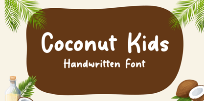 Coconut Kids – Handwritten Font, this font Is perfect for product packaging, product designs, label, photography, watermark, special events, or anything.
 - Late Frost by Gleb Guralnyk,
$13.00 This calligraphic script font is called Late Frost. It's an elegant decorative font with lots of ligatures and multilingual support.
 - Paris Mountain by Sronstudio,
$23.00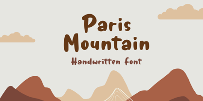 Paris Mountain – Handwritten Font, this font Is perfect for product packaging, product designs, label, photography, watermark, special events, or anything.
 - Flow by Hemphill Type,
$17.99 Flow is a relaxed font family that finds a happy balance between work and play. Its a Caps Only Fonts.
 - Meflin Script by GFR Creative,
$24.00 Meflin Script monoline script font I hope this font is interesting to use in your design projects. Thank you GFRcreative
 - Turtle by Otto Maurer,
$21.00 Turtle Font is a special reptilica Font for all Turtle Fans. It is dedicated to my two little Panther-Turtles
 - Western Shooter by Gleb Guralnyk,
$12.00 Western Shooter a caps-only font in an authentic vintage, Western style. This font includes multi-lingual support as well.
 - Lifeguard by Enrich Design,
$24.95Lifeguard is a Titling font family. Despite its rigid design, this unique font is a very versatile and legible alternative. - Jayce by Michael Browers,
$25.00 Jayce is a hand-drawn, upbeat display font family featuring two fonts: a text face and a set of fleurons.
 - Quirinus by Monotype,
$29.99Alessandro Butti designed the Quirinus font, released in 1939. Quirinus is a headline font with a strong contrast in strokes. - KG All Things New by Kimberly Geswein,
$5.00 This font was born of a desire to play with super thin and super thick lines in a script font.
 - Scrap Brother by Illustration Ink,
$3.00A perfect sibling for the sister font. Use this font for occasions where a clean hand lettered style is required. - Blikfang by Bogstav,
$17.00 All caps font that just want to be your friend, and maybe the font you use for your next project! :)
 - Daddy Bee by WNGSTD,
$10.00 Daddy Bee is a bold and cute handwritten font. It is the perfect font for making original and outstanding designs!
 - Hegorustow by Rometheme,
$12.00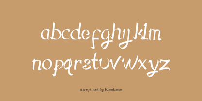 Hegorustow is a luxurious and classy handwritten font. This font looks vintage, elegant, readable, stylish, catchy and easy to use.
 - Beau Chat by Cititype,
$12.00 Beau Chat is a sweet handwritten font. Use this gorgeous and unique font to bring any DIY project to life!
 - Aphrodite Slim by Typesenses,
$57.00 Aphrodite Slim Pro is not just a lighter version of its sister Aphrodite Pro. Aphrodite Slim Pro has duplicated the quantity of characters of its partner, and that means more than 500 new glyphs, reaching a total of more than 1000. More delicate and meticulous, Aphrodite Slim Pro is once more a new typography with deep calligraphic ideals: We immersed ourselves into the world of each calligraphy ductus and each calligraphy masters by studying from decoration to lettering books. This was the key for the logic of Aphrodite Slim’s behavior. The new concept of Aphrodite Slim Pro was to join diverse styles of calligraphy in one in order to achieve an autonomous expressiveness, in fact, this is what calligraphy aims to, and we agreed to bring those ideals to the world of typography: It is justifiable to be inspired in hundred-year-old calligraphies, but it is even better if the results you obtain have a plus. A personal plus. During the creation process we were wondering whether it was possible to mix certain strokes of such rigid styles as uncial, (Li·n’s favourite style), with strokes of the copperplate, (Sav’s favourite style), and also to take and mix cualities of cancelleresca cursiva, formata and moderna; finally giving our creation a roman-transition italic look. So Aphrodite Slim takes ideals and aspects from those formal styles, following its own logic though, and emphasizing the fact of being a decorative typography. Calligraphy masters of our past are who we are in debt with. They are the cause we have lovely letters now. They have been spontaneous at the moment of creation, what differs from the type-designers of nowadays, whose spontaneity is more limited. Digital faces that we are used to see these days are a result of long hours of optical adjustments, grids, macros and inspirations of other existing typography, but without personal contributions. Aphrodite Slim wants to refute this. Its mission is to rescue de spontaneity of the artesanal lettering in order to obtain unique words; those which only calligraphy masters of our past or lettering artists of our present could give us. We have worked hard to achieve this, making Aphrodite the most universal font we could: It was necessary to study the most common words, focalizing more in the ones referring to “sensitivity”, of four of the most spoken languages in the world. Aphrodite Slim has an enormous quantity of decorative characters and special ligatures for phrases and words in English, French, Spanish and German. (See English, Français, Español, Deutsch PDF in the gallery section). We promise there is no existing type that decorates/ligates glyphs and words like Aphrodite Slim does: It is the first time a font like this really considers its purpose. -The way glyphs are ligated is insane- : Aphrodite Slim rescues some ideals of persons like Jan van den Velde (Italian cancilleresca writing of XVI Century) who understands ascenders and descenders as possibilities to beautify the lines of writing with curved strokes that seem to be dancing above and below of the words. This master also creates ascenders and descenders even where they are not necessary, on letters that do not actually need them: Aphrodite Slim takes this ideal. The font counts with a wide range of glyphs that seem not to be satisfied with its more primitive form and prefer to extreme their parts to be decorative. It also existed masters of calligraphy like José de Casanova of XVII Century, who, with a magnificant skill and a really personal mark, had the particularity of ligating words that were actually separated with spaces. This is another innovative feature in Aphrodite Slim. An investigation of the most common beginnings and endings words of the English language was done. Having that feature activated (discretionary ligatures), common words will start to ligate or to be decorated even when they are separated by spaces. Impossible to forget Francesco Periccioli of XVII Century and our experience us designers to face with works of him: His letters, that today are included in the group of cancellerescas modernas, have been a direct inspiration to the oldstyle figures and historical forms variables in Aphrodite Slim. Giovanni Antonio Tagliente (XVI Century) and his particular way of making tails and diagonals longer than usual, qualities that our creation reflects too. Finally, our adventures in Biblioteca Nacional and Barrio San Telmo, Buenos Aires, were essential for us to make Aphrodite Slim more complete and interesting: Sav did an excellent work when studying how the decorative miscellanea and swirls of early XX century were. She also investigated what particularities made those roman titling characters look antique so she could rescue some ideals for the oldstyle figures and historical forms variables. This also leaded her to create the ornaments variable in Aphrodite Slim. We are really proud of presenting Aphrodite Slim Pro, a typography that was the result of days and nights of working hard, because we do love what we do; and we are glad we are living in a present that gives us the possibility to spread this kind of art, because that is the way we consider our job: Aphrodite Slim Pro is Art. Hope you can appreciate the enormous work this type has. Features. Aphrodite Slim Pro is the most complete variable. It includes more than 1000 glyphs. Thanks to the Open-Type programming, it counts with a easy way to change/alternate glyphs if the application in which the font is used supports this. The variables contained in Aphrodite Slim Pro are also offered separately. Aphrodite Slim Text: It is the variable for lines and paragraphs. Thus it is the least ornamental and the most accurate to achieve a satisfying legibility. It has the Standard Ligatures feature in order to improve the possible conflicts some glyphs could have by others. Aphrodite Slim Contextual: It is the one that makes emphasis in decorating. It has the particularity of ligating/decorating words of common use in English, French, Spanish and German. It also has the quality of ligating common beginnings and endings of the common words in English. Aphrodite Slim Stylistic: With similar features of Slim Contextual. It includes a set of decorative numbers for a display use. Aphrodite Slim Swash: This one has special beginnings and endings to decorate words. Aphrodite Slim Endings: It makes words look as a signature. Aphrodite Slim Historical: It adds an antique look to the written word. It also has the special historical ligature function. Aphrodite Slim Titling: This one is the most decorative. Its copperplate inspired ornaments give words a special color, in order to handle the quantity of decoration, it comes with the standard ligature feature, which has the most common ligatures plus others that make decorative swirls not to be conflictive. Aphrodite Slim Ornaments: A set of 52 ornaments. Aphrodite Slim Pro includes all this features plus the Stylistic Set 1; Stylistic Set 2 and the possibility of Slashed Zero. We recommend you to check out the gallery in order to see all these features in action.
 - Captain Kidd Demo - Unknown license

- Carnivale - Unknown license

- Anderson The Mysterons - Unknown license

- Charriot Deluxe - Unknown license

- Sláine - Unknown license

- SF Droob Pro by Sultan Fonts,
$19.99 Droob Pro is a Latin Arabic typeface for print and web, an upgraded version of the Droob7 font, featuring clarity and high readability. The Droob Pro font family contains two weights: Regular and Bold. This font supports Arabic, Latin, Farsi, Urdu, and Kurdish.


