10,000 search results
(0.029 seconds)
- Cooper Black by URW Type Foundry,
$89.99Cooper Black The Cooper Black font should be used in display sizes only. Cooper Blacks serifs are rounded and the counters are small. Cooper Black was designed by Oswald B. Cooper for Barnhart Brothers & Spindler in 1921 for advertising and posters. The capital O and Q of the Cooper Black font are tilted back; in the lowercase, the dot on the I and j become elliptical. The extra bold Cooper Black font has a remarkable personality and reproduces well in sizes over 18 point in titles, subheadings and generally short sentences. - Cooper Black by Mecanorma Collection,
$45.00 - Cooper Black by Linotype,
$40.99 Oswald Bruce Cooper designed Cooper Black, an extra bold roman face, based on the forms of his earlier typeface Cooper Old Style, which appeared with Barnhart Brothers & Spindler Type Founders in Chicago. Copper Black was produced by Barnhart in 1922 and acquired in 1924 by the Schriftguß AG in Dresden, where it was later completed with a matching italic. Although Cooper Black appeared in the first third of the 20th century, it still looks contemporary and it can be found on storefronts in almost any city scene. The flowing outer contours create forms that are both strong and soft, making Cooper Black an extremely flexible font.
 - Hooper dooper - Unknown license

- Cooper Black SH by Scangraphic Digital Type Collection,
$26.00Since the release of these fonts most typefaces in the Scangraphic Type Collection appear in two versions. One is designed specifically for headline typesetting (SH: Scangraphic Headline Types) and one specifically for text typesetting (SB Scangraphic Bodytypes). The most obvious differentiation can be found in the spacing. That of the Bodytypes is adjusted for readability. That of the Headline Types is decidedly more narrow in order to do justice to the requirements of headline typesetting. The kerning tables, as well, have been individualized for each of these type varieties. In addition to the adjustment of spacing, there are also adjustments in the design. For the Bodytypes, fine spaces were created which prevented the smear effect on acute angles in small typesizes. For a number of Bodytypes, hairlines and serifs were thickened or the whole typeface was adjusted to meet the optical requirements for setting type in small sizes. For the German lower-case diacritical marks, all Headline Types complements contain alternative integrated accents which allow the compact setting of lower-case headlines. - Cooper Black SB by Scangraphic Digital Type Collection,
$26.00Since the release of these fonts most typefaces in the Scangraphic Type Collection appear in two versions. One is designed specifically for headline typesetting (SH: Scangraphic Headline Types) and one specifically for text typesetting (SB Scangraphic Bodytypes). The most obvious differentiation can be found in the spacing. That of the Bodytypes is adjusted for readability. That of the Headline Types is decidedly more narrow in order to do justice to the requirements of headline typesetting. The kerning tables, as well, have been individualized for each of these type varieties. In addition to the adjustment of spacing, there are also adjustments in the design. For the Bodytypes, fine spaces were created which prevented the smear effect on acute angles in small typesizes. For a number of Bodytypes, hairlines and serifs were thickened or the whole typeface was adjusted to meet the optical requirements for setting type in small sizes. For the German lower-case diacritical marks, all Headline Types complements contain alternative integrated accents which allow the compact setting of lower-case headlines. - Cooper Black Pro by SoftMaker,
$15.99 SoftMaker’s Cooper Black Pro is a friendly, chubby typefaces with rounded serifs and tilted back ovals. It is perfect whenever an informal, friendly character is desired in your designs. Oswald Cooper designed Cooper Black in 1919 for Barnhart Brothers & Spindler; later it was popularized by ATF. This release adds variations not present in the original design: In addition to a true italic and a condensed version, you can also experiment with a “poster” variant (tighter spacing, integral umlauts and accents) and a “stencil” variant. SoftMaker’s Cooper Black Pro typeface family contains OpenType layout tables for sophisticated typography. It also comes with a huge character set that covers not only Western European languages, but also includes Central European, Baltic, Croatian, Slovene, Romanian, and Turkish characters. Case-sensitive punctuation signs for all-caps titles are included as well as many fractions, an extensive set of ligatures, and separate sets of tabular and proportional digits.
 - Cooper Black EF by Elsner+Flake,
$35.00 - Cooperative by Hafontia,
$99.00 Cooperative is a retro style poster font in Hebrew and Latin. Is based on a printed example of a vintage handmade wood type from the 1950's. This sans serif font is available in both regular and bold versions, with a dirty and grungy styles as well in regular and bold.
 - Cooper by Tilde,
$39.75 - Trooper Roman Black by Wooden Type Fonts,
$15.00 Serif wide thin lines
 - XXII BLACK-BLOCK by Doubletwo Studios,
$22.22
- P22 Pooper Black Pro by IHOF,
$39.95 Pooper Black Pro is based on a brush ethic and has an extreme axis that lends a certain amount of speed to the font while the lack of connectors slows it down. The pro version expands on the original and popular Pooper Black with the addition of full Central and Eastern European character sets and plenty of alternate characters for those who have applications that support Opentype features. Almost all of the lower case characters now include an in stroke and out stroke version for greater design flexibility. A wonderful face for packaging, titling, and short bursts of text.
 - Conners Corners NF by Nick's Fonts,
$10.00 Here's another collection of ornate border elements gleaned from the 1888 specimen books of James Conner's Sons United States Type Foundry in New York City. Refer to the PDF guide for detailed, yet simple, instructions for constructing nine delightfully different border patterns.
 - Back In Black by IKIIKOWRK,
$17.00 Proudly present Back In Black - Hand Brush Type, created by ikiiko. Back in Black is a hand-drawn brush font that attempts to reflect the urban vibe of suburban walls. The expressive stroke style of this typeface mimics the look of graffiti and other street art with bold strokes that produce striking, eye-catching graphics. Large-scale text elements work very well with this font. They can be used to produce a wide variety of designs, from playful and whimsical to edgy and rebellious. Additionally, a level of artistic expression unattainable with more conventional fonts is made possible by the strong strokes and asymmetrical shapes. This type is very suitable for making a poster, magazine layout, book cover, quotes, or simply as a stylish text overlay to any background image. What's Included? Uppercase & Lowercase Numbers & Punctuation Stylistic Ligature Multilingual Support Works on PC & Mac
 - Looper - Unknown license

- Fooper by Volcano Type,
$19.00A bastard of the font Cooper. - Battered Cooper - Personal use only

- Cooper Goodtime by Breauhare,
$35.00 Cooper Goodtime is a font based on the lettering used on the CBS-TV variety series The Glen Campbell Goodtime Hour (1969-1972). The name pays tribute to its two origins, the other being Cooper Black. It was never an actual complete font set on the TV show, only a limited number of handmade letters, all upper case. It has lain dormant since the show went off the air in 1972. With this incarnation, a set of lower case letters has been created to complement the upper case letters. These lower case letters never existed before now. Cooper Goodtime is a funky, nostalgic, cool way to create a display, and it works surprisingly well in text sizes, too.
 - Cooper Screamers by Wordshape,
$- In 1925, at the request of Barnhart Brothers & Spindler, the foundry he worked for, Oswald Bruce Cooper designed a wide selection of "screamers", oversized exclamation points used to grab attention in display advertising. The foundry rushed the screamers into production, much to Cooper's dismay. Cooper was disappointed with the final form of the screamers– they were designed in assorted weights to match the assorted Cooper series of typefaces, as well as in a variety of other formal solutions- squaredoff, incised, wavy, Tuscan, and rounded. Cooper's working design methodology was to re-draw his projects a number of times in order to refine the formal results. However the screamer project was hastily cut by the head of BB&S's matrix engraving room in fourteen sizes from the initial sketches, causing Cooper to fire off a fiery missive stating, "Everything I draw is bum the first half-dozen times I draw it; the trouble with these is that I drew them only once!" This typeface is the result of researching Cooper's original drawings and series of engraved proofs for the screamers, as well as the original Screamer type specimen. Cooper Screamers have never been available before in digital format.
 - Cooper BT by Bitstream,
$34.99 Cooper Black, commissioned by Barnhart Brothers & Spindler, is the best known of Oswald Cooper’s typefaces. Bitstream has expanded the 1921 original into a complete series of round-edged text faces.
 - Cooper Antique by URW Type Foundry,
$35.00
- Cooper Poster by GroupType,
$15.00 Cooper Poster was inspired by showcard lettering samples featured in the book, Commercial Art Of Show Card Lettering, published in 1945. Although named ""Western"", the design was modeled after Ozwald Cooper's 1921 original Cooper Black.
 - Cooper Nouveau by House Industries,
$33.00 Few fonts reach cult status. Despite its ubiquity—and perhaps because of its lack of subtlety—for a hundred years Cooper continues to draw the faithful. It’s even come to define an entire typographic genre and recently starred in its own documentary. Cooper Nouveau is Dave West’s imaginative contribution to the Cooper oeuvre. Drawn in 1966, Nouveau refreshes Oswald Cooper’s original italic with an energetic pitch, simplified contours, and a plump friendly figure. Uniform strokes and generous curves push the font’s playful personality and springy silhouette even further. A selection of swashed characters and ligatures offers options for lively logos and strong captions. While Cooper Nouveau looks laid-back and easy-going, it’s more than capable of pulling it’s own typographic weight. Put it to work where relaxed needs to project confident. Set Nouveau large for eye-magnet posters, packaging, and advertisements. Maximize its youthful energy for kids’ themes, craft action, and apparel bounce. Or set it alongside a master like Benguiat Buffalo or Chalet to show how Cooper Nouveau can communicate on paper and screens with an inherent ability to speak the language of style in many tongues. But like any cult icon: beware! Cooper has a way of setting the needle, and Nouveau just may become your go-to design fix. FEATURES ALTERNATES: Cooper Nouveau contains several alternate characters, which add flair to your designs and can help solve spacing issues LIGATURES: Many letter combinations in Cooper Nouveau form a ligature to solve spacing issues and produce more pleasing designs. COOPER NOUVEAU CREDITS Typeface Design: Dave West Digitization: Dave Foster Typeface Direction: Ben Kiel, with Ken Barber Like all good subversives, House Industries hides in plain sight while amplifying the look, feel and style of the world’s most interesting brands, products and people. Based in Delaware, visually influencing the world.
 - Cooper BT by ParaType,
$30.00Bitstream Cooper was designed at Bitstream in 1986 by means of adding light, medium, and bold styles, with the corresponding italics, to the existing black ones. Based on Cooper Black, 1919, by Oswald Bruce Cooper, which was firstly released as a hand composition font in 1922 by Barnhart Brothers & Spindler of Chicago and later spread by ATF. Cooper Black is an extra bold face based on Cooper Old Style. Bitstream Cooper is an old style face with rounded serifs and tilted back ovals. For use both in text (normal weights) and in advertising and display typography (heavy weights). Cyrillic version was developed for ParaType in 2000 by Manvel Shmavonyan and based on TM Oswald face of TypeMarket, 1996, by Victoria Grigorenko. - Calico Cyrillic - Unknown license

- Whirl Cyrillic - Unknown license

- Pixel Cyrillic - Unknown license

- Blood Cyrillic - 100% free

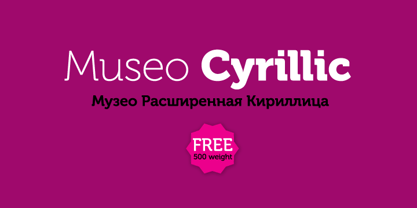
- Museo Cyrillic by exljbris,
$-
- Sextan Cyrillic by deFharo,
$12.00 Sextan serif is a Cyrillic typeface family with 10 styles designed for editorial, corporate, advertising or web use. The excellent readability allows the use in long texts, the coherence of forms make these fonts have a great personality. The fonts have an extra set of lower case letters accessible through the Discretional Ligatures. Also support for Open Type Functions such as Old Style Number, Superiors, Inferiors, Dynamic Fractions, etc. Includes the Bitcoin symbol: b #
 - AndrijScript Cyrillic by AndrijType,
$36.00 The glyphs of AndrijScript typeface are based on usual calligrapher's handwriting, my own native Cyrillic. This strange mix of freedom and professionalism looks vivid but a bit elegant. In three very different weights it has some ligatures and contextual alternatives for more natural look. All you need is love, you know ;)
 - Optima Cyrillic by Linotype,
$65.00Many typefaces are distinctive or attractive at the expense of legibility and versatility. Not so the Optima® family. Simultaneously standing out and fitting in, there are few projects or imaging environments outside of its range. Although Optima is almost always grouped with sans serif typefaces, it should be considered a serifless roman. True to its Roman heritage, Optima has wide, full-bodied characters – especially in the capitals. Only the E, F and L deviate with narrow forms. Consistent with other Zapf designs, the cap S in Optima appears slightly top-heavy with a slight tilt to the right. The M is splayed, and the N, like a serif design, has light vertical strokes. The lowercase a and g in Optima are high-legibility two-storied designs. Optima can be set within a wide choice of line spacing values – from very tight to very open. In fact, there are few limits to the amount of white space that can be added between lines of text. Optima also benefits from a wide range of letter spacing capability. It can be set quite tight, or even slightly open – especially the capitals. If there are any guidelines, Optima should be set more open than tight. It’s not that readability is affected that much when Optima is set on the snug side; it’s just that the unhurried elegance and light gray typographic color created by the face are disrupted when letters are set too tight. Optima is also about as gregarious as a typeface can be. It mixes well with virtually any serif design and a surprisingly large number of sans serif faces. The Optima family is available in six weights, from roman to extra black, each with an italic counterpart. In addition, the family is available as a suite of OpenType® Pro fonts, providing for the automatic insertion of small caps, ligatures and alternate characters, in addition to offering an extended character set supporting most Central European and many Eastern European languages. When you’re ready to find its perfect pairing, browse these fantastic matches: Monotype Century Old Style™, Dante®, Frutiger® Serif, Joanna® Nova, Malabar™, and Soho®. - Scandinavian Cyrillic by Ira Dvilyuk,
$17.00 The Scandinavian Cyrillic kids font is stylish and laconic as famous Scandinavian monochrome design. Each letter of the font was carefully cut out of paper with scissors by little childish hands. And now it's turned into a font :) The Scandinavian Cyrillic kids font includes main uppercase, alternative uppercase, and double letters for uppercase and lowercase. It will be perfect for use in all your fun design projects: logos, labels, packaging design, blog headlines. Also, it will look great on mugs, cards, kid's books headlines, or other typographic projects. Multilingual Support for 32 languages: Latin glyphs for Afrikaans, Albanian, Basque, Bosnian, Catalan, Danish, Dutch, English, Estonian, Faroese, Filipino, Finnish, French, Galician, Indonesian, Irish, Italian, Malay, Norwegian Bokmål, Portuguese, Slovenian, Spanish, Swahili, Swedish, Turkish, Welsh, Zulu. And Cyrillic glyphs support for Russian, Belorussian, Bulgarian, Ukrainian and Kazakh languages. Works perfectly on the Canva platform. For Cricut & Silhouette recommended.
 - Rondolux Cyrillic by Ira Dvilyuk,
$18.00 Rondolux Cyrillic Serif Font is a narrow classy all-caps serif typeface with narrow lowercase, wide uppercase letters, and tons of ligatures. Perfect for gorgeous logos and titles, Rondolux Cyrillic Serif Font will pair beautifully with many fonts and work well with whatever project you're working on. You can choose to use narrow or wide glyphs to make your typography more varied. Rondolux Latin part contains 38 ligatures which you can get by typing the number 1 after letters such as OC1 KO1 Lu1... Rondolux Cyrillic part also contains 27 ligatures Multilingual Support for 32 languages: Latin glyphs for Afrikaans, Albanian, Basque, Bosnian, Catalan, Danish, Dutch, English, Estonian, Faroese, Filipino, Finnish, French, Galician, Indonesian, Irish, Italian, Malay, Norwegian Bokmål, Portuguese, Slovenian, Spanish, Swahili, Swedish, Turkish, Welsh, Zulu. And Cyrillic glyphs support Russian, Belorussian, Bulgarian, Ukrainian, and Kazakh languages.
 - Spaghetti Cyrillic by Ira Dvilyuk,
$17.00 The Spaghetti playful cute font includes the main & alternative uppercase, and main & alternative lowercase, and the full set of double letters in an upper and lowercase, and a large range of numerals and punctuation. The Spaghetti font will be perfect for use in all your fun design projects be it logos, labels, packaging design, blog headlines. Also, it will look great on mugs, cards, kids books headlines, or other typographic projects. Spaghetti cute playful font contains the Cyrillic glyphs too. The Cyrillic part of the font contains a full set of uppercase lowercase, and the Spaghetti Symbols is an additional font with 52 hand-drawn doodles, catchwords, arrows, and swashes and can help to make your design more original. Combine and arrange swashes and illustrations to create your own designs and make borders, frames, dividers, logos, and more (just use A-Z and a-z keys in the included Spaghetti Symbols font). A different symbol is assigned to every uppercase or lowercase standard character so you do not need graphics software just simply type the letter you need. Multilingual Support for 31 languages: Latin glyphs for Afrikaans, Albanian, Basque, Bosnian, Catalan, Danish, Dutch, English, Estonian, Faroese, Filipino, Finnish, French, Galician, Indonesian, Irish, Italian, Malay, Norwegian Bokmål, Portuguese, Slovenian, Spanish, Swahili, Swedish, Turkish, Welsh, Zulu. And Cyrillic glyphs support for Russian, Belorussian, Bulgarian and Ukrainian languages. Thanks!
 - Rosamund Cyrillic by Ira Dvilyuk,
$17.00 Rosamund Cyrillic Script Font is an inky brush script with heavy downstrokes, and skinny loops, and upstrokes. It was made with my favorite brush pen and retains a playful handwritten look for all your designs and will be perfect for use in your projects, be it logos, signatures, labels, packaging design, or blog headlines. Also, it will look great in mugs, cards, gorgeous typographic designs, stationery, and much more. Rosamund Cyrillic Script contains a full set of uppercase letters and 2 full sets of lowercase letters, (standard and alternative), and 17 ligatures. Use alternate lowercase and double-letter ligatures to create a perfect hand-painted look in your creations. The Cyrillic part of the font includes a full set of gorgeous uppercase and lowercase letters, ligatures, numerals, a large range of punctuation. Rosamund Symbols is a font with over 50 unique, hand-drawn doodles and illustrations that can help to make your design awesome. A different symbol is assigned to every uppercase and lowercase standard character so you do not need graphics software just simply type the letter you need. Multilingual Support for 32 languages: Afrikaans, Albanian, Basque, Bosnian, Catalan, Danish, Dutch, English, Estonian, Faroese, Filipino, Finnish, French, Galician, Indonesian, Irish, Italian, Malay, Norwegian Bokmål, Portuguese, Slovenian, Spanish, Swahili, Swedish, Turkish, Welsh, Zulu And Cyrillic glyphs support for Russian, Belorussian, Bulgarian, Ukrainian, and Kazakh languages. Works perfectly on the Canva platform. For Cricut & Silhouette recommended. Thanks!
 - Plantin Cyrillic by Monotype,
$65.00 - Alanta Cyrillic by Ira Dvilyuk,
$15.00 Alanta is an inky brush script with heavy downstrokes, and skinny loops and upstrokes. It was made with my favorite brush pen and retains a playful handwritten look for all your designs and will be perfect for use in your projects be it logos, signatures, labels, packaging design, blog headlines. Also, it will look great in mugs, cards, gorgeous typographic designs, stationery and much more. Alanta Heavy Handwritten script font includes a full set of gorgeous uppercase and lowercase letters, numerals, a large range of punctuation. Extensive language support is included. Multilingual Support for 32 languages: Afrikaans, Albanian, Basque, Bosnian, Catalan, Danish, Dutch, English, Estonian, Faroese, Filipino, Finnish, French, Galician, Indonesian, Irish, Italian, Malay, Norwegian Bokmål, Portuguese, Slovenian, Spanish, Swahili, Swedish, Turkish, Welsh, Zulu And Cyrillic glyphs support for Russian, Belorussian, Bulgarian, Ukrainian, and Kazakh languages.
 - Baldufa Cyrillic by Letterjuice,
$66.00 Baldufa is a charming typeface with strong personality, which looks very comfortable in text. There is a search to obtain complicated curves and detailed features, which gives the typeface a touch of beauty and elegance. However, this is also a self-conscious design that claims through the rounded serifs and irregular vertical stems appreciation for quirkiness and human imperfection. The letterforms are inspired by the slight distortions and idiosyncrasies that came with old printing methods. It has distinct, features such as rounded serifs, irregular vertical streams, ink traps and extremely thin junctions. In the Italic, serifs have been removed to enhance movement and expressivity. These experiments in form have not come at the cost of legibility: The typeface remains suitable for both small and display text.


Page 1 of 250Next page