9,136 search results
(0.041 seconds)
- Architect Small Block by Quiet Designs Inc.,
$20.00 - Thorm Block Graffiti by Sipanji21,
$18.00
- KG Blank Space by Kimberly Geswein,
$5.00
- Ungap Blocks Variable by Pedro Teixeira,
$25.00
- PL Barnum Block by Monotype,
$29.99
- Straight Flush Block by Inumocca,
$18.00
- Boston Blackie NF by Nick's Fonts,
$10.00 - Campus Sans Block by MacCampus,
$30.00 - Children Block Letters by m u r,
$15.00 - KG PDX Blocks by Kimberly Geswein,
$5.00
- KG Geronimo Blocks by Kimberly Geswein,
$5.00
- Cell Block 6 by Enrich Design,
$24.95 - Rounded Block Display by NDS Fonts,
$15.00
- Dry Brush Blocks by BW90,
$24.99
- SK One Block by Salih Kizilkaya,
$3.50
- PIXymbols Baby Blocks by Page Studio Graphics,
$25.00
- Janda Closer To Free - Personal use only

- Antique Borders & Corners 2 by Aerotype,
$29.00
- MFC Bruce Corners One by Monogram Fonts Co.,
$19.95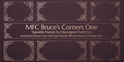
- Corporative Sans Round Condensed by Latinotype,
$26.00
- MFC Franklin Corners Four by Monogram Fonts Co.,
$19.95
- Just Around The Corner by Armandop,
$10.00 - Jolly Good Proper Serif by Letradora,
$-
- MFC Franklin Corners Two by Monogram Fonts Co.,
$19.95
- Antique Borders & Corners 1 by Aerotype,
$29.00
- MFC Franklin Corners One by Monogram Fonts Co.,
$19.95
- MFC Franklin Corners Five by Monogram Fonts Co.,
$19.95
- MFC Bruce Corners Three by Monogram Fonts Co.,
$19.95
- Janda Closer To Free by Kimberly Geswein,
$5.00
- MFC Bruce Corners Two by Monogram Fonts Co.,
$19.95
- MFC Franklin Corners Six by Monogram Fonts Co.,
$19.95
- MFC Franklin Corners Three by Monogram Fonts Co.,
$19.95
- BOOKER ITALIC PERSONAL USE - Personal use only

- Scratch my back - Unknown license

- Back to 1982 - Unknown license

- Never Writes Back - Unknown license

- Want You Back - Unknown license

- Back Groove Outline by Gatype,
$9.00
- Back And Forth by A New Machine,
$10.00
- Back To School by MDF,
$4.00


