10,000 search results
(0.031 seconds)
- FT Weapon Of Choice by Fenotype,
$19.00 A dingbat set with close combat weapons, guns, baseball bats, knives and other tools of violence.
 - Sonata Allegro by Tamar Fonts,
$35.00 “The Emperor Has Clothes” Like in music — the Allegro Sonata form consists of three main sections—the Exposition (section), the Development, and the Recapitulation — so in regard to this Allegro Sonata font family — there is an Exposition (font), a Development, and a Recapitulation—in which each theme is restated alongside its development material. While the Recapitulation font is perfect for titling and branding, the Exposition is perfect for branding {as demonstrated in the Inspiration Gallery pertaining this font} as well as being a comfortable read in long runs of text. The Exposition rounded, mono-line, with great x height, contemporary—A Synthesis Between Geometric & Hand-drawn—font, is at times geometric and at times hand drawn; in the end it all came down to finding the balance in a typeface between the robustness needed to function as a text face and enough refinement to look good as a display font. Following the Exposition, comes the Development (section), decorative, botanic-like, exuberant and playful font, signifying ABUNDANCE [of possibilities] & BENEVOLENCE—in regard to each theme/character, and to demonstrate—that 'structures' in music, are solid structures—like architecture {contrary to the words of J. W. von Goethe, who said: “Music is liquid architecture; Architecture is frozen music”}, just in some spiritual domain that is far beyond one's physical senses to grasp. Like in my art and music works in which I consider its 'Texture' element of vital importance, so is the case when it comes to type, as apparent in my previous Phone Pro/Polyphony font, as well as in this current Sonata Allegro/Development font. Each glyph has its own uniqueness, and when meeting with others, will provide dynamic and pleasing proximity. And due to the [individualistic] nature of this Development font, just a minimal amount of kerning/pairing were necessary... The development font is an extravagant design that looks best when used at large sizes—perfect for titling, logo, product packaging, branding project, wedding, or just used to express words against some [light or dark] background. Finally, “The (Exposition Font) Emperor Has (the Development Font) Clothes!” As said, there are three fonts/styles altogether in this Sonata Allegro type family, designed with the intention of harmonizing between Latin and Hebrew, which makes it an ideal font for the side-by-side use of Latin and Hebrew characters. However, they are being sold separately (kindly search for “Sonata Allegro Hebrew” on this MyFonts site), so they are economical for those interested just in either one of them. My aim is to shake up the type-design world with a range of distinctive fonts which break away from the generic letterforms, to make your design projects stand out—as a graphic designer, add this font to your most creative ideas for projects. This typeface has [lots of ligatures /] OpenType features, to enhance your designs even more — happy designing! Sonata Allegro Features: · 3 Weights/Styles · Multilingual Support · Proportional Figures & Ligatures While using this product, if you encounter any problem or spot something we may have missed, please don't hesitate to write to us; we would love to hear your feedback—in order to further fine-tune our products. Copyright Tamar Fonts/Hillel Glueck 2022 ALL RIGHTS RESERVED Any unauthorized distribution of my work is strictly prohibited, and will be prosecuted; do the right thing, and do not participate in the piracy of my typefaces; if you appreciate my work, then please pay for it and help me prosper — thank you!
 - Sonata Allegro Hebrew by Tamar Fonts,
$35.00 “The Emperor Has Clothes” Like in music — the Allegro Sonata form consists of three main sections—the Exposition (section), the Development, and the Recapitulation — so in regard to this Allegro Sonata font family — there is an Exposition (font), a Development, and a Recapitulation—in which each theme is restated alongside its development material. While the Recapitulation font is perfect for titling and branding, the Exposition is perfect for branding {as demonstrated in the Inspiration Gallery pertaining this font} as well as being a comfortable read in long runs of text. The Exposition rounded, mono-line, with great x height, contemporary—A Synthesis Between Geometric & Hand-drawn—font, is at times geometric and at times hand drawn; in the end it all came down to finding the balance in a typeface between the robustness needed to function as a text face and enough refinement to look good as a display font. Following the Exposition, comes the Development (section), decorative, botanic-like, exuberant and playful font, signifying ABUNDANCE [of possibilities] & BENEVOLENCE—in regard to each theme/character, and to demonstrate—that 'structures' in music, are solid structures—like architecture {contrary to the words of J. W. von Goethe, who said: “Music is liquid architecture; Architecture is frozen music”}, just in some spiritual domain that is far beyond one's physical senses to grasp. Like in my art and music works in which I consider its 'Texture' element of vital importance, so is the case when it comes to type, as apparent in my previous Phone Pro/Polyphony font, as well as in this current Sonata Allegro/Development font. Each glyph has its own uniqueness, and when meeting with others, will provide dynamic and pleasing proximity. And due to the [individualistic] nature of this Development font, just a minimal amount of kerning/pairing were necessary... The development font is an extravagant design that looks best when used at large sizes—perfect for titling, logo, product packaging, branding project, wedding, or just used to express words against some [light or dark] background. Finally, “The (Exposition Font) Emperor Has (the Development Font) Clothes!” As said, there are three fonts/styles altogether in this Sonata Allegro type family, designed with the intention of harmonizing between Latin and Hebrew, which makes it an ideal font for the side-by-side use of Latin and Hebrew characters. However, they are being sold separately (kindly search for “Sonata Allegro Hebrew” on this MyFonts site), so they are economical for those interested just in either one of them. My aim is to shake up the type-design world with a range of distinctive fonts which break away from the generic letterforms, to make your design projects stand out—as a graphic designer, add this font to your most creative ideas for projects. This typeface has [lots of ligatures /] OpenType features, to enhance your designs even more — happy designing! Sonata Allegro Features: · 3 Weights/Styles · Multilingual Support · Proportional Figures & Ligatures While using this product, if you encounter any problem or spot something we may have missed, please don't hesitate to write to us; we would love to hear your feedback—in order to further fine-tune our products. Copyright Tamar Fonts/Hillel Glueck 2022 ALL RIGHTS RESERVED Any unauthorized distribution of my work is strictly prohibited, and will be prosecuted; do the right thing, and do not participate in the piracy of my typefaces; if you appreciate my work, then please pay for it and help me prosper — thank you!
 - Lonely Together by Dumadi,
$20.00 Lonely Together is a unique handwritten-style font created with brush tools. if you have a project in the form of romantic nuances, invitation cards, social media designs, branding, valentine events, crafting designs, and more.
 - Awesome Quote by Atom,
$15.00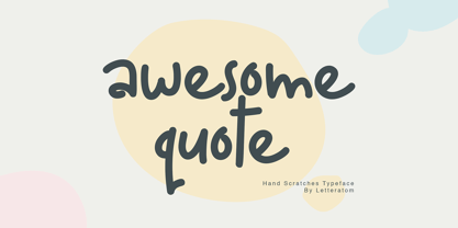 Awesome Quote is a sweet and friendly handwritten font. Its natural and unique style makes it incredibly fitting to a large pool of designs. The only limit is your imagination. Happy design! Eko Kurniawan | Letteratom
 - Lamenta by Dawnland,
$13.00 All that remains from this once so proud and glorious antiqua are steel skeletons. Destroyed. Distorted. Ruins. The main focus and usage of LamentaX are headlines, posters for event graphics and music/media/game packaging. Lamenta X was revised 2012 and now hold a full character set of basic english/latin letters and west european diacritics!
 - Fine And Dandy JNL by Jeff Levine,
$29.00 Fine and Dandy JNL comes from the hand lettered title of the 1929 movie "Isle of Escape"; found on the sheet music for its theme song "My Kalua Rose". An engraved and fancy Roman, the style combines elements of Western, Art Nouveau and Art Deco into one attractive type design; available in both regular and oblique versions.
 - FF Fudoni by FontFont,
$41.99 Dutch type designer Max Kisman created this display FontFont in 1991. The family contains 3 weights and is ideally suited for festive occasions, film and tv, music and nightlife as well as poster and billboards. FF Fudoni provides advanced typographical support with features such as ligatures and case-sensitive forms. It comes with proportional lining figures.
 - Chanson De Paris JNL by Jeff Levine,
$29.00 A couple of pieces of sheet music from France [circa 1925] offered the inspiration for Chanson De Paris JNL (Song of Paris), which is available in both regular and oblique versions. This hand lettered Art Nouveau style features a unique take on thick-and-thin lettering which foreshadows the Art Deco typefaces to come during the 1930s.
 - Schoolyard Blues JNL by Jeff Levine,
$29.00 Schoolyard Blues JNL is based on the hand lettered title found on the sheet music for the 1938 song "I Was Late for School". A condensed sans serif with chamfered corners, it reflects the Art Deco influences of the day in some of the letter forms. This type design is available in both regular and oblique versions.
 - Deco Diva JNL by Jeff Levine,
$29.00 The title hand lettered onto the 1933 sheet music cover for “Yours is My Heart Alone” represents the classic Art Deco typographic features of unusual character shapes and widths, yet at the same time it projects simplicity in geometric design. This served at the basis for Deco Diva JNL, which is available in both regular and oblique versions.
 - Hybrid Deco JNL by Jeff Levine,
$29.00 Squared letters with rounded corners – Deco stylized letter forms – some characters with ‘hook’ semi-serifs – such is the mixed styles that comprise the hand lettered title “United We Stand” on a 1940s-era piece of sheet music. This unusual conglomeration of character shapes inspired the aptly named Hybrid Deco JNL, which is available in both regular and oblique versions.
 - Farringdon by Solotype,
$19.95An old wood type we picked up in London from the Fredrick Ullmer Company. It's not marked, and we've never seen it in a catalog, so we don't know who made it. We like it for antique-looking western posters and playbills. We added the lowercase. We have seen it used on British music hall bills. - FF Dirtyfax by FontFont,
$30.99 German type designer Fabian Rottke created this display FontFont in 1995. The family contains 2 weights: Regular and Heavy and is ideally suited for film and tv, music and nightlife, poster and billboards as well as software and gaming. FF Dirtyfax provides advanced typographical support with features such as ligatures. It comes with proportional lining figures.
 - Personnel JNL by Jeff Levine,
$29.00 The hand lettered title found on the 1938 sheet music for "I Haven't Changed a Thing" is a condensed Art Deco thick-and-thin sans serif with rounded corners. Reminiscent of office door and similar signage, this classic bit of lettering from the past is now available as Personnel JNL in both regular and oblique versions.
 - Uptown Line JNL by Jeff Levine,
$29.00 Ask any typical New Yorker about subway directions and they'll tell you to take the "uptown line", "downtown line" or "cross-town line". Uptown Line JNL is yet another variation of the Art Deco monoline style of lettering prevalent during the 1930s and 1940s, and is based on titling from vintage sheet music for a Johann Strauss classical piece.
 - FF Amoeba by FontFont,
$41.99 British type designer Peter G. Warren created this display FontFont in 1995. The family contains 3 weights: Light, Regular, and Bold and is ideally suited for festive occasions, music and nightlife as well as software and gaming. FF Amoeba provides advanced typographical support with features such as alternate characters and case-sensitive forms. It comes with proportional lining figures.
 - Casual Nouveau JNL by Jeff Levine,
$29.00 Free-flowing pen lettering of the Art Nouveau period took letter forms into interesting curves and angles. The style was embraced and revived by the 1960s counter-culture in its rock concert posters and record album covers. However, the source for Casual Nouveau JNL is a 1911 piece of sheet music entitled "Back to the Carolina You Love".
 - Song Album JNL by Jeff Levine,
$29.00 In the days when sheet music was as popular as phonograph records for home entertainment, a song album was a folio of collected works. The hand-lettering on the 1940s-era cover for "The Sigmund Romberg Song Album, Book II" served as the model for Song Album JNL. Romberg was a noted composer of Broadway show tunes.
 - Deco Semi Serif JNL by Jeff Levine,
$29.00 Deco Semi Serif JNL was modeled from the hand lettered title on the sheet music cover for the 1933 song "Another Perfect Day Has Passed Away". This interesting design blend of serif, sans serif and partial-serif characters commands attention with its eccentric mix of letter forms, and is available in both regular and oblique versions.
 - FF Kipp by FontFont,
$47.99 0 Kipp "German type designer Claudia Kipp created this display and sans FontFont in 1993. The family has 7 weights, and is ideally suited for film and tv and music and nightlife. FF Kipp provides advanced typographical support with features such as ligatures and case-sensitive forms. It comes with proportional lining, tabular lining, and proportional oldstyle figures.
 - Theater Lights JNL by Jeff Levine,
$29.00 Vintage sheet music for the title song from the film "Forty Second Street" was the inspiration for Theater Lights JNL. While the idea of letters comprised of circles (to simulate bulbs) can be both vintage [as in marquee lights] or modern [simulating dot matrix printers], it is always a fun approach to a tried-and-true style.
 - FF Jigger by FontFont,
$41.99 German type designer Steffen Sauerteig created this display and sans FontFont in 2000. The family has 6 weights, and is ideally suited for music and nightlife, poster and billboards as well as software and gaming. FF Jigger provides advanced typographical support with features such as alternate characters. It comes with tabular lining and proportional lining figures.
 - FF Angst by FontFont,
$41.99 German type designer Jürgen Huber created this display FontFont in 1996. The family contains 3 weights: Regular, Condensed, and Heavy and is ideally suited for film and tv, music and nightlife, poster and billboards as well as software and gaming. FF Angst provides advanced typographical support with features such as ligatures. It comes with proportional lining figures.
 - Mongolia by Goodigital13,
$20.00 It can be used in different purposes: lettering and logotype, labels, t-shirts, product packaging, invitations, advertising, and any classic / vintage typography design projects. will be great for any projects including : branding, logo, stationery, business card, signage, flyer, brochure etc. Almost all industries will be match for this typeface: events, music video, makeup artist, travel, promotions, musician, magician etc
 - FF Bionic by FontFont,
$41.99 German type designer Critzla created this display FontFont in 1997. The family contains 3 weights and is ideally suited for advertising and packaging, festive occasions, logo, branding and creative industries as well as music and nightlife. FF Bionic provides advanced typographical support with features such as ligatures and case-sensitive forms. It comes with proportional oldstyle figures.
 - Prospect Heights JNL by Jeff Levine,
$29.00 While the inspiration for Prospect Heights JNL may have been a piece of vintage sheet music entitled "My Ohio Lullaby", the name is classically New York. To be precise, it's a neighborhood in the Borough of Brooklyn. Prospect Heights JNL is available in both the regular version (with an engraving line) and a solid (plain) version.
 - FF Burokrat by FontFont,
$41.99 German type designer Matthias Rawald created this display FontFont in 1996. The family contains 3 weights and is ideally suited for film and tv, music and nightlife, poster and billboards as well as software and gaming. FF Burokrat provides advanced typographical support with features such as ligatures and case-sensitive forms. It comes with tabular lining figures.
 - Conscription JNL by Jeff Levine,
$29.00 The sheet music for the 1914 Word War I comic novelty song "When the War Breaks Out in Mexico I'm Going to Go to Montreal" had one of those overly-worded song titles popular during this period (13!), along with interesting sans serif hand lettering. It now debuts digitally as Conscription JNL in both regular and oblique versions.
 - Deco Pen JNL by Jeff Levine,
$29.00 Hand lettering found across the sheet music cover of 1931's "Bend Down, Sister" [from the Eddie Cantor film "Palmy Days"] covered a couple of varying Art Deco styles; both made with a round-tipped pen nib. Deco Pen JNL combines the best of both styles into one design that's available in both regular and oblique versions.
 - Linotype Pine by Linotype,
$40.99A self made bamboo or reed stick nicely cut down to a broad edged nib must have been the tool with which the designer Andrew Weed wrote his letters for the typeface Pine.Its irregular outline is the result of the flowing of the ink. Ideal for a headline or a poster which reflects the personal touch of the tool. - Billion Laughter by Haksen,
$20.00 Billion Laughter is a Bold serif display style with unique anatomy every letter. Provide variant alternates and ligatures make the design letter looks incredible. Honestly it works perfectly for headlines, logos, posters, packaging and much more. Recommended to use in Adobe Illustrator or Adobe Photoshop with opentype feature. Ligatures feature is default setting in Adobe Illustrator or Adobe Photoshop in Uppercase character. So when you want not to use the ligatures. Open glyphs panel : In Adobe Photoshop choose tool Window Character and then please click fi symbol In Adobe Illustrator choose tool Window Type Open Type and then please click fi symbol How to access Alternates Character? Open glyphs panel : In Adobe Photoshop choose tool Window glyphs In Adobe Illustrator choose tool Type glyphs If you have questions, just send me a message and I’m glad to help. Have a great day, Haksen
 - Mixed Tape by Ksenia Belobrova,
$35.00 Mixed Tape is a brush typefamily inspired by music and based on calligraphy. It has 3 different styles so that you can choose which you need or combine them as you like. Mixed Tape Regular is a casual neutral brush script, Mixed Tape Small is a more elegant variation and Mixed Tape Capitals is an energetic, probably even brutal brush script. You can freely play with the three of them creating your typographic compositions. You can use Mixed Tape for posters, prints, menus, packaging, book covers and headlines, cards and as a starting point for logotypes. Mixed Tape has a lot of alternates and ligatures which are built into the ‘Liga’ feature that is turned on by default. It also has swashes, titles, fractions, ordinals and case sensitive forms. Let’s all enjoy good music and typography!
 - Scientesia by sizimon,
$16.00 Scientesia is hand brushed typeface. Very cool for name tags, handwritten quotes, product packaging, merchandising, social media & greeting cards. And very easy to make design magazine headlines and other products. Time saving in making the design of a product. Scientesia contains a full set of lower & uppercase letters, a large range of punctuation, numerals, and multilingual support.
 - Mo' Funky Fresh by ITC,
$29.99Mo' Funky Fresh is the work of New York designer David Sagorski. It is an all capital typeface which includes a set of alternative capitals, compatible symbols and lively illustrations. Mo' Funky Fresh brings to mind sunny days, tiki bars, surfboards and cool drinks and is a great choice for headlines requiring a vital, energetic look. - Paper Sting Stencil by PizzaDude.dk,
$17.00 I made Paper Sting using an inky pen. There is a great variation in the stroke width, which gives a very lively handmade feeling. Paper Sting comes in two versions: Regular and Stencil - mix them for cool realistic results. Of course there is multi-lingual support as well as contextual alternates, which means 5 different versions of each letter.
 - Linotype Reducta by Linotype,
$29.99Linotype Reducta is a part of the Take Type Library, selected from contestants of Linotype’s International Digital Type Design Contests of 1994 and 1997. It was designed by Austrian artist Herbert O. Modelhart with only a small number of constant form elements. The cool and technical Linotype Reducta is intended exclusively for headlines in large point sizes. - Cookie Kit by Bogstav,
$12.00 Cookie Kit is just like that easy recipe for that delicious cake that you probably know - easy to make and it tastes absolutely fabulous - Cookie Kit has the same effect with designs: It's easy to make cool effects with the 4 layers. Play around with your favourite colors and you get great results at the go!
 - Swadi Marker by Sipanji21,
$15.00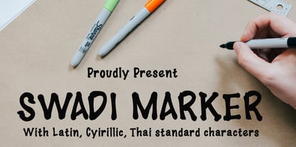 Swadi Marker is a sweet and friendly serif font and features Cyrillic and Thai character. Its natural and unique style makes it incredibly fitting to a large pool of designs. The only limit is your imagination!
 - Tourist Spot JNL by Jeff Levine,
$29.00 Tourist Spot JNL is the same lettering style as Old Tijuana JNL, but with the squiggly inside lines stripped away. The original design was modeled from the hand lettered title on the cover of the 1939 sheet music for "Class Will Tell" and is available in both regular and oblique versions. Casual and playful in nature, the font can be used by itself or combined with Old Tijuana JNL for any project that promotes festive occasions.