10,000 search results
(0.053 seconds)
- Bad Comp AOE by Astigmatic,
$19.95 - Comp Sans 226 by Type Associates,
$24.95 Once upon a time, in the days BC (that's Before Computers) there lived a very talented group of men and women whose job it was to render ads by hand. So skillful were these people that some say it was possible to actually identify the typefaces that the layout artists were emulating. Their renderings were swift and slick, no time for detail as it was necessary to do a whole bunch of variations, usually within ridiculous deadlines. Their only tools: bullet-tip markers and bond paper - often mistakes resulted but no time to re-do and white paint was totally unacceptable - just let the slipups be. Here's a simulation of their craft, we don't really know what typeface this was supposed to represent… any ideas?
 - Aaux Next Comp by Positype,
$22.00 When the original Aaux was introduced in 2002, I intended to go back and expand the family to offer more versatility. Years went by before I was willing to pick it up again and invest the proper time into building a viable and useful recut. Just putting a new designation and tweaking a few glyphs here and there would not do the designer or the typeface justice; instead, I chose to redraw each glyph's skeleton from scratch for the four main subsets of the super family along with their italics. Each glyph across the super family is 'connected at the hip' with each style—each character carries the no frills, simple architecture that endeared so many users to it. The new recut expands the family to an enormous 72 typefaces! The original has spawned Compressed, Condensed and Wide subsets—all with corresponding weights—for complete flexibility. Additionally, all of the original weight variants have all been incorporated within the OpenType shell: Small Caps and Old Style Figures are there along with new tabular figures, numerators and denominators, expanded f-ligatures and a complete Central European character set.
 - Mikey Likes It Corpulent NF by Nick's Fonts,
$10.00Fat and sassy, this ultrabold brush font is based on the works of lettering legend Mike Stevens as seen in his book, Mastering Layout. A natural choice for can't-miss headlines, this typeface also works surprising well for short blocks of body copy. Both the OpenType and Truetype versions of this font contain the complete Latin language character set (Unicode 1252) plus support for Central European (Unicode 1250) languages as well. - 99 Names of ALLAH Compact by Islamic Calligraphy75,
$12.00 We have transformed the “99 names of ALLAH” into a font. That means each key on your keyboard represents 1 of the 99 names of ALLAH Aaza Wajal. The fonts work with both the English and Arabic Keyboards. We call this Calligraphy "Compact" because as you can see everything is very close and decorative symbols are at a maximum. The first "alef" has neither a "hamzit wasel" nor a "fatha", this indicates to skip that first alef so instead of saying "AR-RAHMAAN" you say "R-RAHMAAN". (in the zip file you will find a pdf file explaining the differences in the "harakat", pronunciation and spelling according to the Holy Quran). The calligraphy is anything but traditional & we have used all the decorative letters except for the "Ye". In other calligraphy you don't usually find the decorative letters: "Dal, Ra & Ye" but we like them and we use them, the important thing is that they don't change the pronunciation or the meaning. Decorative letters used in this calligraphy: "Mim, Aain, Sin, HHe, He, Kaf, Alef, Ta, Dal, Ra & Saad". Purpose & use: - Writers: Highlight the names in your texts in beautiful Islamic calligraphy. - Editors: Use with kinetic typography templates (AE) & editing software. - Designers: The very small details in the names does not affect the quality. Rest assured it is flawless. The MOST IMPORTANT THING about this list is that all the names are 100% ERROR FREE, and you can USE THEM WITH YOUR EYES CLOSED. All the “Tachkilat” are 100% ERROR FREE, all the "Spelling" is 100% ERROR FREE, and they all have been written in accordance with the Holy Quran. No names are missing and no names are duplicated. The list is complete "99 names +1". The +1 is the name “ALLAH” 'Aza wajal. Another important thing is how we use the decorative letters. In every font you will see small decorative letters, these letters are used only in accordance with their respective letters to indicate pronunciation & we don't include them randomly. That means "mim" on top or below the letter "mim", "sin" on top or below the letter "sin", and so on and so forth. Included: Pdf file telling you which key is associated with which name. In that same file we have included the transliteration and explication of all 99 names. Pdf file explaining the differences in the harakat and pronunciation according to the Holy Quran. Here is a link to all the extra files you will need: https://drive.google.com/drive/folders/1Xj2Q8hhmfKD7stY6RILhKPiPfePpI9U4?usp=sharing
 - 99 Names of ALLAH Complete by Islamic Calligraphy75,
$12.00 We have transformed the “99 names of ALLAH” into a font. That means each key on your keyboard represents 1 of the 99 names of ALLAH Aaza Wajal. The fonts work with both the English and Arabic Keyboards. We call this Calligraphy "complete" because this is the only calligraphy where the complete set of decorative letters have been used. The calligraphy is more on the traditional side, letters don't overlap, the "ye" at the end of the names doesn't have the two dots, and a decorative "ye" has been included. The first "Alef" doesn't have a "hamzit wasel" nor a "fatha", this indicates to skip the pronunciation of that first letter. So instead of saying "AR-RAHMAAN" you say "R-RAHMAN". (in the zip file you will find a pdf file explaining the differences in the "harakat", pronunciation and spelling according to the Holy Quran). In other calligraphy you don't usually find the decorative letters: "Dal, Ra & Ye" but we like them and we use them. Decorative letters used in this calligraphy: "Mim, Aain, Sin, HHe, He, Kaf, Tah, Dal, Ra, Alef, Ye & Saad". Purpose & use: - Writers: Highlight the names in your texts in beautiful Islamic calligraphy. - Editors: Use with kinetic typography templates (AE) & editing software. - Designers: The very small details in the names does not affect the quality. Rest assured it is flawless. The MOST IMPORTANT THING about this list is that all the names are 100% ERROR FREE and you can USE THEM WITH YOUR EYES CLOSED. All the “Tachkilat” are 100% ERROR FREE, all the "Spelling" is 100% ERROR FREE, and they all have been written in accordance with the Holy Quran. No names are missing and no names are duplicated. The list is complete "99 names +1". The +1 is the name “ALLAH” 'Aza wajal. Another important thing is how we use the decorative letters. In every font you will see small decorative letters, these letters are used only in accordance with their respective letters to indicate pronunciation & we don't include them randomly. That means "mim" on top or below the letter "mim", "sin" on top or below the letter "sin", and so on and so forth. Included: Pdf file telling you which key is associated with which name. In that same file we have included the transliteration and explication of all 99 names. Pdf file explaining the differences in the harakat and pronunciation according to the Holy Quran. Here is a link to all the extra files you will need: https://drive.google.com/drive/folders/1Xj2Q8hhmfKD7stY6RILhKPiPfePpI9U4?usp=sharing
 - Ekorre PERSONAL USE ONLY Black - Personal use only

- Myteri Script PERSONAL USE ONLY - Personal use only

- Hugh is Life Personal Use - Personal use only

- Lucy Said Ok Personal Use - Personal use only

- Hugh is Life Personal Use - Personal use only

- Rebellion Knight Personal Use O - Personal use only

- Myteri Tattoo PERSONAL USE ONLY - Personal use only

- Shipped Goods 1 (Personal Use) - Personal use only

- ho ho ho PERSONAL USE - Personal use only

- Blood Script Italic Personal Us - Personal use only

- Octin Prison Free - 100% free

- Prison Wire 1 - Unknown license

- Permanent daylight Italic - Unknown license

- Planet Benson 2 - Unknown license

- Art Lesson JNL by Jeff Levine,
$29.00The hand-lettered title of a vintage Walter Foster "how to draw" book inspired the Deco-influenced alphabet of Art Lesson JNL. Bold and retro in nature, this typeface gets the message across in a straightforward way, yet still has a bit of a casual feel to it. - Period Borders NF by Nick's Fonts,
$10.00 Here’s a collection of border elements taken from the pages of nineteenth and early twentieth century type specimen books of various American foundries. Download the PDF provided for each font for simple guides to constructing various borders. All characters have identical widths, so use spaces between left and right-side elements. For best results, set solid (no extra leading) and use flush left, flush right or center justification to assure proper alignment.
 - F2F Poison Flowers by Linotype,
$29.99The techno sound of the 1990s, a personal computer, font creation software, and some inspiration all came together to inspire the F2F (Face2Face) font series. Alessio Leonardi and his friends had the demand to create new unusual typefaces, which would be used in the leading German techno magazine of the day, Frontpage. Even typeset as small as 6-points, in nearly undecipherable layouts, it was a pleasure for the kids to read and try to decrypt the messages. F2F Poison Flowers is a psychedelic trip back in time to the era of peace and love. Who would have ever thought that grunge or techno could be so groovy? - Lettering Lesson JNL by Jeff Levine,
$29.00 Lettering Lesson JNL is a bold serif alphabet found within the pages of the 1922 instructional booklet from the St. Louis Show Card School, and is available in both regular and oblique versions.
 - 1543 Humane Jenson by GLC,
$38.00 In 1543 the well-known “De humani corporis fabrica” treatise on anatomy by André Vesale, was printed by Johann Oporinus in Basel (Switzerland). Various typefaces were used for this work, mostly in Latin but including Greek characters. Its Jenson-type font was the one which inspired this font. It is a very elegant one, including the “long s”, a few abbreviation forms and ligatures. As it was a Latin text, there were no accented characters and a few capitals were absent. I had to reconstruct them. A render sheet, in the font file, makes all characters easy to identify on the keyboard. This font may be used as a “modern” one for web-site titles, posters and flier designs, publishing ancient texts... and anything else you want! One of the most elegant types ever cut, it stands up very well to enlargement, remaining as readable as in its original small size.
 - Old Persian Cuneiform by Deniart Systems,
$10.00Based of the ancient Persian writing system. NOTE: this font comes with a comprehensive interpretation guide in pdf format. - The Poisoned Heart by Din Studio,
$29.00 The Poisoned Heart is a beautiful retro script. It's made with a naturally handwritten style. This font will make your design more beautiful and powerful, and is suitable for any design such as branding, quotes, wedding invitations, lettering projects and more. Features: - 76 Alternates - Accents (Multilingual Characters) - 10 Ligatures - PUA encoded - Numerals and Punctuation (OpenType Standard) I hope you enjoy it! Thanks for visiting and purchasing my font! Regards Donis M Din Studio
 - Jenson Old Style by ITC,
$29.00In 1458, Charles VII sent the Frenchman Nicolas Jenson to learn the craft of movable type in Mainz, the city where Gutenberg was working. Jenson was supposed to return to France with his newly learned skills, but instead he traveled to Italy, as did other itinerant printers of the time. From 1468 on, he was in Venice, where he flourished as a punchcutter, printer and publisher. He was probably the first non-German printer of movable type, and he produced about 150 editions. Though his punches have vanished, his books have not, and those produced from about 1470 until his death in 1480 have served as a source of inspiration for type designers over centuries. His Roman type is often called the first true Roman." Notable in almost all Jensonian Romans is the angled crossbar on the lowercase e, which is known as the "Venetian Oldstyle e." Jenson Old Style™ was designed by Freda Sack and Colin Brignall for Letraset in 1982. Because of its darkness, this version is best used for display designs that call for a sense of old-world elegance and solidity." - Music Lesson JNL by Jeff Levine,
$29.00 During the 1940s and 1950s, the Miller Music Corporation issued a number of its songs with a stock cover design for their “Miller Series of Piano Solos” but the song titles were hand lettered in an Art Deco dual line design. Recreated digitally as Music Lesson JNL, this type design is available in both regular and oblique versions.
 - Piano Lesson JNL by Jeff Levine,
$29.00 Piano Lesson JNL comes from the hand lettered title on a 1940s-era piece of sheet music called "The Adult Explorer at the Piano". The mix of both regular and irregular character shapes makes for an interesting font that's Art Deco influenced, yet has its own individual personality.
 - Spring Season JNL by Jeff Levine,
$29.00 Spring Season JNL is a decorated and stylized Art Deco slab serif design from1935 which is based on the hand lettered title on the sheet music for “Paris in the Spring”. The characters are cut through with both a straight line and a wavy, spoked line which looks something like a thorny vine. Spring Season JNL is available in both regular and oblique versions.
 - Graffierz Poison Graffiti by Sipanji21,
$13.00 Graffierz Poison is an urban graffiti font characterized by sharp edges and a bold look. Ideal for music posters, apparel designs, shirts, and streetwear, this font brings a touch of edginess to your projects. The unique style of "Graffierz Poison " makes it the perfect choice for death metal or urban graffiti themes. Whether you want to create a strong and powerful statement or simply add a touch of attitude to your designs, "Graffierz Poison" is the font for you.
 - Period Piece JNL by Jeff Levine,
$29.00 A period piece is something of or pertaining to a specific era or time. Anything evoking a knowledge or feeling of an era can be labeled as such. The aptly named type font Period Piece JNL reflects the hand lettering found on the cover of early 20th century vintage sheet music entitled "My Baby's Arms" (from the stage production of "Ziegfeld Follies of 1919"). Although strongly akin to the coming Art Deco movement in its lettering style, Period Piece JNL still contains a strong influence of the Art Nouveau era of the 1900s through the 1920s.
 - Peylon Viggo Signature by madeDeduk,
$16.00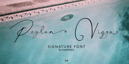 Really excited to introduce Peylon Viggo is gorgeous handmade signature font. Peylon Viggo signature includes alternative and ligatures to make everything look natural handmade signature. Included: Uppercase Lowercase Number & Symbol International Glyphs Multilingual Support Ligature Alternative If you need anything else just shoot me on email at: dedukvic@gmail.com Hope you enjoy it.
 - 1470 Jenson Latin by GLC,
$38.00 This family was inspired by the pure Jenson set of fonts used in Venice to print De preparatio evangelica in the year 1470. The present font contains all of the specific latin abbreviations and ligatures used in the original. Added are the accented characters and a few others not in use in this early period of printing, also small caps, these, contained in a separate file in the Mac TT version. This font supports strong enlargements as easily than small size remaining very smart, elegant and fine. Decorated letters like 1512 Initials, 1550 Arabesques, 1565 Venetian 1584 Rinceau or other fonts from GLC Foundry, can be used with this family without anachronism. If Italic style is required, we recommend the use of 1557 Italique.
 - Pardon Me Boy! by Greater Albion Typefounders,
$8.00 Pardon me boy, is that the Chattanooga Choo-choo? Well, not quite, but "Pardon Me Boy!" is a set of silhouette based ornaments capturing railway locomotives and rolling stock from around the world. Use it to form up trains to make suitable themed rules and borders, or just for fun anywhere a bit of locomotive power will add life and movement!
 - Nicolas Jenson SG by Spiece Graphics,
$39.00 It was the original work of fifteenth century designer Nicolas Jenson that formed the basis for this roman serif style developed by Ernst Detterer in 1923. Similar in spirit to other early twentieth century revivals such as Centaur, Cloister Old Style, and Italian Old Style, Nicolas Jenson is distinguished by its pristine and delicate nature. A gifted young apprentice to Detterer, Robert Hunter Middleton, greatly expanded the family. And by 1929, bold, italic, and open were part of the Ludlow Foundry’s beautiful Nicolas Jenson Series. It was reintroduced under a new name, Eusebius, in 1941. This digital version includes a new medium and extrabold weight with intermediate small caps and swash alternates throughout the family. There is also a regular expert version with a variety of currency symbols plus a regular petite caps (regular x-height small caps) and old style figures version. Nicolas Jenson is now available in the OpenType Std format. Small caps, old style figures, and swash alternates have all been combined into one style for ease of use. You will also find an additional regular petite caps version included with the regular style. Some new characters have been added as stylistic alternates and historical forms. These advanced features work in current versions of Adobe Creative Suite InDesign, Creative Suite Illustrator, and Quark XPress. Check for OpenType advanced feature support in other applications as it gradually becomes available with upgrades.
 - MFC Carson Monogram by Monogram Fonts Co.,
$24.95 The source of inspiration for Carson Monogram is a letter set from the book, Art Monogram and Lettering by J.M. Bergling, Vol. 1, Fifth Edition published in 1912. This elegant historical style was simply labeled, "New Antique 53". Carson Monogram can create one, two, or three letter monograms as well as basic headline and titling settings. By default, Carson Monogram types in a horizontal format, but by utilizing OpenType Contextual Alternates, you can typeset in a three smallcap diagonal format as well! It is a refined look that is perfect for a wide array of classic personalization settings. Download and view the MFC Carson Monogram Guidebook if you would like to learn a little more.
 - Dance Lesson JNL by Jeff Levine,
$29.00 Dance Lesson JNL is a reinterpretation of the popular "Latin Bold" typeface. The font's name is a reference to the Latin dance craze of the 1950s, when the Cha-Cha, Meringue, Tango, Mambo and even the "Chalypso" - a hybrid of Cha-Cha and Calypso rhythms had everyone moving to the beat of Central and South America.
 - Mainframe BB - Personal use only


