1,150 search results
(0.026 seconds)
- Collins Old English by Scriptorium,
$12.00 - Collins Butter Hollow by Omotu,
$18.00 Collins Butter is a display sans font. Comes with 2 fonts family, solid and hollow. Great for logotype, branding, packaging design, poster design, website / display, editorial, headline, and more. Whats Include? Uppercase and lowercase characters Supports international languages Opentype features: alternates and ligatures. Accessible in the Adobe Illustrator Glyphs panel, or under Stylistic Alternates in the Adobe Photoshop OpenType menu, Adobe InDesign, Corel Draw, even work on Microsoft Word
 - Aerovias Brasil NF - 100% free

- Aerovias Brasil NF by Nick's Fonts,
$10.00Eponymous logotype lettering on an airline timetable from 1948 inspired this exercise in aerodynamics. This typeface’s streamlined design remains fresh, even sixty-plus years on. Both versions include the complete Unicode Latin 1252, Central European 1250 and Turkish 1254 character sets, as well as localization for Lithuanian, Moldovan and Romanian. - Brazil Nut JNL by Jeff Levine,
$29.00 Brazil Nut JNL comes from hand lettering on some 1920s sheet music from Florenz Ziegfeld's musical comedy "Rio Rita".
 - Brazil Pixo Reto by Just in Type,
$20.00In Brazil, young people sign their gang names on the top of São Paulo City buildings. Their letters are tall and structured just like the buildings that they have to scale. For them, typography has become an extreme sport. The font Brazil Pixo Reto pays homage to these new athletes of design. - Gaitera Ball - Personal use only

- Bill Hicks - Unknown license

- Buffalo Bill by FontMesa,
$35.00 Buffalo Bill is a revival of an old favorite font that’s been around since 1888, the James Conner’s Sons foundry book of that same year is the oldest source I've seen for this old classic. If you're looking for the font used as the logo for Buffalo Bill’s Irma Hotel in Cody Wyoming please refer to the FontMesa Rough Riders font. New to the Buffalo Bill font is the lowercase and many other characters that go into making a complete type font by today’s standards. The Type 1 version is limited to the basic Latin and western European character sets while the Truetype and OpenType versions also include central and eastern European charcters. William F. (Buffalo Bill) Cody called America’s Greatest Showman was one of the United State’s first big celebrity entertainers known around the world, millions of people learned about the Old West through Buffalo Bill’s Wild West shows which traveled throughout the United States and Europe. William Cody, at age eleven, started work on a cattle drive and wagon train crossing the Great Plains many times, he further went on to fur trapping and gold mining then joined the Pony Express in 1860. After the Civil War Cody went on to work for the Army as a scout and hunter where he gained his nickname Buffalo Bill. In 1872 William Cody started his entertainment career on stage in Chicago along with Texas Jack who also worked as a scout, the Scouts of the Prarie was a great success and the following year it expanded to include Wild Bill Hickok and was eventually named The Buffalo Bill Combination. By 1882 Texas Jack and Wild Bill Hickok had left the show and Buffalo Bill conceived the idea for the traveling Wild West Show using real cowboys, cowgirls, sharpshooters and Indians plus live buffalo and elk. The Wild West shows began in 1883 and visited many cities throughout the United States. In 1887 writer Mark Twain convinced Cody to take the show overseas to Europe showing England, Germany and France a wonderful and adventuruos chapter of American history. The shows continued in the United States and in 1908 William Cody combined his show with Pawnees Bill’s, in 1913 the show ran into financial trouble and was seized by the Denver sheriff until a $20,000 debt (borrowed from investor Harry Tammen) could be paid, Bill couldn't pay the debt and the loan could not be extended so the assets were auctioned off. William Cody continued to work off his debt with Harry Tammen by giving performances at the Sell’s-Floto Circus through 1915 then performed for another two years with other Wild West shows. William F. Cody passed away in 1917 while visiting his sister in Denver and is buried on Lookout Mountain joined by his wife four years later. Close friend Johnny Baker, the unofficial foster son of William Cody, began the Buffalo Bill Memorial Museum in 1921, over the years millions of people have visited William Cody’s grave and museum making it one of the top visitor attractions in the Denver area. William F. Cody romantisized the West creating the Wild West love affair that many still have for it today through books and cinema.
 - Jelly Ball by Yumna Type,
$15.00 Finding a perfect font for your project which always looks good in different display types can be a complicated task. Furthermore, the right font choice determines the success and the failure of your project. Unfortunately, if you fail to find the perfect one, you will waste your time, money and energy. Therefore, we would like to introduce you to Jelly Ball, a perfect font for any different display types without decreasing the legibility. Jelly Ball is a display font in round shapes on the letters’ edges to produce different effects on different applications. Generally, such a display font shows amazing, fresh, modern expressions to highlight important messages, to attract readers’ attention, and to beautify the display as well. The letters’ forms and proportions are relatively consistent enough to be legible. An extra bonus given is the clipart. You can also enjoy the available features here. Features: Multilingual Supports PUA Encoded Numerals and Punctuations Jelly Ball fits best for various design projects, such as brandings, posters, banners, headings, magazine covers, quotes, invitations, name cards, printed products, merchandise, social media, etc. Find out more ways to use this font by taking a look at the font preview. Thanks for purchasing our fonts. Hopefully, you have a great time using our font. Feel free to contact us anytime for further information or when you have trouble with the font. Thanks a lot and happy designing.
 - Razor Bill by Red Rooster Collection,
$45.00 Based on the original typeface from Face, London, circa 1972.
 - Bill Display by OGJ Type Design,
$29.00 Bill Display is a post-Max Bill font, developed in close cooperation with the Max Bill Georges Vantongerloo foundation. MAX BILL Last universal scholar, most important design teacher of the 20th century: There are superlatives, always very enthusiastic, when the importance of Max Bill is discussed. The trained silversmith studied at the Bauhaus, with personalities such as Josef Albers, Paul Klee and Oskar Schlemmer. He worked as an architect, later as sculptor and designer.
 - Bill Smith by Ghuroba Studio,
$20.00 Bill Smith is a fast writing brush script with textures and swashes. This will make your design or project look perfect with authentic characteristics. It's perfect for branding, marriage invitations, poster designs, business cards, bulletins, stationery, logos, packaging, design and more.
 - Baile Guneta by TM Type,
$12.00 Baile Guneta is an elegant script font with a contemporary atmosphere and impeccable form, inspired by timeless classic calligraphy. Not too thin and not too thick, balanced and varied, this font was designed to enhance the beauty of your projects. This font is PUA encoded which means you can access all glyphs and swashes with ease!
 - Bill Poster by Smartfont,
$18.00 A powerful, energetic and exciting condensed typeface. It brings charming curves and satisfying patterns to traditional condensed fonts. It's designed for impact, without sacrificing style or legibility. It looks especially stunning in large scale, although it still carries a punch at smaller point sizes. It's born to be! Ideal for magazine, posters, headlines and pull quotes.
 - Architype Bill by The Foundry,
$99.00 Architype Universal is a collection of avant-garde typefaces deriving mainly from the work of artists/designers of the inter-war years, whose ideals underpin the design philosophies of the modernist movement in Europe. Their ‘universal’, ‘single alphabet’ theory limits the character sets. Architype Bill was developed from the few letterforms created by Max Bill for a 1949 exhibition poster. All the forms, with the exception of the letter ‘o’, were constructed using only straight lines and triangles on a purely mathematical basis, that showed the continued influence of his earlier Bauhaus training, and the universal alphabet principle.
 - Butterfly Ball by Hanoded,
$15.00 The Butterfly Ball and the Grasshopper's Feast is a 70's concept album/rock opera by Deep Purple's Roger Glover. The music video to Love Is All, featuring a lute playing frog in a cape, must be one of the best videos ever made. At least, I believe so. When working on this font, the song popped up in my head (it is still there), so I decided to name this cute, cartoonish font after the album. Butterfly Ball is a fun and happy typeface with rounded glyphs and an uneven baseline. Of course it comes with a hallucinatory range of diacritics.
 - Painted Ball by Letterhend,
$16.00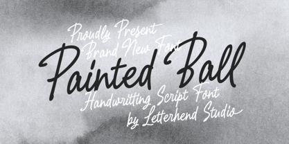 Painted Ball - a monoline script with natural handwritting feel. This type of font perfectly made to be applied especially in logo, headline, signage and the other various formal forms such as invitations, labels, logos, magazines, books, greeting / wedding cards, packaging, fashion, make up, stationery, novels, labels or any type of advertising purpose. Features : uppercase & lowercase numbers and punctuation multilingual alternates / swashes and ligatures PUA encoded We highly recommend using a program that supports OpenType features and Glyphs panels like many of Adobe apps and Corel Draw, so you can see and access all Glyph variations.
 - Swing Bill by Monotype,
$29.99The Swing Bill font was designed as a display face for sport material or pop music posters, but has also been seen on TV. - Jingle Balle by Allouse Studio,
$16.00 Proudly Presenting, ingle Balle A Christmas Font With Two Styles. Jingle Balle is perfect for any titles, logo, product packaging, branding project, megazine, social media, wedding, or just used to express words above the background. Jingle Balle also come with Multi-Lingual Support. Enjoy the font, feel free to comment or feedback, send me PM or email. Thank You!
 - Bray Notes by Brithos Type,
$11.00 Bray Notes is a marker-style script font with casual style. Use it for any design project that requires a personalized appearance!
 - Jackrabbit's Bar & Grill - Unknown license

- Jackrabbit's Bar & Grill by SynFonts,
$39.00 - Trail Boss JNL by Jeff Levine,
$29.00 Trail Boss JNL emulates vintage wood type and was inspired by a few visual examples found online. The erratic widths of the letters are part of the intrinsic charm of this kind of lettering.
 - Old Trail JNL by Jeff Levine,
$29.00 An image of an antique metal marking stencil [circa late 1890s or early 1900s] reading “Folck’s Roller Mills #196 New Surprise manufactured by Wolfe Brothers, Cumberland, MD” had the words “New Surprise” rendered in a Western/Victorian typeface. Those letters served as the model for Old Trail JNL, which is available in both regular and oblique versions.
 - Overland Trail JNL by Jeff Levine,
$29.00 Overland Trail JNL is Jeff Levine Fonts’ interpretation of “Italian”, first introduced in 1821 by the Caslon & Catherwood Type Foundry. Unique and somewhat similar to Faux Pas JNL with its eccentric stroke weights (opposite what is considered normal for serif fonts), the typeface features a design most associated with the Old West. Overland Trail JNL is available in both regular and oblique versions.
 - Cattle Trail JNL by Jeff Levine,
$29.00 Modeled after an image of an almost complete set of Latin Condensed wood type, Cattle Trail JNL is available in both regular and oblique versions.
 - Western Trail JNL by Jeff Levine,
$29.00 For decades, Samuel Welo’s “Studio Handbook for Artists and Advertisers” was a source of inspiration for sign painters, graphic artists and designers. In later years, many digital revivals of Welo’s hand lettered typography have been made available. Western Trail JNL is the latest member of such digital fonts, and is available in both regular and oblique versions.
 - Day And Collins Logotypes by Jeremia Adatte,
$20.00 Please Note: as this is a picture-only font, there are no latin alpha/numeric glyphs. Each wood type manufacturer had their own selection of original Logotypes or Catchwords designs. These are taken right from the original source material, an extremely rare 1910 catalog of an English wood type maker called Day & Collins in London. As the name says it, these words are intended to attract attention, to spice up posters, packaging or advertisement designs. I made these available for the digital age, leaving the original texture of printed wood type at the highest detail possible.
 - PR Bramble Wood 1 by PR Fonts,
$15.00 This font is a collection of spiraling vines with thorns. This can be suitable for themes where beauty is combined with suffering. Adjacent letters will provide left and right versions of the same design, and shift will access the inverted version. Combines well with: PR Bramble Wood 2, PR Hallow Doodles 01, PR Hallow Doodles 02, PR Cauldron, PR Swirlies 01, PR Swirlies 05.
 - PR Bramble Wood 2 by PR Fonts,
$15.00 This font is a collection of spiraling vines with thorns. This set is heavier than BrambleWood 1, more like the thorns that encased Sleeping Beauty’s castle. Adjacent letters will provide left and right versions of the same design, and shift will access the inverted version. Combines well with: PR Bramble Wood 1, PR Hallow Doodles 01, PR Hallow Doodles 02, PR Cauldron, PR Swirlies 01, PR Swirlies 05.
 - Milla Cilla - Personal Use - Personal use only

- Black Shirt Slime Trail - Unknown license

- Happy Brain Creepy Thalamus by TypoGraphicDesign,
$19.00 CONCEPT/ CHARACTERISTICS The base was a head-vein illustration. This served as a design grid. Novel letterforms were sought and found. Hand-drawn analog and digitized later. Experimentally, novel, fresh and an eye-catcher. Completely new insights into the human brain. A font for happy thoughts. ghostly visions, or simply for the next freshen party flyers. APPLICATION AREA The happy, creepy, Horror handmade font »Happy Brain Creepy Thalamus« with many language support would look good at headlines. Magazines or websites, party flyer, movie posters, music Poster, music covers or webbanner. TECHNICAL SPECIFICATIONS Headline Font | Display Font | Handmade Horror Font "Happy Brain Creepy Thalamus" OpenType Font with 283 glyphs, alternative letters and ligatures (with accents & €) & 1 style (regular).
 - KR Eight Ball - Unknown license

- 20.000 dollar bail - Unknown license

- Rail Line JNL by Jeff Levine,
$29.00 Rail Line JNL is a font for the railroad enthusiast for making their own model train car emblems. The logos contained in this font are or may be the property of the various rail companies, their assigns and/or successors. Outside of non-profit hobby use or for historical/educational purpose under the Fair Use rules, any commercial application of these logos must be obtained by written permission by the respective logo owner or owners. Jeff Levine fonts provided Rail Line JNL strictly as a hobby font. We assume no liability for the use, misuse or misrepresentation of any of the logos contained within the font file.
 - Bill Corporate Medium by OGJ Type Design,
$35.00 Bill Corporate is a geometric typeface with generous capitals. A modern classic, based on Max Bill’s lettering work, its straightforward and uncompromising construction can be both edgy and sublime. With minimalist letterforms, pointy apexes instead of flat ones, and archetypal proportions, this font family doesn’t follow any trends but strives to achieve a timeless formal vocabulary. The skeleton of its letters is based heavily on the famous primary shapes of the Bauhaus: square, circle, and triangle. This makes for quite wide uppercase and much narrower lowercase letters. The contrast between uppercase and lowercase benefits inexperienced users, who will be able to get appealing results quickly. At the same time, it’s a powerful tool for seasoned designers, who can employ either case selectively to set the desired typographic course. Bill Corporate Medium’s 16 styles (including a set of eight lighter-than-light fonts from “Two” to “ExtraLight”) are an excellent choice for editorial design, branding, headlines, and even short to mid-length copy in a wide range of applications and industries. The uppercase letters in particular—with their varied widths and lavish dimensions—are suitable for cosmopolitan and stylish logotypes and wordmarks. Whenever a timeless, staid, and classy look is demanded, choose Bill Corporate.
 - Ball Game JNL by Jeff Levine,
$29.00 What has become a rite of passage at baseball games got its start in 1908 when lyricist Jack Norworth and music composer Albert Von Tilzer wrote "Take Me Out to the Ball-Game" (which was published by Von Tilzer's York Music Company). The Art Nouveau hand lettered title on the cover of the sheet music was eccentric and attractive enough to warrant being turned into a digital type face, and in honor of its namesake song is called Ball Game JNL; available in both regular and oblique versions.
 - Top Billing JNL by Jeff Levine,
$29.00Sometimes the simplest ideas yield more than one result. The basic “dot matrix” design of aligned circles that was the basis for Transactive JNL also yielded Zera JNL (connected rings) and Pillow Puff JNL (fluffy and cloud-like lettering). One more design was originally cast aside. A separate file is available for filling in the letters with a colored background, however minute adjustments may be needed due to the fact that each drawing or design software program has its own characteristics and quirks. NOTE: DO NOT purchase the fill font as a “stand alone” type face because of the difference in spacing and alignment. For the dot matrix look in your work, please purchase Transactive JNL.


