1,150 search results
(0.049 seconds)
- Orlock by Scriptorium,
$18.00Orlock was developed by Michael Scarpitti from a sample of hand lettering on the poster of the classic silent film Nosferatu. It is a bit different from the types of fonts Mike has done for us previously. The style of the letters is characteristic of graphic design of the German Expressionist movement of the 1920s. The name of the character is borrowed from the Vampire villain of the film. - Wordy Diva by Chank,
$99.00Take a gander at this jaunty, journal-inspired handwriting style. Wordy Diva was drawn in 1995 by Lisa Bralts and faxed to Chank Diesel. The fax was converted to font format, and it soon became one of Chank's most popular handwriting fonts. You can download this hurried yet intelligent lady's handwriting font today. - Reo by Our House Graphics,
$9.00 Reo is a novel two layered, display font with a decidedly retro look and feel, inspired by the toothy grins of 1930�s and 40�s era truck grilles and the gleaming, streamlined efficiency of the automat. Reo Front (Foreground) is where all the detail resides, and Reo Back provides a background layer.
 - Benson Script by Kyle Wayne Benson,
$10.00 Benson Script is a script that is desperately trying to be anything but a script. With 3 contrast levels, and 2 styles, the six styles of Benson Script are an experiment in the diversity of a single stem width. Modernism’s desire to fit all elements within geometric constraints and adhere to strong verticals has spread throughout type design, but has had little to do with the frills and ornaments of script. Cutting a script down to its bare bones is an offensive idea to many—almost seeming insulting to its genre. Benson Script bridges that genre gap between frill and function. As a matter of genre Benson Script errs on the side of modernism, and adds flair as a last resort. Read more about her open type features, and the development process here.
 - Gundrada ML by HiH,
$12.00 Gundrada ML was inspired by the lettering on the tomb of Gundrada de Warenne. She was buried at Southover Church at Lewes, Sussex, in the south of England in 1085. The Latin inscription on her tomb, STIRPS GUNDRADA DUCUM, meaning “Gundrada, descendant of the Duke” may have led to the speculation that she was the daughter of William, Duke of Normandy and bastard son of Robert the Devil of Normandy and Arletta, daughter of a tanner in Falaise. In 1066 William defeated Harold at the Battle of Hastings and was crowned William I of England. More commonly known as William the Conquerer, he commissioned a string of forts around the kingdom and charged trusted Norman Barons to control the contentious Anglo-Saxon population. William de Warenne, husband of Gundrada, was one of these Barons. There has also been the suggestion that Gundrada may have been the daughter of William’s wife, Matilda of Flanders, by a previous marriage. According to the Dictionary of National Biography (Oxford University Press, Oxford, England 1921-22), both of these contentions are in dispute. Searching the past of a thousand years ago is like wandering in a heavy fog: facts are only dimly in view. Regardless, I know that I found these letterforms immediately engaging in their simplicity. Unadorned and unsophisticated, they have a direct honesty that rests well in the company of humanistic sans serifs like Franklin Gothic or Gill Sans, appealing to a contemporary sensibility. The lettering on the tomb is in upper case only. Although Gundrada does not sound Norman French to me, her husband certainly and her father probably were Norman French. Nonetheless, the man that carved her tombstone was probably Anglo-Saxon, like most of the people. For that reason, we are quite comfortable with a fairly generic lower case from an Anglo-Saxon document of the time. The time was a time of transition, of contending language influences. This font reflects some of that tension. Features 1. Multi-Lingual Font with 389 glyphs and 698 Kerning Pairs. 2. OpenType GSUB layout features: onum, dlig, liga, salt & hist. 3. Tabular Figures and Alternate Old-Style Figures. 4. Alternate Ruled Caps (line above and below, matching to brackets). 5. Central Europe, Western Europe, Turkish and Baltic Code Pages. 6. Additional accents for Cornish and Old Gaelic. 7. Stylistic alternates A, E, y and #. 8. Ligatures ST, Th, fi and fl. 9. Historic alternate longs. The zip package includes two versions of the font at no extra charge. There is an OTF version which is in Open PS (Post Script Type 1) format and a TTF version which is in Open TT (True Type)format. Use whichever works best for your applications.
 - Aint Nothing Fancy by Hanoded,
$15.00 A nice, ‘normal’ script font without the frills and thrills of my other work. It’s a handwritten typeface with a schoolboy kind of feel to it. Use it for your websites, your letters and product descriptions! Because of its unobtrusive nature, the font won't attract too much attention, so your work will stand out better.
 - Quiche by Adam Ladd,
$25.00 Quiche is a high-contrast, sans serif typeface featuring ball terminals and angled stems. A complete branding suite, the 4 subfamilies were created to work harmoniously together based on the need. The design is influenced by the Didone genre, characterized by its elegance and extreme thick/thins, but it removes the serifs for a unique and modern expression. The high-contrast style exudes sophistication while the ball terminals soften the overall look to make it feel a little more approachable.
 - Mailbox Letters Two JNL by Jeff Levine,
$29.00Mailbox Letters Two JNL is the second typeface from Jeff Levine inspired by metal lettering used on mailboxes and homes. Each cast letter or number sat on a lower "rail" which was then slipped into a slot that held them firmly in place. Jeff's Inventory JNL looked close enough to the original type style to use as a model for this font, and for typographic purposes there are certain punctuation and other glyphs that "float" above the rail. Limited character set. - Moranga by Latinotype,
$29.00 Moranga is a contemporary, serif, retro-style typeface with a strong personality. Its design is a mixture between Café Brasil's flowing, organic shapes and elements from 70's popular fonts such as Cooper and Souvenir. Moranga, in 5 weights and matching italics, is the perfect choice for headlines, display use and high-impact or friendly designs. Moranga contains a set of more than 400 characters and supports over 200 Latin-based languages.
 - Nevoa by Océane Moutot,
$32.99 Nevoa is a typeface inspired by the vernacular calligraphy from the streets of Brazil. While walking in the streets of some small towns, I felt so inspired by those rounded letters painted on the walls. That is what inspired Nevoa. Nevoa is a soft and smooth serif typeface, with dynamic curves. It is available in Condensed, Semi Condensed, Regular, Semi Extended and Extended to adapt to various uses, such as visual identity, magazine, branding, ...
 - Gibbs by Typetanic Fonts,
$39.00 Gibbs is a tough, sophisticated sans, inspired by the unique cast aluminum signs found on board the 1950s luxury liner SS United States and named for its designer, William Francis Gibbs. The design is appropriately transatlantic, somewhere in between industrial American vernacular lettering and English humanist styles. The result is both uniquely stylish and comfortably readable in both text and display sizes. Gibbs received a Type Directors Club award for excellence in 2015.
 - MPI Tuscan Extra Condensed by mpressInteractive,
$5.00 Tuscan X Condensed (whose actual name is Gothic Concave Tuscan Extra Condensed) was first produced in wood type by William H. Page & Company around 1872. The design is derived from a Gothic Condensed typeface, but with vertical stokes bowing inwards at the center. We modified the weight of the uppercase characters (since the original wood type has a lowercase much thinner than the caps) to harmonize with the lowercase when used digitally.
 - Empire by Font Bureau,
$40.00 In 1937, Morris Fuller Benton designed Empire, titling capitals that became the headline style for Vogue magazine. In 1989, David Berlow revived it for Publish magazine, adding an italic and a lowercase, both unavailable in the original. He revisited Empire in 1994 with Kelly Ehrgott Milligan, adding two heavier weights, small caps, and an elegant set of Art Deco–flavored oldstyle figures, ultimately expanding it to a seven-part series; FB 1989–94
 - Gulti Brush by Piece of Cake Typework,
$19.00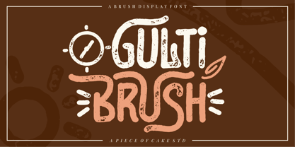 Hello World, Introducing, Gulti Brush is a textured display font suitable for your design project needs, such as; social media posts, quotes, overlays on images, taglines, logos, posters, print needs, website banners, and more. Features * A set of uppercase and lowercase glyphs * Number, symbol, and punctuation * Multilingual Support * Alternate * Swashes Thank you a million times for downloading and using this font for your projects. Enjoy this font and happy creating! Thank You
 - Humble Manford Font Duo by Jinan Studio,
$12.00 Humble Manford Font Duo is an excellent choice for logo design, branding, packaging, business card, and adventure-themed designs. Its combination of script and sans serif styles, along with the textured and solid options, provides ample creative opportunities for designers to explore and create stunning visual identities and marketing materials. Thank you a million times for buying and using this font for your projects. Enjoy this font and happy creating! Jinan Studio
 - Caravan by Linotype,
$29.99Caravan was designed in 1938 by William Addison Dwiggins and consists of a variety of ornaments. He based the forms of the ornaments on the same lines and curves found in his font Electra. He wanted printers and designers to have the chance to combine the two fonts for a more attractive or outstanding overall picture. Caravan is particularly popular for advertisements in newspapers. Caravan can be easily mixed with other fonts designed by Dwiggins. - Blow Jumped by Piece of Cake Typework,
$17.00 Hello World, Introducing, Blow Jumped is a casual display font suitable for your design project needs, such as; social media posts, quotes, overlays on images, taglines, logos, posters, print needs, website banners, and more. Features * A set of uppercase and lowercase glyphs * Number, symbol, and punctuation * Multilingual Support * Extrude Version * Some Swashes Thank you a million times for downloading and using this font for your projects. Enjoy this font and happy creating! Thank You
 - Clarified JNL by Jeff Levine,
$29.00 Based on William H. Page’s Clarendon Extended wood type from the 1800s, Clarified JNL is digitally available in both regular and oblique versions. In the days of wood and metal type, foundries often made changes to an existing design to make their font more unique and different from their competitors. Clarified JNL is different from Clarenwood JNL (which is partially based on another wood type Clarendon and features many alternate letter forms).
 - Diilgant by Piece of Cake Typework,
$19.00 Hello World, Introducing, Diilgant is a textured script font suitable for your design project needs, such as; social media posts, quotes, overlays on images, taglines, logos, posters, print needs, website banners, and more. Features * A set of uppercase and lowercase glyphs * Number, symbol, and punctuation * Multilingual Support * Alternates, ligatures, and swashes Thank you a million times for downloading and using this font for your projects. Enjoy this font and happy creating! Thank You
 - Raleigh by ParaType,
$30.00 Raleigh was produced in 1977 by Robert Norton based on Carl Dair’s Cartier typeface which was designed for the 1967 Montreal World's Fair. It was renamed after Dair’s death. Adrian Williams added three weights for a display series, and Robert Norton developed the text versions. A contemporary old style serif with calligraphic features. For use both in text and display typography. Cyrillic version was developed at ParaType in 2001 by Vladimir Yefimov.
 - Hola Witch by Piece of Cake Typework,
$19.00 Hello World, Introducing, Hola Witch is a display font suitable for your design project needs, such as; Halloween themes, social media posts, quotes, overlays on images, tagline logos, posters, print needs, website banners, and more. Features * A set of uppercase and lowercase glyphs * Number, symbol, and punctuation * Multilingual Support * Some Swashes and alternates Thank you a million times for downloading and using this font for your projects. Enjoy this font and happy creating! Thank You
 - Rohyt by Typesketchbook,
$55.00 Rohyt is a contemporary Sans-serif typeface made up of 32 fonts across 8 weights with normal and slim options. It’s a unique and modern sans typeface, which is well suited for a variety of typographic applications such as headlines and small texts. The Brilk font family supports multiple languages and is available as both webfont and desktop font.
 - Tamiami JNL by Jeff Levine,
$29.00Tamiami JNL is based on a popular old typeface from the early 1900s, best known as "Cuba". 90 miles Northwest of that tropical island is Miami, Florida... and the Tamiami Trail was one of the first connecting routes between the City of Tampa on the West coast of Florida and Miami on the East coast - hence the conjunction "Tamiami". - Dirty Money SRF by Stella Roberts Fonts,
$25.00 Dirty Money SRF is a novelty font with a limited character set emulating the lettering found on U.S. currency. The typeface was designed by Brad O. Nelson of the Brain Eaters Font Company. The net profits from my font sales help defer medical expenses for my siblings, who both suffer with Cystic Fibrosis and diabetes. Thank you.
 - Shesek by Hanoded,
$15.00 Shesek is an informal, loose, handwritten font without any frills. It is deceivingly plain, but when you use it, you will find out that Shesek has a distinct taste, not unlike its namesake, the Japanese plum, or Loquat. The Loquat is a soft, oval, yellow fruit which is grown mostly in Japan and Israel (where it is called ‘Shesek’).
 - Danger Girl by Comicraft,
$19.00 Ancient Evil! Nazi Spies! High Adventure! Spandex! As the sun sets and the sky fades from 100Y, 50M to 100Y, Jeff Campbell's Warm and Friendly Display Letterforms are already receding over the far horizon in a Dakota, trailing a long broken red line all the way from Venice to Cairo! This font really does not belong in a museum!
 - Jazz Age by Studio K,
$45.00 Jazz Age is inspired by the Golden Age of Jazz, the Twenties and Thirties. Think Scott and Zelda Fitzgerald, cocktails, flappers and the whole Art Deco thing. Oh, and don't forget the radios, by which I mean old Bakelite valve or tube radios with their grilles and fretwork. This font is a celebration of them too.
 - Tipperary eText by Monotype,
$57.99Tipperary was designed by Steve Matteson and named for a favorite 'single track' bike trail, Tipperary is a monoline Humanist Sans Serif typeface. The clear, open, letter forms curve abruptly in an almost squarish geometry much like the sharp turns on the Tipperary trail. The clear, austere forms offer exceptional legibility for both interface designs and extended reading. Small size package labels and crisp branding programs benefit from Tipperary's emphasis on clean, readable design. eText typefaces are designed to meet the challenges of extended reading in digital environments such as mobile devices or desktop screens. Their forerunners are among the world's most popular and important book typefaces for print media. These classic designs were reinterpreted to conform to technological constraints of LCD and e-Paper while retaining the properties of proportion and form which made them favorites for print. - Bohemian Initials by Kaer,
$24.00 I’m happy to present you the Bohemian initials font family. Regular and Colored styles (Uppercase & Numbers) based on Codex Gigas originated in medieval Bohemia. The manuscript has been dated 1230. The elaborate initials are at the beginning of the main texts and their principal divisions. The painter was aiming to achieve a plastic depiction of the trailing vines of the initials, and he painted with solid colours. He used only four of the primary colours cinnabar red, blue, green and yellow, brightly toned, as well as white accents and contours. The trailing vines of the initial letters are painted in a decorative, advanced Romanesque style, already bordering on naturalism. The plant taken as the starting point is the acanthus, a thistle-like plant which grows wild in the Mediterranean countries. The decoration of the Devil’s Bible is not the work of an amateur. Scholars have concurred: it is book illuminations created in Northeast France and Southern England in the so-called Channel style which provided the starting point for the coiled trailing-vine shapes in the initials of the Devil’s Bible. --- You can use color fonts in PS CC 2017+, AI CC 2018+, ID CC 2019+, macOS 10.14 Mojave+ Please note that the Canva & Corel & Affinity doesn't support color fonts! --- Please feel free to request any help you need: kaer.pro@gmail.com Thank you!
 - Imagine if your handwriting decided to hit the gym, attend a few self-improvement workshops, and then came back with a new swagger—that's Billion Dreams for you, crafted by the wizard of letters, Mån...
- Terrorista by Just in Type,
$20.00 Terrorista is a homage to everyone who fought against the Millitary Regime in Brazil from 1964 to 1985. The Terrorista Marighella features generous inktraps, fits perfect for small sizes. Terrorista Dilma has the same design as the Marighella, but without inktraps, made for display. The last typeface from the package is Terrorista Lamarca, stencil version, all three weights have the same metrics, making it easier to use them together. Have a look at the Terrorista Specimen.
 - Clintone by Jinan Studio,
$12.00 Hello World, Introducing, Clintone! a display font with 2 style (textured & solid) suitable for your design project needs, such as; logotype, branding, packaging, social media posts, quotes, overlays on images, tagline logos, posters, print needs, website banners, and more. Features A set of uppercase and lowercase glyphs Number, symbol, and punctuation Multilingual Support Alternates Thank you a million times for downloading and using this font for your projects. Enjoy this font and happy creating! Jinan Studio
 - FTY Garishing Worse by The Fontry,
$20.00 Garishing Worse is a multi-language font supporting the complete Latin/Latin-1 character range, as well as Latin-A (Central European), Greek, Cyrillic and Hebrew. In other words, this is more than just the usual line-up of glyphical villains. There’s even a few OpenType features to make things interesting. Just type in a bullet or a hyphen and you'll be presented with some interesting alternatives. A cool ligature or two might even pop up.
 - Hai California by Colllab Studio,
$15.00 Meet Hai California, a handwritten font with a fancy script and a small-caps companion, this passionate pair of hand-drawn marker fonts is for logos + branding ,website design + website accents - think travel blogs, fashion blogs, & more, Clean print design, like magazines + flyers, header elements that need handwritten touch, quote graphics for social media. Hai California comes with stylistic alternate, ligatures, swashes, and multilingual support. Follow us for more great fonts. A Million Thanks Colllab Studio
 - Variety Store JNL by Jeff Levine,
$29.00 Ben Harris' illustrated cover for the sheet music of "I Found A Million Dollar Baby (in a Five and Ten Cent Store)" from 1931's "Billy Rose's Crazy Quilt" lists the show's stars and other credits in a pen lettered monoline design with rounded terminals. This early Art Deco type style has now become the digital font Variety Store JNL (a reference to the Five and Ten Cent stores alluded to in the song title from the sheet music).
 - 1479 Caxton Initials by GLC,
$20.00 This family was created inspired from the two sets of rough initials fonts used by the famous William Caxton in Westminster (GB) in the late 1400’s. As it was normal for the time, there were not any differences between I and J, U and V. It is not a mistake. We have reconstructed the few other missing characters. This font was conceived as a supplement for our 1479 Caxton but may be used with all our Blackletters fonts.
 - Bulldog Slab by Club Type,
$36.99 Figgins and Caslon may be names familiar to many as Type Founders. Indeed they are, but they are perhaps less well known for the emergence of Sans Serif type styles which have become part of our lives since 1889. The first hundred years of this style is celebrated with this design by Adrian Williams, completed in 1989. It echoes many features of the Gothic, Grotesque and Sans Serif models of the period, based particularly on the 1870 Figgins.
 - Big Caslon CC by Carter & Cone Type Inc.,
$35.00 The three largest sizes of type made by the Caslon foundry are strangely unlike the famously consistent text faces cut by William Caslon. Perhaps they were the work of other hands—or of the master in a funky mood. Caslon’s text types have often been revived, but the display sizes, forceful and a touch eccentric, had no digital version until Matthew Carter’s Big Caslon. With striking Italics and rich design features , this typeface shines at BIG sizes.
 - Bulldog by Club Type,
$36.99Figgins and Caslon may be names familiar to many as Type Founders. Indeed they are, but they are perhaps less well known for the emergence of Sans Serif type styles which have become part of our lives since 1889. The first hundred years of this style is celebrated with this design by Adrian Williams, completed in 1989. It echoes many features of the Gothic, Grotesque and Sans Serif models of the period, based particularly on the 1870 Figgins. - Piano Teacher by Haksen,
$14.00 This font is about fleeting vision, touch of moments. some letters may be illegible, but their shapes arouses emotions. sometimes in design emotions are more important. our brain can uncode the letter shapes.It includes full set of uppercase and lowercase letters, multilingual symbols, numerals, punctuation and ligatures. The font has bold texture. Thanks and have a great day, Haksen Studio