10,000 search results
(0.097 seconds)
- ITC Ziggy by ITC,
$29.99ITC Ziggy was designed by Bob Alonso, who says it started out as phone doodles in the early 1970s." Alonso rediscovered the sketches years later, thought they revived the feel of the 70s, and decided to digitize the typeface. He liked the form of the letter Z best, so named the font Ziggy. ITC Ziggy reminds its designer of "elephant bellbottoms" and its style as a display face instantly evokes a nostalgia for the 1970s. - ITC Jellybaby by ITC,
$29.99ITC Jellybaby is the work of British designer Timothy Donaldson, bouncing all over the place but somehow remaining compact and legible. It began as an extremely fattened version of Donaldson't typeface Pink but then became transformed into a play on the futuristic" typefaces of the 1960s. Jellybaby expresses both retro and modern design." - ITC Veljovic by ITC,
$29.99ITC Veljovic was designed by Jovica Veljovic and displays an obvious calligraphic heritage. The designer was strongly influenced by German designer Hermann Zapf and Israeli designer Henri Friedlander. ITC Veljovic exhibits a crisp precision, as if the letters were cut in stone rather than drawn with pen and ink. In 2014 Veljovic revised this family and ITC New Veljovic was released with many more weights and styles - ITC Stepp by ITC,
$29.99When Hal Taylor saw the 1930 logo for the Stetson Shoe Company of Weymouth, Massachusetts, he didn't run out and buy a pair of loafers. Instead, he seized on this striking example of an Art Deco logotype as the basis for a new typeface design. “I was impressed with the delicate and sophisticated letter forms,” Taylor recalls, “particularly the enlarged cap S -- in any other case it would have seemed unbalanced, but in the context of this logo, it worked perfectly.” All the letters in the original all-caps Stetson Shoe logo were rendered with condensed proportions except the O, which was a perfect circle. While the prominent O added visual interest to the logo, Taylor knew that such a character would limit his typeface to display applications. For versatility's sake, he drew his O for ITC Stepp with the same proportions as the rest of the alphabet. Taylor also gave the logotype's inverted S a more traditional design, but kept the original as an alternate character in the OpenType font. Taylor's toughest challenge during the design process was creating a lowercase. “A good type design tells you what it wants to be,” he says, “and after a little while the Stepp caps began to tell me what the lowercase should look like.” Taylor's lowercase is slightly more conventional than the caps. The jaunty g" and almost upside-down "s" add subtle charm, while the capital letters provide the broader gestures of Stepp's personality. Together, they create a versatile and distinctive typeface design. One of Hal Taylor's first jobs was as a photo-lettering typographer in Philadelphia, setting headlines and creating custom lettering. This was followed by a stint doing finished lettering for John Langdon, whose ambigrams appear in Dan Brown's best-selling novel, Angels & Demons. Today, Taylor works as a graphic designer in the publishing industry, but he still finds time to create an occasional hand-lettered book jacket, and draw handsome typeface designs. ITC Stepp is available in four weights, ranging from Light to Ultra Bold. All four weights have companion italics, and the lightest three weights also offer a suite of small caps." - ITC Forkbeard by ITC,
$29.99ITC Forkbeard is the work of British designer Michael Gills and named after a famous Viking warrior. Gills was inspired by the work of Victor Hammer as well as a lesser known uncial style called Andromaque. Distinguishing characteristics of ITC Forkbeard are its geometric overtones and its distinct capital and lower case letterforms. - ITC Scarborough by ITC,
$29.99ITC Scarborough was designed by Akira Kobayashi in 1998 to be reminiscent of the typefaces in advertisements of the 1930s. The special written form of the font has no connection between the letters and follows the principles of the brush scripts often used in the headlines and film trailers of this time. Kobayashi chose dynamic forms for his font, small yet robust with contrast between the strokes. ITC Scarborough is available in regular and bold weights and is best used for headlines and short texts. - ITC Liverpool by ITC,
$29.99Fat, bold, and comfortably bulbous; that's ITC Liverpool, designed by Kevin Bailey. The letterforms are soft and mildly eccentric, characterized by tiny counters that shift around from letter to letter like the highlights on cartoon eyeballs. Some of Liverpool's letters are reminiscent of display lettering from the '30s, yet this exuberant face would also be right at home in the '60s. Not for the typographically timid. - ITC Cali by ITC,
$29.99There are a few professions in which being left-handed confers an advantage-think of the great southpaw pitchers in major league baseball, like Sandy Koufax. Now, think of all the great left-handed calligraphers. Not so easy, right? Here's a hint: Luis Siquot. Far from being an advantage, Siquot's lefty orientation proved a hurdle to overcome. When I was young, I had serious problems writing," he recalls. "If there was a lot of text, I almost always soiled the paper with wet ink as my hand followed the pen." Then, a friend told Siquot about a special store in London that catered to left-handed people. It was there that he found an Osmiroid pen specially designed for left-handed calligraphers. ITC Cali is based on Siquot's use of this pen. "Electronic scans of my calligraphy were the foundation of the design," he says. "I was careful to leave in some imperfections to avoid an excessively mechanical look, and added the little notches in the strokes to imitate the texture of writing on a rough cotton paper." ITC Cali works equally well in text and display sizes, but it is a calligraphic script, Siquot warns, "and shouldn't be set in all capitals." That said, ITC Cali is a remarkably versatile design, well-suited to a variety of communication projects." - ITC Quorum by ITC,
$29.99Australian typographer Harry Pears continues to explore ancient type forms while maintaining his consultancy business Typeface Research Pty. Ltd., of Lake Cathie, Australia. Born in Quirindi, Australia, Harry has had a long career in printing and graphic arts and has been the guiding force behind the creation of the Lindisfarne Nova family. Lindisfarne Nova Incised and Lindisfarne Runes are wonderful illustrative companions to the Lindisfarne Nova text fonts. In a unique partnership, Harry develops the concepts, and calligrapher Margaret Layson brings the designs to life. They both then work on the digital incarnation in a true collaboration. - ITC Tomism by ITC,
$29.99ITC Studio Script was designed by Robert Evans, an informal script for applications in which a calligraphic look would be appropriate. The font includes a wide variety of alternate characters, which give a graphic designer's creativity no limits. - ITC Cherie by ITC,
$29.99Some words from the designer... Like long legs walking a runway in stiletto heels, ITC Cherie is both sophisticated and feminine. West coast designer Teri Kahan developed this art nouveau-style font into two distinct all capital alphabets – one with a “high waist”, placed in the capital position, and the other a “low-waist,” placed in the lower case position. They work separately or together, and this dual nature gives a designer the ability to make subtle changes in a logo or line of text. Additional flourished letters round out this versatile headline font. - ITC Kahana by ITC,
$29.99As if gliding in on the tide, ITC Kahana floats across the page with the pulse and sway of the sacred Hawaiian hula dance. The original drawings for this display typeface were created while designer Teri Kahan lived in the Aloha State, and its bold verticals symbolically convey the power and strength of the Polynesian people. Kahan has spent most of her life working with letters. She discovered Speedball lettering pens in her teens, opened a design studio that specialized in the lettering and calligraphic arts while in her early twenties, and grew her business in California and Hawaii. Today, she embraces new design challenges and digital technology, but letters are still at the core of her work. In ITC Kahana, Kahan created a design that is both distinctive and versatile. Menus, posters, display headlines, packaging and brochures fall easily within this typeface's range. And the word “kahana” is more than just a namesake: in Hawaiian, “kaha” means “to mark, draw, place, turn or surf,” and “na” means “belonging to.” ITC Kahana also includes an enchanting decorated alphabet in the lowercase position that expands this typeface's usefulness to the designer. - WTF Bokytime by Wasabib Type Foundry,
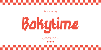
$17.00Bokytime is a display script font is a typeface that exudes elegance and sophistication with its flowing, timeless, minimalistic yet impactful sweeping letterforms. It captures attention and adds a touch of artistic flair to any design project. The ornate and decorative nature of display script fonts makes them ideal for creating a memorable impact in logos, headlines, invitations, and other creative applications. Bokytime is also bold and commanding, with thick, substantial letterforms. It conveys a strong presence and demands attention. Thick fonts are commonly used in headlines, posters, and other design projects where the goal is to make a bold statement. The weightiness of the strokes adds a sense of strength and solidity to the typography, creating visual impact and enhancing readability. - ITC Werkstatt by ITC,
$29.99ITC Werkstatt is a result of the combined talents of Alphabet Soup's Paul Crome and Satwinder Sehmi, along with Ilene Strizver and Colin Brignall. It is inspired by the work of Rudolph Koch, the renowned German calligrapher, punchcutter, and type designer of the first third of this century, without being based directly on any of Koch's typefaces. Werkstatt has obvious affinities with the heavy, woodcut look of Koch's popular Neuland, but also with display faces like Wallau and even the light, delicate Koch Antiqua. Brignall began by drawing formal letters with a 55mm cap height, which Sehmi reinterpreted using a pen with a broad-edge nib. “Not an easy process,” says Brignall, “since one of the features of Koch's style is that while it was calligraphic in spirit, most of the time his counter shapes did not bear any resemblance to the external shapes, as they would in normal calligraphy. This meant that Sehmi could not complete a whole character in one go, but had to create the outside and inside shapes separately and then ink in the center of the letters.” The process was repeated, only without entirely filling in the outlines, for the Engraved version. Crome handled the scanning and digitization, maintaining the hand-made feel while creating usable digital outlines. “The collaboration of artisans with particular skills,” says Brignall, “in a modern-day, computer-aided studio environment, seems very much in step with the 'workshop' ethos that Rudolph Koch encouraged and promoted so much.” - ITC Symbol by ITC,
$29.99ITC Symbol font was designed by Aldo Novarese, a simple, straightforward design of understated elegance. It has just the hint of a serif to aid legibility. Book and medium weights have a light, even color and are perfectly complemented by the bold and black weights. The italics are clear and simple, a comfortable companion to the roman. - ITC Eborg by ITC,
$29.99Designed by the highly regarded American designer George Ryan of the Galapagos Design Group. George is the veteran of a number of successful display fonts and there is no reason why ITC Eborg, with it's striking appearance, should not follow suit. Is it a bold casual sans serif or a disciplined brush script? Probably the former but only just. Whatever it's category though, ITC Eborg has the pedigree to become a highly successful and much sought after font. It has been carefully designed to maximize it's usage potential with conventional capitals combining well with a lowercase in which the x-height is just about right for both large display application whilst retaining good legibility at some of the smallish point sizes. ITC Eborg, with it's warm friendly qualities which are very much in evidence, and in a world where it has become so important to convey that casual approachable air," even in the most aggressive of advertising, be it product or service, it is definitely a style to fill the need." - ITC Grapefruit by ITC,
$29.99ITC Grapefruit is the work of Hungarian designer Gyori Attila, an angular, mannered and geometric display face with a loud appearance. ITC Grapefruit combines strong display characteristics with legibility and is suitable for a wide variety of uses. - ITC Biblon by ITC,
$29.99 - ITC Cyberkugel by ITC,
$29.99ITC Cyberkugel is the work of British designer Timothy Donaldson, who occasionally likes to write with an extra-fine ballpoint pen. I like the spindly scrawny forms that it gives me when I follow all the usual 'italic' writing conventions", he says. And there lie the origins of ITC Cyberkugel, although the creative process was moved from pen and paper to software and a Wacom tablet. "I like the fact that people will be buying it to give them a 'human', 'organic', 'non-digital' look, and yet no ink has soiled paper. Although the movements of the hand are still the essence, the whole thing was created in cyberspace." The name comes from combining cyberspace and Kugelschreiber, the German word for ballpoint pen. ITC Cyberkugel is a fresh interpretation of traditional calligraphy." - ITC Samuel by ITC,
$29.99ITC Samuel is a delicate and lively calligraphy font designed by Phill Grimshaw. Every detail has been worked to create harmony. The stroke contrast, the light brush character, the graceful forms all give ITC Samuel the spontaneity and individuality typical of handwriting. The font includes several ligatures and is legible even in smaller point sizes. ITC Samuel is perfect for invitations, greeting cards and other personal correspondence. - ITC Snap by ITC,
$40.99ITC Snap is the work of American designer David Sagorski and represents both the creativity and humor of the native Kansan. It clealy displays the influence of cartoon graphics of the 1960s and 70s, but does not need to be limited to period or animated graphics. ITC Snap is ideal for headlines which demand attention. - ATF Brush by ATF Collection,
$59.00Oh, Brush … beloved script emblem of plumbers, mechanics, bodegas, lunch counters, and other low-rent concerns. Since 1942, you have given faceless apartment buildings a name, brought life to the badges and banners of otherwise tedious trade conventions, and lent excitement to the postcards of middle America’s unsung travel destinations. We have seen so much of you … but not enough! We need more weights: how about five, extending beyond humdrum Medium? We want swash alternates, too, plus lively ligatures and sporty underline tails! Give us cleaner curves and smoother connections, but stay true to your frisky self! Like a nail salon that offers cucumber water, the new ATF Brush is one step classier than the rest. - ATF Garamond by ATF Collection,
$59.00The Garamond family tree has many branches. There are probably more different typefaces bearing the name Garamond than the name of any other type designer. Not only did the punchcutter Claude Garamond set a standard for elegance and excellence in type founding in 16th-century Paris, but a successor, Jean Jannon, some eighty years later, cut typefaces inspired by Garamond that later came to bear Garamond’s name. Revivals of both designs have been popular and various over the course of the last 100 years. When ATF Garamond was designed in 1917, it was one of the first revivals of a truly classic typeface. Based on Jannon’s types, which had been preserved in the French Imprimerie Nationale as the “caractères de l’Université,” ATF Garamond brought distinctive elegance and liveliness to text type for books and display type for advertising. It was both the inspiration and the model for many of the later “Garamond” revivals, notably Linotype’s very popular Garamond No. 3. ATF Garamond was released ca. 1918, first in Roman and Italic, drawn by Morris Fuller Benton, the head of the American Type Founders design department. In 1922, Thomas M. Cleland designed a set of swash italics and ornaments for the typeface. The Bold and Bold Italic were released in 1920 and 1923, respectively. The new digital ATF Garamond expands upon this legacy, while bringing back some of the robustness of metal type and letterpress printing that is sometimes lost in digital adaptations. The graceful, almost lacy form of some of the letters is complemented by a solid, sturdy outline that holds up in text even at small sizes. The 18 fonts comprise three optical sizes (Subhead, Text, Micro) and three weights, including a new Medium weight that did not exist in metal. ATF Garamond also includes unusual alternates and swash characters from the original metal typeface. The character of ATF Garamond is lively, reflecting the spirit of the French Renaissance as interpreted in the 1920s. Its Roman has more verve than later old-style faces like Caslon, and its Italic is outright sprightly, yet remarkably readable. - ITC Oldrichium by ITC,
$29.99Spirited, unaffected and buoyant, the ITC Oldrichium type family pays homage to the calligraphy and typeface designs of Czech designer Oldrich Menhart. “I came upon one of Menhart's typefaces over a decade ago,” says George Thompson, designer of ITC Oldrichium. “I've been collecting examples of his work ever since.” Thompson was born in Chicago and grew up in north-west Indiana. “While I've been an educator and general graphic designer for over 30 years, lettering and type design have always been an important part of my work,” he says. Thompson now spends much of his free time designing typefaces. ITC Oldrichium is a subtle melding of the shapes and proportions of Menhart's Manuscript typeface, the energetic strokes of his calligraphy, and Thompson's own design skills. The result is a distinctive, powerful, and exceptionally versatile typeface family. Available in light, regular, demi bold and bold weights, with corresponding italics for all but the bold, ITC Oldrichium is comfortable setting both text and display copy. In addition to the basic weights, Thompson has created an Engraved version for those times when an especially powerful statement is called for. - ITC Bookman by ITC,
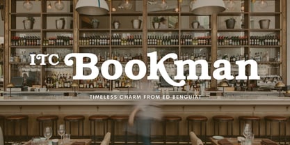
$40.99ITC Bookman font was designed by Edward Benguiat, whose goal was to design a typeface that had a clear resemblance to previous Bookman faces but was different and more versatile. This typeface retains all the traits of the original and adds a large x-height and moderate stroke contrast for optimal legibility. ITC Bookman font also has italics which are true cursive forms, as opposed to oblique roman characters. Featured in: Best Fonts for Tattoos - ITC Pino by ITC,
$29.99The ITC Pino™ typeface family is Slobodan Jelesijevic’s second suite of commercial fonts. Although a small family of three weights, it is remarkably versatile. Like many typefaces, Pino grew out of a desire for a particular kind of design. Jelesijevic was creating a series of illustrations for a children’s magazine and needed a typeface that was lighthearted, legible and would complement his illustrative style. Unable to find exactly what he needed, he decided to make his own font. “I spent the better part of a day looking for just the right typeface,” he recalls. “Of course, the hard part was finding something that would harmonize perfectly with my drawings. A custom font was not part of the project brief or budget, but I thought that perhaps I could use it again.” The regular weight of Pino became the solution to Jelesijevic’s problem. Jelesijevic did use the font again, but quickly realized that the single weight needed companion designs. Pino Bold and Black followed in quick succession. Before licensing the designs to ITC, the three-weight family provided headlines, book cover titles and even short blocks of text copy in several of Jelesijevic’s design projects. Born in Gornji Milanovac, Serbia, in 1951, Jelesijevic graduated with a degree in graphic communication and lettering from the Faculty of Applied Arts in the University of Arts in Belgrade. Currently, in addition to typeface design, he is sought out as a graphic designer and illustrator. When not working on design projects, he teaches graphic communications at the Faculty of Art in the University of Niš, Serbia. Pino is a stressed sans of slightly condensed proportions. Pino’s generous x-height, clearly defined counters and distinctive character shapes enable it to fulfill a wide variety of typographic applications. Friendly without being sanguine, the Pino type family will communicate with charm and vitality. - ITC Kumquat by ITC,
$29.99ITC Kumquat is the work of American designer Eric Stevens. He started with the logo for his company, Tower of Babel Design, and expanded upon the Mesopotamian look to create a typeface to match. Stevens imagined drawing figures in the sand with a stick and how this method would change the way one usually draws characters, usually with lines replacing curves. Most characters are slim but a few, like the uppercase A and L, were made to contrast with the rest. ITC Kumquat is a great display typeface for anything which should have an antiquated feel."" - ITC Vineyard by ITC,
$29.99Although inspired by the engraved lettering on eighteenth-century English trade-cards, ITC Vineyard has unusual characteristics of its own. The type retains some quality of copperplate scripts, but the differentiation between thicks and hairlines is not very sharp. There are a few cursive forms, but most of the letters are romanized: they are almost upright and not joining. Occasional flourishes are casually interpreted from various sources such as the lettering on trade-cards and writing masters' copybooks. “I think it is a new kind of 'copperplate script' which is not too formal and easier to read,” claims designer Akira Kobayshi. Irregularities are apparent in the angle of caps and numerals, but the face's quirkiness gives a type page some friendliness rather than cold brilliancy. ITC Vineyard is designed in two weights: regular and bold. Each variation includes several extra characters such as an alternative lowercase 'd' with a long arm, a T-h ligature, swelled rules, and a pair of flourishes. Swash caps are available for both weights. The swash caps variation also includes oldstyle figures. Kobayashi notes: “There are a few swash-cap lowercase combinations that collide or look awkward. In that case, I recommend using the plain caps. Setting all swash cap copy should also be discouraged.” Featured in: Best Fonts for Tattoos - VTF Gladius by VarsityType,
$18.00This dynamic athletic block has the need for speed. VT Gladius is a display typeface loaded with energy and ready to take off. Each letterform is built on a system of angles that generate a distinct rhythm, drawing the eye through the shape, making every word feel more dynamic. Further reinforcing this are the slightly thicker baseline-adjacent horizontal stems — alluding to the ink-pooling that lower strokes have in traditional penmanship — creating a “bounce” that gives each letter that much more personality. For further customization, the “Disable Speed Cuts” OpenType feature and discretionary ligatures serve as another fine-tuning tool. With five weights, a stencil version, and oblique styles for each, this 12-font family is ready to kick things in to another gear. - ITC Panic by ITC,
$29.99ITC Don't Panic 's distressed shapes and craggy outlines evoke the feeling you get when you're just barely in control of a situation. This is type design on the edge. ITC Panic is further down the emotional track, when you've actually lost control and there is no hope in sight. Thompson says the inspiration for these faces arrived one day in the mail. I received an envelope that looked like it had a rough trip; the type that was stamped on it had a tired, ragged appearance. Ironically, the haggard envelope woke me up. I got excited and wanted to replicate the look as a font of type." Thompson designed ITC Don't Panic, then stood back and looked at it and decided it cried out for a more agitated companion. ITC Don't Panic gave birth to the positively psychotic offspring, ITC Panic. Both are all-cap designs with alternate characters in the unshift position. Creating an authentically disturbed appearance proved to be a challenge for Thompson. "I tried to design agitated characters, but they looked staged. So I tried multiple photocopies, but that didn't work. Eventually, I laser-printed the basic characters, wadded up the lasers, then flattened them out and stomped on them with heavy boots. The end result was scanned and used as the basis for the rest of the design." Thompson's work on web sites and multimedia has influenced his interest in type and typography that transcends the cool, unemotional nature of the computer." - ITC Conduit by ITC,
$45.99A no-nonsense modern sans serif design, the ITC Conduit type family embodies an earnest vernacular spirit. Its designer, Mark Van Bronkhorst, explains: “It’s the kind of lettering you might find on boilers, assembly diagrams, and desiccant packets,” he explains. “It’s plain, grid-based, visually incompetent, yet legible and direct.” Brilliantly assembled from a typographic kit of parts, ITC Conduit's letterforms project a coolness, without feeling austere or unapproachable. It's an excellent choice for publication, packaging, or even wayfinding design systems. The ITC Conduit collection is available in 14 styles, with weights from extra light to black—all with matching italic designs. An easy, efficient way to bolster your go-to typographic arsenal, add it to your type library today! - ITC Schizoid by ITC,
$29.99ITC Schizoid, from designer Frank Marciuliano, displays a stroke contrast which could not be larger, abrupt and uncompromising. Fine strokes turn into thick bars and create angular, consciously awkward forms. Nervous, unbalanced and amusing, Schizoid is an appropriate name for this font. The experimental ITC Schizoid is best used for headlines in print. - ITC Grizzly by Linotype,
$40.99 - ITC Manhattan by ITC,
$29.99Manhattan was designed in 1970 for ITC by Tom Carnase, who also created Avant Garde Gothic. The distinguishing characteristic of this designer's work is found in the emphasis on the thick-thin constrast. In this case, Carnase approached the border of the impossible. The heavy vertical strokes stand opposite the finest of lines and the thick columns dominate the overall look. The basic forms are strictly constructed, as are those of Morris F. Benton's Broadway of 1925, to which many parallels can be found. Manhattan is best used for applications which will not be placed too far from the viewer, as at too great a distance the fine lines can no longer be seen. It should be used exclusively for headlines in medium point sizes. - ITC Blaze by ITC,
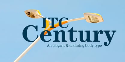
$29.00ITC Blaze was designed by Patty King in 1995. It is a typeface which looks as though it were written by hand with a broad tipped pen on rough paper. The pointed ends of the characters and the leaning to the right give the font a dynamic, energetic feel. Blaze shows the influence of the late 1940s and is best suited for headlines and short to middle length texts. - ITC Century by ITC,
$34.99 - ITC Bolt by ITC,
$29.99 - ITC Weidemann by ITC,
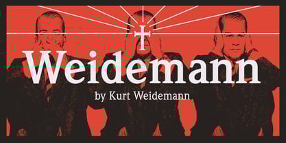
$29.99The Weidemann typeface's original name was Biblica, which was designed for the collaborative publication of a Bible by the German Catholic and Protestant Churches. The mass of text which the face was intended to set required that the design allow many characters to fit onto one line without rendering the words illegible. Thus, narrow spacing does not compromise the legibility or the elegance of Weidemann. - ITC Eastwood by ITC,
$29.99ITC Eastwood is the work of British designer Martin Archer and is named for Clint Eastwood. Archer was looking for a plain oldstyle typeface with open lower case forms and used Stempel Garamond as his starting point, although the result ended up well beyond its origins. In small point sizes the typeface looks interestingly rough while at display sizes it looks like a 16th century French typeface and its unique details come forward. - ITC Fenice by ITC,
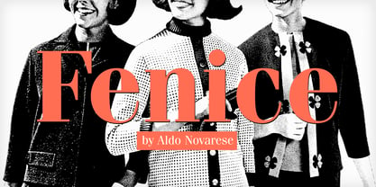
$29.99ITC Fenice font (pronounced fe-nee-chay) is the work of designer Aldo Novarese and was influenced by the traditional designs of Didot, Bodoni, and Ibarra. It displays the fine serifs of a Bodoni but blends such characteristics with a contemporary structural style. ITC Fenice font is perfect for applications requiring the economical use of space.

