10,000 search results
(0.135 seconds)
- Apothem Caps Med - Personal use only

- Stoutface - Personal use only

- Krystal - Unknown license

- Michelle BF by Bomparte's Fonts,
$40.00Michelle BF is the sister font of Monique Sans BF, in serif form. - Delamere by AVP,
$29.00Delamere uses conventional sans-serif letterforms but delivered with a strong calligraphic feel. - Rescue by ArFF,
$24.95A highly readable sans serif that is good for text and display use. - Topanga JNL by Jeff Levine,
$29.00Topanga JNL is based on an ultra-condensed sans serif wood type design. - 20 Kopeek by Letterhead Studio-YG,
$35.00 20 kopeek is sans serif font with a slight touch of a steampunk.
 - Samuello by Intellecta Design,
$22.90a naive interpretation of Samuel Wello art deco sans serif style of typefaces - Mon Petit Cahier by Hanoded,
$15.00 My family and I are stuck in quarantine for a week; my eldest son tested positive for Covid19 (but everyone else tested negative), so we can’t go out. That means that the kids follow classes online. I noticed their notebooks and suddenly realised that a notebook used to be called a ‘cahier’, which is a French word meaning the exact same thing. I guess it sounded sophisticated at the time. Mon Petit Cahier (meaning: My Little Notebook) is a handmade script font. It is not meant to be awe-inspiring, nor do you want to use it for headlines or posters. It is a nice little font that feels at home wherever an unobtrusive script is needed. Comes with all the diacritics you want and a set of cool double letter ligatures.
 - FS Pimlico by Fontsmith,
$80.00 Born in the 70s Personal influences are unavoidable in type design and usually find their way through into finished fonts. At Fontsmith, one period in particular provides inspiration, according to FS Pimlico designer, Fernando Mello. “Jason and Phil have always known that I’m very into the visual language of the 70s. I know that Jason shares my love of the 70s and Phil will sometimes admit to being a fan, too. I think that’s the reason they were both so supportive in the development of this font. “And, of course, we all share an interest in good-humoured and intelligent design. We like to think it’s a Fontsmith characteristic.” Back from black FS Pimlico started in an unusual place: with a tubby, penguin-like lowercase “a” that Fernando Mello had been sketching. From “a” grew the rest of the alphabet – a bubbly, fat, friendly family with a brush-written quality that became FS Pimlico Black. The black weight certainly isn’t the normal starting point for creating a regular and bold weight, but Fernando pressed on, driven by a glut of influences: brush-writing; Letraset and early digital systems catalogues; the type of Herb Lubalin and Tony di Spigna; 70s clothes and vinyl; and 70s revival disco nights in London’s Pimlico and Vauxhall. Natural or flourished Not often do fonts come along that seem to span the ages. FS Pimlico is at home in an office environment providing a fresh clear identity in communications or providing text that’s clear and easy to read. But it likes to party, too, 70s style. With the OpenType features switched on, a designer can totally change the look of their work, and create point-of-sale, headlines and titles that stand out and get noticed.
 - FS Pimlico Variable by Fontsmith,
$249.99Born in the 70s Personal influences are unavoidable in type design and usually find their way through into finished fonts. At Fontsmith, one period in particular provides inspiration, according to FS Pimlico designer, Fernando Mello. “Jason and Phil have always known that I’m very into the visual language of the 70s. I know that Jason shares my love of the 70s and Phil will sometimes admit to being a fan, too. I think that’s the reason they were both so supportive in the development of this font. “And, of course, we all share an interest in good-humoured and intelligent design. We like to think it’s a Fontsmith characteristic.” Back from black FS Pimlico started in an unusual place: with a tubby, penguin-like lowercase “a” that Fernando Mello had been sketching. From “a” grew the rest of the alphabet – a bubbly, fat, friendly family with a brush-written quality that became FS Pimlico Black. The black weight certainly isn’t the normal starting point for creating a regular and bold weight, but Fernando pressed on, driven by a glut of influences: brush-writing; Letraset and early digital systems catalogues; the type of Herb Lubalin and Tony di Spigna; 70s clothes and vinyl; and 70s revival disco nights in London’s Pimlico and Vauxhall. Natural or flourished Not often do fonts come along that seem to span the ages. FS Pimlico is at home in an office environment providing a fresh clear identity in communications or providing text that’s clear and easy to read. But it likes to party, too, 70s style. With the OpenType features switched on, a designer can totally change the look of their work, and create point-of-sale, headlines and titles that stand out and get noticed. - Blastone by Azetype,
$10.00 Presenting Blastone! A Brush Font with 2 Versions, Alternates, and Extra. This font made with the perfect combination of each character. You can type by Mix & Match with an alternate version and extra swashes to get a unique combining. It looks original and can be used for all your project needs. Each glyph has its own uniqueness and when meeting with others will provide dynamic and pleasing proximity. This font can be used at any time and any project. You can see in the presentation picture above, Blastone looks amazing on design projects. So, Blastone Font can't wait to give its touch to all your design projects such as quotes, poster design, personal branding, promotional materials, logotype, product packaging, etc. Besides that, Besteam also has some ligature that gives a surprise when you type certain characters combining. The ligatures are ee, ff, ii, nn, oo, rr, ss, tt, and yy. WHAT'S INCLUDED? 1. Blastone Texture • The first version comes with uppercase, lowercase, ligatures, numeral, punctuation, symbols, and Standard Latin Multilingual Support (Afrikaans, Albanian, Catalan, Danish, Dutch, English, French, German, Icelandic, Indonesian, Italian, Malay, Norwegian, Portuguese, Spanisch, Swedish, Zulu, and More). 2. Blastone Texture Alternate • The Second version comes with uppercase, lowercase, ligatures, numeral, punctuation, symbols, and Standard Latin Multilingual Support (Afrikaans, Albanian, Catalan, Danish, Dutch, English, French, German, Icelandic, Indonesian, Italian, Malay, Norwegian, Portuguese, Spanisch, Swedish, Zulu, and More). 3. Blastone Solid • It comes with uppercase, lowercase, ligatures, numeral, punctuation, symbols, and Standard Latin Multilingual Support (Afrikaans, Albanian, Catalan, Danish, Dutch, English, French, German, Icelandic, Indonesian, Italian, Malay, Norwegian, Portuguese, Spanisch, Swedish, Zulu, and More). 4. Blastone Solid Alternate • It comes with uppercase, lowercase, ligatures, numeral, punctuation, symbols, and Standard Latin Multilingual Support (Afrikaans, Albanian, Catalan, Danish, Dutch, English, French, German, Icelandic, Indonesian, Italian, Malay, Norwegian, Portuguese, Spanisch, Swedish, Zulu, and More). 5. Blastone Texture Swash • It comes with 19 underline swashes. Just type s_1 until s_19 to feature all or type a-z/A-Z and choose this version. 6. Blastone Solid Swash • It comes with 19 underline swashes. Just type s_1 until s_19 to feature all or type a-z/A-Z and choose this version. Enjoy the Font! Thank You Azetype Studio
 - DT Skiart Lexiconic by Dragon Tongue Foundry,
$10.00 Apparently, Lexicon is the most expensive font in the world. ‘Skiart Lexiconic’ has been on a long growing path getting to where it is now. This font family was originally inspired by the san serif font ‘Skia’, by Mathew Carter for Apple. ‘Skiart’ was designed to feel more like a serifed font, but without any actual serifs. It took a small step between sans serif and serif fonts. Next on the path towards a serif font came Skiart Serif Mini, with tiny serifs added. This was a true serif font, although they were subtle. Then came ‘Skiart Serif Leaf’. and now... We present to you... DT Skiart Lexiconic. Having evolved from the Skiart family, we chose to give it the serifed styling of Lexicon. This is no way a copy or clone of Lexicon. It still has the basic bones of the original Skiart font, but the position, shape and size of the serifs were very much influenced by the world famous Lexicon font. DT Skiart Lexiconic is not the most expensive font in the world.
 - Banner by URW Type Foundry,
$39.99 Jan Koller designed the Banner typeface family especially for the creation of animated web banners. Banner is best used at 80p without antialiasing. The family comes in 24 styles which, in combination, create great, unusual screen effects. Three different animation modells provide the basis: extrusion, cutting in/out by ‘pixelation’, outline pixel rotation. The available flash clip listed in the Related Links below demonstrates some of the effects. Take a look! The swf clip runs in any web browser (drag & drop) but you need the flash player plugin. Apart from animation use, Banner also works well in print. Since all 24 styles are identical in width and kerning, you can set several styles on top of each other, maybe using different colours for each style. Look at the nice effects yourself!
 - Whistle by Arendxstudio,
$18.00 Introducing: Whistle - Signature casual handwritten font with personal charm. With an elegant sweep that is perfect for branding your product needs and brand name. PUA ENCODING SUPPORT Whistle contains upper & lower case letters, numbers and various complete marks while Whistle Alt has an alternative character set with lowercase letters that are completely new. Ligatures available for several lowercase letters (more natural double letters). This can only be accessed through software with different devices or machine panels, eg Photoshop / Illustrator. There he is! I really hope you enjoy it - comments & likes are always welcome and accepted. More importantly, don't hesitate to send a message if you have a problem or question. Now just read this, go there and make it happen. Come and say hello on Instagram! https://www.instagram.com/aseprendii.otf/?hl=en
 - Odense by Linotype,
$40.99Franko Luin, Odense's designer, on this typeface: With Odense I entered the field where Optima reigns in royal majesty. The first question I received was, in fact, why I designed another Optima. Look closely: Odense has as much in common with Optima as Garamond with Baskerville. Am I right? Odense Neon is a special variant that can be used for logos or single words. I had the idea for it when I noticed that the neon tubes in a sign over a store only partially followed the characters. The name comes from the Danish town Odense, the town of the famous storyteller Hans Christian Andersen, author of, e.g., 'The Little Mermaid.' Odense is also the place where the first book in the Nordic countries was printed, the 'Breviarium Ottoniense', in 1482. - Klainy by Identity Letters,
$29.00 An unadorned Grotesque with a refreshingly personal touch. If “Grotesque” mainly means “industrial, mechanical, anonymous typeface” to you, Klainy might redefine your image of the genre. Yes, it’s a Grotesque—but with a contemporary look and a lot of personality. Klainy’s apertures are more closed at the top and more open at the bottom, creating an informal rhythm that sets Klainy apart: a confident, optimistic voice with a clean appearance. Terminals are subtly back-bent: these quaint “hooks” make Klainy a bit more personal, a bit friendlier. (You can find them in the a, c, f, and r.) Just like its old-style Grotesque ancestors, Klainy is optimized for display sizes and short texts. There, its unobtrusive quirks can be wholly appreciated. However, the familiar Grotesque appearance makes sure that the typeface is comfortable to read in smaller sizes, as well. Use Klainy whenever a basically classic sans-serif typeface with a modern and individual twist is called for. This font family comes in eight weights ranging from Thin to Black, each with a matching italic style. More than 500 glyphs and a bunch of Open Type Features make it a reliable companion for all of your projects. You can fine-tune the flavor of Klainy with Stylistic Alternates such as a one-story a and a two-story g. Their simple construction blends perfectly with the design concept of this typeface. Klainy is a seasoned blue-collar worker that surprises you with wit and team spirit. It’ll be a great addition to your font library.
 - Yippie Yeah by Almarkha Type,
$25.00 Yippie Yeah Sans & Slab is a Cute & Playful Font full of charm . It will take any DIY-project to the next level! Yippie Yeah Sans & Slab is perfect for Crafts, Poster, product packaging, product designs, label, branding projects, logo, wedding designs, social media posts, advertisements, watermark, invitation, stationery and any projects
 - CCS Monterio by Creative Corner Studio,
$29.00 CCS Monterio sans is a all-caps sans serif contemporary Art Deco typographic style , If you're into classic/vintage letter designs, then this typeface suits best for you. Packed with 300+ glyphs (alternate and multilingual characters included), now it’s your time to go crazy and explore the uniqueness of this typeface!
 - Katelyn by Kimmy Design,
$10.00 Katelyn is a sans serif font that reflects a straight and perfect handwritten note. In being in the middle of a sans serif font and completely handwritten, it will bring and lightness and playfulness to any design. Included in the face is a set of Ornaments that enhances the youthful font.
 - Balcon Round by Tour De Force,
$25.00 Balcon is condensed sans family designed to be your first web font choice. Contains 5 weights: Light, Regular, Bold, ExtraBold and Black, it fits perfect into any project, from editorial editions to packages, labels, posters. If you're looking for "sharp" version of this family, feel free to check Balcon sans family.
 - Alchemia Decorative by Struvictory.art,
$19.00 ALCHEMIA is a modern sans serif font with mystical motives. The font is created in classic proportions and decorated with celestial and boho decor. ALCHEMIA is represented by sans serif lowercase and ornate uppercase. The font is suitable for the design on the theme of astrology, mysticism, spirituality, witchcraft, magic, esotericism.
 - Braveold by Trustha,
$25.00 Braveold is a serif font family with swashes, making it multifunctional. It is inspired by classic and retro fonts in the 70 and comes with 5 weights which can be selected for body text or headlines. Alternative swashes will be an attractive choice, so that your project becomes more beautiful and dynamic.
 - Negroni by Letrizmo,
$18.00What font to choose when it comes to malevolent, wry or downright bad seeded phrases? Negroni can show a nervous, chaotic facade ideal for those rancorous posters, flyers or anonymous messages. Subtly irregular contours and a slight, almost imperceptible difference in the weight of each letter make up Negroni's shy, embittered essence. - Office Squeeze by Hanoded,
$15.00 Office Squeeze was made with a Japanese brush pen. I kind of like the fact that, despite its roughness, Office Squeeze still maintains a very neat appearance. Office Squeeze can be used for just about anything, but product packaging, logos and posters spring to mind. Comes with a generous square footage of diacritics.
 - Moppetops LL by Leftover Lasagne,
$25.00 Moppetops is a sophisticated yet quirky handwritten typeface that comes with a huge amount of graphical elements, accented and even greek letters. The font features auto ligatures for duplicate letters, some connected letters, quite a few graphical elements that can be accessed by shortcuts (lowercase letter + number form 0-9) and smallcaps.
 - Cathedral Display by Clint English,
$25.00 Cathedral is a display typeface with regular, semi bold, and bold weights with alternate glyphs for select characters. This font comes with bonus vector graphics that accompany the font. The bonus vector graphics have editable stroke weights, so they can match each type weight, or any other need you have in mind.
 - Whatnot by Hanoded,
$15.00 Whatnot is a beautiful, hand drawn all caps font. It was made with a fine-liner on smooth paper. Whatnot can be used for almost all designs, in particular for posters, books and ads. Whatnot comes with a full range of alternate lower case letters and upper and lower case are freely interchangeable.
 - Christmas Surprise by AEN Creative Studio,
$16.00 Christmas Surprise is a joyful and festive display font. It is ideal for holiday-themed greeting cards and for any crafting project so add this font to your designs and make them come alive! This font is PUA encoded which means you can access all of the glyphs and swashes with ease!
 - Dragonblood by Hanoded,
$20.00 Dragonblood is quite an unusual font: it was made with Parker ink and a Chinese fur brush. When all the glyphs had been vectorized, and I saw them in a text for the first time, the only appropriate name I could think of was Dragonblood. Dragonblood comes with a realm of diacritics.
 - Spooky Christmas by Stefani Letter,
$12.00 Spooky Christmas is an incredibly unique and spooky display font. Add this font to your favorite Halloween-themed ideas: invitations, banner, logo, app game scary or horror, and notice how it makes them come alive! Spooky Christmas is PUA encoded which means you can access all of the glyphs and swashes with ease!
 - RMU Trifels by RMU,
$35.00 RMU Trifels is a revival of Heinrich Wieynck’s great design which was released by Bauer in 1905. This beautiful Art Nouveau font comes with a long s and a historical form of the letter H. Border and adorning elements were added which you can reach by typing [alt] + P and [alt] + p.
 - Gabilo Script by Sulthan Studio,
$14.00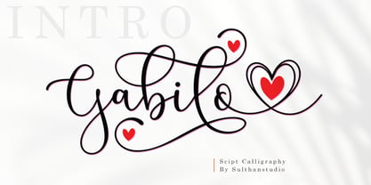 Gabilo Script font with a smooth, handwritten style. Gabilo script is perfect for branding projects, homeware design, product packaging, use in business cards, invitation cards, etc. Simply as a stylish text overlay onto a background image or anything that requires a touch of elegance. also comes with heart swashes that can be spliced.
 - Attaboy by Hanoded,
$15.00 Attaboy is a posh word for ‘well done’. It was made with a broken marker pen to give it that ‘eroded’ look. It is an all caps typeface, but upper and lower case can be mixed. Attaboy comes with stylistic alternates for the lower case glyphs and all the diacritics you need.
 - Hypotermia by Arendxstudio,
$18.00 Hypotermia is very stylistic so you can easily create a logo for your band or whatever. It comes with basic characters and a group of symbols and signs that are often used in the extreme music sector - classic items from Death- and Blackmetal such as pentagrams and crosses, droplets, roots and branches.
 - HK Brandal by HK Studio,
$25.00 HK Brandal was designed by Hendi Kusuma, comes in bold weight. They are all uppercase and lowercase, Brutalism Grunge style typeface with slab based form which were inspired by a number of historical music and subculture movement : grunge, brutalism, roughness. Art is the only place you can do what you like. That's freedom.
 - Linford by Yoga Letter,
$15.00 "Linford" is a very professional and elegant serif font. This font is very easy to use for all your work. This font comes with 8 elegant and attractive ligatures. This font can be used to promote all your business (branding, banners, posters, social media, hotel promotions, villas, companies, products, invitations, and more).
 - Wolesbro by Locomotype,
$10.00 Wolesbro is a brush font designed to give a natural handwriting look without forgetting readability for typography. Comes with two different brush styles; Wolesbro One and Wolesbro Two so you can more easily work with your design. OpenType features include: Ligatures for natural double letters and contextual alternates for casual terminal form.
 - JT Collect by OGJ Type Design,
$35.00 JT Collect is a hybrid sans-serif typeface for the 21st century that takes a playful approach to the type design heritages of Germany and Switzerland. Confidently built on a geometric structure and infused with elements from traditional grotesque typefaces, it hits the sweet spot between geo and grot. I developed JT Collect purely digitally, drawing from years of experience with analog type design. The letters aren’t based on one particular source but seek to merge different type genres from the first half of the 20th century and lift them to a contemporary quality level. JT Collect is less reserved than strictly geometric designs and brings some industrial workmanship and honesty into the game. The six weights plus three optical sizes of JT Collect offer what you need to make an impact. While cool and elegant in the Light weight, the fonts show more presence on the page as they grow bolder. To this end, I drew the letterforms with a slightly unrefined, brawny air in the bolder weights. This sets them apart from the perceived purity of more geometric designs. The Book weight is ideal for short texts and medium-length copy, and the forceful Bold makes wordmarks look crisp and lets headlines radiate cosmopolitan self-confidence. JT Collect is suitable as a primary typeface for branding, advertising, packaging, stationery, posters, documents, and websites from trades and industries as diverse as food & fashion, media & makers, culture & creators, games & gems, sports & startups. Use JT Collect for film titles or watch faces, for leaflets or store signs, for business cards or billboards: this font family is as adaptable as a chameleon (and like a chameleon, it’s never boring). Try it in different contexts. You won’t be disappointed. Its adaptability also makes JT Collect a great starting point for poised and persuasive font combinations. Even a sans/sans pairing is possible due to hybrid nature of JT Collect—something that’d be hard to achieve with most other sans-serif typefaces on the market. You can add to it a heavy slab from the OGJ library, like Temper Wide. You might go for a geometric or a grotesque typeface as secondary (text) typeface. Or you could set your body copy in a classic serif typeface such as Caslon, Sabon, or Plantin. That’s right: JT Collect is a true team player. Whether you need a grotesque or a geometric sans: try JT Collect. You can get the best of both worlds.


