10,000 search results
(0.058 seconds)
- Guilloche B by Wiescher Design,
$24.00 »Guilloche B« is a set of graphics that join with each other to form very sophisticated, op-art-like borders. Try them on lots of different assignments, they form very surprising bands or patterns.
 - The "CrazyZoo" font, imagined as a spirited creation by an artist named Chloe, is a vibrant and captivating typeface that instantly transports its viewer into a whimsical world of imagination and cre...
- Eight by Zang-O-Fonts,
$25.00Eight was desinged to be heavily geometric. The main lines were intended to be entirely comprised of lines of eight different but set angles. - TE Nastaaliq by Tharwat Emara,
$59.00 TE Nastaaliq Font It is one of the Persian calligraphy or ta'liq line that appeared in Persia in the seventh century AH (thirteenth century AD), as it was extracted from the lines of naskh, patch and thuluth. It is a beautiful font whose letters are distinguished by precision and extension. It is also characterized by its ease, clarity and lack of complexity. It does not tolerate diacritics, despite its difference with the line of the patch, as it is one of the best fonts in the world and the best without a competitor and admires many Arab calligraphers, and no cultural or literary exhibition is devoid of a painting written in Persian script. It is one of the most beautiful lines that has a special character that distinguishes it from others, as it is characterized by gracefulness in its letters, so it appears as if it descends in one direction, and its beauty is increased by the soft and rounded lines in it, because it is more flexible in drawing and more flexible, especially if it is drawn with precision, elegance and good distribution, and the calligrapher may baptize In his use of decoration to reach strength in expression by taking advantage of arches and circles, in addition to the grace of painting, the artist may link the letters of one word and the two words to reach the composition of a frame or curved and wrapped lines in which he shows his genius in imagination and creativity.
 - FF Sizmo by FontFont,
$50.99 FF Sizmo™ is available in two flavors. One is an honest, industrial strength, somewhat condensed, sans serif family. The other builds on the first, and is a display design with horizontally connecting baseline strokes. The five weights of basic the FF Sizmo typefaces are ideal for print and digital projects. Character spacing is generous, counters are open and apertures are wide and clear. Banners, navigational links, sub heads, and short blocks of contextual copy are natural on-screen uses for the design. Print projects from branding to way-finding also fall easily into FF Sizmo’s range of applications. The “line” versions of FF Sizmo can be arresting stand-alone typefaces – or distinctive complements to the basic roman and italic designs. In either instance, the line designs make powerful statements in headlines, subheads, posters and cover art. OpenType® fonts automatically insert beginning, middle or ending line element characters into the copy. Drawn by Verena Gerlach, both designs were inspired by the same source, a commercial signage system that enabled quick and easy copy changes. “The idea for the typeface,” explains Gerlach, “is a housing complex index board, on which movable white plastic capital letters were fixed by a thick line to the wooden board. This line is an important part of the font’s appearance.”
 - Alessyia by Umbra95,
$15.00 Alessyia is a classic style typeface font. This font has classic but at the same time a fresh look. "Alessia family" includes 3 font types: Regular ( Classic and elegant with straight geometric lines ) Grunge ( Dirty and messy ) Retro ( Hand drawn brush font with an uneven texture )
 - Quarter Braille by Echopraxium,
$20.00 Presentation QuarterBraille (Abbreviated as "QB" thereafter) is a decorative, steganographic and lattice font. Its core design concept is that Braille dots are represented as "quarters of a square"[1]. This is illustrated by posters 1 and 2 (NB: these glyph parts will be called "QB dots" thereafter). The other glyph parts (see poster 3) are purely decorative and meaningless in terms of Braille dots encoding[2]. All glyph parts are meant to generate a wide variety of patterns from horizontal and vertical combinations of glyphs. There is also a graphic convention to differentiate uppercase from lowercase letters with the presence or absence of shape subparts (in the "endings", "quarter of a circle with a ring" and "quarter of a diamond with a small square in the middle") like shown by poster 4. This font is suitable for very short texts (e.g. logos, acronyms, quotes, ambigrams, pangrams, palindromes, etc...) but on the other hand it may be used for steganographic purpose like geocaching as well as fictive alphabets (e.g. Alien/SciFi/Fantasy/Antique civilizations). Posters 1. Font Logo: the displayed text is " Quarter " followed by " Braille". There's a rainbow layer above the text to highlight the "QB dots", this is achieved by A..Z glyphs with "only QB dots" (codes 230..255) 2. Anatomy of a Glyph (L) and "QB Dots" (quarters of a square) 3. Glyphs Parts: Square and Cross (Inverted square), Circle and Inverted Circle (with or without the small circle in the middle), Diamond (with or without the small square in the middle), Inverted Square and Circle, Shape combos, Ending 4. Uppercase vs Lowercase (tiny shape subparts are shown in red) 5. Sample 1: Bathroom sink with QB tiles on the credence 6. Sample 2: Hands knuckle tatoos: "LOVE/HATE"[4] 7. Sample 3: Poker Hand: pocket Aces. It's an Ace of Hearts (Ah) on the left and an Ace of Spades (As) on the right. Like in regular cards, the card value (e.g. Ah) is displayed twice: at the top and rotated by 180 degrees at the bottom. This poster also illustrates that QB could be used to print embossed playing cards with tactile and visual display of card values. 8. Sample 4: Pangram: "Adept quick jog over frozen blue whisky mix" 9. Sample 5: Latin Magic Square: "SATOR AREPO TENET OPERA ROTAS" (NB: for compensation of the 2/3 glyph ratio, letters on each line are separated by a space: "S A T O R", ...). 10. Sample 6: Quote of Mahatma Gandhi: "Learn as if you will live forever, live like you will die tomorrow.". This is also a demonstration of border glyphs combinations. 11. Sample 7: Steganography use case: the text is a sequence of 64 aminoacids (1 Letter notation), this protein was described in a research paper "The complete Aminoacid sequence of an amyloid fibril protein AA of unusual size (64 residues) 1975". 12. Sample 8: Border Glyphs with the provided styles and mixed styles. The words are the same than in poster 9 ("SATOR AREPO TENET OPERA ROTAS"). Despite the 2/3 glyph ratio, the "TENET cross" was achieved by both inserting spaces in horizontally ("T ENE T") and by using the "thin borders glyphs". Notes a. Border glyphs[3] are meant to enhance the esthetics of text samples displayed with QB b. Special characters (e.g. *$()[].,;:&@# ...) are provided and follow the NABCC (North American Braille Computer Code) convention. c. A..Z Glyphs with only the "QB dots" are provided as demonstrated by posters 1 and 2 (A/N: this was very useful to create them). d. Glyph Map: 32..64: Special characters - 161..187: "Thin variant" of Border glyphs, 192..229: Border glyphs, 230..255: A..Z with only the "QB dots" - Codes 176 an 181 are "regular SPACE" (empty glyph). Footnotes 1. There is indeed two shapes which represent the braille dot: the "quarter of a square" and the "quarter of a cross". It's because a cross may be considered as an "inverted square" because the square corners are merged in the center. 2. That's why the SPACE glyph is only made of decorative/meaningless glyph parts (i.e. no "QB dots"). 3. For other fonts with border glyphs, please take a look at my other "decorative Braille fonts" (GoBraille, HexBraille, KernigBraille, StackBraille, MaBraille, DiamondBraille, LorraineBraille). 4. LOVE/HATE knuckle tatoos are inspired by the anthology scene from "The Night of the Hunter" movie (Charles Laughton 1955), it also appearead in "Do The Right Thing" movie (Spike Lee 1989). Disclaimer This font is not appropriate and not meant to print text documents in Braille for the blind readers audience.
 - Compatil Fact by Linotype,
$50.99Compatil is the first comprehensive type system which enables all typographical elements to be used to full effect in order to reproduce the message conveyed by text information. Four different type styles with a total of 16 weights including italics have been merged into a unique typographical network. There are now no limits to the font user's creativity. The system is a product of technical innovation and constitutes a new design approach which meets the highest aesthetic standards. For almost two years, a team of experts from Linotype has been working with initiator Professor Olaf Leu under the direction of Silja Bilz, Erik Faulhaber and Reinhard Haus to create the Compatil type system. Despite the Internet and TV, it is essential today to be able to absorb information quickly by being able to read it with ease. A fact that is becoming increasingly important both on-screen and on paper. It is the role of the font to increase legibility and to ensure typographically perfect results for text design work. The new Compatil type system meets all these needs. The Compatil is a part of the Platinum Collection. The following four different styles are available: Compatil Exquisit, Compatil Fact, Compatil Letter and Compatil Text. Compatil is available in various font formats: 16 separate OT Pro fonts including the small caps and Adobe Central European character set for OpenType-supporting applications like Adobe InDesign, or as 32 separate OpenType Com fonts for office communication, with the following special features: 1. Optimized display capabilities for computer screens eXcellent Screen Fonts (XSF-quality). 2. An extended, international character set, which supports 48 different languages for Microsoft Office applications like MS Word or as 64 PostScript fonts, which can be used in non-OpenType-supporting applications like Quark XPress. - Compatil Fact Paneuropean by Linotype,
$103.99Compatil is the first comprehensive type system which enables all typographical elements to be used to full effect in order to reproduce the message conveyed by text information. Four different type styles with a total of 16 weights including italics have been merged into a unique typographical network. There are now no limits to the font user's creativity. The system is a product of technical innovation and constitutes a new design approach which meets the highest aesthetic standards. For almost two years, a team of experts from Linotype has been working with initiator Professor Olaf Leu under the direction of Silja Bilz, Erik Faulhaber and Reinhard Haus to create the Compatil type system. Despite the Internet and TV, it is essential today to be able to absorb information quickly by being able to read it with ease. A fact that is becoming increasingly important both on-screen and on paper. It is the role of the font to increase legibility and to ensure typographically perfect results for text design work. The new Compatil type system meets all these needs. The Compatil is a part of the Platinum Collection. The following four different styles are available: Compatil Exquisit, Compatil Fact, Compatil Letter and Compatil Text. Compatil is available in various font formats: 16 separate OT Pro fonts including the small caps and Adobe Central European character set for OpenType-supporting applications like Adobe InDesign, or as 32 separate OpenType Com fonts for office communication, with the following special features: 1. Optimized display capabilities for computer screens eXcellent Screen Fonts (XSF-quality). 2. An extended, international character set, which supports 48 different languages for Microsoft Office applications like MS Word or as 64 PostScript fonts, which can be used in non-OpenType-supporting applications like Quark XPress. - Compatil Letter by Linotype,
$50.99Compatil is the first comprehensive type system which enables all typographical elements to be used to full effect in order to reproduce the message conveyed by text information. Four different type styles with a total of 16 weights including italics have been merged into a unique typographical network. There are now no limits to the font user's creativity. The system is a product of technical innovation and constitutes a new design approach which meets the highest aesthetic standards. For almost two years, a team of experts from Linotype has been working with initiator Professor Olaf Leu under the direction of Silja Bilz, Erik Faulhaber and Reinhard Haus to create the Compatil type system. Despite the Internet and TV, it is essential today to be able to absorb information quickly by being able to read it with ease. A fact that is becoming increasingly important both on-screen and on paper. It is the role of the font to increase legibility and to ensure typographically perfect results for text design work. The new Compatil type system meets all these needs. The Compatil is a part of the Platinum Collection. The following four different styles are available: Compatil Exquisit, Compatil Fact, Compatil Letter and Compatil Text. Compatil is available in various font formats: 16 separate OT Pro fonts including the small caps and Adobe Central European character set for OpenType-supporting applications like Adobe InDesign, or as 32 separate OpenType Com fonts for office communication, with the following special features: 1. Optimized display capabilities for computer screens eXcellent Screen Fonts (XSF-quality). 2. An extended, international character set, which supports 48 different languages for Microsoft Office applications like MS Word or as 64 PostScript fonts, which can be used in non-OpenType-supporting applications like Quark XPress. - Compatil Text by Linotype,
$50.99Compatil is the first comprehensive type system which enables all typographical elements to be used to full effect in order to reproduce the message conveyed by text information. Four different type styles with a total of 16 weights including italics have been merged into a unique typographical network. There are now no limits to the font user's creativity. The system is a product of technical innovation and constitutes a new design approach which meets the highest aesthetic standards. For almost two years, a team of experts from Linotype has been working with initiator Professor Olaf Leu under the direction of Silja Bilz, Erik Faulhaber and Reinhard Haus to create the Compatil type system. Despite the Internet and TV, it is essential today to be able to absorb information quickly by being able to read it with ease. A fact that is becoming increasingly important both on-screen and on paper. It is the role of the font to increase legibility and to ensure typographically perfect results for text design work. The new Compatil type system meets all these needs. The Compatil is a part of the Platinum Collection. The following four different styles are available: Compatil Exquisit, Compatil Fact, Compatil Letter and Compatil Text. Compatil is available in various font formats: 16 separate OT Pro fonts including the small caps and Adobe Central European character set for OpenType-supporting applications like Adobe InDesign, or as 32 separate OpenType Com fonts for office communication, with the following special features: 1. Optimized display capabilities for computer screens eXcellent Screen Fonts (XSF-quality). 2. An extended, international character set, which supports 48 different languages for Microsoft Office applications like MS Word or as 64 PostScript fonts, which can be used in non-OpenType-supporting applications like Quark XPress. - Griba by Decade Typefoundry,
$20.00 GRIBA Typeface is an experimental display typeface, based on every shape of each characters and transformed into double lines. This font is perfect for poster, titles, and t-shirt designs.
 - Ristabella by Coredeon,
$9.00 inspired by my beloved wife's handwriting, starting with a scribble, consists of thick and thin lines These fonts are suitable for letter writing, decoration, display, birthday, wedding and for logos
 - FF Stealth by FontFont,
$41.99 British type designer Malcolm Garrett created this display FontFont in 1995. The font is ideally suited for film and tv and editorial and publishing. It comes with tabular lining figures.
 - Sandy by Oleg Stepanov,
$15.00 Sandy is a handwritten sans serif font, based on shapes made with ink brush. Sandy is a lively and informal typeface with good readability. Most of European languages are supported.
 - Penmanshift JNL by Jeff Levine,
$29.00Penmanshift JNL by Jeff Levine is actually a semiscript - a vertical text font with the curved lines of a script alphabet, but the look and feel of a poster letter. - Gumela Arabic by NamelaType,
$25.00 Arabic font version of Gumela, still with Gumela latin style, based on rounded sans serif whose edges end with unique shapes, to line up in harmony between Latin and Arabic.
 - HU Cookie by Heummdesign,
$15.00 English HU Cookie is a cute handwritten typeface that can be used to express any lively or active moment. The alphabets are not aligned or evenly written but are crooked like scribble, which gives you funny and informal vibe. There are 2 weights of HU Cookie : light, semi bold Greek Το HU Cookie είναι μια χαριτωμένη χειρόγραφη γραμματοσειρά που μπορεί να χρησιμοποιηθεί για να εκφράσει οποιαδήποτε ζωντανή ή ενεργή στιγμή. Τα αλφάβητα δεν είναι ευθυγραμμισμένα ή ομοιόμορφα γραμμένα, αλλά είναι στραμμένα σαν σκαρίφημα, κάτι που σας δίνει αστεία και ανεπίσημη ατμόσφαιρα. Υπάρχουν 2 βάρη του HU Cookie: light, semi bold Cyrillic HU Cookie - это симпатичный рукописный шрифт, которым можно обозначить любой живой или активный момент. Алфавиты не выровнены и написаны неравномерно, они изогнуты, как каракули, что создает забавную и неформальную атмосферу. HU Cookie имеет 2 толщины: light, semi bold
 - Tipperary eText by Monotype,
$57.99Tipperary was designed by Steve Matteson and named for a favorite 'single track' bike trail, Tipperary is a monoline Humanist Sans Serif typeface. The clear, open, letter forms curve abruptly in an almost squarish geometry much like the sharp turns on the Tipperary trail. The clear, austere forms offer exceptional legibility for both interface designs and extended reading. Small size package labels and crisp branding programs benefit from Tipperary's emphasis on clean, readable design. eText typefaces are designed to meet the challenges of extended reading in digital environments such as mobile devices or desktop screens. Their forerunners are among the world's most popular and important book typefaces for print media. These classic designs were reinterpreted to conform to technological constraints of LCD and e-Paper while retaining the properties of proportion and form which made them favorites for print. - HU Crayon Doodles by Heummdesign,
$15.00 English HU Crayon Doodles is a cute handwritten typeface that can be used to express any lively or active moment. The alphabets are not aligned or evenly written but are crooked like scribble, which gives you funny and informal vibe. There are 1 weights of HU Crayon Doodles : light Greek Το HU Crayon Doodles είναι μια χαριτωμένη χειρόγραφη γραμματοσειρά που μπορεί να χρησιμοποιηθεί για να εκφράσει οποιαδήποτε ζωντανή ή ενεργή στιγμή. Τα αλφάβητα δεν είναι ευθυγραμμισμένα ή ομοιόμορφα γραμμένα, αλλά είναι στραμμένα σαν σκαρίφημα, κάτι που σας δίνει αστεία και ανεπίσημη ατμόσφαιρα. Υπάρχουν 1 βάρη του HU Crayon Doodles : light Cyrillic HU Crayon Doodles - это симпатичный рукописный шрифт, которым можно обозначить любой живой или активный момент. Алфавиты не выровнены и написаны неравномерно, они изогнуты, как каракули, что создает забавную и неформальную атмосферу. HU Crayon Doodles имеет 1 толщины: light
 - Stickwithu by Redy Studio,
$19.00 the name Stickwithu was inspired by the title song Stickwitu sung by The Pussycat Dolls which was very popular in the early 2000s. Stickwithu has been designed to make any project look like it was handwritten by hand. a simple yet modern handwritten typeface that’s perfect for adding personality to your typographic design. With its intersecting lines and decorative shapes, Stickwithu gives you the perfect look for use in logos, branding, wedding invitations and stationery, social media posts, and even handwritten quotes. That’s what we’ve done with Stickwithu and want to share with you. We hope you find something unique that will add personality and character to your designs. Feel free to give me a message if you have a problem or question. Thank you so much for taking the time to look at one of our products. ~Redy
 - SL Che by Sudtipos,
$29.00SL Che is a homage to Ernesto Guevara de la Serna, “El Che”, who lived between 1928 and 1967. El Che turned into an universal icon through a memorable photograph which was reproduced and multiplied to the infinite. It was that way he became a synonymous of resistance, revolution and change for lots of generations. That "Che" comes back today by the hand of the genial Jorge Alderete, who designed heroic, laughing and cool variations of that popular first icon. SL Che unfolds like a fan of thousands of "Che", in a development plenty of metaphors. SL Che abridges a sum of original iconographic illustrations in True Type format, which masterly synthesizes the most important themes of the grand genius of the literature. SL Che takes part of the "Icons of Icons" Gallery, developed by SinergiaLab for Sudtipos - Tabac Big by Suitcase Type Foundry,
$39.00 Tabac Big can satisfy all expressionists desiring idiosyncratic colouring in setting because it provides black weights. But at the same time it offers solutions for orthodox environmentalists who like to save ink and toner — all the fragile hair styles are intended just for them. Less clearly-defined typographers can then choose from the six other weights, from Thin through Light, Regular, Medium, Semibold and Bold, including true italics. Tabac Big is a first and universal choice where we look for pronounced display type as a complement to text type. Its modern drawing, made up of precise arcs, sharp lines and seemingly simple segments, gives a clear and unmistakeable impression every time. And yet the typeface knows how to intrigue — especially in shaping the italics, which fully expresses the typeface’s unique details, such as its large bulbous instrokes and outstrokes and heavy wedge serifs.
 - Hutton by Fettle Foundry,
$10.00 Hutton is a sans-serif typeface with flattened overshoots, such as shoulders, arms, and bowls. There are seven weights, from light to bold, with matching oblique italics. Inspired by using a ruler to write straight lines, and offering additional horizontality to characters, Hutton’s flattened bowls are intended to evoke a sense of flatness and retro influence – as if drawn at a drafting table. Featuring closed counters and low-contrast, Hutton is closely related to grotesque sans serif designs of the 20th Century, but with something a little different. Included is comprehensive European language support with contextual kerning on common diacritic combinations – as well as localised alternatives for languages such as Polish. Also included are two stylistic sets, which feature characters with a more geometric quality or a more humanistic quality, depending on which you would like to bring to your design.
 - Rullen by Inumocca,
$15.00 Rullen is A Retro typeface the 70s font style great choice for expressing a summer. The Typeface comes with Stylistic Set Exellent typeface to use for covering your Project, like Branding, Movie Title, Headline Letter, Bookcover or Book Content, Magazine cover, Poster, Quotes Lettering, Logos, and more your project design. - Unique glyphs - Multilingual Characters Support - UPPERCASE - Lowercase - Numeric - Symbol - Punctuation Character - Stylistic Set inumocca type Studio
 - Beauty Modelina by Agny Hasya Studio,
$9.00 Beauty Modelina is a Modern Stylish Serif Display Font with a Decorative, and Elegant Style Come in 2 (two) weights (regular & bold) including slants, and is created with Stylistic Alternates and Ligatures. Perfect for your design projects like logos, branding, advertising, product designs, stationery, photography, art quotes, wedding designs, fashion designs, and more. Featured with Uppercase and Lowercase, Numeral and Punctuation, Multilingual Support, and Opentype Features.
 - Aglore Story Signature by Letterfreshstudio,
$15.00 Aglore Story Signature Duo This professional resource is also powerful because each font has its own magical design. Comes with four versions Regular, Italic, Signature You can use it for almost anything like blog headers, posters, wedding elements, t-shirts, clothing, book covers, business cards, greeting cards, branding, invitations and quotes and so on. Feature: Uppercase Lowercase Number Accent (multilingual character) Thank you for your purchase!
 - Pulp Fiction by Comicraft,
$19.00 The name's Heironymous Flask. Some of my acquaintances call me 'Hip.' Those that know me really well don't call me at all. In my game, you don't make friends. You make excuses. Like it says on the door, I'm a private hippopotamus. This is my story. This is my font. Features: Six weights (Regular, Italic, Bold, Bold Italic, Heavy & Heavy Italic) with upper and lowercase alphabets.
 - Masthina by Sibelumpagi,
$16.00 Masthina is a lovely calligraphy typeface with a modern bouncy style. It comes with a natural flow that looks like a handwritten letter and also we added some swashes and alternates to make the font more elegant. Masthina is perfect for many different projects such as logos & branding, invitation, stationery, wedding designs, social media posts, advertisements, product packaging, product designs, label, photography, watermark, special events or anything.
 - Delarosa by Agny Hasya Studio,
$9.00 Delarosa is a Modern Serif Display Font with Retro Vintage Style yet Decorative, and Elegant Come in 2 (two) weights (regular & bold) including slants, and is created with Stylistic Alternates and Ligatures. Featured with Uppercase and Lowercase, Numeral and Punctuation, Multilingual Support, and Opentype Features. Perfect for your design projects like logos, branding, advertising, product designs, stationery, photography, art quotes, wedding designs, fashion designs, and more.
 - Angely Blooming by Letterfreshstudio,
$15.00 Angely Blooming Duo This professional resource is also powerful because each font has its own magical design. Comes with four versions Regular, Italic, Script You can use it for almost anything like blog headers, posters, wedding elements, t-shirts, clothing, book covers, business cards, greeting cards, branding, invitations and quotes and so on. Feature: Uppercase Lowercase Number Accent (multilingual character) Thank you for your purchase!
 - Troubadour by Cruz Fonts,
$30.00 Poets and musicians flourishing in southern France and northern Italy during the 11th to 13th centuries. Troubadour was designed by using a custom brush created with Adobe Illustrator. A digital tablet was used to draw all the characters in the font. The thick and thin strokes were created by applying pressure to the pen, like jesters dancing and bouncing in the streets as the music played.
 - Bleu Femee by Typetemp Studio,
$15.00 Bleu Fumèe is handwritten like a note, is perfect for quotes, notes, has 2 variants of each letter, and there are ligatures for a natural look. It's perfect and perfect for social media quotes, handwriting, or campaigns. Features : Uppercase and Lowercase Stylistic Alternates & Ligatures Numerals & Punctuation Multilanguange PUA Encoded Web Font Included Contact me with an inbox message If you have any question. Thank you! Happy Creating.
 - bearerFond by JOEBOB graphics,
$9.00 BearerFond has been in my pen for years and I've used this way of writing a lot on cassette cases. Anyone still using cassettes? Me neither, so in order to keep it alive I have made a font out of it and named it bearerFond; as in bearer bond, since it looks like it could be used on official documents. Nothing too official though.
 - JetJaneButton by Ingrimayne Type,
$15.00 JetJaneButton has letters on a design that looks like a computer button. Its letters are from JetJane Mono, a sans-serif monospaced font. The typeface contains characters that can add color to letters. There are two ways to do this. One uses layers and the other a combination of characters, some with zero width. This pdf file explains the how this can be done.
 - Classic Blody by Zeenesia Studio,
$12.00 Classic Blody, The font that has 2 Style with beauty script make your design to be perfect. Classic Blody perfect for large design project like Tshirt, Advertising, bags, book cover, quotes, food, logo , poster, fashion, custom sticker, magazine, and many others. It completed with numbers and punctuation. Multilingual support, and came with PUA encoded. and you will get free editable vector bonus for compliting your project. enjoy :)
 - Caldicote by Aah Yes,
$12.00Caldicote is a formal and conventional serif typeface, with slightly broadened verticals. The Tab version is the same as the ordinary version, EXCEPT the Tab version has monospaced numerals and zero kerning between numbers - useful where you might like columns of numbers all vertically aligned in a Tabular display. The zip files contain both OTF and TTF versions of the font - install one version only. - Widdershins by Hanoded,
$15.00 I like strange words. Widdershins is one of them: it means ‘to go counter clockwise’ and I picked it up from a book I am reading at the moment. Widdershins font was created using a broken bamboo satay skewer and Chinese ink. It is a little messy, uneven and maybe even unnerving, but I am sure you’ll find a way to put it to good use.
 - Nobodi by Wilton Foundry,
$29.00This Bodoni-like font sets out to slightly square off rounded shapes, adding a very slight curve to the join from the square serif and stem, and minimizing and softening the pronounced bulbs found in Bodoni. There are hints of Walbaum and Melior but the overall effect is a more subtle, and interesting letterform that is friendly, fresh and contemporary. Ideal for corporate communications, ads and magazines. - Lava Cookies by Letterhend,
$17.00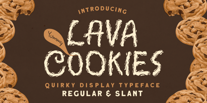 Introducing, Lava Cookies - A quirky display typeface. The unusual quirky style make this font looks great and standout for tittle, branding, logo, packaging, etc. Features : uppercase & lowercase numbers and punctuation multilingual alternates & ligatures PUA encoded We highly recommend using a program that supports OpenType features and Glyphs panels like many of Adobe apps and Corel Draw, so you can see and access all Glyph variations Thank You!