10,000 search results
(0.026 seconds)
- Beg by sugargliderz,
$12.00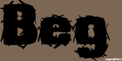
- Ben by Motokiwo,
$20.00 Ben is a simple sans serif font that we made for use on projects that require a touch of elegance. We believe simplicity is the ultimate form of sophistication and give all the idea to Ben. This font is a mirror of our personality. Ben consist of 18 faces (9 weights with italics). All fonts include uppercase, lowercase, numeral, punctuation, and special characters. The weights will give you dynamic control to use Ben in any typography projects.
 - Bea by Autographis,
$39.50 Bea is my Racetrack-Script. I call it that, because it gives the impression of speed. No lingering around with this font. Zaaanggggg!!!
 - Bee by URW Type Foundry,
$35.00
- Relativity by Bedoodle,
$9.00Decorative extended characters font. - Berling by URW Type Foundry,
$35.99 Berling is an old style typeface based on the classical Venetian model used by Aldus Manutius at the end of the fifteenth century. Berling was first cut by the Berling foundry in 1951 with further weights released in 1958. The Berling font family is intended primarily for setting text in books~ journals and magazines.
 - Berling by Linotype,
$29.99The productivity of the Berlingska Stilgjuteriet was made possible by the development of modern typeface art in Sweden in the 1950s. The typeface Berling was designed by Karl-Erik Forsberg for the Berlingska Stilgjuteriet in Lund. It belongs to the modern text typefaces and like most of these markedly shows the influece of the Neorenaissance. Berling Antiqua appeared in 1951 with a matching italic and by 1959, it was expanded to include five weights. Linotype offers Berling in four of them, roman and bold with their respective italics. In 2004 the Swedish publisher Verbum commissioned a complete redesign of Berling for the 21st century. Linotype assisted the designers of this new typeface, which came to be called Berling Nova. - Bely by TypeTogether,
$49.00 Bely is the first design by French newcomer Roxane Gataud. Too many typefaces are either governed by fear and never accomplish what they could, or are unrestrained which results in their frenetic dangling like a leaf caught in a spider’s web. Bely’s strength is that it has both restraint and freedom throughout the text weights and into the unique display weight. There is no fear in this type family, but only great respect for both the tradition of reading and the opportunity to make an impression. Bely is a high-class throwback containing four text weights which were built upon classical proportions to capitalise on reading familiarity. Bely Text features balanced capitals and a play between large, triangular serifs at the top and thick, bracketed, rectangular serifs at the bottom. The family is capped by a radical, expressive French-style display weight which pushes the rules of the text weights to their logical extreme. Bely Display, truly daring with its monstrous and angled contrast, exploits the features which make an impression at larger sizes. In the end, Bely Display is adventurous when used in packaging, identities, and headlines with attitude, while Bely Text’s calm baseline and piercing ascenders give paragraphs texture and familiarity. Bely covers the Latin A Extended glyph set and brings its sense of confidence to your projects with its two text weights, matching italics, and unique display style. Bely’s satisfying OpenType features allow for the implementation of typographic niceties such as small caps, both tabular and proportional lining and oldstyle figures, ligatures, alternate characters, case-sensitive variants, and fractions. The complete Bely family, along with our entire catalogue, has been optimised for today’s varied screen uses. Awards – Selected for TypeTogether’s Typeface Publishing Incentive Programme scholarship in 2014. – Selected by French magazine Étapes for the 2014 Diploma Issue. – Selected for the 2014 exhibition “TransFormations” at Centre Pompidou. — Received the SOTA catalyst Award 2016
 - Belwe by Bitstream,
$29.99 Designed by George Belwe for Schelter & Giesecke in Dresden, Belwe is one of the first typefaces to show the elements of the style we have classified as Kuenstler. Deliberately unusual proportions and detailing break with traditional rhythm and hint at blackletter connections.
 - Bell by URW Type Foundry,
$35.99 Bell is a facsimile of the typeface cut originally for John Bell by Richard Austin in 1788~ using as a basis the matrices in the possession of Stephenson Blake & Co. Used in Bells newspaper~ The Oracle~ it was regarded by Stanley Morison as the first English Modern face. Although inspired by French punchcutters of the time~ with a vertical stress and fine hairlines~ Bell is less severe than the French models and is now classified as Transitional. Essentially a text face~ the Bell font family can be used for books~ magazines~ long articles~ etc.
 - Relatives by T-26,
$22.00 - Belwe by ITC,
$29.99The typeface Belwe, created in 1926 by German typographer and teacher Georg Belwe, has an uncommon style that is difficult to describe. It is a synthesis of many different genres: it is a slab serif with Art Nouveau style but also with many blackletter influences. The angled serifs on the ascenders and the calligraphic flourishes on the the upper and lowercase V, W, and Ys reference marks made by pens. There are also many other special characters that are unlike any other designs. Have a look at the fun lowercase a, the quirky lowercase f and g, and the unique C, F, L, and R for the uppercase. This design works especially well for display sizes, but is also good for short amounts of text. The mood and image suggested by this typeface is great for menus, invitations, and signs when you want to send a personal and friendly message. It's Art Nouveau roots also give it a place in history for designs from the Victorian period up through the 1920's and 30's - Eire - Unknown license

- Airo by LetterMaker,
$28.90 Airo is a monospace type family with inverted contrast. The distinct shapes and detailing give Airo a strong typographic voice. The family comes in six carefully selected weights, from Light to Extra Bold, making it a versatile typographic tool. The family works best as a display typeface for creating a strong visual impact, but you can use the lighter weights for medium length text as well.
 - Aira by Jafar07,
$19.00 Aira is a serif font with a modern style that is designed very neatly and boldly, especially for designers and clients who want to have a classic yet trendy design concept, with 35 alternative lowercase letters and 9 ligatures, as an option for those of you who want to add a unique touch to your design. This font is perfect for a sturdy and discreet company logo and is also perfect for magazine layout designs, articles, quotes, and even posters.
 - Airy by ParaType,
$25.00Airy is in fact a very light-minded summer font without any serious design concept. It is a collection of hand-drawn letters that with the help of OpenType features allow you to get a lace texture with mutable structure. Together with the font you also get a bonus — a set of naive pictures that you normally draw on the margins of your sketchbook. - Airwings by Parker Creative,
$18.00 Airwings is a retro narrow typeface that includes Regular, Distressed, and Outline versions. Each version can be used on its own or combined and overlaid to create even more design options. Airwings is a versatile typeface that can be used in many ways for many different types of designs from album covers, to movie posters, clothing lines, restaurants, and more. Combine Regular and Outline versions to create a retro 3-D look. Use the Distressed version to add a grungy feel to your design.
 - Apres by Font Bureau,
$40.00 David Berlow and staff drew Apres as part of a series designed originally for the Palm Pre smart phone, for use both on the device and in print marketing. Simple, open letterforms and generous proportions provide a clear, comfortable, and inviting experience for navigation and readability. The plain-spoken geometry is regular and balanced, without being static or mechanical, for a friendly and forthright familiarity; FB 2008
 - Aries by FontHaus,
$19.00 In 1995, FontHaus came upon a rare opportunity to create a revival of Aries, a little known and previously unavailable typeface designed by the legendary Eric Gill in 1931. Discovering a lost typeface by one of the major designers of the 20th Century, was the discovery of a buried treasure, and being the first type company to release it in a digital format was an honor. Aries® is now in the fonts catalog of GroupType who owns the the registered trademark and has licensed this historical typeface exclusively to FontHaus as distributor.
 - Aries by GroupType,
$19.00 In 1995, FontHaus came upon a rare opportunity to create a revival of Aries, a little known and previously unavailable typeface designed by the legendary Eric Gill in 1931. Discovering a lost typeface by one of the major designers of the 20th Century, was like the discovery of buried treasure, and being the first type company to release it in a digital format was an honor. Aries® is now in the fonts catalog of GroupType who owns the the registered trademark and has licensed this historical typeface to FontHaus as distributor.
 - Mir by Juliasys,
$22.00 Мир is Mir. The Russian word Мир (Mir) means both World and Peace. The rendezvous of the two terms seems quite unique and utopistic today, but it is comforting to see that it was natural at some time deep down in Russian history. Bits of both meanings were going through my mind while I was designing this typeface. Mir’s character set is multiscript – Latin, Cyrillic and Greek – and extends to many parts of the linguistic world. In fact it covers more than 100 languages. Stylistic consistency between the language systems make typographic border crossings painless even where national borders are still closely guarded. And in regions where mathematics, physics or chemistry are to be expressed, a rich set of OpenType features lets Mir master also these situations. Serious things are best be said in a relaxed, unpretentious way. So Mir doesn’t put on a show. Mir has authority without being authoritarian, it is serious but not stern. It can explain difficult things and stay calm and down to earth at the same time. Mir Medium has another useful feature: It can be freely downloaded and used by anybody anywhere. You can test the Mir Family with free Mir Medium and get more styles when you need them. @juliasys
 - Acre by Jonathan Ball,
$24.00 Acre is a geometric sans-serif type family of eight weights that's both inspired by and named after my great grandfather, Tex Acre. Tex was an artist and sign maker whose handcrafted signs illuminated the roadsides of the American Midwest and typified mid-century Americana. Acre is a tribute to him, his work, and many of my favorite early 20th century geometric typefaces. With eight weights ranging from Thin to Black, Acre is an extremely versatile family that can be used for display, text, or anything in between. Acre offers full European language support plus many OpenType features such as tabular and oldstyle figures.
 - Afire by Bunny Dojo,
$23.00 Afire is a sans-serif of understated warmth and elegance. Through clean legibility and gentle embellishment, Afire delivers lively bounce with sophistication.
 - Hair by URW Type Foundry,
$39.99 Hair is another beautiful URW++ FontForum contribution by Wojtek Ruhnau. It is a technically ambitious multi-line script-like type design that should be used carefully and in large sizes only. However, set properly, Hair renders beautifully and charmingly.
 - Alire by Gittype,
$20.00 Alire is a cursive font and inspired from the famous retro typography design. It includes a total of 518 glyphs and includes several OpenType Features such as: Stylistic Alternates, Swashes, Ligatures, Contextual and Stylistic Set.
 - Air Millhouse Italic - Unknown license

- Londonderry Air NF by Nick's Fonts,
$10.00 An elegant face with dashing swash caps, based on an old American Type Founders typeface called Canterbury. The Opentype version of this font supports Unicode 1250 (Central European) languages, as well as Unicode 1252 (Latin) languages.
 - Air Corps JNL by Jeff Levine,
$29.00 What started as a small project for Mike Humphrey of Chiltern Image Service in the UK ended up as Air Corps JNL, a typeface featuring retro letters and numbers from military aircraft. Expanded to a full character set with punctuation, foreign accents, monetary figures and the like, Air Corps JNL is also available in an oblique version.
 - Air Castles JNL by Jeff Levine,
$29.00 The cover of the 1919 sheet music for "While Others are Building Castles in the Air I'll Build A Cottage for Two" had its title hand lettered in a wonderfully eccentric Art Nouveau serif design that typified the era. Also typical of the time was the habit of various songwriters to come up with wordy titles. This particular one checks in at fourteen words. Nonetheless, the sheet music's title inspired Air Castles JNL and its oblique counterpart.
 - Air Circus JNL by Jeff Levine,
$29.00 A 1930s advertising poster for the Inman Brothers Flying Circus offered up an interesting hand lettered Art Deco design that’s a cross between both squared and rounded character shapes. Because of it's 'futuristic look', the resulting type style can also lend itself to 1970s and 1980s retro projects as well as those from the 1930s and 1940s. Now a digital font, Air Circus JNL is available in both regular and oblique versions. A “Flying Circus” is a troupe of ‘barnstormers’ (stunt pilots) who performed aerial tricks either individually or as a team along with selling airplane rides to the general public.
 - Air Factory Rounded by Khaito Gengo,
$22.00 Air Factory Rounded was made for soft looking version of the original font Air Factory. Air Factory Rounded is a very simple and modern sans-serif and consisting of four weights. This contemporary typefaces would be good for restaurants, in retail, books, posters, etc. Air Factory Rounded also features various ligatures, stylistic alternates, fractions, and languages as well.
 - HWT Bon Air by Hamilton Wood Type Collection,
$24.95 Bon Air was one of a series of script typefaces cut into wood by the Hamilton Manufacturing Company for the Morgan Sign Machine Co. (makers of the Line-o-Scribe showcard press) in the mid 20th Century. These were some of the last new designs cut into wood by Hamilton until the museum revival in the early 2000s. Bon Air was created in 1958 and trademarked in 1961. The wood type made for Morgan was used largely in department stores to make their own signage. The script styles are reminiscent of sign painters alphabets and evoke a Mad Men era advertising aesthetic. The font was only cut in four sizes: 12, 18, 36 and 72 line. It was distributed by Morgan for use in their presses, but as type high wood type, it could be used on any press. The font was issued with several alternate letters and ligatures to simulate the effect of hand lettering. Its lively strokes and odd details give it an exotic flavor suitable for advertising display work. The digital version includes all of the original alternates plus new characters to fill out a full European character set.
 - Lifetime Font - Personal use only

- Sucker Font - Personal use only

- Charming Font - Unknown license

- HEX Font - Personal use only

- Glitter Font - Unknown license

- #44 Font - Personal use only

- Babylon Font - Unknown license

- barcode font - Unknown license


