10,000 search results
(0.085 seconds)
- Freaky Frog BF by Bomparte's Fonts,
$14.95A revival of sorts, Freaky Frog BF is modeled after an 1887 design from Central Type Foundry, called Grimaldi. Much warmth and charm have been instilled into the original design through among other means, reworked contours and serifs. Contours are smoothened, liberated from its roughness, while serifs have become somewhat concave. Verticals and horizontals appear to "swell" owed in part to flared shapes. The overall effect, I believe, is one of pure typographic endearment. - Diplomat by Wilton Foundry,
$29.00Diplomat was designed in response to Portfolio’s very ornate script - a much more legible and formal script that has plenty of flare but without the elaborations. It is still more ornate than Duet so if you need to find a script right in between Portfolio and Duet, Diplomat will do the trick! Diplomat in combination with its elegant lowercase, creates a prestigious presentation useful for Certificates, Wedding Invitations, Corporate Identities, Brochures, and Headlines. - ZionTrain Basic by AndrijType,
$25.00Originally ZionTrain was built as a Cyrillic typeface for public transport navigation system. We wanted comprehensible, distinctive letterforms, that can help everybody on the way from Babylon to Zion. Here, on MyFonts, we present the ZionTrain STD versions with western latin including smallcaps and oldstyle figures in some faces in TrueType format; also western, central, baltic and turkish latin charsets, smallcaps, oldstyle numerals, few alternates, some arrows and fractions in ZionTrain OT OpenType format. - Beret by Linotype,
$29.99Brazilian designer Eduardo Omine designed his Beret family of typefaces in an attempt to create a warm counterpart to the clean, minimalist sans serif of the 20th Century. The most individual characteristics of Beret are the terminals at the ends of its vertical strokes. They are slightly bent", simulating a subtle flare. Like many classic sans-serif typefaces (e.g., the original Syntax and Univers), this family does not include true (calligraphic) italics. Instead, a masterful set of obliques has been created. As Stanley Morison articulated in the early 1920s and 30s, these slanted versions of the regular "roman" faces may even work better when one wishes to emphasize certain words or passages within a text. The Beret family of typefaces is suitable for numerous applications, in both text and display sizes. The following nine fonts make up the family's design: Beret Light, Beret Light Italic, Beret Book, Beret Book Italic, Beret Regular, Beret Medium, Beret Medium Italic, Beret Bold, and Beret Bold Italic. Beret was awarded an Honorable Mention in the 2003 International Type Design Contest, sponsored by the Linotype GmbH." - Stencimilla by GRIN3 (Nowak),
$19.00 Stencimilla is a distressed stencil typeface with two different sets of capital letters - no lowercase. Language support includes Western, Central and Eastern European character sets, as well as Baltic and Turkish languages.
 - Enchanter by Cloveron Media,
$49.00 Cloveron Media unveils its first serif font that goes beyond the formal nature of typography. It celebrates the artistic expressions of graphic designers within themselves. The Name Mary Anne Remulla is the Master Designer behind the Enchanter Font. She aims to make graphic designers filled with delight and enjoy typography with its extensively artistic alternates and multilingual characters. The Font Style The serif style, known for its formal touch to typographic design, infuses the font with its professionalism as its regular. Using its middle alternate adds a hint of unique touch without losing the serif style's essence. The Enchanter font's start and end alternates are the designer's illustrations of design balance, which elevates its charm and enticing nature that adds to its overall artistic power. "I am fascinated by art and so by design. A font with alternates was my great revelation that I can do typography artistically, enthusiastically, and with freedom. I later found myself fascinated and lost in paper space, which then ended up that I completed my first font creation with extensive alternates for each letter." - Mary Anne Remulla
 - Blissful Beauty by Letterhend,
$17.00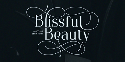 Blissful Beauty is a serif font that radiates elegance and sophistication. Its stylish alternates and delicate swashes make it the perfect choice for creating designs that demand a refined and chic look. From high-end branding to elegant wedding invitations, this font will captivate with its luxurious appeal. Features : Uppercase & lowercase Numbers and punctuation Alternates & Ligatures Multilingual PUA encoded We highly recommend using a program that supports OpenType features and Glyphs panels like many of Adobe apps and Corel Draw, so you can see and access all Glyph variations.
 - Thystle by Scholtz Fonts,
$25.00 Thystle is a "font for all seasons". It has six styles ranging from fine to in-your-face, from delicate mono-weight pen strokes to fully calligraphic lines, from delicate, narrow characters to bold, powerful statements. Characteristically, all the styles abound with Anton Scholtz's energetic "creative common" style - extravagant capitals, clear characters, and bursting-with-life swashes. Three Thystle styles are calligraphic. You can use: - Regular for invitations, poems, greeting cards and body text - Black for swing tags, music media, menus and sub-headings - Fat for posters, book covers and headings Three Thystle styles are monolinear. You can use: - Mono1, which is both delicate and condensed in width, for invitations, poems, greeting cards and body text - Mono2, which is of medium weight and condensed in width, for swing tags, music media, menus and sub-headings - Mono3, which is heavier and of standard width, for posters, book covers and headings. Opentype features include alternative upper case characters, as well as a number of ligatures. (These can be used in applications that access OpenType features.) Thystle contains over 283 characters - (upper and lower case characters, punctuation, numerals, symbols and accented characters for both Text and Display caps). It has all the accented characters used in the major European languages.
 - Brattons by Lone Army,
$17.00 Brattons, a newly crafted font, embodies an essence of elegance and sophistication. Its graceful curves and delicate strokes exude a distinctly feminine allure, capturing the essence of luxury and style. This serif font boasts stylistic alternates and ligatures that elevate its visual appeal, offering a unique and refined touch to any design project. Brattons is a testament to its meticulous craftsmanship, designed to resonate with those seeking a blend of timeless charm and contemporary finesse.
 - Vernacular Sans by jpFonts,
$19.95 The Vernacular trilogy was designed by Swiss designer Hans-Jürg Hunziker, who had worked for Adrian Frutiger in Paris for many years. Based on the concept of a transitional Linear Antiqua, he has developed a colorful bouquet of typefaces that contain the entire spectrum of typefaces for book design and corporate identity. Thanks to his "Swiss school" and his outstanding skills, he has succeeded in giving the typefaces a particularly noble and sympathetic expression. In addition to the Sans family, there is a Serif family and a Clarendon family, each of which, including the separately drawn italics, is equipped with 12 font weights that are finely tuned to one another. Each of the 3 font styles develops its own character, but thanks to a concept that brings the different font styles closer together, they also work well together and complement each other perfectly. Sans and Clarendon have a vertical axis and similar endings in contrast to the Serif, which has a traditional diagonal axis and horizontal endings. The straight stems and the proportions are used as an element to stress the closeness of the typeface-trilogy. They thus share a comon feature. All fonts contain tabular and proportional figures as well as old style figures. Small caps and small cap figures are also available in all fonts. In addition, some fonts have alternative characters available via style set, such as «g», which can be used to further vary the typeface. Vernacular offers all the options for well-kept typesetting for print and web - for small and large orders.
 - Vernacular Serif by jpFonts,
$19.95 The Vernacular trilogy was designed by Swiss designer Hans-Jürg Hunziker, who had worked for Adrian Frutiger in Paris for many years. Based on the concept of a transitional Linear Antiqua, he has developed a colorful bouquet of typefaces that contain the entire spectrum of typefaces for book design and corporate identity. Thanks to his "Swiss school" and his outstanding skills, he has succeeded in giving the typefaces a particularly noble and sympathetic expression. In addition to the Sans family, there is a Serif family and a Clarendon family, each of which, including the separately drawn italics, is equipped with 12 font weights that are finely tuned to one another. Each of the 3 font styles develops its own character, but thanks to a concept that brings the different font styles closer together, they also work well together and complement each other perfectly. Sans and Clarendon have a vertical axis and similar endings in contrast to the Serif, which has a traditional diagonal axis and horizontal endings. The straight stems and the proportions are used as an element to stress the closeness of the typeface-trilogy. They thus share a comon feature. All fonts contain tabular and proportional figures as well as old style figures. Small caps and small cap figures are also available in all fonts. In addition, some fonts have alternative characters available via style set, such as «g», which can be used to further vary the typeface. Vernacular offers all the options for well-kept typesetting for print and web - for small and large orders.
 - Vernacular Clarendon by jpFonts,
$19.95 The Vernacular trilogy was designed by Swiss designer Hans-Jürg Hunziker, who had worked for Adrian Frutiger in Paris for many years. Based on the concept of a transitional Linear Antiqua, he has developed a colorful bouquet of typefaces that contain the entire spectrum of typefaces for book design and corporate identity. Thanks to his "Swiss school" and his outstanding skills, he has succeeded in giving the typefaces a particularly noble and sympathetic expression. In addition to the Sans family, there is a Serif family and a Clarendon family, each of which, including the separately drawn italics, is equipped with 12 font weights that are finely tuned to one another. Each of the 3 font styles develops its own character, but thanks to a concept that brings the different font styles closer together, they also work well together and complement each other perfectly. Sans and Clarendon have a vertical axis and similar endings in contrast to the Serif, which has a traditional diagonal axis and horizontal endings. The straight stems and the proportions are used as an element to stress the closeness of the typeface-trilogy. They thus share a comon feature. All fonts contain tabular and proportional figures as well as old style figures. Small caps and small cap figures are also available in all fonts. In addition, some fonts have alternative characters available via style set, such as «g», which can be used to further vary the typeface. Vernacular offers all the options for well-kept typesetting for print and web - for small and large orders.
 - Triump by Latinotype,
$26.00 The typeface family Triump is a simple sans serif with 6 weights from Thin, ideal for use as an epigraph, to Black for head titles of special impact. Excellent for applying in graphic design as logos, trademarks, posters, editorial and web design. Inspired by the classic types of the late twentieth century with rounded corners that give the typography a smooth appearance with rounded ends, with a horizontal stroke that exceeds the vertical in the letters A, E, F, H, J and K which gives a distinct personality. Triump comes with a Black weight in normal and italic Line both upper and lowercase letters, especially to give a vintage look to the designs.
 - Bell by URW Type Foundry,
$35.99 Bell is a facsimile of the typeface cut originally for John Bell by Richard Austin in 1788~ using as a basis the matrices in the possession of Stephenson Blake & Co. Used in Bells newspaper~ The Oracle~ it was regarded by Stanley Morison as the first English Modern face. Although inspired by French punchcutters of the time~ with a vertical stress and fine hairlines~ Bell is less severe than the French models and is now classified as Transitional. Essentially a text face~ the Bell font family can be used for books~ magazines~ long articles~ etc.
 - Measly by Amarlettering,
$15.00 Measly Script is a delicate and elegant script font with a modern and sophisticated appearance. Its thin letterforms feature fluid strokes and subtle curves, creating a graceful and refined feel. The font is perfect for designs that require a sense of elegance and sophistication, such as wedding invitations, branding, or editorial design.
 - Sothardjo by Isolatype,
$15.00 Introducing! new typeface by wildan type and Isolatype Sothardjo is a delicate, elegant and flowing handwritten font. It has beautiful and well balanced characters and as a result, it matches a wide pool of designs. Sothardjo is PUA encoded which means you can access all of the glyphs and swashes with ease!
 - Mailbox Letters JNL by Jeff Levine,
$29.00Many items we use in our day-to-day lives offer wonderful source material for font designs. Mailbox Letters JNL was inspired by a set of self-stick adhesive letters used on mailboxes, doors and other areas of identification at home or in business. Each letter, number and punctuation mark is centered on a black rectangle - just as the actual model for this font. Use it as spaced, or hand set it tighter to form a ribbon with white-on-black text. To provide continuity for the ribbon effect, a blank rectangle is provided on the vertical bar key (the shift position of the backslash key). Limited character set. - Core Sans R by S-Core,
$20.00 The Core Sans R Family is a part of the Core Sans Series, such as N, NR, N SC, M, E, A, D. and G. This font family has closed and square letter shapes, and overall rounded finishes provide a soft and friendly appearance. Simple shapes with a tall x-height make the text legible and the spaces between individual letter forms are precisely adjusted to create the perfect typesetting. The Core Sans R Family consists of 7 weights (Thin, Light, Regular, Medium, Bold, Heavy, Black) and Italics for each format. Core Sans R supports complete Basic Latin, Cyrillic, Central European, Turkish, Baltic character sets. Each font includes proportional figures, tabular figures, oldstyle figures, numerators, denominators, superscript, scientific inferiors, subscript, fractions and case features.
 - Neutraliser Sans by HamburgerFonts,
$20.00 The Neutraliser family is a versatile collection of geometric-based fonts with 24 styles. The 6 Alternate styles are suitable for headlines and are complemented by the Sans and Serif styles suitable for small amounts text. The Caps styles allow for extra typographic variation within the family. Neutraliser is a direct result of the designer's initial exploration of typography and is uncompromising in its geometric nature. As the name suggests, the typeface celebrates the precision of the digital medium as a drawing tool in which the critical points that make up a letterform can be almost ‘plotted’ according to a grid-based logic.
 - Neutraliser Caps by HamburgerFonts,
$20.00 The Neutraliser family is a versatile collection of geometric-based fonts with 24 styles. The 6 Alternate styles are suitable for headlines and are complemented by the Sans and Serif styles suitable for small amounts text. The Caps styles allow for extra typographic variation within the family. Neutraliser is a direct result of the designers' initial exploration of typography and is uncompromising in its geometric nature. As the name suggests, the typeface celebrates the precision of the digital medium as a drawing tool in which the critical points that make up a letterform can be almost 'plotted' according to a grid-based logic.
 - Neutraliser Serif by HamburgerFonts,
$20.00 The Neutraliser family is a versatile collection of geometric-based fonts with 24 styles. The 6 Alternate styles are suitable for headlines and are complemented by the Sans and Serif styles suitable for small amounts text. The Caps styles allow for extra typographic variation within the family. Neutraliser is a direct result of the designers' initial exploration of typography and is uncompromising in its geometric nature. As the name suggests, the typeface celebrates the precision of the digital medium as a drawing tool in which the critical points that make up a letterform can be almost 'plotted' according to a grid-based logic.
 - Neutraliser Alternate by HamburgerFonts,
$20.00 The Neutraliser family is a versatile collection of geometric-based fonts with 24 styles. The 6 Alternate styles are suitable for headlines and are complemented by the Sans and Serif styles suitable for small amounts text. The Caps styles allow for extra typographic variation within the family. Neutraliser is a direct result of the designers' initial exploration of typography and is uncompromising in its geometric nature. As the name suggests, the typeface celebrates the precision of the digital medium as a drawing tool in which the critical points that make up a letterform can be almost 'plotted' according to a grid-based logic.
 - Ibrani by Arabetics,
$39.00 A completely isolated letters typeface design with an overall Hebrew look and feel. Glyphs were designed with an emphasis on isolation and vertical feel with a visual connectivity measure to help easy reading. The Ibrani (Arabic for Hebraic) font family has two members, regular and left-slanted italic styles. This font family design follows the guidelines of Mutamathil Taqlidi type style with one glyph for every basic Arabic Unicode character or letter, as defined in the latest Unicode Standards, and one additional final form glyph, for the freely-connecting letters in traditional Arabic cursive text. Ibrani employs variable x-height values. It includes only the Lam-Alif ligatures. Soft-vowel diacritic marks, harakat, are selectively positioned. Most of them appear by default on the same level, following a letter, to ensure that they would not interfere visually with letters. Tatweel is a zero-width glyph. Keying the tatweel key before Alif-Lam-Lam-Ha will display the Allah ligature. Ibrani includes both Arabic and Arabic-Indic numerals, in addition to standard punctuations.
 - TDL Ruha Hairline by Tipos Das Letras,
$15.00 Ruha Harline is a modern and mechanical serif typeface and is the result of stencil's RUHA development. Being the first typeface of the family, it sets the basic concepts for further development, on each version to come. The design approach, results from a rigid geometrical connection with the Roman du Roi, since the letterforms are imposed by the constraints of the RUHA ruler. The main typographic proportions are connected with the modern typefaces, like Didot or Bodoni. Maintaining the same structure with different typographical and stylistic properties, the stencil allows to explore a modern typeface, with vertical stress, high contrast between the thick and thin strokes and hairline serifs.
 - Mikaila Signature by IbraCreative,
$14.00 Mikaila Signature is an exquisite and aesthetic font that epitomizes elegance and grace. Inspired by the beauty of a personalized signature, each letter in Mikaila Signature flows effortlessly with a delicate and sophisticated touch. With its refined strokes and precise curves, this typeface exudes a sense of timeless allure, making it ideal for luxury branding, high-end invitations, and sophisticated editorial layouts. Mikaila Signature adds an air of exclusivity and sophistication to any design, capturing attention and leaving a lasting impression. Whether used for elegant logos or refined product packaging, this font exudes an aura of class and finesse, making it the quintessential choice for those seeking an aesthetic signature font that exudes impeccable style.
 - Redzein by Almarkha Type,
$15.00 Introducing our latest Vintage Slab called Redzein Retro Display Slab with vintage taste can make your logotype become more interesting. inspired by the decorative arts and architecture movement. Redzein fonts is perfect for your project and allows you to create designs, headlines, posters, logos, badges, t-shirts and many more that are beautiful. It is also best used for posts, logos, posters, certificates, labels and more.
 - Sketchup by Almarkha Type,
$25.00 Introducing our latest Sketch Display Slab called Sketchup Display Slab with Sketch taste can make your logotype become more interesting. inspired by the decorative arts and architecture movement Sketchup fonts is perfect for your project and allows you to create designs, headlines, posters, logos, badges, t-shirts and many more that are beautiful. It is also best used for posts, logos, posters, certificates, labels and more.
 - Suntage by Almarkha Type,
$15.00 Introducing our latest called Suntage Retro Display Sans with 4 Style vintage taste can make your logotype become more interesting. inspired by the Retro Poster arts and architecture movement Suntage fonts is perfect for your project and allows you to create designs, headlines, posters, logos, badges, and more that are beautiful. It is also best used for posts, logos, posters, certificates, labels and more.
 - Vermost by Putracetol,
$28.00 Vermost is display retro sans serif font. This font is very unique and unlike other fonts, the difference is that the horizontal body is thicker than the vertical. This font also goes into a classic style, with a neat and soft shape. There is a rough/texture version too. I strengthen the vintage/retro impression with the character ligatures, there are 88 ligatures in this font. But if you want to use this font with a neater impression, you can disable this ligature feature. This font is perfect for projects with vintage/retro and classic themes. But this font is also suitable for logos, branding, greeting cards, invitation cards, advertisements, titles, healines, book titles, stickers, packaging, quotes, posters, t-shirts/apparel, billboards and others. This font is also support multi language. To access the alternate glyphs, you need a program that supports OpenType features such as Adobe Illustrator CS, Adobe Photoshop CC, Adobe Indesign and Corel Draw.
 - Merrivale by Greater Albion Typefounders,
$16.50 Merrivale is an ideal example of the benefits of keeping ones eyes open- it was inspired by the gilt-finished raised lettering on a late Victorian shopsign in Melbourne, Australia. The family of seven faces include upper and lower case forms, small capitals, all capital forms, and flamboyant display forms. Extensive Opentype features are incorporated. All faces are offered in incised forms inspired by the original lettering as well as in solid black filled forms. Thsee typefaces are wonderful for signage where either a period air or a dignified but legible feel are required. They also lend themselves to other display uses such as posters, book covers and so forth and are ideal for the title lines of certificates.
 - Linotype Really by Linotype,
$29.99Linotype Really, designed by Gary Munch, is a typeface family of six weights with italics and small capitals that offers a broad palette of expressions to draw from, sensibly light to brightly stentorian. The moderate-to-strong contrast of the vertical to horizontal strokes recalls the Transitional and Modern styles of Baskerville and Bodoni, and the subtly obliqued axis of the stoke weight recalls the old-style faces of Caslon. A strong belt of sturdy serifs completes the Realist sensibility of a clear, readable, no-nonsense text face whose clean details offer the designer a high-impact display face. - Aire by Lián Types,
$37.00 Aire is what Sproviero would call a < big display family >. We recommend seeing its user’s guide. After his success with Reina, Sproviero comes out with this big family of 7 members: Each of them loaded with lots of sophisticated ligatures, alternates and the entire cyrillic alphabet. The overall impression that the font gives is lightness and delicateness; that’s the reason the designer chose to call it Aire, or Air, in English. "Aire was somehow having a rest from my fat face Reina [...] It started as a really thin style of Reina, but it rapidly migrated from it and grew up alone. And how it grew..." The inspiration came from his own past creations: “The heavy strokes of Reina were shouting for a more delicate thing. Something more feminine. More fragile. Something which had a lot of elegance and fresh air inside”. Aire responds to this: Sproviero found that many of the typefaces of nowadays which are used for headlines (best known as display fonts) have almost always just one, maybe two weight styles. This was his opportunity to try something new. Aire makes it easier for the user to generate different levels/layers of communication thanks to its variety of styles. With this font you can solve entire decorative pieces of design with just one font, and that was the aim of it. Aire was designed to be playful yet formal: While none of its alternates are activated it can be useful for short to medium length texts; and when the user chooses to make use of its open-type decorative glyphs, it can be useful for headlines with dazzling results. On March of 2012, Aire was chosen to be part of the most important exhibition of typography in Latinoamerica: Tipos Latinos 2012. TECHNICAL Aire is a family with many members. In total, the user can choose between almost 6,000 (!) glyphs (1,000 per style). Each member has variants inside, which are open-type programmed: The user decides which glyph to alternate, equalizing the amount of decoration wanted. Every decorative glyph has its weight adjusted to the style it belongs to. Exclusively for decoration, Aire Fleurons Pro is an open-type programmed set of ornaments. And last but not least, remember Aire is delicate. What’s my point? It is not recommended to activate all the alternates at the same time. It is typo-scientifically proved: A maximum of 3 or 4 alternates per word would be more than enough.
 - Oscar by Pelavin Fonts,
$25.00 Inspired by the elegance and sophistication of Hollywood's Golden Era, Oscar is a lyrical nod to the pinnacle of cinema achievements, the Academy Awards. Its slim, graceful features are accentuated by undulating triple waves. Delicate yet study, it will handily support messages both solemn and joyful. Use Oscar when you wish to convey a sense of celebration and prestige, a reference to the era of Art Deco and the 1920s or, a feeling of grace and ceremony.
 - Mager - Unknown license

- 2006 - Personal use only

- Anna - Unknown license

- Porcelain - 100% free

- KR Leafy - Unknown license

- Lady Ice - Extra Light - Unknown license

- Mady Risaw by Stringlabs Creative Studio,
$29.00 Mady Risaw is a delicate, elegant and flowing handwritten font. It has beautiful and well balanced characters and as a result, it matches a wide pool of designs. Add it to your most creative ideas and notice how it makes them come alive!


