10,000 search results
(0.093 seconds)
- Danish Script Initials JNL by Jeff Levine,
$29.00 A set of transfer patterns for sewing decorative monogram initials on clothing was manufactured by Women's Day magazine circa the 1940s. Designed by renowned Copenhagen-born industrial artist and letterer Gustav Boerge Jensen [April 8, 1898 - June 27, 1954], these initials have been redrawn into a digital font entitled Danish Script Initials JNL. Large initials are on the uppercase A-Z keys, while smaller initials are on the lower case a-z keys and are centered to the larger cap height. An ornament is provided on the asterisk key, and can be placed between the small initials and the larger initial for decorative effect.
 - Sonny Gothic Vol 2 by W Type Foundry,
$25.00 Sonny Gothic Vol 2 is an extension of our popular font Sonny Gothic. All corners have been softened to get a friendlier and fluffy visual language. As Sonny Gothic, this typeface has ligatures inspired by the incredible work of Herb Lubalin, chiefly Avant Garde. We designed carefully Sonny’s Vol 2 ligatures, and we also created new ones to control the whites formed between softened characters such as FL, FB, FD, FE, FF, FH, FI, FK, FN, and FR. Developed with powerful OpenType features in mind. Each weight includes alternate characters, ligatures, fractions, special numbers, arrows, extended language support, small caps, and many more. Perfectly suited for graphic design advertising.
 - Cassius by W Type Foundry,
$23.00 Cassius & Cassius Italic are a postmodern typeface system from the Garaldes family. The main characteristic of this type family is its inverted anatomy and projected terminals. Cassius was meticulously designed with special focus on its structure. With its proposal for a fresh, attractive and rhythmic system, Cassius gives great personality to all kinds of composition. The family consists of 5 weights from regular to black, with respective Italics. Each instance includes; Case sensitives Accents, Ligatures, Fractions, Small Caps, Old Style Figures, Case Sensitives (symbols and punctuation) and more. This font is perfect for books and magazines compositions, and in general for the construction of immersive printed or digital texts.
 - 52-Kfx by ILOTT-TYPE,
$49.00 Where most fonts are available in varying weights, 52-Kfx is a family consisting of 3 heights; High, Mid and Low. These offer the typographer a full palette, Low is readable for setting copy while at the opposite end High is better suited for display—names, headlines and logotypes. 52-Kfx has a sophisticated and elegant period feel with clean, modern lines that remain relevant for contemporary application. Exaggerated ascenders and descenders of the lowercase and a tall cap-height give it a lofty stature while the low x-height keeps characters grounded. The spacing and lyrical rhythm are perfectly in sync and epitomized by the fluidity seen in the ligatures.
 - Modum by The Northern Block,
$- A contemporary serif font family. The design takes influence from traditional serif forms to develop a precise, highly functional text face with a low contrast. Smooth radius details are blended with carefully drawn angles that give a crisp, distinctive aesthetic when used across body copy. Modum is a stylish modern day serif with great charm, harmony and practicality that is best suited for complex hierarchical projects, such as editorials, newspapers and text based books. Details include 8 weights and true italics, over 800 characters with alternative lowercase a, e, g and y. 7 variations of numerals, true small caps with accents, ligatures, manually edited kerning and Opentype features.
 - Amnestia by Arterfak Project,
$14.00 Amnestia is a vintage serif typeface with a modern-classic feel. Inspired by vintage signage and minimalist serif style, this All-Caps font comes with 100+ alternates that gives you more options to get many variations in your designs. Amnestia has a medium height that looks perfect for display or sub-text. Amnestia available in 2 styles, distressed and normal, and is a great choice to be used in logos, insignia, apparel, labels, packaging, posters and more. Amnestia has a stylistic set 01 - 10 as the alternates of the letterforms. Some alternates have swashes and tails that you can explore to get more possibilities to create different typographic looks.
 - Galavant by Atlantic Fonts,
$32.00 Galavant will take you anywhere you want to go! Enjoy three font looks in one; a fun, chunky lower-case, a bold, animated upper-case, and in all-caps with discretionary ligatures turned on, Galavant is tightly interlocking. To explore the interlocking possibilities, turn some ligatures off and others on until you settle on the best combo. There are over 260 two, three, and four-letter ligatures available. Discover interlocking ligatures featuring lower-case "i" along the road as well. In sentence-case, turn discretionary ligatures off, except to add more handmade variation in double-letter pairs and to access a fine "ft". However you roam, Galavant aims to entertain.
 - Leonardo Sans by Factory738,
$10.00 Leonardo Sans is a modern sans serif with a geometric touch. It comes in 10 weights, clean and modern caps, thereby creating more variability. Designed with powerful opentype features in mind. Each weight includes extended language support, fractions, tabular figures, arrows, ligatures and more. Perfectly suited for graphic design and any display use. It could easily work for web, signage, corporate as well as for editorial design. 10 Weights (Thin, UltraLight, Light, Regular, Medium, SemiBold, Bold, ExtraBold, Black, Heavy) Oblique font is available Numbers & Punctuation Extensive Language Support Thanks for looking, and I hope you enjoy it. Check out Newgate which is a great pair for Leonardo Sans.
 - Stripes by profonts,
$41.99 Stripes is a caps only font and does not contain additional ligatures, because there is an easy way to create as many of them as you like. To form a ligature, convert your word or word string into vectors. Activate the corner points of the straight lines (not the round ones) of a letter and drag them over the next or the previous letter. This way you can create any ligature of your own. Beware of overkilling, it could decrease the legibility of your text. Besides the normal J, Stripes contains a stylistic alternate which should be used to avoid ugly gaps between critical letter pairs (see pdf document).
 - Super League by Arkitype,
$12.00 Super League is a display typeface created for the sports industry. The typeface itself doesn't lean too much in a particular sports category direction which makes it versatile in use across various sporting categories. Super League has loads of. options to make use of including; small caps, stylistic alternates, ligatures for vs, st, nd, rd and th that are very useful when handling typography for sports in particular. Use Super League in all your printed material or on screen. Create badges or print names and numbers sports kits. All weights come with an oblique version which makes the total number of 16 fonts in this typeface.
 - Impara by Hoftype,
$39.00 Impara was designed in 2010. It is a slightly contrasted sans serif with a lively stroke ductus and distinct humanistic characteristics. It represents a synthesis of linear coolness and classic elegance. It qualifies for informational text applications and, in display sizes, it reveals elaborate details. Impara comes in 10 styles in OpenType and TrueType format. Each font is equipped with an extended character set containing: standard and discretional ligatures, small caps, proportional lining figures, tabular lining figures, proportional old style figures, lining old style figures, matching currency symbols, fraction- and scientific numerals. Impara supports Western European as well as Central and Eastern European languages.
 - Arida by Latinotype,
$39.00 Árida pays homage to the Argentinian city of San Juan, located in the semi-desert Cuyo region, where cacti are abundant; a characteristic feature of arid habitats. Árida, inspired by the vegetation of the place, looks sharp and aggressive at large sizes but it also feels friendly at a smaller scale—portraying the dichotomy between humans and nature. Árida comes in 5 weights, ranging from Regular (with a matching italic) to Black. The Regular variant contains 773 glyphs and its Italic counterpart is composed of 939 glyphs. The font also includes small caps, different styles of figures, ligatures, and stylistic and contextual alternates, among other OpenType features.
 - Soundtrack by PintassilgoPrints,
$24.00 Simple and charming, Soundtrack is a lively all-caps font that brings two versions for each letter. Make your choices by simply typing the upper or lower case keys or switch on the Contextual Alternates feature on any OpenType savvy program to instantly alternate between lettershapes. Versatile, Soundtrack comes in two weights and is suited for a wide range of display applications, doing great also for small chunks of text. Handy dingbats are included in both versions. Pick them using a glyphs palette or character map or just turn on the OpenType ornaments feature for accessing them directly from your keyboard. Let music sound!
 - Sore by Omotu,
$18.00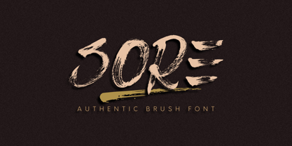 Sore is an authentic brush font, real brush texture. All caps characters. Sore is suitable for branding, logotype, apparel, T-shirts, Hoodies, product packaging, quotes, flyer, poster, advertising and more. Whats Include? 1. Uppercase and lowercase characters 2. Multilingual support. 3. Numerals, punctuations, alternate, and ligatures 4. Accessible in the Adobe Illustrator Glyphs panel, or under Stylistic Alternates in the Adobe Photoshop OpenType menu, Adobe InDesign, Corel Draw, even work on Microsoft Word. Please message me if you're unsure of any language support. Thanks for looking, and I hope you enjoy it! Please don't hesitate to drop me a message if you have any issues or queries. Omotu Studio
 - Price Tags JNL by Jeff Levine,
$29.00 Price Tags JNL is a multi-use dingbat font. Along with over twenty nostalgic price tags, there is a set of individual numbers [1 thru 0 keys] and number pairs [A-T and a-i keys] for creating old-style white-on-black price tags. Blank end caps are available on the parenthesis keys, the decimal point is on the period key, catch words FOR, DOZEN and EACH are on the left and right arrows and right brace respectively, and the dollars and cents marks are on the dollar and hyphen keys. You'll even find a few extras placed upon the bracket and left brace keys.
 - Rodge by Designova,
$15.00 Rodge is a unique display typeface perfect for headlines, big text, branding, logotypes & graphic design purposes such as posters, flyers and advertisements. This all-caps font can be an excellent choice for creating outstanding logos, promotional content, and marketing presentations that can bring uniqueness and freshness at its level best. The typeface comes with OpenType Stylistic Alternatives feature giving you the option to add some unique characters. Please see the examples shown above to get an idea of the capability of this typeface. Rodge comes with extended language support including Western European, Central European, and South-Eastern European character sets (total of 238 glyphs).
 - P22 Mackinac by IHOF,
$39.95 P22 Mackinac Pro spans four centuries of type design, bridging the Old World with the New. This family of four weights and corresponding italics is of old style construction, with a diagonal weight stress. Contrast between thick & thin is modest and proportioned the same for all fonts. The tall x-height recommends itself to a wide variety of text and display uses; including advertising, publishing, signage and packaging. P22 Mackinac Pro (pronounced Mackinaw) is a general-purpose, utilitarian design incorporating an abundance of OpenType features: small caps, ligatures, ordinals, numerous figure options plus a few bonus goodies. Mackinac supports 56 languages using extended Latin character sets.
 - Ethos by Fonts With Love,
$- Ethos is a contemporary serif fontfamily by Fonts With Love. It comes in 36 fontstyles with true italics and a huge bunch of opentype features like small caps, ligatures, nominators and denomiators, fractions and many more. Its x-height is pretty high, which makes it legible even on small fontsizes. Above that, the lighter weights have a rather low-contrast linestyle, which improves the legibility on display application especially on smaller sizes. On larger fontsizes, the typeface stands out with a distinctive character of geometrically shaped letters with soft rounded corners. Each fontface contains 500+ glyphs, supporting a huge amount of languages, mathematical operators, symbols and punctuations.
 - Hazelnut Pro by Eimantas Paškonis,
$- This small family can be counted as 4 fonts in 2. Because both weights contain small caps, 12 sets of stylistic alternates, and a decorative swashed form. That’s not counting dozens of ligatures in both multilingual latin and Cyrillic scripts. Plus ordinals, case-sensitive forms, and manual hinting. Due to its geometric nature, designers can manipulate vectors to change letters' dimensions for logotypes. They may seem modular, but every glyph was shaped individually to give handmade imperfections, reminiscent of wood type press. This allows for plenty of details at large sizes. Regular versions are multilingual but include only standard ligatures and case-sensitive forms.
 - Volupia by DSType,
$19.00I started designing Volupia in 2004 and the main goal was to create a very casual font with some characteristics than we can find in some old commercial advertisements. After designing the basic character set I decided to go OpenType because it would allow me to go deep into the script, correcting the balance of the spaces and the kerning, along with the possibility to create Ligatures and Swashes. The result is a typeface ideal for use in very big sizes. Volupia includes Small Caps, Ligatures, Fractions, CE Characters, Swashes and Alternates. The ligatures and the ending swashes allow the user to make the text more calligraphic and personal. - Mediator Serif by ParaType,
$30.00Mediator Serif is a balanced contemporary serif typeface that performs well both in display sizes (like in packaging or branding) and body text (books or periodicals where narrow styles will be extremely useful). Mediator Serif is a complementary serif face for Mediator Sans. The family contains 32 fonts in 2 widths: 8 romans with matching italics, of slightly extended proportions, from Thin to Black; and 8 narrow styles with matching italics too. The character set in all faces was expanded to include small caps and old style figures. The typeface was designed by Manvel Shmavonyan with the participation of Alexander Lubovenko and released by ParaType in 2017. - Arastin by Graptail,
$17.00 Arastin come with the lowercase and uppercase of the display romantic style like a script, italic, and caps. Its outer curve flows without interruption. In one swift move, from nose to tail. This characteristic is mirrored throughout the typeface and defines both its details as well as its overall type colour. Its wide range of stylistic alternates allows versatile design options and works perfectly for headlines, logos, posters, packaging, T-shirts, postcards and much more. Also supported PUA encoded. Simply copy and paste the alternate characters using the Character Map (Windows), Font Book (Mac) or a software program such as PopChar (for Windows and Mac).
 - Righteous Pro by Stiggy & Sands,
$29.00 Our Righteous Pro was inspired by the all-capital letterforms from the deco posters of Hungarian artist Robert Berény for Modiano. Grid based and geometric in execution, the font is highly readable at a wide range of point sizes, ideal for display and print. Unlike that of its original inspiration source, Righteous has both a full lowercase and a SmallCaps set as well as an extensive figures set to increase flexibility and ease of use. Opentype features include: - SmallCaps. - Full set of Inferiors and Superiors for limitless fractions. - Tabular, Proportional, and Oldstyle figure sets (along with SmallCaps versions of the figures). - Stylistic Alternates for Caps to SmallCaps conversion.
 - EuroSans by profonts,
$41.99 Euro Sans Pro ? created by German type designer Ralph M. Unger - is a classical and modern Roman Sans Serif at the same time. The family comprises of 12 styles, each with more than 500 glpyhs covering standard Latin, Central European, and Cyrillic. It is an all purpose typeface, a strong and expressive roman sans serif with a French touch to it. Euro Sans Pro provides excellent readability in all sizes, for small copy as well as for very large letters on posters and signs. The character complement also includes small caps and old style figures, and the corresponding OTF features are built into the fonts as well.
 - Punkaholic by Sharkshock,
$115.00 Punkaholic started out as a loopy, all caps display font with a semi condensed feel. Before completion some of the letters such as A and W were given a more traditional look and were penciled in for alternates. In the end, however, they were added as uppercase characters instead. For this reason most words in lowercase vary in appearance from their uppercase counterparts. This dichotomy between straight lined capitals and rounded ones makes for some interesting contrasts. Punkaholic works best in less formal settings such as café menus, t-shirts, or children’s publications. It comes in 3 styles and contains Latin, extended Latin, punctuation, and kerning.
 - Bernhard Signature by Jonahfonts,
$40.00I started to work at the Bernhard Studio in 1952 to 1959 in New York. I helped with some type designs and many other projects, this two tiered signature was added on all of Bernhard’s art that was produced in the past and in his later years. In the 50’s I thought Bernhard’s Gothic face was quite a bit outdated but as you may know it has become one of todays most used faces. His signature is based on his Bernhard Gothic Font. With todays computer technology I have digitized the caps and added lower case glyphs with lower ascenders and other slight changes. - Smokum Pro by Stiggy & Sands,
$29.00 Our Smokum Pro is a western inspired slab-serif font with a little playful swagger to it. It's perfect for headlines and display uses that require a little loosened up country flair, but because of the contrast of thicks and thins, it will perform best as a WebFont at medium to large point sizes. The SmallCaps and extensive figure sets offer a little more serious tone and a wider range of design use. Opentype features include: - SmallCaps. - Full set of Inferiors and Superiors for limitless fractions. - Tabular, Proportional, and Oldstyle figure sets (along with SmallCaps versions of the figures). - Stylistic Alternates for Caps to SmallCaps conversion.
 - Vistr by Kobuzan,
$18.99 Vistr is a reverse-contrast display typeface inspired by western movies, infused with the tension of classic horror films. Powerful serifs, smooth curves, sharp details and an impressive contrast of strokes are unusually combined with each other. This creates a dramatic, eye-catching effect. Which is ideal for use in large sizes in titles and headlines to create a gloomy mood. This is an ALL-CAPS font. There is support for extended Latin, basic Cyrillic, and Greek. Features: – Total glyph set: 351 glyphs; – 1 style; – Support 210+ languages; – Latin Extended; – Cyrillic Basic + Bulgarian letters; – Greek; OpenType features: – Uppercase; – Proportional numerals; – Punctuations and symbols; – Arrows; – Stylistic alternates (ss01).
 - Browess Sovar by Ronny Studio,
$19.00 Hundreds of handwritten custom letter combinations make this font look like it was scrawled with a pen, not typed with a computer. These characters belong next to each other... that's how the natural flow and messy style is achieved. You won't see many duplicate letter styles here. Add it with confidence to your projects, and you'll love the results. This typeface is perfect for logos, branding, promotions, book covers, magazine layouts, or simply as a stylish text overlay onto any background image. Features : Lowercase & Uppercase ( All Caps ) numbers and punctuation multilingual alternates PUA encoded Please contact us if you have any questions. Enjoy Crafting and thanks for supporting us! :) Thank you
 - Stempel Sans Print Neo by TypoGraphicDesign,
$9.00 The typeface Stempel Sans Print Neo is designed from 2022 for the font foundry Typo Graphic Design by Manuel Viergutz. The display font based on a original set of 29 old rubber stamps (6 cm height). Digitized via hand-stamped, a scanner and Glyphs app. 3 font-styles (Rough, Misprint, Black) with 321 glyphs incl. decorative extras like icons, arrows, dingbats, emojis, symbols, geometric shapes (type the word #LOVE for ♥︎or #SMILE for ☻ as OpenType-Feature dlig) and stylistic alternates (6 stylistic sets). For use in logos, magazines, posters, advertisement plus as webfont for decorative headlines. The font works best for display size. Have fun with this font & use the DEMO-FONT (with reduced glyph-set) FOR FREE! Font Specifications ■ Font Name: Stempel Sans Print Neo ■ Font Styles: 3 font styles (Rough, Misprint, Black) + DEMO (with reduced glyph-set) ■ Font Category: Display Script for headline size ■ Glyph Set: 321 glyphs (incl. decorative extras) ■ Language Support (36 languages): Asu Bemba Bena Chiga Cornish English German Gusii Indonesian Kalenjin Kinyarwanda Luo Luyia Machame Makhuwa-Meetto Makonde Morisyen North Ndebele Nyankole Oromo Rombo Rundi Rwa Samburu Sangu Shambala Shona Soga Somali Swahili Swiss German Taita Teso Uzbek (Latin) Vunjo Zulu ■ OpenType features (16): aalt calt case ccmp dlig liga lnum onum ss01 ss02 ss03 ss04 ss05 ss06 mark mkmk ■ Design Date: 2022 ■ Type Designer: Manuel Viergutz
 - Retro Games by Hexa,
$0.80 Introducing HEXA’s second family-font, Retro Games Font. The RetroGames font is a witty reinterpretation of the fonts found in 90s 16-bit games that we enjoyed when we were young, presented as bitmap imaged fonts. It offers superior legibility and aesthetic sensibility compared to many other existing bitmap fonts. For instance, while most bitmap fonts create one stroke with 1 pixel or have various thicknesses in pixels, we have standardized it to a maximum of one stroke with 1-3 pixels, enhancing both legibility and aesthetic appeal. Since there are many similar bitmap fonts, we wanted to reinterpret it as a genre of its own. Our latest designed fonts HEXA, we noticed some shortcomings in legibility, and we aim to address those shortcomings in this bitmap font, Retro Games. Our RetroGames font, which brings back memories of our analog past, can be a valuable design element in many design works." ※ RetroGames is Latin-based and a completely crafted font that consists of 2 typefaces. Each typeface contains 195 sets of characters. This font family is in all-caps fonts. ※The font family includes 'Dropline' and 'Black.' 'Dropline' comes with a shadow effect, while 'Black' is designed without a shadow for simplicity." ※RetroGames is a monospaced fonts. So kerning is not applied.
 - Gibon by Juraj Chrastina,
$29.00 Gibon draws inspiration from the fascinating comic book universe, inhabited not only by many legendary superheroes, monsters and superbadass antiheroes, but also by its own legendary typefaces. Every cartoonist and hand letterer needs a pencil, a T-square and on and on. For digital lettering, books Gibon is an option. This handy toolkit helps you easily letter your comic strips, but even if you have nothing to do with cartooning, this bundle can simply add some comic book feel to your design or make some noise with layered sound effects. The basic font for speech balloon inking is Gibon Lettering, while Gibon Bold and Heavy let you emphasize certain text. Gibon Bold is further developed as a multilayer type where different styles are designed to be overlaid on top of each other, letting you work with built-in shadows, 3D effects and outlines to create striking SFX. Gibon Balloons offers different types of layered speech balloons and a few halftone patterns. The OpenType contextual alternate feature is set to automatically apply the random effect using two sets of glyphs. Traditionally, comic books are lettered in caps only, which explains why Gibon is an all caps font. To easily access alternate characters they are encoded as lowercase letters. For example, type the uppercase “I” to access the crossbar “I” and the lowercase “i” to access the crossbar-less “I”. Turn on stylistic set number one to use only crossbar-less “I”.
 - Roos by Canada Type,
$24.95 The Roos family is a digitization and expansion of the last typeface designed by Sjoerd Hendrik De Roos, called De Roos Romein (and Cursief). It was designed and produced during the years of the second World War, and unveiled in the summer of 1947 to celebrate De Roos's 70th birthday. In 1948, the first fonts produced were used for a special edition of the Dutch Constitution on which Juliana took the oath during her inauguration as the Queen of the Netherlands. To this day this typeface is widely regarded as De Roos's best design, with one of the most beautiful italics ever drawn. In contrast with all his previous roman faces, which were based on the Jenson model, De Roos's last type recalls the letter forms of the Renaissance, specifically those of Claude Garamont from around 1530, but with a much refined and elegant treatment, with stems sloping towards the ascending, slightly cupped serifs, a tall and distinguished lowercase, and an economic width that really shines in the spectacular italic, which harmonizes extremely well with its roman partner. The Roos family contains romans, italics and small caps in regular, semibold and display weights, as well as a magnificent set of initial caps. All the fonts contain extended language support, surpassing the usual Western Latin codepages to include characters for Central and Eastern European languages, as well as Baltic, Celtic/Welsh, Esperanto, Maltese, and Turkish.
 - Minotte by Park Street Studio,
$35.00 Originally conceived while sketching outline typefaces for a client, Minotte Pro has blossomed into a font one thousand glyphs strong and is chock full of alternates and contextual swashes! By enabling swashes, style sets, and contextual alternates in your OpenType savvy application, headlines and text set with Minotte Pro will transform into unique combinations of initial, middle and final swash forms! There’s also an alternate Cap set with a partial fill for even greater variety! Perfect for travel ad headlines, Minotte Pro adds a light, carefree touch. If your app doesn't support OpenType, then check out the split out versions, Minotte, Minotte Swash, Minotte Fil and Minotte Swash Fil. Minotte Pro Minotte Solid Pro contain these OpenType features: Contextual Swashes, Stylistic Alternates, Standard & Discretionary Ligatures, 6 Style Sets, Superiors & Inferiors, Fractions and Ornaments. The Minotte Extras Pro Pak includes three chromatic effects fonts, Minotte Center, Minotte Gradient and Minotte Shadow. These Extras fonts are intended to be used with Minotte Pro and Minotte Solid Pro, allowing colorizing and 3-D shadow effects. There are numerous combinations when using all three together! The three Extras fonts support the entire Pro character set and all OpenType features! Intended for users that do not own or use OpenType savvy apps, the four alternative fonts capture the best of the Pro version and will provide you with the glyphs needed to duplicate some of Minotte Pro’s typographic richness. Minotte and Minotte Fil are fully usable, whereas the Minotte Swash and Minotte Swash Fil are intended to work in tandem with the basic Minotte fonts. Set your headlines and text in Minotte, then switch to Minotte Swash and manually select the appropriate swash glyphs. Switch to either of the Fil fonts for full sets of Cap alternates sporting a partial fill. Minotte Pro, Minotte, Minotte Fil, Minotte Swash and Minotte Swash Fil support an extended European character set.
 - Steinweiss Script by Alphabet Soup,
$59.00 Steinweiss Script began its journey towards daylight when Michael Doret was asked by Taschen Publishing to do cover lettering for the huge commemorative edition they were putting together on the work of Alex Steinweiss—“The Inventor of the Modern Album Cover”. The lettering was to be created to appear similar to the famous “Steinweiss Scrawl” the calligraphy that Steinweiss had used on countless album covers. While designing this piece of lettering, Michael realized that there was great potential for a font that was designed in the spirit of that famous “scrawl”. Through his contacts at Taschen Publishing, he was fortunate enough to be able to contact the Steinweiss family, and get the official Steinweiss approval to proceed with his “Steinweiss Script” project. Michael decided that in addition to giving the font his name as an homage, that he would donate a portion of the proceeds from the sale of this font to the man himself: Alex Steinweiss. Read more about the background of Steinweiss Script in Steven Heller’s article in Imprint. Steinweiss Script is a family of fonts in three weights: Light, Medium, and Bold. Additionally, within each weight there are three variations: Simple, Fancy, and Titling. These variations relate to the size/ratio of the caps to the lowercase, the complexity of those caps, and the size of the ascenders/descenders on the lowercase characters. These variations add usefulness to the font, making it accessible not just for headlines, but for longer passages of text as well. For a better understanding of its unique features please download The Steinweiss Script Users Guide from the Gallery section. PLEASE NOTE: the three Steinweiss Script fonts are cross-platform fonts which depend to some extent on certain advanced OpenType features, therefore they can be used to their full potential only with programs that support those features. When setting Steinweiss Script one should almost ALWAYS select the “Standard Ligatures" and “Contextual Alternates” buttons in your OpenType palette. See the “Read Me First!” file in the Gallery section.
 - Code Next by Fontfabric,
$39.00 10 years later, one of the first geometric typefaces in our portfolio and a popular favorite of yours is rising to a whole new level! We’re revealing the stand-alone type family Code Next—a staggering evolution from Code Pro in functionality, versatility, and application. The transformation includes 6 new weights, 10 new Italics, full support of Extended Cyrillic and Greek, full redesign and glyphs refinement, 2 variable fonts, to name but a few. Going back to 2011, the grotesque-inspired Code Pro was designed to complement memorable pieces that make a statement. Balancing between stylization and simplification, it was encoded with the distinct voice of basic organic shapes to stand the test of time. Little did we know, it would expand and live up to the potential of a “font from the future” as the new Code Next. Today, a type family of 22 styles, this geometric sans solidifies its relevance and carries a strong constructive aesthetic through simplified forms with a twist. These fit any modern design in print, web, and display visualization. Developed to go above and beyond, Code Next comes prepared for multi-script projects with Extended Latin, Extended Cyrillic, and Greek. Explore Code Next’s versatility and switch things up with the help of 2 variable fonts, more than 1280 glyphs, and an extensive OpenType features set including small caps, standard and discretionary ligatures, contextual and stylistic alternates, stylistic sets, case sensitive forms, and much more. Overview: • Font family of 22 fonts • 10 weights • Languages - Full support of Extended Latin; Extended Cyrillic; Greek • Entirely refined design and metrics • Glyph count - 1288 • Variable fonts - 2 fonts OpenType features: • Small Caps • Standard Ligatures • Discretionary Ligatures • Contextual Alternates • Stylistic Alternates • Stylistic Sets • Case-Sensitive Forms • Ordinals • Localized Forms • Lining Figures • Proportional Figures • Tabular Figures • Oldstyle Figures • Subscripts • Scientific Inferiors • Superscripts • Numerators and Denominators • Fractions • Roman figures • Extensive mathematical support • Navigation symbols
 - Mariachi by FontMesa,
$25.00 Mariachi is a new condensed version of our Maison Luxe font which is a revival of an old 1800's classic ornate French font. This new 2021 condensed version takes this old classic to an all new level by adding small caps, italics and a new solid black version. Mariachi is perfect for headlines and logos from advertising to product labels, t-shirt lettering and restaurant menus. Fill fonts are also part of this family, new to this font style is the half fill font for creating a two color effect on the letters, you'll need an application that works in layers to use the fill fonts in Mariachi. The regular fill font for Mariachi isn't meant to be used as a stand alone font so we've created a solid black version with thicker serifs on top and adjusted outlines throughout for a better appearance as a solo font. The difference between Mariachi and our Mi Casa font is that Mariachi has a squared off shadow on the top half of the letters. We hope you enjoy Mariachi as much as we did making it. Mariachi is a trademark of FontMesa LLC
 - Mr Palker by Letterhead Studio-YG,
$35.00 A slab serif Mr Palker and grotesque Mr Palkerson build one superfamily together. These are blank types. In a way even the display ones. Typefaces for newspapers, announcements, cheap advertising and police posters. Mr Palker and Mr Palkerson will turn every language into a fence. And due to six types of faces one can choose what material should the fence be made from — from Thin steel rods to the Black stone blocks. In their simplest appearance Mrs P&P are intended for the solid blank composition in victorian or industrial style. They are quite decent, a bit old-fashioned slab serif and grotesque with closed aperture. All my types have layers. Walker and Palkerson also do. Besides the standard set of symbols, they have 4 add-ons. 1. Alternate glyphs, including unicase ones. 2. Ligatures with A letter. 3. Extra tall small caps. 4. Two-storey ligatures. All this options are intended for the complex composition. The additional letters are rather eccentric as their main function here is to imitate the victorian oddities. Imitate, parody, just not repeat. There are lower-case As and Es in the set in height of small caps and uppercases. They can turn every writing into the unicase. The lower-case A (as well as uppercase and small caps version of it) has deliberately by my taste grown a ludicrous tail. To compensate it I’ve built all the possible ligatures - ад, ал, ая. There are 35 of this ligatures all together. Take a closer look at the Russian letters D, L, K, Ya from the main set as well as their alternates. The additional glyphs are one more comic than the other — on purpose to imitate (not to repeat!) the victorian set. This sets have lowercase numbers. And small caps numbers as well. What a modern typeface without them. They also have an У-letter with a generously curvy tail. As if before the WWI. The Latin of course has alternates as well. It has letters to make the perfect French sound more like the russian provincial version of it. The tails of Js and Ts can be made a little bit more open — or a little bit closed. My favorite feature here, an invention of a kind - extra tall small caps. It allows to compose logos with the small caped uppercases directly from the keyboard. The small caps of this typefaces are usually much taller than the customary ones. This is the kind of small caps that Palker and Palkerson have. More to that, the strokes’ weight and the letters width are corresponded to the uppercases. Just a ready set for making a logo a la 1913 style. With a unicase, one has to mind! One more trick with the tall small caps is a possibility to make them work like lower uppercases. Their height is just in between of lower- and uppercases. Isn’t it great to have an additional set of uppercase working ponies in stock for the case of emergency. And finally — the trademark of Palkers family, two-storey ligatures. They are made in the height of uppercases and turn every writing into an ornament or a puzzle of a kind, while at the same time making them much shorter. Each face has 90 of them. Mainly those are twins: CC, BB, DD and so on. ll this things are for the unhasty compositing, even for lettering. Which means that for the things which are not there you always should have Command+Option+O and some patience. Also — among the two storey ligatures one also can find some belvedere villas. All my types are glasses from the one kaleidoscope. The P&Ps family was preliminary part of the victorian set, which already has 1 Cents and Clarendorf - optionally one can add Costro, Gordoni, Handy, Guardy, Surplus, Red Ring, Red Square, Babaev to the list. And also Sklad, Odessa, Dreamland, Romb, Platinum - here, at Letterhead’s, every second one is victorian. All together our typefaces can allow one to set advertisement of any kind, even the trickiest one, and compose everything, from the coffee place’s menu to the antiquarian magazine.
 - Mr Palkerson by Letterhead Studio-YG,
$35.00 A grotesque Mr Palkerson and slab serif Mr Palker build one superfamily together. These are blank types. In a way even the display ones. Typefaces for newspapers, announcements, cheap advertising and police posters. Mr Palker and Mr Palkerson will turn every language into a fence. And due to six types of faces one can choose what material should the fence be made from — from Thin steel rods to the Black stone blocks. In their simplest appearance Mrs P&P are intended for the solid blank composition in victorian or industrial style. They are quite decent, a bit old-fashioned slab serif and grotesque with closed aperture. All my types have layers. Walker and Palkerson also do. Besides the standard set of symbols, they have 4 add-ons. 1. Alternate glyphs, including unicase ones. 2. Ligatures with A letter. 3. Extra tall small caps. 4. Two-storey ligatures. All this options are intended for the complex composition. The additional letters are rather eccentric as their main function here is to imitate the victorian oddities. Imitate, parody, just not repeat. There are lower-case As and Es in the set in height of small caps and uppercases. They can turn every writing into the unicase. The lower-case A (as well as uppercase and small caps version of it) has deliberately by my taste grown a ludicrous tail. To compensate it I’ve built all the possible ligatures - ад, ал, ая. There are 35 of this ligatures all together. Take a closer look at the Russian letters D, L, K, Ya from the main set as well as their alternates. The additional glyphs are one more comic than the other — on purpose to imitate (not to repeat!) the victorian set. This sets have lowercase numbers. And small caps numbers as well. What a modern typeface without them. They also have an У-letter with a generously curvy tail. As if before the WWI. The Latin of course has alternates as well. It has letters to make the perfect French sound more like the russian provincial version of it. The tails of Js and Ts can be made a little bit more open — or a little bit closed. My favorite feature here, an invention of a kind - extra tall small caps. It allows to compose logos with the small caped uppercases directly from the keyboard. The small caps of this typefaces are usually much taller than the customary ones. This is the kind of small caps that Palker and Palkerson have. More to that, the strokes’ weight and the letters width are corresponded to the uppercases. Just a ready set for making a logo a la 1913 style. With a unicase, one has to mind! One more trick with the tall small caps is a possibility to make them work like lower uppercases. Their height is just in between of lower- and uppercases. Isn’t it great to have an additional set of uppercase working ponies in stock for the case of emergency. And finally — the trademark of Palkerson family, two-storey ligatures. They are made in the height of uppercases and turn every writing into an ornament or a puzzle of a kind, while at the same time making them much shorter. Each face has 90 of them. Mainly those are twins: CC, BB, DD and so on. ll this things are for the unhasty compositing, even for lettering. Which means that for the things which are not there you always should have Command+Option+O and some patience. Also — among the two storey ligatures one also can find some belvedere villas. All my types are glasses from the one kaleidoscope. The P&Ps family was preliminary part of the victorian set, which already has 21 Cents and Clarendorf - optionally one can add Costro, Gordoni, Handy, Guardy, Surplus, Red Ring, Red Square, Babaev to the list. And also Sklad, Odessa, Dreamland, Romb, Platinum - here, at Letterhead’s, every second one is victorian. All together our typefaces can allow one to set advertisement of any kind, even the trickiest one, and compose everything, from the coffee place’s menu to the antiquarian magazine.
 - Guadalupe by Rodrigo Navarro Bolado,
$32.00 Article to appear on the font family page: According to the Catholic faith, a well known náhuatl story called "Nican Mopohua" (translated as "Here it's narrate") about the Marianas apparitions on the Tepeyac's hill, to the north of the actual Mexico City. After four apparitions, La Virgen de Guadalupe (LVG) told Juan Diego (JD) that he must introduce himself to the first Bishop of Mexico. JD took in his "ayate" some roses (that aren't natives to Mexico's barren territories) and when he dropped them in front of the bishop, the image of LVG appeared in front of him with indigenous features. I’ve worked a lot in this font that appears to came out of nowhere, just like the image of LVG itself, the fact is that I started first sketching some flowers, because I wanted to do something related to this mexican story, so, taking some features from this flowers I started sketching some letters, for example “r” and “i” and the counter forms for some letters like “a” and “o” (that I didn’t use by the way) and the punctuation marks, all inspired by this leaf forms. Lighter weight coming soon! Hope you like it. Any comments: rodrigonabo@gmail.com