6,944 search results
(0.039 seconds)
- Long Shine Script by BonjourType,
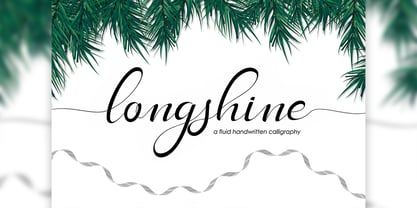
$17.00LongShine Script is a fluid handwritten calligraphy fonts, combining calligraphy typefaces with a free flowing and moving baseline. It has a casual, yet elegant touch. Features 275 glyphs. Including initial and terminal letters, alternates, ligatures and multiple language support. Can be used for various purposes. such as headings, signature, logos, wedding invitation, t-shirt, letterhead, signage, lable, news, posters, badges etc. - Wrong Boys Graffiti by Sipanji21,
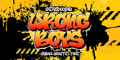
$16.00Wrong Boys is a spectacular Display font with a Fatty and Thick graffiti style for your design look awesome. It will elevate a wide range of design projects to the highest level, be it branding, headings, wedding designs, invitations, signatures, logotype, wall art illustration, apparel, labels, and much more! If you find some problem please chat me Have A Nice Day - Sf Lang by S6 Foundry,
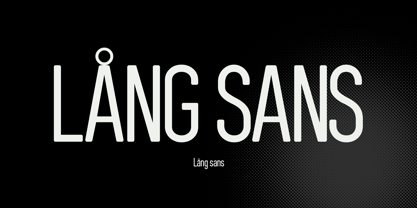
$15.00Lang Sans is an elegant contemporary condensed typeface with strong stylistic geometric, authentic contrasts, drawing on the aesthetics and representing the shifting contemporary aesthetics. The distinctive stance gives the right visual consistency for branding and communications. Lang Sans is perfectly suited for headlines, large-format prints, brand identities, social media, advertising, editorial design, posters, magazines, logos, headings, body copy, digital and more. - Qipao by TEKNIKE,
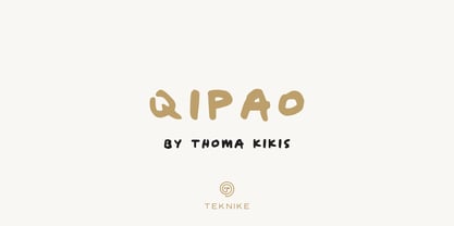
$39.00Qipao is a display monospace handwriting font. The typeface is a distinct hand drawn font using a felt marker. The Qipao name is derived from the traditional Chinese dress that Manchu women wore in China in the 17th century and became known as the qipao (旗袍), meaning “banner gown”. Qipao is great for display work, invitations, writing, architecture, posters, logos and headings. - Brownwood NF by Nick's Fonts,
$10.00The inspiration for this typeface was discovered on a 1906 travel poster, promoting the Hotel Braunwald, located in the Swiss Alps. Its odd blend of Art-Nouveau-meets-the-Old-West makes for fetching heads and subheads. Both versions include the complete Unicode Latin 1252, Central European 1250 and Turkish 1254 character sets, as well as localization for Lithuanian, Moldovan and Romanian. - Quegos by ZetDesign,
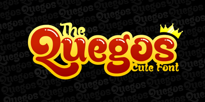
$15.00Quegos is a display font with a sleek yet bold look. make a strong impression. comes in the iconic bubble style with strong outlines and fat strokes. very suitable to create a big, bold logo for your business, work on a poster for an event, or whatever your project, and Perfect to create amazing headings, logos, menus, social media graphics, and many more. - Oakes Grotesk by Studio Few,
$12.00Oakes Grotesk is a more corporate take on the Oakes typeface. It explores a set of brand new metrics that allow it to be more legible in body text as well as headings. The letter 'g' has been tweaked to become double-story as well as the refinement of other characters. This is all whilst maintaining the subtle curves of the Oakes typeface. - Almighton by Uncurve,
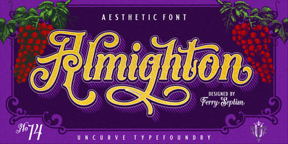
$20.00Almighton is an aesthetic vintage typography font, inspired from the past, elegant signage, gold leaf , sign painting and old label product. Almighton comes with tons of alternates characters to make more eye cacthy . It is suitable for authentic logos, headings, sign painting, posters, letterhead, branding, magazines, album covers, book covers, movies, apparel design, flyers, greeting cards, product packaging, and more. - Everything Calligraphy by Aldedesign,
$18.00Everything Calligraphy is a stylish calligraphy font that features a varying baseline, smooth line, modern and with a deep love. For those of you who are need a touch of love and modernity for your designs or branding, it can be used for various purposes such as headings, wedding, invitation, signature, logos, branding, t-shirt, letterhead, signage, labels, news, posters, badges etc. - Habana Vieja by Letters&Numbers,
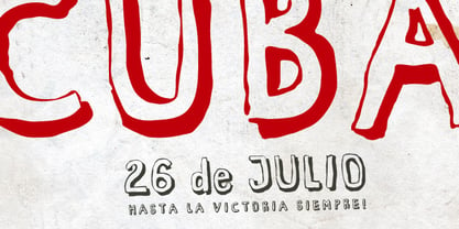
$16.00Habana Vieja is inspired by hand-painted signage in Havana’s old town. Letters are defined by their drop-shadow and worn outlines; suggestive of a sunny environment. This playful sans-serif, bold font, will work well used for headings and short paragraphs especially for posters or signage. Habana Vieja is extended, containing West European diacritics, making it suitable for multilingual environments and publications. - Hakan by Typefactory,
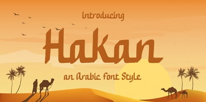
$14.00Hakan is an modern display font with an Arabian look. This font particularly for those not native to Arabic languages. Hakan try to bring back the Baghdad and Alladin memories to your design or typography. The font suits creative titling on both web and print, perfect for scroll text. Well balanced letters make for readable blocks of copy or headings. - Hellrose by madeDeduk,
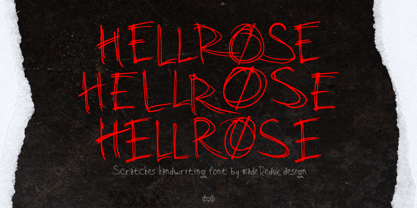
$12.00Hellrose is a scratches hand drawn font contains 50+ ligatures with three alternative. Hellrose is great for branding, posters, logos, invitation, writing and headings. Feature Uppercase & Lowercase Number & Symbol International Glyphs Multilingual support Ligature Thanks so much for checking out my shop and feel free to drop us a message any time and follow my shop for upcoming updates. Hope you enjoy it. - AT Move MMM by André Toet Design,
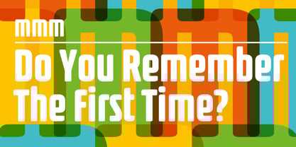
$75.00MMM is a sturdy Typeface, the design is based on a old Soap-Powder advertisement. MMM is very useful for headings and/or logotypes. André Toet his 17th Font Caps, Lowercase. With Numbers, Glyphs and the normal Punctuation. Use this Font well, it’s made with the greatest care. Concept/Art Direction: André Toet © 2017 - Design: André Toet / Jasper Terra - Tshikona by Scholtz Fonts,
$19.00Tshikona is casual and vigorous font with a taste of African spice. Although creating an impression of handwritten informality, Tshikona is a carefully crafted font, making it easy to use in any display setting, either for headings or as an informal body font. The line of the letters is reminiscent of the angular, dry branches of trees in the African veldt. - Solente by TypeFaith Fonts,
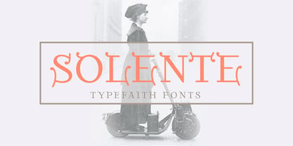
$12.00Solente is an elegant slab serif font and was inspired from Early 1900's Art-Deco, Art Nouveau and Jugendstil fonts. Perfect for use as headline or sub-head text in you design. It perfectly represents vintage esthetics in a modern way. The font has stylistic alternates for all capitals and an extra set of ligatures to replace some combinations. - Hagia Pro by Studio Fat Cat,
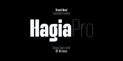
$9.00Hagia Pro's unique sans serif font family is the perfect tool for creators to create impactful things with a different touch. Hagia Pro contains several weights to give the user an interesting experience when using it. This unique sans serif font family is very good for branding, logo projects, headings, advertising, packaging, web design, print goods and other creative projects. - Epic Miracle by Prestige Artsy Studio,
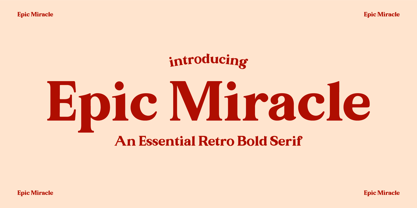
$29.99Epic Miracle is beautiful rounded bold retro serif with a 90s touch. A great serif that works beautifully in modern designs. You can definitely create amazing logos, headings, apparel designs and more. Epic Miracle is an essential font for branding as well if you want to go BOLD. I can't wait to see what you can create with Epic Miracle! - London Court by Greater Albion Typefounders,
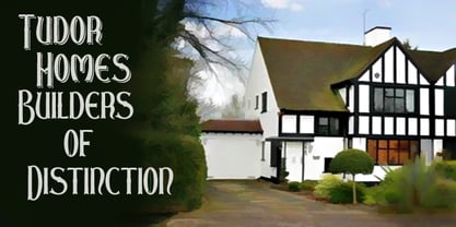
$16.50London Court is a family of three 'Tudor Revival' display faces, inspired by an inscription seen underneath a clock in a splendid Tudor revival arcade in Perth, Western Australia. The resulting typeface designs are similarly 'Tudor Revival' or if you prefer 'Tudorbethan'- Roman with Blackletter details. Ideal for creating headings and posters which have an 'Olde-Worlde' feel with modern legibility. - Orange Avenue by Krismagraph,
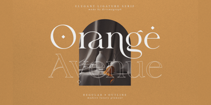
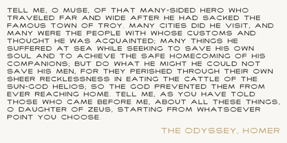
$15.00Orange Avenue is an Elegant Ligature Serif Font. Its soft curves mixed with high contrast glyphs, give it a feminine and masculine quality. Come with two versions, namely Regular & Outline. It comes with epic ligatures and alternates. Great in layout design for quotes or body copy, best used as a display for headings, logos, branding, magazines, product packaging, and invitations. - Quantour by TEKNIKE,
$129.00Quantour is a geometric monospaced display sans typeface which has a distinct style and is inspired by the Mid-Century Modern era. The Quantour name is a combination of the Latin 'quantum' meaning "unit of something" and the French 'tour' which means "to turn". Quantour is recommended for luxury brands, logos, fashion, cinema, architecture, invitations, display work, posters and headings. - Headstone by RagamKata,
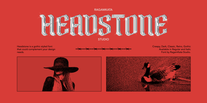
$14.00Headstone a classic blackletter typeface combining a modern and classic typography style, with a touch of retro style. A very suitable font to make your project look elegant with it’s rounded and bold shape. Headstone is very ideal for heading, flyers, posters, product packaging, book cover, printed quotes and many more. Enhance your work with Headstone to make your work more well-known! - Nimous Daven by madeDeduk,
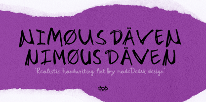
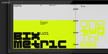
$12.00Nimous Daven is a distinct hand drawn font contains 50+ ligatures with two alternative. Nimous Daven is great for branding, posters, logos, invitation, writing and headings. Feature Uppercase & Lowercase Number & Symbol International Glyphs Multilingual support Alternative Ligature Thanks so much for checking out my shop and feel free to drop us a message any time and follow my shop for upcoming updates - Bix Metric by S6 Foundry,
$20.00Bix Metric is a stylistic display font developed within a set grid. The mono-spaced first set of the family comes in 3 styles in both upper and lowercase glyphs allowing mixing of infinite combinations. Perfectly suited for headlines, large-format prints, brand identities, social media, advertising, editorial design, posters, magazines, logos, headings, digital and more. With multi-language support. - Grave Digger - Unknown license
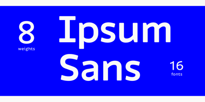
- Ipsum Sans by Rawblind Basetype,
$29.99 - Relaxed Fit by BA Graphics,
$45.00A casual gothic easy-to-read font. Relaxed Fit works for so many applications: text, Headlines and anything in between. - Robine by Craft Supply Co,
$20.00Introducing Robine – Condensed Sans Serif Robine – Condensed Sans Serif font is the ideal choice for creating attention-grabbing titles and headings. With its high x-height, this modern sans-serif typeface offers a sleek and contemporary appearance, ensuring your designs will stand out. Stylish and Space-Efficient: Robine – Condensed Sans Serif strikes the perfect balance between style and space efficiency. Its condensed design allows you to fit more text into tight spaces without sacrificing readability. Versatile Usage: This font is incredibly adaptable, making it suitable for a wide range of design projects. Whether you’re designing posters, logos, or web graphics, Robine – Condensed Sans Serif adds a touch of modern sophistication to your work. Exceptional Clarity: Robine – Condensed Sans Serif ensures your titles and headings remain easily readable, even at smaller sizes, thanks to its clear and legible characters. It’s designed to make a bold statement while maintaining clarity. - Cosmetiqa by Mysterylab,
$15.00Here's a posh serif typeface and its matching italic. Glowing with elegance, Cosmetiqa can go head to head with classic evergreens like Bodoni, Didot, or Century. And just like those go-to favorites, Cosmetiqa really shines at the huge, layout-dominating sizes which have been a staple of top-shelf fashion branding and magazine design since at least the mid-1980s. You'll also find this font to be a great workhorse at much smaller sizes and in extended text passages, as the hairline serifs don't disappear in the smaller size ranges. As its title suggests, Cosmetiqa's unique look works perfectly in cosmetics and fashion branding, but also try it with 1990s-style message forward ad headline applications if you're after a retro look with a hint of a modern twist. The semi-condensed proportions and tall x-height make it great for pull quotes, page banners, and logo design. - Entestats by Typephases,
$25.00Nearly a hundred human heads, in three dingbat files. The whole series comes from the sketchbook: the original ink drawings were then digitized and refined to create vector outlines. Rather than perfectly smooth, geometrical shapes, the Entestats, like their close relatives in the Capsbats series, the Entestats retain a handmade look and feel. The Entestats are ready-made illustrations, though of course they will appreciate being enriched with colours, textures, an imaginative layout... and use them for a variety of projects. Use them small, as spot illustrations or as big as a whole page or page spread. The Entestats and their kin, the Capsbats, are a terrific resource for presentations, packaging, logos, brochures and advertisements, to name a few applications. The book 1000 Heads is a compendium of the drawings featured in the Capsbats and Entestats and it gives a glimpse of the limitless applications of this collection. - Same Same But Different - Personal use only
- Couldnt Be Bothered - Personal use only
- Benson Script by Kyle Wayne Benson,
$10.00Benson Script is a script that is desperately trying to be anything but a script. With 3 contrast levels, and 2 styles, the six styles of Benson Script are an experiment in the diversity of a single stem width. Modernism’s desire to fit all elements within geometric constraints and adhere to strong verticals has spread throughout type design, but has had little to do with the frills and ornaments of script. Cutting a script down to its bare bones is an offensive idea to many—almost seeming insulting to its genre. Benson Script bridges that genre gap between frill and function. As a matter of genre Benson Script errs on the side of modernism, and adds flair as a last resort. Read more about her open type features, and the development process here. - Omnibus by Linotype,
$29.99Omnibus is one of my absolute favourites. My intention was to design a typeface as easy to read as Baskerville, without being a copy of it. It is easy to see that I was influenced by Baskerville, e.g. in the open lowercase g. I had in mind to design a Baskerville with the looks of the Baskervilles used in earlier typesetting. I put aside those plans for a while (but fulfilled them later on) and dedicated myself to Omnibus. In both cases my aim was to achieve a typeface with darker looks than the most used Baskerville. The name has nothing to do with buses, it is Latin with the meaning of for all". It is also in the name of Omnibus Typografi. Omnibus was released in 1993. - Stevie Sans by Typefolio,
$29.00Some years ago I had my first contact with a grotesque typeface, when handling a sample catalog of typographic specimens from the age of phototypesetting. The style eventually settled in my memory waiting for the work of time. Behind its apparent neutrality, there is a complex balance game, that almost leads to the basic principles of design which deliver such power to the grotesque style. Stevie Sans is the answer to the action of time. A bridge that allows the designer to go into the past, while being in the present and looking towards the future. It is what it’s expected from a grotesque designed in the 21st century. With 7 roman styles ranging from thin to black, support to many languages and essential opentype features, Stevie Sans is the ideal choice for your project. - Neftali Pro by TipoType,
$25.002015 First Prize TipoType award. Neftali is a type family designed for continuous reading in long texts & editorial design, created as an interpretation of Pablo Neruda’s “Poema 20”. This work delivers a subtle experimentation of Baroque and Roman styles, rescuing features from some of the most successful chilean typefaces such as “Australis”, “Berenjena” and “Biblioteca”, along with its particular calligraphic details, medium weights, accentuated strokes, and wide curves that seek to project Pablo Neruda’s particular way of reciting. This typeface contains uppercase, lowercase, small caps, oldstyle, and tabular numbers; in addition to a true italic for every weight; and calligraphic details designed to compose his poems. A typography to talk about everything, except love… (Special thanks to: Francisco Gálvez & Patricio Truenos; without the help of the latter, this project wouldn’t have had an ending) - Like Butterflies by Bogstav,
$10.00Now here's a font that is named Like Butterflies, but has got nothing to do with butterflies! What? Why? Well, I recently heard the song "Even flow" by Pearl Jam and took a trip down memory lane - back to my early twenties. I remember how the lyrics affected me, and had an impact on how my life changed the years to follow. Maybe the style of the font does not reflect the inner meaning of the song, but it does reflect a look back in time for me - and the change that took place. Nevertheless, I hope you enjoy the somewhat simple, handmade style of Like Butterflies and the 4 versions that works very well together! Please notice that each letter has got 5 slightly different versions to choose from! - Garota Sans - Personal use only
- Sassoon Infant by Sassoon-Williams,
$48.00An upright typeface family developed to meet the demand for letters to produce pupil material for handwriting as well as for reading. Upright letters with extended ascenders and descenders are ideal on screen. They facilitate word recognition. The exit strokes link words together visually, and in handwriting they lead to spontaneous joins along the baseline leading logically to a joined-up hand. Teachers can print desk strips, charts of letter families and alphabet friezes, as well as consistent material across the curriculum. Together these typefaces provide a valuable resource for special needs teachers. When starting point and stroke direction has been learned, the arrow font (Tracker B) can be dropped and the simpler Tracker font used. Tracker B font, with its direction arrows helps pupils to start in the correct place. Motor movements can be refined by keeping inside the line. When starting and direction is no problem, the arrow can be dropped and the plain Tracker font used. When starting point and stroke direction have been learned, the arrow font (Dotted B) can be dropped and the simpler Dotted font used. Free to download resources How to access Stylistic Sets of alternative letters in these fonts Purchasers of this font package may use their Order Number to receive a free Copybook PDF by Rosemary Sassoon recommended for effective teaching - 37 Kilobyte - Unknown license
- French Ionic by Solotype,
$19.95This would be a Clarendon if it weren't for the cute serifs, which set it apart. Reads well in copy blocks.
