10,000 search results
(0.029 seconds)
- VLNL Breakz by VetteLetters,
$35.00 - BushToad - Unknown license
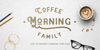
- Coffee Morning by me55enjah,
$10.00 - Lady Ice - Extra Light - Unknown license
- Heil Vertica - Unknown license
- As of my last update in April 2023, there is no widely recognized or commercially popular font specifically named "Milky" within the standard typographic circles or among major font foundries. Howeve...
- sabrina star - Unknown license
- Cartier Book by Monotype,
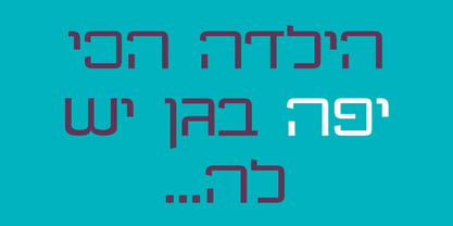
$29.99 - Diode by Burghal Design,
$29.00 - Brie Light - Unknown license
- Feldicouth Compressed - Unknown license
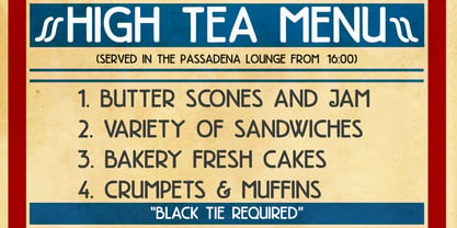
- High Tea by Hanoded,
$15.00 - Feldicouth Compressed Italic - Unknown license
- Feldicouth Norm - Unknown license
- Cacao by Wiescher Design,
$39.50 - Feldicouth Italic Bend - Unknown license
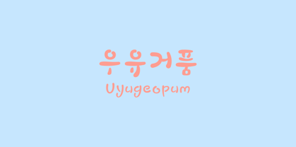
- JTT Uyugeopum by Ziwoosoft,
$300.00 - Blushbutter Fae by Blushbutter,
$45.00 - Storybook - Unknown license
- Feldicouth Italic - Unknown license
- Bank MF by Masterfont,
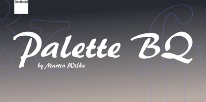
$59.00 - Palette by Berthold,
$57.99 - Local Eatery JNL by Jeff Levine,
$29.00 - HU Milksherbet KR by Heummdesign,
$25.00 - HU Milksherbet by Heummdesign,
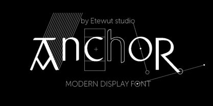
$15.00 - Anchor by Etewut,
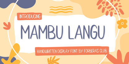
$20.00 - Mambu Langu by Forberas Club,
$16.00 - Signal1885 by astroluxtype,
$20.00 - Bluebeard by Canada Type,
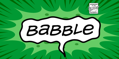
$24.95 - Babble by Comicraft,
$19.00 - Rust Bucket by BA Graphics,
$45.00 - Walt Disney Script - Personal use only
- Pinocchio - Unknown license
- RaveParty Wide - Unknown license
- RaveParty Poster - Unknown license
- RaveParty Oblique - Unknown license
- RaveParty Narrow - Unknown license
- RaveParty Offset - Unknown license
- RaveParty Hollow - Unknown license
- Black - Unknown license


