10,000 search results
(0.054 seconds)
- Black Foroth by Twinletter,
$15.00 Black Foroth is a san serif font with an elegant yet fun relaxed appearance. It differs from other san-serif fonts in its application because it was created by combining serious and relaxed themes, resulting in a font that can give the impression of seriousness while remaining convenient. Use it in your creative projects to get a unique look and feel. This font is perfect for games, sporting events, branding, banners, posters, movie titles, book titles, quotes, logotypes, and more. of course, your various design projects will be perfect and extraordinary if you use this font because this font is equipped with a complimentary font family, both for titles and subtitles and sentence text, start using our fonts for your amazing projects.
 - Adventura by me55enjah,
$14.00 Handmade typeface inspired by permanent marker strokes. Simple, bold and casual shape strokes make this typeface easy to read event in a bunch of text. This can be useful for title, quotes, label, etc. Simple, casual and playful. All caps family comes with different style: Title, Outline and Stripes. Including handwritten style, Adventura Letter with uppercase & lowercase characters, make you have more option to create catchy design. All support basic multi language. Add Adventura Catchwords and Emo icons can gives more personal touch to your design.
 - Strogino by maganet,
$5.00 Strogino is a modern display pseudo-monospaced sans serif font. Due to the special design and some variants, all letters are easily identifiable though stuck together. It is as geometric as possible, being made with the simplest forms, capital letter sizes are exactly square. This allows to even create seamless patterns for backgrounds and watermarks. Diacritic can be added to any letter or even symbol and number, giving in total more than 1500 combinations! Strogino is perfect for logos, headings, titles, inscriptions, overlay text, backgrounds, and many more! Short paragraphs or quotes also look great with it. The font is named after Strogino (Russian: Строгино), a district in northwest Moscow, where the designer Roman Maganet came from. You can read more about making this font here.
 - Umbero by NaumType,
$25.00 Umbero is an experimental geometric blackletter. Umbero was inspired by modern street art (by artists like Pokras Lampas, RETNA, etc.), gothic script and constructivism. It has an ornate and twitchy structure: you can not find two similar letters. Capital letters have even more complex structure, then lowercase, to the extent that you can even use them as initial letters with a different, more calm font if you want to achieve a medieval stylization in a contemporary way. Get Umbero if you need something extra for your design. Or vice versa use it as a starting point of your work. It’s a perfect choice for the mystic or contemporary logos, headlines, oversize typography, branding, identity, website design, album art, covers, posters, advertising, etc.
 - National First Font - Unknown license

- Tim Sale Brush by Comicraft,
$19.00 These handletterered brush fonts were created by Tim Sale and fontmeister JG Roshell for our bestselling book, TIM SALE: BLACK AND WHITE!
 - Celtic Knots by Clanbadge,
$20.00 While it is obvious that this is an ornamental style font, it is more than that: it is a Celtic Knotwork design tool! Irish, Scottish, Welsh, even Norse and Viking cultures have used knotwork designs for millenia. These ancient traditional interwoven designs are experiencing a revival as Celtic culture gains exposure in the modern world. Intricate Celtic knots are featured everywhere from jewelry to tattoos. While many enjoy them simply for their beauty and fascinating twists, they can also be used to add an air of myth, magic and mystery to any project. The interlaced lines make them perfect for wedding invitations, borders, dividers and rules, web graphics, and logos. I began using Celtic knotwork designs in my own work as part of my knifemaking and jewelry making hobbies. I read all of the books I could find about Celtic knots and at first I drew them by hand with pencil and paper. Then as I realized how nice it would be to have "undos" I switched over to using Corel Draw. Draw proved to be a natural for this type of artwork with tools like contour and the trim function. But even with these great tools, it was still tedious to create these designs. I noticed that I was able to reuse a lot of parts in repetitive sections. I developed a small library of reusable bits and chunks of Celtic designs. I found them so useful and fun to work with that I began thinking about ways to market my Celtic design kit. I thought about CDR and EPS formats, but then I thought of creating this toolset as a True Type Font. That way anyone with ANY program that uses fonts could easily create Celtic knotwork designs. Word processors, embroidery programs, engraving programs, jewelry design programs, CAD/CAM programs...almost every program can use fonts. I was also interested in CNC work and thought that this font would work well for applications such as laser etching, vinyl signs, and machining. With that in mind, I designed each character of the font with extremes of accuracy. If one character from the font is used at one inch tall, every control point will be placed to an accuracy of better than 0.0001 inch. I wanted every piece to meet exactly with the next, with no possibility for misalignment. The different styles are all very carefully created to fit accurately with each other. So the Filled Style fits exactly into the Outline Style, and the Inverse Style fits precisely around the Outline Style so as to make up the background behind the knotwork. Combining the styles allows you to have complete creative control. By assembling the nearly 200 pieces it is quite easy to produce very complex designs. It is actually a bit like playing with a puzzle and many people really enjoy putting the pieces together to make designs. In fact, I have had many customers tell me of how they love playing with this font and making knots into the wee hours of morning. If you like puzzles then you will absolutely love this font! And creating the patterns is just the beginning of the fun! If you apply your favorite Photoshop tricks on them you can make anything from dazzling chrome knotwork to carved stone. Photoshop plug-ins like SuperBladePro are great for converting knotwork text into corroded bronze or rusted iron. Use your knotwork to add texture to a virtual landscape, or add them as surface embelishments on architecture and furniture. You can also make round knotwork by using this font with "WordArt" (WordArt is included with every copy of Microsoft Word. See http://clanbadge.com/round_knots.htm for a tutorial on how to make round knotwork). For Crafters there are limitless uses for this font. It has been used for embroidery, jewelry, leatherwork, stencils, stained glass, quilting, painting, pyrography, woodcarving and lots more. We have even sold copies to monks for use in decorating handmade books!
 - DIN Next Stencil by Monotype,
$56.99 The DIN Next™ Stencil suite of designs is DIN with an attitude. It’s even more industrial strength than the original. DIN Next Stencil’s seven roman weights are perfect for projects that require a mechanized, military, or commercial vibe. If you’re looking to create commanding display typography, be it in advertising, apparel, packaging, posters, signage, wayfinding – or crash dummy name tags, DIN Next Stencil can be the perfect typographic enhancement. Based on Akira Kobayshi’s DIN Next with stenciling by Sabina Chipară, the wide range of weights and large complement of diacritical and international characters – including those for Cyrillic and Greek – further expand the design’s capabilities. The DIN Next Stencil fonts are powerful tools in their own right – and provide a distinctive supplement to the DIN Next typographic palette.
 - Revla Round by Eclectotype,
$40.00 Squeezing yet more life out of the Revla skeleton! This is Revla Round, a child-friendly version of Revla Sans, completely overhauled so there's no chance of cutting yourself on any corners. Every rounded terminal and corner has been painstakingly drawn, rather than using a round-corners filter. OpenType contextual alternates make for text that is lively and bouncy, without the monotony of obviously repeating letterforms. It's shamelessly fun, but pretty serious at the same time. The range of weights can be used to maintain an even colour across different sizes - use lighter weights for bigger sizes and vice versa. OpenType features include automatic fractions, ordinals, contextual alternates, standard and discretionary ligatures, and case-sensitve forms. Obviously, in sharing a common skeleton, it will work well with other members of the ever-growing Revla Superfamily.
 - HiTone by Scholtz Fonts,
$19.00 HiTone emulates a natural hand-lettered typeface that provides exceptional legibility with a quirky style. It comes in three widths, the narrowest of which enables text to be placed compactly within a limited space. The widest, on the other hand, increases readability while maintaining the same stroke weight. In addition, each width comes in two weights, regular and black, enabling the user to provide emphasis or headline display without changing the essential style of writing. The font is most useful as a stylish text font. The font has all the features of a fully professional typeface. Language support includes all European character sets.
 - Syamsul by Flawlessandco,
$9.00 Introducing "Syamsul" - an exquisite Arabic-style font that combines elegance and functionality. Inspired by the beauty of Arabic calligraphy, Syamsul captures the essence of this ancient art form while offering a contemporary twist. There's some connected letters and some alternates that suitable for any graphic designs such as branding materials, t-shirt, print, business cards, logo, poster, t-shirt, photography, quotes .etc This font support for some multilingual. Also contains uppercase A-Z and lowercase a-z, alternate character, numbers 0-9, and some punctuation. If you need help, just write me! Thanks so much for checking out my shop!
 - Butter Notes by Aminmario Studio,
$20.00 Butter Notes is a sweet and jolly crafting font. This font is great for your creative projects such as watermark on photography, and perfect for logos & branding, photography, invitation, watermark, advertisements, product designs, stationery, wedding designs,label, product packaging, social media, movie titles, books titles, a short text even a long text letter and good for your secondary text font with sans or serif. And also for special events or anything that need handwritting taste. Thanks for checking out this font. I hope you enjoy it!
 - Balboa Plus by Parkinson,
$20.00 Balboa Plus is a condensed sans serif display family. It was originally conceived as a simple black and white typeface. But it seemed unfinished, begging for something more. I decided to try adding a couple layers of fill and detail to try and make it interesting. The result is this four-layer chromatic font family. The Primary Font is the Main Font. The other fonts ( Fill, Inline, and Gradient) only exist to support the Primary Font. The Fill font should sit behind the Primary font (there is a little color trapping going on). The rest is even easier. There is a free downloadable PDF Balboa User Manual in the Gallery section for this family. It has samples and some backstory. Balboa™ is a trademark of Parkinson Type Design.
 - Joschmi by Adobe,
$29.00Joost Schmidt?s (1893?1948) name is undoubtedly connected with monolinear condensed letters of geometric appearance ? his unfinished draft of a stencil alphabet, constructed on grid paper in 1930, is much lesser known. These modular shapes simply consist of half circles, quarter circles and square strokes with half-round terminals. From just six original letterforms (a, b, c, d, e, g), Flavia Zimbardi completed Schmidt?s draft and extended it to a full character set for contemporary use, adding upper case letters and different figure sets including old-style. Joschmi overcomes legibility issues usually associated with this stencil style, with special attention to the design of white space. Zimbardi lends the face even more character by carefully adding round terminals in subtle spots of the alphabet, accessible through stylistic sets. - AT Move Billiard by André Toet Design,
$39.95 BILLIARD was born from the numerous sketches André Toet did for the design of a series of postage stamps in 2011. It’s a capital monospaced and ‘fun’ alphabet, based on the classic billiard play with two white and one red ball. Actually snooker and pool were derived from this rather old sport! In Europe it used to be a sport played by elderly people, practiced in traditional bars, including the smell of beer and the at that time prevalent smell of cigarettes and cigars. These days billiard, snooker and pool are quite popular once again with young people. Hopefully our new font will get the same attention the ‘old sport’ deserves and who knows it might even be used in a sportive way. Concept/Art Direction/Design: André Toet © 2017
 - Bauhaus Arabic by Naghi Naghachian,
$112.00 Bauhaus is celebrating its centenary in this year. For the Bauhaus's 100th anniversary year, art and design museums and galleries around the world are hosting exhibitions and events. The publication of „Bauhaus Arabic“ font family is my contribution to celebrate this event. Bauhaus Arabic is a sans-serif font family designed by Naghi Naghashian in tree weights. Bauhaus Arabic Light, Bauhaus Arabic Medium and Bauhaus Arabic Bold. It is extremely legible even in very small size. This font family is a contribution to modernisation of Arabic typography, gives the font design of Arabic letters real typographic arrangement und provides more typographic flexibility. Bauhaus Arabic supports Arabic, Persian ( Farsi ) and Urdu. It also includes proportional and tabular numerals for the supported languages. Bauhaus Arabic design fulfills the following needs: A Explicitly crafted for use in electronic media fulfills the demands of electronic communication. B Suitability for multiple applications. Gives the widest potential acceptability. C Extreme legibility not only in small sizes, but also when the type is filtered or skewed, e.g., in Photoshop or Illustrator. Bauhaus Arabic’s simplified forms may be artificial obliqued in InDesign or Illustrator, without any loss in quality for the effected text. D An attractive typographic image. Bauhaus Arabic was developed for multiple languages and writing conventions. Bauhaus Arabic supports Arabic, Persian and Urdu. It also includes proportional and tabular numerals for the supported languages. E The highest degree of calligraphic grace and the clarity of geometric typography.
 - Good Reporting JNL by Jeff Levine,
$29.00 A September 29, 1920 edition of The San Diego Union ran the headline “Cicotte Confesses Baseball Fraud; Eight White Sox Players Indicted”. The White Sox baseball scandal was the first to reveal illegal gambling on the game. However, the headline itself was set in a bold slab serif type style [likely ATF Foster] which served as the model for Good Reporting JNL; which is available in both regular and oblique versions.
 - Rolling Pen by Sudtipos,
$79.00 After doing this for so many years, one would think my fascination with the old history of writing would have mellowed out by now. The truth is that alongside being a calligraphy history buff, I'm a pop technology freak. Maybe even keener on the tech thing, since I just can't seem to get enough new gadgets. And after working with type technologies for so many years, I'm starting to think that writing and design technologies as we now know them, being about 2.5 post-computer generations, keep becoming more and more detached from what the very old humanity arts/tasks they essentially want to facilitate. In a world where command-z is a frequently used key combination, it’s difficult to justify expecting a Morris-made book or a Zaner-drawn sentence, but accidental artistic “mutations” become welcome, marketable features. When fluid pens were introduced, their liquid saturation influenced type design to a great extent almost overnight an influence professional designers tend to play down. Now round stroke endings are a common sight, and the saturation is so clean and measured, unlike any liquid-paper relationship possible in reality. Some designers even illustrate their work by overlaying perfect circles at stroke ends, in order to illustrate how “geometric” their work was. Because if it’s measured with precise geometry, it’s got to be meaningful design. And once in a while, by a total freak accident, the now-cherished mutations prove to have existed long before the technology that caused them. Rolling Pen was cued by just such a thing: A rounded, circular, roll-flowing calligraphy from the late nineteenth century seemingly one of those experimental takes on what inspired Business Penmanship, another font of mine. Looking at it now it certainly seems to be friendlier, more legible, and maybe even more practical and easier to execute than the standard business penmanship of those days, but I guess friendliness and simplicity were at odds with the stiff manner business liked to present itself back then, so that kind of thing remained buried in the professional penman’s oddities drawer. It would be quite a few years before all this curviness and rounding were thought of as symbolic of graceful movement, which brought such a flow closer to the idea of fine art. Even though in this case the accidental mutation just happens to not be a mutation after all, the whole technology-transforms-application argument still applies here. I'm almost sure “business” will be the last thing on people’s minds when they use this font today. One extreme example of that level of disconnect between origin and current application is shown here, with the so-called business penmanship strutting around in gloss and neon. Rolling Pen is another cup of mine that runneth over with alternates, swashes, ligatures, and other techy perks. To explore its full potential, please use it in a program that supports OpenType features for advanced typography. Enjoy the new Rolling Pen designed by Ale Paul with Neon’s visual poetry by Tomás García.
 - Sugar Charm by Kotak Kuning Studio,
$17.00 Sugar Charm is a lovely hand-lettered script font. It has a unique and different style and will give your design a fun touch. Sugar Charm would be perfect for logos & branding, photography, watermarks, social media posts, advertisements, invitations, product designs, labels, stationery, wedding designs, product packaging, special events or anything that need handwriting taste. I highly recommend using a program that supports OpenType features and Glyphs panels such as Adobe Illustrator, Adobe Photoshop CC, Adobe InDesign, or CorelDraw, so you can see and access all Glyph variations. This font is encoded with Unicode PUA, which allows full access to all additional characters without having special design software. Mac users can use Font Book, and Windows users can use Character Map to view and copy one of the extra characters to paste into your favorite text editor/application.
 - Alvia by Zane Studio,
$12.00 Alvia is a clean, modern script font that is carefully crafted with a touch of elegance. This font can be used to write letters, invitations, food products, headlines and more. It will turn any creative idea into a true work of art!
 - Saturday Light by Bogstav,
$15.00 This font was made while listening to The Cure, and taking a trip down memory lane. However, the particular song I had in mind naming the font after, was already taken. But perhaps you can figure out which song I had in mind?
 - Big Trees by A New Machine,
$19.00 Inspired by a trip to Sequoia National Park, this bold, all cap font is reminiscent of the great west and wide open spaces. Upper case letters are solid while lower case letters feature shadow lines. Great for titles, branding and logo work.
 - Andina by Nissa Nana,
$23.00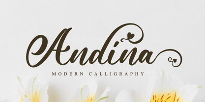 Andina is an exquisite handwritten font, masterfully designed to become a true favorite. It maintains its classy calligraphic influences while feeling contemporary and fresh. This font is PUA encoded which means you can access all of the glyphs and swashes with ease!
 - Andalusia Signature by Letterena Studios,
$9.00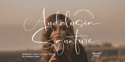 Andalusia Signature is an exquisite handwritten font, masterfully designed to become a true favorite. It maintains its classy calligraphic influences while feeling contemporary and fresh. This font is PUA encoded which means you can access all of the glyphs and swashes with ease!
 - Wedusa by Sign Studio,
$15.00 Wedusa with an antique typeface offers the impression of a classic and elegant design. Inspired by classic and modern calligraphic styles. Can support about 35 languages. Will be a versatile font because writing text using this font is also easy to read.
 - Falcon Casual by TypeArt Foundry,
$45.00 An even more casual script.
 - Coegit by insigne,
$32.00 In the world of webfonts, Condensed proportions are key to maximizing your page's premium real estate while keeping your copy clean and catchy as you cut down to the essentials. Soon after the introduction of webfonts, I began to see Insigne's Le Havre used frequently for web headlines, not so much for its Art Deco look as for its more compact proportions. There seemed to be a need for a font that was designed to be used solely for the web's unique constraints. Enter Coegit Sans. Coegit is built specifically for web applications. Its highly Condensed forms range from thin--offering the greatest number of uses--to the attractive, accenting black. With three widths--Compressed, Compact, and the widest, Condensed --the family holds a total of sixteen fonts. The typefamily has also been hinted for excellent, onscreen display quality, even at small sizes. Overall, its lighter, humanist features provide the reader a more congenial welcome than its square, sans-serif counterparts can offer. Coegit is equipped for complex professional typography with stems, small caps and plenty of alts, including titling capitals. The face includes a number of numeral sets, including fractions, old-style and lining figures with superiors and inferiors. OpenType-capable applications such as Quark or the Adobe suite can take full advantage of automatically replacing ligatures and alternates. You can find these features demonstrated in the .pdf brochure. The family also includes glyphs to support a wide range of languages, including Central, Eastern and Western European languages. In all, Coegit supports over 40 languages that use the Latin script, making the new addition a great choice for multi-lingual publications and packaging. While the advanced OpenType features of webfonts are not currently supported in many browsers, the near future promises wide support. As acceptance of these features grow, Coegit Sans will prove to be a versatile element for your wide range of web projects.
 - P22 Cezanne by P22 Type Foundry,
$79.94 This font set, created for the Philadelphia Museum of Art, celebrates the work of influential French artist Paul Cézanne. P22’s Cezanne font allows you to beautify your documents with a faithful rendition of the artist’s handwriting, while Cezanne Sketches recreates a variety of imagery from the artist’s work. Cezanne Pro includes full western and central European character sets and Cyrillic for typesetting in dozens of languages. It features several types of numerals, ligatures, snap-on swashes, and word glyphs. The Pro version includes over 1,200 glyphs and “smart features” that will automatically substitute letter combination's to create an even more natural handwriting effect than was possible with Cezanne Regular.
 - Pitriya by IbraCreative,
$17.00 Pitriya is a captivating display serif typeface that effortlessly blends classic elegance with a modern twist. Its unique character lies in the harmonious balance between thick and thin strokes, creating a distinct sense of refinement and sophistication. Each letter is meticulously crafted with precision and ornate details, making Pitriya a perfect choice for high-end branding, editorial design, and formal invitations. The serifs are gracefully extended, adding a touch of grandeur to the text, while the ample x-height ensures readability even at smaller sizes. Pitriya is a timeless typeface that commands attention and imparts an air of timeless beauty to any project it graces.
 - Tahillia by Canden Meutuah,
$27.00 Tahillia is a beautiful handwritten font. this font is so simple that i write very carefully. Even though it looks simple, this font still looks cool and stylish. Handwritten script font. Available to you in TTF/OTF/WOFF format. This Fonts are perfect for: logos, branding, wedding invitations, business cards, greeting cards, posters, magazines, social media, proliferate fonts, planner prints and websites. Get creative with their unique fun, and use them to brighten up any craft project! Get this font now and boost your creativity with it! If you have any questions, before or after your purchase, don't hesitate to contact us. Thank You
 - Cambria Math by Microsoft Corporation,
$49.00OpenType Layout features: smallcaps, stylistic alternates, localized forms, standard ligatures, uppercase-sensitive forms and spacing, oldstyle figures, lining figures, smallcap figures, arbitrary fractions, superscript, subscript. Cambria has been designed for on-screen reading and to look good when printed at small sizes. It has very even spacing and proportions. Diagonal and vertical hairlines and serifs are relatively strong, while horizontal serifs are small and intended to emphasize stroke endings rather than stand out themselves. This principle is most noticeable in the italics, where the lowercase characters are subdued in style, to be at their best as elements of word-images. This font is suitable for business documents, email, web design. - Proxemic by Sarid Ezra,
$15.00 Proxemic is a bold sans based font with unique lowercase that will make your logo and design looks advance and modern. With the unique characteristic lowercase, this font can make your logo even more stunning only with simple steps. You can use this font for any purpose, especially to make logotype. You can mix and match the uppercase and lowercase to make your logo more advanced. This font also comes with number, symbol, and multilingual support!
 - Kuroneko by Hanoded,
$15.00 Kuroneko in Japanese means ‘ Black Cat’. I was working on a Japan itinerary for a friend and I told him about the luggage forwarding service by a company with a black cat in its logo. Wait: Black Cat? What’s that in Japanese? Cool name for a font! Kuroneko font will not forward your luggage, nor was it made in Japan. But it IS a very versatile font family - even if you’re more of a dog person.
 - 1512 Initials by GLC,
$20.00 This set of initial decorated letters is an entirely original creation, drawn inspired by Italian renaissance patterns. It contains two roman alphabets : one drawn in white on black background and the other in black on white. We have included a few fleurons and decorative elements. It can be used as variously as web-site titles, posters and flyers design, publishing texts looking like ancient ones, or greeting cards, all various sorts of presentations, as a very decorative, elegant and luxurious additional font... This font supports strong enlargements remaining very smart and fine. It's prefered height is about one inch equivalent to about four lines of characters. This font may be used with all blackletter fonts, but works especially well with 1543 Humane Jenson, 1557 Italique and 1742 Civilite, without any anachronism.
 - Carlin Script by Linotype,
$40.99The Carlin Script family, inspired by the Carolingian minuscule alphabet (ca 800 A.D.), is one of the great new families available through Linotype's Library's Take Type 5 collection. Take a closer look at these beautiful characters; with them, one can create a different, more personal feeling than commonly comes from more available script and chancery fonts. Like a monk with his writing table, German designer Hans-Jürgen Ellenberger created this new design, which includes 10 different weights, bringing scribal excellence directly to your keyboard. The Carlin Script family includes an additional Initial set-allowing the creation of medieval-flavored drop or initial caps in snap. And the critics are raving: Carlin Script was a winner in the New York-based Type Directors Club's 2003 Type Design Contest!" - Sigmund Freud Typeface by Harald Geisler,
$29.00 “For those who regret what keyboards and touch screens have done to their penmanship, typographer Harald Geisler has an answer: Sigmund Freud.” — The Wall Street Journal Sigmund Freud was a neurologist who lived from 1856 to 1939. His research and studies led to the foundation of ‘Psychoanalysis’. When I first saw Freud’s century old letters, I was fascinated by the beauty of these historic manuscripts. It made me smile to imagine a person writing his or her shrink a letter set in Freud’s handwriting. I started to plan creating a font based on his manuscripts. I contacted the Sigmund Freud Museum Vienna and Freud Museum London. To start the creation I selected eight handwritten documents from the archive in Vienna – This selection of specimen was my orientation during the design process. The Samples were created between 1883 to 1938 and are of various character such as handwritten scientific papers, personal letters, notes and a telegram. A successful Kickstarter Campaign "The Sigmund Freud Typeface - A Letter to your Shrink" with over 1400 Backers enabled me to visit the archive in Vienna and study the original manuscripts of Sigmund Freud. After a year of preparation and design work, I finished four alphabets based on Freud’s handwriting. What are the different Versions PRO, Kurrent, #1, #2, #3 and #4 about? “This project gives people the convenience afforded by the computer while maintaining the romantic nostalgia, beauty, and character of letter writing with real handwriting.” — Daniel Vahab, The Huffington Post When you write with your hand, every letter looks a little different. When you write a text on your computer every letter looks exactly the same. In order to make type look like handwriting, I chose four different variations of each letter from Freud’s manuscripts, drew and stored them in the font. The font is then programmed to exchange letters while you are typing. This makes the rendered result on your screen or print look like unique handwriting. PRO While you are typing… the PRO Version actively combines all four alphabets and exchanges them automatically. Through this mechanism never the same two o’s will stand next to each other. With every touch a unique look is generated. This works in certain applications i.e. Word 2010(or newer), Pages, TextEdit, Editor(Pre-installed on Windows 7 or newer), InDesign, Illustrator… →Here you can see an animation of what this effect looks like in action. (Please Note: some applications like LibreOffice, OpenOffice do currently not support this feature. Date: December 2013) #1 #2 #3 and #4 The Sigmund Freud Typeface #1, #2, #3 and #4 each hold one individual lowercase alphabet based on Freud’s handwriting. Kurrent Most of Freud’s correspondence was written in German. Until the 1950′s a different handwriting was taught throughout German speaking countries (Switzerland, Austria, Germany). This style is called Kurrent. The name Kurrent and Cursive derive from the Latin word currere - to run, hurry - both styles were designed to write fast. As you can see in the samples above, Freud practiced both Kurrent and when writing english Cursive (Latin script or Joined-up). Kurrent has three significantly different letters (s,h,e). Use Kurrent to render the authentic look of an historic Sigmund Freud letter in German. Bundle On the Top of this page you can get all six fonts of the Sigmund Freud Typeface Family in a bundle. International Typeface All styles of the Sigmund Freud Typeface feature a wide range of accented letters so you can write to all your friends in Sweden (Bjørn) France (Chloé & Zoë), Ireland (Dáirine), Poland (Łucja), Germany (Jörg) and almost everywhere around the globe (Find a complete list in the tech specs). Usage recommendations I hope that this design will be valuable to you and most of all that you have fun with this typeface! 1. Point Size — To reproduce the size of Sigmund Freud’s handwriting adjust the type size between 18-24 point in your word processor. If you are using an imaging software like Photoshop set the resolution to 300dpi and adjust the point size between 18-24. 2. Line Spacing — Narrow the line hight until swashes of capital letters touch the baseline above. This also happens when you write a letter and gives the document a unique handwritten look. 3. Right Aligned — Freud had the habit to write towards the right edge of the page and start loosely on the left. Set your text alignment to ‘right’ to incorporate this dramatic expression also to your documents. What do other People say about the Sigmund Freud Typeface? “Wouldn’t you love to write a letter to your shrink using the Sigmund Freud typeface?” — Dorothy Tan, Design TAXI ''“JUST DON’T WRITE A LETTER TO YOUR MOTHER WITH IT… …until the reader looks a bit closer, and they see 70+ years of modern science weighing in on turn-of-the-century pop psychology."'' — Mark Willson, Fast Company “Doctor, what does it mean if you dream of creating a font of Freud’s handwriting?” — Ayun Halliday, Open Culture “…geekily romantic, at once artistic and scientific” — Edie Jarolim, Freud’s Butcher “…sympathisch” — Jürgen Siebert, Fontblog !WOW! Thank you for reading the complete font description! You are awesome! If you still have a question please contact me through MyFonts or my website haraldgeisler.com. Credits This project was made possible by the help of 1481 Backers on Kickstarter and the kind support of the Sigmund Freud Museum Vienna and the Freud Museum London. Thank you. All of Freud’s Manuscripts shown are © Sigmund Freud Museum Vienna. Poster Image: IN17 - Sigmund Freud, Germany 1932. © Freud Museum London. Flag Image: IN19 - Sigmund Freud 1930’s. © Freud Museum London.
 - Tello Mallo by Greentrik6789,
$9.00 Just write, I just want to write, I took a pen, I write the words with punctuation, I write the numbers, symbols and some currencies. No matter about My writing is ugly or very ugly, but sharing this handwriting to the world is my best wish. Tello Mallo comes in regular and italic style for every word you type. Do you like it? Hope you enjoy this, if you have problems or questions, please don't hesitate to contact me. Thank you and have a nice day :) ;)
 - Puffy Chips by Say Studio,
$15.00 Hallo everyone, puffy chips! puffy chips - it's groovy,retro, bold, chubby, and playful, chubby typeface of circle in groovy style. Perfect for make any project like header, quote, layout magazine and other. Even better if you use it on 60s and 70s design project Embracing the psychedelia era combine with groovy style, open type features such as stylistic alternates and multilingual support What's you get? - Unique letterforms - Works on PC & Mac - Accessible in the Adobe Illustrator, Adobe Photoshop, Microsoft Word even work on Canva! - PUA Encoded Characters - Fully accessible without additional design software. Have a wonderful day, *Say Studio*
 - National First Font Dotted - Unknown license

- Pocket Initials JNL by Jeff Levine,
$29.00Pocket Initials JNL contains twenty-six initials inside of a white-into-black pattern for monograms, page headers, stationery and other creative projects.

