10,000 search results
(0.038 seconds)
- Wonderfebia by FHFont,
$15.00 Wonderfebia is Script Wedding Font with modern calligraphy style so much opentype feature include of the font. Suitable for design, element design, wedding, event, t-shirt, logo, badges, sticker, and awesome work.
 - Magentasia by FHFont,
$16.00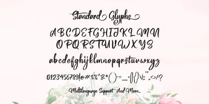 Magentasia is Brush Script Font with Handlettering Brush Style, with opentype feature include of the font. Suitable for design, element design, wedding, event, t-shirt, logo, badges, sticker, and awesome work, etc...
 - Monoline Rounded JNL by Jeff Levine,
$29.00 Monoline Rounded JNL borrows the inline portion of Sales Event JNL. Making a few adjustments to some characters, it is now a lovely monoline with rounded terminals that emulates pen hand lettering.
 - Hard Stones Pro by FHFont,
$17.00 Hard Stones include sans, display, and script, retro combination with layered font, clean and rough vintage authentic style, Suitable for design, element design, event, t-shirt, logo, badges, sticker, and awesome work.
 - Bluebottle by Greater Albion Typefounders,
$14.50 Bluebottle is a lively fun family of typefaces, a boisterous fun design, BLuebottle brings a distinctive cheerful character where ever it's used. Use Bluebottle to bring life and fun wherever you will.
 - Utrecht by Cititype,
$10.00 Utrecht is a handwritten font that is composed from natural and casual handwritten characters so that the shapes are less neat. The hand stroke node becomes the hallmark of this font. It was inspired by environmental posters that were directly handwritten in simple media. We named this font Utrecht, referring to this city in the Netherlands. We choose it because it is a friendly city, caring about the environment, its size is compact and therefore it is very easy to get a broad sense of the city in a short time. Likewise, this font is only handwritten with standard characters but on the other hand this handwriting gives the impression of being more familiar, reflecting natural design and spontaneity. This font is suitable for posters, crafts, writing quotes, unique logos, natural text writing. So this is Utrecht, a quirky handwritten font with a casual feel. It will effortlessly turn any design idea into a statement.
 - Carnova by Typotheticals,
$4.00This is a standard, plain face with no special distinguishing features. It was created over a period of four months for use in small text in a cartographer package. While the face was extremely suitable for the purpose it was designed for, the party who was to purchase the family outright decided upon another design, allowing me to offer it up for sale. The original design for this face is nothing new, and has been greatly influenced by many others already in existence. It was not intended to be flashy, nor eye-catching, and I believe I have managed to escape any individuality that could have affected the face. It displays well in the lower text sizes, and, in my own opinion, displays some characters more clearly than some other similar faces that are currently in use (not all, some). While individuality makes a typeface stand out from all the others, this style of design would have been compromised with it. - Brave Brothers by Strong,
$20.00 Brave Brothers is a stylish modern font that's perfect for use in fashion-related design projects. Its elegant thin font makes it ideal for branding and logo design, while low legibility height makes it perfect for use in websites, advertising, and other types of communications. Brave Brothers Modern Font is perfect for adding a touch of luxury and elegance to your designs. This stylish font was created with care to be perfect for use in modern fashion logos, websites, and marketing materials. Brave Brothers is a stylish modern font that's perfect for use in fashion-related design projects. Its elegant thin font makes it ideal for branding and logo design, while low legibility height makes it perfect for use in websites, advertising, and other types of communications. Brave Brothers Modern Font is perfect for adding a touch of luxury and elegance to your designs. This stylish font was created with care to be perfect for use in modern fashion logos, websites, and marketing materials.
 - Moena by RagamKata,
$16.00 Moena | Stylish Modern Serif Font Moena is a unique serif font that showcases distinctive characters in each letter, while maintaining a high level of readability. With its slight thinness, this font remains versatile for all design purposes, especially for logo designs. Moena's uniqueness lies in its meticulously crafted letterforms, where each character carries its own distinct personality. The font exudes an air of creativity and elegance, making it ideal for adding a touch of sophistication to your designs. Whether you're working on logos, branding, or other design projects, Moena's versatility shines through. Its delicate yet readable appearance adds a sense of refinement, allowing your designs to stand out effortlessly. Crafted with precision and a keen eye for detail, Moena ensures that every curve and stroke is thoughtfully designed to maintain legibility while showcasing its individualistic charm. With Moena, you have a powerful tool to create captivating and memorable designs that leave a lasting impression. Unleash your creativity and elevate your designs with the unique character of Moena!
 - Infusion by Andinistas,
$39.00 Infusion is a type family designed by CFCG & Fabio Godoy for andinistas.net. The creative process of Infusion evolved throughout a myriad of experiments supported by my font gluten This is why its expressivity comes from the addition and subtraction of its parts by mixing and combining, resulting in a great variety and new versatility of uppercase, lowercase, multiple and different numbers to be applied at the beginning, middle or end of the word. Infusion is used to write sentences in craft contexts that require organic graphic design, with meticulous imperfect look. Infusion offers typographic solutions out of the limits, or out of borders that divide the mechanics of the drawn by hand. Infusion has 6 decorative and legible fonts to write casual messages with organic, friendly and natural personality. Infusion “Script, Mix, Roman, Shadow, Extras, Dingbats” contain unconventional visually appealing ideas to work independently or in group in the design of logos, packaging, presentations, headlines or editorials.
 - Hoofer by Scholtz Fonts,
$15.00 Light and flexible, slightly retro, casual and readable, Hoofer combines 28 brush script, mono line script and sans-serif styles with ornaments into one Mega-Family. The different styles of the Hoofer Mega-family have been chosen to work together and to harmonize in a pleasing way. The Hoofer Mega-Family of fonts can be divided into three sub-families: Hoofer BRUSH subfamily: An eclectic group of five fonts. These are mainly joined scripts. Hoofer LINE subfamily: Seven mono-line scripts with joined letters in a number of weights, widths and styles. Hoofer SANS subfamily: Sixteen casual, Sans-Serif fonts. They are very readable and in a variety of weights & styles The mood of the Hoofer mega-family is light and flexible, slightly retro, casual and readable. It combines script and many sans-serif styles with ornaments into one Mega-Family. The different styles of the Hoofer Mega-family have been chosen to work together and to harmonize in a pleasing way. The Brush Sub-Family is designed for titling, packaging and display purposes, The Line Sub-Family can also be used for titling, packaging and display, however, it is less “showy”, and conveys an air of informality. The Sans Sub-Family is designed to shine as sub-heads and as body text. The wide range of Hoofline styles gives you, the designer, great flexibility in creating just the mood or impression that you want. Most of the fonts can use one or more OpenType Features. These can be accessed in a number of ways. The reason for this is that the major software producers provide different (and often conflicting) ways of accessing OpenType Features. In some cases such software manufacturers provide NO way of accessing certain OpenType Features. We have tried to remedy this by providing a highly flexible family of fonts. OPENTYPE (these OpenType features are only available in the “otf” fonts and not in the “ttf” fonts.) OpenType features that Hoofer makes use of are: Swashes (Word-Begin and Word-End Features); Alternate Numerals; and True Small Caps. ORNAMENTS In addition the Hoofer family has a font containing 94 ornaments. ALTERNATE NUMERALS You can access two sets of figures (numbers) in Hoofer Sans fonts. Both sets are tabular and lining but they differ in the height (but not the width) of the figures. The height of the alternate figures has been chosen so that they are compatible with the small caps. However, these alternate figures are available in ALL Hoofer Sans fonts, whether they feature small cap fonts or not. Hoofer has all the features usually included in a fully professional font. Language support includes all European character sets, Greek symbols and all punctuation. Opentype features include automatic replacement of some characters and discretionary replacement of stylistic alternatives.
 - Sonata Allegro by Tamar Fonts,
$35.00 “The Emperor Has Clothes” Like in music — the Allegro Sonata form consists of three main sections—the Exposition (section), the Development, and the Recapitulation — so in regard to this Allegro Sonata font family — there is an Exposition (font), a Development, and a Recapitulation—in which each theme is restated alongside its development material. While the Recapitulation font is perfect for titling and branding, the Exposition is perfect for branding {as demonstrated in the Inspiration Gallery pertaining this font} as well as being a comfortable read in long runs of text. The Exposition rounded, mono-line, with great x height, contemporary—A Synthesis Between Geometric & Hand-drawn—font, is at times geometric and at times hand drawn; in the end it all came down to finding the balance in a typeface between the robustness needed to function as a text face and enough refinement to look good as a display font. Following the Exposition, comes the Development (section), decorative, botanic-like, exuberant and playful font, signifying ABUNDANCE [of possibilities] & BENEVOLENCE—in regard to each theme/character, and to demonstrate—that 'structures' in music, are solid structures—like architecture {contrary to the words of J. W. von Goethe, who said: “Music is liquid architecture; Architecture is frozen music”}, just in some spiritual domain that is far beyond one's physical senses to grasp. Like in my art and music works in which I consider its 'Texture' element of vital importance, so is the case when it comes to type, as apparent in my previous Phone Pro/Polyphony font, as well as in this current Sonata Allegro/Development font. Each glyph has its own uniqueness, and when meeting with others, will provide dynamic and pleasing proximity. And due to the [individualistic] nature of this Development font, just a minimal amount of kerning/pairing were necessary... The development font is an extravagant design that looks best when used at large sizes—perfect for titling, logo, product packaging, branding project, wedding, or just used to express words against some [light or dark] background. Finally, “The (Exposition Font) Emperor Has (the Development Font) Clothes!” As said, there are three fonts/styles altogether in this Sonata Allegro type family, designed with the intention of harmonizing between Latin and Hebrew, which makes it an ideal font for the side-by-side use of Latin and Hebrew characters. However, they are being sold separately (kindly search for “Sonata Allegro Hebrew” on this MyFonts site), so they are economical for those interested just in either one of them. My aim is to shake up the type-design world with a range of distinctive fonts which break away from the generic letterforms, to make your design projects stand out—as a graphic designer, add this font to your most creative ideas for projects. This typeface has [lots of ligatures /] OpenType features, to enhance your designs even more — happy designing! Sonata Allegro Features: · 3 Weights/Styles · Multilingual Support · Proportional Figures & Ligatures While using this product, if you encounter any problem or spot something we may have missed, please don't hesitate to write to us; we would love to hear your feedback—in order to further fine-tune our products. Copyright Tamar Fonts/Hillel Glueck 2022 ALL RIGHTS RESERVED Any unauthorized distribution of my work is strictly prohibited, and will be prosecuted; do the right thing, and do not participate in the piracy of my typefaces; if you appreciate my work, then please pay for it and help me prosper — thank you!
 - Sonata Allegro Hebrew by Tamar Fonts,
$35.00 “The Emperor Has Clothes” Like in music — the Allegro Sonata form consists of three main sections—the Exposition (section), the Development, and the Recapitulation — so in regard to this Allegro Sonata font family — there is an Exposition (font), a Development, and a Recapitulation—in which each theme is restated alongside its development material. While the Recapitulation font is perfect for titling and branding, the Exposition is perfect for branding {as demonstrated in the Inspiration Gallery pertaining this font} as well as being a comfortable read in long runs of text. The Exposition rounded, mono-line, with great x height, contemporary—A Synthesis Between Geometric & Hand-drawn—font, is at times geometric and at times hand drawn; in the end it all came down to finding the balance in a typeface between the robustness needed to function as a text face and enough refinement to look good as a display font. Following the Exposition, comes the Development (section), decorative, botanic-like, exuberant and playful font, signifying ABUNDANCE [of possibilities] & BENEVOLENCE—in regard to each theme/character, and to demonstrate—that 'structures' in music, are solid structures—like architecture {contrary to the words of J. W. von Goethe, who said: “Music is liquid architecture; Architecture is frozen music”}, just in some spiritual domain that is far beyond one's physical senses to grasp. Like in my art and music works in which I consider its 'Texture' element of vital importance, so is the case when it comes to type, as apparent in my previous Phone Pro/Polyphony font, as well as in this current Sonata Allegro/Development font. Each glyph has its own uniqueness, and when meeting with others, will provide dynamic and pleasing proximity. And due to the [individualistic] nature of this Development font, just a minimal amount of kerning/pairing were necessary... The development font is an extravagant design that looks best when used at large sizes—perfect for titling, logo, product packaging, branding project, wedding, or just used to express words against some [light or dark] background. Finally, “The (Exposition Font) Emperor Has (the Development Font) Clothes!” As said, there are three fonts/styles altogether in this Sonata Allegro type family, designed with the intention of harmonizing between Latin and Hebrew, which makes it an ideal font for the side-by-side use of Latin and Hebrew characters. However, they are being sold separately (kindly search for “Sonata Allegro Hebrew” on this MyFonts site), so they are economical for those interested just in either one of them. My aim is to shake up the type-design world with a range of distinctive fonts which break away from the generic letterforms, to make your design projects stand out—as a graphic designer, add this font to your most creative ideas for projects. This typeface has [lots of ligatures /] OpenType features, to enhance your designs even more — happy designing! Sonata Allegro Features: · 3 Weights/Styles · Multilingual Support · Proportional Figures & Ligatures While using this product, if you encounter any problem or spot something we may have missed, please don't hesitate to write to us; we would love to hear your feedback—in order to further fine-tune our products. Copyright Tamar Fonts/Hillel Glueck 2022 ALL RIGHTS RESERVED Any unauthorized distribution of my work is strictly prohibited, and will be prosecuted; do the right thing, and do not participate in the piracy of my typefaces; if you appreciate my work, then please pay for it and help me prosper — thank you!
 - Alchemila by Heyfonts,
$18.00 Alchemila "UNIQUE serif modern font" likely refers to a typeface that combines elements of traditional serif design with contemporary and distinctive features. Serif fonts have small lines or strokes attached to the ends of characters, which can contribute to a more formal or traditional appearance. The term "modern" in this context typically implies a contemporary or updated style. Here's an explanation of the characteristics and significance of a UNIQUE serif modern font: -Serif Elements: Serifs are the small lines or strokes at the ends of characters, and they are a hallmark of traditional typography. In a UNIQUE serif modern font, these serif elements are likely to be present but may have a distinctive shape or style that sets them apart from more conventional serif fonts. -Contemporary Design: The "modern" aspect of the font suggests a contemporary or updated design. This may involve a departure from the more classical serif styles seen in traditional typefaces, incorporating modern design principles, cleaner lines, and a more minimalist aesthetic. -Distinctive Characters: A UNIQUE serif modern font is likely to feature characters with unique and individual design elements. This could include unconventional serifs, letter shapes, or other stylistic details that make the font stand out and contribute to its uniqueness. -Versatility: While serif fonts are often associated with formality and readability, a UNIQUE serif modern font may offer versatility suitable for a range of design applications. It could be used in both traditional and modern contexts, providing flexibility for various design projects. -Applicability to Branding: Fonts play a crucial role in branding, and a UNIQUE serif modern font could be an excellent choice for businesses or projects that want to convey a sense of tradition and reliability while maintaining a contemporary and innovative image. -Digital and Print Design: Modern serif fonts are often designed with both digital and print applications in mind. The clarity of the typeface, even at smaller sizes, and its aesthetic appeal make it suitable for a variety of design projects, from websites and apps to print materials like brochures and posters. -Attention to Detail: The uniqueness of the font may be reflected in the careful attention to detail in each character. This could include refined curves, balanced proportions, and other design elements that contribute to the overall visual appeal and readability of the font. -Available Features: Unique serif modern fonts may come with additional features, such as alternative characters, ligatures, or stylistic sets, allowing designers to customize the appearance of the text for specific design needs. When selecting or working with a UNIQUE serif modern font, designers should consider the overall design goals, the intended audience, and the context in which the font will be used
 - Okaeri by Struvictory.art,
$14.00 Okaeri is a linear display font inspired by Japanese aesthetics, uppercase is decorated with oriental patterns. Okaeri is suitable for typographic posters in oriental style. The font is also suitable for menu and restaurant design, tourist products, magazine and book covers, thematic events design. The font works great both for printing clothes and craft products branding and packaging. Also use individual letters to create logos and monograms. Okaeri includes stylistic alternates for symbols: a, i, o, u. There are also ligatures: aa, ca, ea, ee, ff, ka, ki, la, li, ra, ri, oo, tt, za.
 - Pleiad by URW Type Foundry,
$39.99 Seven superb scripts, to be freely mixed with one another. Alone, each of them flows nicely, but combined they reach ultimate vitality and grace. The Pleiades are one of the most beautiful constellations in the sky, and in Greek mythology they were seven divine sisters. Luxurious freedom of choice and excellent readability make Pleiad the perfect face for a variety of projects, from stylish invitations to magazine ads, from poetry books to restaurant logos. Sometimes calm, sometimes flittering – but always fair and graceful – this sublime calligraphic type family will hold an everlasting fascination.
 - Belle Sans by Park Street Studio,
$25.00 Belle Sans is a clean, straightforward sans serif typeface family, and a very large family at that! It has seven widths, from Ultra Condensed to Extra Wide, and seven weights, ranging from Light to Black, all with Oblique companions. Belle Sans offers up great legibility for on-screen usage, and the breadth of width and weight make it very usable for text applications as well. The heavier weights, especially the Black, are exceptional for creating visual impact! Each font supports Western and Central European languages, ligatures, tabular figures, unlimited fractions, superiors & inferiors, and ordinals.
 - Magista Winter by Agny Hasya Studio,
$12.00 Magista Winter Is a Fun Holiday Typeface With a Concept of the End of the Year Events Such as Christmas, New Year, and Winter. It Comes in 2 (Two) Styles (Regular & Slant) and Is Created With Some Alternate and Ligature. Featured with Uppercase and lowercase, Numeral and punctuation, Multilingual Support, and Opentype Features Perfect for Your Design Projects Like Advertising, Branding, Posters, Sale Signs, Product Designs, Special Events, Book Covers, Cards, Merchandise, Labels, Product Packaging, and More. Have Fun Creating and designing with Magista Winter Thank you! agnyhasyastudio
 - 36 Dope by Power Type,
$- 36Dope is a display typeface with an experimental serif design. It draws from the event ’36DaysOfType’ held in 2023. Created as part of the ’36DaysOfPower’ theme, this font showcases unique and unconventional serifs, reflecting the creative and powerful spirit of the event. With its bold and experimental look, 36dope is well-suited for attention-grabbing headlines, titles, or graphic design projects that aim to convey a sense of strength and artistic innovation. This font is intended for eye-catching headlines, titles, or other graphic design projects that require a bold and experimental look.
 - Analogue Pro by Ingo,
$42.00 very traditional forms strongly slanted italic consistant proportions extraordinary ligatures swashes alternate letters alternate figures lower case l with a hooked “foot” Believe it or not, there are hardly any sans serif fonts in which the lower case letter l also has the hooked form of an l. Instead, we readers have to constantly distinguish whether we are seeing an uppercase I or a lower case l — just take a look at the word “Illinois”... The ingoFont Analogue was developed for exactly this reason. The intent: To create a pretty much »ordinary«, even classical font with its most striking characteristic being the inclusion of the “crooked l.” As a model, I used the »mother of all sans serifs«, Akzidenz Grotesk from Berthold, with its beginnings going back to the 19th century. Analogue is so to say a new interpretation of Akzidenz Grotesk from ingoFonts. All characters — following the model — have been newly designed. And if you want to emphasize the shape of the hooked foot even more, you can also activate the alternate styles for d, h, m, n (Style Set 1). Conversely, the alternate a somewhat softens the “hooked” impression (Style Set 2). The slanted versions — it isn’t truly a real cursive font — are noticeably stronger with 13° than the italics in comparable fonts, and were given a round e with a mind of its own which distinguishes itself considerably compared to the upright characters in the overall appearance of the font. More modern and formal solutions in detail were chosen for some of the characters, for example the M was given lightly slanted sides; the a reflects the curves of the s; the “feet” of a, l and t match; the flared legs of K and R became a “foot”, too. General proportions were carried over almost completely with no changes from Akzidenz Grotesk as well as the slanted trimming on the open forms of a, c, e, s; in comparison, C, G and S were given straight endings. Analogue contains many ligatures, even discretional ligatures, plus proportional, old style as well as tabular figures. All in all, at first sight Analogue brings back memories of the charm of its well-known predecessor; and yet, many small differences give Analogue an unmistakable certain something...
 - Etrusco Now by Italiantype,
$39.00 Etrusco Now is the revival of a lead typeface originally cast in lead by Italian foundry Nebiolo in the early 1920s. Heavily inspired by the design of the Medium weight of Schelter & Giesecke's Grotesk, Etrusco was, like Cairoli, an early precursor of the modernist grotesque superfamilies: a solid, multi-purpose "work-horse" typeface family that could solve a wide range of design problems with its range of widths and weights. When designing the new incarnation of Nebiolo's Etrusco, the Italiantype team directed by Cosimo Lorenzo Pancini and Mario de Libero decided to extend the original weight and width range to keep this "superfamily" approach. Etrusco Now has twenty-one styles widths in three widths of seven weights each, with matching italics; the original weights for the typeface have been collected in the Etrusco Classic subfamily. Etrusco Now new widths allowed the team to include in the design many nods and homages to other vintage classics of Nebiolo. The lighter weights of the normal width have been heavily influenced by the modernist look of Recta, while the heavy condensed and compressed widths refer to the black vertical texture of Aldo Novarese's Metropol. This infuses the typeface with a slightly vintage mood, making Etrusco at the same time warmly familiar and unexpected to eyes accustomed to the formal and cold look of late modernist grotesques like Helvetica. Contemporary but rich in slight historical quirks, Etrusco Now is perfect for any editorial and branding project that aims to be different in a subtle way. Etrusco Now's deviations from the norm are small enough to give it personality without affecting readability, while its wide range of open type features (alternates, stylistic sets, positional numbers) and language coverage make it a problem solver for any situation. Like its cousin Cairoli, Etrusco is born out of love for lost letterforms and stands like its lead ancestor from a century ago, at the crossroads between artsy craftsmanship and industrial needs.
 - Gallagher by Surplus Type Co,
$9.00 Gallagher is a handcrafted vintage font, available in 4 styles - Regular, Rough, Stamp & Outline. That makes Gallagher perfect for any vintage or industrial project as you can combine styles as needed. All fonts feature large & small caps plus multilingual characters. Included: Gallagher Regular Gallagher Rough Gallagher Stamp Gallagher Outline
 - Osnova by AndrijType,
$18.75 The common Slavic word Osnova means basis in English. This universal but still distinctive typeface can make a good foundation for any design project. There is the main Osnova version and separated faces Osnova Alt, Osnova Fancy and Osnova Small Caps for Western Latin, Greek and Cyrillic languages.
 - Bygone by Hanoded,
$20.00 Bygone is an elegant brush font - well, insofar a brush font can actually be elegant that is… It is an all caps typeface, completely handmade using Chinese ink and a rather expensive brush. Use it for posters, book covers and packaging. Comes with an old-fashioned amount of diacritics.
 - Chevayo by Lafitte 58,
$14.00 Chevayo is a modern look without the fonts. Made for professional project branding. Each letter has a unique and beautiful touch. the files you will get are: • Works on PC & Mac • Simple installation • Can be accessed in Adobe Illustrator, Adobe Photoshop. • Long-term support, free features and bug fixes
 - Trisula Street Graffiti by Sipanji21,
$20.00 “Trisula Street” sounds like an intriguing font choice for graffiti-inspired designs. Monoline graffiti fonts often feature a balanced and flowing style that adds an artistic and urban touch to various projects. Given its complexity, it can be particularly suitable for streetwear designs, car decals, product packaging, and more.
 - Arbinova by Brithos Type,
$11.00 Arbinova is a strong slab serif font. With its swash and beautiful arrangement of letters, this typeface will look outstanding in both formal and non-formal designs. This font is PUA encoded which means you can access all of the glyphs and swashes with ease! Caps only Fonts.
 - Mancino by JCFonts,
$15.00 Mancino is an all caps family of 4 fonts, inspired by hand painted signs and advertising. Uppercase and "lowercases" are slightly different, for a more natural look. You can also turn on discretionary ligatures to replace the second letter of any pair (EE, LL, OO) by its other variant.
 - Wishful Gloria by Invasi Studio,
$17.00 With its loop, curly, & playful strokes, Wishful Gloria creates a display font. The font comes in uppercase all caps with OpenType features. Alternate characters and ligatures can be used to give the composition a unique feel. Suitable for display needs such as quotes, branding, logo, poster, cover design, etc
 - Thickness by A New Machine,
$19.00 Thickness is a handmade font created with a casual feel that works well at larger sizes in headers or titles. Also works great in branding applications. Thickness is all cap, but with variation in the lower and uppercase so you can mix and match for a more handmade feel.
 - Halvan by driemeyerdesign,
$35.00 HALVAN –a striking type with half-serifs The Halvan font family comes in 5 styles from Roman to Bold, Italic and a Small Caps Version. Each version includes old style figures and lining figures. It is a versatile type and can be used in a wide range of circumstances.
 - Sugar Smile by Prioritype,
$12.00 Introducing. Sugar Smile - All Caps Display Font Sweet font with hand strokes. Simple and eye catching. You can apply it to craft designs, promotions, creative posts, apparel, quotes, merchandise, posters etc. See some of the previews above for reference. Features: • Uppercase • Lowercase • Numeral • Punctuation • Multilingual • PUA Encoded Thanks.
 - LU LU by Design by Pascal,
$20.00 A mono-weight, bifurcated serif typeface in all caps. Based off of an old classic French biscuit logo. This distinctive vintage display typeface can also evoke edgier sentiments when set in a moodier context, as well as making for a playful option when set in a soft colour palette.
 - Cowboy Strong by Solidtype,
$12.00 Cowboy Strong is a gorgeous and simple handwritten script font; contemporary and fashionable, Cowboy Strong looks great for a large range of project types. This elegant font is legible and looks great as a headline or in body text. This font will perfect for many different project for blogging, social media, branding, wedding invites, cards etc. Cowboy Strong font including over 70 ligatures, uppercase and lowercase alternates. you need a program that supports OpenType features such as Adobe Illustrator CS, Adobe Photoshop CC, Adobe Indesign and Corel Draw X6/X7. and you can also access the alternate glyph via Font Book (Mac user) or Windows Character Map (Windows user).
 - Tenacious Brush by PintassilgoPrints,
$26.00 Tenacious Brush is an expressive font, provocative, free spirited and wild hearted. It's an all-caps face, with 4 alternates for each letter and 2 for each numeral — some letters also have stylistic choices. For that spontaneous hand-painted feel, you know. Turn on the contextual alternates feature to automatically cycle all these variety of glyphs. Or... pick your choices manually, which is quite a playful task now in some applications like Adobe Illustrator and Photoshop — just select a glyph and you see its alternates. The font brings yet some useful ornaments to give an extra buzz here and there. And let's not forget to mention the extended language coverage. And there are even fractions available! And ordinals! Definitely not just a rad face. This is a cool brush font with a contemporary tone, offering endless design possibilities: logos, poster art, branding, bold imagery, packaging, t-shirts, apparel and much more... With loads of attitude included. Step into it!
 - Linotype Tetria by Linotype,
$29.99Tetria was designed by Martin Jagodzinski, who says that the font came from the need for a compact, constructivist typeface. Tetria combines the expression of simplicity of the 'norm' typefaces like DIN Mittelschrift with elements of Old Face typefaces which optimize legibility. It therefore contains old style figures and a larger stroke contrast, which makes the font legible even in smaller point sizes." Sources of inspiration for Tetria were the designs of Joost Schmidt and Herbert Bayer as well as the norm typefaces. The name comes from the Greek word for 'four', tetra. "Four is the number of many simple and useful objects, four wheels on a car, four corners of a book. Also, the basic forms of Tetria come from the simple geometric form of the square." The space-saving Tetria is well-suited to a variety of uses, from corporate typeface to text to display on posters, flyers or onscreen." - Celestina by Piñata,
$- Celestina is the lively spirit, just like drops of ink on a piece of paper or clouds in the sky. The same spirit is maintained by the rounded letters of the script and by the characters' small whorls. Celestina has come to life as a result of a peculiar game in which I tried to bring together the letters with different tempers with help of calligraphic instruments. I wanted to create a very light and playful font which would look like a quick inscription on a piece of paper, but would also be easy to read in a text array. As I was working on the font, my cat Celestina has been very interested in the brush painting process, and I had no other option but to name the font after her! Celestina works perfect for both Moomins stories and personal blogs, as well as for the design of hand-made things, and even just then when you want to put yourself into a good mood!
 - Strak by Kustomtype,
$25.00 Strak is a font that was born out of admiration for the work of E. Vermeulen, a Belgian artist known for his tight, precise line and an unseen masterpiece that is spread around the world. He has published and exhibited his work in London, Liverpool, Angoulême, New York, Geneva, Amsterdam, Lyon and Turku (in Finland) and he even signed for the New York Times. Based on a few characters, a complete font was composed by Kustomtype. After a few sketches, Strak came to life. The name Strak, in this case, refers to the slender, beautiful woman with the correct waistlines and proportions. The font is designed this way; it is completely hand-drawn, digitized and can be used in all modern and graphic media. Strak is available in 8 different styles, has class and will make many people's mouth water when they see it on your designs. Do you want quality and style? Then Strak is the font-perfect solution!
 - Ciao Bella by Oddsorts,
$29.00 Oddsorts’ Ciao Bella family pairs the funky elegance of a hand-drawn copperplate script with a bouquet of ornament fonts. Ciao Bella’s expansive range of alternate opening and closing forms, word-connecting ribbons, and swash characters use the power of OpenType to create a genuinely hand-lettered look. Bursting with over 2,000 characters, the Ciao script mates broad linguistic support with expressive possibilities galore in an easy-to-use software experience. But then there are the ornaments! What’s truly innovative about Ciao Bella’s ornaments is that most of the characters come in pairs that can be set in multiple colors without any stacking, layering, or aligning. They work in any application that supports kerning — even most word processors. See the slideshow and Gallery link above to see how they work. Ciao Bella marries the best of the old world — the warm, classic feel of ink on paper — and the new — the amazing capabilities of “smart” OpenType fonts — in a union that’s sure to delight.
 - Core Sans B by S-Core,
$20.00 The Core Sans B Family is a part of the Core Sans Series, such as N, NR, N SC, M, E, A, D, G, R and BR. The family has very small x-heights and large ascenders(descenders) which give an elegant feeling in body text. It is a sans-serif family but it’s structure is similar to serif fonts, so you can make paragraphs beautiful with this font family. It is very legible and readable even in small size because of its open counters and distinctive shapes. This font family consists of 7 weights (Thin, Light, Regular, Medium, Bold, Heavy, Black) and Italics for each format. Core Sans B supports complete Basic Latin, Cyrillic, Central European, Turkish, Baltic character sets. Each font includes proportional figures, tabular figures, oldstyle figures, numerators, denominators, superscript, scientific inferiors, subscript, fractions and case features. We highly recommend it for use in books, web pages, screen displays, and so on.