3,191 search results
(0.022 seconds)
- Rock And Cola by Corradine Fonts,
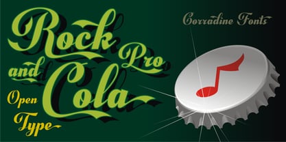
$49.95Rock and Cola's design is clearly inspired by the sinuous shapes of the world's most famous drink's logo. It however does not pretend to copy it faithfully or to serve as a platform to generate the logo itself. Rock and Cola is a very elegant Script font with great weight and contrast. Its OpenType features include ligatures, swashes, alternative characters, ornaments and accents in order to support many foreign languages. It has huge possibilities for application in logos, titles and short texts by generating in them great impact and recalling. Use Rock and Cola in your projects and enjoy it! - Enza Expanded by Neo Type Foundry,
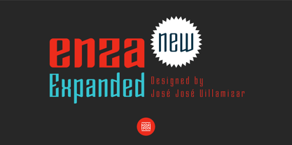
$25.00Designed by José José Villamizar, Enza Expanded is a display sans font family. This typeface has nine styles and was published by Neo Type Foundry. This font includes 8 OpenType features including Stylistic Alternates and Standard Ligatures making this font a great value. Enza Expanded has extensive Latin language support. Its design stems from the typographic exploration for conducting an identity aimed at entrepreneurs of the Millennial Generation, also known as Generation Y. Its use is recommended for titles, semicondensed texts or short, and elements of visual communication large phrases. It is also ideal for creating logos, in packaging, signboards and poster design. - Dear Penpal Script by Giaimefontz,
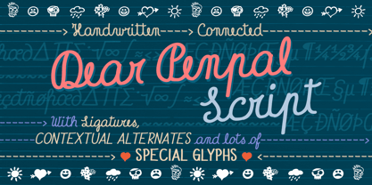
$6.00This is a fully connected script font, not calligraphic, but entirely designed to follow handwritten cursive ligatures rules as teached in schools. In order to correctly visualize it, you have to enable OpenType features (Contextual Alternates, Discretionary Ligatures, Standard Ligatues and Kerning). Trying to write All Capitals will generate Block Letters writings, since cursive style doesn't allow more than the first uppercase per word, however this font is not meant to be a Block Letters font. Using specific type combinations will generate special glyphs. All of these features are intended to reproduce a classic schoolboy or schoolgirl notebook. - Taper - Unknown license
- Dismembered - Personal use only
- Carambola by Hanoded,
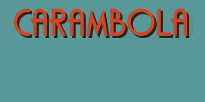
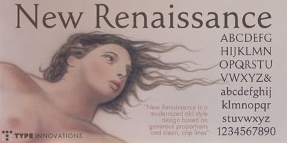
$15.00 - New Renaissance by Type Innovations,
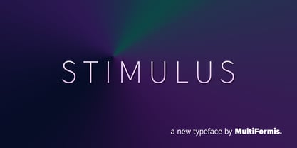
$39.00 - Stimulus by Multiformis,
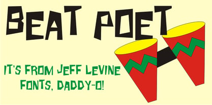
$19.99 - Beat Poet JNL by Jeff Levine,
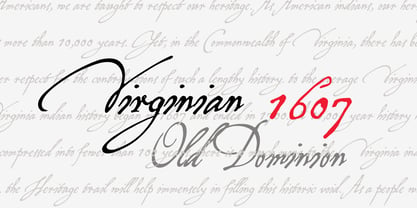
$29.00 - P22 Virginian by IHOF,
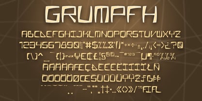
$24.95 - Grumpfh by Jean-Jacques Morello,
$- - PIXymbols Signet Umbra by Page Studio Graphics,
$29.00A monogram font of classic capitals with a thin shadow embossed look, to create elegant stationery. Includes six border styles for monograms, each accessed by a single keystroke, as well as decorative rule characters to generate business letterheads. - Stone Soup NF by Nick's Fonts,
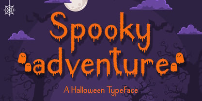
$10.00A poster for Buster Keaton's 1925 classic film "The General" provided the inspiration for this bit of typographic falderal. Essentially a monocase font, the lowercase letters are alternates, so double-clutch the shift key to add visual interest. - Spooky Adventure by AEN Creative Studio,
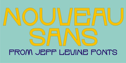
$15.00 - Nouveau Sans JNL by Jeff Levine,
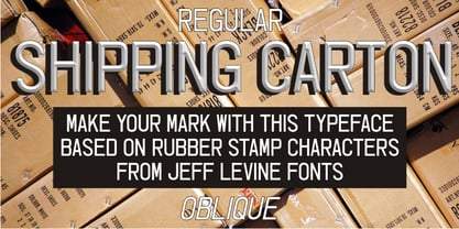
$29.00 - Shipping Carton JNL by Jeff Levine,
$29.00 - Geefium Serif - Personal use only
- Zaragoza by ITC,
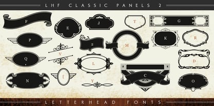
$29.99Zaragoza is the work of British designer Phill Grimshaw, a bold and beautifully rendered script which incorporated an internal zigzag decoration. Generous capitals harmonize with a lowercase that should be set close to reproduce the look of true handwriting. - LHF Classic Panels 2 by Letterhead Fonts,
$39.00 - Hunky Chunk by Just My Type,
$25.00 - Systeme Robraille - Unknown license
- Faraco Hand - Unknown license
- i-hearts - Unknown license
- Vital Formations - Unknown license
- Gilke 3000 - Unknown license
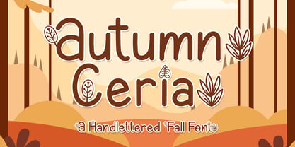
- Autumn Ceria by AEN Creative Studio,
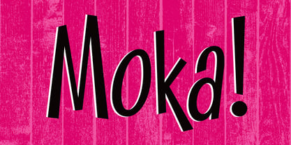
$16.00 - Moka by Alive Fonts,
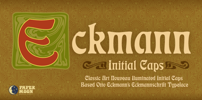
$30.00 - PM Eckmann Initials by Paper Moon Type & Graphic Supply,
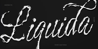
$15.00 - Liquida by Resistenza,
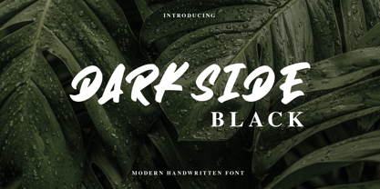
$49.00 - Darkside Black by Aldedesign,
$25.00 - Faqro Extended by ffeeaarr,
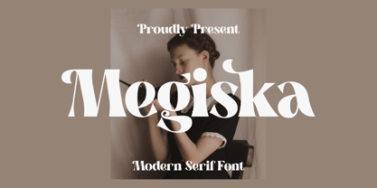
$9.00 - Megiska by Letterena Studios,
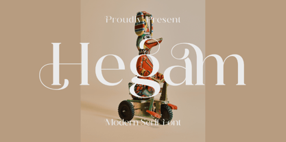
$17.00 - Hegam by Letterena Studios,
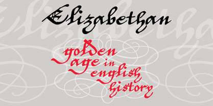
$10.00 - P22 Elizabethan by IHOF,
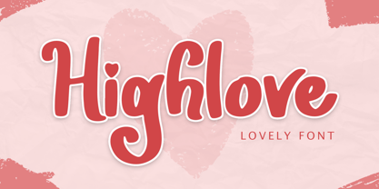
$24.95 - Highlove by Sakha Design,
$10.00 - Bindweed by Solotype,
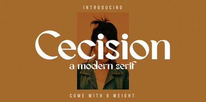
$19.95From an old wood type owned by a San Francisco printer. Wood types were customarily given somewhat generic names (Antique Tuscan) or, more frequently, numbers to identify them. Our clients liked colorful, easily-remembered names better, and so did we. - Cecision by WNGSTD,
$20.00 - Americana by Linotype,
$40.99Americana was designed by typeface artist Richard Isbell in 1965. The generous forms of this typeface contain large inner spaces. Lines of text look light and airy and require generous line spacing. The high cross strokes and the open inner spaces make this font highly legible even in small and very small point sizes. The triangular serifs are a distinguishing characteristic of Americana. These first appeared in the 19th century in France and inspired by the developments in lithography, which allowed for freer forms. The forms were typical for advertisement and display typefaces. The sophisticated Americana is particularly suitable for advertisements and personal correspondence. - Mortice by ArtyType,
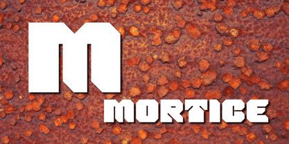
$24.00I set out to create a solid, bold, strong, rugged font, one that would lend itself to any industrial type of use, and by that I mean industry in general, but probably sectors that would still be considered male preserves such as carpentry or metalwork. I thought specifically of mortice & tenon joints, whilst toying with shape and form for this self imposed challenge. I was also visualizing a router tool used for producing most wood joints nowadays. I think the general premise worked out well; in the end I settled on the name Mortice, referring to the slots or negative spaces that the matching part, or tenon would fit into. - Americana EF by Elsner+Flake,
$35.00Americana was designed by typeface artist Richard Isbell in 1965. The generous forms of this typeface contain large inner spaces. Lines of text look light and airy and require generous line spacing. The high cross strokes and the open inner spaces make this font highly legible even in small and very small point sizes. The triangular serifs are a distinguishing characteristic of Americana. These first appeared in the 19th century in France and inspired by the developments in lithography, which allowed for freer forms. The forms were typical for advertisement and display typefaces. The sophisticated Americana is particularly suitable for advertisements and personal correspondence.
