10,000 search results
(0.042 seconds)
- Domosed Slab Serif by Etewut,
$29.00 Domosed Slab Serif typeface was build during lockdown. As a result of home sitting it appears in two weights. It refers to Italian futurism when all generation understand global changes of industrial revolution. The forth industrial revolution appears with new rules but the main idea is the same – simplifying the processes. Causing the vibe of a bright phenomenon I want you to use my font to match to zeitgeist.
 - Rangly by Mans Greback,
$59.00 Rangly is a square-based and rough typeface. It has graffiti inspired shapes built with wide paint rolls. The font is designed and created by Måns Grebäck in 2017, and has support for hundreds of languages.
 - Fastbrag by Konstantine Studio,
$17.00 Fastbrag was inspired by the vintage sign painting culture in the early 1900s. We talk about visuals from the building-sized messages, billboards, storefronts, windows, doors, and menus. A shot to deliver the heritage and historical vibes of storytelling, and branding. To give a strong persona and character to your graphic design projects.
 - High Cut by Palmer Type Company,
$30.00 High Cut came about by this found object I stumbled upon, while exploring an abandoned building, which had this word "High" cut out of it in a similar stencil design. I thought it would be a fun challenge to create an entire typeface inspired by this found object. Enjoy this new stencil typeface!
 - BD Motra by Typedifferent,
$20.00 BD Motra is fat wide uppercase font with some variants on the small character keys. The inspiration source for this typeface is the stencil lettering on Honda’s rare Motra CT50 off-road scooter made in Japan 1982. The font usage ranges from big lettering on vehicles, cargo boxes, products, buildings with an industrial approach.
 - Bulgattie by Alcode,
$20.00 Bulgattie is actually a unique font, I build it with the spontaneity of my relaxed hands. designing a formal font but having a classic element, which makes it particularly suitable for wedding media, book covers, greeting cards, logos, branding, business cards and certificates, in fact for any design work that requires a clasik, formal or luxury look. Try Bulgattie, enjoy its wealth of OpenType features and let its vigorous yet elegant exuberance delight you and enhance your creativity! You can use this font very easily.
 - Announcement Board JNL by Jeff Levine,
$29.00 Many decades back, churches, schools and other buildings with a need to display an outdoor message often chose a sign making system utilizing characters silk screened onto metal pieces in a block chamfer style. Each piece had a crimp in the top of the metal which formed a hook to fit over the existing rails of a message panel. This allowed for a finished sign to be displayed within minutes, and a quick change of information was not very time-consuming. A popular version of these signs provided white letters and numbers on black backgrounds. This was the model for Announcement Board JNL, which is available in both regular and oblique versions. There are two different width blank panels on the broken and solid bars for those who wish to kern the letters tight to form a ribbon, however they were designed to have slight spacing in order to emulate the hand assembly of those vintage sign panels.
 - Waldorfschrift by Joachim Frank,
$23.00 The Waldorfschrift family was created in digital form in the years 1993-1994 by Joachim Frank, inspired by the naturally organic letters from the anthroposophical movement of the 20th century of Rudolf Steiner . In nature there are no right angles, straight lines or complete uniformity, but instead round corners, varying thicknesses and all kinds of variability. This is what the anthroposophical movement created in their buildings, their art, in their music – and also in their lettering. And this Font is like the plants in nature: it grows upwards, branches out, letters hugs to some letters, with others they keeps more distance, some letters proudly stretch their belly, others crouch in the corner - a completely natural font. Take a look at the brand of Weleda (the natural cosmetics company), Demeter (one of the biggest organic foods companies), Filderklinik (a great anthroposophical hospital in Germany) and you will see these great companies work with different but organic letter styles. More recently, Joachim revisited the Waldorf fonts with modern type design software and added extra characters such as the euro sign, and extra weights to make the fonts useable for a wide variety of design tasks. Dez 21: A big update: All fonts have been digitized again and given a complete character set, new kerning, minor bugs removed.
 - Ocean Beach by LLW Studio,
$22.00 Ocean Beach is a fun, retro, all-caps Nautical Art Deco headline font. It sports geometric letterforms, perfect circles and highly stylized crossbars with waves on several letters—think the beach, flags rippling in the breeze and Fred and Ginger tap-dancing merrily on the deck of a ship! The inspiration for this font are the many whimsical nautical-themed buildings still to be found dotting the landscapes of America, from South Beach in Miami to hidden gems tucked away in industrial areas of southern California. I was fascinated by some of them when I was growing up, and in doing research on Art Deco styles I found many images of these wonderful buildings sporting portholes, streamlined moderne details and even faux rivets. Ocean Beach is created with a 3-stroke detail, and the complexity of the design will be appreciated better in larger sizes of type (36 pts or larger). Use this font for any application that needs a bold, decorative or Art Deco look; great for signage, magazine layout, illustration, posters and packaging.
 - Flamante Sans by deFharo,
$8.00 Flamante Sans is a group of eight corporate typographies of geometric construction, without serifs and neo-grotesque style, are fonts with an excellent readability for titles, short texts or for use in signage. The group of fonts is made up of 4 weights: Light, Book, Medium & Bold plus their respective italics. This initial development of Flamante Sans typography has been the basis for the drawing of the "Flamante family" fonts composed of 5 styles (Sans, Serif, SemiSlab, Round & Stencil) making a total of 40 fonts that are perfect corporate use, advertising or editorial titles or signage of public spaces for example. They include the Bitcoin symbol. Swiss-style fonts built on a 4 ◊ 6 building grid, formed with 144 x 119 units (Medium version), two digits taken from the fibonacci and Perrin sequences, these measures define the width and height of the vertical and horizontal antlers and the overall proportion of the font. The metrics and kerning have been carefully set up for fluent reading in paragraph texts. ================================== - OpenType Features: Standard Ligatures, Additional languages, All Alternates, Alternate Annotation Forms, Superscript, Kerning, Superiors, Capital Spacing, Localized Forms, Superior letters, Discretionary Ligatures, Subscript, Fractions, Slashed Zero, Inferiors, Extended Fractions, Scientific Inferiors, Ordinals, Denominators, Oldstyle Figures, Numerators, Historical Forms, Historical Ligatures. They include the Bitcoin symbol. - 500 glyphs. Latin Extended-A ï OTF & TTF
 - Sadina by NumidiaType,
$29.00 Sadina™ is the first font family in Sadina's series, based on geometric modernism with a classic touch. Designed with triple thicknesses to build a beautiful mix between modern humanist style, contrast, and classic sense, it provides support for double linguistic zone scripting in the world, depending on "Western European and Cyrillic" languages. It supports Professional Opentype features and supports a wide variety of alternative letters and styles for scripting and an attractive titling.
 - Henares Street by Arendxstudio,
$15.00 Heares Street - Brush Font inspired by urban fonts with sharp and beautiful letters that create fonts that are modern, trendy and elegant. Heares Street came with opentype features such stylistic alternates, stylistic sets & ligatures good for logotype, poster, badge, book cover, tshirt design, packaging and any more. Features : • Character Set A-Z • Numerals & Punctuations (OpenType Standard) • Accents (Multilingual characters) • Ligature • Alternate
 - Goatskin Brush by Mans Greback,
$59.00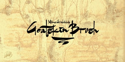 An untamed typeface built with contrasting brushstrokes.
 - Potenciarte by Nasir Udin,
$25.00 Potenciarte is an all-caps display typeface inspired by the facade of old buildings from the era of Nederlandsch-Indie (1900’s) in Surabaya, where Art Deco & Art Nouveau typographic styles were widely used.
 - Nanami by Thinkdust,
$10.00 A font inspired by the oriental flavours of Japan, Nanami a confident font with clear, clean lines which are well defined without being obtrusive. The distinctly sharp edges slice through empty space like Samurai swords, proudly wearing curves and corners like a Samurai wears their traditional ceremonial armour, and just as fierce. If Nanami isn't quite floating your boat why not check out its counterparts Nanami Rounded and Nanami Handmade.
 - Pukupuku by yamayama,
$20.00 Pukupuku is a cute round font. This font is designed based on the shape of clouds and beans, which looks somewhat like handwritten letters.
 - Brandold by Krisp Designs,
$18.00 Brandold is based on the repetition of one shape, the equilateral triangle. Using these triangles as pixels I built a medieval-like font that looks new, but follows an old aesthetic. I chose to make this font because I hadn’t seen anything similar.
 - Letterhack Serif by Comicraft,
$19.00 IT’S MAILBAG TIME! Dear Jolly JG Roshell and Rascally Richard Starkings, Comicraft Fonts are a thing of Beauty and a Joy Forever! You guys must be a Wild Bunch, and I roar with delight whenever a new comicbookfonts release appears in my emailbox. But I have to level with you daredevils...what about us Letterhacks? We need representation too! We haven’t spent years hammering away on our typewriters to be ignored! BRING BACK THE LETTER HACK! In fearless font form. You know it makes sense! Truly Yours, Forbush, Irving, senior. We give up! We can’t resist your appeals, threats and commands ANY LONGER!!! We may crack under the strain, but this month’s release IS two (count 'em) Letterhacks! That’s right, a pair of fantastic fonts that recreate the look and feel of your Marvelous Letters of the Sixties! It’s a Bullpen Bulletin! It’s an Iconoclastic Item!
 - Structural Glass JNL by Jeff Levine,
$29.00 A page from the 1931 Vitrolite catalog showing illustrations of store fronts and building exteriors utilizing the material provided a classically Art Deco type example. The business name “Sylvin” did not offer many characters to work with, so completion of the digital type design was simply left to imagination. The end result is Structural Glass JNL, which is available in both regular and oblique versions According to Wikipedia: “Pigmented structural glass, also known generically as structural glass and as vitreous marble, and marketed under the names Carrara glass, Sani Onyx, and Vitrolite, among others, is a high-strength, colored glass. Developed in the United States in 1900, it was widely used around the world in the first half of the 20th century in Art Deco and Streamline Moderne buildings. It also found use as a material for signs, tables, and areas requiring a hygienic surface. Over time, the trademarked name “vitrolite” became a generic term for the glass.”
 - Brumers by Trustha,
$17.00 Brumers is a fun sans serif font. Inspired by the curves of a bear. The basic concept is actually hand-drawn. Then, I developed and improved it in the next process. It comes in six styles, which makes it easy to choose according to the project you are working on. Brumers is perfect for headlines, branding, and many more.
 - Rase Nicolous by Graffiti Fonts,
$24.99 Rase Nicolous is a tall, handwritten graffiti font built to emulate a particular category of modern American, west coast graffiti styles. The varied stroke width & rough edges can produce the look of a number of different writing implements, paint brush, pencil, marker, chalk etc.
 - Le Havre Layers by insigne,
$19.00 With this charming new layered typeface, the possibilities are endless with your vision behind it. Accomplish the effect you've been searching for by layering these exceptional fonts and altering opacity and color, for a unique custom appearance that yells “hello there!” Play around a bit with the potential of Le Havre Layers. Build effects which include realistic 3D appearances reminiscent of the storefronts of old and adding centerlines, dotted centerlines, and shadow variations. Inspired by the affable appearance of vintage signage from the 1930s to the 1960s, Le Havre Layers spacing is altered from Le Havre Titling’s to accommodate shadows and other options properly. With its generous width it sends a message of refinement and grace. The geometric and art deco curves are a beautiful addition to your work. Mix and match with the other members of the Le Havre Hyperfamily. There are many amazing design solutions for you to discover. See what you could build with Le Havre Layers!
 - Decolot by Ryzhychenko Olga,
$6.00 Decolot font was created being impressed by the art deco era. It is built on simple geometric forms. The font is ideal for posters design, invitations, headlines.
 - Streamwood JNL by Jeff Levine,
$29.00 Streamwood JNL is an outline sans wood type re-drawn from vintage source material. The design bears strong resemblance to Woodlawn JNL; but is a bit narrower and has a much different set of numbers as well as a more stylized letter "Q".
 - Andis by JAM Type Design,
$- Andis’ rough cut makes it an interesting display typeface, but thanks to its generous x-height and firm serifs, Andis works equally well in text sizes. The typeface’s idiosyncratic italic builds a strong contrast with the roman. Andis is both functional and expressive; using it lends a humanistic touch to editorial or advertising work.
 - Avenida by ITC,
$29.00Avenida was created by architect and designer John Chippindale in 1994 and is a constructed typeface that leaves a cool, sophisticated impression. An Art Deco typeface inspired lettering found on buildings constructed in Spain's Andalucian region in the 1930's and 1940's. Avenida is best suited to headlines and short to middle length texts. - You are Superb by DainType,
$15.00 Nicely scribbled script font. It has a masculine, wild and wild mood. It also has a feeling of being torn. It is good when you want to use a lively atmosphere because of the fast flow of strokes. It is good to use when you want a cool and striking design such as a bromide for a rock festival, an album cover for music, a beer package, or a beer logo.
 - Gryffensee by Catharsis Fonts,
$30.00 Gryffensee is designed to be the Futura of blackletter, combining the time-honored gravity and relentlessness of the Gothic script with the clean, contemporary freshness of the geometric sans. Built from a tightly controlled inventory of lines, arcs, sharp cuts, and OpenType features, Gryffensee was born and raised in the digital age, yet retains the powerful charisma and human warmth of its mediaeval blackletter ancestors. As a result, it excels in a wide range of display settings, logotypes, and short text. Unlike most conventional blackletters, it even handles all-caps usage with grace, and includes an extensive Cyrillic character set (in the Pro version). Apart from a generous range of automatic ligatures and contextual alternates, Gryffensee offers stylistic alternates that allow users to customize its appearance to their tastes. The capital letters |AGHIKZ| come in alternate cuts that trade traditional shapes for increased legibility, while the letter |s| appears in three cuts, each with a unique, distinct flavor. All these options are accessible through OpenType stylistic sets in the main Latin font, Gryffensee Eins. For easy use in applications without OpenType support, we provide two additional Latin fonts (Gryffensee Zwei and Drei) in which these options replace the default cuts. Finally, Gryffensee Pro offers all the functionality of Gryffensee Eins, plus Cyrillic support. My intention to devise a contemporary geometric blackletter was inspired by four hand-painted letters, |ABCD|, in Sasha Prood�s online portfolio. I later found out that he had, in turn, taken those letters from an existing font, Bastard, by Jonathan Barnbrook. Luckily, by that time my project had taken on a life of its own. Gryffensee is an original design that bears only the most superficial resemblance to Bastard. Gryffensee is a mediaeval spelling of the lake Greifensee near which I grew up. It is pronounced [?gri?f?n?se?], or "GRIEF-un-say" in English approximation. This font is dedicated to Simone.
 - MVB Greymantle by MVB,
$39.00Kanna Aoki had fairy tales in mind when she designed MVB Greymantle. She drew dots with a felt pen to build up the forms, giving them their particular rough character. The “Extras” font contains a set of whimsical illustrations, including a portrait of Greymantle—her 18-pound cat, a set of curly initial caps, and border parts. MVB Greymantle has been spotted on numerous children's books, in magazines, in salad dressing advertisements, and on food packaging. - Badehaus by Hanoded,
$15.00 In the German city of Bad Neuenahr you can visit a spa called Thermal Badehaus. This beautiful art deco building has an even more beautiful art deco lettering covering its facade. I had to work with only a couple of glyphs ('Thermal Badehaus' to be exact) and tried to capture their beauty in the remaining glyphs. The result is a font called Badehaus (Bath House in German). It is a bold, all caps typeface, with some unique glyphs.
 - Aligarh by NamelaType,
$23.00 Aligarh is a semi-slab serif font formed with a smooth rounded bracket whose edges end with unique shapes, an exploration of combining unique styles in a typefaces. Designed to be used in a variety of media both print and digital media. 18 fonts built from 9 sizes and supported by open types.
 - Dolcissimo by Resistenza,
$39.00 Dolcissimo is a sans serif typeface with a geometric skeleton that has been built drawn by hand which makes it a friendly typeface. This font has more than 28 decorative styles, that can be overlapped, because Dolcissimo is a layered font. We highly recommend to use Dolcissimo for packaging design, logo branding, ads.
 - Ouido by Hanken Design Co.,
$30.00 The Ouido typeface has tastefully narrow characters with enough default spacing for comfortable reading at small sizes. Equipped with features like letter-spaced small caps and conservatively drawn italics for emphasizing words that maintain the reading speed—providing the reader a pleasant overall experience. Ouido (pronounced as “widow”) is derived from the Portuguese word OUVIR which means to hear or to listen. Ouido refers to the ability to play a song on any musical instrument after listening to it a couple of times and without reading the notes. The Ouido typeface is a modernized nostalgia for music enthusiasts, a whimsical revamp of the classic serif font. It bears resemblance with printed classical music scores, characterized by each letter’s rounded strokes like how one drew clefs with passion. Each dot is a twin of the quarter note minus the stem, so weaving sentences together could feel like composing a melody. Inspired by the astounding phenomenon of absolute pitch, the visual appeal of this typeface may hone your imaginative ability to embellish your creation without needing a reference.
 - All Is Quiet by Kitchen Table Type Foundry,
$15.00 The year 2022 went and 2023 came. I can honestly say that last year was a horrible year and I am happy it ended a couple of days ago. The first week after New Year’s Eve always fills my head with the U2 song ‘New Year’s Day’ - so I named this font after a line from the lyrics. I also happened to watch a fantastic movie called ‘Im Westen Nights Neues’, directed by Edward Berger, but based on a book by Erich Maria Remarque, which, in English, was published as ‘All Quiet On The Western Front’. So there you have it: naming a font in 2 easy steps! ;-) All Is Quiet is a lovely brush font, which I created using my father in law’s Chinese pencil and ink. I can suggest some uses here, but I am convinced you can come up with that yourself.
 - Softrobo by Koval TF,
$10.00 Fine-built, straight but not official, with soft corners is suitable for short texts, placards and advertising. It was inspired by 1970s when people were mad about robots, space and so on. I decided to create a font as if it was a progressive font of the 1970s.
 - Big Softie by HouseOfBurvo,
$24.99 A cute, fun, soft bubblegum font in one fatty flavor. Perfect for club posters, flyers and packaging, Big Softie is sure to tingle your clients' taste buds. The font was built on a geometric skeleton, and then rounded and softened, carefully adding character without kitsch. Designed in 2011.
 - Melodi by Diego Berakha,
$20.00 Melodi is the result of years of working with hand made types on my designs. Every time I draw the letters and words that I need for every design piece. One day I decided to go serious and make a real type of it and “Melodi” is the result of this work. It’s a calligraphic font, built using a regular stroke, and carefully crafted to have nice joins between all the letters. It has some playful but stylish capitals that brings lot of personality to the font. It work super nice either in lowercase writing as in all-caps texts. It looks specially good on lists of words or small sentences. Melodi is a playful but very versatile font, it can be used in lots of different scenarios. From creating a logo, writing the tittles of a catalogue or use it in a poster combined with other types (it work really well as counter point of more classical types) to motion graphics animations or advertising work. It can be cute but it also can do hard work!
 - Quinn Display Typeface by FoxType,
$50.00 Introducing Quinn Display new generation Typeface created for building brand identity. Quinn Typeface created with the vision of to attract the audience to your brand . The finest details of this typeface are methodically and mathematically created. Quinn is created with all the tasks of a corporate font and also for the usage in a variety of projects, including branding, logos, titles, headlines, servers, posters, screens, display, digital ads, and everything else. We are putting a lot of effort on this font as a long-term project.
 - Moraco by FoxType,
$50.00 Introducing Moraco Display new generation Typeface created for building brand identity. Moraco Typeface created with the vision of to attract the audience to your brand. The finest details of this typeface are methodically and mathematically created. Moraco is created with all the tasks of a corporate font and also for the usage in a variety of projects, including branding, logos, titles, headlines, posters, screens, display, digital ads, and everything else. We are putting a lot of effort on this font as a long-term project.
 - Geiger by WyldType,
$14.99 Geiger is a geometric typeface inspired by type found in the intros of Commodore 64 games, its attention to the grid and its limited set of building blocks. The design of Geiger respects these criteria to create a sturdy alphabet without diagonals, and loosen its grip on the classic limitations to produce a complete character set worthy of today`s high-resolution displays with a retro touch. The properties of classic computing platforms, like their limited memory and low-resolution displays, required that the designers and programmers of the time devise and use certain techniques to produce interesting visual results. These platforms offered limited sets of default building blocks from which to build more complex graphics and type, and some skilled coders would work around these limitations to produce the unexpected. One of the areas that saw experimental digital type flourish is the Commodore 64 intro scene. The Geiger family includes four styles (regular, oblique, bold and bold oblique), all include common ligatures (fi, ff, ffi, fj, fl, jj, tt, Th, TT) and a few stylistic alternates (K, L). A particular attention was paid to the pattern created by the vertical stem and negative spaces of tightly set text, especially for Geiger Bold. Geiger produces good results at a size of 30pt or more, but we suggest using it at higher display sizes.