10,000 search results
(0.05 seconds)
- FF Fago Monospaced by FontFont,
$67.99 FF Fago Thanks to his many years of involvement in major corporate type projects, Ole Schäfer had the necessary resources from which to construct his FF Fago™. The result is an extended family that provides comprehensive typographic support and whose qualities come to the fore in all relevant contexts ? from print to office through internet and wayfinding systems. FF Fago The sizable x-height together with the generous and open design of the characters ensure that the sans serif Fago remains clearly legible even in small point sizes or in potentially difficult situations, such as on wayfinding systems. A subtle contrast in line weight and letter forms that are reminiscent of those of an antiqua typeface provide the font with a restrained yet friendly and lively tone. Available in five weights, each with three different kerning widths and matching genuine italic variants, FF Fago is equipped for practically every situation. There are also small caps, oldstyle and lining figures, a selection of ligatures and geometric symbols. The range of potential applications of this universal font is almost inexhaustible ? it can be used in packaging design, on signs, posters and even for setting longer text sections. Fago is the ideal partner for those working on major corporate projects! FF Fago Correspondence Sans und Correspondence SerifThe Correspondence versions of Fago have been optimized for use in the business environment and in office communication. The carefully modified characters have a particularly robust feel, so that the clear, easily differentiated glyphs allow for straightforward communication even on screen. With these aims in mind, Schäfer has not only adjusted the x-height, but has provided certain letters in the sans variant ? such as the lowercase "i", the "r" and the uppercase "I" ? with serifs. Correspondence Serif, on the other hand, has been conceived as a slab serif throughout and in appearance has the look of the letters produced by the old office typewriting machines. An individual note has been added by providing a few unusual serif forms, as for example in the case of the "m", the "v" and the "y". Both Correspondence Sans and Serif are available in two weights with complementary italic versions and thus are ideally suited for use with standard office programs. This is all rounded off with a selection of office symbols. FF Fago Monospaced The use of a few typographic tricks is necessary to ensure that the letters of the alphabet appear to have the same width. Narrow letters such as "r" and "i" have been made to seem more expansive by using prominent serifs while the broader letters ? a good example is the "m" ? have the forms seen in a condensed font. And it is thanks to this design strategy that Fago Monospaced has the character of old typewriter text. What was once unavoidable because of the technology of the time is now a welcome alternative that can be used for the purposes of emphasis. As an additional supplement to the Fago superfamily, Fago Monospaced can be used, for example, to set short notes or draw attention to special text passages. There are three weights, in their original form without italic variants or small caps, but offering an alternative, technical form of the "0" with a crossbar.
 - Wolves by Eotype,
$12.00 The Wolves font is a serif condense font with a sleek and elegant appearance. This font is created as a unique professional multipurpose font that you can use in your projects. You can use it in modern and fancy designs. This font is perfect for a variety of projects, such as branding, poster displays, logo designs, magazine covers, product labels, clothing and more. This font contain ligatures and alternative styles. This font provides a great experience!
 - "A Theme for Murder" is a font that evokes a sense of eerie suspense and chilling mystery, reminiscent of classic horror films and novels. Designed by Chris Hansen, this distinctive typeface encapsul...
- Glypster by Ardyanatypes,
$15.00 Glypster - Bold Aesthetic Serif Fonts is a font that has boldness in every line. This font's robust and bold style conveys a luxurious, elegant, retro, and aggressive feel. The serenity afforded by this font's blend of boldness and subtlety makes Glypster suitable for a wide variety of design choices. Apart from that, the strengths of Glypster are its ability to support multiple languages and additional features that can add interest to every design you make. In terms of marketing, Glypster is very suitable for purposes such as logos, posters, business cards, and many more, so you can explore the potential of this font for various designs. Glypster's simplicity, but still elegant and luxurious, makes it the right choice for all procedures.
 - Vapor by The Hiscott Foundry,
$35.00This font was inspired by the swirling steam drawn on a chalkboard at a coffee shop. Not actually a script font though it has a similar feel. This font dances and twirls the way a wisp of smoke or steam would. - White Block by Nathatype,
$29.00 Looking for a font that will make your branding stand out? Do you sometimes have an appetite for a bit more wholesome typography? Looking for a fabulous, stylish, and adventure font? We've got what you want. White Block-A Display Font White Block is a bold display font with a modern look. This display font is perfect for anything adventurous, and direct. Designed primarily as a captivating font that easy to read but still stylish, A real head-turner for your presentation, designs, branding, quotes, invitation, website illustrations, and much more. Our font always includes Multilingual Options to make your branding globally acceptable. Features: PUA Encoded Numerals and Punctuation Thank you for downloading premium fonts from Natha Studio
 - Murisa Alexandra by Murisa Studio,
$10.00 Murisa Alexandra is one of our next proud fonts. Combining a strong and strong font style with a beautiful and charming calligraphy style, Alexandra is the perfect combination. You will be presented with a variety of font styles contained therein. Starting from the font that is sturdy and tough, there are also beautiful and charming swash fonts. Coupled with decorative fonts that are beautiful to look at. Not only that, this font is also equipped with an outline font type. So many kinds of fonts in it make you more and more expressive. Explore this font in such a way that it creates the perfect piece of work. Alexandra, a font, a perfection.. Get it now
 - Mencken Std by Typofonderie,
$59.00 An American Scotch remixed in 27 fonts Mencken has twenty seven styles, divided into three widths, three optical sizes, romans and italics. Generally, optical size typeface families belong to a same common construction. It falls into the same category of type classification, while presenting different x-heights or contrasts. Mencken is unique because it is designed according to different axis and optical sizes. Firstly, Mencken Text is a low-contrast transitional typeface, designed on an oblique axis, asserting horizontal with featuring open counters. Its capitals follow Didots to better harmonize the rest of the family. On the other side of the spectrum, Mencken Head (and narrow variations) is designed on a vertical axis, high contrast, in a contemporary Didot style. The Mencken is therefore a typeface answering to different sorts of uses, whose design is different according to its uses: from oblique axis in small size to vertical axis in large sizes. Vertical proportions (x-height, capitals height, etc.) were calibrated to be compatible with many Typofonderie typeface families. Lucie Lacava and I followed the idea launched by Matthew Carter few years ago for some of his typefaces intended for publications. From Baltimore Sun’s project to Typofonderie’s Mencken It is a bespoke typeface for American newspaper The Baltimore Sun started at the end of 2004 which marks the beginning of this project. The story started with a simple email exchange with Lucie Lacava then in charge of redesigning the American East Coast newspaper. As usual, she was looking for new typeface options in order to distinguish the redesign that she had started. At the time of its implementation, a survey of the newspaper’s readers has revealed that its previous typeface, drawn in the mid-1990s, was unsatisfactory. The Mencken was well received, some reader responses was particularly enjoyable: “It’s easier to read with the new type even though the type is designed by a French.” Why it is called Mencken? The name Mencken is a tribute to H. L. Mencken’s journalistic contributions to The Sun. According to the London Daily Mail, Mencken ventured beyond the typewriter into the world of typography. Because he felt Americans did not recognize irony when they read it, he proposed the creation of a special typeface to be called Ironics, with the text slanting in the opposite direction from italic types, to indicate the author’s humour. Affirming his irreverence, the Mencken typeface does not offer these typographic gadgets. Henry Louis Mencken (1880 — 1956) was an American journalist, satirist, cultural critic and scholar of American English. Known as the “Sage of Baltimore”, he is regarded as one of the most influential American writers and prose stylists of the first half of the twentieth century. He commented widely on the social scene, literature, music, prominent politicians and contemporary movements. Creative Review Type Annual 2006 Tokyo TDC 2018
 - Chalk Cowboys by Learning Kiddos,
$18.99 Chalk Cowboys is a vintage chalk font, handwritten by me. It has a real chalkboard feel and is a: textured font handwriting font has bonus shape elements and full Latin support As a bonus you will get real chalkboard shapes (as seen in preview pic three). Get creative and use this retro font for: a menu food branding as a display font for invites chalk lettering (of course =)) shirt designs magazine layout Instagram posts or any Social Media posts, really This font also works great as a running text, too. =) Don't forget to check out my two other fonts: Casual Crew Signsurfers Script
 - Wild Soul by Pixel Colours,
$24.00 Wild Soul is a handwriting font duo designed for projects with a hand drawn, organic vibe. Imperfect with a subtle texture, great for artsy designs! This artistic font is perfect for product packaging, movie posters, art posters, quotes, logo design, etc. Includes a dingbats font full of extra doodles for decorating texts or creating beautiful quotes for social media posts. This font pair is a must have if you love handwritten fonts! Includes: Wild Soul Regular: a script hand drawn font with imperfect lines and texture Wild Soul Extras: a dingbats font full of hand drawn doodles
 - Lilard by Putracetol,
$28.00 Lilard - Elegant Serif Font Lilard - Elegant Serif Font is a beautiful typeface that exudes sophistication and grace. The font was designed with the idea of creating a classic and elegant look, while still maintaining a modern and clean feel. The result is a font that is versatile and can be used for a variety of projects such as branding, logos, packaging, photography, and more. The design of Lilard font is inspired by the timeless and elegant look of serif fonts, but with a contemporary twist. The designer wanted to create a font that would stand out and be memorable, while also being easy to read and understand. The elegant curves and sharp serifs make Lilard a perfect choice for projects that require a touch of elegance and sophistication. Lilard font is best used for projects that require an elegant and refined look. This font is perfect for use in wedding invitations, business cards, and other high-end print materials. The font works well when paired with other sans-serif fonts, which helps to create a modern and clean feel. Lilard font comes with a variety of features that make it stand out from other fonts. The font includes uppercase and lowercase letters, as well as opentype features such as alternates and ligatures. Additionally, the font includes numbers, punctuation, and symbols, making it a versatile choice for a variety of projects. The font also supports multiple languages, making it a great choice for international projects. If you're looking for a font that is elegant, sophisticated, and versatile, Lilard - Elegant Serif Font is the perfect choice. Its unique design and features make it an ideal choice for a variety of projects. Use this font to add a touch of elegance and refinement to your designs and make them stand out. In summary, Lilard - Elegant Serif Font is a beautiful and elegant font that is perfect for high-end projects. Its unique design, features, and versatility make it a great choice for a variety of projects, including branding, logos, packaging, photography, and more. With its opentype features, multiple language support, and easy-to-use formats, Lilard is sure to become a go-to font for designers looking for an elegant and refined look.
 - Danu by Phoenix Group,
$12.00 Danu font is a font with a traditional style with a minimalist approach, this font is inspired by Javanese script with curved letters and some dots in it.
 - Sweet Summer by Seemly Fonts,
$12.00 Sweet Summer is a tall and a bit quirky handwritten font. Its friendly and simple style makes this font adept to a wide variety of designs.Caps only Fonts.
 - Rosalline Handwritten by Ditatype,
$29.00 Rossaline Handwritten is a lovely script font of which characteristics are the connections between letters to look like a naturally connected handwriting that leaves the impression of this font being organically, spontaneously written in order to add a firm personal touch. This font has various line thicknesses to show high letter contrasts to strengthen the font’s firm, clear impressions. Besides, the letters’ height variety, meaning that some of the letters are higher than the others, makes Rossaline Handwritten more interesting and dynamic. However, the connected letters can cause difficulty to read in small text sizes, so that you need to be more careful to use this font by adjusting it to your needs. In addition, you may enjoy the available features here as well. Features: Ligatures Multilingual Supports PUA Encoded Numerals and Punctuations Rossaline Handwritten fits best for various design projects, such as brandings, quotes, invitations, name cards, greeting cards, printed products, merchandise, social media, etc. Find out more ways to use this font by taking a look at the font preview. Thanks for purchasing our fonts. Hopefully, you have a great time using our font. Feel free to contact us anytime for further information or when you have trouble with the font. Thanks a lot and happy designing.
 - Hefuma by Twinletter,
$13.00 Introducing “Hefuma Font” – Where Playfulness Meets Typography! Dive into the world of creativity with Hefuma Font, a playful display font that’s set to infuse charm and imagination into your designs. Hefuma Font adds a delightful twist to your projects, making it ideal for anything from children’s books to eye-catching posters. Its whimsical style captures attention and brings a sense of joy to your work. Crafted with meticulous detail, Hefuma Font’s unique design invites readers to explore your content with curiosity. Its playful appearance radiates creativity, making it the perfect choice for projects that aim to stand out. With Hefuma Font, the possibilities are endless. Use it to inject a sense of fun into your designs and watch as your creations come to life with personality and flair. No matter the creative endeavor, Hefuma Font is your trusted companion for adding a playful touch to your work. Embrace the world of creativity, and let Hefuma Font elevate your designs to new heights. – PUA Encoded Characters – Fully accessible without additional design software.
 - The Junos by Maulana Creative,
$14.00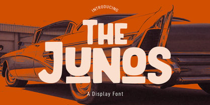 The Junos is a handwritten display sans font. With a bold stroke, rough and fun character with a bit of ligatures. To give you an extra creative work. The Junos font support multilingual more than 100+ language. This font is good for logo design, Social media, Movie Titles, Books Titles, a short text even a long text letter and good for your secondary text font with script or signature font. Make a stunning work with The Junos font. Cheers, MaulanaCreative
 - Dubia by Ilhamtaro,
$17.00 DUBIA is a western style font, a font that goes well with cowboy, rodeo and vintage designs. The font, which is based on a serif font, is bold and tends to carry a strong and tough character like a cowboy taming a wild horse. This font is allcaps so it is perfect for creating a title or headline on a poster or magazine cover design. To enable the OpenType Stylistic alternates, you need a program that supports OpenType features such as Adobe Illustrator CS, Adobe Indesign & CorelDraw X6-X7. Cheers!
 - Night Michy by Zeenesia Studio,
$16.00 Have a great day! My new font was present, Night Michy!! Night Michy is a Bold vintage style serif font with strong character and soft features. modern and classic serif font with a clear and bold look. It’s a very versatile font that works great in large.
 - UNDERSTOOD by Studio Hello Good,
$12.00 Understood is a cool alternative for you to easily create a logo for your underground metal band. Using alternate front and ending letters brings the font to life, It comes with a basic character set and a small group of symbols and signs often used in the extreme music sector – the classics of Death- and Blackmetal like pentagram drops, roots, spikes and more.
 - Fractura ND by Neufville Digital,
$29.60 Fractura ND is a stencil typeface designed by José María Cerezo. It includes, in addition to four fonts of different weights, an outline font, a pair of fonts to make bicolor sets and a dripped font. A geometric sans serif that, with the particularity of being a stencil, provides personality and wide compositional possibilities. Fractura is a Trademark of BauerTypes SL
 - Goversy by Maulana Creative,
$15.00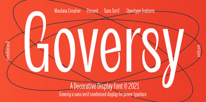 Goversy is a Decorative Condensed Display font. With Regular stroke, fun character with a bit of ligatures. To give you an extra creative work. Goversy font support multilingual more than 100+ language. This font is good for logo design, Social media, Movie Titles, Books Titles, a short text even a long text letter and good for your secondary text font with handwriting and script font. Make a stunning work with Goversy font. Cheers, Maulana Creative
 - Roble by Latinotype,
$26.00 Roble is a Slab Serif Font, from a mix between Andes and Sanchez, following a harmony with both fonts one sans and one serif with a fresh and dynamic result. Roble is a family of 16 display fonts 8 weights plus italics.
 - Kungfu Brush by Ditatype,
$29.00 Kungfu Brush is a captivating game-themed display font designed in uppercase, infusing the essence of martial arts and the artistry of brush strokes. It features a distinct brush-style accent that brings a sense of handcrafted artistry to each letter. Inspired by the fluid movements of martial arts, the font captures the energy and elegance of brush strokes. This unique feature adds a touch of creativity and authenticity, making this font stand out from conventional display fonts. Designed with fairly low contrast, Kungfu Brush prioritizes a balanced and harmonious visual experience. The subtle differences in stroke width across the letters create a smooth and comfortable reading experience. With its uppercase design, Kungfu Brush exudes power and strength. Each letter commands attention and showcases the boldness of martial arts. The font's uppercase style adds a sense of authority and captures the spirit of determination found in the martial arts realm. You can also enjoy the available features here. Features: Multilingual Supports PUA Encoded Numerals and Punctuations Kungfu Brush fits in headlines, logos, posters, titles, branding materials, print media, editorial layouts, website headers, and any projects that aim to capture the essence of combat, adventure, and discipline. Find out more ways to use this font by taking a look at the font preview. Thanks for purchasing our fonts. Hopefully, you have a great time using our font. Feel free to contact us anytime for further information or when you have trouble with the font. Thanks a lot and happy designing.
 - Nextrue by Asenbayu,
$12.00 Nextrue font is a sans serif font with a sleek and sporty look. This font is shaped as a professional multipurpose font with a strong look in upright and a dynamic look in slant letter. You can use it in modern youth design, adventure, hobbies and sports. This font is perfect for a variety of projects, such as branding, poster displays, logo design, magazine covers, product labels, clothing and more. This font is perfect for taking your designs to the next level! Nextrue fonts feature opentype, kerning, ligatures, and alternative styles packed in 12 fonts (Condense, Extend, Slant). Nextrue fonts include uppercase, lowercase, numbers, punctuation and multilingual support.
 - Kohirug by Twinletter,
$15.00 Looking for a font that exudes style and elegance? Look beyond the KOHIRUG Blackletter font. This font evokes a strong, confident personality with striking details on each side of the lettering. Whether you’re creating a vintage-inspired project or want to add a bold classic look to your visuals, this font is a perfect choice.
 - "Linearmente," a font crafted by the creative minds at Jambo!, is a striking embodiment of modern design principles merged with minimalist aesthetics. At its core, Linearmente is built on the foundat...
- Celestial by My Creative Land,
$18.00 Have you ever struggled while creating a quote with all ascenders/descenders getting on the way? When you can't find a perfect placement for a word because the letters on the upper line crossing the ones on the lower one? Well, I have :) If you want to reduce this struggle to a minimum, the Celestial brush font is for you. Full of open type features and alternates it won't stand on your way to get the job done ;) Most of the font's letters have "longer" or "shorter" alternates. Celestial brush font is fully unicode mapped.
 - Beauty Outside by Pixel Colours,
$22.00 A serif font with a hint of retro. Includes a display font for larger words and a text font optimized for reading. Use them alone or pair them together to create amazing compositions and designs. Beauty Outside Text: a serif font with loose letter spacing suited for reading great for larger blocks of text. Beauty Outside Display: a serif font with with tight letter spacing suited for larger type and headlines. Multilingual
 - The Lutontown by Teweka,
$15.00 The Lutontown font is a font with a unique style inspired by triangles, there are several triangle shapes in the letters. This font has a opentype simple but elegant. This font is also equipped with Multilingual. This font is perfect for branding, logos, etc
 - Prillwitz Pro by preussTYPE,
$49.00 Johann Carl Ludwig Prillwitz, the German punch cutter and type founder, cut the first classic Didot letters even earlier than Walbaum. The earliest proof of so-called Prillwitz letters is dated 12 April 1790. Inspired by the big discoveries of archaeology and through the translations of classical authors, the bourgeoisie was enthused about the Greek and Roman ideal of aesthetics. The enthusiasm for the Greek and Roman experienced a revival and was also shared by Goethe and contemporaries. »Seeking the country of Greece with one’s soul«. All Literates who are considered nowadays as German Classics of that time kept coming back to the Greek topics, thinking of Schiller and Wieland. The works of Wieland were published in Leipzig by Göschen. Göschen used typefaces which had been produced by until then unknown punch cutter. This punch cutter from Jena created with these typefaces master works of classicist German typography. They can stand without any exaggeration on the same level as that of Didot and Bodoni. This unknown gentleman was known as Johann Carl Ludwig Prillwitz. Prillwitz published his typefaces on 12th April 1790 for the first time. This date is significant because this happened ten years before Walbaum. Prillwitz was an owner of a very successful foundry. When the last of his 7 children died shortly before reaching adulthood his hope of his works was destroyed, Prillwitz lost his will to live. He died six months later. His wife followed him shortly after. The typeface Prillwitz as a digital font was created in three optical styles (Normal, Book and Display). The typeface Prillwitz Press was created especially for a printing in small sizes for newspapers. »Prillwitz Press« combines aesthetic and functional attributes which make written text highly readable. It was originally designed for a newspaper with medium contrast to withstand harsh printing conditions. Its structure is quite narrow which makes this typeface ideal for body text and headlines where space is at premium. For the Normal – even more for the Book – a soft and reader-friendly outline was created through a so-called »Schmitz« and optimized in numerous test prints. The arris character and the common maximal stroke width contrast of the known classicist typefaces (Didot/Bodoni) were edited by the study of the original prints. This was also done in order to reach a very good readability in small type sizes. This typeface is perfectly suited to scientific and belletristic works. Accordingly it has three styles: Regular, Bold and Italic as Highlighting (1). The typeface Prillwitz is a complete new interpretation and continuing development of the conservated originals from 1790. They have been kept in the German Library in Leipzig. It was always given the priority to keep the strong roughness and at the same time optimizing the readability of this striking font. The type family has all important characters for an efficient and typographic high quality work. ----------- (1) Accentuation of particular words or word orders (e.g. proper names, terms etc.). Typographic means for Highlighting could be Italic, SmallCaps or semi-bold.
 - Lisbeth by TypeTogether,
$39.00 Louisa Fröhlich’s Lisbeth is the charming all-italic trailblazer that handles branding and text with internal vividness. With no roman style, it’s an italic-only family whose creation was guided by imagination instead of restrictive writing tools. Some type families aren’t sure what they want. Lisbeth proceeds with the utmost confidence on its own terms — it’s a feisty three-dimensional thespian amidst the cast of strait-laced characters you’re used to. With branding and magazine usage in mind, Lisbeth addresses the distinct challenges of text and display in a characterful way. The curves of the text weights show a soft angularity, emphasising the handwritten quality and the subtle twist inside the letters. The stroke’s carefully balanced contrast is more pronounced in the vibrant heavier weights but almost absent in the graceful structure of the thin weight. The angle of the letters is almost upright and the x-height is relatively large, so longer texts can be read comfortably and without effort. Lisbeth is slightly condensed and so uses a smaller area to efficiently impart much information. So if a type design can be thought of as the clothing letters wear, then Lisbeth is an energetic, freely flowing stroke wrapped around practical and efficient letter proportions. Another highlight of the family is the quirky high-contrast display style, easily catching every eye. The design concept of the twisted stroke shows at the extreme here and makes the letters dance a little on the page. Even though the shapes behave wildly, every letter is carefully balanced in itself so that the rhythmic repetition of the lettershapes results in an even and harmonic total picture. Lisbeth’s five text weights (from thin to bold) perform excellently in text settings, and its funky display style amps up the internal shimmer within each glyph. It supports numerous languages (Latin-A extended) and comes with ligatures and contextual alternates to produce beautiful typography. The character set contains proportional lining and oldstyle figures, tabular figures, subscripts, superscripts, and fractions. The complete Lisbeth family, along with our entire catalogue, has been optimised for today’s varied screen uses.
 - Dupla by Tipo Pèpel,
$22.00 When Dupla was designed, its DNA shown the best of the typographic heritage from the XIX century types, the oldest san serif known, also named as “Grotesk”, a soft synonym for bizarre, unnatural weird. XIX century Germans' eyes were surprised, astonished by the formal strangeness that provoked the mutilation of the well known serifed types. But the skeleton and DNA are barely perceptible, an invisible part of the nature of objects. We are interested in the epidermis, the outer, the visible, which directly speak to the eyes, and Dupla tells us with overwhelming presence, that is a formal, traditional type, covered with a childlike sweetness, with slight curves, epidermic, sweetening even ink’s traps up. Frutiger said that Latin alphabet letter’s minimum skeleton is like a lock where you should fit all the letters you see, but that skeleton allows many skins. We use a different skin for every specific use. And Dupla’s skin points to how generous, how friendly it is; the sweetness of the big and good-natured. They do not feel very comfortable in low-cost airplanes company’s seats, but in the proper location with enough room, they'll fill the atmosphere with kindness. Do not ask for narrow columns, or terse captions in squalid sizes; do not ask for ridiculous “small print” in dark contracts where «The party of the first part shall be known in this contract as the party of the first part …» That’s not for Dupla. Large headlines, generous width columns to cover, rude pullquotes half-breaking columns, loud exclamations, great sizes, with black weights. It’s in the insultingly generous, almost obscene use where Dupla is felt. And if you consider this a obscene, gargantuan, typographical feast, Dupla brings you everything to demonstrate that quantity does not mean less quality. Multi-language support, Latin plus full coverage, complete sets of small caps, fractions, old numerals, modern, tabular, bonds and all the “gourmet” paraphernalia that Patau has accustomed us, after many years of work. If you want to be obscene and pass the censorship, use Dupla. Hedonism is just a venial sin.
 - Zeogari by Phoenix Group,
$13.00 Zeogari is a classic style font that has a combination of serif and sans-serif forms, this font depicts a sense of love and loneliness, in addition, the Zeogari font has a bold shape with strong characters.
 - KG OnlyHope by Kimberly Geswein,
$5.00 This font is a playful doodled font with a variety of styles.
 - Artes by Greentrik6789,
$19.00 Proudly present, Artes groovy layered display font. Inspired by bubble letters in graffiti art and retro style design, it produces a display font with a fun style that is perfect for the design needs of posters, flyers, covers, titles, logos, packaging, t-shirts, branding and various needs that require a unique display font. Activate the Contextual Alternates feature so that the shape of the character changes according to the shape of the character in front of it, and Activate the Stylistic Alternates feature to change the number characters into bubbles that you can use as additional elements in your design.
 - Snowgoose by Typodermic,
$11.95 As the winter holiday season approaches, it’s time to give your designs a touch of frosty magic. Imagine letterforms that glisten with snow, adding a charming and whimsical feel to your design work. Look no further than Snowgoose—the ultimate Christmas typeface for graphic designers. With Snowgoose, you’ll save time and effort by using a pre-designed typeface that mimics the look of a snow-capped letterform. No more tedious manual filling or attempting to create the snow effect from scratch. Snowgoose is designed to give your work that perfect wintery touch with its multiple layers that help you achieve the snow effect quickly and easily. But it’s not just the snow effect that makes Snowgoose stand out. This typeface is built on an old-fashioned typeface, which adds a vintage charm to your designs. The result is a perfect balance between classic design and modern aesthetic, all while staying true to the winter holiday theme. Adding the finishing touches to your design is just as easy. Enhance the snow layer with a fuzzy light blue shadow to create an emboss effect, and your design will be ready for the season. Imagine creating your holiday designs effortlessly, leaving you with more time to enjoy the festivities and spend time with your loved ones. So don’t wait any longer. With Snowgoose, you can create stunning winter holiday designs that stand out from the crowd. Get your hands on this instrument of choice and create magical designs that will bring joy and cheer to everyone who sees them. Most Latin-based European writing systems are supported, including the following languages. Afaan Oromo, Afar, Afrikaans, Albanian, Alsatian, Aromanian, Aymara, Bashkir (Latin), Basque, Belarusian (Latin), Bemba, Bikol, Bosnian, Breton, Cape Verdean, Creole, Catalan, Cebuano, Chamorro, Chavacano, Chichewa, Crimean Tatar (Latin), Croatian, Czech, Danish, Dawan, Dholuo, Dutch, English, Estonian, Faroese, Fijian, Filipino, Finnish, French, Frisian, Friulian, Gagauz (Latin), Galician, Ganda, Genoese, German, Greenlandic, Guadeloupean Creole, Haitian Creole, Hawaiian, Hiligaynon, Hungarian, Icelandic, Ilocano, Indonesian, Irish, Italian, Jamaican, Kaqchikel, Karakalpak (Latin), Kashubian, Kikongo, Kinyarwanda, Kirundi, Kurdish (Latin), Latvian, Lithuanian, Lombard, Low Saxon, Luxembourgish, Maasai, Makhuwa, Malay, Maltese, Māori, Moldovan, Montenegrin, Ndebele, Neapolitan, Norwegian, Novial, Occitan, Ossetian (Latin), Papiamento, Piedmontese, Polish, Portuguese, Quechua, Rarotongan, Romanian, Romansh, Sami, Sango, Saramaccan, Sardinian, Scottish Gaelic, Serbian (Latin), Shona, Sicilian, Silesian, Slovak, Slovenian, Somali, Sorbian, Sotho, Spanish, Swahili, Swazi, Swedish, Tagalog, Tahitian, Tetum, Tongan, Tshiluba, Tsonga, Tswana, Tumbuka, Turkish, Turkmen (Latin), Tuvaluan, Uzbek (Latin), Venetian, Vepsian, Võro, Walloon, Waray-Waray, Wayuu, Welsh, Wolof, Xhosa, Yapese, Zapotec Zulu and Zuni.
 - AL Hermaiona by Aluyeah Studio,
$90.00 Bonjour! Hermaiona a royal and lux display font. This font was carefully crafted and inspired by luxury fashion in the world. It creates a luxurious, rich, exclusive and elegant look in design. Coming to you with 100+ rich and luxury alternate to create a perfectly beautiful, classy, rich, elegant, and luxurious design. Use this font for your luxury brand, fashion brand, resort, cosmetics, invitations, wedding, branding, packaging, magazines, boutique, social media, restaurant, spa, greeting cards, headers, headline and many more. Features: OpenType support Multilingual support (15 languages) PUA Encoded Super Easy to Use alternates - It's OpenType support but you can easily call alternates character using special combination like A.2 B.2 a.2 a.5 b.3 etc so you dont need special software You will receive: Al_Hermaiona.otf Al_Hermaiona.ttf Thanks for checking out my font. I really hope you enjoy using it! If you have any questions I'd be more than happy to answer them, just send me a message! linggarsundoro@gmail.com Stay Healthy & Stay Strong
 - Density by Alandya TypeFoundry,
$15.00 Density Heavy Slab Serif Features a smooth slab serif and a wide surface that makes it especially suitable for horizontal and lengkungan compositions. This is a front view, best used at larger sizes when weight and impact are desired. It's classic with a modern edge and most importantly packed with different styles, and ligatures Density is a heavy slab serif that comes with regular, oblique, outline, outline slanted, rough, rough slanted, extrude and extrude slanted style. this font is perfect for every project. suitable for branding logo, badge design, or apparel design. This font also comes with multilingual support.
 - Beardman Outline by Jafar07,
$10.00 Beardman is a condensed sans-serif font designed specifically for bold and powerful headlines and titles. With four variants available: regular, italic, regular outline, and italic outline, this font allows you to express yourself with a style that suits your design project. The name "Beardman" is inspired by the meaning of a man who is masculine but has a soft heart, and it is reflected in the font's design. With strong and sturdy letterforms, the font also has a gentle and smooth touch that gives an elegant and modern impression. With its strong and expressive appearance, "Beardman" is suitable for use in graphic design projects such as posters, brochures, magazines, websites, and much more. Add a touch of masculine yet gentle to your design with the "Beardman" font. What did you get? Regular, Italic, Regular Outline & Italic Outline Alternates & Ligatures Numbers & Punctuation Multilingual Support Works on PC & Mac Simple Installations
 - Beardman by Jafar07,
$10.00 Beardman is a condensed sans-serif font designed specifically for bold and powerful headlines and titles. With four variants available: regular, italic, regular outline, and italic outline, this font allows you to express yourself with a style that suits your design project. The name "Beardman" is inspired by the meaning of a man who is masculine but has a soft heart, and it is reflected in the font's design. With strong and sturdy letterforms, the font also has a gentle and smooth touch that gives an elegant and modern impression. With its strong and expressive appearance, "Beardman" is suitable for use in graphic design projects such as posters, brochures, magazines, websites, and much more. Add a touch of masculine yet gentle to your design with the "Beardman" font. What did you get? Regular, Italic, Regular Outline & Italic Outline Alternates & Ligatures Numbers & Punctuation Multilingual Support Works on PC & Mac Simple Installations