10,000 search results
(0.098 seconds)
- Lecturia by Ingo,
$42.00 Lecturia is a modern humanist sans serif typeface. Ascending dynamic movement characterizes the structure of it’s characters -- the stylistic alternates emphasize this impression. The family comprises eight weights from the most delicate "Hairline" to the strong "Bold" -- each upright and italic. Using the variable font, the intermediate levels can be controlled fluently. The forms and proportions of Lecturia have been selected to be very legible as body type for longer texts. Lecturia ist still legible from a great distance or under unfavorable conditions. In large sizes as a heading, the font is very eye-catching. The shapes of the individual characters follow the "humanistic" form language of modern faces. In addition to ligatures for problematic letter combinations, it contains stylistic alternates for some characters that make the appearance even livelier. Small caps provide a restrained opportunity for emphasis. In addition, Lecturia offers several sets of numerals: proportional standard figures, lining figures, proportional oldstyle figures, non-proportional tabular figures, superscripts and subscripts, numerator and denominator to represent fractions, circled numbers. The very good legibility of Lecturia makes it the ideal typeface for information systems -- a selection of directional arrows is included.
 - Brenham JNL by Jeff Levine,
$29.00 Before typography had 'rules', lettering artists set down designs that have endured as classics. A perfect example is Brenham JNL, which was modeled after an antique wood type. The extra elongation of some characters, the irregular shapes of others and the overall hand-made charm of the entire design makes this digital font the perfect choice for replicating broadsides, posters and anything needing a nostalgic look as if from the past.
 - Mezalia Sans by Arrière-garde,
$9.00 Mezalia Sans is a logical continuation of the Mezalia family. Its shapes are based on medieval calligraphic style: the Bastarda. This time the evolution is taken a step further, as these classic shapes are merged with the straightforwardness of a modern sans-serif. This results in an original, strong yet very much usable typeface, that can hold its own in a wide range of applications. Mezalia Sans has two distinct styles: straight and cursive (true italic if you will, although the word is not really correct here), which come in ten weights, from thin to black. This wide range ensures that whether you are looking for delicate or bold strokes (or a combination of both) you will be satisfied. Every style also contains a set of small caps (with matching punctuation). Old-style, proportional and tabular numerals are included too, along with ligatures, symbols and language support in Adobe Latin 3 range.
 - Megamind by Twinletter,
$12.00 Introducing “Megamind” – sanserif / display font with a new look, which is stylish and flexible. Its bold, solid, clear, and strong characteristics make this font look beautiful with the right portions in your various design projects This font is made with passionate pleasure and passionate passion applied to this font design, so this font is suitable for offline or online games, PC or smartphone games, adventure posters, children’s movie titles, food titles and logos, magazines, youtube covers, youtube cover images, social media page covers, banner headlines, children’s book titles, film titles, and more. What’s Included : File font Web Fonts Standard glyphs Ligature Works on PC & Mac Simple installations Accessible in Adobe Illustrator, Adobe Photoshop, Adobe InDesign, even work on Microsoft Word. PUA Encoded Characters – Fully accessible without additional design software. Fonts include multilingual support for; Afrikaans, Albanian, Croatian, Czech, Danish, Dutch, English, Estonian, Finnish, French, German, Hungarian, Italian, Norwegian, Polish, Portuguese, Slovak, Slovenian, Spanish, Swedish
 - Random Phrase by Bogstav,
$18.00 Every now and then you can use a good phrase, and luckily there's a lot to choose from. This font also have a lot to choose from, because I've added 7 different (and hastily written) versions of each letter.
 - Koutura by Konstantine Studio,
$15.00 Everybody has their own message. Everybody's different, everybody wants to be remarkable. Eyes catch everything from first sight. Fashion is a statement. Elevate your persona higher, classier, with KOUTURA. A tailored high-fashioned font to put make-up on your visual works. Make your fashion branding, logo, poster, clothing, magazine, lookbook, mood board, boutique glam in a secs after you type out the words straight from your keyboard.
 - Cuanky by Kereatype,
$14.00 Cuanky is a super fun, retro-style sans serif font with subtle serifs. It possesses a recognizable flair and evokes a sense of warm nostalgia. Available in both regular and italic styles, Cuanky also features a playful hint of the future. Cuanky is perfect for headlines or food-related designs, such as pizza, burgers, and restaurant themes. Additionally, it's well-suited for creating eye-catching posters with a cool aesthetic.
 - ÉconoSans Pro by Ingo,
$41.00 The most space-saving sans serif This font saves more space than any of its kind! Slim proportions, but not “condensed” Characters which nearly touch Sparse ascenders and descenders Distinct forms How close to each other can the characters of a font get? Theoretically, as close as you want. But obviously, the words should still be legible. And as any designer knows, body clearance of characters also depends on other parameters such as point size and line spacing. In practice, there are always situations in which as much information as possible has to be positioned in as little space as possible. The ingoFont ÉconoSans is made for exactly this purpose. Even the name of the font implies its function: French for the infinitive “to save” is “économiser.” Now if that doesn’t sound good… The shapes of the upper and lower case letters are completely matter-of-fact, the way a modern font has got to be. The letters c e, and s are wide open to their neighbors. An especially distinguished trait of this font is the design of the “triangular” characters v w y x k z and A V W Y Z K X M N. And the open form of B R and P is also not typical in a sans serif. The distance between letters is kept tight and often the characters nearly touch, but only nearly. With ÉconoSans you gain approximately 20% more text in a line than with »Tahoma«, and even still more than 10% compared to »Helvetica«. ÉconoSans also includes tabular figures as well as ligatures. Among the ligatures, the double mm is especially unusual and is hardly familiar, but can contribute greatly to saving space without catching the reader’s eye.
 - Spaghetti Western NF by Nick's Fonts,
$10.00One in the series of fonts called Whiz-Bang Wood Type, intended to be set large and tight. Spaghetti Western is a based on an Italian interpretation of a classic ultrabold Western-style face; so, fittingly, the font is named for the genre of “cowboy” film pioneered by Sergio Leone. Both versions of this font contain the complete Unicode Latin A character complement, with support for the Afrikaans, Albanian, Basque, Bosnian, Breton, Catalan, Croatian, Czech, Danish, Dutch, English, Esperanto, Estonian, Faroese, Fijian, Finnish, Flemish, French, Frisian, German, Greenlandic, Hawaiian, Hungarian, Icelandic, Indonesian, Irish, Italian, Latin, Latvian, Lithuanian, Malay, Maltese, Maori, Moldavan, Norwegian, Polish, Portuguese, Provençal, Rhaeto-Romanic, Romanian, Romany, Sámi, Samoan, Scottish Gaelic, Serbian, Slovak, Slovenian, Spanish, Swahili, Swedish, Tagalog, Turkish and Welsh languages, as well as discretionary ligatures and extended fractions. - Celion by Dora Typefoundry,
$19.00 Celion is a serif display type with a nonsensical feel. modern high contrast with a bright positive character. The clean shapes and slightly conical edges of the letters create a welcoming atmosphere in any design. Including ligatures and custom alternative glyphs, the Celion font is perfect for headlines, magazines, logotypes, food packages, advertisements, and many others. Features: All Caps Font with different uppercase and lowercase Number & Symbol Supported Languages Alternates and Ligatures PUA Encoded We highly recommend using a program that supports OpenType features and Glyphs panels like Adobe apps and Corel Draw, so you can see and access all Glyph variations. This type of family has become the work of true love, making it as easy and fun as possible.I really hope you enjoy it! Thank you Enjoy the font and go get creative :)
 - Boxed by Tipo Pèpel,
$18.00 Boxed typography is a new and extensive 18 weight typeface, brightly conceived and designed to look good on small screen devices, but offering also enlightened looks on paper. The semi-modular geometric font shapes seek to be fully responsive to the grid of screen«s pixels to deliver a crisp, fluid reading rate. Due to its extensive range of weights and subtle difference in thickness, compensating for the stain of characters between different CSS styles is really easy. It offers an extensive set of Latin characters, even the Cyrillic.
 - Dominique by Canada Type,
$24.95An endearing upright script with outspoken shapes, casual connections and generous swashes. Somewhere between very legible handwriting and calligraphy, Dominique captures the attention of a much larger audience than either strictly elegant calligraphy or regular everyday handwriting. A font full of alternates and ligatures is also provided. Perfect for book covers, magazine advertisement, music design, party invitations, food-and-drink and cosmetics branding, etc. The OpenType version of Dominique is a single cross-platform file that makes all the alternates and ligatures accessible at the touch of a button in OpenType-savvy programs. - Gefuh by Twinletter,
$12.00 Gefuh is our latest handwritten font that we designed with a natural theme, if you are having an outdoor project or something related to nature or whatever your special project is then this font will make your project look special because of the theme and the alignment looks appropriate and appropriate. This font is designed with a natural touch of handwriting which is refined to create a portion and composition that suits your needs. So this font is suitable for craft, children’s writing, adventure posters, food banner titles, wedding invitations, product packaging logos, quotes, social media page covers, furniture banner headlines, book covers, and much more.
 - Bojimtes by Twinletter,
$12.00 Introduce Bomjites font. Calligraphy fonts are made by hand in detail on each letter character so that they can be combined with various kinds of writing design needs. This font is designed to produce lovely and beautiful words and sentences, creating beautiful writing has never been easier. Not limited to that, the bold calligraphy font is designed to keep paying attention to the beauty of each letter, there are alternate options for the letters which are certainly easy for you to access, so you can automatically customize the letters you want to enhance the visual appearance of your design project. This charming font also offers the beauty of abstract typography harmony for a wide variety of design projects, including digital natural handwriting for designs, quote designs, for social media business designs, advertisements, trademarks, food and beverage promotion banners, text, posters, a signature, and all designs require handwriting or whatever design you want. ============================================================================================================ What’s Included : File font Web Fonts Standard glyphs Ligature Works on PC & Mac Simple installations Accessible in Adobe Illustrator, Adobe Photoshop, Adobe InDesign, even work on Microsoft Word. PUA Encoded Characters – Fully accessible without additional design software. Fonts include multilingual support for; Afrikaans, Albanian, Croatian, Czech, Danish, Dutch, English, Estonian, Finnish, French, German, Hungarian, Italian, Norwegian, Polish, Portuguese, Slovak, Slovenian, Spanish, Swedish Thank you for your purchase! Hope you enjoy our font!
 - Joe Cool by Studio K,
$45.00 Joe Cool is a bold geometric sans with minimal counters designed to achieve the maximum weight, solidity and impact on the page. Joe Cool Extended was actually created first, then it seemed like a good idea to add progressively more compact versions for added variety and versatility. See also Gravitas, my Bauhaus inspired font family which explores similar territory.
 - Quinter by Picatype,
$15.00 Quinter is inspired by the writing on the vintage beer labels from the good old days, but still has a strong modern appearance. It come with 2 types of styles. Each combination has been carefully crafted to make your design look better. Ideal for product names, packages, labels, old-fashioned coffee shops, bars and everything with special characteristics in the past. This combination allows you to easily build beautiful vintage designs in a short amount of time. To enable the OpenType Stylistic alternates, you need a program that supports OpenType features such as Adobe Illustrator CS, Adobe Indesign & CorelDraw X6-X7, Microsoft Word 2010 or later versions. We hope you enjoy the font, please feel free to comment if you have any thoughts or feedback. Or simply send me a PM or email me at picatypestudio@gmail.com. Thanks for purchasing and have fun!
 - PR Arco by PR Fonts,
$10.00 Arcs for framing curved lines of text, in a style common on Victorian posters and almanac covers, and still seen on modern food packaging.
 - Final Edition JNL by Jeff Levine,
$29.00 A classic sans grotesk wood type design, Final Edition JNL was modeled from actual headlines found in online examples of an old daily newspaper.
 - Brohillo by Alit Design,
$12.00 Brohillo font is created from the frequent use of typeface for wedding needs. This font has an elegant and bold concept. It is perfect for designs with romantic themes such as wedding properties, Valentine cards, romantic quotes and others. This Dio font when combined is really good with a bold and bold serif combined with an elegant and spontaneous script to create an awesome design.
 - Origins Smooth by Laura Worthington,
$39.00 Origins is based on letters hand-drawn with a crow quill on parchment paper, a testament to calligraphic grace and antique ambiance. Its tight, energetic angularity can be complemented with swooping swash capitals, alternate ascending and descending letterforms, and graceful ending characters. Origins sings in settings related to food and wine, celebrations, travel, and history. Origins features 120 alternates and swashes, 8 ligatures and 20 ornaments. See what’s included! http://bit.ly/2hsRQ15 This font has been specially coded for access of all the swashes, alternates and ornaments without the need for professional design software! Info and instructions here: http://lauraworthingtontype.com/faqs/
 - Chimphand by One Fonty Day,
$6.00 Chimphand is an organic, natural and contemporary handwritten typeface with their tall x-height. Weights of light, regular and bold for both normal width and condensed allow you to play with the typeface more. In addition, you will have an access to their style sets ( Gap ) to add stencil-ish character to every weights. This gap style is much more subtle than normal stencils, but unique and nicely fit to the typeface. Gaps are more visible on larger fonts and bolder weights. Chimphand is good for any purpose, but works more on shorter text. Thanks and enjoy!
 - Nawin Arabic by Letterjuice,
$43.00 Nawin is an informal Arabic typeface inspired by handwriting. The idea behind this design is to create a type family attractive and ownable for children but at the same time a design that keeps excellent letter recognition for reading. Handwriting has been a great source of inspiration in this particular typeface. By emulating the movements of the pen, we have obtained letter shapes that express spontaneity. A bright group of letters create a lively and beautiful paragraph of text. To get closer to handwriting and the variety of letter shapes that we draw while writing, this typeface offers a large number of alternative characters, which differ slightly from the default ones. Because we have programed the «Contextual Alternate» feature in the fonts, these alternate characters appear automatically as you set a text on your computer. The proportions and letter shapes are flexible, escaping from tradition to increase expressivity and personality in the design. For instance, variability on vertical proportions between letters Alef and initial Lam, create movement in text and avoid the cold mechanical feel of repetition. Nawin is quirky and elegant at the same time. Letter recognition is relevant when reading continuous text. For this reason, we have added another contextual alternate feature with alternate characters that help to avoid confusion when letters with similar or the same shape repeat inside one word. For instance, this is the case of medial «beh and Yeh» repeated three times continuously in the same word. The alternate characters change in shape and length, facilitating distinction to the reader. Since this typeface is inspired by handwriting and the free movement of the hand while writing, we considered ligatures a good asset for this design. The typeface has a wide range of ligatures that enhance movement and fluidity in text making look text alive.
 - Allrounder Antiqua by Identity Letters,
$40.00 Timeless Renaissance looks, gently updated. For novels and billboards alike. Allrounder Antiqua is an old-style serif member of the Allrounder superfamily. A timeless typeface based on classical proportions, Allrounder Antiqua is perfectly suitable for advanced book and editorial design well as packaging and branding. True: its main purpose is to set flawless body copy and to generate an evenly textured page—but its refined shapes work fantastically in display applications, too. Some details, such as the small and sharp bowl of the lowercase a, are fully appreciated in large sizes only. If you need a sophisticated serif typeface for packaging, food, fashion, consumer goods, or lifestyle branding, Allrounder Antiqua is up for it. It's also apt as an outstanding corporate typeface, be it for a more conservative venture or the latest hipster start-up. This classy serif typeface comes in four weights with corresponding true italics. Just like its sans-serif counterpart, Allrounder Grotesk, Allrounder Antiqua is equipped with plenty of Opentype Features like small caps, six sets of figures, case-sensitive forms, superiors, fractions and many ligatures. You will find alternate letters with swashes within this extended character set, as well as all the accented glyphs necessary to support more than 200 Latin-based languages. Historical Background The (French) Renaissance-influenced typeface started as Moritz Kleinsorge's graduation project within the "Expert Class Type design" course of the Plantin Institute for Typography, located in the famous Museum Plantin-Moretus in Antwerp, Belgium. There, Moritz Kleinsorge decided to create a revival of Robert Granjon's "Ascendonica Romain", described as "a beautiful face; typical of Granjon's mature style" in the inventory list of available material. "To touch punches and matrices cut by Robert Granjon back in 1567 was an invaluable inspiration", Moritz explains. Over time, the typeface moved away from being a true revival. Rather, it evolved into a Granjon-inspired typeface. That typeface is now available as Allrounder Antiqua. Perfect Pairing: Allrounder Antiqua + Allrounder Grotesk Allrounder Grotesk is the ideal complement to Allrounder Antiqua. They both share common vertical metrics and a common color. This allows you to pair both typefaces within the same layout—even within the same paragraph—without creating visual disruption. Head over to the Family Page of Allrounder Grotesk to get more information about this typeface. Design Trick: Bilingual Design With the Allrounder Superfamily Combining Allrounder Grotesk with Allrounder Antiqua is an ideal approach for bilingual designs, wherein both languages get the same emphasis yet are distinguished with two different typefaces. It's also best practice to set headlines in a different typeface than the body text if they harmonize with each other. Allrounder Grotesk and Allrounder Antiqua provide you with the perfect pair for this purpose.
 - Chiq by Ingo,
$36.00 The name suggests it: the Chiq is based on a well-known system font from Apple's classic Mac OS operating system. By revamping and expanding good old “Chicago“, I want to make that 90s tech charm available for the future. The model consisted of just a single style and inspired me to create “Chiq Bold,” which later became the starting point for the entire font family. The shapes of the Chiq are constructed according to a very simple principle. The contrast of stems and hairlines becomes more pronounced towards the bolder cuts. A few basic shapes form the framework for all characters. The shapes are very regular and sometimes form somewhat unusual figures, which has a negative effect on readability and makes the font rather unsuitable for long passages of text, but results in a very even typeface. This is particularly true for the extra-wide “UltraExpanded,” which is so wide that you can no longer recognize word images but literally have to spell them out. In this way, words are turned into letter bands with a great decorative effect. With variants from “Light” to “Black”, from “Normal” to “Ultra Expanded” and the italics, Chiq reaches beyond its archetype. This opens up a wide range of uses. It is even clearer, even more sober, and to a certain extent speaks an even more modern formal language. Chiq is also a variable font!
 - CA Cape Rock by Cape Arcona Type Foundry,
$39.00 CA Cape Rock, first released in 2007 and now reissued and expanded, is an impressive display typeface. Designed with a fat Clarendon and wood type in mind, the typeface’s bold and distinctive forms add spice and personality to any design that requires a strong display aesthetic. CA Cape Rock is particularly enjoyable for use in headlines and ideal for highlighted text. With already two dozen existing ligatures and many OpenType swashes, the new edition also received letters for use in the Central European and South Eastern European area. Cleaned and harmonized paths, a completely new kerning as well as a newly added Italic (Slanted) style are also among the new features.
 - Masha by Vladislav Ivanov,
$15.00Masha is a new 3D font notable for its unique style and attractiveness. It is appropriate to use this font as addition to different pictures or pieces of art, it is a good final touch for something unusual and beautiful. The hand made letters provide individuality and an unusual appearance. It supports all European languages. - Holland Matcha by Attype Studio,
$16.00 "Holland Matcha" – the handwritten font that adds a touch of organic elegance and warmth to your food and beverage brand. Elevate your identity with this unique, memorable typeface and make your culinary creations truly stand out. Explore "Holland Matcha" today for an unforgettable brand transformation. Features : - Holland Matcha Font - Multilingual, US Roman, Latin 1 Support
 - Orbi Sans by ParaType,
$30.00 Orbi Sans was designed as an extension of the font system Orbi released on the end of 2010. It’s a low contrast humanist sans serif of open design with the elements of dynamic nature that inherited from Orbi its elegance and clearness. The faces were coordinated with Orbi on metrics, proportions, weights, and design features. Orbi Sans consists of 4 roman weights with corresponding true italics. It can be used together with Orbi and separately. Due to wide variety of styles the family is very good for books, periodicals, and business papers. The fonts were designed by Natalia Vasilyeva. Released by ParaType in 2011.
 - Cairoli Now by Italiantype,
$39.00 Cairoli was originally cast by Italian foundry Nebiolo in 1928, as a license of a design by Wagner & Schmidt, known as Neue moderne Grotesk. Its solid grotesque design (later developed as Aurora by Weber and Akzidenz-Grotesk by Haas) was extremely successful: it anticipated the versatility of sans serif superfamilies thanks to its range of weights and widths, while still retaining some eccentricities from end-of the century lead and wood type. In 2020 the Italiantype team directed by Cosimo Lorenzo Pancini and Mario De Libero decided to produce a revival of Cairoli, extending the original weight and width range and developing both a faithful Classic version and a Now variant. The Cairoli Classic family keeps the original low x-height range, very display-oriented, and normalizes the design while emphasizing the original peculiarities like the hook cuts in curved letters, the high-waisted uppercase R and the squared ovals of the letterforms. Cairoli Now is developed with an higher x-height, more suited for text and digital use, and adds to the original design deeper ink-traps and round punctuation, while slightly correcting the curves for a more contemporary look. Born as an exercise in subtlety and love for lost letterforms, Cairoli stands, like its lead ancestor from a century ago, at the crossroads between artsy craftsmanship and industrial needs. Its deviations from the norm are small enough to give it personality without affecting readability, and the expanded weight and width range make it into a workhorse superfamily with open type features (alternates, stylistic sets, positional numbers) and coverage of over two hundred languages using the latin extended alphabet.
 - Cairoli Classic by Italiantype,
$39.00 Cairoli was originally cast by Italian foundry Nebiolo in 1928, as a license of a design by Wagner & Schmidt, known as Neue moderne Grotesk. Its solid grotesque design (later developed as Aurora by Weber and Akzidenz-Grotesk by Haas) was extremely successful: it anticipated the versatility of sans serif superfamilies thanks to its range of weights and widths, while still retaining some eccentricities from end-of the century lead and wood type. In 2020 the Italiantype team directed by Cosimo Lorenzo Pancini and Mario De Libero decided to produce a revival of Cairoli, extending the original weight and width range and developing both a faithful Classic version and a Now variant. The Cairoli Classic family keeps the original low x-height range, very display-oriented, and normalizes the design while emphasizing the original peculiarities like the hook cuts in curved letters, the high-waisted uppercase R and the squared ovals of the letterforms. Cairoli Now is developed with an higher x-height, more suited for text and digital use, and adds to the original design deeper ink-traps and round punctuation, while slightly correcting the curves for a more contemporary look. Born as an exercise in subtlety and love for lost letterforms, Cairoli stands, like its lead ancestor from a century ago, at the crossroads between artsy craftsmanship and industrial needs. Its deviations from the norm are small enough to give it personality without affecting readability, and the expanded weight and width range make it into a workhorse superfamily with open type features (alternates, stylistic sets, positional numbers) and coverage of over two hundred languages using the latin extended alphabet.
 - Elephant by Alias Collection,
$60.00 A contemporary interpretation of grotesque (historic) typestyle, relying on geometric shapes applied to a grid. Idiosyncrasies within the typeface are based on how this grid is constructed and applied rather than those inherent in drawing type with a pen or cutting from a block of wood. Other grot types retain the quirks of original woodcut typefaces. Elephant has a different vocabulary of quirks that remove it from being too reverential or constrained to a historic context.
 - Fineprint by Monotype,
$29.99The script typeface named Fineprint is based on its designer's own handwriting, or at least as Steve Matteson saw his handwriting on a really good day. Unlike many digitizations of handwriting, Fineprint maintains a consistent harmony and balance across its letters in a line of text. The Fineprint family includes a number of swash and alternate letterforms, which helps pull this quirky personal nature off. Use Fineprint whenever you want to make something appear personal, friendly, or informal! - Bandera Display Cyrillic by AndrijType,
$21.00 This contrast serif typeface is good for display use. Bandera Display Cyrillic has six weights with original italics. It catches attention in headlines of posters and magazines. It works well with Bandera Cyrillic (slab serif), Osnova Cyrillic (sans serif) and Bandera Text Cyrillic (serif) fonts. Bandera is Spanish for 'flag'. And Bandera is a symbol of Ukrainian fighting for freedom for many years.
 - Goversy by Maulana Creative,
$15.00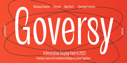 Goversy is a Decorative Condensed Display font. With Regular stroke, fun character with a bit of ligatures. To give you an extra creative work. Goversy font support multilingual more than 100+ language. This font is good for logo design, Social media, Movie Titles, Books Titles, a short text even a long text letter and good for your secondary text font with handwriting and script font. Make a stunning work with Goversy font. Cheers, Maulana Creative
 - Bestorika by Mokatype Studio,
$19.00 Introducing Bestorika Beautiful Modern serif with contrast lines and balanced curves. This font may be conservative and classic, and also may be more playful and modern. A lot of stylish alternates will give you many useful variations for use. Try to play with compositions of curves / alternates letters basic. Like all of my fonts it is inspired by lettering from the good old past, but it still has a strong modern appearance. Its wide range of stylistic alternates allows versatile design options and works perfectly for headlines, logos, posters, packaging, coffee shops, restaurants, magazine's headers, signs or gift/post cards,cafe's and weddings. Try to use it in your beauty or travel blogs, you will see how many options you will have with stylish Bestorika. What's Included : Standard glyphs Ligatures Alternates Web Font International Accent Works on PC & Mac Simple installations Accessible in the Adobe Illustrator, Adobe Photoshop, Adobe InDesign, even work on Microsoft Word. PUA Encoded Characters - Fully accessible without additional design software. Fonts include multilingual support Image used : All photographs/pictures/vector used in the preview are not included, they are intended for illustration purpose only. Thank You
 - Horrified Tonight by Arendxstudio,
$16.00 Horrified Tonight - Halloween Font Horrified Tonight - Halloween Font is a display font that is inspired by horror style because its shape is very unique and is perfect for any project that you will use with this theme. Horrified Tonight came with opentype features such stylistic alternates, stylistic sets & ligatures good for logotype, poster, badge, book cover, tshirt design, packaging and any more. Features : 1.Uppercase & Lowercase 2.Multilingual support 3.Number 4.Symbol 5.Punctuation 6.Extra Dingbat 7.Support in Mac and Windows OS -Support in design application (photoshop, illustrator, and more)
 - Poligon by Halbfett,
$30.00 Poligon is a large family of geometric sans serif fonts. It is inspired by classic typefaces from the geometric-sans genre, like Futura and Avant Garde Gothic, whose shapes were constructed from circles and straight lines. Every character has been crafted to give it a distinct and individual feel. The family is an excellent choice for both corporate design and editorial design projects because of its range of weights, as well as its legibility in text. The typeface family ships in two different formats. Depending on your preference, you can install the typeface as two Variable Fonts or use the family’s eight static OpenType font files instead. Those weights run from Thin to Black. While the static-format fonts offer a good intermediary-step selection, users who install the Variable Fonts have vastly greater control over the stroke width in their upright and italic texts. The weight axes in Poligon’s Variable Fonts allow users to differentiate between almost 1,000 possible font weights. That enables you to fine-tune your text’s exact appearance on-screen or in print. But even the static fonts satisfy the need for flexibility, creating harmonious variations of texture and emphasis. Despite their rigid geometry, the fonts have a playful air to them. That playfulness and uniqueness can be dialed up by applying stylistic alternates via the fonts’ four Stylistic Sets. The first of these replaces “G”, “M”, and “&” with alternate, more outgoing shapes. Stylistic Set 2 has an alternate “ß”; Stylistic Set 3 has a “Q” with a longer tail and another “G”. Stylistic Set 3 has alternates for “A”, “K“, “Q”, “R”, “S”, “Y”, and “Z”.
 - Skramp by PizzaDude.dk,
$20.00Skramp is my funky comic text font, looks good with massive text or just a headline here and there. You will need to use OpenType supporting applications to use the autoligatures - Collibryums by Maulana Creative,
$11.00 Collibryums is a modern signature font inspired by social media advertising and product titles. It has Opentype features Ligatures. Collibryums support multilingual more than 100+ language. This font is good for logo design, Social media, Movie Titles, Books Titles, a short text even a long text letter and good for your secondary text font with sans or serif. Make a stunning work with Collibryums signature font. Cheers, MaulanaCreative
 - Sabre by Alias,
$60.00 I generally refer to our typefaces as ‘graphic’ rather than typographic. By that I mean their starting points are usually ways of constructing shapes and systems of shapes. As with other Alias typefaces, Sabre has stone and wood cut letterforms as a starting point. What is interesting about lettercutting is the connection between shape and material. These beautifully crafted letterforms have a particular sharpness which reflects, of course, how they were made. The idea of constructing letters from a kit of parts we first explored in early fonts Elephant and Factory. These are different in that they were very much grid-based, with a geometric structure. For Sabre I also had Fred Smeijers’ stencil construction drawings in mind. These show how a set of components can be the basis for a crafted, elegant typeface. Sabre is quite a loose interpretation of this idea. Sabre’s graphic shape means it works well at large sizes, with a dramatic, angular impact. Its aim is to be typographic enough to function for blocks of small-size text too.