10,000 search results
(0.095 seconds)
- Painter by Mans Greback,
$59.00 Painter is a bold script font, with wide and wet brush strokes. It is articulate and clean, holds a high quality and comes with many features. Some of them are contextual and stylistic alternates, support for hundreds of languages, ligatures and a lot of special characters. The typeface is created by Måns Grebäck and works great for logotypes and other graphics that require a confident, handcrafted impression. Use > or < after a word to add a swash effect. Example: Painter>
 - Slack 01 by Fateh.Lab,
$10.00 Hello, Introducing our newest font Slack 01, Slack 01 has a character with a fun, happy, colorful, and very modern style, this is good news for those of you who are thinking of ideas and making something great, and Slack 01 is the answer for that all, with vector illustration support that you will get for free, so what are you waiting for, get Slack 01 right away
 - Rotis Sans Serif Paneuropean by Monotype,
$98.99Rotis is a comprehensive family group with Sans Serif, Semi Sans, Serif, and Semi Serif styles. The four families have similar weights, heights and proportions; though the Sans is primarily monotone, the Semi Sans has swelling strokes, the Semi Serif has just a few serifs, and the Serif has serifs and strokes with mostly vertical axes. Designed by Otl Aicher for Agfa in 1989, Rotis has become something of a European zeitgeist. This highly rationalized yet intriguing type is seen everywhere, from book text to billboards. The blending of sans with serif was almost revolutionary when Aicher first started working on the idea. Traditionalists felt that discarding serifs from some forms and giving unusual curves and edges to others might be something new, but not something better. But Rotis was based on those principles, and has proven itself not only highly legible, but also remarkably successful on a wide scale. Rotis is easily identifiable in all its styles by the cap C and lowercase c and e: note the hooked tops, serifless bottoms, and underslung body curves. Aicher was a long-time teacher of design with many years of practical experience as a graphic designer. He named Rotis after the small village in southern Germany where he lived. Rotis is suitable for just about any use: book text, documentation, business reports, business correspondence, magazines, newspapers, posters, advertisements, multimedia, and corporate design. - Posh by Lián Types,
$49.00 I've always been in love with fat didones. That’s the reason of Posh. In search of something unique, I started this family back in 2013 with the aim of creating the fattest yet readable bodonian typeface in the market: It was a challenge, because roman fonts need generous counters (or what some call white spaces) and taking them to the extreme of inexistence attempted against the construction of many glyphs. Ears, dots, terminals and serifs always need some extra space so I had to find the exact point of boldness to make characters which have those attributes work well in the middle of those which haven't. (1) After a while, I felt I was again ‘in my element’: Big contrasted letters, sexy and elegant curves, and that Lubalinesque feeling that characterise my fonts. (2) Words written with Posh are a explosion of elegance and sensuality due to the fact that its didone attributes were exaggerated. Since it’s full of alternate glyphs, one can change and choose them until a nice block of ‘‘black’’ is achieved. (3) To accompany the regular style, I designed Posh Inline, a font with the same quantity of glyphs than the regular one; an all caps style called Posh Capitals, and also a really playful Italic version. I hope you find this one delicious like I do! This font is dedicated to all who understand letters are not just meant to be read, but also to be appreciated in group and individually. Enjoy it. NOTES (1) In example, it can be easy to design a fat letter ‘n’ with almost no counter, but really tough to make a satisfactory letter ‘s’ with serifs to match that ‘n’. (2) Also, it wasn't my first attempt in fat didones. Take a look at my font Reina, made in 2012. (3) Posters above show many words with ball terminals that seem to dance above and below the words in order to fill those “undesired” blank spaces.
 - JAF Lapture by Just Another Foundry,
$59.00 Lapture is based on the Leipziger Antiqua by Albert Kapr, released in 1971 by the East German foundry Typoart. It has been extended and carefully redesigned by Tim Ahrens in 2002-05. The strong calligraphic characteristics are a result of the design process: "The size of the counters and the width of individual characters at small optical sizes were analysed with a steel pen while the letter shapes were designed in larger size with a specially trimmed reed pen. Sometimes the hand is more innovative than the head alone," says Kapr. A unique feature of this font is the introduction of gothic shapes into a latin typeface. "The basic concept is to string together narrow white hexagons as counters and inter-letter spaces, defined by vertical stems and triangular serifs. The interior spaces are at least as important as the strokes that make up the characters." Lapture is an ideal choice if a reference to gothic style is desired, as true black letter types are often too eye-catching and not as legible as latin fonts for unfamiliar readers. "The last few years have seen a number of very elegant typefaces based on the mellow and feminine renaissance model. However, sometimes we require a font that is strong and robust, harmonic yet rigid," says designer Tim Ahrens. JAF Lapture is provided in OpenType format. Each font contains more than 600 glyphs, including true small caps, nine sorts of figures, contextual and stylistic alternates and accented characters. This means that you only need to purchase one font whereas in other families you would have to buy two or three fonts in order to get the same. Technically, they follow the Adobe Pro fonts and provide the same glyph set and OpenType functionality. JAF Lapture Basic is provided in OpenType format. Each font contains the standard sets of both MacOS and Windows. In contrast to JAF Lapture they do not provide any advanced OpenType features and no extended glyph set.
 - Yakout by Linotype,
$187.99Yakout is an Arabic text face that was developed by Linotype & Machinery in 1956 for hot-metal typesetting. Similar to the typewriter fonts created during this period, it utilises a limited range of letterforms to represent a full Arabic characer set, thus forming a style of type design known as Simplified Arabic. The skilful reshaping of letterforms demanded by the constraints of the original restrictive technology has given Yakout a very dynamic effect, and has helped to produce a design whose overall pattern works particularly well in newspaper setting. Digital technology has enhanced the original design by permitting the introduction of wide characters and some additional letterforms, and by improving the joining of the strong, slightly curved baseline. Yakout is available in two OpenType weights: Yakout Light and Yakout Bold. Both of the fonts include Latin glyphs (from Times Europa Roman and Times Europa Bold, respectively) inside the font files, allowing a single font to set text in both most Western European and Arabic languages. Yakout incorporate the Basic Latin character set and support all languages that use the Arabic script. They include tabular and proportional Arabic, Persian, and Urdu numerals and a set of tabular European (Latin) numerals. - Elfabet - Unknown license

- Echo Soul by Set Sail Studios,
$14.00 Introducing Echo Soul; a free-flowing and carefree brush font duo, hand painted with love. Echo Soul speaks from the heart and doesn't hold back. With elongated brush strokes and a natural flow, it's the perfect choice for handwritten quotes, product packaging, and logo designs with a personal and affectionate touch. The Echo Soul family consists of; 1. Echo Soul • A handwritten script font containing upper & lowercase characters, numerals and a large range of punctuation. 2. Echo Soul Alt • This is a second version of Echo Soul, with a completely new set of lowercase characters. If you wanted to avoid letters looking the same each time to recreate a custom-made style, or try a different word shape, simply switch to this font for an additional layout option. 3. Echo Soul Sans • An all-caps font containing uppercase-only characters, perfect for supporting text to compliment the Echo Soul Script font. Also includes numerals and a large range of punctuation. Stylistic Alternates • Are also available for several lowercase characters - these have elongated tails and look great when placed at the end of a word. These can be used by turning on 'Stylistic Alternates' in OpenType capable software, or accessing via a Glyphs panel.
 - Breitkopf Fraktur by profonts,
$39.99Breitkopf Fraktur was designed by Johann Gottlob Immanuel Breitkopf (1719-1794), the well-known type designer and printer of Leipzig. Breitkopf's high reputation is based on a system of printing musical notes which was developed by him. 1793, in the final stage of his life, he designed this beautiful broken script named after himself.Breitkopf Fraktur is classified as broken", something created by the German renaissance. Broken, because all round parts of the lower case characters in such typefaces look broken.Ralph M. Unger redrew and digitized this font exclusively for profonts in 2003. His work is based on artwork taken from old font catalogues." - Hebrew Modern by Samtype,
$49.00 This is a classic design from the beginning of the 20th century. This font can be used in many kinds of books
 - defatted milk - Personal use only

- Heathen by Canada Type,
$24.95A few emails sent to Canada Type have asked for more “bad scripts”. A few others asked for "more Mascara-like treatments". And some asked for more fonts of “distressed elegance”. Whatever you like to call this style of doubled-script font, sightings of designs using it have become common within the last few years. Such fonts have become the standard in expressing elegant confusion, old chaos in modern settings, recycled histories, and rebellious ideas. This style is quite often seen on chic clothing, music packaging, some sports paraphernalia, surfer and skateboarder gear, even book covers. That said, the Heathen font was made to include an advantageous feature that other distressed scripts do not normally have: More intertwined over-swashing in the majuscules. This over-swashing is quite useful in settings where the stroke and fill colors differ, or complement each other. It is also quite the point of emphasis where the idea is to show elegance gone ancient, old thoughts in a modern wrapper, rust never sleeping, or the very basic limits of the world’s nature. The original Heathen was made by redrawing Phil Martin’s Polonaise majuscules and superposing them over the majuscules of Scroll, another Canada Type font. The lowercase is a superposition of Scroll’s lowercase atop a pre-release version of Sterling Script, yet another Canada Type font. Heathen Two was made in a similar way, by combining two pre-release Canada Type scripts. - Alchemila by Heyfonts,
$18.00 Alchemila "UNIQUE serif modern font" likely refers to a typeface that combines elements of traditional serif design with contemporary and distinctive features. Serif fonts have small lines or strokes attached to the ends of characters, which can contribute to a more formal or traditional appearance. The term "modern" in this context typically implies a contemporary or updated style. Here's an explanation of the characteristics and significance of a UNIQUE serif modern font: -Serif Elements: Serifs are the small lines or strokes at the ends of characters, and they are a hallmark of traditional typography. In a UNIQUE serif modern font, these serif elements are likely to be present but may have a distinctive shape or style that sets them apart from more conventional serif fonts. -Contemporary Design: The "modern" aspect of the font suggests a contemporary or updated design. This may involve a departure from the more classical serif styles seen in traditional typefaces, incorporating modern design principles, cleaner lines, and a more minimalist aesthetic. -Distinctive Characters: A UNIQUE serif modern font is likely to feature characters with unique and individual design elements. This could include unconventional serifs, letter shapes, or other stylistic details that make the font stand out and contribute to its uniqueness. -Versatility: While serif fonts are often associated with formality and readability, a UNIQUE serif modern font may offer versatility suitable for a range of design applications. It could be used in both traditional and modern contexts, providing flexibility for various design projects. -Applicability to Branding: Fonts play a crucial role in branding, and a UNIQUE serif modern font could be an excellent choice for businesses or projects that want to convey a sense of tradition and reliability while maintaining a contemporary and innovative image. -Digital and Print Design: Modern serif fonts are often designed with both digital and print applications in mind. The clarity of the typeface, even at smaller sizes, and its aesthetic appeal make it suitable for a variety of design projects, from websites and apps to print materials like brochures and posters. -Attention to Detail: The uniqueness of the font may be reflected in the careful attention to detail in each character. This could include refined curves, balanced proportions, and other design elements that contribute to the overall visual appeal and readability of the font. -Available Features: Unique serif modern fonts may come with additional features, such as alternative characters, ligatures, or stylistic sets, allowing designers to customize the appearance of the text for specific design needs. When selecting or working with a UNIQUE serif modern font, designers should consider the overall design goals, the intended audience, and the context in which the font will be used
 - Scripps College Old Style by Monotype,
$49.00The story of Scripps College Old Style is a heart-warming and inspiring chronicle about a young librarian, a handful of students, a wealthy grandmother, a dedicated educator -- and two eminent American type designers. The story begins in 1938, when Dorothy Drake, the newly hired librarian at Scripps College, a small women's college in southern California, became an impromptu dinner companion of the American type designer Fred Goudy. By the 1990s, the original fonts that Goudy had created for Scripps College in the 1940s had become prized -- but they were seldom-used antiques. Scripps needed digital versions of the metal fonts. This goal posed two immediate challenges: finding a designer familiar with letterpress printing who was skilled at creating digital fonts, and locating the money to commission the designer's services. The first challenge was the easiest to conquer. Sumner Stone was my first and only choice," recalls Kitty Maryatt, the current curator of the Scripps College Press. "I knew he had letterpress experience, was an accomplished calligrapher, and that his typeface designs were simply exquisite. The choice was easy."The second challenge was more difficult. It took the dedication, hard work and tenacity of Maryatt to bring the beautiful Goudy designs into the twenty-first century. While Stone was eager to begin work on the project, the college had no more money for new typeface designs in the 1990s than it did in the1930s. Years of lobbying, cajoling and letter writing were necessary to obtain the college's approval for the design project. Once she had the necessary funding, the design brief posed yet a third challenge. Goudy had provided two sizes of type to the Press: 14 point and 16 point. Which would serve as the foundation for Stone's work? In addition, the Goudy fonts were quite worn. Should Stone use printed samples as his design master, or base his work on the original Goudy renderings? The 14-point master drawings were the ultimate choice, with the stipulation that the finished fonts would provide both a seamless transition from the worn metal versions and a faithful representation of the original Goudy designs. Once the budget and design brief were established, the process of converting the original Goudy drawings into digital fonts took just a little over two months. Stone delivered finished products to Scripps in the fall of 1997. The first official use of the fonts was to set an announcement for a lecture by Stone at Scripps in February of 1998. But the story is not quite finished. Maryatt was so pleased with the new digital fonts, she wanted to share them with the graphic design community. At Stone's suggestion, she contacted Monotype Imaging with the hope that the company would add the new designs to its library. An easy decision! Now Monotype Imaging is part of the story. We are proud to announce the release of Scripps College Old Style as a Monotype Classic font. The once exclusive font of metal type is now available in digital form for designers around the world. " - Alphabet Of Death by Celebrity Fontz,
$24.99The Alphabet of Death font is inspired by the work of Hans Holbein the Younger. This series of Northern-Renaissance-style woodcut letters shows the figure of Death in many disguises, confronting individuals from all walks of life and intervening directly in scenes of everyday life. As depicted in this detailed alphabet, Death is sometimes the dispenser of justice, denouncing greed and the abuse of power. At other times, Death plays the role of a friend or a servant. This unique font includes one set of A-Z ornamental initials conveniently assigned to both the upper- and lower-case alphabet characters and is perfect for starting off the beginning of paragraphs in artistic publications, storybooks, fairy tales, biblical texts, and any written work conveying the expressive style of typography in the 1500s. - Spiraltwists by Aah Yes,
$0.75Spiraltwists is a family of 2 fonts giving assorted spiral shapes. In each font they're grouped in fours - the same basic spiral in 4 different orientations (N S E W almost), and Spiraltwists has solid lines making up the spirals, Spiraltwists Antique has dotted lines making up the spirals, giving them an antique or rustic appearance. Spiraltwists has heavier spirals on Upper Case, lighter spirals on lower case; plus a group of spirals with a straightened outer end and connecting lines so you get two spiral scrolls joined together by a long line at the top or bottom. (inputting UVWXYZ into the text-box on this webpage will show it). The big example on the webpage shows it all more clearly than any explanation. A fuller description, plus the above example, are included in the zipfile. Please note: for the avoidance of doubt, the font does not contain any letters, the text in these 2 examples is not Spiraltwists but Luzaine. - Leonore by ArimaType,
$15.00 Leonore is a strong and elegant family font display. Inspired by the style of design that is currently popular, and this is the answer to all the needs of every idea that you will pour in this modern era, with a thick and solid style in each letter as if this font has a soul in it. Features: *Uppercase & Lowercase *Number & Symbol *Multi-language *Regular, Italic, and Outline Happy Creating! ArimaType@gmail.com #1266576
 - Wall Scrawler by Comicraft,
$39.00 This slick, marker style font was created by our fontmeister, Mr Fontastic, based on the slick, marker style of... Well, Mr Fontastic himself! Check it out in the pages of Marvel's classic DAREDEVIL story GUARDIAN DEVIL. DD scribe and indy movie maker Kevin Smith himself told us it was the coolest font he'd ever seen in his entire life! No, sorry, that is a lie, but he did tell us he liked the design work Mr Fontastic created for the JAY & SILENT BOB trades, No, seriously, he did. We wouldn't lie to you. Well, except for that last time. By the way, this font also doubles as a dynamite sound effect font, that's why we're charging you twice as much as usual. No, sorry, lying again. About the price, not the sound effect thing.
 - Aderyn by Hanoded,
$15.00 Aderyn is a hand drawn, elegant font with a light touch to it. Aderyn is soft and sleek, but also comes in bolder styles to give a little extra oomph to your designs. Aderyn is Welsh for 'bird', a language I meant to master, but never took beyond 'good morning', 'bird' and 'cat'. I know, it's pathetic… Aderyn comes in 12 styles, all of which have kerning, stylistic and contextual alternates for both lower and upper case letters. It even has a smiley!
 - Hebrew Siddur by Samtype,
$59.00 This is a classic design from the beginning of the 20th century. This font can be used in many kinds of books. This font has the modern Hebrew punctuation: Shevana, Kamatz Katan, Dagesh Hazak, and Cholam Chaser.
 - Dept by Clevus,
$17.00 Proudly present Dept display typeface With a Unique and dynamic Display typeface style, Dept is a font that brings a bold and modern impression. The geometric and bold letter characteristics provide a unique and strong look to every design. Suitable for use in branding and advertising projects, Dept will make every design more attractive and effective. Font Features : Dept includes Lettres, numbers, symbols, punctuation, alternates, and ligatures No special software is required they may be used even in canvas, any basic program /website apps that allow standard fonts That's it, folks! Multilingual Support Language Support: Danish, English, Estonian, Filipino, Finnish, French, Friulian, Galician, German, Gusii, Indonesian, Irish, Italian, Luxembourgish, Norwegian Bokmål, Norwegian Nynorsk, Nyankole, Oromo, Portuguese, Romansh, Rombo, Spanish, Swedish, Swiss-German, Uzbek (Latin) Follow My Shop For Upcoming Updates Including Additional Glyphs And Language Support. And Please Message Me If You Want Your Language Included or If There Are Any Features or Glyph Requests, Feel Free to Send me A Message. Have a Good Day!
 - Daft Script by Hanoded,
$15.00 I really like creating script fonts. Why, I hear you say? Well, creating script fonts lets me be me. I am not trying to create classy, connected fonts for you to write love letters with: there are already too many of those available and quite frankly, I just don't like them. I prefer the messy script fonts - uneven, no real baseline and with a bit of splatter or rough edges for good measure. Daft script is one of these messy script fonts: it was handmade and it comes with two alternates for the lower case glyphs that cycle as you type. This is an all-caps font, so that means you have 4 options per letter! I also love languages (I speak 6), so Daft Script comes with fantastic language support, including Vietnamese and Sami.
 - Tropicano JNL by Jeff Levine,
$29.00 Before 1959, in pre-Castro Havana, Cuba, the preeminent nightclub was the Tropicana. During the regime of Fulgencio Batista, Cuba was resplendent with nightclubs and gambling casinos catering to [mostly] the North American tourists; which brought it the title of the Monte Carlo of the Americas. Although Cuba (and the world as a whole) has changed vastly over the decades, the hand-lettered logo of the Tropicana Night Club has survived, and has been reproduced as a complete digital font called Tropicano JNL (a slight twist to the club's name). At first the font seems to be awkward, crude and amateurish, but in taking a second look, there's a playful charm to it. Additionally, this font can double as a "spooky" font for the Halloween season, monster parties and in other similar themes.
 - Boule Plus by Ingo,
$33.00 CAPITALIZED, geometric, bold and round. If the typographer sees a font like that, it's enough to make his toes curl. But sometimes it just has to be that way. Geometrically constructed fonts do not necessarily have to be pointed and angular; It also works consistently around. And if I say it consistently, then in this case, that's done consistently. The basis for the BOULE is the circle. The letters are drawn with constant line width, the “corners“ and endings all have the same radius, the lines are all the same thickness. The BOULE consists only of capitals. There is only one difference in the use of uppercase and lowercase letters: in the uppercase letters, the round letters are circular, while the lowercase letters are narrow. The character set of the Boule contains all letters and accents to support the Western, Northern, Central and Eastern European languages with Latin alphabet. The BOULE is not only very fat, it also runs very tight; that is, the glyphs are very close to each other. To avoid "holes" due to unfortunate letter combinations, the BOULE contains ligatures for FT, ST, TT and TZ. There are also other versions of the font: BOULE Brillant on the one hand. In this version, simple highlights simulate a light incidence from the top right. These light edges give the font a decorative effect that makes it easy to think of wet sausages or balloons in some shapes. And finally the BOULE Contour. As the name implies, it is the outer contour of the letters, combined with a shadow at the bottom left. The name BOULE (French for ball) says it already: this font is globated. Therefore, it is also very suitable for all three-dimensional alienation effects. With simple light and shadow you can achieve a very convincing 3D effect with little effort.
 - Ongunkan Wardruna Arabic Runes by Runic World Tamgacı,
$50.00 Wardruna Arabic is a method of writing Arabic with a Runic-like alphabet devised by Devin Lester. He imagined that if some vikings had settled in the Middle East, they might have started speaking Arabic and writing it with a version of the Runic alphabet. This particular alphabet is based on Tolkien's Cirth Runes. A band of vikings went to Baghdad after raiding in Europe. The markets in Constantinople were closed as the Turks had just sacked the city. These men had heard of the great market in Baghdad and went there to sell their wares, seeing that this land was warm and fertile they decided to stay. They ended up settling the land and taking Arab wives and having children, because of thier Northern European accent their Arabic evolved into a part-Arabic dialect of Iraqi arabic. This is why today you see a few Arabs with green eyes and dark blonde or red hair. The Arabic alphabet was too fluid for them and vikings disdained the use of paper as a persons writings could be burned, so the evolved their runes to fit Arabic.
 - MoreLeaves by Ingrimayne Type,
$14.95 In 1990 I designed the font XLeafMeAlone. In 2006 I decided that it was time to improve it. Instead of adding to it, I created two new fonts containing almost 200 leaves: MapleOaks and More Leaves. Among the leaves you will find in MoreLeaves are elm, cottonwood, tulip tree, ash, hickory, locust, ginko, aspen, sassafras, hawthorn, beech, and birch. There are also a few that come from shrubs and I am not sure what they are, but they looked interesting so I put them in. You will not find oaks, maples, or sycamores--they are in MapleOaks. Why leaves? Because people like them. As a large part of the biological world that is all around us, leaves are fascinating in their shapes and endless variations. In XLeafMeAlone I took about 50 shapes and rotated them 180 degrees to give a typeface with approximately 100 glyphs. In each of these two typefaces, MoreLeaves and MapleOaks, there are almost 100 glyphs. Each of those glyphs is rotated in 90-degree increments to yield two families of four typefaces that should be very useful if one wants to create borders of leaves.
 - Caesario by Scriptorium,
$18.00Caesario is Mike Scarpitti's newest font, based on the famous inscriptory lettering on the Trajan column in Rome. After searching through many sources, he turned to the drawings of the original column lettering made by Frederic Goudy in 1936. The superior quality of these drawings combined with the Mike's faithful reproduction of the characters forms make Caesario the best available representation of the style of this famous incription. - Caravan by Linotype,
$29.99Caravan was designed in 1938 by William Addison Dwiggins and consists of a variety of ornaments. He based the forms of the ornaments on the same lines and curves found in his font Electra. He wanted printers and designers to have the chance to combine the two fonts for a more attractive or outstanding overall picture. Caravan is particularly popular for advertisements in newspapers. Caravan can be easily mixed with other fonts designed by Dwiggins. - Galix Mono by Eclectotype,
$25.00 This monospaced version of Galix was commissioned in 2037 by the space exploration company Earth2, as part of a major overhaul of their branding, which had used, since 2021, a generic sans serif (much like every other company). Many specialists in both design and space exploration suggested that this very rebrand started a chain of events that concluded with the invention of time travel in 2041. Contrary to the perceived notion put forward in popular Science Fiction, time travel is only (as of now) possible in the digital realm. It was considered fitting that included among the first files sent back in time should be the Galix Mono typeface, which was remade in OTF format to ensure that it would work with the technology available in 2019. Earth2, for all their insight, did not foresee that the release of the typeface in September of 2019, would lessen the impact of their rebrand. What kind idiots would rebrand a forward looking company with a font that was, by then, almost 18 years old? The subsequent lacklustre response to the redesign didn’t inspire the tidal wave of R&D funding Earth2 had anticipated, and the company went into administration in the summer of 2039, having never invented the time travel which made the release of Galix Mono in 2019 possible. Experts believe that the files sent back in time, although their very sending made it impossible for them to be sent, remained as “time relics” of the future that might have been.
 - FS Lucas by Fontsmith,
$80.00 Pure and not-so-simple Maybe it’s the air of purity, openness and transparency that they transmit, but geometric typefaces are more popular than ever among leading brands. Based on near-perfect circles, triangles and squares, geometric letterforms look uncomplicated, even though making them readable is anything but – something the designers of the first wave of geometric fonts discovered nearly a century ago. Many of the world’s most recognisable brands in technology, retail, travel, food, manufacturing and other industries continue to be drawn to the straightforward, honest character that geometric fonts convey. Fontsmith set out in 2015 to develop a typeface in the same tradition, but optimised for the demands of modern brands – online and offline usage, readability and accessibility. And, of course, with the all-important Fontsmith x-factor built in. FS Lucas is the bold and deceptively simple result. Handle with care The letterforms of FS Lucas are round and generous, along the lines of Trajan Column lettering stripped of its serifs. But beware their thorns. Their designer, Stuart de Rozario, who also crafted the award-winning FS Millbank, wanted a contrast between spiky and soft, giving sharp apexes to the more angular letterforms, such as A, M, N, v, w and z. Among his inspirations were the colourful, geometric compositions of Frank Stella, the 1920s art deco poster designs of AM Cassandre, and the triangular cosmic element symbol, which led him to tackle the capital A first, instead of the usual H. The proportions and angles of the triangular form would set the template for many of the other characters. It was this form, and the light-scattering effects of triangular prisms, that lit the path to a name for the typeface: Lucas is derived from lux, the Latin word for light. Recommended reading Early geometric typefaces were accused of putting mathematical integrity before readability. FS Lucas achieves the trick of appearing geometric, while taking the edge off elements that make reading difficult. Perfectly circlular shapes don’t read well. The way around that is to slightly thicken the vertical strokes, and pull out the curves at the corners to compensate; the O and o of FS Lucas are optical illusions. Pointed apexes aren’t as sharp as they look; the flattened tips are an essential design feature. And distinctive details such as the open terminals of the c, e, f, g, j, r and s, and the x-height bar on the i and j, aid legibility, especially on-screen. These and many other features, the product of sketching the letterforms in the first instance by hand rather than mapping them out mechanically by computer, give FS Lucas the built-in humanity and character that make it a better, easier read all-round. Marks of distinction Unlike some of its more buttoned-up geometric bedfellows, FS Lucas can’t contain its natural personality and quirks: the flick of the foot of the l, for example, and the flattish tail on the g and j. The unusual bar on the J improves character recognition, and the G is circular, without a straight stem. There’s a touch of Fontsmith about the t, too, with the curve across the left cross section in the lighter weights, and the ampersand is one of a kind. There’s a lot to like about Lucas. With its 9 weights, perfect proportions and soft but spiky take on the classic geometric font, it’s a typeface that could light up any brand.
 - FS Lucas Paneureopean by Fontsmith,
$90.00Pure and not-so-simple Maybe it’s the air of purity, openness and transparency that they transmit, but geometric typefaces are more popular than ever among leading brands. Based on near-perfect circles, triangles and squares, geometric letterforms look uncomplicated, even though making them readable is anything but – something the designers of the first wave of geometric fonts discovered nearly a century ago. Many of the world’s most recognisable brands in technology, retail, travel, food, manufacturing and other industries continue to be drawn to the straightforward, honest character that geometric fonts convey. Fontsmith set out in 2015 to develop a typeface in the same tradition, but optimised for the demands of modern brands – online and offline usage, readability and accessibility. And, of course, with the all-important Fontsmith x-factor built in. FS Lucas is the bold and deceptively simple result. Handle with care The letterforms of FS Lucas are round and generous, along the lines of Trajan Column lettering stripped of its serifs. But beware their thorns. Their designer, Stuart de Rozario, who also crafted the award-winning FS Millbank, wanted a contrast between spiky and soft, giving sharp apexes to the more angular letterforms, such as A, M, N, v, w and z. Among his inspirations were the colourful, geometric compositions of Frank Stella, the 1920s art deco poster designs of AM Cassandre, and the triangular cosmic element symbol, which led him to tackle the capital A first, instead of the usual H. The proportions and angles of the triangular form would set the template for many of the other characters. It was this form, and the light-scattering effects of triangular prisms, that lit the path to a name for the typeface: Lucas is derived from lux, the Latin word for light. Recommended reading Early geometric typefaces were accused of putting mathematical integrity before readability. FS Lucas achieves the trick of appearing geometric, while taking the edge off elements that make reading difficult. Perfectly circlular shapes don’t read well. The way around that is to slightly thicken the vertical strokes, and pull out the curves at the corners to compensate; the O and o of FS Lucas are optical illusions. Pointed apexes aren’t as sharp as they look; the flattened tips are an essential design feature. And distinctive details such as the open terminals of the c, e, f, g, j, r and s, and the x-height bar on the i and j, aid legibility, especially on-screen. These and many other features, the product of sketching the letterforms in the first instance by hand rather than mapping them out mechanically by computer, give FS Lucas the built-in humanity and character that make it a better, easier read all-round. Marks of distinction Unlike some of its more buttoned-up geometric bedfellows, FS Lucas can’t contain its natural personality and quirks: the flick of the foot of the l, for example, and the flattish tail on the g and j. The unusual bar on the J improves character recognition, and the G is circular, without a straight stem. There’s a touch of Fontsmith about the t, too, with the curve across the left cross section in the lighter weights, and the ampersand is one of a kind. There’s a lot to like about Lucas. With its 9 weights, perfect proportions and soft but spiky take on the classic geometric font, it’s a typeface that could light up any brand. - Neuarc by CozyFonts,
$25.00 Neuarc Font Family This is the 20th font family of CozyFonts Foundry, established 10 years ago in 2012 with the release of Aladdin Bold. Neuarc is based loosely on arcs and curves, hence it’s naming. As shown in one of the font posters that serves to showcase this font, a collage of rough sketches is displayed as the poster’s background. These hand drawn pencil drawings were worked and reworked and The final drawings were scanned and built in Adobe Illustrator and transferred to glyph windows, glyph by glyph, in Fontlab 8. The 5 styles, so far, are reminisscent of The Art Deco Era of Design between the 1030s and 1950s. Neuarc also has it’s own footprint with several characters that stand out, eg. A, 8, &, B, ?, $, 5, w, x, a, c, e, etc. giving the reason for the ’Neu’ in the naming. These letterforms & Numbers work extremely well in monograms. Each styles has it’s own personality. From the ultra chic Light style to the dominant cool Bold style, this family maintains a uniform legibility at small to large sizes. Meant primarily for display uses, Neuarc works well for posters, logos, headlines, packaging, branding, signage for a myriad of applications. The Neuarc Deco style font will work well in titles and numbers of any application.
 - 1689 GLC Garamond Pro by GLC,
$42.00 This typeface family was inspired by a set of fonts, designed in the Garamond style, used for an edition of Remarques critiques sur les œuvres d’Horace by “D.A.E.P.”, published in Paris in 1689 by two different booksellers: Deny Thierry and Claude Barbin. We can see some differences in comparison with our “pure” Garamond (see our 1592 GLC Garamond), particularly in the lowercase of the Normal style and the uppercase of the Italic. Unfortunately, we know neither the name of the punchcutter, nor that of the printer. This complete font set contains small caps, fractions all the way up to 1999/1999, historical and standard ligatures, and all of the fleurons contained in the edition (Normal style only). The alphabet covers all Western, Eastern and Central European languages (including Celtic diacritics) and Turkish.
 - Gorod.Volgograd by FontCity,
$15.00The general idea: Can You imagine to yourself, what the hydroelectric power station is? The building of this electricity production foundry is half hidden under the water, but the visible above-water part astonishes your sense. It is a construction almost 1,5 km length dammed out the powerful river stream. Besides thousand of electricity conduction lines supports it bears also the highway and the railroad. From a faraway distance the train seems like a caterpillar that has climbed up the stout tree. There are also the navigable sluices, the flood channels and other erections. The idea of this typeface outlines arrived to the authors exactly on the viewing platform, under the impression of the waterfalls, which are escaping from the dam womb, falling from almost 50 meters altitude and becoming white-haired during this flight. Release: in the form of "gorod.Volgograd" font with the one style. We work with other styles now and sometime we will be very glad to introduce the Bold and Italic styles to You. We should explain the font name meaning. "Gorod" is "city of" in Russian and Volgograd is the old, big and famous Russian city. The Volga hydroelectric power station of a name of XXII congress of the CPSU caused the Volgograd sea formation. It expands of 14 km width and more than 600 km along the Volga river-bed. But HEPS isn't the sole Volgograd sight. There are many interesting places here. The most known tourist sight, the visit card of Volgograd is the Mamaev Hill. Being here You can see almost all 100 kilometers of city length. Due to its geographical position, Mamaev Hill has got a great importance during the Great Patriotic War (1941-1945). It became and still is the Main Height of Russia. Soviet people have built the huge stately memorial ensemble here. There are many other witnesses of the heroic past of Volgograd: the Alley of Heroes, the Perished Fighters Square, the Soldiers Field and others. The line of tank turrets is stretched out along all town not far from Volga bank. It marks the line, where fascist troops was stopped in 1943. It is very amazingly when You dive under the ground on a usual tram. Volgograders have built a few underground station for the high-speed tramway. The river tram need a quarter of an hour to get an island in the Volga. And You need the same time to walk across the river station. The Volga-Don navigable channel starts from Volgograd. There are planetarium, circus, some theatres, many museums in Volgograd. One of football matches of Euro-2004 qualifying round took a place in the "Rotor" stadium in Volgograd. Volgograd holds the longest - above 50 km - park in the world. Its avenues, squares, embankments are beautiful, Volgograd central districts are built in unique architecture style called the Stalin Empire. You can enjoy fountains, parks, attractions, water-pools and other Volgograd sights. If You visit Volgograd once You'll never forget it. You can read about the ancient history of Volgograd city on the Tsaritsyn font page. Also we plan to create the Stalingrad font and give You a short story about another period in Tsaritsyn-Stalingrad-Volgograd history. - Titla Brus by ParaType,
$25.00 Font family Titla Brus was developed as an extension of Titla, released earlier in 2009. New slab serif family consists of 20 members the normal and condensed proportions that present 6 weights from Light to Ultra. The fonts can be used in combination with Titla or by itself in different display matters. Typefaces demonstrate original and catchy way of using serifs -- in some places there are traditional slab serifs, in other places -- one-sided and often there are no serifs in the places where they normally should be. This approach brings to the letter shapes an unusual appearance and peculiarity. Design was developed by Oleg Karpinsky. Released by ParaType in 2011--2013 at first as a set of ten condensed styles and later in extended version enhanced by ten normal styles.
 - Aeris by Linotype,
$29.99 Aeris™ typeface is a contemporary book face created by the American designer Tom Grace. It combines the proportions and rhythm of a sans serif font with the high contrasts and flexed strokes of script faces, while the open counters also ensure optimal legibility. Tom Grace focuses on providing subtle differentiations in his cuts and, as a consequence, this font family has its own individual structure: there are A and B variants of the basic forms regular, italic, bold and bold italic, and a display version for use in titles that also comes in A and B variants. It is advisable to use the A variant for larger font sizes, while the slightly more emphasized B variant can be recommended for smaller font sizes. Where the basic forms are to be mixed together in a work, it is important to use the corresponding A/B variants throughout as their designs have been carefully coordinated. Aeris is available in the OpenType Pro format and thus includes a wide range of different glyphs. The font family can be used in various environments, such as books, magazines, advertisements and promotional materials, but it is also the perfect choice for printed corporate documentation.
 - Poppin by Kustomtype,
$20.00 Poppin is a playful font-type that you can comfortably use in all kinds of styles, from modern to old school. A combination of a few names on an old movie poster is what triggered the creation of this font type. Because it had such a strong rock and roll character, I decided to dedicate a font-type to it. The Poppin font is completely hand-drawn and then digitized. It results in being an extremely user-friendly, complete and modern font that you can use in all your graphic applications. Poppin is a font from the subculture that has been updated to a hip and classy font, ideal for eye-catching designs. Poppin comes in 4 styles, regular, bold , round & bold round. Poppin makes everyone smile!
 - Outslight by Gassstype,
$23.00 Outslight - is Modern Hand Written font with a natural feel. This handmade font will make your design has a beautiful natural touch for each details. It is perfect for any design project as Invitation,logo, book cover, craft or any design purposes. This font is PUA encoded which means you can access all of the magical glyphs with ease! It also features a wealth of special features including ligatures glyphs . Inspired by Food Logo style and combination with Cute Craft style. that will fulfill your design needs for quotes,sporty theme, logotype, wordmark, etc. This has many opentype features and support multi language.
 - Unleash by Gassstype,
$23.00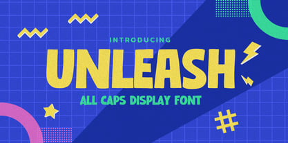 Hello Everyone, introduce our new product UNLEASH is All Caps Display Font with a natural feel. This handmade font will make your design has a beautiful natural touch for each details. It is perfect for any design project as Invitation,logo, book cover, craft or any design purposes. UNLEASH is Inspired by Food Logo style and combination with Unique Craft style. that will fulfill your design needs for quotes,sporty theme, logotype, wordmark, etc. This has many opentype features and support multi language. This font is PUA encoded which means you can access all of the magical glyphs with ease!
 - Double Nines JNL by Jeff Levine,
$29.00 Double Nines JNL is a dingbat font containing fifty-five glyphs for the tiles found in the second level of domino games. Sets of dominoes can be of either double six, double nine or double twelve. In this font, the double blank tile is located on the zero keystroke, while the one/blank and 1/1 tiles are on the 1 and 2 keystrokes. The rest of the tiles (in numerical order through 9/9) are located on the A-Z and a-z keystrokes respectively. To use any or all of the images contained in Double Nines JNL in any manufactured products or services, please refer to the software license agreement provided when purchasing this font. A separate royalty license must be secured from Jeffrey N. Levine for such purposes. The images are NOT licensed for use in proprietary logos or service marks.

