10,000 search results
(0.057 seconds)
- Basmala by Afkari Studio,
$17.00 Basmala - An Arabic Style Typeface NEW Ramadhan and Islamic font, Basmala, is an Arabic-styled display typeface. This Islamic Ramadhan Arabic font is perfect for any graphic design related to the Islamic style. You will get an Arabic feel to every text you type using this font. Made with Latin characters so that it can be read internationally which does not have to be able to read Arabic characters This Islamic font is suitable for branding, product packaging, quotes, flyers, posters, logotype, apparel, T-shirt, Hoodie, book covers, movie title, advertising, and more. Features; - Uppercase, Lowercase, Number, and Punctuation - Special Alternates and ligatures - Works on PC & Mac - Simple installations - Accessible in Adobe Illustrator, Adobe Photoshop, Adobe InDesign, even work on Microsoft Word - Fully accessible without additional design software. - Mültîlíñgúãl Sùppört for; ä ö ü Ä Ö Ü ß ¿ ¡ Hope you enjoy our font and this font is useful font for your projects!
 - Saleha by Afkari Studio,
$19.00 Saleha - An Arabic Style Typeface NEW Ramadan and Islamic font, Saleha, is an Arabic-styled display typeface. This Islamic Ramadhan Arabic font is perfect for any graphic design related to the Islamic or Arabic style. You will get an Arabic feel to every text you type using this font. Made with Latin characters so that it can be read internationally which does not have to be able to read Arabic characters This Islamic font is suitable for branding, product packaging, quotes, flyers, posters, logotype, apparel, T-shirt, Hoodie, book covers, movie title, advertising, and more. Features; - Uppercase, Lowercase, Number, and Punctuation - Special Alternates and ligatures - Works on PC & Mac - Simple installations - Accessible in Adobe Illustrator, Adobe Photoshop, Adobe InDesign, even work on Microsoft Word - Fully accessible without additional design software. - Mültîlíñgúãl Sùppört for; ä ö ü Ä Ö Ü ß ¿ ¡ Hope you enjoy our font and this font is useful font for your projects!
 - Boonville JNL by Jeff Levine,
$29.00Boonville JNL is a slightly condensed version of Cloverdale JNL - a "Western" style typeface based on classic wood type from the 1800s. - Chipping by Greater Albion Typefounders,
$13.95 Chipping is a brand new face inspired by Edwardian and 1920s letterforms. It's good for clear and legible headings which need a gentle and unobtrusive period touch, and is the latest is Greater Albion's line of faces to explore the 'small capitals' idea. You will see a broad similarity with our Chipperly family, and the two work well together in combined projects. Four faces are offered: regular and bold, as well as Black with a heavy drop shadow and white which explores the idea of 'whitespace' design.
 - MC Rock Ice by Maulana Creative,
$17.00 Rock Ice Funny Display Typeface Rock Ice funny display typeface. Heavy stroke, fun character with a bit of ligatures. To give you an extra creative work. Rock Ice funny display typeface support multilingual more than 100+ language. This font is good for logo design, Social media, Movie Titles, Books Titles, a short text even a long text letter and good for your secondary text font with script or serif. Make a stunning work with Rock Ice funny display typeface. Cheers, Maulana Creative
 - Banknote 1948 by Ingo,
$39.00 A very expanded sans serif font in capital letters inspired by the inscription on a bank note Old bank notes tend to have a very typical typography. Usually they carry decorative and elaborately designed markings. For one thing, they must be practically impossible to forge and for another, they should make a respectable and legitimate impression. And in the days of copper and steel engravings, that meant nothing less than creating ornate, shaded or otherwise complicated scripts. Designing the appropriate script was literally in the hands of the engraver. That’s why I noticed this bank note from 1948. It is the first 20 mark bill in the then newly created currency ”Deutsche Mark.“ All other bank notes of the 1948 series show daintier forms of typography with an obvious tendency toward modern face. The 1949 series which followed shortly thereafter reveals the more complicated script as well. For whatever reason, only this 20 mark bill displays this extremely expanded sans serif variation of the otherwise Roman form applied. This peculiarity led me in the year 2010 to create a complete font from the single word ”Banknote.“ Back to those days in the 40’s, the initial edition of DM bank notes was carried out by a special US-American printer who was under pressure of completing on time and whose engravers not only engraved but also designed. So that’s why the bank notes resemble dollars and don’t even look like European currency. That also explains some of the uniquely designed characters when looked at in detail. Especially the almost serif type form on the letters C, G, S and Z, but also L and T owe their look to the ”American touch.“ The ingoFont Banknote 1948 comprises all characters of the Latin typeface according to ISO 8859 for all European languages including Turkish and Baltic languages. In order to maintain the character of the original, the ”creation“ of lower case letters was waived. This factor doesn’t contribute to legibility, but this kind of type is not intended for long texts anyway; rather, it unfolds its entire attraction when used as a display font, for example on posters. Banknote 1948 is also very suitable for distortion and other alien techniques, without too much harm being done to the characteristic forms. With Banknote 1948 ingoFonts discloses a font like scripts which were used in advertising of the 1940’s and 50’s and were popular around the world. But even today the use of this kind of font can be expedient, especially considering how Banknote 1948, for its time of origin, impresses with amazingly modern detail.
 - Bad Cake Recipe by Bogstav,
$15.00 I've had a lot of lovely cakes through the years (My wife is a great cook!) But I've also tried some really...ehem...not so good cakes. Actually, the worst cake I ever had, was at work - if you didn't know, I work as a kindergarten teacher - and the cake was made by one of the kids! Anyway, this font was made as a sort of tribute to that cake - the font may not represent something that is smooth and lovely, but it was made with lots of personality and love - just like that cake from that kindergarten kid!
 - Pronter by Larin Type Co,
$16.00 Pronter It is a stunning vintage font that comes in three styles: Regular, Rough and Stamp style and also includes two font styles: shadow and rough shadow. This font contains many alternates, so make them up to the extent that your design's creativity is enough. Pronter font versatile it can be used both in modern projects and in vintage ones, as a main or additional one. This font is easy to use, has OpenType features.
 - Strapwork by 2D Typo,
$36.00 The Strapwork is a symbolic font with the ornaments from the 16th century Mannerism era. These type of ornaments are called Strapwork and are combined with the Moreske ornament. Together they create a rich and refine style. As a prototype for this font I took the tables of ornament examples by etcher Balthasar Bos (1554). The font contains high quality vector graphics with a special attention paid to details. This collection consists of many friezes (borders). There are more than ten basic motifs and a great number of combinations. The ribbon elements are easily laid out by typing the combination of letters. The four typefaces help to combine ornaments in various tones and colors. By overlaying plants elements with ribbon elements you can get a multicolor richness and combinations variety. The font comes with a detail documentation and examples in PDF format. The Strapwork ornaments will ideally suit your needs in graphic design, textile industry or various decorations. The Strapwork font can be easily used not only in traditional approach but also in grunge stylistics, which will enrich your compositions.
 - Ana by LetterPalette,
$35.00 Ana is a chromatic typeface consisting of 26 uppercase Latin characters, inspired by arabesque patterns from the nineteenth century. Programmed to enable users to easily create multicolored drop caps and initials, this decorative display typeface features a different ornament for every letterform, which fits perfectly with its glyph shape. This ornament is usually more luxurious on the left side of the letter, while on the right it is scarce, so that the body text can be placed close to the initial. These initials are valuable for use in large sizes, like posters, magazines, packaging design, fairy tales, and so on. The final forms of the initials consist of 5 parts which can be individually colored. There are 5 font files named Ana Layer A, Ana Layer B, and so on. A font user can manually create a multicolored initial with these font files, if there is no possibility to use the Contextual Alternates option. To do that, it is necessary to make 5 layers in the page layout software. Then, the corresponding character should be placed on each layer, so that Ana Layer A is on the lowest layer and Ana Layer E is on the highest one. Note that the glyph shapes are contained in the lower case positions. In contrast, the font file named Ana is programmed, so it is possible to create a multicolored initial with the Contextual Alternates command. There is no need for additional layers, everything happens on a single layer. First, the Contextual Alternates command (usually under OpenType menu) should be disabled. Then, using lower case key, type the desired character 5 times and apply color to them. Select them all and turn on the Contextual Alternates. Also, the font file Ana comes with a set of ‘black’ initials that can be used just like any other non-color typeface. The ornamental versions are contained in the uppercase positions, while the letters without the ornaments are in the lower case. With the font file Ana Monochrome one can only get the monochrome initials. Ornamental letters are contained in the upper case positions, while the letterforms without the ornaments are in the lower case.
 - Cabrito Inverto by insigne,
$- Life’s always more fun when you reverse the stress. The same goes for the new member of the Cabrito family. Cabrito itself is a recently developed slab serif made for the kid’s book The Clothes Letters Wear. Cabrito proved to be more popular than I thought, and I promised I would create an inverted style for this new addition to the font world--a variant that would pair well with the original or even stand well on its own. And so now, here it is. Cabrito Inverto, which features the reversed stress of the strokes from a font’s “normal” traits. Inverted stress fonts are most often associated with cowboys and the Old West. The inverted stress gives it a happy-go-lucky appearance, not to be taken too seriously. It’s a pleasantly rounded, not-so-strictly geometric typeface with handwriting-inspired forms. Whew, that’s a mouthful! Inverto’s bundle of alternates is accessible in any OpenType-enabled program. It contains a workforce of alternates, swashes, and alternate titling caps to embellish the font. Also bundled are swash alternates, aged design and style figures, and compact caps. Peruse the PDF brochure to examine out these solutions in action. OpenType-enabled purposes such as Adobe suite or Quark will allow ligatures and alternates. This font family also includes the glyphs for 72 different languages. Cabrito Inverto does pair well with Cabrito. There is even an extra font weight, Black, for when you want to punch it up a bit. Jeremy Dooley designed Inverto to be a welcoming, day-to-day font family. Use it to express friendliness on just about anything, from candy to food to children’s toys. Cabrito Inverto’s one-of-a-kind visual appearance brings a bundle of fun to the party. Buy Cabrito Inverto to give a boost to your designs every day of the week.
 - Copasetic NF Pro by CheapProFonts,
$10.00 Another typical Art Deco font from Nick Curtis. Uppercase only, but with alternate letterforms in the lowercase positions. I have completely redesigned all the diacritics (which were way too flimsy for this robust design) before expanding the character set in the usual fashion. Nick Curtis says: "Back in the Olden Days of Graphic Design B.C. (before computers), type freaks used to wait in anxious anticipation for each new release of the Letraset catalog. The inspiration for this font, Premiere Lightline, was one such release, and probably help spur my interest in Deco designs. The original font was VERY light indeed, suitable only for use in large sizes. My version is beefier, and includes an entire lower case of alternate letterforms, making this (at least) two fonts in one. The name is the 40’s hep talk equivalent of “Cool!”". ALL fonts from CheapProFonts have very extensive language support: They contain some unusual diacritic letters (some of which are contained in the Latin Extended-B Unicode block) supporting: Cornish, Filipino (Tagalog), Guarani, Luxembourgian, Malagasy, Romanian, Ulithian and Welsh. They also contain all glyphs in the Latin Extended-A Unicode block (which among others cover the Central European and Baltic areas) supporting: Afrikaans, Belarusian (Lacinka), Bosnian, Catalan, Chichewa, Croatian, Czech, Dutch, Esperanto, Greenlandic, Hungarian, Kashubian, Kurdish (Kurmanji), Latvian, Lithuanian, Maltese, Maori, Polish, Saami (Inari), Saami (North), Serbian (latin), Slovak(ian), Slovene, Sorbian (Lower), Sorbian (Upper), Turkish and Turkmen. And they of course contain all the usual “western” glyphs supporting: Albanian, Basque, Breton, Chamorro, Danish, Estonian, Faroese, Finnish, French, Frisian, Galican, German, Icelandic, Indonesian, Irish (Gaelic), Italian, Northern Sotho, Norwegian, Occitan, Portuguese, Rhaeto-Romance, Sami (Lule), Sami (South), Scots (Gaelic), Spanish, Swedish, Tswana, Walloon and Yapese.
 - Etruria by Dima Pole,
$34.00 Font Etruria is based on a real Etruscan inscriptions and realistic accurately simulates the writing of the Etruscans. The idea of the font Etruria is to give an opportunity for anyone to touch the past of mankind! The character of the Etruscan alphabet involves the creation of a font with only uppercase letters. However, I did not limit this font by that. Etruria has not only a lowercase is different from uppercase, but an additional sets of alternative characters. In General, the main characteristic of Etruscan writing is randomness and diversity of characters. Differs from lowercase to uppercase is only the first step on the road to make randomness effect. Next to the aid of the OT features. To recreate the randomness effect, in Etruria there are several OT features (Contextual Alternates, Stylistic Alternates and Stylistic Sets), which built a script to simulate randomness. Additionally, another script creates the effect of random positioning. Together they create incredibly realistic Etruscan inscription. Thus, any of these features can be disabled at will. I also used a small line spacing, because it is characteristic of the Etruscan writing. Actually the Etruscan writings is a mirror of the writings compared with the current European alphabets. I didn't use this feature all the letters, because this would make the font difficult to perceive, but to make the font characteristic of the Etruscan style, Etruria has a few letters in mirror image. However, if for someone it may seem unusual, mirrored letters can be disabled instead of them will appear more familiar to them. Another feature of Etruscan writing is the use instead of a space dotacentered. Font Etruria has this feature, there is a OT feature Stylistic set ss03. Naturally, it also can optionally be disabled. All these features can be used together, separately, or turn it off. The main goal achieved! The text typed in Etruria, creates full impression of these Etruscan inscriptions.
 - Yashie by pentagonistudio,
$17.00 Yashie Is A Modern Arabic Typeface Inspired By Ramadhan and Islamic Style. Font Features : SOFTWARE REQUIREMENTS : Fonts and alternate: No special software is required they may be used in any basic program /website app that allows standard fonts That's it, folks! You can go ahead and get cracking :) Follow My Shop For Upcoming Updates Including Additional Glyphs And Language Support. And Please Message Me If You Want Your Language Included or If There Are Any Features or Glyph Requests, Feel Free to Send me A Message. Have a Good Day !
 - Break Love by pentagonistudio,
$19.00 Break Love Is An Classy Retro Font Inspired By Stylish and Vintage Character. SOFTWARE REQUIREMENTS : Fonts and alternate : No special software required they may be used in any basic program /website apps that allows standard fonts That's it folks! You can go ahead and get cracking :) Follow My Shop For Upcoming Updates Including Additional Glyphs And Language Support. And Please Message Me If You Want Your Language Included or If There Are Any Features or Glyph Requests, Feel Free to Send me A Message. Have a Good Day !
 - Argithea by pentagonistudio,
$19.00 Argithea Is An Modern Stylish Font Inspired By Bold Modern Stylish Serif and Vintage Curves. SOFTWARE REQUIREMENTS : Fonts and alternate : No special software required they may be used in any basic program /website apps that allows standard fonts That's it folks! You can go ahead and get cracking :) Follow My Shop For Upcoming Updates Including Additional Glyphs And Language Support. And Please Message Me If You Want Your Language Included or If There Are Any Features or Glyph Requests, Feel Free to Send me A Message. Have a Good Day !
 - Qestero PS by pentagonistudio,
$14.00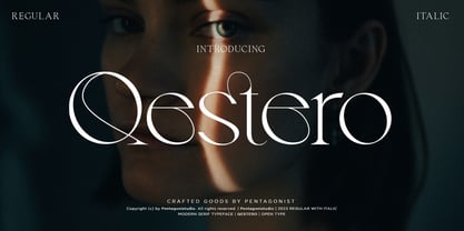 Qestero Is A Modern Display Font Inspired By Sleek and Exotic Style. SOFTWARE REQUIREMENTS : Fonts and alternate: No special software is required they may be used in any basic program /website app that allows standard fonts That's it, folks! You can go ahead and get cracking :) Follow My Shop For Upcoming Updates Including Additional Glyphs And Language Support. And Please Message Me If You Want Your Language Included or If There Are Any Features or Glyph Requests, Feel Free to Send me A Message. Have a Good Day!
 - Eulogy Family by pentagonistudio,
$9.00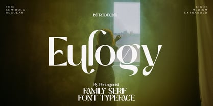 Eulogy Is A Serif Family Font and Variable Display Inspired By Retro and Vintage Style. . SOFTWARE REQUIREMENTS : Fonts and alternate : No special software required they may be used in any basic program /website apps that allows standard fonts That's it folks! You can go ahead and get cracking :) Follow My Shop For Upcoming Updates Including Additional Glyphs And Language Support. And Please Message Me If You Want Your Language Included or If There Are Any Features or Glyph Requests, Feel Free to Send me A Message. Have a Good Day !
 - Stoner PS by pentagonistudio,
$19.00 Stoner PS Is New Geometric Family Sans Inspired By Modern and Elegant Font. SOFTWARE REQUIREMENTS : Fonts and alternate : No special software required they may be used in any basic program /website apps that allows standard fonts That's it folks! You can go ahead and get cracking :) Follow My Shop For Upcoming Updates Including Additional Glyphs And Language Support. And Please Message Me If You Want Your Language Included or If There Are Any Features or Glyph Requests, Feel Free to Send me A Message. Have a Good Day !
 - Fluence PS by pentagonistudio,
$12.00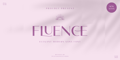 Fluence PS Is An Elegant Sans Serif Font Inspired By Feminine and Elegant Character. SOFTWARE REQUIREMENTS : Fonts and alternate : No special software required they may be used in any basic program /website apps that allows standard fonts That's it folks! You can go ahead and get cracking :) Follow My Shop For Upcoming Updates Including Additional Glyphs And Language Support. And Please Message Me If You Want Your Language Included or If There Are Any Features or Glyph Requests, Feel Free to Send me A Message. Have a Good Day !
 - Migontama by Qaratype,
$18.00 Migontama is a stylish modern font with a touch of vintage. It looks amazing at display sizes and is easily readable in text size. Migontama comes with access to your OpenType features. There are two versions of this font : REGULAR and Bold. Migontama is a display font made mainly for headlines, titles, and other short texts and is well-suited for advertising, vintage mood board, branding, logotypes, packaging, titles, editorial design and modern and vintage design. Main Features: Uppercase & Lowercase letters Punctuation and special characters Multilingual support Alternate glyphs
 - Olive Village by Ivan Rosenberg,
$16.00 Olive Village is a stylish vintage font inspired by 70’s groovy vibe with a touch of modernity. It looks amazing at display sizes and is easily readable in text size. Olive Village comes with access to your OpenType features, large selection of alternate glyphs and ligatures. There are two versions of this font : REGULAR and ITALIC. Olive Village is a display font made mainly for headlines, titles, and other short texts and is well-suited for advertising, vintage mood board, branding, logotypes, packaging, titles, editorial design and modern and vintage design.
 - Vapour PS by pentagonistudio,
$19.00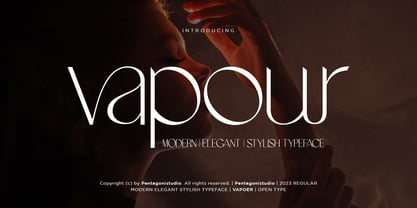 Vapour PS Is An Elegant/Modern Serif Font with Stylistic Alternates and Ligatures. SOFTWARE REQUIREMENTS : Fonts and alternate : No special software required they may be used in any basic program /website apps that allows standard fonts That's it folks! You can go ahead and get cracking :) Follow My Shop For Upcoming Updates Including Additional Glyphs And Language Support. And Please Message Me If You Want Your Language Included or If There Are Any Features or Glyph Requests, Feel Free to Send me A Message. Have a Good Day !
 - Kindest Reality by pentagonistudio,
$19.00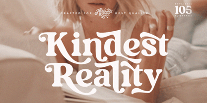 Kindest Reality Is A Nostalgic Serif Font Inspired By Classy and Curve Character. SOFTWARE REQUIREMENTS : Fonts and alternate : No special software required they may be used in any basic program /website apps that allows standard fonts That's it folks! You can go ahead and get cracking :) Follow My Shop For Upcoming Updates Including Additional Glyphs And Language Support. And Please Message Me If You Want Your Language Included or If There Are Any Features or Glyph Requests, Feel Free to Send me A Message. Have a Good Day !
 - Matter Sculpit by pentagonistudio,
$15.00 Matter Sculpsit Is A Classic Serif Fonts Inspired By Modern and Ligature Characters. SOFTWARE REQUIREMENTS : Fonts and alternate : No special software required they may be used in any basic program /website apps that allows standard fonts That's it folks! You can go ahead and get cracking :) Follow My Shop For Upcoming Updates Including Additional Glyphs And Language Support. And Please Message Me If You Want Your Language Included or If There Are Any Features or Glyph Requests, Feel Free to Send me A Message. Have a Good Day !
 - Creating Balance by pentagonistudio,
$17.00 Creating Balance Is A Modern Serif Font Including Regular and Italic versions. SOFTWARE REQUIREMENTS : Fonts and alternate: No special software is required they may be used in any basic program /website apps that allow standard fonts That's it folks! You can go ahead and get cracking :) Follow My Shop For Upcoming Updates Including Additional Glyphs And Language Support. And Please Message Me If You Want Your Language Included or If There Are Any Features or Glyph Requests, Feel Free to Send me A Message. Have a Good Day!
 - Vanilla Ravioli by pentagonistudio,
$19.00 Vanilla Ravioli Is A Chic Serif Fonts Inspired By Modern and Ligature Characters. SOFTWARE REQUIREMENTS : Fonts and alternate : No special software required they may be used in any basic program /website apps that allows standard fonts That's it folks! You can go ahead and get cracking :) Follow My Shop For Upcoming Updates Including Additional Glyphs And Language Support. And Please Message Me If You Want Your Language Included or If There Are Any Features or Glyph Requests, Feel Free to Send me A Message. Have a Good Day !
 - Delaguerra by Scriptorium,
$18.00Delaguerra is based on a lettering style originating in the California Arts & Crafts period commonly associated with 'Mission Style'. It is still in common usage in signage at historical sites in California. This version is a sort of idealized hybrid of several different variations on the style from samples we were sent by a customer who wanted to use the font in a set of invitations. It features a basic character set on the lower case and then relief initial versions of the same characters for the upper case. - Moviemania by Artisticandunique,
$40.00 Moviemania - Sans Serif font Family - Multilingual - 12 STYLE Moviemania font family is a modern sans serif typeface with its sharp lines and soft turns that form its characteristic structure. It offers you two alternative concepts in your preferences with its sharp lines in upper cases and soft lines in lower cases. It has an ideal modern structure in your preferences for branding and identity creation in today's modern world. Absolutely perfect for movie titles, magazines, branding, branding identity, posters, logo designs, packaging designs, websites - all digital platforms and more! This font can meet your needs in all modern and classic creative projects. CHARACTER RANGES : Basic Latin, Latin-1 Supplement, Latin Extended-A, Latin Extended-B, General Punctuation, Currency Symbols, Letter like Symbols,Arrows, Mathematical Operators, Miscellaneous Technical, Geometric Shapes, Miscellaneous Symbols, CJK Symbols And Punctuation, Private Use Area (plane 0), Alphabetic Presentation Forms GLYPH COUNT : (543) Uppercase typeface Lowercase typeface Numbers Symbols Multilingual With this font you can create your unique designs. If you have a question, please contact me. Have a good time.
 - FS Aldrin by Fontsmith,
$80.00 Elegant and round Having harboured a desire for a rounded font within the Fontsmith library for some time, Phil Garnham recognised that FS Emeric offered the perfect skeleton around which to design it. Most new rounded fonts rely on scripts or other in-app automation to form their characters. For all their warmth and approachability, they too often conjure images of jelly sweets and sausages. Not so FS Aldrin, where every curve and transition has been crafted by hand, giving a distinctive look and elegant feel. Design highlights FS Aldrin enjoys wide-open ‘lunar’ counters and soft, tube-like terminals. These improve legibility, especially on backlit signage and screens. The open proportions and circular strokes are juxtaposed against a more serious technical aspect that exists within each counter shape. The lighter weights feel precise and efficient, perfect for notes on blueprints or technical drawings. The heavy weights are equally crafted but more playful by their rotund nature, and are perfect for strong headlines or packaging projects. UI icons A suite of 268 icons complement the typeface beautifully and extend the design language in all directions. They cover a range of commonly used applications and themes ranging from ecommerce to weather, and also serve as a solid starting point for a bespoke brand icon set or UI. In addition, born of FS Aldrin’s astronomical theme and playful nature is a special collection of space-themed icons, including rockets, shuttles and lunar modules (hint: if you type the word BUZZ with ligatures enabled, an astronaut appears). Earth to Buzz Buzz Aldrin was the pilot of Apollo 11’s lunar module, the one that put man on The Moon for the very first time. Early on in the project’s life, FS Aldrin emerged as the ideal hook on which to hang the font’s space helmet (hardly surprising given Phil’s fascination with space travel and astronomy). An approach was made to Buzz’s management to see if he would sanction the association. Not only was the great man himself happy to see his name on a typeface, he also asked to use it in his upcoming keynote talks, book launches and online projects.
 - JT Collect by OGJ Type Design,
$35.00 JT Collect is a hybrid sans-serif typeface for the 21st century that takes a playful approach to the type design heritages of Germany and Switzerland. Confidently built on a geometric structure and infused with elements from traditional grotesque typefaces, it hits the sweet spot between geo and grot. I developed JT Collect purely digitally, drawing from years of experience with analog type design. The letters aren’t based on one particular source but seek to merge different type genres from the first half of the 20th century and lift them to a contemporary quality level. JT Collect is less reserved than strictly geometric designs and brings some industrial workmanship and honesty into the game. The six weights plus three optical sizes of JT Collect offer what you need to make an impact. While cool and elegant in the Light weight, the fonts show more presence on the page as they grow bolder. To this end, I drew the letterforms with a slightly unrefined, brawny air in the bolder weights. This sets them apart from the perceived purity of more geometric designs. The Book weight is ideal for short texts and medium-length copy, and the forceful Bold makes wordmarks look crisp and lets headlines radiate cosmopolitan self-confidence. JT Collect is suitable as a primary typeface for branding, advertising, packaging, stationery, posters, documents, and websites from trades and industries as diverse as food & fashion, media & makers, culture & creators, games & gems, sports & startups. Use JT Collect for film titles or watch faces, for leaflets or store signs, for business cards or billboards: this font family is as adaptable as a chameleon (and like a chameleon, it’s never boring). Try it in different contexts. You won’t be disappointed. Its adaptability also makes JT Collect a great starting point for poised and persuasive font combinations. Even a sans/sans pairing is possible due to hybrid nature of JT Collect—something that’d be hard to achieve with most other sans-serif typefaces on the market. You can add to it a heavy slab from the OGJ library, like Temper Wide. You might go for a geometric or a grotesque typeface as secondary (text) typeface. Or you could set your body copy in a classic serif typeface such as Caslon, Sabon, or Plantin. That’s right: JT Collect is a true team player. Whether you need a grotesque or a geometric sans: try JT Collect. You can get the best of both worlds.
 - Night Light Neon by Wing's Art Studio,
$24.00 Night Light is a specially created collection of seven neon inspired fonts giving designers the power to replicate traditionally hand-made lettering from the comfort of their own computer. Choose from the selection of script, sans serif and outline fonts to set your text. Then apply our custom graphic styles for a life giving jolt of electricity! The appeal of neon lettering lives in its power to display a message in a functional, eye-catching and timelessly cool way. How many times have you stopped in the street to admire a bar sign or shop front blazing with neon colors? It's aesthetic works equally well for a Hot Dog stand or high-end fashion brand, providing a tried and tested technique for grabbing customer attention. I've designed these fonts to make the power of neon accessible to all, investing time to research real neon signs and how they are made, paying attention to their human imperfections and inherent limitations (all of which makes them). This research has been distilled into these essential styles; Script, Outline, Inline, Square and Compressed. These seven core fonts give designers a new opportunity to take advantage of realistic neon lettering in their print and online projects, perfect for music promotion, film titles, YouTube tutorials and gig posters. Ready to be moulded to any requirement, the power of neon is in your hands. Neon Graphic Style Presets Available Here The link above provides access to the graphic styles seen in the visuals with support for Adobe Photoshop, Adobe Illustrator, Adobe After Effects. Simply download and follow the instructions provided.
 - Velocity Vipers by Mevstory Studio,
$25.00 Velocity Vipers Brush Font, a modern and stylish font style influenced by urban style and branded goods that can be used in a wide variety of ways by Lettercorner Studio Velocity Vipers font is ideal for branding, photo overlays, watermark, typography, greeting cards, posters, business card, branding projects, social media posts, magazines, book covers, invitations, weddings, photography, fashion, apparel, letter, stationery, or any tasks that need a signature taste.
 - Apricot by Canada Type,
$24.95 A. R. Bosco made Romany for ATF in 1934, when there was much demand for script types in advertising and publishing. It was the high times of Speedball lettering, and a casual script in that fashion was naturally very welcome. It became an instant hit and was used widely for a good part of the 1930s and 1940s. Apricot is not only a revival of Bosco's work, but also a major expansion of it. It contains very effective solutions to the many problems presented by the original metal type, which had to always be tracked too wide because of the forms of some of its letters. Solving these problems was not an easy task. A comprehensive set of alternates was designed to give the user the ability to replace some forms in certain uses, and a large set of two-, three-, and even four-letter ligatures was added to solve the awkwardness of some of the more common letter pairings. The resulting work is quite delightful, especially for those who like to take advantage of OpenType technology. Apricot is the rarest kind of script in digital type these days, the kind that is upright, round, bold, feminine, and distinctly young in appearance. A birthday cake for a teenage girl can certainly benefit from these letters. So can greeting cards, family show posters, diary covers, party invitations, women's shirts, toy packaging, celebration literature, and almost anything that needs that special touch of shiny happy youth. Apricot is available in all common font formats. The Postscript and True Type versions come in 4 fonts, which include one for alternates and two for ligatures alongside the main font. The OpenType version is one font that contains more than 380 glyphs and all the necessary programming for the palettes of OpenType-supporting applications. If you liked Canada Type's hugely popular font Dominique, you will love Apricot.
 - Klainy by Identity Letters,
$29.00 An unadorned Grotesque with a refreshingly personal touch. If “Grotesque” mainly means “industrial, mechanical, anonymous typeface” to you, Klainy might redefine your image of the genre. Yes, it’s a Grotesque—but with a contemporary look and a lot of personality. Klainy’s apertures are more closed at the top and more open at the bottom, creating an informal rhythm that sets Klainy apart: a confident, optimistic voice with a clean appearance. Terminals are subtly back-bent: these quaint “hooks” make Klainy a bit more personal, a bit friendlier. (You can find them in the a, c, f, and r.) Just like its old-style Grotesque ancestors, Klainy is optimized for display sizes and short texts. There, its unobtrusive quirks can be wholly appreciated. However, the familiar Grotesque appearance makes sure that the typeface is comfortable to read in smaller sizes, as well. Use Klainy whenever a basically classic sans-serif typeface with a modern and individual twist is called for. This font family comes in eight weights ranging from Thin to Black, each with a matching italic style. More than 500 glyphs and a bunch of Open Type Features make it a reliable companion for all of your projects. You can fine-tune the flavor of Klainy with Stylistic Alternates such as a one-story a and a two-story g. Their simple construction blends perfectly with the design concept of this typeface. Klainy is a seasoned blue-collar worker that surprises you with wit and team spirit. It’ll be a great addition to your font library.
 - dearJoe 7 by JOEBOB graphics,
$39.00 The dearJoe series of fonts came to life around the year 1999, when I created dearJoe 1, which was a first (and half-assed) attempt to convert my own handwriting into a working font. Being able to type in my own hand had always been a childhood fantasy, and even though I only partly understood the software, a working font was generated and I decided to put it on the internet for people to use in their own personal projects. Which they did: at this moment the dearJoe 1 font has been downloaded millions of times and can be found on Vietnamese riksjas, Tasmanian gyms and chocolate stores on 5th Avenue for instance. The font is not something I am particularly proud of, but it started me of in building what's now the JOEBOB graphics foundry. Inbetween creating other fonts, the dearJoe series has become a theme I revisit every once in a while, trying to create an update on how my handwriting has evolved, along with my abilities in creating fonts that mimic actual handwriting. In the last decade or so I started implementing ligatures and alternate characters, which helped a lot in coming to a result that can almost pass for actual handwriting. The 2019 dearJoe 7 font is the latest addition to this font family. All characters were scanned from handwritten notes, cherrypicking the characters and letter-combinations I liked best. They were written with a Lamy M66 B pen and only minor adjustments were made to the original scans, leaving most little flaws and rough edges as they were for a convincing ball-point on paper result. The font comes with over 150 ligatures, making sure the font has a variated and credible overall look and feel.
 - Stencil Round Ends by Creative Juncture,
$15.00 Stencil Round Ends, is just that, a stencil typeface with rounded terminations to each line rather than the squared terminations found in your typical stencil font. This design was developed while designing a typeface for engraving. The end mill tools used to engrave a font are round, thus the lines will all end with a rounded edge. While designing the engraving font I also designed this font to make sure that the single line version will have the desired aesthetic. Unlike many stencil fonts that have a limited range of glyphs I made this to contain the majority of letters, accents, ligatures, and mathematic symbols commonly used in most latin based languages.
 - Aquinas by ITC,
$29.00Aquinas is distinguished by the contrast between its upright, generous capitals and its narrow, slanted lower case letters which look almost like italics. The combination of these so different alphabets creates an opportunity to give texts an unusual yet elegant look. Aquinas is suitable for both running text and headlines and should be used in point sizes of 10 or larger. The lyrical and sophisticated feel of Aquinas makes it a particularly good typeface for poems, songs and other artistic texts. - Steak by Sudtipos,
$59.00 Here I am, once again digging up 60-year sign lettering and trying to reconcile it with the typography of my own time. The truth is I've had this particular Alf Becker alphabet in my sights for a few years now. But in the typical way chaos shuffles the days, Buffet Script and Whomp won the battle for my attentions way back when, then Storefront beat the odds by a nose a couple of years ago. Nevertheless, revisiting Alf Becker’s work is always a breath of fresh air for me, not to mention the ego boost I get from confirming that I can still hack my way through the challenges, which is something I think people ask themselves about more often as they get older. You can never tell what may influence your work, or in this case remind you to dig it out of dust drawers and finally mould it into one of your own experiences. On my recent visits to the States and Canada, I noticed that quite a few high-end steak houses try their best to recreate an urban American 1930s atmosphere. This is quite evident in their menus, wall art, lighting, music, and so on. The ambience says your money is well spent here, because your food was originally choice-cut by a butcher who wears a suit, cooked by a chef who may be your neighbour 20 minutes from downtown, and delivered by a waitress who can do the Charleston when the lights dim and who just wouldn't mind laughing with you over drinks at the bar later. So Steak is just that, a face for menus and wall art in those places that see themselves in the kind of jazzy, noirish world where one-liners rule and exclamation points are part of a foreign language. As is usual with my lettering-inspired faces, there is very little left of the original Alf Becker alphabet. Of course, the challenges present in bringing typographic functionality to what is essentially pure hand lettering gives the spirit of the original art a hell of a rollercoaster ride. But I think that spirit survived the adventure, and may in fact be even somewhat magnified here. This font is over 850 glyphs. It’s loaded with ligatures, swashes, ending forms, alternates, ascender and descender variations, and extended Latin language support. Steak comes in 3 versions. According to your taste you can choose Barbecue, Braised or Smoked. It’s up to you!
 - Rockwell by Monotype,
$40.99 Whether you call them slab serif, square serif, or Egyptian, you know them when you see them – sturdy, nearly monoweight designs with blunt, straight-edged serifs and a no-nonsense attitude. The Rockwell® Nova family is a fine example of this appealing and eminently usable type style. This is a design that is both robust and adaptable. Marked by the flat top-serifs on the cap A, unusual Q tail and high-legibility two-storied lowercase a, Rockwell has a bit of handmade charm that distinguishes it from the cool, more modern interpretations of the slab serif style. The family is excellent for branding, headlines and other display uses. The simple shapes and hearty serifs also make it a good choice for short blocks of textual content in both print and on-screen environments. The light and bold weights are perfect for setting blocks of text copy, while the extra bold and condensed designs bring authority to display copy. Throw in a little color, and you amp up Rockwell’s messaging power. The regular and italic designs perform handsomely, in the most modest of screen resolutions. With four weights of normal proportions, each with a complementary italic, and three condensed designs, two with italics, the family is a commanding and versatile graphic communicator. Rockwell’s large x-height, simple character shapes and open counters, make for an exceptionally legible design. It should not, however, be set so tight that its serifs touch, as this will erode legibility and impair readability. A benefit to Rockwell’s slab serifs, however, is that the design combines beautifully with both sans serif typefaces and a variety of serif designs. Rockwell OpenType® Pro fonts have an extended character set supporting Greek, Cyrillic, most Central European and many Eastern European languages, in addition to providing for the automatic insertion of ligatures and fractions. Looking for its perfect pairing? Look no further than ITC Berkeley Old Style, Between™, ITC Franklin Gothic®, Harmonia Sans™, Metro® Nova or Frutiger® Serif.