10,000 search results
(0.027 seconds)
- Avid Pro by Naghi Naghachian,
$49.00 Avid Pro font family is designed by Naghi Naghashian. A modern interpretation of classic Sans Serif characters in 6 weights: Thin, Light, Regular, Demi Bold, Bold and Heavy. The character set of this Font family supports most western languages including: Afrikaans, Basque, Breton, Catalan, Danish, Dutch, English, Finnish, French, Gaelic, German, Icelandic, Indonesian, Irish, Italian, Norwegian, Portuguese, Sami, Spanish, Swahili and Swedish. There are 17 additional symbol characters: euro, litre, estimated, omega, pi, partialdiff, delta, product, summation, radical, infinity, integral, approxequal, notequal, lessequal, greaterequal, and lozenge. It also includes the characters necessary to support the following central European languages: Croatian, Czech, Estonian, Hungarian, Latvian, Lithuanian, Polish, Romanian, Serbian (Latin), Slovak, Slovenian and Turkish.
 - VLNL Decks by VetteLetters,
$35.00 Donald DBXL Beekman lives on a ship in Amsterdam’s waters (well, the Amstel river, actually). Living on the water inspired him to design this ‘cruise ship’ typeface VLNL Decks. Available in several variations, it’s a fabulous cocktail of freshly caught fish typography. Decks is recommended for seafood restaurants, speed boats as well as slick city boys wearing overly expensive sunglasses or Ibiza sunset parties. Decks is the tiger prawn amidst sea foods. VLNL Decks has a distinct modern techno look but the rounded corners give it a warm and human feel. It is available in 3 monolinear weights (Light, Medium, Bold) and 3 weights with contrast between horizontals and verticals (Different Light, Different Medium, Different Bold).
 - Las Palmas by Fenotype,
$20.00 Las Palmas is a vintage type collection with print texture. • Brush - Two weights of a connected Brush Script with Contextual and Swash Alternates • Pen - A connected monoline Script with Contextual and Swash Alternates • Slab - Two weights of a chunky Slab Serif with rounded corners, Bold has the same proportions but fuller texture. • Condensed - A bold and tight condensed Sans Serif with rounded corners. Las Palmas fonts are designed to work together - in pairs or more. Las Palmas is great for branding, posters or any display use. If you need a clean version of Las Palmas try Steak And Cheese by Fenotype. All fonts are PUA encoded and have a wide language support.
 - FF Meta Correspondence by FontFont,
$97.99 German type designer Erik Spiekermann created this sans FontFont between 1997 and 2002. The family contains 4 weights: Regular, Italic, Bold, and Bold Italic and is ideally suited for logo, branding and creative industries. FF Meta Correspondence provides advanced typographical support with features such as ligatures, alternate characters, case-sensitive forms, fractions, super- and subscript characters, and stylistic alternates. It comes with a complete range of figure set options – oldstyle and lining figures, each in tabular and proportional widths. As well as Latin-based languages, the typeface family also supports the Cyrillic and Greek writing systems. This FontFont is a member of the FF Meta super family, which also includes FF Meta, FF Meta Headline, and FF Meta Serif.
 - Skate by DearType,
$29.00 Skate is a multifunctional font family of a script in five weights and a bold complementary sans. It is a versatile combination that works best in large sizes - think billboards, posters, magazine and website headlines, as well as packaging. The Skate family is edgy and packs quite a punch which also makes it suitable for branding projects that rely heavily on type. Both the script and the sans have Latin Extended and Cyrillic support, while the script also comes with a variety of ligatures and stylistic sets for even more design freedom. The Skate family was inspired by urban culture, so it is a great fit for projects that cater to a bold and youthful audience.
 - Deco Wood Type JNL by Jeff Levine,
$29.00 When people usually think of wood type, images of bold and ornate designs reminiscent of the Old West or the Victorian Era come to mind. In truth, wood type was manufactured well into the late 20th century, and only fell out of favor when the letterpress was replaced by the offset press and computerized typesetting. Although there are hard-core collectors who have started a small resurgence in the preservation and use of wood type, it's the digital interpretations of these classic faces that see the most use in today's electronic layout work. Deco Wood Type JNL reinterprets one of these later designs, a bold sans with a decidedly Art Deco influence.
 - Apricosa by SG Type,
$19.00 Apricosa – A beautiful bold serif with vintage swashes, alternate letters and ligatures. Apricosa is a delightful, modern take on a vintage font. Packed with plenty of alternates and ligatures to really bring it to life! Create stunning designs that are truly unique to your brand. Vary between a light and heavy vintage look based on how many letters you alter. Due to its large selection of alternate letters and ligatures, Apricosa is very versatile, covering a wide range of project types, from unique branding, to bold magazine design, to vintage wedding invitations, and so much more. FEATURES Uppercase alphabet Lowercase alphabet 41 alternate glyphs 36 ligatures big range of numbers, symbols & punctuation comprehensive language support
 - Motobreath by Epiclinez,
$18.00 Introducing Motobreath, the bold typeface that is sure to turn heads. This font is inspired by the energy and power of hard rock music and the thrill of the racing car scene. With Motobreath as your secret weapon, you'll instantly add excitement and attitude to any design project. The simple angles yet energetic lines give this typeface an unmistakable edge that sets it apart from other fonts on the market. Whether you're looking to create a bold headline that demands attention or a logotype that conveys strength and power, Motobreath has got you covered. Motobreath features : Standard Latin Numbers, symbols, and punctuations Multilingual Support. Fully accessible without additional design software Simple Installations Works on PC & Mac Thank You.
 - Marleone Brando by IKIIKOWRK,
$13.00 Introducing Marleone Brando - Condensed Sans, created by ikiiko. Marleone Brando is a bold-sturdy font with strong character, inspired by the typeface in mafia films. Marleone Brando has two types of letters, regular and oblique. A simple font with a bold size with shadow line inside, make this font look elegant and classy impression. This typeface is perfect for an elegant logo, branding, movie poster, layout magazine, sport wear, packaging product, quotes, or simply as a stylish text overlay to any background image. What's included? 2 Weights Regular & Oblique Uppercase & Lowercase Number & Punctuation Multilingual Support Works on PC & Mac Enjoy our font and if you have any questions, you can contact us by email : ikiikowrk@gmail.com
 - Kropotkin Std by sugargliderz,
$30.00 This typeface design was influenced by the British Rail corporate type introduced in an old lettering instruction book published in Japan. Of course, the only clue to this typeface is the lettering instruction book at hand. Therefore, this typeface is based on the British Rail corporate type introduced in an old lettering instruction book published in Japan, and I have expanded the design variations. I started with the Bold design first. Then I designed Light, Regular, and Black in that order. Light and Regular are intended to be used as the text type, while Bold and Black are intended to be used as the base for logotypes, headlines, and other eye-catchers.
 - Ctoxina by FSdesign-Salmina,
$39.00 The Ctoxina family is growing. Due to the success the author decided to add an outline version of the font. The typeface is now available in 6 different styles: light, light italic, regular, italic, bold and bold italic. The Atoxina family is designed especially for the burgeoning market of starships and other space cruisers. The fonts are ideal for internal and external use (including zero-g and occasional bursts of cosmic rays), and with their simplified forms are expected to survive well in non-linear galaxies. With their unusual diagonal half-pixels the fonts are striking as abstract designs at astronomical sizes, where small text may be placed within the black holes formed inside the letters.
 - Curwen Sans by K-Type,
$20.00 Curwen Sans is a monoline sans-serif dating from the early twentieth century. Though contemporary with Johnston’s Underground and Gill Sans, and emerging from the same artistic milieu, Curwen Sans was created solely for in-house use at the Curwen Press in London so never achieved a wide audience or recognition. The original face was cut only in a Medium weight, but the new digital family consists of four weights, each with an optically corrected Oblique, and all containing a full complement of Latin Extended-A characters. K-Type Curwen Sans comprises three packages: • Basic Family (Regular, Oblique, Bold, and Bold Oblique) • Light (Light and Light Oblique) • Medium (Medium and Medium Oblique)
 - Banthani by Nurf Designs,
$25.00 Banthani is a dynamic bold script font. Inspired by its predecessor Raphtalia, it comes with a bold script style and is equipped with Opentype Features (Stylistic Alternate, Contextual Alternate, Ligature, etc.). You can get a different character in almost every glyph, you can choose it according to your design needs. We designed some characters to change “DYNAMICALLY” when they meet other characters, in order to create readability and harmony in each appearance. Banthani is very suitable for the needs of Logotype, Branding, Header and designs that require distinctive features. Works on PC & Mac Simple installations Accessible in the Adobe Illustrator, Adobe Photoshop, Adobe InDesign, even work on Microsoft Word. PUA Encoded Characters – Fully accessible without additional design software.
 - Armavir by FontaZY,
$19.00 Armavir by Fontazy is an uppercase type-family consisting of three gradually distressed sub-families Armavir 01, Armavir 02 and Armavir 03 (each in Regular and Bold weights) and Shadow (also in Regular and Bold). Armavir is a sans serif font with a slight touch of handmade. Each typeface contains stylistic alternate version of vowels -A, -a, -E and -e, that converting uppercase font in unicase(-ish). The Shadow style is suitable for each of three text styles. Being a duplicate of the text layer, it gives an additional decorative appearance to the text. All fonts in the family has Latin (West, Central and Baltic) and Cyrillic encoding. Armavir is perfect for logo making, print design, advertising, branding etc.
 - ED Laurentsa by Emyself Design,
$9.00 Introducing - ED Laurentsa is a classic serif font family consisting of 9 Weights (Thin, ExtraLight, Light, Regular, Medium, Semibold, Bold, ExtraBold, and Black). Try DEMO Version : https://emyselfdesign.gumroad.com/l/pgtit ED Laurentsa has a classic minimalist look with a condensed style and has a wide variety from thin to black to suit your needs. This font is perfect for your design needs, such as logo design, branding, apparel, headings, web, etc. This font can also be easily combined with other fonts to create the perfect typography. Bold fonts are perfect for displays such as logos, or in-text headings. while the font with a thin style is suitable for covers, posters, or social media posts.
 - Ablation by VP Creative Shop,
$20.00 Introducing Ablation Sans Serif Typeface - 6 weighs Ablation is casual, clean typeface that contains 6 weights to enchant your next project. They have basic latin, advanced latin, basic Cyrillic and advanced Cyrillic character sets. Very versatile fonts that works great in large and small sizes. Ablation is perfect for branding projects, home-ware designs, product packaging, magazine headers - or simply as a stylish text overlay to any background image. Uppercase, numeral, punctuation & Symbol Hairline Light Regular Bold Extra Bold Black Basic and advanced latin character sets Basic and advanced Cyrillic character sets Feel free to contact me if you have any questions! Mock ups and backgrounds used are not included. Thank you! Enjoy!
 - Fireplace by Mans Greback,
$59.00 Fireplace is a decorative logotype font. Drawn and created by Mans Greback in 2020, this script typeface has a cozy and warm holiday vibe, bringing the thoughts to a Christmas Eve and winter season. It is a vintage sport lettering that has velocity, style and class. Use + * ¤ × to create snowflakes, sparkles and stars. Use [ ] < > after any word to create a swash. Example: Snow] For a longer swash, use several characters: Decorative>>>> The typeface is provided in four styles: Regular, Italic, Bold and Bold Italic. Each style contains alternates and ligatures, giving the calligraphy true customized possibilities. The font has extensive lingual support, covering all European Latin scripts. It contains all characters you'll ever need, including all punctuation and numbers.
 - Dreams Note PS by pentagonistudio,
$14.00 Dreams Note Is A Modern Family Font Serif Including 8 Font Style. Font Features : Dreams Note Thin Dreams Note Extra Light Dreams Note Light Dreams Note Regular Dreams Note Medium Dreams Note Semi Bold Dreams Note Bold Dreams Note Black SOFTWARE REQUIREMENTS : Fonts and alternate: No special software is required they may be used in any basic program /website app that allows standard fonts That's it, folks! You can go ahead and get cracking :) Follow My Shop For Upcoming Updates Including Additional Glyphs And Language Support. And Please Message Me If You Want Your Language Included or If There Are Any Features or Glyph Requests, Feel Free to Send me A Message. Have a Good Day!
 - Triplex by Emigre,
$39.00 Although initially designed as a rational/geometric font, Triplex developed into one of Zuzana Licko's most intuitive typeface designs at the time. Its first extensive use was in Emigre magazine #14, a special issue devoted to Swiss designers published in 1990. Triplex was intended as a friendly substitute for Helvetica. The name Triplex refers to the three versions that make up the entire family; Triplex, Triplex Serif and Triplex Italic. Each version of the typeface comes in light, bold and extra bold. The italic was designed and drawn by type designer and sign painter John Downer, and was designed to work with both the serif and sans serif versions. See also Triplex Italic OT.
 - GR Altosa by Garisman Studio,
$35.00 GR Altosa is a very cool typeface for headline designs with a bold and bold theme. With a strong display and clean nodes make text in the design become more character and great. Inspired by headline trends in a poster or magazine today. So that with a firm and a very modern style makes your design better! This font is formed from the headline display font of a very careful title. Suitable for all graphic design projects, prints, logos, posters, t-shirts, packaging, website, ticket and applies to several types of graphic design. Especially for the use of a title! Very suitable! GR Read is compatible with any software without pain, especially in headlines with GR Altosa pairing
 - HV Philosykos by Harmonais Visual,
$15.00 Looking to add a touch of refinement to your designs? Look no further than Philosykos. With its carefully crafted details and more than 80 ligature choices, Philosykos is the perfect choice for adding a cultured, sophisticated look to your artwork. This typeface comes in four styles - Regular, Italic, Bold, and Bold Italic - making it versatile enough for a wide range of designs. Whether you're creating a logo, designing packaging, or working on a book cover, Philosykos will help elevate your work to the next level. So if you're looking for a typeface that exudes elegance and style, look no further than Philosykos. Try it out today and see the difference for yourself.
 - Peloric by TanveerType,
$8.00 Introducing fresh PELORIC sans serif typeface which is well crafted for the classic and modern outlook. It can be read easily from a small size to a large size. Feeling fresh & trendy with it’s distinctive visual. It is well suited for branding, website & mobile layout and many more. It can also be used for branding materials, business cards, social media, packaging, prints, quotes & posters, etc. It comes up with 12 different weights as thin, thin italic, light, light italic, regular, italic, medium, medium italic, bold, bold italic, inline & inline italic. So, if you are looking for a new stylish and unique font, then here is the best font just designed for you and supporting any operating system and platform.
 - Kolbano by Jehoo Creative,
$19.00 Kolbano is a visually captivating typeface that is renowned for its distinctive and expressive letterforms. Designed with meticulous attention to detail, each character in Kolbano Font possesses a unique shape, making it an exceptional choice for creative and artistic projects. The font's design philosophy centers around providing a harmonious balance between elegance and personality. The letters in Kolbano are meticulously crafted with fluid curves, sharp angles, resulting in an eye-catching and memorable visual experience. Every character stands out on its own, showcasing its own individuality and artistic flair. Whether used in headlines, logos, or other design applications, Kolbano is sure to make a lasting impression. In addition to its regular upright variant, Kolbano also offers a captivating italic style. The italics add a dynamic touch to the typeface, imbuing the text with a sense of movement and energy. The slanted letterforms maintain the unique shape of each character, preserving the font's distinctiveness while introducing a sense of flow and elegance. The italics are perfect for emphasizing words, creating emphasis, or adding a touch of sophistication to any design. Kolbano s versatile and adaptable, suitable for a wide range of creative projects. Its aesthetic appeal makes it ideal for editorial design, branding, packaging, posters, and any application where typography plays a central role. The font's versatility allows it to effortlessly adapt to various design themes and concepts, whether it be modern and sleek or vintage and nostalgic.
 - Orto by LetterPalette,
$20.00 Orto is a type family of sans serif fonts in eight weights. It's a humanist typeface with real cursive, containing both Roman and Italic styles. The letters are designed to look good on screen, they have a bit narrower proportions and simple shapes. Their structure is based on flat horizontal and vertical strokes, which are emphasized wherever possible. That’s where the name comes from: Orto is an abbreviation of the word orthogonal. Thanks to its narrow width, the typeface is less space-consuming and adapts well to the screens of smaller devices. It is legible in small sizes, thanks to the larger x-height. The characteristic details, like bent ends of diagonal strokes, stand out when used in larger sizes. Orto can be used equally good in print and its overall neutral look fits different contexts. However, its character is pretty recognizable. Orto contains Latin and Cyrillic script and covers six codepages: Latin 1, Latin 2, Cyrillic, Turkish, Windows Baltic and MacOS Roman. It has basic OpenType features like ligatures, oldstyle numerals, proportional and tabular lining figures, fractions, superiors, etc. Capital German sharp S shows up when the lowercase is typed between two uppercase letters, and the Contextual Alternates feature is turned on. The Stylistic Set 01 changes the shape of the Cyrillic b. The Stylistic Set 02 is a shortcut for using Serban Cyrillic alternatives that differ from Russian in cursive.
 - ITC Panic by ITC,
$29.99ITC Don't Panic 's distressed shapes and craggy outlines evoke the feeling you get when you're just barely in control of a situation. This is type design on the edge. ITC Panic is further down the emotional track, when you've actually lost control and there is no hope in sight. Thompson says the inspiration for these faces arrived one day in the mail. I received an envelope that looked like it had a rough trip; the type that was stamped on it had a tired, ragged appearance. Ironically, the haggard envelope woke me up. I got excited and wanted to replicate the look as a font of type." Thompson designed ITC Don't Panic, then stood back and looked at it and decided it cried out for a more agitated companion. ITC Don't Panic gave birth to the positively psychotic offspring, ITC Panic. Both are all-cap designs with alternate characters in the unshift position. Creating an authentically disturbed appearance proved to be a challenge for Thompson. "I tried to design agitated characters, but they looked staged. So I tried multiple photocopies, but that didn't work. Eventually, I laser-printed the basic characters, wadded up the lasers, then flattened them out and stomped on them with heavy boots. The end result was scanned and used as the basis for the rest of the design." Thompson's work on web sites and multimedia has influenced his interest in type and typography that transcends the cool, unemotional nature of the computer." - Distefano Slab by Tipo,
$60.00 Designed from the perspective of a multi-purpose font family, comprehending the slab-serif and humanist-sans subtypes, the Distéfano typefaces were specifically developed and subsequently tested considering the needs of editorial products, for both print and digital media. Includes a comprehensive program where formal, style, thickness and slant attributes are especially indicated for the composition of text and headings in newspapers, journals and magazines. For that reason, in addition to the more traditional weights, others, ranging from Light to Black were added. The identity and systemic criteria of this font family doesn’t fall short on diversity of specific solutions, flair and quirks for each variant, especially noticeable in the contrast of the italics to the roman styles. The original drawings of Distéfano date back to 1983; embodied in pencil on paper, provided only the alphabetical characters and punctuation signs for Spanish, and the Sans Serif family. By digitalizing them, their possibilities of use were widened, the set of characters of each typeface were considerably completed considering the current requirements for the majority of the latin and germanic languages, and the slab-serif family was developed. This type family bears the name of the most notable argentinian designer, and it is a homage to his work, that influenced the youth of the 50’s decade of the 20th century, and especially to him, whom I have always recognized as a friend, and a teacher.
 - Distefano Sans by Tipo,
$60.00 Designed from the perspective of a multi-purpose font family, comprehending the slab-serif and humanist-sans subtypes, the Distéfano typefaces were specifically developed and subsequently tested considering the needs of editorial products, for both print and digital media. Includes a comprehensive program where formal, style, thickness and slant attributes are especially indicated for the composition of text and headings in newspapers, journals and magazines. For that reason, in addition to the more traditional weights, others, ranging from Light to Black were added. The identity and systemic criteria of this font family doesn’t fall short on diversity of specific solutions, flair and quirks for each variant, especially noticeable in the contrast of the italics to the roman styles. The original drawings of Distéfano date back to 1983; embodied in pencil on paper, provided only the alphabetical characters and punctuation signs for Spanish, and the Sans Serif family. By digitalizing them, their possibilities of use were widened, the set of characters of each typeface were considerably completed considering the current requirements for the majority of the latin and germanic languages, and the slab-serif family was developed. This type family bears the name of the most notable argentinian designer, and it is a homage to his work, that influenced the youth of the 50’s decade of the 20th century, and especially to him, whom I have always recognized as a friend, and a teacher.
 - Hedwig Pro by Ingo,
$42.00 A modern sans serif with open round forms. The ”round“ letters emphasize the condensed open oval; the light counter forms provide the rhythm of the typeface, causing the typeface to appear gentle and pleasing. The ”modern“ design of a and g being especially contributive here. All of the letters are recognizably narrow, almost ”condensed,“ the forms being very functionally shaped. The construction of the ”triangular“ upper case letters A M N V W as well as v and w, especially catches the eye with the shafts joined together as beams are stacked upon each other. With this construction Hedwig displays a down-to-earth touch. Contrary to the classical sans serifs, a few letters were given light echoes of serifs which promote fluency: a d l are displayed below the line in a reading direction and end in a compressed but also very short serif style; on m n p r the upstroke is gently displayed and on u the downstroke. For all the typo-maniacs among you designers there are alternative forms for a number of letters in Hedwig: A B D G I M R W and a d f g j l ß u. Even an antiquated ”long“ s and an upper case ß is available. Plus, Hedwig includes numerous ligatures which can save that little bit of space where required and which allow the typeface to appear more variable: ch, ck, ct, fi, fj, fl, ff, ffi, ffl, ft, mm, ti, tt, tz.
 - Dr Slab by Dharma Type,
$14.99 Extraordinary impact and visual conspicuousness. Dr Slab is a super 3D serif family for posters, logos and all display. The basic idea is not a brand new. Stacking type system have been used since before wood type age. As you imagined, colored wood type(woodcut), many other engravings and contemporary printer machine print many colors separately with different printing plates for each colors. Dr Slab uses the same system for 3d effect. Please use Photoshop or Illustrator, or your favorite graphic design apps that can handle layers. Layers are the printing plates of wood type. You should be able to change text color for each layers. Dr Slab "Base" style is the core of this font family. You can add effects by using the other styles(Rim, Shadow, Ext). Instruction 1. Type your text as you like. 2. Set font-name "Dr Slab" and font-style "Base" 3. Set color for "Base". 4. Duplicate the layer which includes "Base" text. 5. Set font-style and color for new layers. 6. Stacked layers in different font-style and color make the text in 3D. For further detail, https://www.dropbox.com/s/9p9083zv2855bcq/DrSlab.pdf Dr Slab "Base" style can be used solely. Rounded slabs add soft, cute and casual impressions to your design. Spec: OpenType Format (.otf) with over 500 glyphs! Basic Latin ✓ Western Europe ✓ Central Europe ✓ South Eastern Europe ✓ Mac Roman ✓ Windows 1252 ✓ Adobe Latin 1 ✓ Adobe Latin 2 ✓ Adobe Latin 3 ✓ Almost all Latins are covered.
 - Klibers by Picatype,
$12.00 A new modern calligraphy font that features a varying baseline, smooth line, classic and elegant touch. Klibers Script features 350+ glyphs and 107 alternate characters. It comes with a handy set of OpenType stylistic, use the beautiful ligatures, alternates and swashes. You need a program that supports OpenType features such as Adobe Illustrator CS, Adobe Photoshop CC, Adobe Indesign, Microsoft Word 2010. It is perfect for logo, greetings, branding, quotes, prints, invitations and crafting. All lowercase letters include alternates, beginning & end swashes, that makes the font look fabulous! These are all coded with PUA Unicode. Mac users can use Font Book and Windows users can use Character Map to view and copy any of the extra characters to paste into your favourite text editor/app.Klibers Script only available for uppercase letters, numbers, punctuation and all fonts are available in multilingual support. Thanks and have a wonderful day :)
 - Morgenwalsh by LetterStock,
$20.00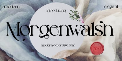 **Morgenwalsh Font** This pair was inspired by the elegance vintage poster design that i saw on some coffee shop, It was crafted by hand specially to add natural handmade feeling in its brand identity than i make it clean with pentool. **Opentype features** Morgenwalsh font has 207 character set included Morgenwalsh Font is very good looking in logo, labels, product packaging, invitations, advertising and others. This fonts works with folowing languages: Afrikaans, Albanian, Asu, Basque, Bemba, Bena, Chiga, Cornish, Danish, English, Estonian, Filipino, Finnish, French, Friulian, Galician, German, Gusii, Indonesian, Irish, Italian, Kabuverdianu, Kalenjin, Kinyarwanda, Low German, Luo, Luxembourgish, Luyia, Machame, Makhuwa-Meetto, Makonde, Malagasy, Malay, Manx, Morisyen, North Ndebele, Norwegian Bokmål, Norwegian Nynorsk, Nyankole, Oromo, Portuguese, Romansh, Rombo, Rundi, Rwa, Samburu, Sango, Sangu, Scottish Gaelic, Sena, Shambala, Shona, Soga, Somali, Spanish, Swahili, Swedish, Swiss German, Taita, Teso, Vunjo, Zulu Thank you for using this font. LS
 - Blooming Meadow by ParaType,
$25.00A set of original ornamental symbols was designed by Viktor Kharyk and licensed to ParaType in 2007. The name was inspired by the famous book “Champ Fleury” by Geoffroy Tory (1529) but the theme of blooming meadow was embodied much more literally. Each ornamental motive has a real prototype in flora. Mainly there are plants raising on Ukrainian wooded steppe. Plants were chosen for their Ukrainian and Latin names begin of proper letters from Ukrainian and Latin alphabets. The font is consisted of two styles: Day for normal and Night for reversed that reminds night lighting by its unexpected distribution of black and white areas. Fleurons may be used for creation of ornamental surfaces, composed borders and corners, decoration of any materials, and even as botanical illustrations. Blooming Meadow Day have been adjudged Award of Excellence in Type Design at TypeArt’05 international type design contest - Sinofluck by LetterStock,
$23.00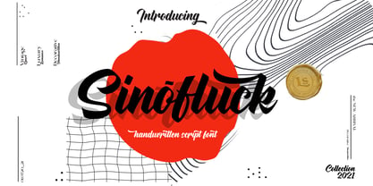 **Sinofluck Font** This pair was inspired by the samurai poster design that i saw on some coffee shop, It was crafted by hand specially to add natural handmade feeling in its brand identity than i make it clean with pentool. **Opentype features** Sinofluck font has 207 character set included Sinofluck Font is very good looking in logo, labels, product packaging, invitations, advertising and others. This fonts works with folowing languages: Afrikaans, Albanian, Asu, Basque, Bemba, Bena, Chiga, Cornish, Danish, English, Estonian, Filipino, Finnish, French, Friulian, Galician, German, Gusii, Indonesian, Irish, Italian, Kabuverdianu, Kalenjin, Kinyarwanda, Low German, Luo, Luxembourgish, Luyia, Machame, Makhuwa-Meetto, Makonde, Malagasy, Malay, Manx, Morisyen, North Ndebele, Norwegian Bokmål, Norwegian Nynorsk, Nyankole, Oromo, Portuguese, Romansh, Rombo, Rundi, Rwa, Samburu, Sango, Sangu, Scottish Gaelic, Sena, Shambala, Shona, Soga, Somali, Spanish, Swahili, Swedish, Swiss German, Taita, Teso, Vunjo, Zulu Thank you for using this font. LS
 - Narcis by VP Creative Shop,
$15.00 Introducing Narcis, the delightful retro bold script font that's bound to add a touch of nostalgia and flair to any project! This charming typeface boasts a unique blend of boldness and elegance, making it perfect for various design purposes. With its alternate and ligature glyphs, Narcis offers a wonderful range of creative possibilities. These additional characters add extra variety to your text, giving it a truly personalized and artistic feel. Whether you're designing a logo, poster, invitation, or any other project, Narcis' alternates and ligatures will help you achieve a distinct and eye-catching look. But that's not all! Narcis is also impressively versatile when it comes to language support, accommodating up to 87 languages. This means you can confidently express yourself in multiple languages without compromising on the font's aesthetics or legibility. Narcis comes in both regular and italic styles, allowing you to emphasize specific parts of your text or create a dynamic interplay between the two styles. The regular style offers a bold and confident appearance, while the italic style adds a touch of sophistication and movement to your design. Whether you're a seasoned designer or just starting on your creative journey, Narcis is sure to become your go-to font for adding that retro touch with a modern twist. Its warm and friendly demeanor will instantly win you over, making every project a joyful and visually captivating experience. So go ahead and give Narcis a try – you won't be disappointed! Language Support : Afrikaans, Albanian, Asu, Basque, Bemba, Bena, Breton, Chiga, Colognian, Cornish, Czech, Danish, Dutch, Embu, English, Estonian, Faroese, Filipino, Finnish, French, Friulian, Galician, Ganda, German, Gusi,i Hungarian, Indonesian, Irish, Italian, Jola-Fonyi, Kabuverdianu, Kalenjin, Kamba, Kikuyu, Kinyarwanda, Latvian, Lithuanian, Lower Sorbian, Luo, Luxembourgish, Luyia, Machame, Makhuwa-Meetto, Makonde, Malagasy, Maltese, Manx, Meru, Morisyen, North Ndebele, Norwegian, Bokmål, Norwegian, Nynorsk, Nyankole, Oromo, Polish, Portuguese, Quechua, Romanian, Romansh, Rombo, Rundi, Rwa, Samburu, Sango, Sangu, Scottish, Gaelic, Sena, Shambala, Shona, Slovak, Soga, Somali, Spanish, Swahili, Swedish, Swiss, German, Taita, Teso, Turkish, Upper, Sorbian, Uzbek (Latin), Volapük, Vunjo, Walser, Welsh, Western Frisian, Zulu How to access alternate glyphs? To access alternate glyphs in Adobe InDesign or Illustrator, choose Window Type & Tables Glyphs In Photoshop, choose Window Glyphs. In the panel that opens, click the Show menu and choose Alternates for Selection. Double-click an alternate's thumbnail to swap them out. Mock ups and backgrounds used are not included. Thank you! Enjoy!
 - Apocalypto Display by FoxType,
$10.00 Apocalypto Display is a Unique Modern Elegant Typeface with Web-fonts. It's a very versatile font that works great in large and small sizes. Apocalypto Font would perfect for branding, logos, headlines, Captions. or simply as a stylish text overlay to any background image. Strong capitals and a smooth, open lowercase are effective in a variety of applications. It's shown a clean, minimalist, warmth, quirky, yet still purposed to be versatile and easy to read. 07 Weights with 14 Styles Included. Free updates and feature additions.
 - !Sketchy Times - Unknown license

- MGN Debris by Morgana Studio,
$17.50 This design is characterized by its futuristic and modern aesthetic. The clean lines and minimalist approach create a sleek and sophisticated look, while the unique touches and use of the MGN Debris font give it a bold and edgy vibe. It is a perfect example of how a modern design can also be unique and innovative, with elements that set it apart from traditional designs. This style is perfect for businesses and organizations that want to convey a sense of innovation and cutting-edge technology. The MGN Debris font used in this design adds to its modern and futuristic feel. The font is bold and sharp, with a unique style that makes it stand out. It complements the overall design perfectly and adds to the edgy and unique vibe. This font is perfect for businesses and organizations that want to convey a sense of innovation and forward-thinking, and it pairs well with modern designs. Overall, this design is a great example of how a modern and futuristic style can be unique and captivating, with the use of the MGN Debris font adding an extra element of boldness and edge.
 - Jogan by Wahyu and Sani Co.,
$15.00 Inspired by the early days of video games where the graphics were made of squares (pixels), Wahyu Wibowo comes up with pixel based typeface design, Jogan, but instead of having medium width, he decided to make it narrow which is rarely exist in pixel style font. The style were expanding in the development process, so the family have 4 subfamilies: Jogan (regular, bold and monospace) Jogan Soft (regular, bold and monospace) Jogan Round (regular and monospace) Jogan Slab (regular and bold) Each Jogan font style contains 280+ glyphs which covers Western Europe languages: Afrikaans, Albanian, Asu, Basque, Bemba, Bena, Breton, Catalan, Chiga, Cornish, Danish, Dutch, English, Filipino, French, Friulian, Galician, German, Gusii, Indonesian, Irish, Italian, Kabuverdianu, Kalenjin, Kinyarwanda, Luo, Luxembourgish, Luyia, Machame, Makhuwa-Meetto, Makonde, Malagasy, Manx, Morisyen, North Ndebele, Norwegian Bokmål, Norwegian Nynorsk, Nyankole, Oromo, Portuguese, Quechua, Romansh, Rombo, Rundi, Rwa, Samburu, Sango, Sangu, Scottish Gaelic, Sena, Shambala, Shona, Soga, Somali, Spanish, Swahili, Swedish, Swiss German, Taita, Teso, Uzbek (Latin), Volapük, Vunjo, Zulu. Retro, retro-futuristic, futuristic, modern, techno theme projects fit perfectly with this typeface, any works from logo, poster, video, headlines, titles, and more!
 - Milky Berly by Blankids,
$24.00 Hello, Are you looking for a stylish and unique font? Do you want of creating Something that stand out and inspire creativity, imagination, and endless fun? Wait no more, we will give you the best choice. Milky Berly a Bold Stylish Font Milky Berly a Bold Stylish Font, Inspiring from playful stylish quirky style typography. This Bold Stylish font is perfect for a design that makes it more attractive and playful. made with a very good level of aesthetics making this font suitable for book cover, children book, comic, poster, packging, merchandise, logotype and much more. Milky Berly font includes Multilingual Support, among others : Afrikaans, Albanian, Asu, Basque, Bemba, Bena, Breton, Catalan, Chiga, Cornish, Danish, Dutch, English, Estonian, Faroese, Filipino, Finnish, French, Friulian, Galician, German, Gusii, Indonesian, Irish, Italian, Kabuverdianu, Kalenjin, Kinyarwanda, Luo, Luxembourgish, Luyia, Machame, Makhuwa, Meetto, Makonde, Malagasy, Manx, Morisyen, North Ndebele, Norwegian Bokmål, Norwegian Nynorsk, Nyankole, Oromo, Portuguese, Quechua, Romansh, Rombo, Rundi, Rwa, Samburu, Sango, Sangu, Scottish Gaelic, Sena, Shambala, Shona, Soga, Somali, Spanish, Swahili, Swedish, Swiss German, Taita, Teso, Uzbek (Latin), Volapük, Vunjo, Zulu FEATURES : Uppercase Lowercase Number Punctuation Multilingual PUA Encode Opentype
 - ITC Schuss Hand by ITC,
$29.99Designed by German graphic designer Jochen Schuss. ITC Schuss Hand and ITC Schuss Hand Bold can probably best be described as excellent all around scripts useful for a broad spectrum of advertising purposes as well as for those applications that benefit from a refined handwritten appearance. The characters themselves have a soft, almost “liquid” appearance which is enhanced by the subtle swelling at most of the stroke terminals. The slightly condensed nature of the characters plus a relatively large x-height ensures that both weights are ideal for the advertising arena. An additional feature on ITC Schuss Hand and ITC Schuss Hand Bold are the capital letters which can actually be used on their own in word settings whereas most script capitals are designed just for initialing purposes. The designer has also invested a good deal of careful thought to the way in which a high percentage of the lowercase letter combinations overlap to create an authentic hand-scripted appearance. This, together with the italicized letter forms, will make Schuss Hand and Schuss Hand Bold ideal candidates for those occasions when paper correspondence requires an informal style. So, as is claimed, an excellent all around script style.
