10,000 search results
(0.185 seconds)
- ArTarumianBehrensInitialen by Tarumian,
$100.00 Behrens Initialen is based on the type graphics of the German architect and type designer Peter Behrens (1868-1940). The drawing of the original typeface is in tune with the Art Nouveau (Jugendstil) style in which Behrens worked. This is a light, delicate, somewhat theatrical typeface, the forms of which bear at the same time a certain shade of Gothic and modernity, and can be used, in particular, when there is a need to make a reference to medieval graphics while maintaining the modern style of composition. In the proposed version, the original initial graphics are used not only for uppercase letters, but also for Arabic figures, while for lowercase letters and for the base of other characters are used the letters themselves - without decorative framing. This feature can be useful for obtaining various effects when using both lower and upper cases in parallel, including when they are overlaid. The font includes the Latin, Cyrillic and Armenian ranges. Created by Ruben Tarumian in 2020.
 - Deathmetal by Madhaline Studio,
$29.00 Tutorial : https://www.youtube.com/@madhalinestudio Deathmetal is a carefully crafted font, which features a very heavy black metal feel. This letter combines graffiti style and blackmetal style, giving a unique and cool new impression. Deathmetal suitable for metal band logos, merchandise, clothing, apparel, or anything that needs a black metal feel.
 - Carolus - Unknown license

- Doriss Girls by Open Window,
$- Dorriss girls were the dancing troop at the Moulin Rouge. I had the idea for this font while trying to come up with an alternative to beveling. I thought it would be interesting to create this sort of stepped effect as I've never really seen this treatment on a font before. Then my need to create chaos shows up again with Doriss Girls informal. A hand drawn take on the forms. This seemed like it would appear on an old art nouveau poster by the great Toulouse Lautrec, so there you have the genesis of this font. I've been somewhat compelled by the letterforms so I may expand and create a more normal version of this font someday with a range of weights. That would be the bees knees.
 - Brab by VSF,
$30.00 A bold grotesque typeface in the best traditions of the Star Wars logo. It has clean geometric lines, a humnaist character, it combines a tech feeling with a friendly organic feeling. Will work excellently as a white text on a busy background.
 - Mairy by Typesketchbook,
$39.00 Mairy font family is a modern sans serif font family. Featuring 9 separate weights each followed by own true italics Mairy is positioned somewhere between rounded sans with humanist touch. In fact the humanist presence in Mairy is a little bit more than the usual doze adding more calligraphic elements mostly noticeable in italic weights but also very important in regulars. This symbiosis of Grotesk geometry with handwriting is well balanced regarding contrast and legibility so that at the end we have a highly usable font family. Light weights are very tender and elegant while the old and blacks are soft, friendly and full of vitality. The mid weights are just perfect with their medium contrast and excellent legibility. Mairy is very fresh font family and is surprisingly flexible when it comes to screen or print use – it is optimized for both even if the conditions are poor. Use it with OpenType compatible software and explore its true potential by accessing additional set of ligatures, alternates and multilingual support.
 - Cocogoose Pro by Zetafonts,
$39.00 Discover Cocogoose Pro Narrow Weights! Designed by Cosimo Lorenzo Pancini in 2013, Cocogoose was first expanded in 2015 with the help of Francesco Canovaro who co-designed the decorative display weights and Andrea Tartarelli who developed the condensed widths. In 2020 a full redesign of the typeface has been published: Cocogoose Pro now includes new widths, weights, open type features and characters, thanks to the help of Mario De Libero. Influenced by vernacular sign-painting and modernist ideals, Cocogoose is drawn on a classic geometric sans skeleton, softened by rounded corners and slight visual corrections. Its very low contrast, dark color and tall x-height make it a solid choice for all designers looking for a powerful display typeface for logos, headings and vintage-inspired branding. The tall x-height makes texts set in Cocogoose very readable even at small sizes, while the bold regular weight allows for maximum impact when used as a branding, signage or decorative typeface. Cocogoose Pro was designed as a highly reliable tool for design problem solving, and given all the features a graphic designer needs, starting from its wide range of widths and weights. Its 2000+ latin, cyrillic and greek characters make sure it covers over 200 languages worldwide, while its comprehensive set of open type features allows faultless typesetting thanks to small capitals, positional numbers & case sensitive forms. A wide range of alternate letterforms, developed along nine different stylistic sets, gives you an extra level of design fine-tuning. The layerable and color-ready display variants include inline, outline, shadow and a letterpress version that can simulate the effect of old print, also thanks to programmed randomization of its letters. Cocogoose Pro has been completely re-engineered in 2020 to include extra features and technologies. A variable font version allows you to fine tune precisely the appearance of the text while minimizing download size on the web. A darkmode weight range has been added to the whole family, to keep consistency of effect when the typeface is used in reverse on the web and in dark mode interfaces. Also, a new text subfamily has been developed for body text usage, to keep the look and feel of Cocogoose while maximizing readability on screen and on the printed page.
 - Oven Plate JNL by Jeff Levine,
$29.00 Oven Plate JNL solidifies the outline lettering of Stove Plate JNL; based on the logo for Red Star Oil Stoves and found on an old letterpress cut.
 - Signature Creation by Arterfak Project,
$17.00 Introducing "Signature Creation," a nostalgic display font inspired by vintage sign painting. Representing craftsmanship, creativity, and movement. Immerse yourself in a wave of nostalgia with this font set, available in 5 distinct styles that harmoniously interact as layers: Regular, Inline, Shadow, Outline, and Extrude. Signature Creation boasts a contemporary aesthetic and seamless design. Complete with swashes and special characters, Signature Creation infuses a playful feel into your design
 - We Love Nature Stems Two by kapitza,
$85.00 We Love Nature Stems Two is a picture font consisting of 52 all new high quality, hand drawn illustrations with clean outlines and a minimum of vector points. Due to the overwhelming success of our flower font We Love Nature Stems, we have created this brand new set of original illustrations. We loved creating these beautiful new flowers and hope that you will love designing with them. Enjoy!
 - Casual Crew by Learning Kiddos,
$18.99 A fresh friendly font with upper and lower cases inspired by the Casual Style of Sign Painters. It features well-designed curves, four versatile styles (including Regular, Bold, Halftones and Outlines), latin language support and sexy built-in signs and catchwords. Suitable for titles, Branding, package design & more. If you are looking for a fine Hand-drawn font Family with great curves, Casual Crew is what you want.
 - 1906 Fantasio Auriol by GLC,
$38.00 We have created this family inspired from the set of well known Auriol fonts used by the French popular "cheerful" satirical magazine Fantasio (1906-1948). The present version contains Normal, Italic, Bold and Bold Italic styles, in use for texts, plus narrow titlings and normal outlined with upper and lower case, both in use for titles. This family may be used together with 1906 French News, 1906 Titrage and 1890 Notice.
 - Bernound by 38-lineart,
$8.00 The Bernound is an amazing typeface which comes in three weights. The clean weight comes with rounded corners and a slim shape that presents a minimalist impression. The outlined weight has a fancy feel when displayed on its own, and the rough weight has a vintage, rustic, and grunge look. All weights can be combined perfectly which gives you the opportunity to create endless unique designs with just this one download.
 - Hillray by Sarid Ezra,
$15.00 A NEW STYLISH BOLD FONTS WITH LIGATURE & ALTERNATES, Hillray! Hillray is a stylish bold sans that contains ligatures and alternates each characters! You can make a unique branding with this fonts. This stylish bold fonts also included extrude and outline style that will compliments the regular style! This fonts suitable to use for poster, branding, merchandise, and any street art style! Also support multilingual and already PUA Encoded! Thank You!
 - Ytoxina by FSdesign-Salmina,
$39.00 Ytoxina. Acid new Pixelfont. Do you look for an unconventional aggressive headlinefont? Ytoxina might be exactly what you are looking for. Ytoxina is a new member oft the Atoxina family with experimental character. The form of the letters suggests the effect of an aggressive acid having devoured their outlines. Like the other member of the family it is based on a pixelfont. Avoid nicely typography, experiment with Ytoxina!
 - Noa by Linotype,
$29.99The Danish designer Nina Lee Storm designed Noa for use on television and computer screens during the late 1990s. She began her six-member type family with the creation of bitmap fonts, developing their print outlines only secondarily. Noa’s letters exhibit a tall x-height, coupled with very short ascenders and descenders. Storm is proud to report that her typeface also looks very “Danish.” Why don't you give it a try? - Helena Handbasket NF by Nick's Fonts,
$10.00The 1888 edtion of James Conner's Sons United States Type Foundry specimen book listed this little gem simply as "Antique Light". Its original, rather anemic outlines have been beefed up and its serifs have been rounded, with the result that this face will get noticed wherever it goes. Both versions of this font include the complete Latin 1252 and CE 1250 character sets, with localization for Romanian and Moldovan. - Hispania Script by HiH,
$10.00 Hispania Script is a distinctive and distinctly nineteenth century script. It was released by Schelter & Giesecke of Leipzig, Germany around 1890. Particularly noteworthy are the sharply-pointed legs of the upper case ‘K’ & ‘R’ that seem to be characteristic of the period. Similar strokes, often with a slight curve, may be seen in typefaces like Alt-Romanish and Tinteretto by Schelter & Giesecke, Artistic and Lateinsch by Bauer and Berthold and the poster lettering of Edward Penfield. The angle of this script (approximately 24 degrees) and the sharp delicate points must have made the manufacture of this face in metal type a challenge. The resulting type was probably quite fragile and subject to accidental damage. Additionally, the sharp points would be subject to wear. With digital type, these concerns are eliminated. As far as I know, no one has ever dropped a digital letter on the floor. Nonetheless, creating a digital outline for a typeface like Hispania Script, with many crossing strokes, can be quite time-consuming. Even with an accurate scan of a good quality original, it is usually necessary to construct each crossing stroke separately and then remove the overlap in order to obtain a sharp and convincing intersection. Steep internal angles are often defined with two points, rather than one, to minimize ink or toner fill that can muddy the rendering in smaller sizes. Like all formal scripts, Hispania Script is always useful for announcements and invitations. However, the distinctiveness of of this design strongly suggests that there are other applications that may benefit from its use. Step outside the box and try it in some unexpected places. It is the unexpected that often draws a person’s eye.
 - Plasto by Eko Bimantara,
$19.00 Plasto is a complete grotesk sans serif family. The quirky letterforms and its slight width variation characterized the typeface as fun and playful as "plastic" in a graphic layout, fit for various design spaces, fit for both informal or functional purposes, fit for large display and also small text. Plasto complete family contains 54 styles with two axes; Weight and Width. The weight consists of 18 styles from Thin to Black, and the width consists of 3 styles, condensed, normal and expanded.
 - Sofa Bird by Bogstav,
$18.00 Sofa Bird is my name for a laid back and relaxed comic font, with a twist of handcraft mixed with adventurous penmanship!
 - Rickslord by Nathatype,
$29.00 Rickslord is an uppercase display font that transports you back in the early 20th century. Some characters show high contrast between thick and thin strokes, creating a dramatic visual impact, while others maintain a more consistent weight for a balanced appearance. This blend of contrasts adds an unexpected dynamic quality to the text, making every word a work of art. Beautiful ornaments are included as a bonus. Rickslord fits in headlines, logos, branding materials, and many more.
 - Dikta Neue by Atasi Studio,
$16.00 Dikta Neue is a neo-grotesque sans serif typeface inspired by Swiss Design in The 1960s. With a solid and minimalist letterform make this typeface suitable for text and display. Dikta Neue is available in 18 different styles from thin to black including italics.
 - Snorkel JNL by Jeff Levine,
$29.00 A package for a swim mask and snorkel was the basis for this decidedly unusual typeface with a wild 1970s-era design. There's no telling how to apply this font to a project, but think black light posters, psychedelic music and some cheap wine!
 - Grota Rounded by Latinotype,
$26.00 Grota Rounded is a very expressive font, has a gestural character inspired by the hand lettering . Grota Rounded is grotesque, unicase and exceptional. It has six weights ranging from thin to black with their italics. It is ideal for logos, brands, magazines, headlines, books. etc.
 - Bartleby by AdultHumanMale,
$20.00 Bartleby is a hand-drawn all caps display font. It has over 300 glyphs and several variations on the standard alphabet with all those €xtra pesk¥ foreign characters too. It is available in 3 weights regular, bold, black and as a family of all three.
 - Genius by Artegra,
$19.00 Genius is a clean, geometric typeface with great legibility and modern look, which makes it a perfect typeface for any kind of use. It's especially suitable for branding, advertising, magazines, web design and so on. Created by Ceyhun Birinci, the Genius family consists of 9 weights from thin to black along with their italics.
 - Neue Konstrukteur Round by HouseOfBurvo,
$15.00 Neue Konstrukteur Round is an engineered, mechanical typewriter font with a hint of heritage blackletter. Inspired by a trip to Germany this font has five weights from Thin to Black with accompanying italics. That makes 10 font files in total, enough for the most demanding projects. Also check out its sister font Neue Konstrukteur Square.
 - Neue Konstrukteur Square by HouseOfBurvo,
$15.00 Neue Konstrukteur Square is an engineered, mechanical typewriter font with a hint of heritage blackletter. Inspired by a trip to Germany this font has five weights from Thin to Black with accompanying italics. That makes 10 font files in total, enough for the most demanding projects. Also check out its sister font Neue Konstrukteur Round.
 - Encorpada Pro by dooType,
$40.00After the successful release of Encorpada Black, now it’s time of Encorpada Pro type system. Now with seven weights and a lot of curves. Freely inspired by the didones shapes, Encorpada Pro now have a extended character set with more than 40 languages supported, Opentype Features and Amazing Swashes in Italic Version. Enjoy It. - Benoa by Creativemedialab,
$20.00 Benoa is a versatile font family for your design, consist of 6 weights from thin to black with dozens of alternates. Benoa works well with any style of design concept, from branding to a nice bold modern look! Benoa also available in Variable format, multilingual support, numbers, and currency symbols, and dozens of alternates.
 - MC Inversa by Maulana Creative,
$14.00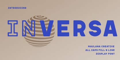 Inversa is a Display sans font with two style. Regular Fill and Outline stroke, fun character with a bit of ligatures and alternates. To give you an extra creative work. Inversa font support multilingual more than 100+ language. This font is good for logo design, Social media, Movie Titles, Books Titles, a short text even a long text letter and good for your secondary text font with script or serif. Make a stunning work with Inversa font. Cheers, Maulana Creative
 - Groundage by Mofr24,
$11.00 Groundage is a Gothic Blackletter font that offers three styles: Outline, Regular, and Shadow. With its bold and clean calligraphic strokes, this typeface boasts a modern-vintage look that exudes elegance and masculinity. Its Y2K-inspired design makes it perfect for stylish posters, marketing materials, logotypes, and headlines. Additionally, it is great for art and craft projects, y2k-streetwear designs, and much more. What sets Groundage apart from other Gothic Blackletter fonts is its unique combination of traditional and modern design elements. Its clean lines and bold strokes give it a contemporary feel while its Blackletter roots pay homage to its historical origins. Groundage also includes both Latin and Cyrillic character sets, making it a versatile option for a range of projects. This font pairs well with other modern-vintage fonts and looks great alongside sans-serif fonts for contrast. Its three styles allow for versatility in design and can be used for a variety of creative projects. Groundage was designed with the intention of creating a stylish, masculine font that could be used in a variety of contexts. Its Y2K-inspired design concept was chosen to evoke nostalgia while still feeling fresh and modern. The combination of traditional Blackletter elements with a contemporary twist creates a unique aesthetic that stands out from other fonts in its category. Groundage is not based on any historical design, but its Blackletter roots pay homage to centuries of typographical tradition. Its modern twist on the classic Gothic style creates a unique and versatile font that can be used in a range of creative projects.
 - Kitsch by Zetafonts,
$39.00 Designed by Francesco Canovaro with help from Andrea Tartarelli and Maria Chiara Fantini, Kitsch is a typeface happily living at the crossroads between classical latin and medieval gothic letterforms. But, rather than referencing historical models like the italian Rotunda or the french Bastarda scripts, Kitsch tries to renew both its inspirations, finding a contemporary vibe in the dynamic texture of the calligraphic broad-nib pen applied to the proportions of the classical roman skeleton. The resulting high contrast and spiky details make Kitsch excel in display uses, while a fine-tuned text version manages to keep at small sizes the dynamic expressivity of the design without sacrificing legibility. Both variants are designed in a wide range of weights (from the almost monolinear thin to the dense black), and are fully equipped with a extended character sets covering over two hundred languages that use latin, cyrillic and greek alphabets. Special care has been put in designing Kitsch italic letterforms, with the broad-nib movements referencing classical italian letterforms to add even more shades to your typographic palette. The resulting alternate letter shapes have also been included in the roman weights as Stylistic Alternates - part to the wide range of Open Type features (Standard and Discretionary Ligatures, Positional Numerals, Small Caps and Case Sensitive Forms) provided with all the 32 weights of Kitsch. Born for editorial and branding use, Kitsch is fashionable but solid, self-confident enough to look classic while ironic enough to be contemporary.
 - Luft by Sebastian Cabaj,
$20.00 Luft is blackletter typeface with a modern feel. Inspired by old writing letters and preparation for using in modern design.
 - VLNL Cleaver by VetteLetters,
$29.99 Chop chop! VLNL Cleaver is an important tool in the Vette Letters’ kitchen. It’s a butcher knife of a font. Razor sharp, ultra heavy and with pointy slanted serifs. At first glance it seems straight-lined, but a closer look revails that all straight lines are curved inward slightly, which enhances the sharp image even more. Cleaver was originally designed by DBXL for cutting meat - hell, it even hacks right through bone. It can easily splice a chicken in one slash or seperate ribs, just like that. You can also very well use it to chop up hard vegetables like pumpkin or squash on the chopping block. It gets better, the opposite blunt side can be deployed to crush ingredients like garlic, nuts or spices like black pepper. You could use a grinder, but with Cleaver it’s more fun, isn’t it? VLNL Cleaver is suitable to give a sharp edge to flyers, posters, logos (Heavy metal bands and other) or magazine headlines.
 - Deportivo by 8AV,
$15.00 Welcome Deportivo - Spanish for sporty. Deportivo is a simple and powerful typeface based on the lettering on vintage sports equipment. I saw it as a brand on a pair of old skis and fell in love with it because it is so bold and it can be easily read while moving at high speed, making it perfect in a sports and dynamic environment. Due to its high legibility, it gets great results with sports teams, league names and t-shirt numbers and race indications. The high x-height gives the typeface a unique look and a strong tone of voice - that will echo in each arena and outside making it perfect also for headlines in newspapers and magazines and product names. Keep scoring!
 - Galea Display by Letra Type,
$50.00 Galea is a slightly condensed serif typeface with long extenders. Its elongated proportions and graceful terminals seek to bring femininity and elegance to any layout. It is a display face that works well at large sizes in editorial contexts as a headline, titling or introduction to a text. Galea was designed by Isabel Urbina Peña while at Cooper Union’s Type@Cooper Extended Program, 2012 and released on May, 2014. Galea obtained an Honorable Mention from the Fine Press Book Association in the Text Family Category, 2013. Also, it is featured in the book "Playing with Type: 50 Experiments" by Lara McCormick, Rockport Press, on Parenthesis Magazine, Autumn 2013 on Behance's Typography Served and will appear on "Typography Magazine", Japan (Nov 2014).
 - Mahameru Arabic by NamelaType,
$39.00 Mahameru Arabic is sibling of Mahameru with the addition of Arabic glyphs, for Arabic, Urdu, and Farsi. With still gives a firm and soft character, with the terminal point on straight and curved strokes. The family has 9 weights ranging from Thin to Black and offers a lot of features flexibility that will help you find the best typographic color for your project.
 - Pill Gothic by Betatype,
$40.00 Pill Gothic walks the tightrope between a heads down, hard working, utilitarian sans and something that stands out, saying, "Look at me!" Designers looking for a type that will work in blocks of text for callouts, captions and headlines will find that unique balance with Pill. Pill Gothic asks the question: what is the effect of a few truly unique characters on the meaning of a type? In particular, the 'a' and the 'g', while relating strongly to the forms of the other characters, stand out from the traditional milieu of sans serif types. The name Pill Gothic came from early studies of the condensed weight where the lower case characters had the shape of a pill capsule.
 - New Comer Sans by ave,
$12.00 New Comer Sans is a combination of two ideas. First is my speed writing with flat acrylic marker on boards. And second is to make new bold font something like puffy «comic sans» font. Unstable stems (vertical main lines) give it some playful unserious character. The result is cute funny font. You can use it in short text blocks in huge and medium sizes. For example, for comic books or kids applications. NewComerSans includes: uppercase lowercase more than 480 glyphs which support Latin, Western European, Central European languages (Cyrillic is also included) Hope you are enjoying using New Comer Sans. Please do not hesitate to ask me any questions about the product. (c) Photo credit - Unsplash
