10,000 search results
(0.083 seconds)
- Oksana Text Swash Cyrillic by AndrijType,
$25.00 These Oksana Text Swash Cyrillic fonts have swashed initials and ampersand for Oksana Text italics in six weights from Thin to Black. They support basic Latin and European Cyrillic. For all-in-one fonts please look at that OpenType version of Oksana Text.
 - Old English by URW Type Foundry,
$35.00 Old English Old English is related to Black Letter styles from early printed books and have a distinguished, historic look. The Old English font is used in advertising, invitations, greeting cards, and wherever a formal hand-lettered or engraved look is desired.
 - Ductus by Thomas Jockin,
$35.00 Ductus is a five weight typeface that is both ancient and contemporary. Drawing on various sources such as rustic capitals, Naskh arabic calligraphy, and black-letter, Ductus is a reflection on how the broad-nib pen can be relevant for today’s designer.
 - Carlgine by Muksal Creatives,
$10.00 Carlgine is a unique and modern family of serif fonts. Carlgine has 18 families Regular and italic font, starting from the small thin to the largest black. This typeface is versatile and can be used successfully in magazines, posters, branding, websites, etc.*
 - Olivier by Letters&Numbers,
$28.00 Olivier is based on painted black ink letters. Inspiration for this typeface is fluidity of wine. Shifting base-, mean- and cap lines, varying tails and ascenders give it an organic, playful feel. The font is suitable for logo types, short paragraphs and headings.
 - Carltine by Muksal Creatives,
$10.00 Carltine is a unique and modern family of Sans serif fonts. Simply Conception has 18 families Regular and italic font, starting from the small thin to the largest black. This typeface is versatile and can be used successfully in magazines, posters, branding, websites.
 - Gaban - Personal use only

- Baradig by Asenbayu,
$15.00 Baradig is a versatile grotesque sans serif font family. Baradig provides a unique collection of glyphs with wide spacing and strong yet subtle geometric outlines. Baradig will give you an extraordinary modern visual experience. These fonts also have alternate and ligature features which are perfect for completing various projects such as logos, brands, products, labels, websites, posters, and many more. Baradig fonts feature Open Type Format, kerning, ligature and alternate packed in 10 styles: Light, Light Italic, Regular, Italic, Medium, Medium Italic, SemiBold, Semibold Italic, Bold and Bold Italic. Baradig fonts include uppercase letters, lowercase letters, numeral, punctuation and multilingual support.
 - Aethelred NF by Nick's Fonts,
$10.00This unicase typeface, with alternate characters in several of the lowercase positions, is patterned after Mosaik, designed by Martin Kausche for Schriftgeißerei Stempel in 1954. A stencil treatment has been employed, and the outlines have been roughened to enhance its ancient feel. The typeface is named for a king of England, Æðelred the Unready, who ruled over a millenium ago. Unlike its namesake, this typeface is quite ready to do yeoman's duty on your next project. The Opentype, Truetype and Windows Postscript versions of this font contain both the Windows 1252/ANSI character set and the 1250/Central European character set. - Victorian Supremacy by Burntilldead,
$14.00 With over a year of design and development, Victorian Supremacy is ready to help you and your clients make a statement by adding elegance and unique flair to your next design project. Victorian Supremacy inspired by letterheads from the late 1800's and early 1900's. Set includes four major styles and layered version (gradient, outline & extrude). Victorian Supremacy offers an expansive set of options, making it the perfect choice for books, magazines, packaging, branding and signage. From period style and Victorian to modern and elegant, Victorian Supremacy is strong and stately, yet elegant and decorous.
 - Broken Glade by Letterhend,
$17.00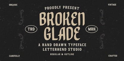 Broken Glade is a classic hand drawn with vintage looks!. This unique font has 2 styles : regular and outline. This font perfectly made to be applied especially in logo, and the other various formal forms such as invitations, labels, logos, magazines, books, greeting / wedding cards, packaging, fashion, make up, stationery, novels, labels or any type of advertising purpose. Features : Uppercase & lowercase Numbers and punctuation Multilingual PUA encoded We highly recommend using a program that supports OpenType features and Glyphs panels like many of Adobe apps and Corel Draw, so you can see and access all Glyph variations.
 - Flapper by Greater Albion Typefounders,
$9.50 Flapper is family of four typefaces which embody a great deal of fun and more than a little spirit of the roaring 20s. If ever a set of typefaces could dance a high kicking Charleston, these are they. Flapper is offered in regular, condensed, oblique and outline forms, and they all bring a great deal of fun and life wherever they are used. The Flapper family (yes, think of one of those dancing 20s girls with a long string of pearls...) is ideal for casual heading, bold captions, poster work and anywhere else a sense of fun is required.
 - Blue Goblet Frames and Vignettes #2 by insigne,
$22.00 The designer favorite Blue Goblet series has been extended once again with Blue Goblet Frames and Vignettes #2. These animated and lively frames and vignettes can be resized easily without any loss of quality, and can easily be converted to outlines and modified. Combining them to form unique compositions or inserting them into chapter headings are just a few ideas for these versatile ornaments. Please see the sample .pdf to see all 96 Frames and Vignettes in action, and be sure to check out the original Blue Goblet Frames and Vignettes, Blue Goblet brush script and Blue Goblet Ornaments, Emblems and Florals.
 - Spitting Image by preussTYPE,
$25.00 SpittingImage is a font which speaks of mechanical exactness, cool and reserved. The SpittingImage font family is formed by two different weights (regular and bold), each one with uppercase and lowercase letters, numbers, punctuation marks and diacritic characters in regular and italic. The outline version included as a part of OpenType-Feature. There are in all styles numerous ligatures, alternate characters, small caps, and different sets of numbers that you can put both headlines and short texts without any problems. OpenType features: contains over 1.000 Glyhps Central European Glyhps Standard Ligatures Small Capitals Stylistic Alternates Discretionary Ligatures OldStyle Figures Ordinals Slashed Zero Feature
 - Pseudographia by The Ampersand Forest,
$35.00 Pseudographia is a lighthearted, loving pastiche of “Greek-Style” type inspired by J.M. Bergling’s 1917 “Society Greek” lettering. Happily living in the world of kitschy cross-cultural fonts of the kind found on restaurant awnings around the US, Pseudos is blithely unconcerned with legibility. Instead, it embraces its own benign exoticism and revels in its own chicanery! Pseudographia’s standard letterforms are angular Roman forms. Its Stylistic Set One contains a simplified Small Caps version of the kind commonly seen at Mediterranean eateries. Its Stylistic Set Two contains a full set of outlined Ornamental caps. Opa! Part of The Ampersand Forest's Sondheim Series.
 - Acworth by Jehoo Creative,
$20.00 Acworth is a contemporary progressive typeface that explores mechanical robustness and dynamism. Inspired by the advancement of fast-moving technology culture. The characters have an ink trap that makes Acworth very legible and a standout feature, thereby creating a modern versatile form. Making it usable for editorial, graphic design, web look, quotes or as a logo. This new type will make your designs stand out. Has 4 weights and 1 outline style having alternate features on the characters a, f, g, y and equipped with ligatures. Support languages Western Europe, Central / Eastern Europe, Baltic, Turkish, Romanian, Cyrillic.
 - Mailart Rubberstamp by K-Type,
$20.00 The Mailart Rubberstamp font was inspired by rubberstamped envelopes and artworks by Mailartists Jonathan Stangroom, H. R. Fricker and Flea Art, and the typeface Clarendon Condensed. Mailart Rubberstamp now has an additional Bold weight and complimentary Obliques. The typeface has also been updated with subtle outline improvements, a bigger repertoire of European accented characters, and more consistent, slightly tighter spacing; increase the tracking to recreate the more relaxed, rustic appearance of the earlier version. The fonts are derived from the individually rubber-stamped letters on printed and collaged envelopes received from mailartists, and the typeface Clarendon Condensed.
 - Faible by Identity Letters,
$29.00 An open-hearted humanist sans-serif. Playful and friendly. Faible is everybody’s darling. You cannot not like this good-natured humanist typeface. Sure, it’s a typeface for serious work—but all serious work is better when you put a smile on your face and a whistle on your lips. The typeface itself isn’t rooted in calligraphy, but there are quite some details in Faible that reference handwriting and add a friendly, humanist facet to its appearance. Take the bowls of B, P, and R: they are merrily bulged, like balloons about to take off. The curved leg of the R adds to this joyful mood. Faible’s italics are rendered playfully, too: they’re not merely sloped Roman styles. Rather, they were designed independently with an internal dynamic that sets them apart on the page. With its trademark glyphs, the swooshin’ K and k, and its friendly details, Faible will radiate optimism in display sizes, titles, and headlines. That makes it a great choice for book covers, posters, editorial design, branding, corporate design, advertising, and packaging. Nontheless, it’s carefully spaced and equipped with plenty OpenType features—a reliable tool for short texts and body copy, too. The font family consists of six weights (ranging from Thin to Black), each with its corresponding italic style. Faible’s glyph set contains more than 600 characters, allowing you to enhance your layouts with ligatures, different sets of figures, case sensitive forms, arrows, and other necessities for the ambitious typographer. Faible is the typeface that puts “fun” back into “functional”.
 - Street Legal by LetterBalm,
$17.99 Hard core street scrawl, for tough graffiti urban hood, laid back and tough, lots of attitude and tons of muscle, for automotive, motorcycles, urban settings and back alleys. Gives your designs some serious five o'clock shadow.
 - TA Bankslab by Tural Alisoy,
$33.00 The building of the Northern Bank of St. Petersburg's Baku branch was built in 1903-1905. It was the first Art Nouveau-style building in Baku, Azerbaijan. Later the bank was transformed into the Russian-Asian Bank. After the oil boom in Baku in the 19th century, branches of many banks and new banks were opened in the city. The branch of the Northern Bank of St. Petersburg was among the first banks that was opened in Baku. N.Bayev was the architect of the building for the branch of the Northern Bank of St. Petersburg located at Gorchakovskaya 3 in 1903-1905. The building currently houses the Central Branch of the International Bank of Azerbaijan. My purpose in writing this is not to copy and paste the information from Wikipedia. What attracted me to the building was the word "Банкъ" (Bank) written in Cyrillic letters, which was also used in Azerbaijan during the Soviet era. The exact date of the writing is not known. Every time I pass by this building, I always thought of creating a font of this writing someday. I had taken a photo of the building and saved it on my phone. I did a lot of research on the font and asked a lot of people. However, some did not provide information at all and some said they did not have any information. I was interested in the history of this font but I do not know if this font really existed or it was created by the architect out of nowhere. If there was such a history of this font, I wanted to recreate this font and make it available. If not, I had to create it from scratch in the same way, using only existing letters on the building. Finally, I made up my mind and decided to develop the font with all letters I have got. It was difficult to create a font based on the word, Банкъ. Because in the appearance of the letters, the midline of the letters on A, H, K was very distinct, both in the form of inclination and in more precise degrees. The serif part of the letters, the height of the upper and lower sides, differed from each other. I don't know whether it was done this way when the building was constructed or it happened over time. I prepared and kept the initial version of the font. I took a break for a while. I started digging on the story of the font again. Meanwhile, I was researching and got inspired by similar fonts. Unfortunately, my research on the font's history did not yield any results. I decided to continue finishing up the font. After developing the demo, I created the font by keeping certain parts of these differences in the letters. In addition, I had to consider the development of letters in the Cyrillic, as well as the Latin alphabet, over the past period. Thus, I began to look at the appearance of slab-serif or serif fonts of that time. In general, as I gain more experience in developing fonts, I try to focus on the precision of the design for each font. In recent years, I specifically paid attention to this matter. YouTube channel and articles by Alexandra K.'s of ParaType, as well as, information and samples from TypeType and Fontfabric studios on the Cyrillic alphabet were quite useful. I gathered data regarding the Latin alphabet from various credible sources. I do not know if I could accomplish what I aimed at but I know one thing that I could develop the font. Maybe someday I'll have to revise this font. For now, I share it with you. I created the font in 10 styles. 7 weight from Thin to Extra Black, an Outline, Shadow, and Art Nouveau. The Art Nouveau style was inspired by the texture in the background used for the text on the building. The texture I applied to capital letters adds beauty to the font. If you like the font feel free to use it or simply let me know if your current alphabet doesn't support this font.
 - TA Bankslab Art Nouveau by Tural Alisoy,
$40.00 TA Bankslab graphic presentation at Behance The building of the Northern Bank of St. Petersburg's Baku branch was built in 1903-1905. It was the first Art Nouveau-style building in Baku, Azerbaijan. Later the bank was transformed into the Russian-Asian Bank. After the oil boom in Baku in the 19th century, branches of many banks and new banks were opened in the city. The branch of the Northern Bank of St. Petersburg was among the first banks that was opened in Baku. N.Bayev was the architect of the building for the branch of the Northern Bank of St. Petersburg located at Gorchakovskaya 3 in 1903-1905. The building currently houses the Central Branch of the International Bank of Azerbaijan. My purpose in writing this is not to copy and paste the information from Wikipedia. What attracted me to the building was the word "Банкъ" (Bank) written in Cyrillic letters, which was also used in Azerbaijan during the Soviet era. The exact date of the writing is not known. Every time I pass by this building, I always thought of creating a font of this writing someday. I had taken a photo of the building and saved it on my phone. I did a lot of research on the font and asked a lot of people. However, some did not provide information at all and some said they did not have any information. I was interested in the history of this font but I do not know if this font really existed or it was created by the architect out of nowhere. If there was such a history of this font, I wanted to recreate this font and make it available. If not, I had to create it from scratch in the same way, using only existing letters on the building. Finally, I made up my mind and decided to develop the font with all letters I have got. It was difficult to create a font based on the word, Банкъ. Because in the appearance of the letters, the midline of the letters on A, H, K was very distinct, both in the form of inclination and in more precise degrees. The serif part of the letters, the height of the upper and lower sides, differed from each other. I don't know whether it was done this way when the building was constructed or it happened over time. I prepared and kept the initial version of the font. I took a break for a while. I started digging on the story of the font again. Meanwhile, I was researching and got inspired by similar fonts. Unfortunately, my research on the font's history did not yield any results. I decided to continue finishing up the font. After developing the demo, I created the font by keeping certain parts of these differences in the letters. In addition, I had to consider the development of letters in the Cyrillic, as well as the Latin alphabet, over the past period. Thus, I began to look at the appearance of slab-serif or serif fonts of that time. In general, as I gain more experience in developing fonts, I try to focus on the precision of the design for each font. In recent years, I specifically paid attention to this matter. YouTube channel and articles by Alexandra K.'s of ParaType, as well as, information and samples from TypeType and Fontfabric studios on the Cyrillic alphabet were quite useful. I gathered data regarding the Latin alphabet from various credible sources. I do not know if I could accomplish what I aimed at but I know one thing that I could develop the font. Maybe someday I'll have to revise this font. For now, I share it with you. I created the font in 10 styles. 7 weight from Thin to Extra Black, an Outline, Shadow, and Art Nouveau. The Art Nouveau style was inspired by the texture in the background used for the text on the building. The texture I applied to capital letters adds beauty to the font. If you like the font feel free to use it or simply let me know if your current alphabet doesn't support this font.
 - Sorren Ex by Reserves,
$49.00 Sorren Ex is a slightly less condensed, more robust version of Sorren. Its overall width has been increased to the point just before its rounded forms begin to flatten, retaining the aesthetic essence of the original without compromise. Sorren is a definitive bold condensed sans influenced by neo-grotesque designs. A relatively low stroke contrast complimented with sharp, horizontal stroke ends lend an unyielding appearance, while its rounded forms and refined curves juxtapose its inherent strength with grace. Stylistically, Sorren has a classic, timeless feel with a contemporary finish and attention to detail. It is characteristically more elegant and considerably sturdier than the typical condensed sans, lending to its singular disposition.
 - The Ruby by Vintage Voyage Design Supply,
$15.00 The Ruby Duo - a retro inspired font duo with a wide range of sans and script styles. Rugged and simple sans with a cool pair of mono line script. The main thing is the possibility of various combinations of using - from Condensed to Extra Expanded and from Light to Black. You will definitely find the best way to use in your projects with more than 50 styles. The sans has underline small caps alternates to use it with conjunctions. The script also has some alternates to change the script mood. Also, you will find a five graphic fonts with 130 elements total! A lot of vintage badge shapes and more than 100 vector vintage mood icons to use it in your badges or logos. PDF graphic navigation
 - Casira Script by Krafted,
$10.00 We live only to discover beauty, all else is a form of waiting. --- Khalil Gibran Wait no more, this beautiful font can be yours right now! This custom made font was specifically designed to fit whatever you need! The curvature of the Casira Script was fully thought out to easily meld inside your designs. These fonts make a good foundation of what you want it to be! Discover the beauty in your own imagination while this font gives you a quick kickstart to what it can be. Everything’s well with cursive! Show your opulence and decadence with this fancy font and blow your audience’s mind away as you put these cursive letters in your projects. Communicate the extent of your mind so that whoever views your designs understand not just what you write, but also the tone and feel of it! The Casira Script makes a perfect addition for your collection of fonts, show love and bring out the true you! Feel free to contact us if you need anything else! If you have a request on what kind of fonts you’d like to see, tell us that too!
 - Blinkstar by Great Studio,
$15.00 Blinkstar Font Duo is a playful script containing many choices of alternative characters to choose from as well as ligatures that look natural to add to the authenticity of letters. A collection of strange and initial swash tips is also included to add finishing touches or fill the design space in your type design. Blinkstar scripts are calligraphy handwriting fonts, loaded with awesome opentype features, and full alternative upper and lower case character sets. make custom letters a dream thanks to all the extra decorative choices you can enter for beautiful and unique customizations - swash, endings, alternative letters and ligatures all make it the prettiest little thing since tutus and tiara. Designed to work harmoniously, this duo font consists of super fine and casual signature scripts and a complete and clean set of all sans serif letters. Sans Serif fonts consist of two outline fonts of different weights, and a regular version. Layer them with different colors and turbidity to get a million different views. This font is perfect for branding, logos, web and editorial design, branding, prints, invitations, crafts, quotes, and more. Including Files: • Blinkstar Script • Blinkstar Sans Regular • Blinkstar Sans Outline Need help? If you need help or advice, please contact me by e-mail "Greatstudio92@gmail.com" Thank you for your purchase! Cheers, Great Studio
 - Etruria by Dima Pole,
$34.00 Font Etruria is based on a real Etruscan inscriptions and realistic accurately simulates the writing of the Etruscans. The idea of the font Etruria is to give an opportunity for anyone to touch the past of mankind! The character of the Etruscan alphabet involves the creation of a font with only uppercase letters. However, I did not limit this font by that. Etruria has not only a lowercase is different from uppercase, but an additional sets of alternative characters. In General, the main characteristic of Etruscan writing is randomness and diversity of characters. Differs from lowercase to uppercase is only the first step on the road to make randomness effect. Next to the aid of the OT features. To recreate the randomness effect, in Etruria there are several OT features (Contextual Alternates, Stylistic Alternates and Stylistic Sets), which built a script to simulate randomness. Additionally, another script creates the effect of random positioning. Together they create incredibly realistic Etruscan inscription. Thus, any of these features can be disabled at will. I also used a small line spacing, because it is characteristic of the Etruscan writing. Actually the Etruscan writings is a mirror of the writings compared with the current European alphabets. I didn't use this feature all the letters, because this would make the font difficult to perceive, but to make the font characteristic of the Etruscan style, Etruria has a few letters in mirror image. However, if for someone it may seem unusual, mirrored letters can be disabled instead of them will appear more familiar to them. Another feature of Etruscan writing is the use instead of a space dotacentered. Font Etruria has this feature, there is a OT feature Stylistic set ss03. Naturally, it also can optionally be disabled. All these features can be used together, separately, or turn it off. The main goal achieved! The text typed in Etruria, creates full impression of these Etruscan inscriptions.
 - Dorris by Creativemedialab,
$20.00 Dorris - Swirly font family Unique, cute and versatile serif family with alternates and ornaments to create a more stunning display. Try capital letters for groovy vintage style look or Capitalize for a happy, cute and beauty. This Family has 9 weights from thin to black with a soft and curly tail that makes this font look funky and fresh. Suitable for use in many design forms, for example, magazines, DIY projects, quotes, ice cream, postcards, logos, vintage look badges, old classic music, the 60s, 70s, 80s era, stickers, label, kids, baby, wedding projects and many more. We recommend using Adobe Programs.
 - Handwritten Note JNL by Jeff Levine,
$29.00 The movie poster promoting the 1962 James Cagney comedy "One, Two Three" had it's text done in free-style hand lettering. Starting with an auto-trace in order to have an isolated version of the black letters separated from the red poster background, the tracing kept the basic forms intact, but with limited accuracy. Cleaning up and digitally reshaping the letters manually to form a more correct version [closer to the original movie poster], additional figures, foreign characters, accents and punctuation were drawn from scratch. This is now available as Handwritten Note JNL in both regular and oblique versions.
 - FF Nuvo Mono by FontFont,
$68.99 German type designer Siegfried Rückel created this sans FontFont in 2011. The family has 10 weights, ranging from Regular to Black (including italics) and is ideally suited for film and tv, logo, branding and creative industries, software and gaming as well as web and screen design. FF Nuvo Mono provides advanced typographical support with features such as ligatures, small capitals, alternate characters, case-sensitive forms, super- and subscript characters, and stylistic alternates. It comes with tabular oldstyle, proportional oldstyle, and tabular lining figures. This FontFont is a member of the FF Nuvo super family, which also includes FF Nuvo.
 - Rozanova by Variable Type Foundry,
$22.99 Rozanova glyph proportions and shapes make it functional, legible and with personality. The personal character of its shapes makes Rozanova a versatile, dynamic, recognizable, legible and functional typeface, perfect for editorial projects, corporate use, and strong brand identity design such as posters, logotypes and packaging. This typeface shows two version shapes: geometric and humanist. Rozanova consists of a standard version (geometric) and an alternative version (humanistic), each in 9 weights (ranging from Thin to Black) with matching italics. The font also includes OpenType features, like case-sensitive forms, and the whole 503 character set supports more than 200 languages.
 - Dimensions by Dharma Type,
$19.99 Dimensions is redesigned font family based on Blackout font released as free font in 2005. The original blackout has been used especially for company or brand logo of fashion and music label in the world. In 2011, Blackout had evolved into this Dimensions font family of seven weights with roman and italics. They are one of the most condensed, black and skinny font in the world. All weights and italics have upper and lower cases, accented characters and small capital glyphs that can be used with OpenType smcp feature. There is high contrast version called Speedometer.
 - Gabriela Stencil by Latinotype,
$29.00 Gabriela Stencil is a classic font family with a unique character designed by Antonio Mejía Lechuga in collaboration with Latinotype Team. This font, well-suited for headlines, has features that emphasise its modern and elegant personality, inspired by the style of the 19th-century Didone typefaces. The x-height—sized at 50% of the cap height —and short ascenders and descenders make Gabriela Stencil a highly readable font and ideal for headlines, short text, branding and publishing projects. The family comes in 6 styles, from Thin to Black, plus matching italics and contains a 433-character set that supports 206 different languages.
 - Kubo Sans by Jehoo Creative,
$15.00 Kubo Sans is a Typefamily based on square geometric shapes and subtle as possible. It is designed to be as thick and strong as possible following its basic shape as well as being versatile. Equipped with 10 weights ranging from Thin to Extra Black, making Kubo sans very suitable for use on the body and even perfectly applied to headlines / titles, giving a bold and strong impression to the design. With a complete weight, Kubo sans will be very integrated for design needs such as, Poster, Cover, Magazine, Web Ui, social media posts, advertisements, books, quotes, movie screens, thumbnails, and many more.
 - Metronic Slab Pro by Mostardesign,
$26.00 Metronic Slab Pro is a slab serif typeface with a technological and minimalist look for text and headlines. It has six versatile weights from Air to Black with an alternative glyph set to improve its use in different graphic contexts. Metronic Pro has a wide range of OpenType features such as: old style and proportional figures, ligatures, case sensitive forms, fractions, stylistic alternates, arrows and an icons/ornaments set. This set of 60 icons, directly inspired from the typeface improves the OpenType features and can be quickly and easily use in your web design, GUI design, graphic design or any other graphic work.
 - Gardenia by W Type Foundry,
$25.00 Gardenia is a grotesk sans-serif. It comes in 9 weights with matching italics. It was designed by Salvador Rodríguez in 2015/2016. It is characterized by legibility in the medium sizes, black and thin weights are great performers in display sizes. Gardenia is well suited for longer texts and headlines. It’s perfect for graphic design, web, print, motion graphics, interaction design etc… Gardenia is equipped with a wide range of opentype features. Learn about upcoming releases, work in progress and get to know us better! On Instagram W Foundry On facebook W Foundry Check out our website!
 - Neue Frutiger Vietnamese by Linotype,
$29.00 Neue Frutiger Vietnamese''' was developed by a team of designers and font engineers from the Monotype Studio under the direction of Monotype type director Akira Kobayashi. The family is available in 10 weights from Ultra Light to Extra Black, with matching italics. Neue Frutiger Vietnamese embodies the same warmth and clarity as Adrian Frutiger's original design, but allows brands to maintain their visual identity, and communicate with a consistent tone of voice, regardless of the language. It is part of the Neue Frutiger World collection, offering linguistic versatility across environments – suited to branding and corporate identity, advertising, signage, wayfinding, print, and digital environments.
 - Object by Fontador,
$24.99 Object is a geometric sans serif especially designed for contemporary typography and comes with 8 weights from ultralight to black plus handslanted obliques. A large x-height not only creates space for smaller sizes, but also lends Object an open and generous character for print and screen. Many OpenType features including 642 ligatures, contextuel alternates, inits and stylistic set built into all cuts. The font contains 1.118 glyphs with a wide range of flexibility for Latin language support for every typographical needs. Object is a contemporary geometric typeface, special for logotypes, brands, magazines and corporate design.
 - FF ThreeSix by FontFont,
$62.99 British type designers Paul McNeil and Hamish Muir created this display FontFont in 2012. The family has 52 weights, ranging from 018 Thin to 144 Black and is ideally suited for logo, branding and creative industries, music and nightlife as well as poster and billboards. FF ThreeSix provides advanced typographical support with features such as ligatures. It comes with tabular lining and proportional lining figures. FF ThreeSix received several awards: the ISTD Premier award in 2011 and the ISTD Certificate of Excellence award in 2011. The typeface was also selected as one of Typographica’s favorite typefaces of 2012.
 - Karsten by Nasir Udin,
$25.00 The first development of Karsten typeface was inspired by signs on some old Dutch-buildings in Java. Then in the making, it blends with modern style. It's a synthesis between two cultures, the East & the West. The typeface was named after the Dutch architect who gave major contributions to architecture and town planning in Indonesia, Herman Thomas Karsten. It comes in nine weights from thin to black with matching italics. Its mixture of weights provide a wide range of styles that will help you find the best vibe for your projects, for headlines or a short paragraph. See the full presentation on Behance
 - Matterdi by Creativemedialab,
$20.00 Introducing Matterdi, an elegant High-Fashion serif family with tons of unique and fashionable ligatures. This versatile serif family contains 100+ unique, elegant ligatures and alternates. 9 weights available from Thin to Black which gives you many possibilities to layout your next projects. Perfect for word-marks, monograms, logos, branding projects, or to use as web font. Try Matterdi Bold for display titles or Matterdi Thin for a fashionable and elegant look. It is also perfect to pair with a hand-drawn script! How to access alternate? Adobe Photoshop go to Window - glyphs Adobe Illustrator go to Type - glyphs
