10,000 search results
(0.062 seconds)
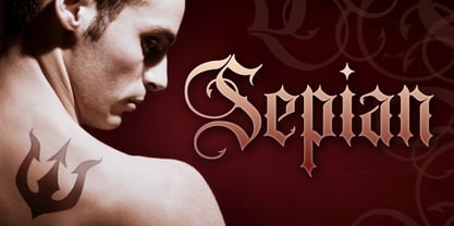
- Sepian by Laura Worthington,
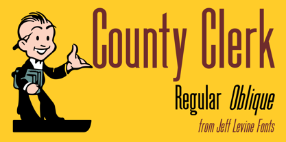
$19.00 - County Clerk JNL by Jeff Levine,
$29.00 - Osande by XdCreative,
$20.00Osande is a modern sans serif font with neo-Grotesque touch, more homogenous forms with minimal stroke contrast. Osande the font family contains 3 basic forms: italics, obliques, and upright. Each of which has 7 different weights ( Thin, Extra Light, Light, Regular, Medium, Semibold, and Bold ). Osande can easily be matched to an incredibly large set of projects, so add it to your creative ideas and notice how it makes them stand out! Thank you. - Augsburg Initials by Kaer,
$18.00Hey! I'm happy to introduce to you my new initial's set. These drop caps I found in the "Introductorium in astronomiam" manuscript. It was printed in Augsburg in 1489 by Erhard Ratdolt. I've added some lost letters and assembled a full alphabet. Augsburg is a medieval gothic style font. Set of dim colored and monochrome grunge style emblems. Engraved initial drop caps. Perfect for vintage premium identity, Middle Ages posters, luxury packaging. If you want dark and strong medieval style concepts, please try it. --- *You can use color fonts in PS since CC 2017, AI since CC 2018, ID since CC 2019, macOS 10.14 Mojave* *Please note that the Canva & Corel doesn't support color fonts!* --- Please feel free to request any help you need: kaer.pro@gmail.com Best, Roman. Thank you! - Media Gothic is a contemporary font that embodies a sleek and modern aesthetic, drawing inspiration from the principles of geometric design and minimalist styles. It falls within the category of sans...
- ALS Zwoelf by Art. Lebedev Studio,
$63.00The design of Zwoelf stems from a letter created by Oleg Pashchenko for the poetry book called “They Talk.” Modified in several ways, the lettering gained readability and a more neutral look. This typeface combines Modern and Gothic styles, ugliness and beauty, the horrifying and the funny. Typographers may highlight any of this. Zwoelf features elements that can be found in both Roman and Gothic styles, but has no real historical prototype. It creates coarse body copy that feels like blackletters. The type is well-suited for use with rough line graphics. Zwoelf is a good choice for short texts, headings, witchcraft potion recipes, madrigals, spells and treasure map naming. - ITC Roswell by ITC,
$40.99Roswell was designed by Jim Parkinson, who acknowledges the 'spacey' ancestry of its name. Yes, Roswell, New Mexico. There was a big anniversary of 'the incident' in the news while I was designing in Roswell. "The incident" is of course the alleged UFO crash in Roswell. "I thought the name was acceptable as a serious font name, while, on another level, having a strangely humorous edge," says Parkinson. Roswell looks great in large sizes on a poster or in a magazine layout. It started out as "a variation on American gothic forms like Railroad Gothic", says the designer, but Roswell is an original design with eccentricities of its own." - Rama Slab by Dharma Type,
$19.99Rama Slab is an antique slab serif designed inspired by 1800s-style wood type. All glyphs have been designed carefully to be retro-looking to fill the viewer with nostalgia. This condensed font family with 18 styles is a great solution for posters, titles and anywhere you need impact. To complete your work perfectly, Gothic Extras family is ready for free. They include borders, ornaments and frames designed using vintage catalog of Hamilton in 1800s as a model. Incidentally, -r- has its alternative glyph that can be used with OpenType salt feature. Be sure to check out the sans serif style of this Rama series named Rama Gothic. - Thunder Inferno by Mans Greback,
$79.00Thunder Inferno is a gothic black metal typeface with sharp serifs. Rooted in the aesthetics of heavy metal and the occult, this typeface is a harbinger of darkness and intensity. Evocative of Halloween and gothic grandeur, Thunder Inferno also captures a march toward darkness. It serves as a rebellious voice for skate culture and alternative lifestyles. Crafted exclusively in uppercase, this font is a growl in typographic form, a visual cacophony that grabs your attention and refuses to let go. Capitalize the first and last letters of any word for symmetrical heavy metal style. Example: Heavy metaL Enclose any word in < > ( ) [ ] { } to give it wings. Example: [HawkstylE] - Bernhard Signature by Jonahfonts,
$40.00I started to work at the Bernhard Studio in 1952 to 1959 in New York. I helped with some type designs and many other projects, this two tiered signature was added on all of Bernhard’s art that was produced in the past and in his later years. In the 50’s I thought Bernhard’s Gothic face was quite a bit outdated but as you may know it has become one of todays most used faces. His signature is based on his Bernhard Gothic Font. With todays computer technology I have digitized the caps and added lower case glyphs with lower ascenders and other slight changes. - Highand by Craft Supply Co,
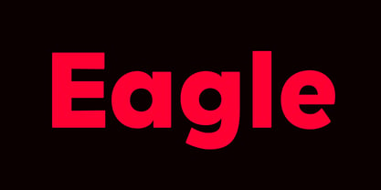
$20.00Highand – Gothic Font A Font of Horror Highand – Gothic Font encapsulates the essence of terror, designed meticulously to send spine-tingling shivers down your spine and evoke chilling emotions. Dreadful Display Furthermore, Highand’s unnerving aesthetics deliver an atmosphere of dread, creating an unforgettable and unsettling experience for your audience. It’s the perfect choice for spine-tingling displays that demand immediate attention. Terrifying Typography With every character, Highand conjures a feeling of impending doom. Its jagged edges and macabre curves create a nightmarish impression that lingers in the mind. Ideal for Horror-themed Projects Highand is tailor-made for horror-themed projects. Whether it’s for spine-chilling horror movie posters, eerie Halloween invitations, or haunting haunted house flyers, this font sets the eerie tone with sinister grace. In Conclusion Highand – Gothic Font is your sinister accomplice in design, evoking fear and suspense with every meticulously crafted letter. Embrace the darkness and plunge your audience into an abyss of fear. Make your displays truly terrifying with Highand’s chilling presence, ensuring an unforgettable and spine-tingling experience that leaves a lasting impression of horror. - Eagle by Font Bureau,
$40.00The Eagle series realizes the ideas behind Morris Fuller Benton’s famous titling face, Eagle Bold, which was drawn in 1933 for the National Recovery Administration and became the symbol of American recovery. Font Bureau’s Eagle was started in 1989 for Publish magazine. David Berlow designed a lowercase, finished the character set, and in 1990 added Eagle Book for setting text. In 1994, Jonathan Corum added Eagle Light and Eagle Black to form a full series; FB 1989–94 - LT Comical - 100% free
- FruitForEars - Unknown license
- Home Address JNL by Jeff Levine,
$29.00 - Wandering Phantom by Letterhend,
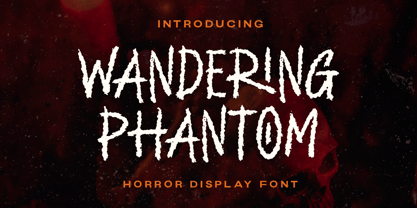
$15.00Introducing Wandering Phantom, a font that beckons you into terror and fascination collide. Whether you're evoking horror aesthetics or weaving a web of scary sophistication, Nightmare Glyph's versatility knows no bounds. Features : Uppercase & lowercase Numbers and punctuation Alternates/Ligatures Multilingual PUA encoded - Cabaret by Solotype,
$19.95We've always liked Art Gothic (you've seen it on the titles and credits for TV's Murder She Wrote) but felt it was far too animated for most uses. Here is our super-simplified version, a calmer font that will fit many display uses. - Vafthrudnir by Scriptorium,
$18.00Vafthrudnir is an original font design which draws on the tradition of Germanic uncial and early gothic calligraphy. It is designed to be extra bold and somewhat rough-hewn, for use in title design, and features variant versions of many of the characters. - Tinderbox by Device,
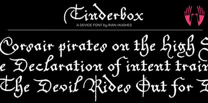
$29.0016th and 17th century formal handwriting forms the basis for Tinderbox, an antique script. Preserving the rough impression of a quill pen on parchment, Tinderbox evokes old manuscripts, ecclesiastical texts, gothic inscriptions, faded tattoos and horror literature; spooky calligraphy for the digital age. - GrottoGoth by Grey Fortress Ent,
$20.00 - Juvelith by Keristyper Studio,
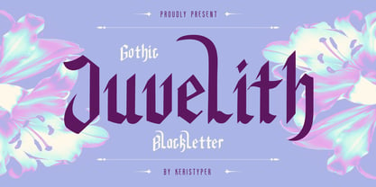
$14.00Proudly present Juvelith a modern black letter font inspired by contemporary design and calls back to Old English Gothic Scriptures. This font is good for logo design, Social media, Movie Titles, Books Titles, short text even long text letters, and good for your secondary text font with sans or serif. **Featured:** * Standard Uppercase & Lowercase * Numeral & Punctuation * Multilingual : ä ö ü Ä Ö Ü ß ¿ ¡ * Alternate & Ligature * PUA encoded We recommend programs that support the OpenType feature and the Glyphs panel such as Adobe applications or Corel Draw. so you can use all the variations of the glyphs. Hope you enjoy our fonts! - Royal Kingdom by Pixesia Studio,
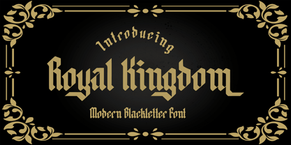
$23.00Introducing Royal Kingdom - Modern Blackletter Font Royal Kingdom is a modern blackletter font that elegantly blends contemporary design elements with the essence of Old English Gothic scriptures. Royal Kingdom is perfectly suited for branding projects, logos, social media posts, advertisements, product packaging, labels, photography, watermarks, stationery, and any creative project seeking a touch of modern blackletter elegance. FEATURES: - Stylistic Alternates - Ligatures - PUA Encoded - Uppercase and Lowercase letters - Numbering and Punctuations - Multilingual Support - Works on PC or Mac - Simple Installation - Support Adobe Illustrator, Adobe Photoshop, Adobe InDesign, also works on Microsoft Word Hope you Like it. Thanks. - Elderich by Keristyper Studio,
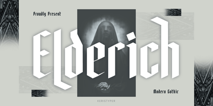
$14.00Introducing Elderich is a modern gothic typeface. Strong and geometric with a fraktur style inspired by the blackletter concept. This font is good for logo design, Social media, Movie Titles, Books Titles, short text even long text letters, and good for your secondary text font with script, sans, or serif. Featured: Standard Uppercase & Lowercase Numeral & Punctuation Multilingual : ä ö ü Ä Ö Ü ß ¿ ¡ Alternate & Ligature PUA encoded We recommend programs that support the OpenType feature and the Glyphs panel such as Adobe applications or Corel Draw. so you can use all the variations of the glyphs. Hope you enjoy our fonts! - Nightmare AOE - Unknown license
- BROKEN GHOST - Unknown license
- Asylum - Unknown license
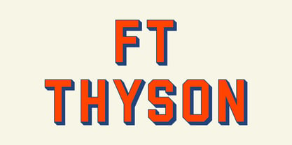
- Ft Thyson by Fateh.Lab,
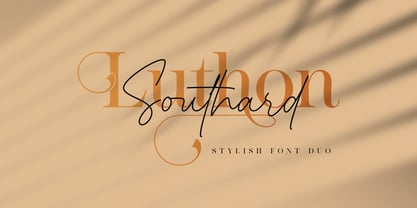
$30.00 - Luthon Southard by Lemonthe,
$14.00 - FF Good by FontFont,
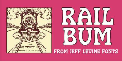
$72.99FF Good is a straight-sided sans serif in the American Gothic tradition, designed by Warsaw-based Łukasz Dziedzic. Despite having something of an “old-fashioned” heritage, FF Good feels new. Many customers agree: the sturdy, legible forms of FF Good have been put to good use in the Polish-language magazine ‘Komputer Swiat,’ the German and Russian edition of the celebrity tabloid OK!, and the new corporate design for the Associated Press. Although initially released as a family of modest size, the typeface was fully overhauled in 2010, increasing it from nine styles to 30 styles, with an additional 30-style sibling for larger sizes, FF Good Headline. In 2014, the type system underwent additional expansion to become FontFont’s largest family ever with an incredible 196 total styles. This includes seven weights ranging from Light to Ultra, and an astonishing seven widths from Compressed to Extended for both FF Good and FF Good Headline, all with companion italics and small caps in both roman and italic. With its subtle weight and width graduation, it is the perfect companion for interface, editorial, and web designers. This allows the typographer to pick the style best suited to their layout. As a contemporary competitor to classic American Gothic style typefaces—like Franklin Gothic, News Gothic, or Trade Gothic—it was necessary that an expanded FF Good also offers customers both Text and Display versions. The base FF Good fonts are mastered for text use, while FF Good Headline aims for maximum compactness. Its low cap height together with trimmed ascenders and descenders give punch to headlines and larger-sized copy in publications such as newspapers, magazines, and blogs. There is even more good news about FF Good: it has something of a serif companion. Łukasz Dziedzic built FF Good to work together with FF More, creating in a powerhouse superfamily that is versatile in both its function and aesthetic. - Rail Bum JNL by Jeff Levine,
$29.00Morris Fuller Benton's Hobo [designed in 1910] is one of a number of fonts which have been so over-used that many designers shy away from it altogether. However, Jeff Levine had often wondered what the design might look like it given a serif treatment. The result is Rail Bum JNL, named for the hobos and transients who hitched along on freight cars to ride the rails across the country during the years when trains were the mainstay of American transportation. - Pettiford JNL by Jeff Levine,
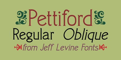
$29.00 - Bertolessi by Greater Albion Typefounders,
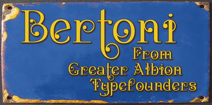
$12.50 - Excelsis by Solotype,
$19.95This font began life as a metal type called Duerer, from the Boston Type Foundry about 1890. A wood type maker copied it, and that's where we got it (in Guadalajara, Mexico, already! Some people travel to see the sights; we travel to collect type.) - Old Bikers by Fractal Font Factory,
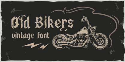
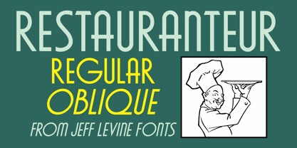
$8.00 - Restauranteur JNL by Jeff Levine,
$29.00 - Omerta by Anomali Creative,
$15.00Omerta Blackletter Font Blackletter fonts have letters that are very bold and ornate. It is a Western calligraphy style that was used in Europe from 1100s to the 1600s. Blackletter is also known as Old English or Gothic script. During the 20th century, blackletter type styles were adopted by new audiences and came to be associated with punk, street art, and heavy metal. Omerta Blackletter Font Specifically developed to be suitable for perfect for tattoos clothing, labels and packaging, branding, or any Gothic-themed projects. Omerta Blackletter Font are great for Classic Calligraphic type projects and convey a sense of what’s to come. This font can be used with all software that can read standard fonts. - TT - Unknown license
- TonleSab - Unknown license
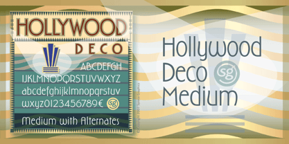
- Hollywood Deco SG by Spiece Graphics,
$39.00This is yet another Willard T. Sniffin deco-inspired original. Created for the American Type Foundry, Hollywood Deco remains a classic that is still as contemporary today as when it first appeared in 1932. Use this novelty gothic typeface on announcements and stationery. It is also well-suited for many advertising situations where a stylish retro look is desired. A useful set of alternate characters (including the illustrious “Overlapping O's”) is included with this version. Hollywood Deco Medium with Alternates is also available as an OpenType font. This version now contains small caps, lining and oldstyle figures, prebuilt fractions, stylistic alternates, word buttons and a wide assortment of f-ligatures. These advanced features currently work in Adobe Creative Suite InDesign, Creative Suite Illustrator, and Quark XPress 7. Check for OpenType advanced feature support in other applications as it gradually becomes available with upgrades. - Arkais by Logitype,
$25.00Introducing Arkais, a glyphic serif typeface inspired by the rhythmic construction of Gothic architecture. This unique typeface is characterized by slightly broken shoulder and bowl shapes, offering a fresh and classic feel. With contrasting brackets, consistent barb, and beak shapes, Arkais brings a touch of elegance to any project. Arkais features five weight variants—light, regular, medium, bold, and extra—as well as three width options: condensed, normal, and expanded. Each font family also includes italic styles, providing even greater versatility. Equipped with OpenType features, Arkais offers multiple character alternatives, ligatures, small caps, and more, ensuring a tailored look for your designs. Designed as an alternative to current trends, Arkais is perfect for creating strong headers or captivating display text. The typeface supports over 500 basic Latin glyphs, making it suitable for a wide range of projects.
