10,000 search results
(0.04 seconds)
- GingkoFraktur - Unknown license
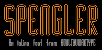
- SPENGLER by AdultHumanMale,
$10.00 - X Ruffian by ThoroughBR&,
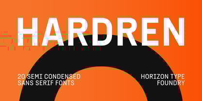
$9.00 - Hardren by Horizon Type,
$40.00 - IRON MATHBOOK - Personal use only
- Skizzed DSG - Unknown license
- rhino dino - Unknown license
- Ian Jude - Unknown license
- Osselets - Unknown license
- Coulures - Unknown license
- Tingle Institute - Unknown license
- Honey Bunches - Unknown license
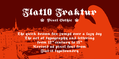
- Flat10 Fraktur by Dharma Type,
$14.99 - Outgribe NF by Nick's Fonts,
$10.00 - Quasari - Personal use only
- rayando - Unknown license
- Mucha - Personal use only
- GF Halda Normal - Unknown license
- GF Halda Smashed - Unknown license
- DisorderedBold - Unknown license
- Vasilisa Demo - Unknown license
- Malagua Demo - Unknown license
- Latinia - 100% free
- ACTlove - Unknown license
- SteinAntik - 100% free
- Pi in the SciFi - Unknown license
- IngoFont1 - Personal use only
- OldTypefaces - 100% free
- IngoFontduenn - Personal use only
- Preciosa - Unknown license
- WizardSpeak - Personal use only
- Amigo by Monotype,
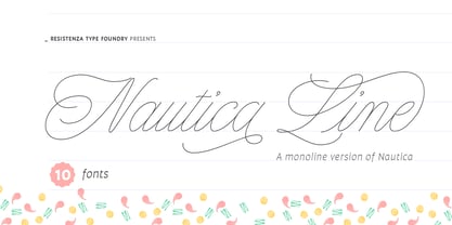
$29.00 - Nautica Line by Resistenza,
$39.00 - Davison Spencerian by House Industries,
$33.00 - Neues Bauen - Unknown license
- Mr & Mrs Konky by Rocket Type,
$12.00 - DS Diploma - Unknown license
- Sumdumgoi - Unknown license
- elaine - Unknown license
- MARSHOSBN - Unknown license


