3,630 search results
(0.021 seconds)
- Hiruko Pro by Thinkdust,
$10.00 Charming and friendly, Hiruko Pro is a modern and legible font cleverly combining smooth lines and playful curves. It’s a complete revamp of the original 2008 Hiruko family. With its softened edges, it emits a family friendly, kids welcome vibe and is easily legible in any situation. With a full family of 21 weights, varying from bold and attention-grabbing, to slick and smart outlines, to extra light and delicate, Hiruko Pro has a tonne of applications, and we still come across new ones.
 - Pancetta Pro by Mint Type,
$- Pancetta Pro is a squarish sans-serif typeface with semi-closed aperture and pillow-shaped terminals. The shape of a pillow is furthermore used to enliven the boring horizontal stems which are very frequent in Cyrillic script, and get rid of the right angles. Also take a look at Pancetta Pro's serif companion – Pancetta Serif Pro
 - Regalo Pro by Jonahfonts,
$39.00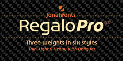
- Insurgent Pro by The Type Fetish,
$25.00 Destroy, destroy, destroy. Insurgent was expanded to include extended Latin, extended Cyrillic and Greek alphabets so it will work with most languages in Europe and the Americas.
 - Organica Pro by Sudtipos,
$39.00 Just as most buildings are based on a structure of vertical columns, horizontal floors, square angles and the occasional arch, most Latin typefaces are designed within a largely uniform, static, alphabetic structure that provides a framework for playing with the style of the terminals —serif, sans-serif, slab-serif, flared, Tuscan— without significantly modifying the deep anatomy of the letters. Orgánica Pro, by contrast, proposes a different structure: curvilinear, subtle and sophisticated, beyond the typical «sticks and balls» model. Organic anatomy, in one word; deliberately dynamic and asymmetrical. Over this radically distinct structure, terminals play a characteristic, expressive role that challenges easy classifications: Is this a serif or a sans font? A semi-serif? A semi-sans? For text or display? Modern or ultra-modern? Joke or serious? All answers are valid. Anyway, its six stylistic variants allow for multiple, diverse uses in text setting, headings and logotypes. In spite of —or perhaps thanks to— its innovative, uncommon structure, Orgánica’s personality is sweet to the eyes, wittily elegant and surprisingly legible.
 - Coliseum Pro by Red Rooster Collection,
$60.00 Coliseum Pro is a five-weight compressed spur serif font family. ITF’s original Coliseum family, released in 1992, was designed by Julie Hopwood and Pat Hickson. Steve Jackaman completely redesigned, redrew, and improved the Coliseum family over a two-year period, and two additional lighter weights have emerged: Light and Book. Coliseum Pro is inspired by Roman display typefaces, and is powerful and eye-catching at any size. Two sister typefaces, Clydesdale and Torpedo, were born from Coliseum’s redesign.
 - Contact Pro by RMU,
$35.00 Based on the letterforms of Matheis' Contact, this font was completely redrawn, digitized and extended to include Central European glyphs.
 - Xtencil Pro by John Moore Type Foundry,
$25.00 Xtencil is a typeface inspired by the shapes of the drawing templates letters, based on the letter forms of Photo-lettering Glaser Stencil from universal teacher Milton Glaser who at the same time was influenced by the modernism and the Futura of Paul Renner. Xtencil is a round letter to create a great looks, ideal for posters and headlines. Xtencil not come as a drawing template, but as true Pro OpenType typography. Now in a complete family with upper and lower cases, an inline and a thickened Shadow versions to play with layers, also accompanied by a Dingbats font with fun graphics in the same spirit.
 - Elston Pro by Red Rooster Collection,
$60.00 Originally designed by Les Usherwood for a famous European car company, Elston Pro has been completely redrawn and remastered by Steve Jackaman and Ashley Muir. The new Elston Pro family has been fleshed out with a glyph set that is over 40% larger than the original Elston release, and contains all the high-end features expected in a quality OpenType Pro font.
 - Matrise Pro by CheapProFonts,
$10.00 A new font in the style of a dot matrix/needle-printer. I have used some slightly smaller dots when designing the diacritics - this makes them easier to separate from the main letters. I have also used variable letter widths (and kerning), as opposed to the technology's original monospaced design - this to make the text more readable. Matrise Pro has a more modern/streamlined design, while Matrise Text Pro features a more "oldstyle" look with spurs and notches... ALL fonts from CheapProFonts have very extensive language support: They contain some unusual diacritic letters (some of which are contained in the Latin Extended-B Unicode block) supporting: Cornish, Filipino (Tagalog), Guarani, Luxembourgian, Malagasy, Romanian, Ulithian and Welsh. They also contain all glyphs in the Latin Extended-A Unicode block (which among others cover the Central European and Baltic areas) supporting: Afrikaans, Belarusian (Lacinka), Bosnian, Catalan, Chichewa, Croatian, Czech, Dutch, Esperanto, Greenlandic, Hungarian, Kashubian, Kurdish (Kurmanji), Latvian, Lithuanian, Maltese, Maori, Polish, Saami (Inari), Saami (North), Serbian (latin), Slovak(ian), Slovene, Sorbian (Lower), Sorbian (Upper), Turkish and Turkmen. And they of course contain all the usual "western" glyphs supporting: Albanian, Basque, Breton, Chamorro, Danish, Estonian, Faroese, Finnish, French, Frisian, Galican, German, Icelandic, Indonesian, Irish (Gaelic), Italian, Northern Sotho, Norwegian, Occitan, Portuguese, Rhaeto-Romance, Sami (Lule), Sami (South), Scots (Gaelic), Spanish, Swedish, Tswana, Walloon and Yapese.
 - Avellana Pro by Sudtipos,
$39.00 When it comes to packaging or friendly logotypes, subtle designs are never enough. Avellana Pro is a bit wild but also smooth and creamy for that ultimate client seduction. From headlines to small text, the possibilities are endless with versatile new font. The majority of Latin languages are covered in this Pro version.
 - Odyssey Pro by Tim Rolands,
$29.00Odyssey Pro is an elegant and majestic face well suited for display work in books, magazines, posters, invitations, and more. Featuring an abundance of ligatures and alternates, as well as swash capitals. Its design was inspired by the letterforms of classical Roman inscriptions in stone but also strongly influenced by later calligraphic forms. The result is a chiseled authority and dignity tempered by a refined warmth and flow. - Lovers Pro by Scholtz Fonts,
$35.00 Lovers is a romantic, elegant handwritten calligraphic script, with well over 300 additional characters, including standard and discretionary ligatures, swashes and stylistic alternatives. Use of its extensive OpenType features enable the designer to create text that constantly changes, giving the impression of genuine handwriting, but handwriting that has all the flair and styling of hand-done calligraphy produced towards the end of the twentieth century. Lovers is based on traditional calligraphic ideals, but I've combined these with my own brand of relaxed, handwritten spontaneity, to design a font that is formal yet free and accidental, traditional yet contemporary. The font’s extravagant curves and swashes make it perfect for valentine’s day and wedding media, book covers, greeting cards, and certificates, in fact for any design work that requires a romantic or opulently elegant look. The range of stylistic alternatives and swashes enable users to create a wide range of moods in their work. In many ways it is a calligraphy toolkit. Lovers contains the accented characters used in the major European languages. What sets it apart from most other calligraphic fonts is that it appears so genuinely handwritten and avoids the uptight formality that characterizes so many of the fonts in this genre. Try Lovers, enjoy its wealth of OpenType features and let its vigorous yet elegant exuberance delight you and enhance your creativity!
 - Dokument Pro by Canada Type,
$29.95 Jim Rimmer aptly described his Dokument family as a sans serif in the vein of News Gothic that takes nothing from News Gothic. Building on that internal analysis, Dokument Pro is the thoroughly reworked and expanded of the original main set released in 2005, with different widths still in the pipeline. This new version updates Jim’s work to six Pro weights and their italic counterparts, each of which takes advantage of OpenType stylistic sets to introduce different degrees of graduation from gothic to humanist. Dokument Pro is now a unique text sans family, with an adaptable personality suitable for the kind of edgy, uncompromising corporate and media typography that just tells it like it is, instead of having to resort to the common contemporary luring and baiting tactics. Dokument Pro’s range of weights, styles and features (over 775 glyphs per font, built-in small caps, alternates galore, and support for over 45 Latin languages) allows for multi-application versatility and clear, precise emotional delivery. This is the kind of straight-shooter sans that should be in every designer’s toolbelt. For more details on the fonts' features, text and display specimens and print tests, consult the Dokument Pro PDF availabe in the Gallery section of this page. 20% of Dokument Pro’s revenues will be donated to the Canada Type Scholarship Fund, supporting higher typography education in Canada.
 - Chatter Pro by Jonahfonts,
$35.00 Chatter Pro is a handwritten unconnected script face in four styles: Light, Regular, Semibold and Bold with Small-Caps. Chatter Pro is a Pro-version of my previous font 'Chatter'. A free style specifically designed for Packaging but still works well for Greeting cards, Magazines, Posters and Advertising Ads. Invoking the OpenType CONTEXTUAL ALTERNATIVE variant. A space after any lower-case glyph will produce the word terminal. (Opentype variants may only be accessible via Opentype-Aware applications.)
 - Quintessential Pro by Stiggy & Sands,
$29.00 Our Quintessential Pro is based on the calligraphic lettering style known as the Italic Hand. As speed became more essential in writing hands, styles became less formal and more relaxed. Classic, clean, and casual, Quintessential fits a lot of design uses - hence its name. The SmallCaps and extensive figure sets only work to further expand the usefulness of the typeface across a wider breadth of applications.
 - Artica Pro by Green Type,
$46.00 Artica is an elegant sans serif typeface, offered in five weights. It was inspired by classic Roman letterforms. Artica Pro supports Latin, Cyrillic and modern Greek scripts, and includes swash initial & final forms, stylistic alternates and ligatures.
 - Ronde Pro by RMU,
$35.00 Ronde Pro is an expressive and decorative broad-nib font for multilingual usage.
 - Amerika Pro by CheapProFonts,
$- This is the 200th font released by CheapProFonts, and again I wanted to make something special - so I have chosen to upgrade another well-known font by the infamous Fredrick "Apostrophe" Nader: Amerika! The whole character set for this stylish font has been polished for consistent baseline placement and serif thickness, and proper overshoots has been implemented. All the alternate letterforms (and some new ones) have been included as OpenType alternates AND they have now been made available with accents, too! The Greek and Cyrillic letterforms are properly encoded and kerned. I hope many will enjoy the improvements - and naturally: it is still free! ALL fonts from CheapProFonts have very extensive language support: They contain some unusual diacritic letters (some of which are contained in the Latin Extended-B Unicode block) supporting: Cornish, Filipino (Tagalog), Guarani, Luxembourgian, Malagasy, Romanian, Ulithian and Welsh. They also contain all glyphs in the Latin Extended-A Unicode block (which among others cover the Central European and Baltic areas) supporting: Afrikaans, Belarusian (Lacinka), Bosnian, Catalan, Chichewa, Croatian, Czech, Dutch, Esperanto, Greenlandic, Hungarian, Kashubian, Kurdish (Kurmanji), Latvian, Lithuanian, Maltese, Maori, Polish, Saami (Inari), Saami (North), Serbian (latin), Slovak(ian), Slovene, Sorbian (Lower), Sorbian (Upper), Turkish and Turkmen. And they of course contain all the usual "western" glyphs supporting: Albanian, Basque, Breton, Chamorro, Danish, Estonian, Faroese, Finnish, French, Frisian, Galican, German, Icelandic, Indonesian, Irish (Gaelic), Italian, Northern Sotho, Norwegian, Occitan, Portuguese, Rhaeto-Romance, Sami (Lule), Sami (South), Scots (Gaelic), Spanish, Swedish, Tswana, Walloon and Yapese.
 - Fakir Pro by Underware,
$50.00 Fakir | A Hindu ascetic or religious mendicant, especially one who performs feats of magic or endurance. The well known feats performed by them include sitting steadily on a bed of nails and walking on burning coals. Blackletter | A script used throughout Western Europe from approximately 1150 to 1500. It continued to be used for the German language until the 20th century. Fakir, a blackletter with a holy kiss is a contemporary interpretation of gone letterforms with origin in blackletters. More precisely, we based the construction on broadnip textura, with lots of broken, edgy, interrupted strokes – try to sit on a nail bed and you’ll know why fakirs like to read just these kind of fonts! After being abandoned for some time (not accepted, nearly forbidden), we would like to give our generation a blackletter from here and now. So Fakir is not a revival, but an all new 21st-century blackletter. Fakir is a set of edgy text and display fonts, ranging from tight and heavy to light and wide. It has 11 fonts, all supporting Underware Latin Plus character set, that covers 219 languages.
 - Horse Pro by Studio Fat Cat,
$14.00 Horse Pro is another popular sans-serif typeface. Horse Pro was designed by Atok Khoirudin and released through the Studio Fat Cat Type foundry. It is characterized by its bold and uppercase letters, giving it a strong and impactful appearance. Horse Pro is perfectly used in various design contexts, such as headlines, posters, logos, and banners, where a bold and modern look is desired. The font family includes different weights and styles, allowing for flexibility in design projects and have become go-to choices for many designers looking for a bold and stylish sans-serif font for their projects.
 - Romantica Pro by Cruz Fonts,
$38.00 - Harfang Pro by PSY/OPS,
$45.00 My goal for Harfang was to create a serif typeface that would be easy to read at text sizes, while having a strong personality at larger sizes. The initial design had a purely rounded style, but with each development pass I introduced some angularity. The final result is a typeface that is easy to read in long texts, advertising copy, annual reports and the like; but one that also provides a crisp and stylish appeal in more prominent display settings. I choose the name Harfang (Harfang des neiges — Snowy Owl or Great White Owl) because after my first typeface, Migration, I wanted something with a thematic relation. On a more personal level, Harfang is the official bird of Québec, a province with a long winter and a wonderful, white landscape, and the place I call home. —André Simard
 - Anglecia Pro by Mint Type,
$- Anglecia Pro is an exquisite and versatile system of three transitional serif typefaces designed to work together in editorial design. Sharing the same skeleton, vertical axis, and trapezoidal uncurved serifs, each of these faces bears different key dimensions and different contrast typical for three different type epochs. Anglecia Pro Text is a typeface designed for general typesetting in average reading sizes. Although it features a vertical axis, its soft skeleton, relatively small x-height and prominent ascenders and descenders give the typesetting a traditional warm texture with a slight contemporary touch. Anglecia Pro Title incorporates proportions of familiar transitional serif typefaces but exposes higher-than-average vertical contrast which makes it useful for setting captions, pull quotes or general purpose text in sizes of 12 pt and above. Anglecia Pro Display, still having non-rectangular serifs and the same soft skeleton as the rest of Anglecia Pro system, features extreme contrast, much thinner serifs and exaggerated ball terminals typical for Didone modern serif families. Its large x-height and tighter letter spacing suggests larger text sizes e.g. in decorative headlines, extra large pull quotes or logos. Altogether these three typefaces form 36 styles – each supporting numerous Latin-based languages as well as major Cyrillic languages. In roman styles the Cyrillic script comes in two flavours accessible via OpenType alternates – to choose either more traditional and curvy (default) or more formal and rigid type texture. In italics this feature affects uppercase and small caps. Also, each style is packed with OpenType features: ligatures, small caps, six sets of digits, superiors and inferiors, fractions, ordinals, and respective punctuation varieties including all-cap punctuation. There are also language-specific alternates for Polish kreska, Romanian Ș/ș, Catalan punt volat, and correct small-cap versions for Turkish/Azerbaijani i/ı. Some of the styles of Anglecia Pro can be found in Mint Type Editorial Bundle together with other fonts which make some great pairs. Check it out!
 - Fascinate Pro by Stiggy & Sands,
$29.00 A soft Art Deco inspired typestyle with panache The Fascinate Pro Family, which includes both Regular & Inline styles, began as a nod to Art Deco yesteryear and typefaces like Broadway, yet they have an exaggerated x-height and softness that give them a friendly yet sophisticated vibe. Even with their high contrast weighting, the Fascinate Pro family is cleanly legible at small sizes, while the Inline style is better visible at larger display sizes. See the 5th and 6th graphics for a comprehensive character map preview. OpenType features include: - Full set of Inferiors and Superiors for limitless fractions. - SmallCaps feature. - Oldstyle (default) and Standard Tabular figure sets. - A small collection of Standard Ligatures. - A Stylistic Alternates feature for an alternate lowercase i and j style. Approx. 581 Character Glyph Set: each style of Fascinate Pro comes with a glyph set that includes standard & punctuation, international language support, and additional features.
 - Clarence Pro by RodrigoTypo,
$29.00 Clarence pro, is a version with many alternatives such as ligatures and alternatives in letters, it also contains the Greek and Cyrillic alphabet, especially for children and teenagers!
 - Manutius Pro by RMU,
$35.00 A pleasant looking slab serif font family which was originally released by the Wagner foundry as hot-metal fonts. These fonts avoid the appearance of being constructed, and this is underlined by the beautiful swash caps in the Italic style.
 - Amplia Pro by Jonahfonts,
$45.00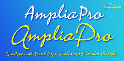
- Rocklidge Pro by Red Rooster Collection,
$60.00 Steve Jackaman & Ashley Muir. This design was inspired by the 1965 VGC typeface, Jana by Richard D. Juenger. Rocklidge contains all the high-end features expected in a quality OpenType Pro font.
 - Ascent Pro by Fontop,
$17.00 Ascent Pro – a modern geometric sans serif with an engaging character. Inviting and versatile, with ton of stylistic alternates and ligatures to choose AscentPro works perfectly for logos, headlines, posters, packaging, business cards and many more! Thinner fonts look great in text copy. All in all 18 fonts including obliques provide you with a huge number of design options. HOW TO ACCESS ALTERNATE CHARACTERS Open glyphs panel: In Adobe Photoshop go to Window - glyphs In Adobe Illustrator go to Type – Glyphs / or Window – Type - OpenType FEATURES: 18 weights and obliques Stylistic Alternates & Contextual Alternates Standard Ligatures & Discretionary Ligatures Numerals & Punctuation Fractions, Superscript & Subscript Multiple Latin Languages Supported
 - Sporty Pro by Sudtipos,
$39.00 We love sports – like billions of fans all over the world – but in Argentina, we really love fútbol (soccer). Fútbol is part of our culture: it makes our hearts’ race and our pulses quicken, it inspires screams of joy and screams of anguish, and it has been the cause of more than a few heated conversations amongst friends. So you can imagine our delight when, in recent years, a local team’s fútbol jersey used a Sudtipos font; it got us thinking about designing a font that explicitly had sports in mind yet still had the versatility to work for other types of projects. Sporty has a geometric and modular structure with many potential applications that far exceed jerseys, score boards and stadium wayfinding. Its flexibility is evident when examining its four style – from a square style to a rounded one – as well as the Shadow and Inline options. Each of the styles also comes with a set of miscellaneous shapes including modular banners, plates and arrows. Sporty comes in 3 widths – Condensed, Regular and Expanded – and 7 weights that equate to a total of 39 fonts.
 - Relish Pro by Red Rooster Collection,
$60.00 Relish is a more traditional sans serif version of our Guildford typeface, with round punctuation. Relish contains all the high-end features expected in a quality OpenType Pro font.
 - Vaughan Pro by Factory738,
$15.00 Vaughan is a contemporary and minimalist sans serif font family. The different weights offer a variety of options to help you find the best typographic color for your project. This is an unrivaled sans serif for varying your headlines, branding visual identity, poster, logo, magazines, and so on. 5 Weights (Light, Regular, Semibold, Bold, Black) 4 Styles (Regular, Oblique, Italic, All Caps) Basic Latin A-Z and a-z Numbers & Punctuation Ligatures Multilingual Support for ä ö ü Ä Ö Ü ... Free updates and feature additions Thanks for looking, and I hope you enjoy it.
 - Cyceon Pro by DBSV,
$90.00 Fluted pillars… As for the name of "Cyceon", it is a "juice-drink" that they made in ancient Greece...! In this font the straight lines are not vertical but inclined like something from the Doric columns!!! There are two versions of letters. In the first version, it is of a normal character, while in the second version I have mixed some capitals with lower case letters. I have given them the acronym Msc "miscellaneous". I tried in this way to give another version of the small capitals and I think they show a different view from the purely small capitals… And in this family, the “Strap”/“Strap Msc”/“StrapIt”/ and “Strap MscIt” with “Solid”/“Solid Msc”/“SolidIt”/ and “Solid MscIt” engage in the same way like… “Layered font families” as the previous series. This series is composed and includes twenty-four fonts with 642-658 glyphs each, with true italics and supports Latin, Greek and Cyrillic.
 - Paradigm Pro by Shinntype,
$59.00 Originally released in 1995 as a three font family, Paradigm forcefully addressed the emaciating effect that digitization was then exerting upon traditional serifed typography. Investigating the new media of a much previous era, Nick Shinn deconstructed the first roman type, designed by Sweynheym and Pannartz in 1467, and gleaned, from its minuscules, the low contrast and discreet serif treatment (portrayed by a novel convex effect), which he subsequently applied to both capitals and lower case of a classically proportioned Venetian invention. In 2008 the glyphs, metrics and hinting of the 1995 fonts were refined, Extra Bold and Light weights added, a full range of OpenType features instituted, and the number of characters per style increased almost threefold. A major upgrade to a unique typeface.
 - Niobium Pro by CheapProFonts,
$10.00 This font has been used for signage and wayfinding in the new Mbombela Stadium built for the FIFA World Cup 2010 - and it looks strangely appropriate there: the font has a certain hand-painted, relaxed charm so fitting of the south African culture. Interesting and bold choice of the architects. :) Anyway, the font has now been updated with our usual multilingual glyphset, and is ready to use around the world by soccer fans and typo fans alike. ALL fonts from CheapProFonts have very extensive language support: They contain some unusual diacritic letters (some of which are contained in the Latin Extended-B Unicode block) supporting: Cornish, Filipino (Tagalog), Guarani, Luxembourgian, Malagasy, Romanian, Ulithian and Welsh. They also contain all glyphs in the Latin Extended-A Unicode block (which among others cover the Central European and Baltic areas) supporting: Afrikaans, Belarusian (Lacinka), Bosnian, Catalan, Chichewa, Croatian, Czech, Dutch, Esperanto, Greenlandic, Hungarian, Kashubian, Kurdish (Kurmanji), Latvian, Lithuanian, Maltese, Maori, Polish, Saami (Inari), Saami (North), Serbian (latin), Slovak(ian), Slovene, Sorbian (Lower), Sorbian (Upper), Turkish and Turkmen. And they of course contain all the usual "western" glyphs supporting: Albanian, Basque, Breton, Chamorro, Danish, Estonian, Faroese, Finnish, French, Frisian, Galican, German, Icelandic, Indonesian, Irish (Gaelic), Italian, Northern Sotho, Norwegian, Occitan, Portuguese, Rhaeto-Romance, Sami (Lule), Sami (South), Scots (Gaelic), Spanish, Swedish, Tswana, Walloon and Yapese.
 - Majora Pro by Latinotype,
$29.00 Majora Pro is a slab serif typeface which derives its name from a Portuguese historical toy manufacturer. The font comes in 8 styles, ranging from a delicate Thin to a robust Black, with matching italics and an upright version of stencil fonts, resulting in a total of 24 weights. Majora Pro is well-suited to a wide range of design projects which include packaging, editorial design, screen use, etc. Its humanistic features and moderate contrast between thick and thin strokes make it also suitable for long block of texts while having a high degree of legibility. The font includes a set of alternate glyphs which help give your compositions a different and unique look. The Stencil version was specially designed for use in signage, packaging, titles and headings. Majora Pro contains an extensive set of 750 characters (including small caps, different figure styles, etc.) that support over 200 Latin-based languages. Majora is the previous version of Majora Pro.
 - Fragment Pro by (v) design,
$49.00 Fragment Pro is a part of a larger OpenType font family (see also Fragment Pro Inline). It is an elegant, soft and decorative typeface built on classical proportions. Its outlines have been carefuly crafted with a high attention to detail, so it could be used even at very large sizes. Fragment Pro is derived from the separately sold layered Fragment Pro Inline, however it has been significantly optimized for standalone use. Fragment has been conceived to be used as a display typeface in publications, titles, logotypes etc., but it is surprisingly legible even in smaller print sizes. Thanks to its strictly onefold oulines, Fragment can be also used as a stencil typeface. Fragment supports many OpenType features and offers great multilingual support for most of the Latin-based languages. Feel free to download the detailed PDF Specimen.
 - Everest Pro by NicolassFonts,
$25.00 The complete family contains 24 weights, 1568 glyphs in each font, and supports OpenType features. RAlt sub-family has rounded corners. Everest Pro family is ideally suited for advertising, packaging, brand identity, books, magazines, logotype, software, sports as well as web and screen design. Everest Pro OpenType features list: zero, ordn, case, locl, c2sc, smcp, frac, subs, sinf, tnum, sups, numr, dnom, dnom, onum, lnum, pnum, ss01, ss02, ss03, ss04, ss05, ss06, ss07, ss08, ss09, dlig, liga, salt, hist
 - Cita Pro by XdCreative,
$29.00 About Cita Pro Hi there please say hello to "Cita Pro" the latest collection from @faldykudo, Cita Pro is a serif typeface with a taste of old style, its very beautiful with a timeless aesthetic and has a very wide range for various design situations. Cita Pro is perfect for both display and body text because it has a very good readability. Cita Pro has 14 style and 7 weights, - from Thin to Bold and Matching calligraphic italic. Cita Pro also has special alternate characters in complete uppercase from A-Z . it is to give a different look for your display design. thanks, hope you would like and accept "Cita Pro" as part of your family. thank you in advance