10,000 search results
(0.062 seconds)
- Rambat Campotype - Personal use only
- LT Sonoma - 100% free
- LT Renovate - 100% free
- LT Makeup - 100% free
- LT Superior - 100% free
- LT Superior Serif - 100% free
- LT Beverage - 100% free
- LT Wave - 100% free
- LT Stopwatch - 100% free
- Monotage by Fargun Studio,
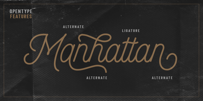
$14.00Monotage a modern combination Monoline Script and Sans. Monotage Font Duo, a classy, contemporary pair of Monoline Script and Sans. With a stylish didot-style Sans font and a free-flowing, expressive script companion, Silver South offers beautiful typographic harmony for a diversity of design projects, including logos & branding, wedding designs, social media posts, advertisements & product designs. Monotage Script • A clean, free-flowing script font containing upper & lowercase characters, numerals and a large range of punctuation. Monotage Sans • A classy Sans font containing uppercase characters, numerals and a large range of punctuation. Creates a perfect pairing contrast with Monotage Script fonts. Monotage Script Ligatures & Alternates • Monotage Monoline Script also includes 5 character ligatures and 130 alternates. To enable the OpenType Stylistic alternates, you need a program that supports OpenType features such as Adobe Illustrator CS, Adobe Indesign & CorelDraw X6-X7. There are additional ways to access alternates, using Character Map (Windows), Nexus Font (Windows), Font Book (Mac) or a software program such as PopChar (for Windows and Mac). - Birtgoche by Ilhamtaro,
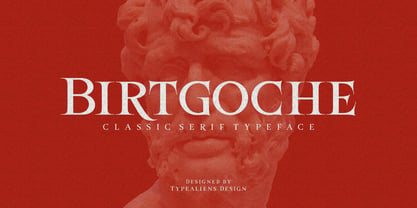
$14.00BIRTGOCHE is a serif font with long, thin hooks, it's beautiful because it's quite formal and manly. Attractive fonts to support elegant art designs. A fairly standard serif font because there are not many changes from the basics of the previous serif fonts, only the modifications to the hooks are not too significant and some letters have their body part below the baseline. For media, it will also be very suitable for the headline of a magazine or poster because this font has a strong character supported by this font, which is an all caps font. To enable the OpenType Stylistic alternates, you need a program that supports OpenType features such as Adobe Illustrator CS, Adobe Indesign & CorelDraw X6-X7. Cheers! - Filogofil by Muksal Creatives,
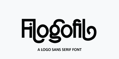
$12.00Filogofil is a sophisticated type of sans serif logo font. Inspired by a mix of logos and philosophies, a solid, uncompromising style can be felt through controlled letterforms and a modern twist. A balance of hard lines and smooth curves.Filogofil are perfect for logo projects and great for any design project - Fantastique by Hanoded,
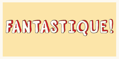
$15.00Fantastique is a bit of a sloppy 3D font: the outline is wobbly and the glyphs are uneven. Because of its imperfectness, it is ideal to create posters, advertisements and the like, because sloppy as it may be, Fantastique will catch your eye! C'est Fantastique! Comes with extensive language support. - Amtera by Prioritype,
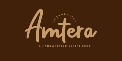
$15.00Handwritten font with an elegant and minimalist impression are ready to accompany your project. Can be applied to business cards, social media posts, branding, wedding invitations, logos, photographer watermarks, food packaging, beauty products, crafts and many more. See some examples the preview above for reference. Features: -Uppercase -Lowercase -Numeral -Punctuation -Multilingual - PR Swirlies 02 by PR Fonts,
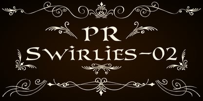
$10.20This font is a collection of calligraphic ornaments suitable for invitations, gift tags,etc. These designs are assembled from hand drawn elements, and mirrored elements have been modified slightly, to increase the hand-drawn appearance. They would also be right at home framing the dialogue screens of a silent film. - Wofferine by Sipanji21,
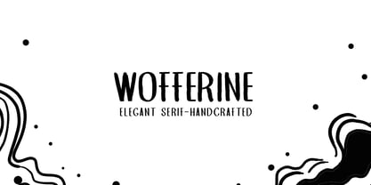
$8.00Wofferine is a Serif Handwritten Font with Playfull touch. it offers support of English Language. Standard punctuation glyphs are included and multilingual support also. Great for crafters and graphics artist alike. Compatible with all opration system. its playfulness make it great for creative projects, be inspirational wall posters, logo, brand etc. - Embryo Open by HVD Fonts,
$30.00Embryo Open is the companion of the Embryo Typeface. In contrast to its forerunner it is equipped with counters. These superheavy sweet fonts are perfect for logos, posters or flyers and can be used nicely together. Embryo Open has an extended character set to support Central and Eastern European languages. - Blattwerk by Volcano Type,
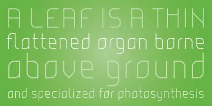
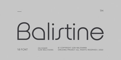
$39.00The shapes of "Blattwerk" (german for leafage) are based on an abstract leaf. The geometrical sans serif font has several standard and decorative ligatures and will work best as a display typeface for logos, headlines and short texts. The individual letters can also be used to form symbols or patterns. - Balistine by Owl king project,
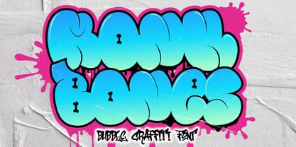
$39.00 - Monk Bones by Sipanji21,
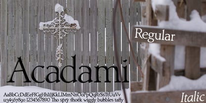
$15.00Monk Bones is a decorative font with a graffiti style and bubble looks there are bones hollow in the characters. It will elevate a wide range of design projects to the highest level, be it branding, headings, wedding designs, invitations, signatures, logotype, wall art illustration, apparel, labels, and much more! - Acadami by Hackberry Font Foundry,
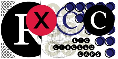
$24.95 - LTC Circled Caps by Lanston Type Co.,
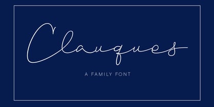
$24.95This handy font allows designers of commercial products to add basic circled letters that are uniform in appearance. For example, on music CDs, the Copyright and Publish (AKA Phonogram) symbols often do not match. While most fonts include a circled 'c' for Copyright, they seldom contain a circle 'p' for Publish (note that all P22 fonts include the circle 'p' and 'c'). The circle 'U' and 'K' for Kosher foods are rarely included in fonts and have to be made as needed. This single font contains both a serif and sans serif style caps A-Z as well as figures assigned to regular keys and also mapped to standard Unicode for "Enclosed Alphanumerics". - Clauques by Eurotypo,
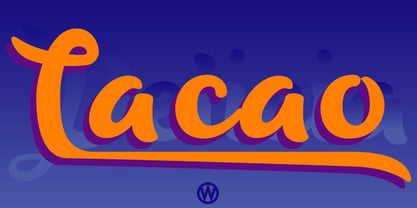
$24.00Clauques Family includes four fonts and, in addition, a very useful extra elements. Clauques Script and Clauques Script Light are elegant and youthful fonts with many stylistic variations, swashes and ligatures. Clauques Sans and Clauques Sans Light add a little seriousness. Both are designed to be combined but they also work great on their own. Clauques Ornaments has a lot of beautiful ornaments that work very well with the two styles of fonts. With all this, Clauques Family Font will allow you to create elegant works. This family font is the great choice for any project from logos, magazines and book covers, children’s material, fashion, headlines, cards, posters, websites, packaging and, basically, anywhere you want. - Delicia Pro by Wiescher Design,
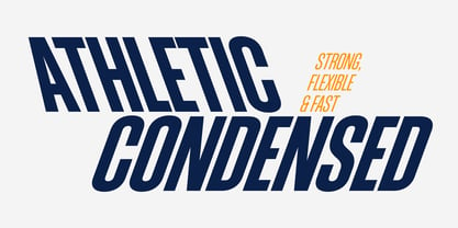
$69.50Delicia Pro Script is a versatile fat script designed with delicatessen shops in mind, it has lots of variations. There are for example seven different versions for the uppercase letters that can be accessed with opentype savy software. different ampersands, @-signs, Th combinations, lots of different lowercase letters and so on. The font can be used in all of Europe, Turkey and the Baltic countries (sorry no Greek and Cyrillic). Yours very versatile Gert Wiescher - Athletic Condensed by Mandarin,
$19.00Athletic Condensed was designed to be a must have for any kind of projects. Bold and elegant at the same time, both the regular and slanted styles are super versatile and can be used to dictate a strong message, headlines or just setting casual text. Practical and simple, this font is a classic that will not let you down, as it does an excellent job either as the main character or supporting role. - Chrysa by Christie,
$10.00Chrysa can be used to give a handwritten and child-friendly style in a funky way. - What was the inspiration for designing the font? My everyday need to use a typeface that looks handwritten but is also readable, charming and easy to use. - What are its main characteristics and features? Freedom, sketchiness and readability at the same time. - Usage recommendations It can be used in communication materials where the copy needs to look handwritten. - ITC Schuss Hand by ITC,
$29.99Designed by German graphic designer Jochen Schuss. ITC Schuss Hand and ITC Schuss Hand Bold can probably best be described as excellent all around scripts useful for a broad spectrum of advertising purposes as well as for those applications that benefit from a refined handwritten appearance. The characters themselves have a soft, almost “liquid” appearance which is enhanced by the subtle swelling at most of the stroke terminals. The slightly condensed nature of the characters plus a relatively large x-height ensures that both weights are ideal for the advertising arena. An additional feature on ITC Schuss Hand and ITC Schuss Hand Bold are the capital letters which can actually be used on their own in word settings whereas most script capitals are designed just for initialing purposes. The designer has also invested a good deal of careful thought to the way in which a high percentage of the lowercase letter combinations overlap to create an authentic hand-scripted appearance. This, together with the italicized letter forms, will make Schuss Hand and Schuss Hand Bold ideal candidates for those occasions when paper correspondence requires an informal style. So, as is claimed, an excellent all around script style. - Adieu Mon Ami by Hanoded,
$15.00No, I am not leaving and none of my friends or relatives have packed up and left. I needed a more ‘letter-like’ name for this font and I found Adieu Mon Ami (farewell, my friend in French). Adieu Mon Ami is a handmade pencil font that will add that extra ‘je ne sais quoi’ to your designs. It comes with joie de vivre, un petit peu de vilain, but can be doux comme de la soie as well. Bonne chance! - Letterhack Sans by Comicraft,
$19.00IT’S MAILBAG TIME! Dear Jolly JG Roshell and Rascally Richard Starkings, Comicraft Fonts are a thing of Beauty and a Joy Forever! You guys must be a Wild Bunch, and I roar with delight whenever a new comicbookfonts release appears in my emailbox. But I have to level with you daredevils...what about us Letterhacks? We need representation too! We haven’t spent years hammering away on our typewriters to be ignored! BRING BACK THE LETTER HACK! In fearless font form. You know it makes sense! Truly Yours, Forbush, Irving, senior. - Ruth Pro by David Engelby Foundry,
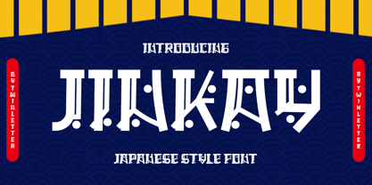
$25.00Ruth Pro is a creative work horse primarily designed to be used for typographic design of magazines, posters and books. Though roughly inspired by fonts like Mendoza and Stone Serif, it has its own distinctive look, carefully crafted following all the classic ideals of typography. If you are also looking for that special display font, you will be surprised by all the great details of Ruth Pro, including dingbats, arrows, alternative characters, special designed ligatures and small caps characters—and much more! Ruth Pro also includes a vast selection of Slavic and Scandinavian characters. - Jinkay Faux by Twinletter,
$15.00We’ve created Jinkay, a display typeface with a Japanese style that’s similar to original. Don’t be afraid to use this font in all of your special projects right now; imagine how beautiful and appealing your design will be; your project will instantly captivate all of your audience at first glance; they will easily remember the appearance of your project if you use this font, because it will be unique, different, and stand out from the crowd. Logotypes, food banners, branding, brochure, posters, movie titles, book titles, quotes, and more may all benefit from this font. Of course, using this font in your various design projects will make them excellent and outstanding; many viewers are drawn to the striking and unusual graphic display. Start utilizing this typeface in your projects to make them stand out. - Crescent by TrendGFX Design Studios,
$20.00The most sensational design of the decade is now at large. These high-definition fonts can be used for titles, banners, tattooing, logotypes and many more places. Be it domestic or industrial, formal or informal, it can be used in every field imaginable. It has a sensational, funky style and remarks the current youth's style. Such a font style has never been seen by the world, until today. These designs are 100% original and handmade. I searched a million miles but found this as the most appropriate idea for the world of font types at this time. It's the coolest, funkiest and the best font ever made. It's the era of graffiti and 3D, and we've combined both to give you CRESCENT.. So, use it, love it, buy it! - Old Standard TT - 100% free
- Justus - Unknown license
- Doriss Girls by Open Window,
$-Dorriss girls were the dancing troop at the Moulin Rouge. I had the idea for this font while trying to come up with an alternative to beveling. I thought it would be interesting to create this sort of stepped effect as I've never really seen this treatment on a font before. Then my need to create chaos shows up again with Doriss Girls informal. A hand drawn take on the forms. This seemed like it would appear on an old art nouveau poster by the great Toulouse Lautrec, so there you have the genesis of this font. I've been somewhat compelled by the letterforms so I may expand and create a more normal version of this font someday with a range of weights. That would be the bees knees. - String by Lián Types,
$45.00Inspired by the sound of acoustic guitars, delicacy of harps and elegance of the engrossers script, String is a trendy monoline font which will for sure make unique layouts for your pieces of design. Combining String with String Hole in the same word is a good idea when a more playful rhythm is needed. The font works particularly well when standing on photographs, so be ready to use it in magazines with food, landscapes or super models. I like thinking of String as a distilled version of Erotica. A more “pure” relative of hers. When I designed Erotica, I was so in love with the spencerian style that I knew it'd be hard to just abandon it. With that in mind, this time my aim was to take the subtlety of it to the limit. So, in order to do that I had to find out what was actually the secret of its beauty. I found that the essence of Erotica, in other words, its ductus was the most responsible. The result is a font made of hairlines with a lot of emphasis on the pureness of the form and, (with a lot of inspiration in music) the sensation of continuity between its letters as if they were written with a string. Try String and its flowing melody. - ROBO - Personal use only
- Amonos display by Brenners Template,
$19.00Amonos Display Font Family aims for a modern and simple lifestyle. Sleek and stylish skeletons boast a unique style from thin to black weights. Regardless of weights, 18 styles have special talents related to headings, subtitles and logos. The understated metaphor and sense of stability is the best alternatives for creative typography. Therefore, it supports stable dynamics beyond the biased simplicity of geometric fonts. And some different Glyphs of oblique typefaces add to the delightful fun. Enclosed Glyphs and Symbols will be so useful for editorial design. - Roc Grotesk by Kostic,
$40.00Roc is a sans serif grotesk inspired by American wood types from the end of the 19th century. With nine weights in five widths, this family contains 45 fonts in total. The character set supports Western and Central European languages, as well as Turkish. Roc Grotesk comes in a range of five widths: Compressed, Condensed, Normal, Wide and ExtraWide, in order to cover a wide scope of applications. Although the styles at both ends of each range are made in their most pronounced form in terms of width and weight, they are not taken to such extremes as to become absurd, and are quite usable in display settings. The Normal width keeps all its nine styles in proportionally similar widths. The Compressed width, however, is deliberately made to be disproportionate, so that every style takes the least possible horizontal space. That is why the contrast between Compressed Thin and Compressed Heavy style is substantial. As the weights progress from Thin to Heavy, the stroke contrast becomes more prominent. It is intentionally exaggerated in heavier weights, which is particularly apparent in the uppercase E and R of the Black and Heavy style. Roc has a large x-height and relatively short descenders and ascenders. No uppercase letter descends below the baseline, so the lines of an all-caps text can be packed tightly on a poster or a headline. The Regular style is somewhat generously spaced, as it is most likely to be used for setting longer passages of text. Its Bold counterpart is spaced in such a way that the width of the text column will be similar to the text set in Regular. Tabular figures in these two styles have exact matching widths, so for example, you could emphasize one row of numbers in a data column without visually disrupting the vertical order of the table. The lowercase g and r have alternatives to accommodate what most designers expect from a typical Grotesk typeface. The single-story g and the cut-off r are accessible via the OpenType feature. - Saylist by Ardyanatypes,
$15.00Saylist is a serif font that exudes luxury and elegance. It has various features that will make your designs look beautiful and sophisticated. This font is highly recommended for logos and branding purposes. Still, its versatility allows you to use it for a wide range of design themes, such as luxurious, unique, vintage, and elegant. One of the standout features of Saylist is its unique shape, which gives off a creative impression. The font's clean lines and sharp edges make it easy to read, while its elegant curves add a touch of sophistication. Saylist's balanced letterforms and consistent spacing provide a harmonious and cohesive look, making it an excellent choice for any design project. Saylist is a font that can be used for various design projects. Its elegant and luxurious style makes it ideal for fashion, beauty, and lifestyle branding. It can also be used for headings, body text, invitations, and other print materials. Saylist's versatility allows it to be paired with other fonts to create a unique and cohesive design. Overall, Saylist is a beautiful and versatile serif font that can add a touch of luxury and elegance to any design project. It's unique shape, and balanced letterforms make it a standout choice for logos and branding, while its versatility allows it to be used for various design themes. If you're looking for a font that exudes sophistication and creativity, Saylist is an excellent choice.


