10,000 search results
(0.074 seconds)
- Desphalia Pro by Ingo,
$42.00 A classic “American” sans serif with a kink Desphalia belongs to the kind of sans serif fonts that were created in the 19th century. You could also name it “American Gothic”, a sans serif in the style of fonts like Franklin Gothic, News Gothic and similar. Above all, the high x-height characterizes this typeface style, as do the identical heights of uppercase and ascenders. However, I allowed myself a few peculiarities ;-) On the one hand, there is the gently sloping horizontal middle line on letters such as H, E, F, A and e. The M also got gently slanted sides. Some of the lower-case letters have an up- or down-stroke: a d m n p u. This "kink" on the shaft also serves to better distinguish the small l from the capital I — as can be seen clearly with the term »Illinois«. In keeping with the tradition of American typefaces, Desphalia does not have a true italic. Rather, the letters of the “Italic” have the same character forms as the normal upright variant, but in oblique — and so it is not called “Italic” but “Oblique”. Style Set 01: Another American peculiarity is the capital I with dashes above and below. It is included in the Desphalia as an alternate character form. An alternative small l with the “kink” in the ascender is also included — as is a y with the “kink” in the descender. Style Set 02: The corresponding “straight” forms a d l m n p u without the break are included as alternatives in a separate style set. Small caps are uppercase letters that are optically the same size as lowercase letters. They offer a very classy way of emphasis. Desphalia is available in the widths Condensed, Normal and Expanded, the weights include Thin, Light, Book, Bold, Black. Using the variable font, all intermediate levels can be freely selected. The figures are optionally available as tabular figures, proportional lining figures or old style figures.
 - Dudek PRO by Hotniedog Studio,
$22.00 Dudek is a highly functional font family. Styles from thin to black with italics for each one, allows to create wide and consistent design systems. I wanted Dudek to be soft and simple. Not too much geometrical, but also not calligraphic in detail. Dudek can help in every day jobs and wide multilingual support leaves no one behind.
 - Faqro Pro by ffeeaarr,
$9.00 Faqro is a cool and casual looking display font. No matter the topic, this font will be an incredible asset to your fonts’ library, as it has the potential to elevate any creation.
 - Isbit Pro by CheapProFonts,
$10.00 Inspired by the shape of melting icecubes (“isbit” is the norwegian word for “ice cube”), this small superelliptical font family is perfect for logos and headlines. An alternate lowercase a and n is available as stylistic alternates - and a straight lowercase j (which also will be automatically substituted when the normal j would collide with the preceding glyph). ALL fonts from CheapProFonts have very extensive language support: They contain some unusual diacritic letters (some of which are contained in the Latin Extended-B Unicode block) supporting: Cornish, Filipino (Tagalog), Guarani, Luxembourgian, Malagasy, Romanian, Ulithian and Welsh. They also contain all glyphs in the Latin Extended-A Unicode block (which among others cover the Central European and Baltic areas) supporting: Afrikaans, Belarusian (Lacinka), Bosnian, Catalan, Chichewa, Croatian, Czech, Dutch, Esperanto, Greenlandic, Hungarian, Kashubian, Kurdish (Kurmanji), Latvian, Lithuanian, Maltese, Maori, Polish, Saami (Inari), Saami (North), Serbian (latin), Slovak(ian), Slovene, Sorbian (Lower), Sorbian (Upper), Turkish and Turkmen. And they of course contain all the usual “western” glyphs supporting: Albanian, Basque, Breton, Chamorro, Danish, Estonian, Faroese, Finnish, French, Frisian, Galican, German, Icelandic, Indonesian, Irish (Gaelic), Italian, Northern Sotho, Norwegian, Occitan, Portuguese, Rhaeto-Romance, Sami (Lule), Sami (South), Scots (Gaelic), Spanish, Swedish, Tswana, Walloon and Yapese.
 - TypeKeys Pro by CheapProFonts,
$10.00 A range of retro initials mimicking the keys of an old style typewriter. Expanded from just a basic ASCII character set to our usual large CheapProFonts selection of glyphs. (I'm not sure all of them appears in the beginning of words, though. ALL fonts from CheapProFonts have very extensive language support: They contain some unusual diacritic letters (some of which are contained in the Latin Extended-B Unicode block) supporting: Cornish, Filipino (Tagalog), Guarani, Luxembourgian, Malagasy, Romanian, Ulithian and Welsh. They also contain all glyphs in the Latin Extended-A Unicode block (which among others cover the Central European and Baltic areas) supporting: Afrikaans, Belarusian (Lacinka), Bosnian, Catalan, Chichewa, Croatian, Czech, Dutch, Esperanto, Greenlandic, Hungarian, Kashubian, Kurdish (Kurmanji), Latvian, Lithuanian, Maltese, Maori, Polish, Saami (Inari), Saami (North), Serbian (latin), Slovak(ian), Slovene, Sorbian (Lower), Sorbian (Upper), Turkish and Turkmen. And they of course contain all the usual "western" glyphs supporting: Albanian, Basque, Breton, Chamorro, Danish, Estonian, Faroese, Finnish, French, Frisian, Galican, German, Icelandic, Indonesian, Irish (Gaelic), Italian, Northern Sotho, Norwegian, Occitan, Portuguese, Rhaeto-Romance, Sami (Lule), Sami (South), Scots (Gaelic), Spanish, Swedish, Tswana, Walloon and Yapese.
 - Hedwig Pro by Ingo,
$42.00 A modern sans serif with open round forms. The ”round“ letters emphasize the condensed open oval; the light counter forms provide the rhythm of the typeface, causing the typeface to appear gentle and pleasing. The ”modern“ design of a and g being especially contributive here. All of the letters are recognizably narrow, almost ”condensed,“ the forms being very functionally shaped. The construction of the ”triangular“ upper case letters A M N V W as well as v and w, especially catches the eye with the shafts joined together as beams are stacked upon each other. With this construction Hedwig displays a down-to-earth touch. Contrary to the classical sans serifs, a few letters were given light echoes of serifs which promote fluency: a d l are displayed below the line in a reading direction and end in a compressed but also very short serif style; on m n p r the upstroke is gently displayed and on u the downstroke. For all the typo-maniacs among you designers there are alternative forms for a number of letters in Hedwig: A B D G I M R W and a d f g j l ß u. Even an antiquated ”long“ s and an upper case ß is available. Plus, Hedwig includes numerous ligatures which can save that little bit of space where required and which allow the typeface to appear more variable: ch, ck, ct, fi, fj, fl, ff, ffi, ffl, ft, mm, ti, tt, tz.
 - Wallington Pro by Zeune Type Foundry,
$24.00 Wallington Pro is a decorative-serif font embodying vintage and elegant curves with functional structure. Style is adopted from Old English cultures with their descendants around mid-12th century and Art nouveau in 19th century, it was inspired by natural forms and structures and the curved lines. Crafted with love and easy-to-read letter design. Wallington Pro consists of 721 glyphs including 268 unique ligatures, 30+ catchwords and 10 stylistic sets. All glyphs are divided into several OpenType features such as Ligatures, Contextual alternates, Old Style Numeric and some astonishing special characters that allows you to mix and match pairs of letters to fit your design. This variety encourages unusual and extroverted creation in lettering design. The typeface offers numerous combination possibilities between the basic glyph set and stylistic sets.The stylistic sets are alternate alphabets that you can access by using OpenType savvy programs such as Adobe Illustrator, Adobe Photoshop CC, Affinity Designer, CorelDraw or Adobe InDesign. Wallington is an experimental and versatile font. Suitable for digital lettering, prints, logo, poster, t-shirt, packaging and applicable for some type of graphic design.
 - Seria Pro by Martin Majoor,
$49.00 The multi award-winning Seria (1996) is Martin Majoor’s second comprehensive typeface family and the successor to his popular text letter Scala. Seria explores the proportions of classical text typefaces. Its degree of sophistication is perfect to be used for poetry and other refined literature, its eye-catching details however makes Seria also suitable as a display typeface. The first sketches for Seria emerged in the summer of 1996 on the train from Berlin to Warsaw, to be precise, on July 25 – the date Majoor noted on the napkins of the train’s on-board restaurant, which he used for lack of suitable drawing paper. The italics are almost upright which contributes much to Seria’s delicately proportioned appearance. The Seria family consists of Seria Serif and Seria Sans. Combining the two creates countless possibilities of expression.
 - Lard Pro by The Type Fetish,
$25.00 Lard Pro Regular is an extreme contrasted extra black typeface designed for usage at larger sizes. Lard Pro Bold is an extra black typeface designed for usage at larger sizes. They contain extended Latin, Cyrillic and Greek alphabets to support a very wide range of languages.
 - Upstanding Pro by Multiformis,
$10.99 Upstanding Pro is suited for use as a display typeface, but legible enough to be used in small blocks of text (lighter weights), thus providing a lot of flexibility for all kinds of projects. Upstanding Pro conveys presence, strength and speed with the italics, yet conserving certain traces of sobriety and elegance. Want to make a statement? Use Upstanding Pro!
 - Esmeralda Pro by Sudtipos,
$59.00 From the beginning “Esmeralda” was born with a strong influence of the classical “capitalis monumentalis”, carved in stone. In the same way, the origin of this majuscule writing emerged from the brush, from a way of writing made merely by hand. For this reason, these two universes were intended to lie beneath the shape of each letter, redefining them. And this combination of styles should also be reflected in a lower case set that also allows to open up the spectrum of usage possibilities. Foundational calligraphy represented a solid base for the development of lower case glyphs, ensuring proper interaction with the upper case letters. “Esmeralda” features a great number of ligatures that mix classic structures with a more contemporary impression. With more than eleven hundred glyphs, it provides a multiplicity of uses across a wide combinatory of ligatures, alternative signs, initial caps, miscellaneous and connectors; each one of them accessible through Open Type. “Esmeralda” is perfect to speak with a classical yet fresh, modern – and a little bit bold – tone of voice. Designed by Guille Vizzari, together with the tough and remarkable work of Ale Paul, in use “Esmeralda” stands out in a subtle and unexpected way that’s almost unnoticeable. Its delicate yet solid curves, serifs and endings give each composition a fine, elegant and exquisite feeling, along with a firm and sturdy look. “Esmeralda” was initially born as a typographic project developed by Guillermo Vizzari – tutored by Ale Paul and Ana Sanfelippo – under completion of the Specialization in Typography Design at University of Buenos Aires, Argentina, during the years 2011 and 2012.
 - Michiana Pro by BluHead Studio,
$39.00 Michiana Pro is my new, hand-crafted connecting script! I've been hand lettering cards and envelopes to my wife and family in this type style for years and decided it was time to make a font based on it. I typically start with a single thin stroke for each letter, then build up the weight of the heavy stroke, so there ends up being a lot of charming variations in terms of style and color. The overall finish is rough, yet friendly. Perfect for invitations, place cards, love notes, and with its large x-height, it sets nicely for text. I grew up running around the dunes and beaches along Lake Michigan in northwest Indiana, and I think the shoreline and dune grass has inspired my aesthetic. Michiana Pro takes the name from a small area along the lake between the Indiana and Michigan state lines. There are a lot of nice, modest homes nestled in the duneland forests. Thinking about what it's like back there, it's like having a bowl of steaming hot comfort food. So I hope Michiana Pro feels that way to you too. Michiana Pro features include: + extended character set for Western European language support + 1,205 glyphs + lowercase beginning and ending swashes + contextual initial and final letterforms + alternates for L, R, Z, f, g, p, t and y + 140+ ligatures + superior and inferior figures for unlimited fractions + ordinals (st, nd, rd, th) + 4 ornamental swashes + available in both OTF and TTF formats
 - Excentra Pro by Mint Type,
$35.00 Excentra Pro, being a sans serif inspired by the typefaces of 1920s, features the humanistic stroke variation with inclined axis. The peculiar elegant drawing makes Excentra Pro suitable for use in magazines as well as in all kinds of branding applications including body-copy typesetting. The typeface comes in 8 weights + real italics, each supporting numerous Latin-based and major Cyrillic languages. Its OpenType features include ligatures, small caps, 6 sets of digits, superiors and inferiors, fractions, ordinals, respective punctuation varieties including all-cap punctuation, as well as language-specific alternates. It also features the newly adopted German capital Eszett.
 - Oklahoma Pro by Die Typonauten,
$29.00 A large update of a successful type face: Oklahoma. There is a new style (Oklahoma Pro Marshal) and a cool Open Type Feature. Alternate characters and an effect - we call it “dancing baseline”.
 - Aeolus Pro by DBSV,
$50.00 Aeolus Pro is a second attempt at writing a monoline style. Completed after many design transformations. And here (as in KhamaiPro) attempted to provide a different visual design with style as Staccato: (dashed line) Rail: (double line) Tribe: (triple line) and finally a New style Shadow. Also (Bold, BoldItalic) has the advantage of involving between styles… (Rail, RailItalic, Tribe, TribeItalic, Shadow and ShadowItalic) for example: …you have a text frame with some text or one word or one letter with Bold or BoldItalic style with e.g. (color blue), if you duplicate the text frame or duplicate the Layer (as is, without shifting position - text) and you make changes ONLY (the Style* and color of text) in second text frame, would have the effect of filling the gap at the following styles... *(Rail, RailItalic, Tribe, TribeItalic, Shadow and ShadowItalic) you can see the presentation of the photo “Multiplex”. This series of 20 fonts with 624 glyphs each is composed and includes true italics and supports Latin, Greek and Cyrillic.
 - Lapis Pro by Canada Type,
$29.95 Lapis was Jim Rimmer's venture into a territory he'd earlier explored with his Lancelot and Fellowship faces. This time he stayed much longer, dug pretty deep, and had plenty of fun in there. The end result is the kind of mosaic of influences only a guy like Jim could consider, gather, manage and apply in a way that ultimately makes sense and works as a type family. On the surface Lapis seems like something that can be billed as what Jim would have called an "advertising text face". But under the hood, it's a whole other story. On top of the calligraphic, nib-driven base Jim usually employed in his faces, Lapis shows plenty of typographic traits from a variety of genres, from Egyptian to Latin, from blackletter angularity to Dutch-like curvature, with an overall tension even reminiscent of wood type. There are some Goudy-informed shapes that somehow fit comfortably within all this. Then it's all strung together with a mix of wedged, tapered and leaning serifs, placed with precision to reveal expert spontaneity and a great command of guiding the forms through counterspace. In the fall of 2013, the Lapis fonts were scrutinized and remastered into versatile performers for sizes large and small. The three weights and their italic counterparts have been refined and expanded across the board to include small caps, alternates, ligatures, ordinals, case-sensitive forms, six kinds of figures, automatic fractions, and a character set that covers an extended range of Latin languages. Each of the Lapis Pro fonts contains over 760 glyphs. For more details on the fonts' features, text and display specimens and print tests, consult the Lapis Pro PDF availabe in the Gallery section of this page. 20% of Lapis Pro's revenues will be donated to the Canada Type Scholarship Fund, supporting higher typography education in Canada.
 - Adultometric Pro by CheapProFonts,
$10.00 This is the mature version of our previous release Infantometric Pro - The same basic skeleton, but with a more normal x-height. One feature is that no letters (except some accented letters - with cedillas, ogoneks and comma accents) go below the baseline, so this is one condensed font that is perfect for headlines! :) ALL fonts from CheapProFonts have very extensive language support: They contain some unusual diacritic letters (some of which are contained in the Latin Extended-B Unicode block) supporting: Cornish, Filipino (Tagalog), Guarani, Luxembourgian, Malagasy, Romanian, Ulithian and Welsh. They also contain all glyphs in the Latin Extended-A Unicode block (which among others cover the Central European and Baltic areas) supporting: Afrikaans, Belarusian (Lacinka), Bosnian, Catalan, Chichewa, Croatian, Czech, Dutch, Esperanto, Greenlandic, Hungarian, Kashubian, Kurdish (Kurmanji), Latvian, Lithuanian, Maltese, Maori, Polish, Saami (Inari), Saami (North), Serbian (latin), Slovak(ian), Slovene, Sorbian (Lower), Sorbian (Upper), Turkish and Turkmen. And they of course contain all the usual "western" glyphs supporting: Albanian, Basque, Breton, Chamorro, Danish, Estonian, Faroese, Finnish, French, Frisian, Galican, German, Icelandic, Indonesian, Irish (Gaelic), Italian, Northern Sotho, Norwegian, Occitan, Portuguese, Rhaeto-Romance, Sami (Lule), Sami (South), Scots (Gaelic), Spanish, Swedish, Tswana, Walloon and Yapese.
 - Scriptina Pro by CheapProFonts,
$- This is the 100th font released by CheapProFonts, and I wanted to make something special - so I have chosen to upgrade one of the most popular free fonts ever: the one and only Scriptina by the infamous Fredrick “Apostrophe” Nader! After first cleaning up the outlines, spacing and kerning, Scriptina Pro has been expanded with a set of alternate letters without the loops and swashes, using the OpenType contextual alternates feature to switch them around automatically to avoid too many overlapping and repeating elements. You can also manually turn off the loops and swashes with the OpenType titling and swash features respectively. The originals alternate letters have been incorporated as stylistic alternates (and stylistic set 02) and the ligatures as discretionary ligatures if you should want them. The alternate non-script lowercase z is programmed as stylistic set 01. In addition Scriptina Pro has been given the usual CheapProFonts large multilingual character set, of course. I hope many will enjoy the improvements and additional language support. And, naturally: it is still free! ALL fonts from CheapProFonts have very extensive language support: They contain some unusual diacritic letters (some of which are contained in the Latin Extended-B Unicode block) supporting: Cornish, Filipino (Tagalog), Guarani, Luxembourgian, Malagasy, Romanian, Ulithian and Welsh. They also contain all glyphs in the Latin Extended-A Unicode block (which among others cover the Central European and Baltic areas) supporting: Afrikaans, Belarusian (Lacinka), Bosnian, Catalan, Chichewa, Croatian, Czech, Dutch, Esperanto, Greenlandic, Hungarian, Kashubian, Kurdish (Kurmanji), Latvian, Lithuanian, Maltese, Maori, Polish, Saami (Inari), Saami (North), Serbian (latin), Slovak(ian), Slovene, Sorbian (Lower), Sorbian (Upper), Turkish and Turkmen. And they of course contain all the usual “western” glyphs supporting: Albanian, Basque, Breton, Chamorro, Danish, Estonian, Faroese, Finnish, French, Frisian, Galican, German, Icelandic, Indonesian, Irish (Gaelic), Italian, Northern Sotho, Norwegian, Occitan, Portuguese, Rhaeto-Romance, Sami (Lule), Sami (South), Scots (Gaelic), Spanish, Swedish, Tswana, Walloon and Yapese.
 - Bronex Pro by Alit Design,
$15.00 "BRONEX Pro Typeface" is a modern sans serif font that comes in a variety of weights, ranging from Thin to Heavy. It has a high body, making it easy to read even in small sizes. The font includes 494 glyphs, which allow for a wide range of typographic possibilities. In addition to the regular weight, "BRONEX Pro Typeface" also includes a condensed version, which is ideal for situations where space is limited. The font supports Private Use Area (PUA) encoding, allowing you to access special characters and symbols that are not available in standard character sets. Overall, "BRONEX Pro Typeface" is a versatile font family that can be used in a variety of design contexts, from branding and advertising to editorial and web design. Its clean and modern aesthetic make it a popular choice for designers looking for a fresh and contemporary look.
 - Crate Pro by Kustomtype,
$25.00 Crate Pro is a brand-new stencil font with rounded edges and thick main strokes, all glyphs have been contemplated very carefully so that all characters match in a well-balanced and streaming way. In both shaped weights, the font suits extraordinary well for headings, slogans etc. The cleanly cut and powerful Crate Pro font can easily be used for logotype, games, prints, magazines, web, apps, packaging, posters, T-shirts, signage & design projects. The font is original and custom made by Kustomtype.
 - Colombine Pro by URW Type Foundry,
$49.99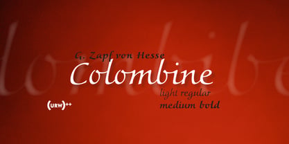
- Halvorsen Pro by Australian Type Foundry,
$49.00
- Marcellus Pro by Stiggy & Sands,
$29.00 Our Marcellus Pro was inspired by classic Roman inscription letterforms. Clarity and beauty are embodied in the standard lowercase, while this historically influenced typeface also nods to the powerful presence of the Trajan titling style with its SmallCaps set. When combined together, Marcellus is a gorgeous flare-serif typeface, rich with presence and usability. Opentype features include: - SmallCaps. - Full set of Inferiors and Superiors for limitless fractions. - Tabular, Proportional, and Oldstyle figure sets (along with SmallCaps versions of the figures). - Stylistic Alternates for Caps to SmallCaps conversion.
 - Filson Pro by Mostardesign,
$26.00 Designed by Olivier Gourvat in 2014, Filson Pro is a new geometric sans serif family with versatility in mind. With its 575 glyphs and its round aspect, this typeface covers all kind of graphic and web design projects. This font family contains 16 fonts from Thin to Black with a professional range of Opentype functions such as pro kerning,lining and oldstyle figures, stylistic alternates, case sensitive forms, localized forms and f-ligatures. For better typographic control, Filson Pro also includes Opentype class kerning with thousands of kerning pairs.
 - Autoprom Pro by Stefan Stoychev,
$29.88 AutopromPro is a modern sans serif display font with a geometric touch contains 24 styles. It comes in 6 weights and its matching rounded and italics. The Thin weight and Black Rounded Italic is a free of charge, so you can use them to your projects.
 - Kremlin Pro by ParaType,
$30.00 The first version of Kremlin was designed at ParaType (ParaGraph) in 1995 by Tagir Safayev. Based on an informal handwriting. Kremlin is a Russian word for a fortress or a citadel. The reason why the author selected this word for the font name is not quite clear even for him. Probably the appearance of the text line set in this font resembled a tight fence. Later the font was expanded in character set and got two style variations with extended proportions. The suffix "Pro" in the name was added to distinguish the new version from the previous one. The derivative work was done by Dmitry Kirsanov and Gennady Fridman in 2010. The font is recommended for advertising and display typography.
 - Centima Pro by TipografiaRamis,
$39.00 Centima Pro is an enhance development of Centima – a geometric Sans Serif typeface, released back in 2011. Centima Pro family consists of two sub-families Sans and Serif fonts. Centima Sans – an upgraded version of Centima, with careful refinements to glyph shapes and extension of glyph amounts, which enabled support of Cyrillic languages. A new extended sub-family Centima Serif have been added to the Centima Pro family. This typeface is released in OpenType format with some OpenType features.
 - Bibalgoski Pro by Mchcrafter,
$18.00 Bibalgoski Pro is a Modern Stylistic Serif typeface A new serif that we created specially for branding needs, with extra ligatures and alternates in a unique shape just to add value to your brand. It so nice to leverage designer or product owner that need solutions to make their design look more stylish and modern. And specially for Bibalgoski Pro font, We prepared all the ligatures, and the alternates characters to help you create unlimited variations for your creative needs. Bibalgoski Pro includes: All uppercase & lowercase letters All numbers 0-9 & Punctuation Ligatures & Alternates Symbols Multiligual Letters
 - Galena Pro by Typorium,
$45.00 Galena Pro is an extended version of Galena, a typeface published for Bayer Corporation in 1996. Galena Pro is based on the open and organic forms imagined by the writers of humanist Italy, who designed the first so-called Roman characters. Humanist style fonts have moderate stroke contrast, uneven widths, and a classic, but soft and easy-to-read appearance. Galena Pro gives a new birth to the 15th century incunabula, a typographic drawing where the gestures of this standardized handwriting are not mechanical, but more fluid. The Galena Pro series can provide professional typography with OpenType features such as alternative sets of numbers, fractions and an extended character set to support Central and Eastern European as well as Western European Languages. The different styles of the Galena Pro are enriched with a condensed variant to meet the need for space savings in titles and texts.
 - Adlery Pro by Zetafonts,
$39.00 Adlery is a brush typeface designed by Cosimo Lorenzo Pancini for display use. It has a handmade feel and it’s optimized for maximum readability at medium sizes. The typeface comes in three styles: Basic, Swash and Blockletter Uppercase and has a double set of lowercase alphabets that alternate in writing, so that no double letters are the same.
 - ÉconoSans Pro by Ingo,
$41.00 The most space-saving sans serif This font saves more space than any of its kind! Slim proportions, but not “condensed” Characters which nearly touch Sparse ascenders and descenders Distinct forms How close to each other can the characters of a font get? Theoretically, as close as you want. But obviously, the words should still be legible. And as any designer knows, body clearance of characters also depends on other parameters such as point size and line spacing. In practice, there are always situations in which as much information as possible has to be positioned in as little space as possible. The ingoFont ÉconoSans is made for exactly this purpose. Even the name of the font implies its function: French for the infinitive “to save” is “économiser.” Now if that doesn’t sound good… The shapes of the upper and lower case letters are completely matter-of-fact, the way a modern font has got to be. The letters c e, and s are wide open to their neighbors. An especially distinguished trait of this font is the design of the “triangular” characters v w y x k z and A V W Y Z K X M N. And the open form of B R and P is also not typical in a sans serif. The distance between letters is kept tight and often the characters nearly touch, but only nearly. With ÉconoSans you gain approximately 20% more text in a line than with »Tahoma«, and even still more than 10% compared to »Helvetica«. ÉconoSans also includes tabular figures as well as ligatures. Among the ligatures, the double mm is especially unusual and is hardly familiar, but can contribute greatly to saving space without catching the reader’s eye.
 - Noema Pro by DBSV,
$130.00 About family “Noema Pro” Steps… The name “Noema” is again borrowed from ancient Greek word, which may have different meanings depending on the phrase: meaning, logic, significance, purpose, reason, value, nod, implied. In this font i tried and here(like in “ErisPro”) to give a different illustration in letters with a reverse dial(…sloping or recline) from Italic, simply because of whims or because the monotony is tiring me… This series is composed and includes twenty-four fonts with 658 glyphs each, with true italics, true Sloping and supports of course: Latin, Greek & Cyrillic.
 - Audiowide Pro by Stiggy & Sands,
$29.00 Our Audiowide Pro has vague inspirations from other styles like that of Handel Gothic and the Converse logo, yet it veers off in a direction of its own for a slightly more techno-futuristic and yet cleanly readable format. Great for both headlines and shorter body copy, its cleanly legible forms lend itself to a plethora of uses. The SmallCaps and extensive figure sets offer Audiowide an even wider breadth of design options. Opentype features include: - SmallCaps. - Full set of Inferiors and Superiors for limitless fractions. - Tabular, Proportional, and Oldstyle figure sets (along with SmallCaps versions of the figures). - Stylistic Alternates for Caps to SmallCaps conversion.
 - Isbellium Pro by No Bodoni,
$35.00 Isbellium is a sans serif version of Dick Isbell’s Americana type, designed in 1967 and the last type cut in metal by the American Type Founders Co. (ATF). Isbellium retains the large x-height, open character, wide stance and elegance of Americana, but with a quieter voice and polite authority. Isbellium is a display face with broad Latin support along with small caps, fraction support and other typographic niceties are included in the ten font family.
 - Primana Pro by RMU,
$40.00 This is an RMU multilingual font family with eight style, of which all come with small caps and oldstyle figures.
 - Aerolite Pro by CheapProFonts,
$10.00 The history of Aerolite, from Jan Paul: "The Aerolite fonts are essentially stripped down versions of a complex outline typeface I designed for the first Midnight Oil album in 1978, affectionately known as "The Blue Meanie". Many years later I saw the font "powderworks" and asked Brian Kent if he would be interested in digitizing Aerolite. Brian is a font (!) of knowledge and was of invaluable help by getting Aerolite to where it is today. Special care was taken in keeping the distinct character while as Aerolite Regular also providing a legible, thouroughly kerned body type which can be used in all sizes for large volume text." For the Pro version the kerning has been tweaked further, and the character set completed and expanded - and the alternate uppercase A (also with accents) is available as OpenType stylistic alternates. It is now ready for your next international science or sci-fi project. ALL fonts from CheapProFonts have very extensive language support: They contain some unusual diacritic letters (some of which are contained in the Latin Extended-B Unicode block) supporting: Cornish, Filipino (Tagalog), Guarani, Luxembourgian, Malagasy, Romanian, Ulithian and Welsh. They also contain all glyphs in the Latin Extended-A Unicode block (which among others cover the Central European and Baltic areas) supporting: Afrikaans, Belarusian (Lacinka), Bosnian, Catalan, Chichewa, Croatian, Czech, Dutch, Esperanto, Greenlandic, Hungarian, Kashubian, Kurdish (Kurmanji), Latvian, Lithuanian, Maltese, Maori, Polish, Saami (Inari), Saami (North), Serbian (latin), Slovak(ian), Slovene, Sorbian (Lower), Sorbian (Upper), Turkish and Turkmen. And they of course contain all the usual "western" glyphs supporting: Albanian, Basque, Breton, Chamorro, Danish, Estonian, Faroese, Finnish, French, Frisian, Galican, German, Icelandic, Indonesian, Irish (Gaelic), Italian, Northern Sotho, Norwegian, Occitan, Portuguese, Rhaeto-Romance, Sami (Lule), Sami (South), Scots (Gaelic), Spanish, Swedish, Tswana, Walloon and Yapese.
 - Ayumi Pro by Positype,
$9.00 Ayumi is one of those precocious sans. At first glance, I wanted it to look simple...basic characters, moderate modulation, common structure...but at closer inspection, it is filled with all kinds of fun and expressive details. The italics are...well, fun. They're curvy and expressive and truly compliments the face. The new Pro version includes a tightened character set, Central European glyphs, and remastered kerning.
 - Peralta Pro by Stiggy & Sands,
$29.00 Our Peralta Pro was inspired by egyptian slab serif letterforms, yet have a haywire disregard for classic balance. You'll find that Capitals and Lowercase have opposite weight distributions, as well as an all-around offbeat nature, and yet it all works to create a delightfully comic typeface. The SmallCaps and extensive figure sets help to offer a little more serious of a persona to this otherwise wild child typestyle. Opentype features include: - SmallCaps. - Full set of Inferiors and Superiors for limitless fractions. - Tabular, Proportional, and Oldstyle figure sets (along with SmallCaps versions of the figures). - Stylistic Alternates for Caps to SmallCaps conversion.
 - Priva Pro by DSType,
$26.00PrivaPro is available in four styles with italics. It includes Greek and Cyrillic characters, along with small caps, ligatures, alternates and swashes. - Primeform Pro by Punchform,
$29.00 The most versatile geometric font ever is here. With 421 alternative characters and 19 stylistic sets, you get unlimited power to take your creativity to the next level. The first typeface of its kind, Primeform Pro is meticulously designed to adapt its personality to any project. Primeform Pro is the smartest choice for any creative project. With a single click, you can change its typographic personality and adapt it to your desired style. Choose between 3 predefined styles or create your own style by combining the hundreds of alternate characters available. OpenType Features Access All Alternates (aalt) Stylistic Alternates (salt) 19 Stylistic Sets (ss01 – ss19) Localized Forms (locl) Case-Sensitive Forms (case) Standard Ligatures (liga) & Discretionary Ligatures (dlig) Slashed Zero (zero) Proportional Figures (pnum) Tabular Figures (tnum) Subscript (subs) & Superscript (sups) Numerators (numr) & Denominators (dnom) Fractions (frac) Ordinals (ordn) Glyph Composition/Decomposition (ccmp) Language Support 317 Latin Languages 2 Greek Languages 15 Cyrillic Languages Tech Specs Glyph Count: 1185 Format: OpenType CFF