10,000 search results
(0.018 seconds)
- Paris - Unknown license

- Darkness by BaronWNM,
$14.00 Blackletters have a long history and appeal to the world of lettering. "Darkness" is a blackletter font, but with a contemporary style with a simple form. Darkness is very suitable for use on product labels, logos, ads, brochures, invitations, etc.
 - Varking by Runsell Type,
$16.00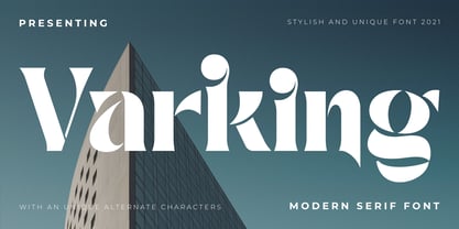 Varking font is perfect for many of your projects like logos & branding, photography, invitations, watermarks, advertisements, product designs, stationery, wedding designs, labels, product packaging, special events and much more.
 - Garked by Linecreative,
$16.00 Garked is a font typeface inspired by ancient nordic runes, you want to customize a logo, brand or other design with ethnic or tribal style, this font is perfect for your choice. What you get, you will get: 1. Garked – Clean San serif font including Uppercase & Lowercase (ALL CAPS) characters, 2. Numbers and Punctuation 3. Support Multi language (Western Europe Latin)
 - Paris by kapitza,
$99.00 Walking around Paris looking for inspiration for our latest people font, we encountered chic Parisians, yummy food markets, and bakeries on virtually every street corner with delicious baguettes and pastries. We were surprised how many people were cycling, motorcycling and rollerblading along the vast boulevards and side streets of Paris. We spotted classic French cars like the 2CV and Citroën CX and watched the world go by in one of the many sidewalk cafes whilst enjoying a 1664 or a café crème. With our latest people font, Paris, we tried to capture this unique Parisian atmosphere and hope we succeeded. All 64 illustrations are based on photographs taken on location over a period of time. The photographs are then hand traced to create high quality, detailed silhouettes.
 - Lark by Shana Hu,
$20.00 Lark is a modern calligraphic sans inspired by a rich history of broad-edge and translation contrast calligraphy. By combining its sharp geometry with flared curves, Lark exhibits a nice warmth as a display face. Lark was initially conceived as a final project as part of the Type@Cooper West Extended Program's post-graduate certificate program in typeface design, so its journey has benefitted from routine feedback from experienced typeface designers. Comes in Bold, Medium, Regular, and Light weights for both roman and italic, and supports multiple languages including Danish, Dutch, English, French, German, Italian, Portuguese, Spanish, Swedish, and more.
 - Parus by VladB,
$20.00 Parus is a impacted modern sans serif geometric font, includes upper and lower case characters, Latin, Cyrillic, Latin Eastern Europe, Turkish, Baltic and other. The Parus family consists of 8 fonts, divided into 2 subgroups (according to the type of style - St, Obl), and have the 4 types of thickness in each subgroup. Parus fonts will be useful in a word processing, developing a brand, creating posters and other graphic products.
 - Pask by Valentino Vergan,
$16.00 Pask is a retro inspired variable font family. Pask has a high-contrast and a thin hairline, this gives the typeface a bold and retro look. Pask comes with standalone fonts and a variable version, the variable version allows you to adjust the width and slant. Pask can cover a wide range of project such as: branding, mastheads, magazines, logos, blog posts, quotes, product packaging, advertisements and much more. WHAT YOU GET: Pask - Condensed Pask - Condensed Oblique Pask - Semi Condensed Pask - Semi Condensed Oblique Pask - Regular Pask - Oblique Pask - Semi Expanded Pask - Semi Expanded Oblique Pask - Expanded Pask - Expanded Oblique I hope you enjoy using the Pask typeface.
 - KR Eight Ball - Unknown license

- Ball Game JNL by Jeff Levine,
$29.00 What has become a rite of passage at baseball games got its start in 1908 when lyricist Jack Norworth and music composer Albert Von Tilzer wrote "Take Me Out to the Ball-Game" (which was published by Von Tilzer's York Music Company). The Art Nouveau hand lettered title on the cover of the sheet music was eccentric and attractive enough to warrant being turned into a digital type face, and in honor of its namesake song is called Ball Game JNL; available in both regular and oblique versions.
 - Milk and Balls by Alit Design,
$12.00 Introducing Milk and Balls Serif font family. This character that seems rigid and decisive is perfect for bold and formal design concepts. The unique shape of the letter makes the design made different from the others. Milk and Balls font is very suitable for header text, body text, and the contents of paragraphs because there are 11 family fonts from Thin to Heavy, in addition there is also an italic version. So Milk and Balls are very complete and suitable to be a collection of fonts that can be used at any time. Don't worry about Multilingual, because Milk and Ball’s are supported by multilingual.
 - Ball And Chain by Funk King,
$5.00 Each glyph is fashioned using "balls" and "chains".
 - Linotype Space Balls by Linotype,
$29.99 - Rolling Ball Cursive by Gerald Gallo,
$20.00 Rolling Ball Cursive simulates a handwritten style executed with one of the many types of rolling ball pens now available.
 - Maria-Ballé-Initials by ARTypes,
$35.00Maria-Ballé-Initials are derived from the Ballé series I made by the Bauer foundry. When set at 60 pt this font will match the size of the original 48-pt Didot design. - Ark by Fenotype,
$25.00 Let Ark, an Art Nouveau-infused high-contrast serif, transport your designs into the realm of elegant psychedelia. Ark draws deep inspiration from Heinz Keune's Edda, a remarkable design from 1900. While its vibe might evoke the groovy 70s and the mesmerizing world of trippy album covers, Ark transcends any assumed historical shabbiness. It trims the style into a refined and neatly cut serif, suitable for gallery-worthy presentations, all while maintaining a strong and unmistakable connection to its original roots. The standard letters of Ark maintain a respectable demeanor, only scratching the surface of the font's psychedelic potential. To truly unlock its full potency, try the Swash or Stylistic Alternates, or dig for even more Alternates from the Character palette. Needless to say, that Ark is a natural match for anything trendy, artsy, wierd and fun.
 - Parks Department JNL by Jeff Levine,
$29.00 A WPA (Works Progress Administration) sponsored Water Carnival taking place in Central Park in the 1930s had "Department of Parks, City of New York" in the thin Art Deco hand lettering which is now available as Parks Department JNL.
 - Park Avenue Script by Linotype,
$29.99Park Avenue is a lighthearted contemporary script designed by Robert E. Smith in 1933 for American Type Founders. This unique design has small x-height lowercase letters with very long ribbon-like ascenders. Park Avenue is a good design for occasional pieces such as invitations and menus. - Fenway Park JF by Jukebox Collection,
$32.99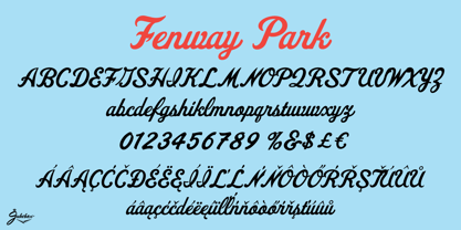
- Echinos Park Script by Mans Greback,
$59.00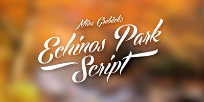
- Borough Park JNL by Jeff Levine,
$29.00 Borough Park JNL is named for a neighborhood in the southwestern part of the borough of Brooklyn, NY and was modeled from hand lettering found on vintage sheet music.
 - Central Park JNL by Jeff Levine,
$29.00 The beautiful Art Deco monoline pen lettering on the cover of a 1940s piece of sheet music inspired Central Park JNL. The 1940s was an era when couples took romantic walks along the pathways of Manhattan's Central Park or rode around it in hansom cabs. Big bands played at the major clubs and ballrooms and "uptown" meant the well-to-do. Men dressed in their tuxedos and top hats and the ladies were in their jewels and evening gowns.
 - National Parks JNL by Jeff Levine,
$29.00 National Parks JNL was based on a 1930s WPA (Works Progress Administration) poster where the word "National Parks" was hand lettered in an unusual and eclectic Art Deco style. Bold and non-conformist, the typeface is available in both regular and oblique versions.
 - Jackson Park NF by Nick's Fonts,
$10.00Handlettering in an ad from the 1920s for a Chicago engraving company provided the inspiration for this fine, fat, flowing face, full of fun and antique charm. Both versions of this font include the complete Unicode 1252 Latin and Unicode 1250 Central European character sets. - No Parking JNL by Jeff Levine,
$29.00 No Parking JNL was inspired by a hand-cut stencil of those words painted in an area of a department store's parking lot.
 - Park Slope JNL by Jeff Levine,
$29.00 The free-form geometric shapes of the lettering on a vintage piece of sheet music entitled "Four Pictures" is the basis for Park Slope JNL, named for a neighborhood in Brooklyn, New York.
 - Waite Park JNL by Jeff Levine,
$29.00Waite Park JNL is based on the smallest of the die-cut letters and numbers contained in the Webway Sign Cabinet - once manufactured by the Holes-Webway Company of Minneapolis, Minnesota. The largest of the set's sizes (2 inch) was the model for Sign Kit JNL, the medium size (1-1/8 inch) was used to make Sign Production JNL and this font is a version from the 3/4 inch size. Each size of alphabet and numerals have their own unique characteristics, although they all follow the same basic font style, which is reminiscent of classic Art Deco-era sanserif typefaces. The name Waite Park JNL was derived from a division of Holes-Webway that (for some reason lost to time) distributed their sign kits under the name Waite Park Sign Company, located in the Minnesota city of the same name. - Park West JNL by Jeff Levine,
$29.00 The thin, stylish Art Deco slab serif lettering featured on the cover of the 1934 sheet music for “Then I’ll be Tired of You” inspired the digital type face Park West JNL, which is available in both regular and oblique versions. Central Park West has always been the upscale area for affluent New Yorkers, but in the Great Depression years of the 1930s the mystique of the well-to-do held an even stronger significance.
 - Prospect Park JNL by Jeff Levine,
$29.00 Prospect Park JNL was inspired by inline lettering found on some vintage sheet music from the Art Deco era entitled "By My Side". The font's namesake is located in the Crown Heights section of Brooklyn, NY. Prospect Park is famous for its zoo as well as its tree lined paths, historic carousel and the expansive park area.
 - Trailer Park Numerals by Coniglio Type,
$9.95Trailerpark numbers 0-9 were rather old fashioned 1950's cut aluminum numbers, you've seen digitized nowhere else but here! Part of Market LTD, a collection of limited faces, mostly alpha-numeric and some just plain numeric, used primarily in retail and display situations and titling. - Buena Park JF by Jukebox Collection,
$32.99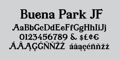
- Asbury Park JNL by Jeff Levine,
$29.00 In the 1930s the WPA (Works Progress Administration) sponsored a Federal art project. Many posters were produced that featured government-sponsored cultural events, health and safety tips and various other topics. One such poster from Pennsylvania has the words “Work with Care” in a hand-lettered inline sans design. This became the basis for Asbury Park JNL.
 - FALLING SKIES - Personal use only

- Tall & Lean - Personal use only

- Tall Films - Personal use only

- Tall Paul - Unknown license

- Boneribbon Tall - Unknown license

- Oaxaqueña Tall - Personal use only

- Estrogen-Wall - Unknown license

- Rubber Walls - Unknown license


