10,000 search results
(0.064 seconds)
- Rosebud by aRc,
$10.00 Rosebud is a great blend of simple yet organic rosy caps. Each big caps has a single rose while the small caps has the prickly, thorny stems. This decorative TrueType font is great for any occasion (from Wedding to Sweet 16 Party) or for surprising a rose lover with a flowery note. Plus, you can create your own border patterns or flower arrangements by using the rosy and/or the thorny punctuation marks.
 - Dulcyna Hand by Michael Browers,
$25.00 Dulcyna Hand is a casual hand-drawn typeface developed by Michael Browers and his son Eli. Seeking to bond over a collaborative creative project, this father-son duo leveraged Eli’s emerging interest in lettering and Michael’s font development experience to create Dulcyna Hand. Embedded with Eli’s youthful energy and fun personality, Dulcyna Hand is ideal for greeting cards, invitations, scrapbooking, children’s books and other projects in need of a light-hearted touch.
 - MVB Emmascript by MVB,
$39.00Kanna Aoki drew the letters for MVB Emmascript while on a picnic near the Conservatory of Flowers in San Francisco’s Golden Gate Park. Mark van Bronkhorst adapted the writing as a font that maintains a very natural scrawl. Later a bold weight was added. MVB Emmascript has been used to add a lighthearted, human touch to everything from fiction paperbacks to potato chip packaging. The typeface is named for Aoki's 1968 Volkswagen, Emma. - Mainsail by Melvastype,
$29.00 Mainsail is a handwritten brush script font. It is casually written with dry brush pen, so it has this nice texture and flow. Mainsail has lots of alternates to make it look more like real handwriting; four sets of lower cases and two sets of upper cases. Mainsail is great option for logos, headlines and packaging. You can also use it in longer texts where you need this casual handwritten look. It will also combine well with sans and serif fonts. Mainsail has OpenType features that automatically makes text look more authentic. Discretionary Ligatures replaces other of two identical letters following each other. Contextual Alternates will unleash the full cycle of the alternates. It will cycle all four lower case sets to make the text look as natural as possible. Mainsail has also underline strokes in separate font called Mainsail Swash. It includes combined 52 different underlines, strokes and circles. With these you can add the final punch to your design.
 - Hebrewish by JAB,
$18.00I decided to create Hebrewish because the only Hebrew Latino font I have ever seen didn't really live-up to my expectations. Each Roman letter and Arabic numeral in this font is based directly on one or more of the Hebrew characters. Originally I was tempted to create an upper case only - since there is no lower case in Hebrew that I know of. But, as this would have limited it's usefulness, I changed my mind and added a lower case also. Nevertheless, those who want to create very Hebrew looking text, need only use the upper case. I've also added some typical Judaic symbols for the artistic minded, e.g. David's star *, the Menorah ^(Jewish candelabrum) and brackets{ } based on this, as well as brackets [] which, used together, produce a 'Ten commandments' stone-tablet symbol(use this [~] for another version). In short, you can either have some fun with this font or use it for serious work - the choice is yours. - DragonFyre by Scholtz Fonts,
$21.00 Beware: Here be Dragons! It Be Dangeroues to Venture Yonder! This warning, inscribed on a rock at the entrance of a cave in an inaccessible mountain in the far north of Scotland, provided the inspiration for the font DragonFyre. While I have not seen the actual rock myself, I have based the font on an accurate drawing of the original inscription. DragonFyre speaks of lands beyond our ken, of wistful faerie kingdoms, of dark happenings and white magic. Use it at your peril, for its very use will conjure up worlds long forgotten, places of faeries, elves and hobgoblins, of ogres and giants. Those who read texts written in this font may well have their lives strangely changed. I have included a complete character set of 242 characters; upper and lower case; as well as all accented and special characters. All characters have been carefully letterspaced and kerned. For maximum dramatic impact I suggest you use combinations of both upper- and lower-case characters.
 - YR Basma by Alrefaiy,
$20.00 YR Basma is a slab serif font that is renowned for its bold and distinctive appearance, which is designed to create a powerful impact. It is characterized by its strong and striking letterforms, with bold and thick strokes that give it an intense and impactful look. The font is also highly legible, with a focus on clear and easy-to-read letterforms that are meticulously crafted to balance visual weight and vertical alignment. YR Basma is ideal for a broad range of design projects that require a robust and striking visual presence, such as headlines, posters, packaging, and branding. It boasts a comprehensive set of glyphs, including both upper and lowercase letters, numerals, and symbols, making it highly versatile and adaptable to diverse design needs. YR Basma font offers a bold and commanding aesthetic, while maintaining excellent legibility and clarity of letterforms. Its powerful design makes it an excellent choice for various design projects where a strong and dominant visual presence is desired.
 - LT Anomaly - 100% free

- Carpe Noctem by Hanoded,
$20.00 Carpe Noctem (Latin for ‘Seize The Night’), was a bit of a surprise. Someone asked me if I could create a lower case for my Closet Skeleton font. I began working on it and lo and behold, a beautiful font started taking shape. So, if you’re in need of a slightly scary fairytale font, complete with angled edges, swirly bits, a couple of alternate - even more curly - glyphs and an alternate medieval ampersand, then Carpe Noctem is your typeface!
 - Craze Bubble by Sipanji21,
$15.00 "Craze Bubble " is an urban graffiti font characterized by Bubble edges and a bold look. Ideal for music posters, apparel designs, shirts, and streetwear, this font brings a touch of edginess to your projects. The unique style of "Craze Bubble" makes it the perfect choice any urban graffiti themes. Whether you want to create a strong and powerful statement or simply add a touch of attitude to your designs "Craze Bubble" is the font for you.
 - Aeroblock Layered Graffiti by Sipanji21,
$13.00 Aeroblock is an urban graffiti font characterized by Rounded edges and a bold look. Ideal for music posters, apparel designs, shirts, and streetwear, this font brings a touch of edginess to your projects. The unique style of "Aeroblock" makes it the perfect choice for street style or urban graffiti themes. Whether you want to create a strong and powerful statement or simply add a touch of attitude to your designs, "Aeroblock" is the font for you.
 - Hello Melodi by IRF Lab Studio,
$10.00 Hi, Introducing the latest styles Hello melodi Script with the kind of modern hand scratches, I hope you are interested in this font, if you want to use for your work this font can be used easily and simply because there are a lot of features in it to contain a complete set of letters lower and uppercase letters, assorted punctuation, numbers, and multilingual support. font also contains several ligatures and alternate style Stylistic. Thank You.
 - Kaleko 105 Round Remix by Talbot Type,
$19.50 A remixed variation, available in three weights, of the popular Talbot Type geometric sans Kaleko 105 Round . The addition of occasional flourishes at the intersections of strokes, in both upper and lower case, adds character charm, making the font a perfect titling font to accompany Kaleko 105 and/or Kaleko 105 Round , or a display font in its own right. Kaleko 105 Round Remix features a comprehensive glyph set including accented characters for central European languages.
 - Gabret Street Layered by Sipanji21,
$15.00 "Gabret Street" is an urban graffiti font characterized by sharp edges and a bold look. Ideal for music posters, apparel designs, shirts, and streetwear, this font brings a touch of edginess to your projects. The unique style of "Gabret Street" makes it the perfect choice for death metal or urban graffiti themes. Whether you want to create a strong and powerful statement or simply add a touch of attitude to your designs, "Gabret Street" is the font for you.
 - Wild Rebel Layered by Sipanji21,
$15.00 Wild Rebel is an urban graffiti font characterized by sharp edges and a bold look. Ideal for music posters, apparel designs, shirts, and streetwear, this font brings a touch of edginess to your projects. The unique style of "Wild Rebel" makes it the perfect choice for street style or urban graffiti themes. Whether you want to create a strong and powerful statement or simply add a touch of attitude to your designs, "Wild Rebel" is the font for you.
 - Roket Monster Graffiti by Sipanji21,
$10.00 Roket Monster is an urban graffiti font characterized by sharp edges and a bold look. Ideal for music posters, apparel designs, shirts, and streetwear, this font brings a touch of edginess to your projects. The unique style of "Roket Monster" makes it the perfect choice for street style or urban graffiti themes. Whether you want to create a strong and powerful statement or simply add a touch of attitude to your designs, "Roket Monster" is the font for you.
 - Core Gungseo by S-Core,
$59.00 CoreGungseo is a Korean calligraphy font. We considered the change of stroke thickness and the power & speed of brushes when designing this calligraphy font. This font has the beauty of spaces by proper balance among individual letter forms. Both horizontal and vertical writing are acceptable to use. Supported codepages are MS Windows 1252 Latin1 and MS Windows 949 Korean consisting of 11,172 Korean letters and Symbols except Chinese. We suggest to use for books, cards, displays and so on.
 - Block busta by Sipanji21,
$18.00 "Block Busta" is an urban graffiti font characterized by sharp edges and a bold look. Ideal for music posters, apparel designs, shirts, and streetwear, this font brings a touch of edginess to your projects. The unique style of "Block Busta " makes it the perfect choice for death metal or urban graffiti themes. Whether you want to create a strong and powerful statement or simply add a touch of attitude to your designs "Block Busta " is the font for you.
 - Break Enemy Graffiti by Sipanji21,
$15.00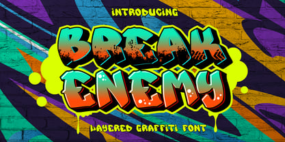 Break Enemy is an urban graffiti font characterized by sharp edges and a bold look. Ideal for music posters, apparel designs, shirts, and streetwear, this font brings a touch of edginess to your projects. The unique style of "Break Enemy" makes it the perfect choice for street style or urban graffiti themes. Whether you want to create a strong and powerful statement or simply add a touch of attitude to your designs, "Break Enemy" is the font for you.
 - Graffierz Poison Graffiti by Sipanji21,
$13.00 Graffierz Poison is an urban graffiti font characterized by sharp edges and a bold look. Ideal for music posters, apparel designs, shirts, and streetwear, this font brings a touch of edginess to your projects. The unique style of "Graffierz Poison " makes it the perfect choice for death metal or urban graffiti themes. Whether you want to create a strong and powerful statement or simply add a touch of attitude to your designs, "Graffierz Poison" is the font for you.
 - Lord Jamet Graffiti by Sipanji21,
$19.00 "Lord Jamet" is an urban graffiti font characterized by sharp edges and a bold look. Ideal for music posters, apparel designs, shirts, and streetwear, this font brings a touch of edginess to your projects. The unique style of "Lord Jamet " makes it the perfect choice for death metal or urban graffiti themes. Whether you want to create a strong and powerful statement or simply add a touch of attitude to your designs "Lord Jamet " is the font for you.
 - GRAFF PUMPHIZ by Sipanji21,
$18.00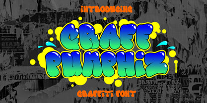 "Graff Pumphiz" is an urban graffiti font characterized by Bubble edges and a bold look. Ideal for music posters, apparel designs, shirts, and streetwear, this font brings a touch of edginess to your projects. The unique style of "Graff Pumphiz" makes it the perfect choice any urban graffiti themes. Whether you want to create a strong and powerful statement or simply add a touch of attitude to your designs "Graff Pumphiz" is the font for you.
 - Bubble Horns by Sipanji21,
$17.00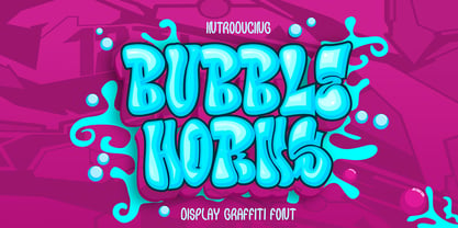 "Bubble Horns" is an urban graffiti font characterized by Bubble edges and a bold look. Ideal for music posters, apparel designs, shirts, and streetwear, this font brings a touch of edginess to your projects. The unique style of "Bubble Horns" makes it the perfect choice any urban graffiti themes. Whether you want to create a strong and powerful statement or simply add a touch of attitude to your designs "Bubble Horns" is the font for you.
 - Hobo by URW Type Foundry,
$35.99 The Hobo font is a dynamically tapering face in which all strokes are accentuated curves, achieving a superb decorative effect. Hobo almost suggests a freely drawn alphabet with its unusual robust roundness. The Hobo font was designed to be used at large sizes. It has no descenders: the lower case g, p, q and y are incorporated into the x-height. The Hobo font imparts a friendly personality to display work such as invitations, menus, signage and packaging.
 - Stonecrop by Andrew Harper Fonts,
$5.00 Stonecrop is a font unified by bold, imposing lines as well as its use of rounded rectangles as the central stylistic shape. Stonecrop loosely conforms to the monospaced font style, with near-equal widths for all letters and numbers (but not all symbols/punctuation), however it does incorporate kerning for all types of glyphs where appropriate to aid in legibility. A perfect font for usages that demand consistency and precision, while still maintaining a quirky and stylized handwritten effect.
 - Gingham by SilkType,
$47.50 Gingham is a modern sans serif typeface. The unaltered version of the font is clean and classic. However, the font has multiple different options for alteration. Each letter has up to 8 different versions, which the user can choose from to make connections between letters and words, creating a completely new shape. The font also includes two stylistic sets, nr. 01 gives the overall feel of the text a more modern look and nr. 02 a more traditional one.
 - Fast Blaze Graffiti by Sipanji21,
$19.00 "Fast Blaze" is an urban graffiti font characterized by sharp edges and a bold look. Ideal for music posters, apparel designs, shirts, and streetwear, this font brings a touch of edginess to your projects. The unique style of "Fast Blaze" makes it the perfect choice for death metal or urban graffiti themes. Whether you want to create a strong and powerful statement or simply add a touch of attitude to your designs "Fast Blaze" is the font for you.
 - Under Boom Graffiti by Sipanji21,
$15.00 "Under Boom" is an urban graffiti font characterized by sharp edges and a bold look. Ideal for music posters, apparel designs, shirts, and streetwear, this font brings a touch of edginess to your projects. The unique style of "Black Squad" makes it the perfect choice for death metal or urban graffiti themes. Whether you want to create a strong and powerful statement or simply add a touch of attitude to your designs, "Under Boom" is the font for you.
 - Road Vanders Graffiti by Sipanji21,
$15.00 "Road Vanders" is an urban graffiti font characterized by sharp edges and a bold look. Ideal for music posters, apparel designs, shirts, and streetwear, this font brings a touch of edginess to your projects. The unique style of "Road Vanders" makes it the perfect choice for death metal or urban graffiti themes. Whether you want to create a strong and powerful statement or simply add a touch of attitude to your designs, "Road Vanders" is the font for you.
 - Euroque by CozyFonts,
$20.00 Euroque is the 23rd font family from Cozyfonts Foundry, a California Foundry established in 2012 by designer and typographic illustrator Tom Nikosey Euroque began with pencil sketches, as all my fonts trace their beginnings. Influenced by European poster art of the 1920s and 1930s Euroque takes its name almost literally, European Style. These fonts are designed as a Small Caps Family, where the lower case mirrors the Upper case in design but its weights are compatible and consistent.
 - Black Squad Graffiti by Sipanji21,
$16.00 "Black Squad" is an urban graffiti font characterized by sharp edges and a bold look. Ideal for music posters, apparel designs, shirts, and streetwear, this font brings a touch of edginess to your projects. The unique style of "Black Squad" makes it the perfect choice for death metal or urban graffiti themes. Whether you want to create a strong and powerful statement or simply add a touch of attitude to your designs, "Black Squad" is the font for you.
 - Wild Graf by Sipanji21,
$17.00 "Wild Graf" is an urban graffiti font characterized by sharp edges and a bold look. Ideal for music posters, apparel designs, shirts, and streetwear, this font brings a touch of edginess to your projects. The unique style of "Wild Graf" makes it the perfect choice for death metal or urban graffiti themes. Whether you want to create a strong and powerful statement or simply add a touch of attitude to your designsWild Graf" is the font for you.
 - Post Box by Great Scott,
$16.00 Written in a ballpoint pen style POST BOX is a neighborly sans serif is slightly condensed and slanted. Scribbled quickly but readable. Exact but still human. Perfect for print, package and display use. You can also use it in shorter paragraph text.
 - Monotype Goudy by Monotype,
$40.99Over the course of 50 years, the charismatic and enterprising Frederic W. Goudy designed more than 100 typefaces; he was the American master of type design in the first half of the twentieth century. Goudy Old Style, designed for American Type Founders in 1915-1916, is the best known of his designs, and forms the basis for a large family of variants. Goudy said he was initially inspired by the cap lettering on a Renaissance painting, but most of the flavor of this design reflects Goudy's own individualistic style. Recognizable Goudy-isms include the upward pointing ear of the g, the diamond-shaped dots over the i and j, and the roundish upward swelling of the horizontal strokes at the base of the E and L. The italic was completed by Goudy in 1918, and is notable for its minimal slope. Goudy Bold (1916-1919) and Goudy Extra Bold (1927) were drawn not by Goudy, but by Morris Fuller Benton, who was ATF's skillful in-house designer. Goudy Catalogue was drawn by Benton in 1919-1921 and was meant to be a medium weight of Goudy Old Style. Goudy Heavyface was designed by Goudy for Monotype in 1925, and was intended to be a rival to the successful Cooper Black. Goudy Modern was designed by Goudy in 1918; its small x-height, tall ascenders and shorter caps impart a spacious and elegant feeling. Benton designed Goudy Handtooled, the shaded version that has just a hairline of white through its bold strokes. The Goudy faces, especially the bolder weights, have long been popular for display and advertising design. They continue to pop up all over the world, and still look reassuring to our modern eyes." - Goudy Ornate MT by Monotype,
$29.99Over the course of 50 years, the charismatic and enterprising Frederic W. Goudy designed more than 100 typefaces; he was the American master of type design in the first half of the twentieth century. Goudy Old Style, designed for American Type Founders in 1915-1916, is the best known of his designs, and forms the basis for a large family of variants. Goudy said he was initially inspired by the cap lettering on a Renaissance painting, but most of the flavor of this design reflects Goudy's own individualistic style. Recognizable Goudy-isms include the upward pointing ear of the g, the diamond-shaped dots over the i and j, and the roundish upward swelling of the horizontal strokes at the base of the E and L. The italic was completed by Goudy in 1918, and is notable for its minimal slope. Goudy Bold (1916-1919) and Goudy Extra Bold (1927) were drawn not by Goudy, but by Morris Fuller Benton, who was ATF's skillful in-house designer. Goudy Catalogue was drawn by Benton in 1919-1921 and was meant to be a medium weight of Goudy Old Style. Goudy Heavyface was designed by Goudy for Monotype in 1925, and was intended to be a rival to the successful Cooper Black. Goudy Modern was designed by Goudy in 1918; its small x-height, tall ascenders and shorter caps impart a spacious and elegant feeling. Benton designed Goudy Handtooled, the shaded version that has just a hairline of white through its bold strokes. The Goudy faces, especially the bolder weights, have long been popular for display and advertising design. They continue to pop up all over the world, and still look reassuring to our modern eyes." - Goudy Handtooled by Monotype,
$40.99Over the course of 50 years, the charismatic and enterprising Frederic W. Goudy designed more than 100 typefaces; he was the American master of type design in the first half of the twentieth century. Goudy Old Style, designed for American Type Founders in 1915-1916, is the best known of his designs, and forms the basis for a large family of variants. Goudy said he was initially inspired by the cap lettering on a Renaissance painting, but most of the flavor of this design reflects Goudy's own individualistic style. Recognizable Goudy-isms include the upward pointing ear of the g, the diamond-shaped dots over the i and j, and the roundish upward swelling of the horizontal strokes at the base of the E and L. The italic was completed by Goudy in 1918, and is notable for its minimal slope. Goudy Bold (1916-1919) and Goudy Extra Bold (1927) were drawn not by Goudy, but by Morris Fuller Benton, who was ATF's skillful in-house designer. Goudy Catalogue was drawn by Benton in 1919-1921 and was meant to be a medium weight of Goudy Old Style. Goudy Heavyface was designed by Goudy for Monotype in 1925, and was intended to be a rival to the successful Cooper Black. Goudy Modern was designed by Goudy in 1918; its small x-height, tall ascenders and shorter caps impart a spacious and elegant feeling. Benton designed Goudy Handtooled, the shaded version that has just a hairline of white through its bold strokes. The Goudy faces, especially the bolder weights, have long been popular for display and advertising design. They continue to pop up all over the world, and still look reassuring to our modern eyes." - Goudy by Linotype,
$39.00Over the course of 50 years, the charismatic and enterprising Frederic W. Goudy designed more than 100 typefaces; he was the American master of type design in the first half of the twentieth century. Goudy Old Style, designed for American Type Founders in 1915-1916, is the best known of his designs, and forms the basis for a large family of variants. Goudy said he was initially inspired by the cap lettering on a Renaissance painting, but most of the flavor of this design reflects Goudy's own individualistic style. Recognizable Goudy-isms include the upward pointing ear of the g, the diamond-shaped dots over the i and j, and the roundish upward swelling of the horizontal strokes at the base of the E and L. The italic was completed by Goudy in 1918, and is notable for its minimal slope. Goudy Bold (1916-1919) and Goudy Extra Bold (1927) were drawn not by Goudy, but by Morris Fuller Benton, who was ATF's skillful in-house designer. Goudy Catalogue was drawn by Benton in 1919-1921 and was meant to be a medium weight of Goudy Old Style. Goudy Heavyface was designed by Goudy for Monotype in 1925, and was intended to be a rival to the successful Cooper Black. Goudy Modern was designed by Goudy in 1918; its small x-height, tall ascenders and shorter caps impart a spacious and elegant feeling. Benton designed Goudy Handtooled, the shaded version that has just a hairline of white through its bold strokes. The Goudy faces, especially the bolder weights, have long been popular for display and advertising design. They continue to pop up all over the world, and still look reassuring to our modern eyes." - Ezekiel by MYSTERIAN,
$9.00 Ezekiel Script is the font become flesh—mythic gesture imposed upon forms of mechanical medium. Typography has changed the internet; our phasing mimetic desires tend toward posture rather than rationale, and the face is a concept that explores that concept. Obviously some reading of McLuhan has infliunced this concept of analysis. The script has ample diacritic extensions, as well as an alternative for the ampersand (characteristic of MYSTERIAN type) and the eszette: an upper and lower case. The upper and lower case alphabets are diverse in that the majuscules do not have linking strokes while the miniscules do. This was the first script that I've made, and great attentiveness was taken to ensure that links were set accurately, and spacing harmonious throughout.
 - Shabby Chic by Resistenza,
$39.00 The softening of edges in the Shabby Chic aesthetic are markers of age, warmth, authenticity and use. The charming style popular with Bohemians and artisans has a soft, relaxed and romantic feeling. Resistenza used their highly successful monolinear script Mina as the basis to explore how to recreate the spirit and charm of the Shabby Chic design style in a typeface. Drawn by hand with dry brush pen for rustic warmth and distressed edges. Shabby Chic has long connections between letters creating a visual rhythm that echoes the form and pace of gentle waves lapping at a seashore. Each character has an expressive touch, OpenType enabled alternates, for character combinations, initial and final forms allow effortless customisation, flair and a realistic handwritten-sign appearance. (The alternates are accessible by turning on 'Stylistic Alternates' and 'Ligatures' buttons on in Photoshop's Character panel, or via any software with a glyphs panel, e.g. Adobe, Quark...etc) Introduce some rustic romance to your font library. Shabby Chic is perfect for cards, invitations, labels and logos where you want to convey intimate, friendly, warm and genuine sentiment.
 - Sabre by Alias,
$60.00 I generally refer to our typefaces as ‘graphic’ rather than typographic. By that I mean their starting points are usually ways of constructing shapes and systems of shapes. As with other Alias typefaces, Sabre has stone and wood cut letterforms as a starting point. What is interesting about lettercutting is the connection between shape and material. These beautifully crafted letterforms have a particular sharpness which reflects, of course, how they were made. The idea of constructing letters from a kit of parts we first explored in early fonts Elephant and Factory. These are different in that they were very much grid-based, with a geometric structure. For Sabre I also had Fred Smeijers’ stencil construction drawings in mind. These show how a set of components can be the basis for a crafted, elegant typeface. Sabre is quite a loose interpretation of this idea. Sabre’s graphic shape means it works well at large sizes, with a dramatic, angular impact. Its aim is to be typographic enough to function for blocks of small-size text too.
