10,000 search results
(0.027 seconds)
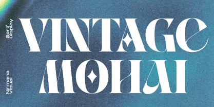
- Vintage Mohai by Nirmana Visual,
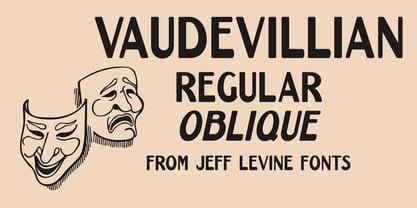
$29.00Vintage Mohai Inspired by art nouveau Design Era. This Serift font is perfect for adding a touch of elegance and sophistication to your designs. With its flowing lines and graceful curves, it is ideal for a diversity of design projects, including logos & branding, social media posts, advertisements & product designs. - Vaudevillian JNL by Jeff Levine,
$29.00The place for a family to be entertained by comedians, dancers, acrobats, animal acts, singers and just about any other acts that fit the bill at the time was the vaudeville theater. Prior to radio becoming the major source of entertainment for the American public, popular songs were introduced on the stages of these entertainment venues. One such song from 1916 with a World War I patriotic sentiment was "A Yankee Doodle Boy Is Good Enough for Me". The sheet music featured the title hand lettered in Art Nouveau style. This became the design source for Vaudevillian JNL, available in both regular and oblique versions. - 20 db - Personal use only
- El&Font - Unknown license
- Deco Blocks - Unknown license
- Can Control - Unknown license
- StandingRoomOnly - Unknown license
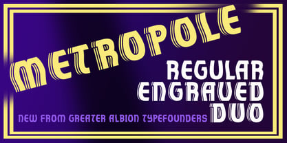
- Metropole by Greater Albion Typefounders,
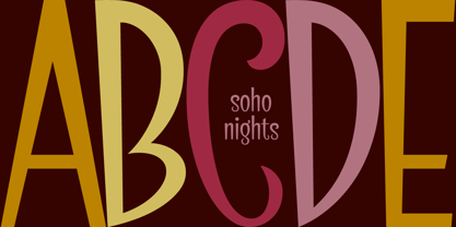
$12.00Metropole is an exercise in combing the curvaceous lines of the Art Nouveau with the solid character and simplicity of Art Deco. The resulting three display faces combine the spirit of the 20s and of the thirties, creating lively fun display faces for headings, signage and banners. These characterful faces with clear simple outlines are also ideal to lend a distinctive air to your web pages, or to create a distinctive 'house-style' for lettering. - SoHo Nights BF by Bomparte's Fonts,
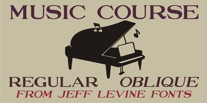
$40.00Named after the trendy New York City locale, SoHo Nights BF features sensuous curves and tapering lines that combine to create a unique new look that’s a little bit art deco and a little bit art nouveau. The font also exhibits attributes that can be described as cartoon-like, and even “spooky” when seen in short blocks of large text. Use SoHo Nights BF when your projects require that certain "air of mystique". - Music Course by Jeff Levine,
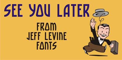
$29.00 - See You Later JNL by Jeff Levine,
$29.00 - Coliseo by Greater Albion Typefounders,
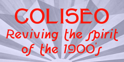
$16.50Coliseo is a lively and fun Art Nouveau inspired typeface, inspired by stone lettering seen on facade of the Coliseum Theatre in London. It's beautifully characterful let legible making it ideal for poster work or anything where it's useful to combine Roman display faces with a feeling of life and energy. - Josef Wein Moderne Blackletter by Intellecta Design,
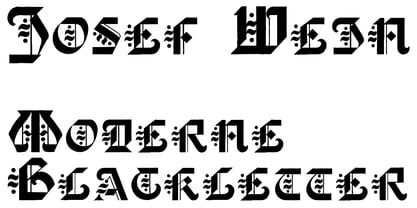
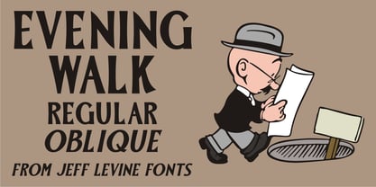
$20.90Josef Wein Moderne Blackletter is inspired in the rare work of Josef Heinz, who publish, in 1900 (Wien, Leipzig), a small catalog with gothic and art nouveau inspiration : "Moderne Schriften / herausgegeben und verlegt von Josef Heim", or, in the french title : Alphabetes Modernes. Soon, other fonts in that collection... Enjoy it - Evening Walk JNL by Jeff Levine,
$29.00 - Alathena by Studio Sun,
$20.00Alathena was inspired by the French art decade between art nouveau to art deco, comes with 2 style, Alternative swash and Modern deco, with some modified ligatures. Available with 6 Weights, Thin, Extra Light, Light, Regular, Bold, Extra Bold with support 75+ language (Latin Pro), and contains OpenType features. - Matching small caps for all weights. - Old Style Figure. - Full "f" Ligature set. - 20+ Optional (discretionary) ligatures. - Over 400+ Swash Characters. - Automatic Fractions. - Automatic Ordinals. - Extended language support for most Latin-based Western and Central European languages, including all the swash and alternate characters. - Dutch Deco JNL by Jeff Levine,
$29.00Although the Art Deco movement is generally attributed to the 1930s and 1940s, a number of design influences were showing up during the late 1920s in what is referred to as the Art Nouveau period. The Dutch illustrator Anton Kurvers’ hand lettering on the front cover of the (1927) magazine “Het Vlaamsche Volstooneel” clearly shows the clean lines and Avant Garde geometrics that foreshadow Art Deco. This attractive pre-Deco lettering has been recreated digitally as Dutch Deco JNL, and is available in both regular and oblique versions. - Jazmo by URW Type Foundry,
$49.99Jazmo is an offspring of an assignment I did for a Dutch architect. A classic building and coincidently the place of my studio in my hometown Zwolle, Netherlands, needed to be renovated. My job was to design the house numbers and signs for this building. This building I refer to was built in 1932 and designed according to the ‘New objectivity’ architecture. Now it accommodates several artist and craftsmen and also houses students. In my design I used elements of the Art Nouveau, which is related to the ‘New Objectivity’. Words as stately, angular, linear, stylish, artful, playful and frolic came to mind. It should be a design with a hint of the past and a flirt with the future. This house numbering is the root wherefrom Jazmo arises. The name Jazmo cites to the Jazz scene, which was a new and very popular artistic influence that time and age and is still a vibrant source of musical renewal. Mo stands for my Name Marit Otto. Together with my intern Arie Blok I created the missing characters and completed the font. Welcome Jazmo! - Mira by HiH,
$10.00Mira is a playful, decorative Art Nouveau font, released by Roos & Jung Foundry in Offenbach AM, Germany about 1902. The exaggerated serifs and the sharp contrast between the thick and thin strokes gives the page a whimsical “salt and pepper” look that is very distinctive. Mira uses our new encoding. The Euro symbol has been moved to position 128 and the Zcaron/zcaron have been added at positions 142/158 respectively. Otherwise, MIRA has our usual idiosyncratic glyph selection, with the German ch/ck instead of braces, Western European accented letters, lower case “o” and “u” with Hungarian umlaut and our usual Hand-in-Hand symbol. In addition, black-letter-style upper case “H” and “T” characters are included. Download the PDF Type Specimen for locations. - Hippie Mojo by Mysterylab,
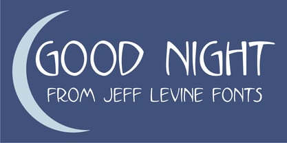
$18.00Set the wayback machine for about 1967. Smell the patchouli? Now you can inject just the right dose of swirly-licious mojo into your retro design with this original vintage-styled sixties font. But as with many psychedelic hippie lettering designs, the history reaches back even further; it owes a designer's debt of gratitude to the designs of the Art Nouveau era as well. This is predominantly a uni-case alphabet, but also features a few alternative characters in the lower case – at the full height of the capitals. With an extensive character set and multilingual glyphs, you can use Hippie Mojo to say "Groovy baby" in many languages. Evoke the carefree and tripped-out vibe of the psychedelic era with Hippie Mojo; it's pure retro fun! - Good Night JNL by Jeff Levine,
$29.00The beautiful hand lettering on the sheet music cover for Will R. Anderson's "Good Night Dear" (circa 1908) features quaint, semi-calligraphic lettering in the Art Nouveau Style. The song itself was popularized by Billie Burke [best remembered as the Good Witch in “The Wizard of Oz”] in the musical comedy "Love Watches". - LeBeau by Ascender,
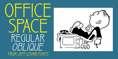
$29.99 - Office Space JNL by Jeff Levine,
$29.00Office Space JNL is based on “Condensed Edina” from the 1921 Miller & Richard type specimen book and is available in both regular and oblique versions. This spurred serif Art Nouveau monoline font is a milestone – marking the 1900th font design released by Jeff Levine Fonts since its inception in January of 2006. - ITC Benguiat Gothic by ITC,
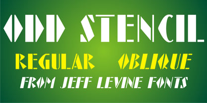
$29.99A roman face designed in the early 1980s by Ed Benguiat for ITC, ITC Benguiat shows a strong Art Nouveau influence. As with ITC Korinna, the stress of the ITC Benguiat font family occurs in the upper half of each capital. This distinctive typeface is particularly useful for display and advertising work. - Odd Stencil JNL by Jeff Levine,
$29.00The sheet music for "Dancing Butterfly" had the title of the 1929 composition hand lettered in what can be only described as an odd hybrid of letters with an Art Nouveau stencil influence. This quirky style became the basis for Odd Stencil JNL, which is available in both regular and oblique versions. - Millinery JNL by Jeff Levine,
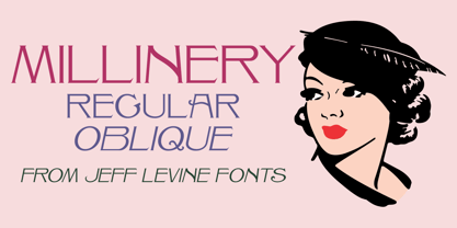
$29.00One of the type samples showcased in the 1907 Barnhart Brothers & Spindler specimen book was named “Sterling”; a spurred serif Art Nouveau design. This is now available digitally as Millinery JNL in both regular and oblique versions. An old fashioned term for a once plentiful business, ‘millinery’ is a women’s hat shop. - Antiga by FAEL,
$25.00What happens when Roman and Art Nouveau heritage get together? Antiga happens. Combining an old style typeface with an elegant and modern touch, Antiga is ideal for magazines and newspaper headlines, or even book covers! With a delightful and versatile amount of ligatures and diacritics, Antiga will give your text a unique personality. - Alea Weiqsaw by Sitintahitam,
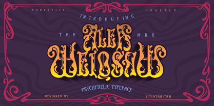
$25.00Alea Weiqsaw inspired from victorian era, art neuveau, psychedelic art and music. This font comes with unique trippy style, it will be interesting to make a headlines, packaging design and vintage style logotype like a cover album, sign logotype, vintage headline. Alea Weiqsaw also bring some alternative glyph and unique ornament. This combination allows you to easily develop awesome designs. - Ruthless Drippin TWO - Personal use only
- Greenwich Village JNL by Jeff Levine,
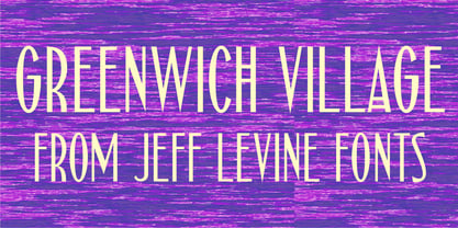
$29.00For decades, the Greenwich Village area of New York was a home for artists, poets, writers and free-thinkers of their time who were labeled "Bohemians" because of their non-conformist approach to life and the arts. Greenwich Village JNL is an Art Nouveau-influenced typeface with a Bohemian approach in its double crossbars on the A and H; all the while being a nice example of hand lettering found on a vintage piece of sheet music. - Periodical JNL by Jeff Levine,
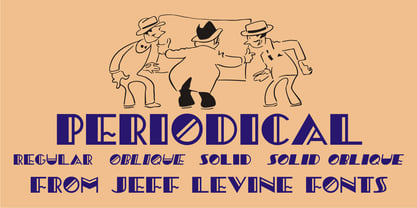
$29.00Periodical JNL is based on one the many stylized titles from the cover of the 1920s Spanish magazine "Nuevo Mundo" (New World). Each cover displayed a beautiful piece of period artwork along with the magazine's name in different lettering styles of the time (Art Nouveau and early Art Deco). The original design features an "engraved" look and now has an oblique counterpart. Also available are solid versions (without the inside lines) in both regular and oblique styles. - Gradl Initialen ML by HiH,
$12.00Max Joseph Gradl designed Art Nouveau jewelry in Germany. At least some of his designs were produced by Theodor Fahrner of Pforzheim, Germany -- one of the leading manufacturers of fine art jewelry on the Continent from 1855 to 1979. I don't know if he designed for Fahrner exclusively, but every example I found was produced by that firm. I assume it was also the same M.J, who edited a book, Authentic Art Nouveau Stained Glass which was reissued by Dover and is still available. For an artist as accomplished as Gradl was, he is very tough to research. There just does not seem to have been much written about him. The jeweler is visible in most of his typeface designs. They exhibit a sculptural quality as if they were modeled in clay (or gold) rather than drawn on paper. His monograms, especially, reflect that quality. Those shown in plates 112 through 116 in Petzendorfer actually appear to have been designed specifically for fabricating in the form of gold or silver pendents. Of the initial letters that came out of Germany during this period, these by Gradl seem unusually open and lyrical. They seem to be dancing on the page, rather than sitting. Please note that Gradl designed only the decorated initials. All other characters supplied were extrapolated by HiH, including the accented initials. Orn.1 (unicode E004) is based on a jeweled gold clasp designed by Gradl (please check out Gallery Image on Myfonts.com). Also included are an art nouveau girl’s face, a swan and the face from Munch’s “Scream”, from scans of old printer’s ornaments. Gradl Initialen M represents a major extension of the original release, with the following changes: 1. Added glyphs for the 1250 Central Europe, the 1252 Turkish and the 1257 Baltic Code Pages. Added glyphs to complete standard 1252 Western Europe Code Page. Special glyphs relocated and assigned Unicode codepoints, some in Private Use area. Total of 341 glyphs. Both upper & lower case provided with appropriate accents. 2. 558 Kerning Pairs. 3. Added OpenType GSUB layout features: salt, dlig, ornm and kern. 4. Revised vertical metrics for improved cross-platform line spacing. 5. Refined various glyph outlines. 6. Alternative characters: 16 upper case letters (with gaps in surrounding decorations for accents above letter). 8. Four Ornaments: face1, face2, swan and orn1 (silhouette of Gradl clasp) The zip package includes two versions of the font at no extra charge. There is an OTF version which is in Open PS (Post Script Type 1) format and a TTF version which is in Open TT (True Type)format. Use whichever works best for your applications. - BD Kameron by Typedifferent,
$20.00BD Kameron has a pretty strange mix of Art Nouveau curves and modern corporate cleanness. This font works well as an identity type of an entire guidance in a hotel or restaurant with a chic approach. It could be the source for a new logo, as it could also the headline font in a magazine. - Movie Drama JNL by Jeff Levine,
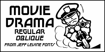
$29.00The Nov. 26, 1921 issue of “The Moving Picture World” carried an ad for the dramatic film “For Your Daughter’s Sake” (originally tilted “The Common Sin” and produced in 1920). Hand lettered in an Art Nouveau sans serif style, the ad copy inspired Movie Drama JNL, which is available in both regular and oblique versions. - Supernouveau by Intellecta Design,
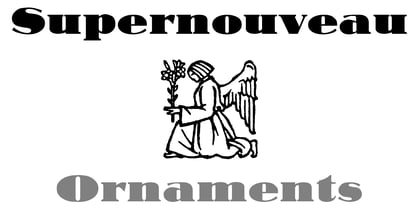
$39.90Supernouveau is a handfull and easy to use font with 244 pieces of art nouveau elements of decoration : frames, cuts, tailipieces, headpieces among others... Ready to use to make patterns, book coovers, públishing design, package material and all you need in your design with a XIX to XX centuru first decades feeling of beauty. - Postre by Fenotype,
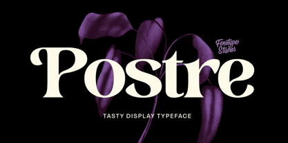
$25.00Tasty and sweet, Postre is a sleek high contrast serif type with certain Art Nouveau influence. Postre is excellent for headlines, packaging, posters and any other display use conveying an elegant impression. Postre is equipped with a selection of 50 alternate characters set in Swash, Stylistic and Titling Alternates, as well as standard ligatures. - FHA Nicholson French by The Fontry,
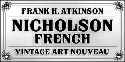
$25.00An Art Nouveau alphabet that has stood the test of time, Nicholson French, by legendary sign-painter Frank H. Atkinson, is over 100 years old and going strong. In modern typographic trim, it comes with OpenType feature replacement options and multi-language support, from standard Latin-1 to Latin Extended-A, Greek and Cyrillic. - Carlsbad by RMU,
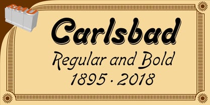
$30.00The Carlsbad font family is a bringing together of Regina Cursiv and Hansa Cursiv which both had been released by H. Berthold Messinglinienfabrik und Schriftgiesserei around 1895. Both these beautiful Art Nouveau italic fonts come with the following swash alternatives: D, E, G, H, K, S, T, h, k, m, n, s, and z. - Free Form Showcard JNL by Jeff Levine,
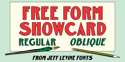
$29.00One of the examples in the 1916 publication “Baker’s Showcard Book” [an early 20th Century instructional book on sign lettering] was simply called “Plain Poster”. Somewhat Art Nouveau in style, but with many ‘nonconforming’ character shapes and widths, this novelty design is available digitally as Free Form Showcard JNL in both regular and oblique versions. - Wolfram by Scriptorium,
$18.00Wolfram is a bold display font based on an Art Nouveau type design from Germany. It features very thick letter forms with gnarled edges simulating antique printing, though the letter forms are stylish and rather modern looking. It's a striking font - excellent for buttons and other places you want to provide some strong emphasis. - Hamilton by Scriptorium,
$12.00Hamilton is a tall, bold display font developed from hand lettering by Samuel Welo. It embodies elements of art nouveau poster lettering and turn-of-the-century advertising design. The result is handsome and versatile, well suited to many uses. The full version includes lots of nice alternate versions of many of the letters.
