10,000 search results
(0.022 seconds)
- South Amsterdam DEMO - Personal use only
- Zombie Food Demo - Personal use only
- MUMIA DEMO VERSION - Unknown license
- BONDAGE DEMO VERSION - Unknown license
- LYSSA DEMO VERSION - Unknown license
- Captain Kidd Demo - Unknown license
- Cosmic Dude Demo - Unknown license
- Megaserif One Demo - Unknown license
- DS Motion Demo - Unknown license
- Collins OE Demo - Unknown license
- John Speed Demo - Unknown license
- DS Russia Demo - Unknown license
- Chancellerie Moderne Demo - Unknown license
- Stuttgart Gothic Demo - Unknown license
- Pyle Initials Demo - Unknown license
- DS JugendSC Demo - Unknown license
- Monumental Gothic Demo - Unknown license
- Fujita Ray Demo - Unknown license
- Decked Out NF by Nick's Fonts,
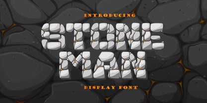
$10.00 - Stone Man Decorative by Sipanji21,
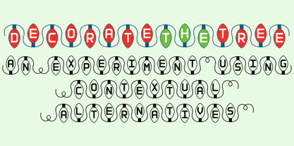
$16.00 - Decorate The Tree by Ingrimayne Type,
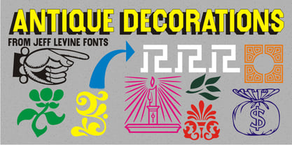
$9.00 - Antique Decorations JNL by Jeff Levine,
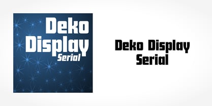
$29.00 - Deko Display Serial by SoftMaker,
$15.99 - Pool Deck JNL by Jeff Levine,
$29.00 - DIN Next Decorative by Monotype,
$40.99 - Linotype Decoration Pi by Monotype,
$29.00 - Deca Serif New by ParaType,
$30.00 - Decorative Arrows JNL by Jeff Levine,
$29.00 - Deko Black Serial by SoftMaker,
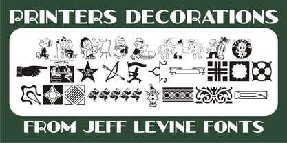
$15.99 - Printers Decorations JNL by Jeff Levine,
$29.00 - Petre Devos NF by Nick's Fonts,
$10.00 - Stencil Decor JNL by Jeff Levine,
$29.00 - Deutsche Poster Decorative by Intellecta Design,
$9.00 - Intellecta Decorative 017 by Intellecta Design,
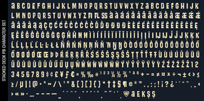
$19.95 - Stacked Deck PB by Pink Broccoli,
$14.00 - Decorative Panels JNL by Jeff Levine,
$29.00 - Bright Gesture DEMO - Personal use only
- OL Titling Deco Semi Hilight by Dennis Ortiz-Lopez,
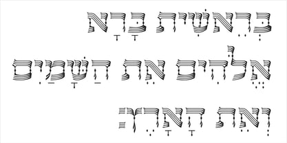
$40.00 - OL Hebrew David Deco Linear by Dennis Ortiz-Lopez,
$30.00 - AT Orlando by Monotype,
$29.99


