1,517 search results
(0.009 seconds)
- Neue Comic by Unio Creative Solutions,
$4.00
- Bazinga Comic by Ferry Ardana Putra,
$10.00
- LT Comical - 100% free

- The Archies Typeface by IKIIKOWRK,
$17.00
- Archive Tinted by Archive Type,
$19.95 - Archive Kludsky by Archive Type,
$19.95 - Archive Atlantique by Archive Type,
$19.95 - Archive Mann by Archive Type,
$19.95 - Archive Cider by Archive Type,
$19.95 - Archive Hands by Archive Type,
$19.95 - Archive Blackcap by Archive Type,
$19.95 - Archive Tilt by Archive Type,
$19.95 - Archive Garamond by Archive Type,
$59.99 - Archive Ribbon by Archive Type,
$19.95 - Archive Tale by Archive Type,
$19.95 - Archive Garfield by Archive Type,
$19.95 - Archive Woodchild by Archive Type,
$19.95 - Archive Steeler by Archive Type,
$19.95 - Arbhie Script by Zane Studio,
$20.00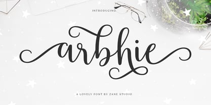
- Archive Ironlace by Archive Type,
$19.95 - SF Comic Script - Unknown license

- Bionic Comic Condensed - Unknown license

- Bionic Comic Italic - Unknown license

- SF Wonder Comic - Unknown license

- Comic Strip MN - Unknown license

- Casper Comics Solid - Unknown license

- SF Wonder Comic - Unknown license

- SF Comic Script - Unknown license

- SF Wonder Comic - Unknown license

- HVD Comic Serif - Unknown license

- FortuneCity Comic Outline - Unknown license

- SF Slapstick Comic - Unknown license

- Comic Book Commando - Personal use only

- Bionic Comic Expanded - Personal use only

- SF Wonder Comic - Unknown license

- SF Slapstick Comic - Unknown license

- SF Slapstick Comic - Unknown license

- SF Slapstick Comic - Unknown license

- Classic Comics JNL by Jeff Levine,
$29.00
- FF Comic Jens by FontFont,
$41.99


