10,000 search results
(0.054 seconds)
- Rigaster by Iwm Design,
$10.00 Rigaster is a font that encompasses four distinct styles, skillfully blending elements from classic serif fonts with those from modern typography. This fusion results in dynamic characteristics that lend themselves perfectly to contemporary designs as well as those with a retro aesthetic.
 - Rugged Rock by Comicraft,
$19.00 Around the rugged rock the ragged rascal ran, Foregoing fancy fonts, the Fontographer fawned and fell! Alliteratively allowing for assonant aspects as well, He spoke of several sentences that some should never spell! This classic title font will deliver tall tales that tell!
 - DIN Next Devanagari by Monotype,
$103.99DIN Next is a typeface family inspired by the classic industrial German engineering designs, DIN 1451 Engschrift and Mittelschrift. Akira Kobayashi began by revising these two faces-who names just mean ""condensed"" and ""regular"" before expanding them into a new family with seven weights (Light to Black). Each weight ships in three varieties: Regular, Italic, and Condensed, bringing the total number of fonts in the DIN Next family to 21. DIN Next is part of Linotype's Platinum Collection. Linotype has been supplying its customers with the two DIN 1451 fonts since 1980. Recently, they have become more popular than ever, with designers regularly asking for additional weights. The abbreviation ""DIN"" stands for ""Deutsches Institut für Normung e.V."", which is the German Institute for Industrial Standardization. In 1936 the German Standard Committee settled upon DIN 1451 as the standard font for the areas of technology, traffic, administration and business. The design was to be used on German street signs and house numbers. The committee wanted a sans serif, thinking it would be more legible, straightforward, and easy to reproduce. They did not intend for the design to be used for advertisements and other artistically oriented purposes. Nevertheless, because DIN 1451 was seen all over Germany on signs for town names and traffic directions, it became familiar enough to make its way onto the palettes of graphic designers and advertising art directors. The digital version of DIN 1451 would go on to be adopted and used by designers in other countries as well, solidifying its worldwide design reputation. There are many subtle differences in DIN Next's letters when compared with DIN 1451 original. These were added by Kobayashi to make the new family even more versatile in 21st-century media. For instance, although DIN 1451's corners are all pointed angles, DIN Next has rounded them all slightly. Even this softening is a nod to part of DIN 1451's past, however. Many of the signs that use DIN 1451 are cut with routers, which cannot make perfect corners; their rounded heads cut rounded corners best. Linotype's DIN 1451 Engschrift and Mittelschrift are certified by the German DIN Institute for use on official signage projects. Since DIN Next is a new design, these applications within Germany are not possible with it. However, DIN Next may be used for any other project, and it may be used for industrial signage in any other country! DIN Next has been tailored especially for graphic designers, but its industrial heritage makes it surprisingly functional in just about any application. The DIN Next family has been extended with seven Arabic weights and five Devanagari weights. The display of the Devanagari fonts on the website does not show all features of the font and therefore not all language features may be displayed correctly. - DIN Next Cyrillic by Monotype,
$65.00DIN Next is a typeface family inspired by the classic industrial German engineering designs, DIN 1451 Engschrift and Mittelschrift. Akira Kobayashi began by revising these two faces-who names just mean ""condensed"" and ""regular"" before expanding them into a new family with seven weights (Light to Black). Each weight ships in three varieties: Regular, Italic, and Condensed, bringing the total number of fonts in the DIN Next family to 21. DIN Next is part of Linotype's Platinum Collection. Linotype has been supplying its customers with the two DIN 1451 fonts since 1980. Recently, they have become more popular than ever, with designers regularly asking for additional weights. The abbreviation ""DIN"" stands for ""Deutsches Institut für Normung e.V."", which is the German Institute for Industrial Standardization. In 1936 the German Standard Committee settled upon DIN 1451 as the standard font for the areas of technology, traffic, administration and business. The design was to be used on German street signs and house numbers. The committee wanted a sans serif, thinking it would be more legible, straightforward, and easy to reproduce. They did not intend for the design to be used for advertisements and other artistically oriented purposes. Nevertheless, because DIN 1451 was seen all over Germany on signs for town names and traffic directions, it became familiar enough to make its way onto the palettes of graphic designers and advertising art directors. The digital version of DIN 1451 would go on to be adopted and used by designers in other countries as well, solidifying its worldwide design reputation. There are many subtle differences in DIN Next's letters when compared with DIN 1451 original. These were added by Kobayashi to make the new family even more versatile in 21st-century media. For instance, although DIN 1451's corners are all pointed angles, DIN Next has rounded them all slightly. Even this softening is a nod to part of DIN 1451's past, however. Many of the signs that use DIN 1451 are cut with routers, which cannot make perfect corners; their rounded heads cut rounded corners best. Linotype's DIN 1451 Engschrift and Mittelschrift are certified by the German DIN Institute for use on official signage projects. Since DIN Next is a new design, these applications within Germany are not possible with it. However, DIN Next may be used for any other project, and it may be used for industrial signage in any other country! DIN Next has been tailored especially for graphic designers, but its industrial heritage makes it surprisingly functional in just about any application. The DIN Next family has been extended with seven Arabic weights and five Devanagari weights. The display of the Devanagari fonts on the website does not show all features of the font and therefore not all language features may be displayed correctly. - DIN Next Paneuropean by Monotype,
$92.99DIN Next is a typeface family inspired by the classic industrial German engineering designs, DIN 1451 Engschrift and Mittelschrift. Akira Kobayashi began by revising these two faces-who names just mean ""condensed"" and ""regular"" before expanding them into a new family with seven weights (Light to Black). Each weight ships in three varieties: Regular, Italic, and Condensed, bringing the total number of fonts in the DIN Next family to 21. DIN Next is part of Linotype's Platinum Collection. Linotype has been supplying its customers with the two DIN 1451 fonts since 1980. Recently, they have become more popular than ever, with designers regularly asking for additional weights. The abbreviation ""DIN"" stands for ""Deutsches Institut für Normung e.V."", which is the German Institute for Industrial Standardization. In 1936 the German Standard Committee settled upon DIN 1451 as the standard font for the areas of technology, traffic, administration and business. The design was to be used on German street signs and house numbers. The committee wanted a sans serif, thinking it would be more legible, straightforward, and easy to reproduce. They did not intend for the design to be used for advertisements and other artistically oriented purposes. Nevertheless, because DIN 1451 was seen all over Germany on signs for town names and traffic directions, it became familiar enough to make its way onto the palettes of graphic designers and advertising art directors. The digital version of DIN 1451 would go on to be adopted and used by designers in other countries as well, solidifying its worldwide design reputation. There are many subtle differences in DIN Next's letters when compared with DIN 1451 original. These were added by Kobayashi to make the new family even more versatile in 21st-century media. For instance, although DIN 1451's corners are all pointed angles, DIN Next has rounded them all slightly. Even this softening is a nod to part of DIN 1451's past, however. Many of the signs that use DIN 1451 are cut with routers, which cannot make perfect corners; their rounded heads cut rounded corners best. Linotype's DIN 1451 Engschrift and Mittelschrift are certified by the German DIN Institute for use on official signage projects. Since DIN Next is a new design, these applications within Germany are not possible with it. However, DIN Next may be used for any other project, and it may be used for industrial signage in any other country! DIN Next has been tailored especially for graphic designers, but its industrial heritage makes it surprisingly functional in just about any application. The DIN Next family has been extended with seven Arabic weights and five Devanagari weights. The display of the Devanagari fonts on the website does not show all features of the font and therefore not all language features may be displayed correctly. - Anethysta by Twinletter,
$12.00 Anethysta is an authoritative bold script font carrying a crisp and flexible theme for use in various projects, feminine or masculine this font will remain elegant when you use it, this font has a unique and different impression but is still beautiful to look at. made with natural handwriting to create an attractive impression when all your audience sees it. This font is designed by considering the portion and composition that suits your needs, also designed with a natural hand touch, has alternative features, ligatures and also supports multi-language, So this font is suitable for crafts, outdoor activities, logotypes, posters, titles, banners, wedding invitations, product packaging logos, quotes, social media page covers, book covers and more. what are you waiting for start creating special projects with this font!
 - Hella Instegra by Skypia,
$17.00 Start good day for new font! present to you, Hella Instegra! Hella Instegra is a stylish font It has both modern and retro look - clear, modern and fun. Helps to create layout design in 60s or 70s design projects. This font have more than 150 unique alternate and 59 ligature that to give your logo,business card and another project to a unique vintage look. It has Italic and Outline version too so what a perfect vintage font! Hella Instegra is also included full set of: uppercase and lowercase letters multilingual symbols numerals punctuation Alternates PUA Encoded Unique letterforms I really hope you'll get pleasure using Hella Instegra font and it will be perfect addition to your font collection! If you have some questions, please write me a letter! Thank You Skypia.
 - Caltic by Ingrimayne Type,
$12.95 Caltic-Holiday, Caltic-Festival, and Caltic-Straight are three eye-catching, very bold typefaces that are suitable for posters and signage. Caltic-Holiday and Caltic-Festival base letter shapes on trapezoids with curved sides but with curves that are reversed going from one to the other. Caltic-Straight has letters based on trapezoids with straight sides. None are suited for text and with their built-in spacing will not work as all upper-case or all lower-case. All three come in two widths, regular and wide, giving the Caltic family six members. Caltic has nothing to do with Celts. The Calt refers to the calt or contextual alternative OpenType feature that makes this typeface work. When the letters on the upper-case keys alternate with the letters on the lower-case keys, they fit snuggly together. As long as the user has a word processor that supports the contextual alternatives feature, there is no need for the user to alternate letters; the calt feature does it automatically. Although the fonts seem similar to hand-drawn lettering that was done on posters and signs during the hippie era of the 1960s and 1970s, I can find nothing quite like them. My inspiration for them is older, in a newspaper from 1932 that led to the typeface family PoultySign. Caltic (and Lentzers) are the result of seeing what else I could do with the inspiration that sprang from that 1932 newspaper.
 - Chaotic Circuit - Unknown license

- Static Cling - Unknown license

- Fire Wood - Unknown license

- Afolkalips by Arterfak Project,
$15.00 Introducing 'Afolkalips' a tribal display font. Inspired by hinterland culture in the world, especially Papua Tribe, Indonesia. The Papuan Culture has many native tribes based on their location, culture and different ancestors. The equation is, they have a culture of decorating the body with paint from plants. The motives are also diverse, but with the characteristics of firm lines. In addition to various line motifs, Papuan hinterland people also explore colors that distinguish one tribe from another. You can see it on face decoration, as well as their body parts. The tools they used to paint their faces were usually with wood or leaves. Clear lines are etched, producing a natural, rough and authoritative form. It is this form that inspires us in designing the 'Afolkalips' typeface. All-capitals font with strong strokes that very recommended for headline or display on a traditional theme. Complete with 50+ custom ligatures that give you more variations. Also featured with 28 accents. This font also has ornament swashes to give your design more tribal looks, you can use the swashes as a frame or decoration. Suitable for your design such as poster, flyer, t-shirt design, logo, magazine, signage, or billboard. Afolkalips is a minimalist-joyful font which is flexible to apply in bright theme or elegant style. What you'll get : - Uppercase - Lowercase - Numbers - Punctuations - Symbols - Stylistic alternates - Ligatures - Accents Hope you like it! Thank you for your support and happy designing!
 - Aistoria by Black Studio,
$29.00 New from Black Studio, presenting Aistoria is a typeface that is feminine, adaptable, aesthetically contemporary and creates limitless variety for your creative needs. Its striking contrasts and subtle details, together with luxurious strokes and voluptuous curves, create a beautiful and powerful statement for any typographic composition, blending glamor with contemporary aesthetics. Aistoria really helps you create unlimited variations for your creative needs in making your project titles: such as Books, fashion, magazines, logos, branding, photography, invitations, wedding invitations, quotes, blog headers, posters, advertisements, postcards, books, websites, etc. WHAT IS INCLUDED; • Aistoria – Regular This typeface of has become the work of true love, making it as easy and fun as possible. I can't wait to see what you do with Aistoria! Feel free to use the #Black Studio tag and the #Aistoria font to show what you've done, I really hope you enjoy it! Thank you!
 - Toisy by Letrizmo,
$21.00When the right late seventies / early eighties message is needed, Toisy comes to the rescue. Founded on a mix of references from letterforms of the time, this new original nods to a style that defined an era. A sexy theme font that conveys a clear image of what was truly chic thirty years ago, this alphabet is deeply rooted in sultry memories of soft, endless nights. Exaggerate contrast between strokes and angular lines combine with rounded corners to provide a unique character and a look that sharply differs when set in all caps or lower case, thanks to an uncommon treatment of density and proportions. Set it real tight, as was typographically in fashion circa 1981. Toisy and Toisy Greek include a set of 13 matching images inspired in leisure stuff and the clothing of the last days of disco. They are different from the set included with Toisy Alt. - String by Lián Types,
$45.00 Inspired by the sound of acoustic guitars, delicacy of harps and elegance of the engrossers script, String is a trendy monoline font which will for sure make unique layouts for your pieces of design. Combining String with String Hole in the same word is a good idea when a more playful rhythm is needed. The font works particularly well when standing on photographs, so be ready to use it in magazines with food, landscapes or super models. I like thinking of String as a distilled version of Erotica. A more “pure” relative of hers. When I designed Erotica, I was so in love with the spencerian style that I knew it'd be hard to just abandon it. With that in mind, this time my aim was to take the subtlety of it to the limit. So, in order to do that I had to find out what was actually the secret of its beauty. I found that the essence of Erotica, in other words, its ductus was the most responsible. The result is a font made of hairlines with a lot of emphasis on the pureness of the form and, (with a lot of inspiration in music) the sensation of continuity between its letters as if they were written with a string. Try String and its flowing melody.
 - Best Life by Sulthan Studio,
$12.00 Best life - This cool one line handwritten font is very stylish and elegant that has a great style for your work with hearts in the middle and also lowercase swashes in front and back and lowercase swashes on back and hearts in front of letters to connect.
 - Coestral by Nathatype,
$29.00 Coestral is a captivating capital serif font designed with elegance and a touch of interconnected charm. Each letter is meticulously crafted to exude sophistication without being overly heavy, creating a harmonious and visually pleasing appearance. The capitalized letterforms of this font showcase clean lines and refined serifs, striking the perfect balance between elegance and readability. The font's moderate weight ensures a versatile and adaptable design, making it suitable for a wide range of creative projects. What sets Coestral apart is its subtle yet delightful feature of connected letters. Some letters are gracefully linked, creating a seamless and flowing look that adds a touch of uniqueness and artistic flair. This interconnected style adds a sense of continuity and grace to the font, enhancing its overall elegance. On the other hand, its legibility and graceful appearance ensure that it makes a bold statement without overwhelming the viewer. Enjoy the available features here. Features: Ligatures Multilingual Supports PUA Encoded Numerals and Punctuations Coestral fits in headlines, logos, posters, flyers, invitations, greeting cards, branding materials, print media, editorial layouts, website headers, and many more. Find out more ways to use this font by taking a look at the font preview. Thanks for purchasing our fonts. Hopefully, you have a great time using our font. Feel free to contact us anytime for further information or when you have trouble with the font. Thanks a lot and happy designing.
 - Bestoom by Arterfak Project,
$15.00 Bestoom is a playful handwritten font, made with dynamic letter strokes and a bouncy layout that makes your design looks more cheerful! Inspired by comic typography and kids' storybook. This font is available in regular and bold that you can use separated or combined. Bestoom is an all-caps font that has the gorgeous uppercase and lowercase also complete with alternates and playful ligatures that expand your possibility to get many variations of typographic design! Other features: Uppercase Lowercase Numbers Punctuations Accented characters : ÀÁÂÃÄÅÆÇÈÉÊËÌÍÎÏÑÒÓÔÕÖØÙÚÛÜÝÞßàáâãäåæçèéêëìíîïñòóôõöøùúûüýþÿĀāĆćĈĉĊċČčĎďĒēĖėĚě ĜĝĠġĢģĤĥĨĩĪīİıĴĵĶķĹĺĻļĽľŃńŅņŇňŌōŐőŒœŔŕŖŗŘřŚśŜŝŞşŠšŤťŨũŪūŮůŰűŴŵŶŷŸŹźŻżŽžȘșŢţ ẀẁẂẃẄẅ Stylistic alternates Custom ligatures Thank you for visiting and have a nice day!
 - Calymati by Ilhamtaro,
$14.00 CALYMATI is a bold, vintage-style font that has beautiful curves. This font is basically a classic serif font that is thick and has a slightly beautiful feature because the strokes have beautiful bends so that even though it is sturdy it still has a beauty side, it is very suitable for vintage designs such as a brand logo badge, liquor label, but also can for more modern designs like magazine headlines. To enable the OpenType Stylistic alternates, you need a program that supports OpenType features such as Adobe Illustrator CS, Adobe Indesign & CorelDraw X6-X7. Cheers!
 - Bhortead by Vultype Co,
$29.00 Bhortead that has a vintage theme that you can use for your project. This font has 2 styles, Clean and Rough, and so you can use that style according to the type of project. This font has many OpenType features so you can combine each font to be more dynamic. Special features include: stylistic alternates, ligatures and swashes. Bhortead includes western European characters (multilingual support). All characters have an imperfect shape that gives a natural look in design. It cooperates well for creating the traditional style logos, labels, package design, lettering for t-shirts and much others.
 - Merlovaz by Ilhamtaro,
$14.00 MERLOVAZ is a bold, vintage-style font that has beautiful curves. This font is basically a classic serif font that is thick and has a slightly beautiful feature because the strokes have beautiful bends so that even though it is sturdy it still has a beauty side, it is very suitable for vintage designs such as a brand logo badge, liquor label, but also can for more modern designs like magazine headlines. To enable the OpenType Stylistic alternates, you need a program that supports OpenType features such as Adobe Illustrator CS, Adobe Indesign & CorelDraw X6-X7. Cheers!
 - Wenzel by FaceType,
$15.00 This work is the result of an assignment to digitize and complete a typeface that was used for the intertitles of Kleider machen Leute from 1921. We only had a basic alphabet with some glyphs missing. Sure, Wenzel is not a beaut, but ... what the heck!
 - Megabeat by Invasi Studio,
$17.00 Megabeat Font is a new and exciting typeface that is inspired by the robotic and mecha poster movies of the past. The font references the science-fiction visual of the retro-futurism mindset, making it perfect for any project that requires a futuristic and technologically advanced design. This font is perfect for creating sci-fi movie posters, serials, technology-based branding, posters, logos, vintage illustrations, packaging, snacks, event and festival materials, album and cover artwork, books, toys, games, arcades, cards, automotive designs, and many more. The font features bold and chunky letterforms with sharp angles and mechanical elements, giving it a futuristic and robotic feel. The font is easy to read and legible, making it perfect for headlines, titles, and other design elements that need to be easily understood. The font is perfect for any project that requires a futuristic and technologically advanced design that is inspired by the iconic visual of retro-futurism.
 - Merside by Putracetol,
$28.00 Merside - Premium Serif Font Merside - Premium Serif Font is a stunning typeface that exudes sophistication and elegance. The font's clean and crisp lines make it a versatile choice for various design projects, from high-end branding to classic book covers and posters. The font was crafted with the utmost care and attention to detail, resulting in a timeless typeface that will elevate any design. Merside - Premium Serif Font is the perfect choice for designers who want to convey a sense of luxury and exclusivity in their work. The font's classic serif style adds a touch of refinement, while the clean lines give it a modern twist. Whether you are designing a logo for a luxury brand, creating marketing materials for a high-end fashion label, or designing a product packaging, Merside will add a touch of elegance and sophistication to your project. One of the standout features of Merside - Premium Serif Font is its OpenType features, which include alternates and ligatures. These features give designers more creative freedom, allowing them to customize the font and create unique and eye-catching designs. The font also includes uppercase and lowercase letters, as well as number, punctuation, and symbol glyphs. Additionally, Merside supports multiple languages, making it an excellent choice for global brands. The font is compatible with a wide range of design software and platforms. You can easily install and use Merside - Premium Serif Font on your computer or device, making it a convenient and accessible choice for designers. If you are looking for a premium serif font that will make your design stand out, Merside - Premium Serif Font is an excellent choice. With its elegant and refined style, it is perfect for creating luxury branding, elegant design, and high-end fashion. This font will give your project a timeless and classic look that will never go out of style. In summary, Merside - Premium Serif Font is a stunning and versatile font that is perfect for designers who want to create high-end and sophisticated designs. With its classic serif style, OpenType features, and multilanguage support, it is a font that will elevate any design project.
 - Wonder Brush by Canada Type,
$29.95 Wonder Brush is a display typographer's guilty pleasure. It's one of very few fonts ever made that can take intense abuse and still look natural. Partly based on a 1969 Friedrich Poppl design called Poppl Stretto, but considerably fused with ideas found in interwar magazine ad lettering and signage, Wonder Brush caters to the idea that most graphic designers would rather use design elements they can enjoy. When you spend your days being "challenged" and "creatively tested" and "communicating the message," you can definitely use a little bit of playtime. And this font gives you just that, playtime on the job. Wonder Brush appears to be a straightforward narrow upright brush script. But it really is made of malleable rubber. Take it into a program like Adobe Illustrator, set something, stretch or squeeze, shear or warp, slant or transform… just play with it like they used to do in the 70s and 80s. You will soon discover that this font really is a big old top hat, and it's up to you and your mischief to pull rabbits or geese out of it. A single font that allows you to emphasize content or manage space mechanically without affecting the integrity of the type setting. And if your playtime includes fiddling with OpenType features, you're in for a bonus treat: Wonder Brush comes with over 800 characters, including a lot of alternates and extended language support. So tweak away until your eyes cry with joy. The only rules are the ones you set, and even those are meant to be broken.
 - Rocket Please by PizzaDude.dk,
$17.00 A charming font with shaky lines and 6 different version for each letter. Use it for something that needs a handmade and/or organic look. That could be children's books, posters, greeting cards, product packaging ... anthything that needs a special appearance and charm.
 - Sporten by Din Studio,
$29.00 Sporten is a classic sport font. Made for any professional project especially that related to the sports. Beside that, this font can be used for printing, branding and quotes. Includes: Sporten (OTF) Features: PUA Encoded Multilingual Support Numerals and Punctuation Bonus Esport Logo Thank you for downloading premium fonts from Din Studio
 - True Message by Attractype,
$15.00 True Message is a handwritten brush font that created by skilled hands to make this font look stylish and elegant. This font is suitable for branding projects, logo, wedding designs, visiting cards, social media posts, advertisements, product packaging, product designs, label, photography, watermark, invitation, stationery and any projects that need unique handwriting taste.
 - Biscuit Kids by PizzaDude.dk,
$19.00 The other day, a couple of kids at work (I work as a kindergarten teacher!) played this game where they were detectives. Not the usual detective, but someone who worked for cookies and biscuits! They called themselves The Biscuit Kids, and I knew instantly that I had to make a font with that name! My Biscuit Kids font is a playful comic book font, but also suitable for anything that needs a fresh extra spicy attention!
 - Adigussto by Twinletter,
$14.00 Adigussto is a signature font that we created with dramatic hand strokes paying attention to the aesthetic appearance in every curve that is so elegant and fun. This font is designed with a natural touch of handwriting refined to create portions and compositions that suit your needs. So this font is perfect for crafts, kids writing, adventure posters, food banner titles, wedding invitations, product packaging logos, quotes, social media page covers, furniture banner headers, book covers, and more.
 - Organa by TypeFaith Fonts,
$5.00 Now that we're done with the hipster stuff, the handwritten and the brush fonts, it is time for something new: Organa, a stylish geometric font family. Create a new feel for your designs. Organa is a unique and creative font that can be used for logo design and branding, posters flyers and book covers. Organa will help you to shake off the old feel and to create something new. It comes in three styles that are easy to combine.
 - Sticky Shoes by Bogstav,
$15.00 Sticky Shoes was inspired by a sign at a local flea market. The artist behind the sign obviously didn’t care much about painting the letters “in the right way” - leaving a slobby and uneven impression. And what is wrong with that? Nothing, if you ask me. I tried my best to capture the charm and innocence behind that sign in Sticky Shoes. I even made the paint version go outside the outline in the Regular version! I added 6 different versions of each letter, and they automatically changes as you type. That goes for all 4 versions, and they even mix very nicely!
 - Brutal Fashion by Bogstav,
$18.00 There are a lot of things to say about fashion. I never really cared about what people meant was fashion, at any time of my life...well, not counting my teenage years!!! I was a teenager in the 1980ies and I was really into what was hot or not...but when I look at photos of myself from that time, I always wonder what kind of fashion trends I was following! :) Brutal Fashion is really not brutal in any way, but more attractive, nice, charming, handsome, delicate and graceful - with a stunning amount of handmade roughness!
 - Vandermark by TypeTrust,
$30.00Vandermark began as a simple daydream of what became the 'n' glyph. I considered the elegant balance of a terminal stroke that would never join its supporting stem. The premise was simple, but further experimentation was required for other parts of the alphabet. Vandermark follows a somewhat flexible array of structural rules and curve arrangements that called for considerable sketching to harmonize. The names I choose for my typefaces have to look decent when set in the signature type. Considering its improvisational development, it was only fitting that the namesake is a jazz musician and fellow Chicagoan, Ken Vandermark. - Misheard Lyrics by Bogstav,
$18.00 Did you ever get lyrics from a song wrong? And maybe found out years and years later, that is was wrong...but the wrong lyrics get stuck, even though you know that they are wrong! :) Misheard Lyrics is a font that most likely gets stuck in your design, because it has that bouncy and random look that makes your text come alive - without overdoing it!
 - Wonderful Melanesia by Arterfak Project,
$15.00 Say hello to Wonderful Melanesia. A fancy font combination, minimalist signature, and elegant serif. These fonts are carefully designed with attention to every detail of the letterforms, which makes the perfect font combination that you can apply for your design that needs an elegant touch, classy looks, and minimalist. The serif font is designed with a few spacing so that it provides more clarity when reading it, and the signature font designed with dynamic strokes that give it the more natural handwriting. Wonderful Melanesia has equipped with many OpenType features. There are beautiful ligatures, Stylistic alternates, and swashes which you can use it to get your design more softly. Fonts featured : Uppercase Lowercase Numbers Punctuation & symbols Stylistic alternates Ligatures Swashes Accented characters : ÀÁÂÃÄÅÆÇÈÉÊËÌÍÎÏÐÑÒÓÔÕÖØÙÚÛÜÝÞßàáâãäåæçèéêëìíîïñòóôõöøùúûüýþÿıŁłŒœŠšŸŽž Thank you for watching and have a wonderful day!
 - Amfost by PizzaDude.dk,
$20.00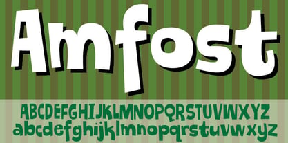 A comic font with that casual and funky pizzadude-look!
 - Agudal MF by Masterfont,
$59.00 Fresh text font that will serve as title, signage etc.
 - Pillow Talk by Elemeno,
$10.00Please note that this font has a limited character set. - My BONNY by Cooldesignlab,
$12.00 My Bonny is a handcrafted font that has several interrelated characters. My Bonny has an opentype feature that will automatically convert each character into a ligature. so that it becomes a unique character. My Bonny has a bold yet playful style that is easy to read and apply to all design projects such as poster designs, apparel, logos, quotes, album covers, books, business cards, product designs and many more. more design projects. We made this font look cute, memorable and easy to use.


