10,000 search results
(0.066 seconds)
- Maraka by Rosario Nocera,
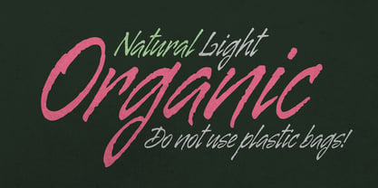
$12.00Maraka is a handwritten font family, drawn with a paint marker on rough paper, then scanned and turned into vector format. Maraka has a lot of alternative letters and is available in three versions: “Regular”, characterized by an unique look obtained by drawing the letters on a rough sheet, "Solid" and "Serif". Maraka is ideal for large headers, straplines and typographic compositions, but it still gives a great dynamic effect when writing wordy paragraphs. - Mitreba by Yahya Type,
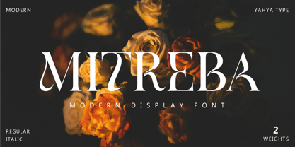
$18.00Mitreba – is an elegant classic serif font with Fancy Curves, More Alternative Characters, and Multilingual Support. Mitreba – this style works well for branding projects, logo, wedding designs, social media posts, advertisements, product packaging, product designs, label, photography, watermark, invitation, or whatever project you’re working on. WHAT’S INCLUDED? Uppercase & lowercase letters Numbers, punctuation Ligature & Huge Stylistic alternate Multilingual support. Still got a question? Send me a message and I’ll be happy to answer! qura.yahya@gmail.com - Killing Time by PizzaDude.dk,
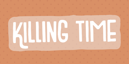
$15.00Killing Time can be quite good - if the time killed is being used on something useful ... could be if your are taking your fantasy and imagination for a walk, and let your creativity sprout. Use the soft lines and corners of Killing Time font for your comics, toys, candy, posters, postcards, invitations ... well, the list goes on - but if you need something fresh and comic, and not overdoing it, Killing Time could be your choice! - Nakone by madeDeduk,
$14.00Really excited to introduce Nakone, a luxury bold Serif with two styles: solid and stencil. A lot of stylish alternates will make this font suitable for your any design project. Features: UPPERCASE lowercase Number & Symbol International Glyphs Alternative Uppercase Alternative lowercase Ligatures If you need anything else just shoot me on email at: dedukvic@gmail.com or find more previews on my Instagram here : https://www.instagram.com/acekelgondolayu/?hl=en Hope you enjoy it. - Wedding Text by Monotype,
$40.99Wedding Text was designed by Morris Fuller Benton in 1901 for American Type Founders (ATF). The face was so popular that its forms soon began appearing with other font foundries under different names, Elite Kanzlei with D. Stempel AG, Comtesse with C.F. Rühl, Linotext with Linotype, etc. Its ornamental forms are not considered very legible by today's standards; therefore it should be used for headlines and short texts in point sizes 12 or larger. - FE Gigant by Egor Stremousov,
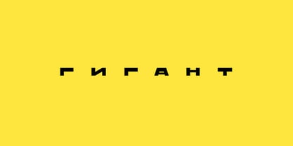
$50.00The font has a pronounced decorative effect and is suitable for the gaming, publishing and film industry. The Cyrillic alphabet conveys the spirit and atmosphere of Soviet constructivism. It is well suited for names of Soviet (or pseudo-Soviet) trademarks, large headings, signs, giant letter structures, etc. The Latin part is not tied to the Soviet period and can be applied in a wider range. Sharp angles and unnatural proportions create dynamics, strength and heaviness. - Ratafly by Ingrimayne Type,
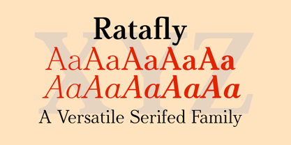
$9.00Ratafly is versatile serifed font that can be used for display or text. The family has ten styles, with five weights and italics for each weight. The name Ratafly is a reference to the origin of the family. It began by blending two very different serifed typefaces, Rataczak and FlyHigh. After a lot of cleaning up, the end result is a family that works better for book text than either of the parents. - Silly Habit by Bogstav,
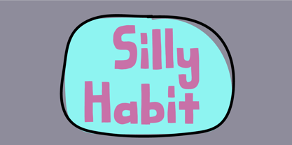
$12.00Don't we all have a silly habit? I've got mine, for sure! - like checking whether I remembered to bring my keys, immediately after locking the door...and then checking again like 2 minutes later! Silly Habit is my laid back comic font, easy to read and fresh enough for a design that needs an extra party to it! Comes with contextual alternates, which in this case means 4 different versions of each lowercase letter - Only Kidding by PizzaDude.dk,
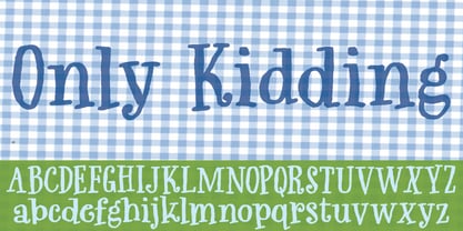
$20.00Massive text suits my Only Kidding very well. Even at small sizes it is super legible, and it really keeps that handmade image. At larger sizes the crunchiness really comes forward and may surprise you how detailed edges the letters has got! I am going to use this font for one of my children's books - I am thinking something adventure-ish! What you think? Comes with fi and fl ligatures and double letter substitutions! - Umerica by Typotheticals,
$4.00Umerica first made its appearance in 2007 as a series of characters in a pdf I posted to Typophile. It has taken a lot of time, and determination, for me to finally decide to complete it. I had the basic font completed in 2008, but put it aside as the creation of the italics it deserved were beyond me. That was then. Now the italic version has finally been added twelve years later. - Funky Tut NF by Nick's Fonts,
$10.00Two handlettered typefaces from J. M. Bergling’s 1914 classic, Art Alphabets and Lettering collided to produce this lively and unusual combination. The caps were originally called "Morocco", and the lowercase are taken from his Keramic Text. The result suggested more of an Egyptian flair, in an offbeat kind of way, and so it got its name. Both versions of the font include 1252 Latin, 1250 CE (with localization for Romanian and Moldovan). - Now Appearing JNL by Jeff Levine,
$29.00Now Appearing JNL is a digital version of some hand-lettering spotted on an early 1960s ad for a Miami Beach night club. Its fun, casual appearance makes it perfectly suitable for any project that conveys a relaxed atmosphere. The font was intentionally not kerned, so the free-flowing form of the lettering is at its best, but it can be set tight by hand if a more compact look is desired. - Fifty Holliwing by Attract Studio,
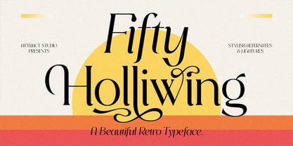
$17.00Fifty Holliwing is a modern classic serif font inspired by a classy eighties magazine with soft curves and a sharp eye for detail that makes it a must for any project that requires high-end. Fifty Holliwing also comes with an italic version that really helps with your designs as well as lots of unique alternatives and ligatures that are really versatile. Include: Regular & Italic Alternates & Ligatures OpenType support Multilingual PUA Encoded. - Ardila by Subectype,
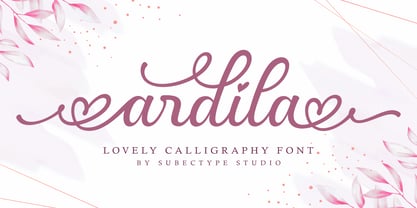
$15.00Ardila is a lovely calligraphic font with a lot of love swashes. Equipped with lovely alternative letters for beginning and ending and also up to 5 stylistic alternates which makes this letter very beautiful and attractive. Ardila is suitable for logos, headlines, clothing, branding, quotes, invitations, stationery, wedding design, album covers, business cards, clothing, magazines, posters, and more! Thank you for your purchase! and hope you have fun with Ardila. Happy creating! - Shinano by Hanoded,
$15.00Shinano is an old province of Japan. Kobayashi Issa (1763 - 1828), a famous Japanese Haiku poet and Buddhist priest, was born here. Together with Bashō he is my favourite Haiku poet. Shinano font was hand made using a Japanese brush pen. At first glance it may look like a messy script, but underneath its rough appearance beats a poetic heart. Comes with some alternates and ligatures and a whole lot of diacritics. - 21 Cent by Letterhead Studio-YG,
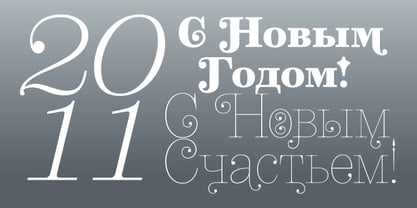
$45.0021 Cent - not Century or Clarendon. This is an original font family designed from scratch. 21 Cent is named after a magical coin that brings good luck. And well, in honor of the 21st century, of course. 21 cent family is used in the almanac of the State Hermitage Museum, St. Petersburg, Russia. All members of 21 Cent family include the expanded character set of with support of Cyrillics, Central European and Baltic languages. - Lovely Dramatis by Saffatin.co,
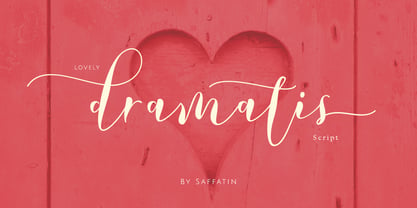
$22.00LOVELY DRAMATIS is a modern script typeface. This font very easy to use and really playful. You can explore to create a combination that would be nice. Comes with modern style, is handmade and clean. LOVELY DRAMATIS, includes swashes, ligatures, Alternate and International support for most Western Languages. LOVELY DRAMATIS come with 484 glyphs. This typeface will look sweety for fashion, e-commerce brands, wedding boutiques, photography, quotes design, and a lot more. - Los Muertos by Just My Type,
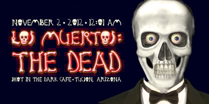
$25.00Happy Halloween (and All Souls Day and Day of the Dead)! I’ve seen other fonts made up of bones of various kinds, but none with this variety. Henry Gray’s Anatomy of the Human Body (the book, not Grey’s Anatomy, the TV series) was heavily scoured to find more unusual bones shaped like letters. You’ll find Los Muertos both fun and appropriate for the up-coming holidays. (Uppercase is Solid, lowercase is Outline). - Spring Butter by Sipanji21,
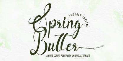
$18.00Spring Butter is a modern script with leaves looks in the open type feature. This font is elegant, messy and modern. Spring Butter perfect for wedding event, anniversary, birthday, greeting cards, logotype, branding, wedding invite and card, elegant logo, poster, packaging, stationery, website, and any other projects requiring a handwritten and luxurious touch. Come with open type feature with a lot of alternates and some ligatures also its help you to make great lettering. - Hungry Beast by Bombastype,
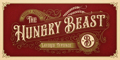
$35.00Hungry Beast is a Victorian theme font. With another old fashioned feel on it, because we were very passionate with that kind of typeface style. This typeface will be suitable for a lot of display purposes like you can see in our previews for the work samples. And don't forget about the Layer system, because who hates layers typeface? We also give you the ornaments for FREE. So let's try this Beast asap. - Afterglow by Vintage Voyage Design Supply,
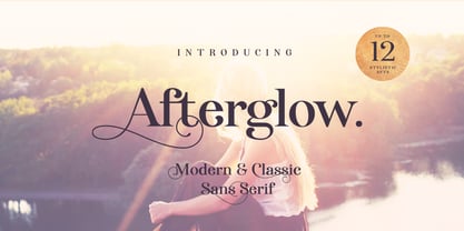
$18.00Elegant and so stylish serif typeface full of contrast lines, a lot of Stylistic Alternates with thin swashes. Some letters has up to 12 of them. Use only capitals for headers or quotes, it looks strong and refined, or use Caps with lowercase for block texts, or subheaders. Design your art- or beauty blogs, t-shirts or websites, posters, magazines or cards, and logo's of course. You will return to this font again and again. - Gandy Dancer NF by Nick's Fonts,
$10.00The 1912 American Specimen Book of Type Styles from ATF featured a quaint little offering called "Tabard", whose antique charm was enhanced by several rather quirky alternate characters. This version tosses out the standard characters and keeps the quirks in the works: the result is warm, engaging, slightly mischievous and a whole lot of fun. The Opentype version of this font supports Unicode 1250 (Central European) languages, as well as Unicode 1252 (Latin) languages. - Galgo Script by Sudtipos,
$59.00The Galgo is a Spanish Greyhound, an ancient hybrid breed of dog. Just like the Galgo, the letters of this font are a mix of elegant brush calligraphy and the rough, weathered strokes of speedy scrawl. Galgo Script is quite suitable for logomarks, titles, single sentences or paragraph-length artistic writing passages. Drawn by Angel Koziupa and digitized by Alejandro Paul, Galgo Script was made because of popular demand for this kind of "rush brush". - Core Label by S-Core,
$59.00Core Label is a condensed sans serif font. You will be able to manage a lot of information into limited spaces with Core Label. Its highly legible even in condensed forms and also clear at small sizes. Supported codepages are MS Windows 1252 Latin1 and MS Windows 949 Korean consisting of 11,172 Korean letters and Symbols, except Chinese. This Type-face is good for narrow spaces such as Labels, Books and so on. - Atlantis by Solotype,
$19.95This is Solotype's alternative sans serif version of the once popular caps-only font Atlanta issued by the Central Type Foundry in St. Louis in 1885. As we often do, we have created a lowercase, adding to its versatility. - Gallard by Type-Ø-Tones,
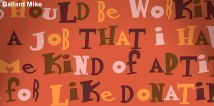
$40.00 - Air Superfamily by Positype,
$29.00In B-movie awesomeness, Air began as Grotesk vs. Grotesque. I was trying to unify the prevailing traits of German and English Grotes(que/k)s in order to make something different but familiar. I am NOT trying to reinvent Helvetica (snore), so get that out of your system. From the onset, I intended this typeface to be a true workhorse that offers infinite options and flexibility for the user. At its core, it is the maturation of the Aaux Next skeleton I developed years ago. I worked out Aaux Next to settle my issues and love for Akzidenz. With Aaux Next, I strove to be mechanical, cold and unforgiving with it. I was single, young, cocky and it fit. Now I'm married, kids, dog and have found that I've turned into a big softy. When I look at Aaux Next (and have for the past few years) I see another typeface trying to eek out. I wanted it to avoid the trappings of robotic sans, quick tricks and compromises. The typeface’s DNA needed to be drawn and not just generated on a screen — so I set aside a year. I love type. I love working with type. I hate when my options for a slanted complement is only oblique or italic. I set out to produce both to balance usage — there are more than enough reasons to prepare both and I want the user to feel free to consciously choose (and have the option to choose) the appropriate typeface for print, web, etc. That flexibility was central to my decision-making process. The Oblique is immediate and aggressive. The Italic was redrawn at a less severe angle with far more movement and, as a result, is far more congenial when paired with the Uprights. Condensed and Compressed. Yep, why not? I know I would use them. There are nine weights currently available. The logical progression of weights and the intended flexibility demanded I explore a number of light weights and their potential uses — this has produced a number of ‘light without being too light’ options that really work based on the size. The result is a robust 81-font superfamily that is functional, professional, and highly legible without compromising its personality. Pair that with over 900 characters per font that includes ligatures, discretionary ligatures, stylistic alternates, fractions, proportional/tabular lining and proportional/tabular oldstyle figures, numerators, denominators, ordinals, superiors, inferiors, small caps, case-sensitive functionality and extensive language support and you have a versatile superfamily well-suited for any project. - Alt Fat by ALT,
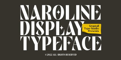
$- - Naroline by Graptail,
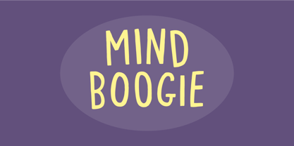
$15.00Naroline is a typefaces with a strong characteristic. The ideas are from Art Nouveau era, explore some of other art era and combining them into strong characteristic Naroline. The final fonts are looks Classic yet Modern, like what we do on the preview above, how the fonts can "stands" within your design. - Mind Boogie by Bogstav,
$16.00 - Legendaria by Corradine Fonts,
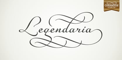
$59.95Legendaria is a very sophisticated and elegant connected script font. Its more than 1300 ornamented characters make it incredibly versatile. Most lower case letters have at least 15 different options, including tails and flourishes. For Open Type users “Legendaria OT” is the best choice instead the separated files of ornamental complementary fonts. - Trant by Konstantine Studio,
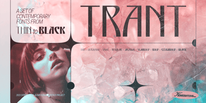
$9.00Fashion is a statement, and so do fonts. Push yourself to the breakthrough of the visual trend with TRANT. An experimental display font, with the elegant slick yet glamorous vibes in every letter. Carefully tailored with reference to the couture fashion, implemented as ready-to-wear stuff in the form of the typeface. - Medin by Viaction Type.Co,
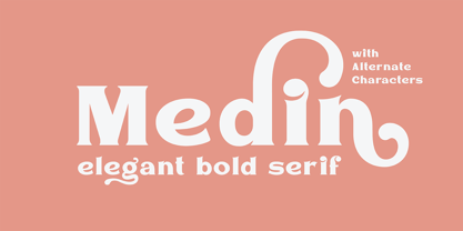
$25.00Medin is a serif font with elegant characters. Medin is perfect for your elegant-themed work, suitable also for elegant vintage. This font is available multilingual & alternate characters, making it easy to do work on various design themes. Medin is equipped with multilingual accents. Get it now Medin fonts, to add to your collection and work solutions. Viaction Type Thanks. - Midnight by Three Islands Press,
$29.00Midnight is a neon-sign-style font with two "gauges," Light and Bright. Works best when used in reverse against a dark background. The styles have a 2:3 ratio, as do the gauges of the neon "tubing," making both fonts equally useful across a range of applications. An elegant, stylish, wonderfully rendered display font. Comes with a complete character set. - Chizcake by Tigade Std,
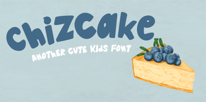
$35.00Chizcake. Do you love random shape thick font? This font is cuteness overload. It is for everyone, for various design purpose. This font is suitable for happy theme, cute, party, holiday, kids and many more. It is also suitable for Logo, Cards, Branding, Social Media, Youtube Thumbnail, Advertisement, Posters, any many others. Features: – Standard Characters (Uppercase and Lowercase) – Numerals – Punctuation – International Characters - Fruehling by RMU,
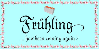
$30.00Fruehling, first released by the Klingspor Brothers foundry in 1914, is a rather calligraphic blackletter font designed by Rudolf Koch. This font was completely redrawn and redesigned for contemporary usage. The font comes with old-style figures, and the letters d, e, g, n, and t have swash variants. It is recommended to use also the OT feature Discretionary Ligatures. - Wieynck Gotisch by RMU,
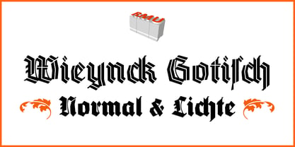
$25.00Wieynck Gotisch, a 1920s font family created by Heinrich Wieynck, was completely redrawn and redesigned for modern usage. Use this remarkable and eye-catching fonts in an appropriate context. This font contains a bunch of useful ligatures, and by typing 'N', 'o' and period plus activating the OT feature Ordinals you get an oldstyle numbersign. The round ‚s‘ lies on the #-key. - Xiomara - Personal use only
- Generous Hospitality by Dear Alison,
$19.00While there can be similar handwriting styles out there, no two handwritings are exactly the same. I like to think that I have the same handwriting style as my father, but I had never seen him write with lowercase letters, only in all capitals, except when signing his name on something in cursive. I recently came across a letter my father had written long ago to a friend. It was returned to sender, yet he kept it intact. The letter primarily thanked his friend for his hospitality when my father unexpectedly dropped in for a visit while traveling. I was so taken by the handwriting, that I decided to make it into a font, not only to remember my father, but also to forever preserve his handwriting. Generous Hospitality not only taps into the character of the person the letter was written to, it also reflects the personality of my father. If you are looking for a masculine handwriting type style for your designs, I think this font could be a nice fit. - Risotto Script by Estudio Calderon,
$69.00Risotto Script is a sexy font designed by Felipe Calderón, it represents the texture, sound, smell and flavor of food that come in those interesting packages with different concepts. This font makes you want to eat it because it is designed with a unique texture like a lot of vegetables, it has flourishes that suggest herbs and country roots. Calligraphy with folded pen and food packaging were two of the inspirations to develop this project that will work well wherever it is applied. Risotto Script Pro has 672 glyphs that have the purpose of covering a lot of writing options with different results, by applying OpenType programming as: - Standard ligatures - Stylistics alternatives - Contextual alternates - Discretionary ligatures - Swashes - Terminal forms - Stylistic Set 1, 2, 3 and 4 - Initials (it includes leaves in some endings) NOTE: The X height is generous, in order to design signs to 8 and low size. You`d better get the “extras” for a more complete experience. Most of the Standard ligatures include Stylistics alternatives with detailed endings Multiple language options.

