10,000 search results
(0.099 seconds)
- Gilbert JNL by Jeff Levine,
$29.00 Gilbert JNL is an interpretation of Eric Gill's classic sanserif typeface, which has become an all-purpose workhorse in ad copy. While other versions of gill-sans fonts have multiple weight sets, Jeff Levine chose to replicate this particular weight as a single design [in both regular and oblique versions] because of its popularity with sign makers of the past and give to it the minor nuances of hand-made lettering.
 - Advertising Stencil JNL by Jeff Levine,
$29.00 An ad spotted in a 1964 issue of Billboard magazine with the words “STAND BACK…” introduced the first record album from then-new stand-up comedian Bill Cosby. The lettering of those two words was in a stencil sans serif design that was a perfect candidate for developing into a digital font. The end result is Advertising Stencil JNL, which is available in both regular and oblique versions.
 - Deco Drop Caps JNL by Jeff Levine,
$29.00 From the pages of the 1939 French lettering book “Modèles de lettres modernes par Georges Léculier” (“Models of Modern Lettering”) comes an attractive and unusual set of initial drop caps made from square letters adorned with multiple vertical lines. Originally designed as white letters on black backgrounds, an additional set with black letters on white backgrounds comprise Deco Drop Caps JNL; available in both regular and oblique versions.
 - Sunshine Susie JNL by Jeff Levine,
$29.00 Sheet music for the song "Today I Feel So Happy" from the 1932 motion picture "Sunshine Susie" provided both the visual model and the name for Sunshine Susie JNL, available in both regular and oblique versions. The lettering is a bold Art Deco thick-and-thin design, and comes not from the song's title, but the hand lettered name of the movie as it appeared on the cover the song folio.
 - Musnad Serif by Sultan Fonts,
$19.99 About this font family Musnad Serif Is Old South Arabian typeface for desktop applications ,for websites, and for digital ads. Musnad font family contains two types: Rigular and bold. The font includes a design that supports Latin, Arabic, and Old South Arabian language systems.
 - Alizzya by Maulana Creative,
$15.00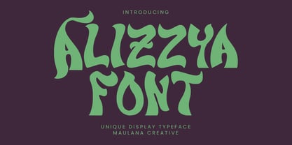 Alizzya unique display typeface. Bold stroke, fun character with a bit of ligatures and alternates. To give you an extra creative work. Alizzya unique display typeface support multilingual more than 100+ language. This font is good for logo design, Social media, Movie Titles, Books Titles, a short text even a long text letter and good for your secondary text font with script or serif. Make a stunning work with Alizzya unique display typeface. Cheers, Maulana Creative
 - Elogy by PizzaDude.dk,
$20.00 Elogy not just a scratchy basic sans serif font - it is a font with a lot of attitude! Every single character is unique! I personally drew every single character - meaning that accented letters are unique! Elogy contains ligatures for both double lowercase, double uppercase and double numers! On top of that, it has got alternate letters for both upper- and lowercase! Talk about unique! You will need to use OpenType supporting applications to use the autoligatures,
 - Herben by Innire,
$14.00 The Herben - is a unique ligature serif font inspired by nature and autumn mood. It is perfect for logos (especially to word-mark logos), branding, invitation card, and much more; and well to emphasize your unique style, eco concept, or something else. 75 ligatures and 14 swashes will help create individual writing, thereby expanding the scope for creative expression. What's about details and features? Letters A-Z, a-z, 0-9 and punctuation (all in preview); 75 unique ligatures;
 - Cerafino by AVP,
$29.00Cerafino creates a sense of movement using open, angular strokes on lowercase characters. The capitals and numerals are less exaggerated. - ArcticPatrol by The Northern Block,
$12.80 ArcticPatrol is a modern angular font influenced by military related computer games. Examples include: Ghost Recon and Medal of Honor.
 - Janda Fabulous by Kimberly Geswein,
$5.00 This doodled font features a variety of unique, fun letters.
 - Pueblito by Corradine Fonts,
$15.00 Pueblito is a hand drawn font with a rustic and antique appearance. Was inspired from old books and newspapers but express a very own personality and not necessary represent a specific classic style. The family consists of twelve fonts in six weights plus a set of ornaments in order to compose all kind of texts. Using Pueblito in your projects, you can obtain an original aged flavor and just by adding a subtle texture effect will help you to obtain the desired vintage look.
 - Asta by LLW Studio,
$16.00 Asta, named after the adorable pup in the “Thin Man” movies from the 1930‘s and early ‘40‘s, is an Art Deco / Streamline Moderne all-caps display font. Inspired by forms from the iconic machinery of the day like trains and autos, Asta has a heavy and masculine proportion, a cut-in “grille” effect and a slight slant which emphasizes its moderne roots. Fantastic for illustration or retro applications like antique product “logos,” signs and vintage packaging, or for a fun & funky ‘70‘s Disco look.
 - Streamers NF by Nick's Fonts,
$10.00This curly, swirly antique offering is based on a Victorian-era typeface called "Fillet". Opening and closing flourishes can be found at the brace and bracket positions, and the ribbon effect can be carried between words by using the underscore character in place of a space. Due to the highly ornate nature of this font, it does not contain math operators, fractions or superior numbers. Both versions of the font include 1252 Latin and 1250 CE (with localization for Romanian and Moldovan) character sets. - Rossika by ParaType,
$25.00 Rossika is a four-style typeface designed by Oleg Karpinsky in 2002-2004 for the ParaType company. The general design and some letterforms were borrowed from antique Russian typefaces of XV-XVIII centuries. For example, the upper Cyrillic N has a diagonal stem, a tail of Ц character is attached in the center unlike major contemporary designs. Some characters have alternatives. There are several Latin and Cyrillic ligatures. Rossika is intended for logos, headlines and short text blocks: posters, calendars, post cards, diplomas, certificates and the like.
 - PR Scrolls 03 by PR Fonts,
$10.00 Inspired by food labels, signs and coats of arms, PR-Scrolls is a collection of images which can be used for framing text in contexts where antiquity, craftsmanship, or traditional quality are conveyed. There are several sets of glyphs which work together to make a variety of shapes, or banners of custom length. Most of the glyphs are presented in a range of three or more widths. Scrolls 3 has a greater unity of detail, and a greater variety of form than our earlier designs.
 - Kenoky Coffekan by Alit Design,
$12.00 Introducing KENOKY Coffekan font duo. Unique and fantastic duo fonts combined or they stand alone. KENOKY font family consists of 14 families, from Thin to Heavy style. The elegant modern font creates a unique design and is sure to steal the eye of the design target audience. Besides being unique, the KENOKY font also has a luxury simple character that makes the design charming and luxurious. The Coffekan font is a signature script that has cool strokes. The line shape of Coffekan is inspired by a unique monoline style. In addition, Coffekan has an altenate ligature that looks natural and not stiff. Combining the two KENOKY and Coffekan fonts will create a design that is charming, unique, elegant and cool. you can see from the design preview. These two fonts are perfect for designs with the concept of elegant, luxury, romance, fashion and so on.
 - Okay A by Okaycat,
$24.95 Okay-A lets you make 3D letters that look to be fastened down with screws. Inspired by the angular futuristic shapes of Japanese Katakana letters, this angular font is bold and square. Okay-A lets you easily make multicolour logos or signs as the styles can be overlaid. It features extended characters, containing West European diacritics & ligatures, making it suitable for international environments & publications.
 - Walterosse by Almarkha Type,
$35.00 Hello Introducing, Walterosse - Elegant Stylish Display Serif is an unique font that uses ligatures to smoothly link letters. Perfect for adding a unique twist to word-mark logos, monograms or pull quotes. Walterosse has 7 cigatures can be turned off if required standard writing needs.
 - Viva Kaiva by Creativemedialab,
$20.00 Viva Kaiva is one of our unique fonts with a psychedelic touch, this font has many stylistic alternates that make this font the best option for creating a unique title for your Illustrations, titles, posters, branding projects as well as designs with a fantasy theme.
 - Quastro by Almarkha Type,
$29.00 Hello Introducing, Quastro - Elegant & Stylish Display Serif is an unique font that uses ligatures to smoothly link letters. Perfect for adding a unique twist to word-mark logos, monograms or pull quotes.Quastro has 12 ligatures can be turned off if required standard writing needs.
 - Nighty by Ahmad Jamaludin,
$17.00 Inspired by vintage magazine around 70s, so this font born for all of you, Nighty! Nighty is a display typeface that says we’re here to nostalgia! It brings back the 70s vibes with groovy, retro and unique typeface This font fits perfectly into those nostalgic moodboards and vintage logos. It come with 95 unique alternate and ligature that to give your any project to a unique vintage look, What's you get? Has 95 alternate and ligatures Unique letterforms Multilingual Works on PC & Mac Simple Installations Accessible in the Adobe Illustrator, Adobe Photoshop, Microsoft Word even work on Canva PUA Encoded Characters Fully accessible without additional design software. Drop any message if you any question, thanks Dharmas Studio
 - Arsis by Linotype,
$40.99Arsis is a condesed modern headline face that was originally produced and cast in hot metal by the Dutch type foundry Lettergieterij Amsterdam. The Arsis font family was designed by Gerry Powell in 1937. Arsis is a Serif (Antiqua) Modern Style font. Arsis font family attributes include roman serif, Didone, elegant, formal, modern style, feminine. - Crazer by Atom,
$13.00 Crazer is a strange and irregular display typeface. Bringing tense, scary, powerful, and chaotic artwork. Create your creativity with Other Dangers!
 - Avishag MF by Masterfont,
$59.00 So free so fresh, this personal handwriting will always look unique.
 - Elamy MF by Masterfont,
$59.00 Intuitive freestyle handwriting font, with unique emphasizes on curves and rhythm.
 - Hulahoy Typeface by Alit Design,
$19.00 Introducing Hulahoy Typeface. This font is inspired by the design styles of the 70s. The style is funny, groovy, classic, not serious but has aesthetic and unique value, besides that the Hulahoy font is very easy to remember and becomes the image of a design. Hulahoy is very good for being your font collection because this font is very unique and easy to apply to any media that has a design concept that is not so serious, groovy, classic, funny and unique.
 - Bogem Style by Sensatype Studio,
$15.00 Bogem is a Historical Vintage Serif. A New Vintage font that we created special for Unique branding needs, with extra ligature in unique style that ready to add value of your brand. It's so nice to leverage designer or product owner that need solutions to make their design look more unique and vintage. Lowercase and Uppercase characters Numbers and Punctuations Preview as a inspirations that you can do with Bogem font Available for PC and Mac Wish you enjoy our font.
 - Graj by Fontsphere,
$16.00 GRAJ is a minimalist, bitmap font with a unique pixel style. It features a sophisticated and original form, making it quite experimental. Despite this, it is widely applicable, and can be used for a variety of large text projects, headers, and custom projects. Its unique geometric elements are perfect for creating custom designs, logos, and other projects requiring a unique and modern aesthetic. With its ingenuity and versatility, GRAJ is a perfect choice for any project requiring a modern bitmap typeface.
 - Laerna by Sensatype Studio,
$15.00 An Unique Feminine Display Serif font that we created special for elegant branding needs, with unique shape will be ready to add value of your brand. And specially for Belgium font, We prepared any characters to help you create unlimited variations for your creative needs. Laerna Unique Feminine Display Serif Font ready with: Ready with Alternate Fancy Characters Preview as a inspirations that you can do with Laerna font Ready with Lowercase and Uppercase characters Wish you enjoy our font. :)
 - El Masterico by OKSHUtypeCO,
$14.00 El Maestro - a new fresh unique font. Very suitable for greeting cards, branding materials, business cards, quotes, posters, and more!This font are perfect for wedding postcard. Or you can create perfect and unique design of your logo, blog, stationery, marketing, magazines and more :) Multilingual OK!!!
 - Sweet Curly by Inumocca,
$19.00 Sweet Curly inspired from Girls handlettering, more unique character decorative, fancy, powerfull and beautiful. Really Beautiful font to covering your Project, like For logos, Poster art, Magazine, Branding, Sticker and more your project design. - Unique glyphs - Multilingual Characters - UPPERCASE - Lowercase - Numeric - Symbol - Punctuation Character - PUA encoded inumoccatype
 - Hardbones by Krntype Studio,
$16.00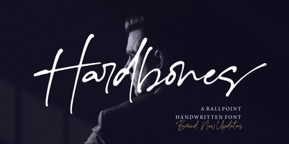 Hardbones is a stunning ballpoint signature font. font with unique natural flow and feminine style, made using a unique gel ballpoint ink. Each letter is deliberately imperfect to make it look more natural and charming. Hardbones comes with multilingual support, ligature, and ending swash from a-z.
 - Korsel by Cocodesign,
$10.00 Korsel handwritten font script display. This font was designed by handwriting, and it has a modern and unique forms of calligraphy, the writing style is very natural. Belgia has a very unique style of calligraphy, it is very suitable for use in the work of modern design.
 - Joined Tightly by Jehansyah,
$9.00This is a very unique font, because of its cute appearance, will give your designs a very modern look. use this design for any design that smells retro or futuristic, suitable for any appearance of any media design, and supported by unique ligatures, very easy to use - Broker by In-House International,
$5.00 Broker is an angular variable display type family that invites carefree experimentation, but is designed to make a statement. With twelve unique styles and variable controls for thickness, decoration, and shape, Broker is a versatile and expressive shape-shifter that adapts to fit your mood. It can go from slim, square mono-weight to edgy stressed angled styles, and full-on style with chunky serif heels. And because it’s drawn on a rectangular frame, it’s modular, making it particularly easy to lay out and stack. Inspired by DIY, cut paper lettering Broker isn’t delicate, elegant or precious—it’s a rough and tumble typeface to play with and make your own. Use the variable control to try different styles to give shape to your words. It’s perfect for creative projects, posters, funky packaging, flyers, cover art, motion displays, and fearless branding. The font family includes uppercase and lowercase alphabets, numbers, punctuation and latin diacritics—fully adaptable as a variable type (.ttf) for designers using compatible platforms. It’s also available as thirteen unique opentype (.otf) fonts that can be mixed and matched. Broker was designed by Alexander Wright and In-House International for the In-House International foundry and developed by Rodrigo Fuenzalida at FragType.
 - Cyclic by ArtyType,
$29.00 Cyclic is a stylish and modern slab serif in three practical, highly legible weights. The name ‘cyclic’ suits this typeface in several ways. Firstly because I wanted to create an ‘all-round’ typeface (pun intended) that could adapt to most applications, but also, as the dictionary definition explains - “occurring in circles, regularly repeated”. The basis for a lot of the characters did begin with a circle or sections of one; the equally distributed, rounded forms of this font are complemented however by the vertical strokes, and further counter-balanced by angular slab serifs on the remaining glyphs. Curved alternates with a celtic vibe are also included in the fonts and feature on the default slots in the separate Cyclic Uncial set. In summary, the whole Cyclic type family comprises a combined palette of circles and straight lines; something the cubist movement would have been proud of!
 - Cyclic Uncial by ArtyType,
$29.00 Cyclic is a stylish and modern slab serif in three practical, highly legible weights. The name ‘cyclic’ suits this typeface in several ways. Firstly because I wanted to create an ‘all-round’ typeface (pun intended) that could adapt to most applications, but also, as the dictionary definition explains - “occurring in circles, regularly repeated”. The basis for a lot of the characters did begin with a circle or sections of one; the equally distributed, rounded forms of this font are complemented however by the vertical strokes, and further counter-balanced by angular slab serifs on the remaining glyphs. Curved alternates with a celtic vibe are also included in the fonts and feature on the default slots in the separate Cyclic Uncial set. In summary, the whole Cyclic type family comprises a combined palette of circles and straight lines; something the cubist movement would have been proud of!
 - RePublic by Suitcase Type Foundry,
$75.00In 1955 the Czech State Department of Culture, which was then in charge of all the publishing houses, organised a competition amongst printing houses and generally all book businesses for the design of a newspaper typeface. The motivation for this contest was obvious: the situation in the printing presses was appalling, with very little quality fonts existing and financial resources being too scarce to permit the purchase of type abroad. The conditions to be met by the typeface were strictly defined, and far more constrained than the ones applied to regular typefaces designed for books. A number of parameters needed to be considered, including the pressure of the printing presses and the quality of the thin newspaper ink that would have smothered any delicate strokes. Rough drafts of type designs for the competition were submitted by Vratislav Hejzl, Stanislav Marso, Frantisek Novak, Frantisek Panek, Jiri Petr, Jindrich Posekany, and the team of Stanislav Duda, Karel Misek and Josef Tyfa. The committee published its comments and corrections of the designs, and asked the designers to draw the final drafts. The winner was unambiguous — the members of the committee unanimously agreed to award Stanislav Marso’s design the first prize. His typeface was cast by Grafotechna (a state-owned enterprise) for setting with line-composing machines and also in larger sizes for hand-setting. Regular, bold, and bold condensed cuts were produced, and the face was named Public. In 2003 we decided to digitise the typeface. Drawings of the regular and italic cuts at the size of approximatively 3,5 cicero (43 pt) were used as templates for scanning. Those originals covered the complete set of caps except for the U, the lowercase, numerals, and sloped ampersand. The bold and condensed bold cuts were found in an original specimen book of the Rude Pravo newspaper printing press. These specimens included a dot, acute, colon, semicolon, hyphens, exclamation and question marks, asterisk, parentheses, square brackets, cross, section sign, and ampersand. After the regular cut was drafted, we began to modify it. All the uppercase letters were fine-tuned, the crossbar of the A was raised, E, F, and H were narrowed, L and R were significantly broadened, and the angle of the leg and arm of the K were adjusted. The vertex of the M now rests on the baseline, making the glyph broader. The apex of the N is narrower, resulting in a more regular glyph. The tail of Q was made more decorative; the uppercase S lost its implied serifs. The lowercase ascenders and descenders were slightly extended. Corrections on the lower case a were more significant, its waist being lowered in order to improve its colour and light. The top of the f was redrawn, the loop of lowercase g now has a squarer character. The diagonals of the lowercase k were harmonised with the uppercase K. The t has a more open and longer terminal, and the tail of the y matches its overall construction. Numerals are generally better proportioned. Italics have been thoroughly redrawn, and in general their slope is lessened by approximatively 2–3 degrees. The italic upper case is more consistent with the regular cut. Unlike the original, the tail of the K is not curved, and the Z is not calligraphic. The italic lower case is even further removed from the original. This concerns specifically the bottom finials of the c and e, the top of the f, the descender of the j, the serif of the k, a heavier ear on the r, a more open t, a broader v and w, a different x, and, again, a non-calligraphic z. Originally the bold cut conformed even more to the superellipse shape than the regular one, since all the glyphs had to be fitted to the same width. We have redrawn the bold cut to provide a better match with the regular. This means its shapes have become generally broader, also noticeably darker. Medium and Semibold weights were also interpolated, with a colour similar to the original bold cut. The condensed variants’ width is 85 percent of the original. The design of the Bold Condensed weights was optimised for the setting of headlines, while the lighter ones are suited for normal condensed settings. All the OpenType fonts include small caps, numerals, fractions, ligatures, and expert glyphs, conforming to the Suitcase Standard set. Over half a century of consistent quality ensures perfect legibility even in adverse printing conditions and on poor quality paper. RePublic is an exquisite newspaper and magazine type, which is equally well suited as a contemporary book face. - Zomsenso by Pootis Type Corp.,
$31.99 Zomsenso is an angular, semi-modular typeface that supports OpenType alternates. The angular part means that the entire* font uses only angular segments and shapes. The alternate glyph shapes are under Stylistic Set 01. This font includes Seven Segment display (U+E000 to U+E07F) and arbitrary fractions (U+E1nd, n=numerator; d=denominator) that are mapped to the Private Use Area, so users can easily insert them via Unicode input. You can combine these fractions with the superscript and subscript numerals to create more fractions. This font can be used for essays, signs, logos, posters, commercial projects, videos, and many more. *except the circles in the Geometric Shapes block, which are still round