10,000 search results (0.092 seconds)
  1. Kreased - Personal use only
  2. Grounds Crew Stencil JNL by Jeff Levine, $29.00
    The opening title from the 1943 Abbott and Costello comedy ”It Ain't Hay” shows a park bench with the words “Universal Presents” stenciled on it in a chamfered sans serif style. This served as the design model for Grounds Crew Stencil JNL, which is available in both regular and oblique versions.
  3. Hatchery JNL by Jeff Levine, $29.00
    A photo from Gene Gable (a regular contributor of ideas to Jeff Levine Fonts) shows the vintage signage for the Lasher Hatchery in a slightly different take on the classic Art Deco solid letter style. Since good ideas, like eggs can be hatched, thus the font's name of Hatchery JNL.
  4. Zoelander by Locomotype, $15.00
    Zoelander is an experimental geometric font. The distinctive feature of this font is having an irregular x-height. This will look unusual, but if you are looking for something unique and looks different, Zoelander can be an alternative to making an attractive typography. Zoelander comes in two versions, Zoelander Regular and Zoelander TF. Each has a bold and rounded style. Zoelander Regular is a sans serif font with irregular x-height but if you want the same x-height size, the stylistic alternates feature allows you to do it. While Zoelander TF is the development of a regular version where each letter is connected in a line at the baseline. Some of the other opentype features make it easier for you to explore more interesting typographic designs.
  5. Mishega by Mega Type, $12.00
    Mishega Script is modern calligraphy font, including Regular. This font is casual and pretty with swashes. Can used for various purposes. such as logo, product packaging, wedding invitations, branding, headlines, signage, labels, signature, book covers, posters, quotes and more. Feature: · All Uppercase and Lowercase · Alternates and Ligatures · Numbers & Symbols · Supported Languages · Substitutes and Binders · PUA Encoded Have fun using Mishega!!! I really hope you enjoy it! Feel free to follow, like and share. Thank you so much for checking out my shop!
  6. Destroy by Meutuwah, $12.00
    INTRODUCING Destroy Brush is handwritten font with a modern Brush feel. Destroy Brush is perfect for modern projects, headings, blogs, logos, brandings, web design, card, coffee shop, t-shirt, invitations and more! Programs that support in this font is a Microsoft Office Adobe Photo Shop, Adobe Illustrator, Adobe Indesign, and Corel Draw, badges etc. Thank You Font Lovers....!
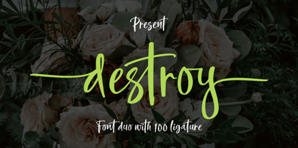
  7. Northell by Meutuwah, $20.00
    INTRODUCING Northell is handwritten font with a modern Brush feel. Northell is perfect for modern projects, headings, blogs, logos, brandings, web design, card, coffee shop, t-shirt, invitations and more! Programs that support in this font is a Microsoft Office Adobe Photo Shop, Adobe Illustrator, Adobe Indesign, and Corel Draw, badges etc. Thank You Font Lovers....!
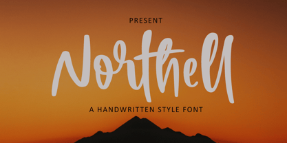
  8. Mountty by Meutuwah, $20.00
    INTRODUCING Mountty is handwritten font with a modern Brush feel. Mountty is perfect for modern projects, headings, blogs, logos, brandings, web design, card, coffee shop, t-shirt, invitations and more! Programs that support in this font is a Microsoft Office Adobe Photo Shop, Adobe Illustrator, Adobe Indesign, and Corel Draw, badges etc. Thank You Font Lovers....!
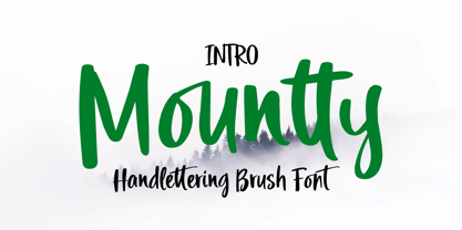
  9. Love Squall by Meutuwah, $16.00
    INTRODUCING Love Squall is handwritten font with a modern Brush feel. Love Squall is perfect for modern projects, headings, blogs, logos, brandings, web design, card, coffee shop, t-shirt, invitations and more! Programs that support in this font is a Microsoft Office Adobe Photo Shop, Adobe Illustrator, Adobe Indesign, and Corel Draw, badges etc. Thank You Font Lovers....!
  10. Fun Time Nouveau JNL by Jeff Levine, $29.00
    “One Hundred Alphabets for the Show Card Writer” was published in 1919 to afford sign artists the ability to create signs and show cards in then-contemporary lettering styles. One such alphabet was big, bold and representative of the Art Nouveau stylings popular in the early part of the 20th Century. Most likely it was applied to store sales and public events that were casual and informal, for its letter forms are free of any constraints. This design is now available as Fun Time Nouveau JNL in both regular and oblique versions.
  11. Dutch Deco JNL by Jeff Levine, $29.00
    Although the Art Deco movement is generally attributed to the 1930s and 1940s, a number of design influences were showing up during the late 1920s in what is referred to as the Art Nouveau period. The Dutch illustrator Anton Kurvers’ hand lettering on the front cover of the (1927) magazine “Het Vlaamsche Volstooneel” clearly shows the clean lines and Avant Garde geometrics that foreshadow Art Deco. This attractive pre-Deco lettering has been recreated digitally as Dutch Deco JNL, and is available in both regular and oblique versions.
  12. Sandalwood JNL by Jeff Levine, $29.00
    An example of an antique sans serif wood type displayed in Rob Roy Kelly’s “American Wood Type” was the working model for Sandalwood JNL, which is available in both regular and oblique versions.
  13. Teatral - Personal use only
  14. Weaver - Unknown license
  15. Escheresk - Personal use only
  16. Hard Light - 100% free
  17. RM Albion - 100% free
  18. Med Splode - Unknown license
  19. Ligne Claire - 100% free
  20. New Alphabet - Unknown license
  21. Básica - Personal use only
  22. DarkPix - Personal use only
  23. Pullchain - Personal use only
  24. Structurosa Script - Unknown license
  25. ProLamina - 100% free
  26. Plump - Unknown license
  27. SlabStruct Too - Unknown license
  28. Cheese Fontdue - 100% free
  29. Trium - Personal use only
  30. Vipond Chubby - Unknown license
  31. Divad - Personal use only
  32. heavyLOUDedge - Personal use only
  33. Theater Lobby JNL by Jeff Levine, $29.00
    A vintage photo (circa 1950s) taken outside one of the movie houses owned at the time by Miami-based Wometco Theaters showed a small hand lettered sign with the word “Wometco” painted in a stylized Art Deco alphabet. This inspired Theater Lobby JNL, which is available in both regular and oblique versions.
  34. Ordinary Gothic JNL by Jeff Levine, $29.00
    Ordinary Gothic JNL is a simple, thin "stovepipe" style of hand lettering found on the cover of a piece of sheet music for 1937's "You Can't Stop Me from Dreaming", and is available in both regular and oblique versions. The song was introduced and featured by Guy Lombardo and His Royal Canadians.
  35. Popular Records JNL by Jeff Levine, $29.00
    Browsing through an online edition of the Feb 29, 1960 issue of Billboard magazine, an ad was spotted for the Jamie record label of Philadelphia. The text was hand lettered in a free-form show card style, and this inspired Popular Records JNL, which is available in both regular and oblique versions.
  36. Lumberyard Stencil JNL by Jeff Levine, $29.00
    Lumberyard Stencil JNL was inspired by the image of an antique brass stencil that was probably used for marking various wood products by a lumber company. It's available in both regular and oblique versions.
  37. Major Snafu - Unknown license
  38. Skeksis - Unknown license
  39. Antiquarian Scribe by Three Islands Press, $39.00
    Henri Abraham Chatelain was a cartographer and publisher of the famous Atlas Historique, ou Nouvelle Introduction a L'Histoire, a world atlas released between 1705 and 1732 in Amsterdam. A few years ago, at an antique book shop in London, I bought a page from Chatelain's atlas—a page covering the Near East, India, the Indian Ocean—that had a particularly alluring, oblique handlettering style. The text is in French, which gave me plenty of samples of diacritics and accented characters. The overall effect is neat and legible, with a distinctly historical flair.
  40. Fine Gothic by Fine Fonts, $29.00
    Fine Gothic was developed over several years, and was partly inspired by the blackletter fonts of the great 20th century calligrapher and lettering designer, Rudolf Koch. Although blackletter has many historical and cultural associations with Germany, and has been used in the English-speaking world excessively on the mastheads of newspapers or the facades of antique shops, contemporary designers should not be deterred from adding these vigorous letterforms to their repertoire. Conventional blackletter tends towards the heavier weights, which makes the Light weight of Fine Gothic something of a delight and a rarity.
Looking for more fonts? Check out our New, Sans, Script, Handwriting fonts or Categories
abstract fontscontact usprivacy policyweb font generator
Processing