10,000 search results
(0.049 seconds)
- Zayne by HandletterYean,
$12.00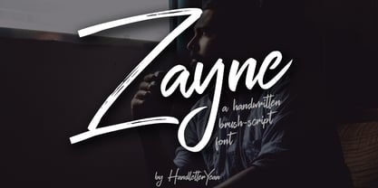 Zayne is a fresh, urban and unique handwritten script font that includes ligatures and swashes. With its funky, elegant, and handmade feel, it will add uniqueness to your creative designs.
 - Huntly by Rockboys Studio,
$25.00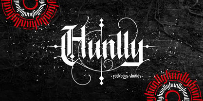 Huntly is an incredibly unique and distinct blackletter font. It will add a unique touch to your designs. Use it for tattoo designs, logos, posters, book covers, albums and more!
 - Stabia by Eurotypo,
$29.00 Stabia is a multi-purpose typeface with large wedge-angular serifs. It is delicate and highly readable at very small sizes but reveals all its strength and personality when used at big sizes. The contrast of the sharped serifs provides a fresh and very contemporary look. The family has 5 weights, ranging from Light to Black (including italics) and is ideally suited for advertising and packaging, book text, editorial and publishing, logo and branding, small text as well as web and epub. Stabia provides advanced typographical support with features such as ligatures, small capitals, alternate characters, case-sensitive forms, fractions, and super- and subscript characters. It comes with a complete range of figure set options – oldstyle and lining figures, each in tabular and proportional widths. As well as Latin-based, the typeface family also supports Central European languages. Stabiae was an ancient Roman town, located close to the modern town of Castellammare di Stabia approximately 4.5 km southwest of Pompeii. According to the account written by his nephew, Pliny the Elder was at the other side of the bay in Misenum when the Mount Vesuvius eruption started. He travelled by galley ship across the bay, partly to observe the eruption more closely, and partly to rescue people from the coast near the volcano. Pliny died at Stabiae the following day, probably during the arrival of the sixth and largest pyroclastic surge of the eruption caused by the collapse of the eruption plume.
 - Ghost Sign JNL by Jeff Levine,
$29.00 Ghost Sign JNL is a spurred serif type design based on the faded lettering of an antique brick wall sign for Homer Hardware [located in Homer, NY] and is available in both regular and oblique versions. From Wikipedia: “A ghost sign is an old hand-painted advertising sign that has been preserved on a building for an extended period of time. The sign may be kept for its nostalgic appeal, or simply indifference by the owner. Ghost signs are found across the world with the United States, the United Kingdom, France and Canada having many surviving examples. Ghost signs are also called fading ads or brickads. In many cases these are advertisements painted on brick that remained over time. Old painted advertisements are occasionally discovered upon demolition of later-built adjoining structures. Throughout rural areas, old barn advertisements continue to promote defunct brands and quaint roadside attractions. Many ghost signs from the 1890s to 1960s are still visible. Such signs were most commonly used in the decades before the Great Depression. Ghost signs were originally painted with oil-based house paints. The paint that has survived the test of time most likely contains lead, which keeps it strongly adhered to the masonry surface. Ghost signs were often preserved through repainting the entire sign since the colors often fade over time. When ownership changed, a new sign would be painted over the old one.”
 - P22 Late November by IHOF,
$39.95 P22 Late November is a transitional Antiqua-inspired type design great for text and display uses. The name is derived from the dark, November night in which the design of the font began. The Pro version features fractions, ligatures and full Central European support.
 - Brilliant by FaceType,
$35.00 Brilliant is a modern antiqua typeface that includes three weights. It is both very readable and easy to cut. The corners in the typeface makes it easy to cut, but doesn’t disturb the readability. Brilliant is perfect for big sizes, headlines and characterful sublines.
 - Phoenica Std by preussTYPE,
$29.00 PHOENICA is a contemporary humanistic typeface family suitable for traditional high-resolution print purposes, office application and multi-media use. Of the creation formed the basis an idea which was developed for the first time by Lucian Bernhard approx in 1930 with the Berhard Gotic and was taken up in the last time by different written creators repeatedly: the repeated elimination anyway (in comparison to a Antiqua, e.g. Garamond) already very much diminished form Grotesque (as for example Helvetica) by systematic leaving out of the serifs. The horizontal direction of the writing is thereby stressed remarkably by which so-called »Rail effect« originates. The eyes can grasp the line to be read very well what is ordinarily left to a Serif-stressed font. By this desired effect is suited PHOENICA also for big text amounts. In numerous test runs Stems and tracking was compared to experienced fonts and was adapted. The experienced was taken over without renouncing, nevertheless, the modern and independent character PHOENICA. PHOENICA offers to you as a welcome alternative to the contemporary humanistic Sansserif. It is a very adaptable family for text and Corporate design uses. Several companies have discovered PHOENICA meanwhile as a Corporate font for themselves and use them very successfully. She provides a respectable typeface combined with refinement and elegance. Every PHOENICA family has at least six weights in each case in regular and italic. In addition more than three fine Haarline weights (Hairline 15, 25, 35). These are a total of 27 possibilities. Phoenica as well as Phoenica Condensed are excellently readable fonts, because they were optimised especially for amount sentence. Both basic styles (Regular and Condensed) are tuned on each other and follow the same form principle. The family is neither exclusively geometrical nor is constructed humanistically, the forms were sketched on quick and light Recognition effect of every single letter. The PHOENICA family design and logo is suited for all only conceivable uses like newspapers and magazines, for the book typography and Corporate Design.
 - Ignite The Light by Kimberly Geswein,
$5.00 Painted using tempera paints and a paintbrush, these letters are messy and angular.
 - Pixel Disc by Ech000,
$9.00 This unique typeface is a great addition to a graphics designer collection. Great for pixel artists who want a unique text style for their works, album artwork and much more. This font contains over 400+ unique glyphs to accommodate for English, Latin languages, most symbols and much more. All characters feature the same size disc surrounding letters utilising negative space through the design. Created by Kole Cook for Ech000 Foundry. The font is inspired by computer text and command line with a unique twist.
 - Schnebel Slab Pro by URW Type Foundry,
$35.99 The refreshingly clear Antiqua Schnebel Slab is a refreshingly clear and strong interpretation of a contemporary Antiqua with subtle contrast and firm serifs, which offer excellent readability at very small size, and, at the same time, provide a lot of expression for use in headlines. The italics, drawn specifically for this purpose, contribute to a harmonious picture, which never loses creative tension, thanks to its aesthetics. The careful addition of ligatures, small caps, and proportional and old-style figures allows for well-proportioned typesetting. The condensed and expanded variants, which also come in 6 weights each, offer plenty of freedom to design with numerous combinations. Schnebel Slab Pro combines especially well with Schnebel Sans Pro.
 - Falstaff MT by Monotype,
$29.99 Falstaff first appeared with Monotype in 1931, an alphabet in the style of a wide, bold antiqua that was especially popular in the first third of the 19th century. Such typefaces distinguished themselves through their consistent basis in the transitional antiqua style. They are characterized by their extremely fine unflexed serifs with no curve connecting them to the thick strokes. The numerals with their generous curves and ball-like stroke endings and beginnings are particularly decorative. The vertical strokes are dominant and give lines of this typeface a column-like and therefore static look. Falstaff is today often used for book titling, especially for mystery novels. It is best used sparingly in middle and larger point sizes.
 - Aldo New Roman by Indian Summer Studio,
$45.00 Aldo New Roman (1000+ glyphs, incl. medieval Latin, Cyrillic, some Greek, ornaments, small capitals, nut fractions...) Renaissance antiqua · Venetian types · Venetian serif · Humanist serif · Old style antiqua A modern version of the typeface cut by Francesco Griffo for Venetian printer Aldus Manutius around 1490 AD. Intentionally not the original Griffo / Aldus / Bembo — but the part of the large project on revival and further development (by drawing many additional glyphs, sometimes over 1000) of the 20th century's typewriters’ fonts. Triple pun here :: :: #1 Aldine Roman type; #2 Since it is equalized, modernized version — the parallel to the Times New Roman; #3 He called himself Aldus Pius Manutius Romanus — he was a new Roman during his Renaissance times.
 - Gans Neoclassic Fleurons by Intellecta Design,
$23.90 Historical printers ornaments researched by Intellecta Design; from the 1882 very rare Richard Gans first catalogue. See also other font families inspired by Gans' original typefaces: Gans Tipo Adorno, Gans Lath Modern, Gans Titular Adornada, Gans Ibarra, Gans Antigua, Gans Antigua Manuscrito, Gans Fulgor, Gans Radio Lumina, Gans Carmem Adornada, Gans Italiana, and Gans Titania.
 - Gans Headpieces by Intellecta Design,
$24.90 Historical printers ornaments researched by Intellecta Design; from the 1882 very rare Richard Gans first catalogue. See also other font families inspired by Gans' original typefaces: Gans Tipo Adorno, Gans Lath Modern, Gans Titular Adornada, Gans Ibarra, Gans Antigua, Gans Antigua Manuscrito, Gans Fulgor, Gans Radio Lumina, Gans Carmem Adornada, Gans Italiana, and Gans Titania.
 - Vallerine by Heyfonts,
$15.00 Vallerine - Display Font is a versatile, bold and unique serif font. Combination between high contrast and Brutalism style, Vallerine has a unique style with stylistic, alternates, ligatures and supports multilingual languages.
 - Weely Honey by Sipanji21,
$15.00 Weely Honey is a funny, bold and cute display font with a unique twist. Get inspired by its unique feel, and turn to add a lovely charm to any crafts project
 - Maron American by Zeenesia Studio,
$12.00 Maron American is a sweet unique and natural handwritten font. Its unique and neat style makes it incredibly versatile, fitting a wide range of designs. The only limit is your imagination!
 - Miny Fellas by Stringlabs Creative Studio,
$25.00 Miny Fellas is inspired by classic typography and brings its own unique style to any design project. Use this gorgeous and unique handwritten font to bring any DIY project to life!
 - Gold Empire by Rockboys Studio,
$23.00 Gold Empire is an incredibly unique and distinct blackletter font. It will add a unique touch to your designs. Use it for tattoo designs, logos, posters, book covers, albums and more!
 - Dingos by Antipixel,
$18.00 Dingos is a display typeface specially handcrafted for potent usage. It is compact, solid, and dense, with a heavy-built structure, tight internal space, and a versatile touch. Dingos is perfect for large settings due to its precise shapes. The 'Display' and 'Display Outline' styles have sharp and clean paths with angular ink traps, while 'Stamp' and 'Stamp Outline' have round ink traps and irregular, soft, curvy outlines optimized to ensure high-quality contours. Stamp textured styles have three sets of alphabets that slightly differ from one another. Thanks to the Contextual Alternates, these alphabets are automatically alternated to avoid repeating the same curvy textures. Some of Dingos' features are ligatures, discretionary ligatures, stylistic sets, numerators, fractions for any number combinations, arrows, special decorative characters, and a glyph coverage that ensures extended language support.
 - Mother VP by VP Creative Shop,
$20.00 Introducing Mother Serif Typeface - 5 fonts Mother is named after all the moms and children left behind. This typeface is feminine, fragile typeface with 5 fonts loaded with ligature glyphs, alternates and multilingual support to enchant your next project. Very versatile fonts that works great in large and small sizes. Mother is perfect for branding projects, home-ware designs, product packaging, magazine headers - or simply as a stylish text overlay to any background image. Uppercase, lowercase, numeral, punctuation & Symbol Light Regular Medium Bold Black ligature glyphs ab ac ad ae ag ai al am an ap ar as at au ba be bi bl bo br ca cc ce ch ci cl co cr cs ct cu da de di do dr ea ec ed ee ei el em en eo ep er es et eu fa fb ffb fh ffh fj fk ffk ft fft ga gi gl gn go gr ha he hi ho hy ic id ie il im in io ip ir is it iv ka ke la le li ll lo lu ma me mi mo mp na nc nd ni no nt oc od ol om op or os ot ou pa pe pi po ra rc rd re ri ro sh si sm sp su ta te th ti to tr ts tt ul um un ur us ut ff fi fl ffi ffl st alternates Multilingual support How to access alternate glyphs? To access alternate glyphs in Adobe InDesign or Illustrator, choose Window Type & Tables Glyphs In Photoshop, choose Window Glyphs. In the panel that opens, click the Show menu and choose Alternates for Selection. Double-click an alternate's thumbnail to swap them out. Feel free to contact me if you have any questions! Mock ups and backgrounds used are not included. Thank you! Enjoy!
 - Materia Pro by Elsner+Flake,
$79.00 Minimal, modular, modern—at first glance, Materia shows a contemporary flair, combining pure, strong geometrical form with a subtle, distinct appearance. Actually, the design was inspired by lettering from the turn of the 19th to the 20th century that still can be found in the East of France. While its formal origins date back as far as this, revived e. g. by the constructivists into the nineteen twenties and later on by Dutch information designer Wim Crouwel in the nineteen-sixties, the visual language of Materia still speaks of the »future«. Following a minimalistic concept the font is formally built on a grid. Wherever optical curves are needed for a smoother, more comfortable shape of letters than a simple rectangular block, diagonals cut off the egdes – like a diamond is cut to achieve more beauty. Thus headlines and texts set in Materia are given a certain »egdy« feeling, whereas their tonality is still kept well-balanced, keeping concentation all on information in a nonconfomist way. Materia comes in eight styles, from elegant Thin to attention-forcing Ultra. Even a regular Italic is available, following the classic type-set-principle. Two of the styles are explicitly designed for display use, Shadow and Code. Both are ready for combinations with Bold or each other respectively, the layering of Shadow and Code e. g. allows astonishing effects or highlighting within the letters. For OpenType-users Materia is a real Pro, containing accented Latin letters for over 70 languages, small caps, old style, tabular and lining figures and special condensed titling all caps for cases in which space is all that counts. How useful all of the above mentioned is may be seen in the book David Lynch – Lithos, designed by Koma Amok, published in 2010 by item éditions, Paris, and Hatje Cantz, Germany, which was typeset completely in Materia.
 - Erotique by Zetafonts,
$39.00 Designed by Cosimo Lorenzo Pancini and Mariachiara Fantini with the help of Solenn Bordeau, Erotique is an evolution of the original design by Zetafonts for Lovelace, that challenges its romantic curves with the glitchy and fluid aesthetic of trans-modern neo-brutalist typography. The seductive "evil serif" look of the Pheimester-like Oldstyle letter shapes is made edgier by the quirky connections and unexpected calligraphic twirls that marry digital distortions to traditional penmanship. Sensuous but sharp, Erotique speaks the language of teasing, and unrequited love, over-the-top and restrained like a show of Japanese Kinbaku, and beautifully heartbreaking like a friendzone valentine. Designed for display use, this high-contrast serif typeface is ready to take center stage in projects where a subtle elegance and an edgy, aggressive touch are required. For branding use it is paired by a Erotique Ornaments, a set of interlocking patterns based on the font letter-shapes, allowing for striking packaging, digital and ambient design. For editorial use it can add a sharp sensuality to logos and titles thanks to an impressive array of alternate glyphs, subtle ligatures and a set of whiplike fleurons, collected in the Erotique Flourishes pack. The typeface has been developed in the regular, medium and bold weight plus a monoline version, all of which have been paired with an Alternate version to give immediate access the more exotic alternate letterforms. With a character set of over five hundred glyphs, all the the weights of Erotique cover almost 200 languages using extended latin, and include advanced Open Type features as Stylistic Alternates, Standard and Discretionary Ligatures, Positional Numerals, Swash and Case Sensitive Forms. If you are a typeface lover, be warned: Erotique could be your fatal attraction!
 - Modulus Pro by Arkitype,
$16.00 Modulus Pro, the extensive update to Modulus. This update was built around the original Modulus Font. This rounded sans-serif has a larger glyph set which covers many languages. Modulus Pro now comes in 8 weights from Extra-Light to Black. This updated version was designed with the designer in mind, you have many stylistic alternates to get creative with and make some really cool customised typography. A large range of examples have been designed to show just how versatile and creative you can get with this font family. It's fun but has a cool, edginess to it at the same time. Modulus Pro is not just another rounded sans-serif, you are going to want this in your font list.
 - Hyper Super by Bisou,
$15.00 Made in La Chaux-de-Fonds Switzerland, Hyper Super is born while the hyperdesigner Bisou watches "Blow up", a french film-lover show. This episode about Paul Newman quotes the 1969 movie "Winning". The Italian poster with the title "Indianapolis pista infernale" uses a striking handmade font that inspire Hyper Super, a very fast font. Hyper super is thought from ground up to give a strong impact and an impression of speed. Its retro 70’s car racing movies style makes it best suitable a dog race stadium. It works perfectly with short texts for advertisement like a tuning garage sign or delivery pizza menu. Just use it for your pizza restaurant and see Paul Newman in person apply for a delivery boy job.
 - Ni Serif by DSType,
$40.00 Ni is a kind of typographic love letter, revealed in three distinct, yet close, type formulas. Ni Serif is a contemporary serif typeface with slight diagonal modulation, amazingly legible, and with a very steady rhythm that allows a wonderful performance, especially in long passages of text. Ni Sans closely match the design characteristics and proportions of the serif counterpart. Ni Sans undeniably shows the strong calligraphic influence that comes from Ni Serif, resulting in a very comfortable humanistic typeface, suited both for print and digital environments. Ni Slab is not a simple Sans with serifs attached. Despite the thick and strong serifs, Ni Slab is a gentle mixture of the DNA of the Serif and Sans counterpart and does not intend to reflect any mechanic approach.
 - Boldoy by Ardyanatypes,
$15.00 Boldoy is here everyone~ an attractive Typeface with agile and energic character See the beefy trunk? it will attract more attention like telling "hug me" ;) Boldoy come up with many decoration in multilanguage When you put it on the boom cover, it will stopping eye from others. The joyful shape impress a cheerful, clingy, gentle, cute, elephant, which super fit for your summer season Big Boy Boldoy also including alternates and ligatures that will make your idea never run out. It was so playful font but also easy to read and applied in various design styles such as traveling snacks, packaging, logos, event poster, animal lovers, cool T-shirts, and many more design projects. So, ready for play? Enjoy your design playground with BOLDOY
 - Ni Slab by DSType,
$40.00 Ni is a kind of typographic love letter, revealed in three distinct, yet close, type formulas. Ni Serif is a contemporary serif typeface with slight diagonal modulation, amazingly legible, and with a very steady rhythm that allows a wonderful performance, especially in long passages of text. Ni Sans closely match the design characteristics and proportions of the serif counterpart. Ni Sans undeniably shows the strong calligraphic influence that comes from Ni Serif, resulting in a very comfortable humanistic typeface, suited both for print and digital environments. Ni Slab is not a simple Sans with serifs attached. Despite the thick and strong serifs, Ni Slab is a gentle mixture of the DNA of the Serif and Sans counterpart and does not intend to reflect any mechanic approach.
 - Libertine by Canada Type,
$24.95 Taking its cue from the lettering of 1930s Dutch commercial artist Martin Meijer, Libertine is a script where expert calligraphy and total wrist control are on display. With strokes stopping and starting at very steep angles and extreme contrasts, every character is a high riff jolting from within a stunning epic that brands the message home. This is the rebel yell, the adrenaline of scripts. Libertine comes in three interchangeable fonts, each of which containing extended language support. The complete set comes with a fourth font that includes tons of alternates and ligatures and, more importantly, Libertine Pro, the 1160+ character behemoth that combines all four fonts for advanced typography environments, where automatic ligatures, stylistic alternates, and position-sensitive forms are seamlessly put to good use.
 - Morning Glow by Allouse Studio,
$16.00 Proudly Preseneting Morning Glow, handwritten stylish script font. This will give you an stylish impression. Morning Glow come along with many Ligatures, underline styles and Multilingual-Support which will add more cool impression. We highly recommend using a program that supports OpenType features and Glyphs panels like many of Adobe apps and Corel Draw, so you can see and access all Glyph variations. Morning Glow is perfect for any tittle, logo or even shope name sign. This also very suitable on product packaging, branding project, magazine, social media, wedding, or just used to express words above the background. Enjoy the font, feel free to comment or feedback, send me PM or email if there are issues or queries. Thank you!
 - Jubileum by Hanoded,
$15.00 Some time ago, I found myself in a clinic with my wife: at the time she was 20 weeks pregnant and had to do an ultrasound. To pass the time, I leafed through some (ladies') magazines which were lying around. Most of them tackled big issues like which shoes to wear and what type of foundation to plaster on, but one glossy featured a photo shoot. The photographer had found an old building with a beautiful art deco tile mural and had placed his skinny model in front of it. Fortunately for me, the mural featured a lot of text in a beautiful frilly style. I re-created the font I saw and it became "Jubileum" - which just means Jubilee in Dutch.
 - Raj JY by JY&A,
$39.00JY Raj has had a lengthy gestation. The original one was a sans serif adaptation of a slab serif typeface design by Jure Stojan. Raj looked instantly better as a sans serif. After refining it further one lengthy night in 2001, he showed the drafts to Jack Yan, who completed the character sets and finished the kerning. A characterful sans serif, JY Raj pushes the boundaries of what is possible with various geometric shapes, combining legibility and tradition with sharp, unexpected angles. As with Stojan's earlier JY Koliba, it possesses a delightful balance, thanks to the designer's eye for detail and typographic harmony. The name has little to do with the Asian subcontinent: it translates to paradise in Stojan's mother tongue, Slovenian. - Appleton by Decade Typefoundry,
$35.00 Back to 1880-1900 when a number of events were coming together, the country was evolving from a local market economy to mass merchandising, rail systems were being built and color lithography was becoming more affordable. The first rail cars full of oranges were being shipped from Southern California to the East - what a treat during a cold winter’s day. Labels were pasted on every fruit crate and these labels had large images of oranges and orange groves. With technological advances in soldered cans, canneries popped up all over the country. In order to market their products many California Canneries pooled their resources to form the California Fruit Canners Assn. in 1899. This font was inspired from that era. Loaded with alternates, swashes, stylistic and multilingual support.
 - Wanted by ITC,
$29.99 One look at the font Wanted brings to mind swinging saloon doors, double shots of whiskey and sheriff's badges. It belongs to the so-called Italienne typefaces which began to appear at the beginning of the 19th century. The distinguishing characteristic of such typefaces is the robustness of its serifs, which exceeds that of the base strokes. Wanted looks almost as though it were stamped on paper. Small white flecks appear in some of the strongest black strokes just as they would in a stamp which did not get quite enough ink...or are they perhaps the work of a sharp shooter? Wanted is best for short headlines and perfect for anything which should have the look and feel of the Wild West.
 - P22 Art Deco by P22 Type Foundry,
$24.95 Art Deco turned mundane objects into graceful, sensual works of art, with a nod towards the opulent and extreme. Art Deco sought to build upon the elements of Modern Art movements by focusing on the principal object and removing the extraneous elements found in the Victorian era and in Art Nouveau. The concept of "form following function" and the technological advances of the early 20th century played a very important role in defining the direction of Art Deco. Popular images included stylized people, svelte animals, tall buildings, sleek vehicles and exotic scenes. Art Deco typographic designers were also inspired by these diverse themes. P22's Art Deco font set shows the influence of a cross section of some of the various European and American Art Deco styles.
 - Linotype Bix by Linotype,
$29.99Linotype Bix Plain, from Argentinian designer Victor Luis Garcia, is part of the Take Type Library, chosen from the entries of the 1999 International Digital Type Design Contest for inclusion on the Take Type 3 CD. The font is composed exclusively of capital letters. The figures have constructed basic forms and show the influence of the advertisement types of the 1920s, with all their well-mannered details. The lower sections of the graceful letters are white and set against a black background, the upper sections are black on white. This makes the overall picture look as though written on stripes and gives the delicate letter stability. The nostalgic-modern Linotype Bix Pleain is best for headlines in point sizes of 18 or larger. - Cosmic Turtle by Hanoded,
$10.00 Cosmic Turtle is the belief that the world is supported by a giant turtle. It is mostly found in Hindu and Chinese mythology and the mythologies of the indigenous peoples of the Americas. I had to think of this, as the idea of the Cosmic Turtle is referenced to in the 1982 book ‘A Wild Sheep Chase’ by Haruki Murakami - my favourite author. Cosmic Turtle is a font that I made using a broken chop stick and Chinese ink. I was actually trying to create something scary for Halloween, but this is what came out and I quite like it. Cosmic Turtle is a fat display font with rough edges, wobbly glyphs and a set of double letter ligatures for you to play with.
 - Aurelux by Andfonts,
$16.00 Just imagine, You are searching for the font that should be modern and elegant at the same time, which is not possible with typical sans or serif fonts. So, Aurelux is what You need. This font in your library can be with you for decades, because it is useful and It's open border to create graphic designs that require "modern but elegant touch". : cafe, bar, theatre, spa, hotels, overall entertainment industry, travel, vintage, retro signs. Font is gender neutral. But, when You see Bold and black styles You understand that this font can be in the design of some industrial companies, factories, construction companies that want to show that they have history and heritage. You can contact me if You need questions: andfontscontact@gmail.com
 - JWX Western by Janworx,
$19.95 The term Old West conjures up memories of vintage movies and TV shows featuring saloons and dancehall girls. Old wanted posters and cowboys. Rowdy prospectors in the Goldrush, mountains and lots of wide open space. Many of the lettering styles of those days are still in use, reflecting the past, present, and probably the future here. Western style fonts appear in the signage of bars, restaurants, casinos and ski areas. It's a style that speaks of the way it once was in a nostalgic way. This family of three fonts pays tribute to the Old West and its colorful history, with a semi-plain style, a decorated style, and a really lively rendition of our gaudy and raucous history from a century or more ago.
 - Rodeo Clown by FontMesa,
$25.00 Rodeo Clown is a revival of an old classic font that you may have known under the name of Carnival. The Rodeo Clown family includes Fill fonts that you may layer behind the letters to add color or set to white so any background image doesn't show through the letters. The half fill should be layered on top to change the color of the top inlay design. The fill font for Rodeo Clown may also work as a stand alone black weight. In our sales images you'll see a sample of the fill font being used, we've intentionally offset the fill font to give it a misaligned printed look which was common to see with fill fonts in the 1800's