10,000 search results
(0.026 seconds)
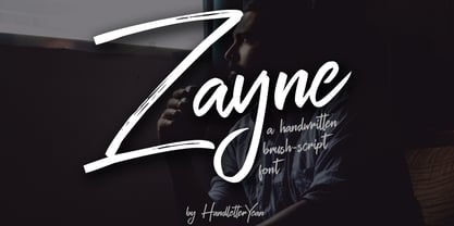
- Zayne by HandletterYean,
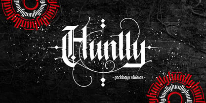
$12.00 - Huntly by Rockboys Studio,
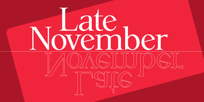
$25.00 - P22 Late November by IHOF,
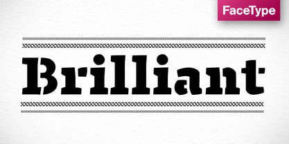
$39.95 - Brilliant by FaceType,
$35.00 - Pixel Disc by Ech000,
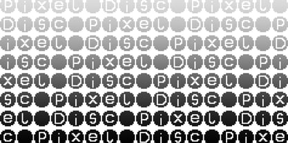
$9.00This unique typeface is a great addition to a graphics designer collection. Great for pixel artists who want a unique text style for their works, album artwork and much more. This font contains over 400+ unique glyphs to accommodate for English, Latin languages, most symbols and much more. All characters feature the same size disc surrounding letters utilising negative space through the design. Created by Kole Cook for Ech000 Foundry. The font is inspired by computer text and command line with a unique twist. - Gans Neoclassic Fleurons by Intellecta Design,
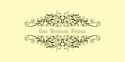
$23.90Historical printers ornaments researched by Intellecta Design; from the 1882 very rare Richard Gans first catalogue. See also other font families inspired by Gans' original typefaces: Gans Tipo Adorno, Gans Lath Modern, Gans Titular Adornada, Gans Ibarra, Gans Antigua, Gans Antigua Manuscrito, Gans Fulgor, Gans Radio Lumina, Gans Carmem Adornada, Gans Italiana, and Gans Titania. - Gans Headpieces by Intellecta Design,
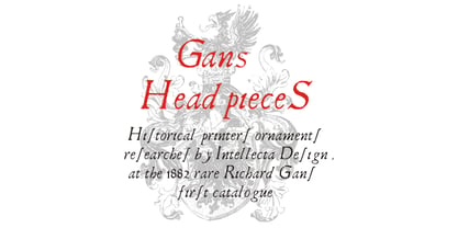
$24.90Historical printers ornaments researched by Intellecta Design; from the 1882 very rare Richard Gans first catalogue. See also other font families inspired by Gans' original typefaces: Gans Tipo Adorno, Gans Lath Modern, Gans Titular Adornada, Gans Ibarra, Gans Antigua, Gans Antigua Manuscrito, Gans Fulgor, Gans Radio Lumina, Gans Carmem Adornada, Gans Italiana, and Gans Titania. - Schnebel Slab Pro by URW Type Foundry,
$35.99The refreshingly clear Antiqua Schnebel Slab is a refreshingly clear and strong interpretation of a contemporary Antiqua with subtle contrast and firm serifs, which offer excellent readability at very small size, and, at the same time, provide a lot of expression for use in headlines. The italics, drawn specifically for this purpose, contribute to a harmonious picture, which never loses creative tension, thanks to its aesthetics. The careful addition of ligatures, small caps, and proportional and old-style figures allows for well-proportioned typesetting. The condensed and expanded variants, which also come in 6 weights each, offer plenty of freedom to design with numerous combinations. Schnebel Slab Pro combines especially well with Schnebel Sans Pro. - Falstaff MT by Monotype,
$29.99Falstaff first appeared with Monotype in 1931, an alphabet in the style of a wide, bold antiqua that was especially popular in the first third of the 19th century. Such typefaces distinguished themselves through their consistent basis in the transitional antiqua style. They are characterized by their extremely fine unflexed serifs with no curve connecting them to the thick strokes. The numerals with their generous curves and ball-like stroke endings and beginnings are particularly decorative. The vertical strokes are dominant and give lines of this typeface a column-like and therefore static look. Falstaff is today often used for book titling, especially for mystery novels. It is best used sparingly in middle and larger point sizes. - Aldo New Roman by Indian Summer Studio,
$45.00Aldo New Roman (1000+ glyphs, incl. medieval Latin, Cyrillic, some Greek, ornaments, small capitals, nut fractions...) Renaissance antiqua · Venetian types · Venetian serif · Humanist serif · Old style antiqua A modern version of the typeface cut by Francesco Griffo for Venetian printer Aldus Manutius around 1490 AD. Intentionally not the original Griffo / Aldus / Bembo — but the part of the large project on revival and further development (by drawing many additional glyphs, sometimes over 1000) of the 20th century's typewriters’ fonts. Triple pun here :: :: #1 Aldine Roman type; #2 Since it is equalized, modernized version — the parallel to the Times New Roman; #3 He called himself Aldus Pius Manutius Romanus — he was a new Roman during his Renaissance times. - Vallerine by Heyfonts,
$15.00 - Weely Honey by Sipanji21,
$15.00 - Gumela by NamelaType,
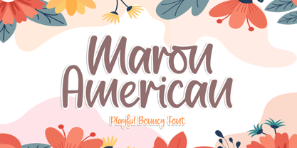
$17.00 - Maron American by Zeenesia Studio,
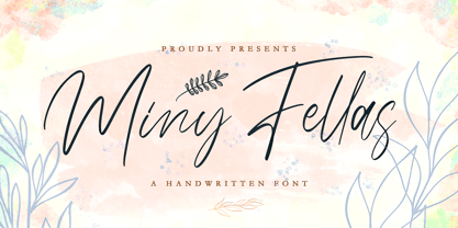
$12.00 - Miny Fellas by Stringlabs Creative Studio,
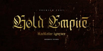
$25.00 - Gold Empire by Rockboys Studio,
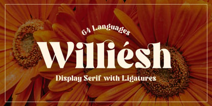
$23.00 - Williesh by Almarkha Type,
$25.00Introducing Williesh - Unique font that uses ligatures to smoothly link letters. inspired by the famous minimalist logo, perfect for the purposes of designing templates, brochures, videos, advertising branding, logos and more. Perfect for adding a unique twist to word-mark logos, monograms or pull quotes. Kavaloora has 18 unique ligatures and Alternate Glyphs as well as numbers and punctuation making it super fantastic. - Starting Color by Sensatype Studio,
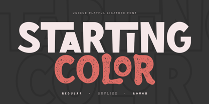
$15.00Starting Color is A Modern Playful and Unique Ligature Font. This font specially crafted for your design projects such as urban poster, unique design, modern for t-shirt designs, product packaging, merchandise, and so many more with easy to use but unique results are so playful. Enjoy to Design any your needs with unique, urban, and playful feel. What will you get: Starting Color Font (Regular, Outline, Rough) All Characters (from A to Z) Numbers and Punctuation Works on PC & Mac Simple installations PUA Encoded Thanks and have a wonderful day. :) - Qiomy Style by Sensatype Studio,
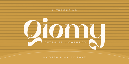
$15.00Qiomy is A New Display font that perfect for unique Branding and any Design needs A New font that we created special for Unique branding needs, with unique style that ready to add value of your brand. It's so nice to leverage designer or product owner that need solutions to make their design look more unique, Stylish and elegant. Qiomy New Display font ready with: Lowercase and Uppercase characters with Ligatures Numbers and Punctuations Preview as a inspirations that you can do with Qiomy font Available for PC and Mac Wish you enjoy our font. - Ghufy Style by Sensatype Studio,
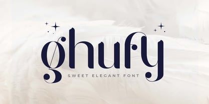
$15.00Ghufy is A Sweet Elegant Serif font perfect for unique beauty project and Another Design needs A New font that we created special for Unique branding needs, with unique style that ready to add value of your brand. It's so nice to leverage designer or product owner that need solutions to make their design look more unique, sweet and elegant. Ghufy Sweet Elegant Display font ready with: Lowercase and Uppercase characters Numbers and Punctuations Preview as a inspirations that you can do with Ghufy font Available for PC and Mac Wish you enjoy our font. - Prosaic Std by Typofonderie,
$59.00A Postmodern vernacular sanserif in 8 fonts Prosaic designed by Aurélien Vret is a Postmodern typographic tribute to the french vernacular signs created by local producers in order to directly market their products visible along the roads. These signs drawn with a brush on artisanal billboards do not respect any typographic rules. The construction of these letterforms is hybrid and does not respect any ductus. Nevertheless the use of certain tools provokes a certain mechanism in the development of letter shapes. It’s after many experiments with a flat brush, that’s these letterforms have been reconstructed and perfected by Aurélien Vret. This is the starting point for the development of an easily reproducible sanserif with different contemporary writing tools. From non-typographical references of Prosaic towards readability innovation The influence of the tool is revealed in the letterforms: angular counterforms contrasting to the smoothed external shapes. This formal contrast gives to Prosaic a good legibility in small sizes. These internal angles indirectly influenced by the tool, open the counterforms. In the past, to deal with phototype limitations in typeface production, some foundries modified the final design by adding ink traps. In our high resolution digital world, these ink traps — now fashionable among some designers — have little or no effect when literally added to any design. Should one see in it a tribute to the previous limitations? Difficult to say. Meanwhile, there are typeface designers such as Ladislas Mandel, Roger Excoffon, and Gerard Unger who have long tried to push the limits of readability by opening the counters of their typefaces. Whatever the technology, such design research for a large counters have a positive impact on visual perception of typefaces in a small body text. The innovative design of counter-forms of the Prosaic appears in this second approach. Itself reinforced by an exaggerated x-height as if attempting to go beyond the formal limits of the Latin typography. It is interesting to note how the analysis of a non-typographical letters process has led to the development of a new typographic concept by improving legibility in small sizes. Disconnected to typical typographic roots in its elaboration, Prosaic is somewhat unclassifiable. The formal result could easily be described as a sturdy Postmodern humanistic sanserif! Humanistic sanserif because of its open endings. Sturdy because of its monumental x-height, featuring a “finish” mixing structured endings details. The visual interplay of angles and roundness produces a design without concessions. Finally, Prosaic is Postmodern in the sense it is a skeptical interpretation of vernacular sign paintings. Starting from a reconstruction of them in order to re-structure new forms with the objective of designing a new typeface. Referring to typographic analogy, the Prosaic Black is comparable to the Antique Olive Nord, while the thinner versions can refer to Frutiger or some versions of the Ladislas Mandel typefaces intended for telephone directories. Prosaic, a Postmodern vernacular sanserif Prosaic is radical, because it comes from a long artistic reflection of its designer, Aurélien Vret, as well a multidisciplinary artist. The Prosaic is also a dual tone typeface because it helps to serve the readability in very small sizes and brings a sturdy typographic power to large sizes. Prosaic, a Postmodern vernacular sanserif - Bread Crackers by Jehansyah,
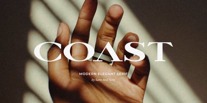
$9.00 - La Coast by Sans And Sons,
$19.00 - Roskell - Personal use only
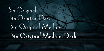
- Sin Original by FontHaus,
$14.95 - Bikambone - Personal use only
- Glitter Font - Unknown license
- Kingthings Annex - 100% free
- Kingthings Spikeless - 100% free
- Multistrokes - Unknown license
- odstemplik - 100% free
- Kingthings Tendrylle - 100% free
- Display Dots - 100% free
- TOY_SOLDIERS - Personal use only
- Fleurs de Liane - Unknown license
- KG Shadow of the Night - Personal use only
- exotica - Unknown license
- JICAMA - Unknown license
- Averia Sans - Unknown license
- Pinniepoker - Personal use only
