1,601 search results
(0.041 seconds)
- Diashapes by Curvature Creations,
$10.00 My font Diashapes has been created by the power Point shape Diagonal Stripe and its angles act like curves. It is a unique font that stands out like a building frame work.
 - Parkitecture JNL by Jeff Levine,
$29.00Parkitecture JNL is the latest font to embrace the angles and lines of the Art Deco era. Bold and solid in look and feel, it gives nostalgic headlines a "solid" retro appearance. - Stand Up JNL by Jeff Levine,
$29.00 An online reproduction of a trade ad circa the 1950s for comedian-actor Paul Gilbert featured his name in the hand-drawn lettering that serves as the basis for Stand Up JNL. While the style of the typeface is derivative of the Latin Spur faces used popularly since the 1800s, the playful – almost awkward angles create a casual design that evokes good times. It should be noted that the extremes of such angles might appear ill-spaced unless kerning is turned on within the application where the typeface will be used.
 - Bargain by Arkalandara,
$115.00 Handwriting is a unique and personal expression of language created by individuals using a pen, pencil, or other writing instrument. It encompasses various styles, characteristics, and nuances that make each person's writing distinctive. Pointed shapes and characters refer to the specific forms and angles of the letters and symbols in a written script. Pointed shapes in handwriting typically involve the presence of sharp angles or well-defined points in the formation of letters. This can contribute to a more angular and edgy appearance in the overall writing style.
 - Quarzo by Corradine Fonts,
$39.95 This script font is inspired by the flexible nib strokes to create a concatenation of refinement with character mixing the contrast with pronounced but rounded angles. This angles along with the inktraps give the font a better performance when printing. Texts will have a very even rhythm due to its consistency on the stroke’s angle and spacing. The words can receive a dramatic touch by using the wide range of glyphs with curly and refined ornamentation. There are lots of caps and number variants dressed up with a variety of swashes. Also, two sets of versatile ornaments will be found: a first set of ending flourishes that match with any lowercase letter and a second set of independent flourishes to be placed around the words. Quarzo will give a great sophistication level to invitations, cards, tags, menus, advertising and packaging. Its character map covers Western and Central European characters.
 - MPI Sardis by mpressInteractive,
$5.00 Sardis is based on a family of wood type called "Lydian," designed for American Type Founders Company by Warren Chappell in 1938. The strokes have angled ends, referencing the use of a calligraphy nib.
 - Elektrakution by Comicraft,
$19.00 SHE'S DEAD, FRANK It's the year 1991, BC (Before Comicraft) when REM were still making records and Frank Miller’s memorable run on Marvel Comics’ DAREDEVIL was just over ten years old. Comicraft’s Richard Starkings found himself working in Anaheim, California for Graphitti Designs. Graphitti had produced the first hardcover edition of Miller’s Batman tale, DARK KNIGHT RETURNS and was now putting together the sequel to Miller’s DAREDEVIL — ELEKTRA LIVES AGAIN! Richard was not engaged to letter this book, the pages of Frank’s incredible original art that came through Graphitti’s studio were already lettered by Marvel Stalwart, Jim Novak. However, there were some cover elements that needed to be added, based on the logo originally rendered by Frank’s brother, Steve. Starkings set about the task of creating an alphabet that could be used to develop Steve’s idea for the trade dress -- the cover elements, the back cover copy and credits on the interior pages. This was long before Macintosh computers and font programs made this work considerably easier, so Rich sat down with a pencil and a sheet of vellum and rendered an alphabet that could be used as the basis for the text that was needed... Those sketches have languished in a drawer for nearly thirty years, but now, finally, Comicraft’s John Roshell has dusted off those old letterforms and Elektrakuted a font based on those designs, a font we HAD to call ELEKTRAKUTION! As for Elektra; she’s dead, Frank. Features: Ten weights (Light, Regular, Bold; Rough Light, Regular & Bold; Inline, Inline Rough, Outline & Outline Rough) with upper & lowercase characters, Western & Central European accents and Greek characters.
 - Lev Serif by TypeFaith Fonts,
$15.00 Lev is a slab serif font, the rectangular serifs and the straight angled shoulders and links contrasting the curves and loops. Lev Serif is characterized by thick, block-like serifs. Lev contains 12 high quality fonts.
 - Confirmation JNL by Jeff Levine,
$29.00An old set of brass stencils spotted for sale on eBay were the inspiration for this font from Jeff Levine. Redrawn completely from scratch, Jeff retained the narrow "M" and angled corners found in the original. - Arrieta by W Type Foundry,
$35.00 Arrieta is a versatile typeface family designed to serve various design purposes. It combines the traditional mechanical typography process of punch cutting with the expressive strokes of a nib pen, resulting in a reliable, angled typeface.
 - Kalash by Tomass Gavars,
$7.00 Kalash is minimalistic monospaced font family. Each glyph has eased 45° angled cut and has the right properties to fit with various styles. Combine multiple weights for best results. Each font includes 230 Glyphs & Latin support.
 - Monni by Matt Chansky,
$29.00 Meet Monni, a clean and balanced sans-serif typeface family—fresh-faced and cosmopolitan with a high x-height. Monni sports finely crafted angles, complemented by confident squared punctuation. This sans-serif has a universal appeal accentuated by select modern angles. Perfect for campaign work with its memorable lines, clear consistency, and optimization for screens. Noteworthy for both headline and body copy needs. Monni is sure to aid in brand retention. Monni is generously multilingual, including Ukrainian and comes in 5 weights, from light to black. With nearly 800 total glyphs, Monni’s versatility will make an excellent addition to any professional font collection.
 - EmBauhaus by Emboss,
$25.00 EmBauhaus is a display typeface, geometric in style, inspired by the face named after the world changing Bauhaus School. To aid readability I rethought the original typeface and closed all of the voids cut out of the strokes. We also modified the upper case to make it a more traditional design. An example of this is the upper case L, where a 90 degree angle was added. This typeface was designed to be used judiciously in a layout, to draw focus to words and headlines, using stark angles, radii and geometry to create visual rhythm and gestalt.
 - Estrand by Firstype Studio,
$16.00 Hello, design enthusiasts! Allow me to present "Estrand" - a distinctive Display font with a penchant for sharp angles and bold character. Estrand features an edgy and angular design, characterized by rigid corners and a slightly condensed form that exudes a sense of precision and boldness. The font is crafted with sharp angles, giving it a unique and commanding presence. Its condensed nature ensures a sleek and modern aesthetic, making it an excellent choice for designs that demand a tinge of fierceness. Key Features: Sharp Angles and Bold Character: Estrand embraces a sharp design with well-defined angles, adding a touch of assertiveness to your typographic compositions. Slightly Condensed Form: The font's condensed structure contributes to a sleek and modern look, allowing for efficient use of space in various design applications. Distinctive and Commanding: With its firm personality, Estrand stands out as a font that commands attention and leaves a lasting impression. Versatility: Whether applied to branding, logos, or any design project, Estrand's unique characteristics make it adaptable to a wide range of creative endeavors. Estrand is your go-to font for designs that demand a sharp and distinctive edge. If you have any inquiries or require further information, feel free to reach out. Your feedback is highly appreciated. Thank you for considering "Estrand" for your design endeavors.
 - Katigert by Oleg Gert,
$20.00 Katigert – is a rather friendly italic with a touch of measured severity, combines very sharp angles and bold shapes. The font works best for display. The font includes extended Cyrillic and Latin alphabets, punctuation marks and currencies.
 - Galeb by Tour De Force,
$25.00 Galeb is simple geometric sans font family in 4 weights - Light, Regular, Bold and Black, ideal for corporate and editorial projects. With angled stem endings, Galeb gives enough impression to be used as display font as well.
 - Voyeur by Sudtipos,
$59.00 Since you like to look, Angel Koziupa and Alejandro Paul bring you Voyeur, an entirely different direction from their usual collaborations. This typeface attracts two opposite design theories by mixing bold and blocky modernism with delicate ornamentals. The unlikely mix is not haphazard, however. It is calculated with an alchemist's (or voyeur's) attention to detail. This font includes many, many different ornamental treatments, each adjusted specifically for its letter form counterpart. Open your glyph palette to find plenty more variation and alternative combinations. For everyone's eyes only.
 - Electric Newspaper JNL by Jeff Levine,
$29.00 Around 1931, the Los Angeles Times (in partnership with the Richfield Oil Company) installed on its building a moving message board similar to the one at the New York Times in New York City which they dubbed an “electric newspaper”. The style of characters used on this electronic sign were the basis for the namesake font Electric Newspaper JNL, which is available in both regular and oblique versions. A blank space to place between words is available on both the solid bar and broken bar keystrokes.
 - Felipe by Sudtipos,
$49.00 As a follow-up to his popular Chocolate font, Angel Koziupa softens his brush again to produce Felipe, a font made in the memory of his brother. As packaging-friendly and versatile as any Koziupa font, Felipe contains fresh perspectives on old characters. Some of the majuscules and figures show characteristics normally reserved for minuscules. The overall color of the font is somewhat bittersweet, which adds to its ability to capture the attention in display settings. Felipe is ideal for packaging, signs, culinary-related designs, and posters.
 - Ongunkan Enochian Script by Runic World Tamgacı,
$60.00 I drew this font staying true to the original design. The letter table in the relevant book was taken as reference. Enochian (/ɪˈnoʊkiən/ ə-NOH-kee-ən) is an occult constructed language[3] — said by its originators to have been received from angels — recorded in the private journals of John Dee and his colleague Edward Kelley in late 16th-century England.[4] Kelley was a scryer who worked with Dee in his magical investigations. The language is integral to the practice of Enochian magic.
 - Drone by Barnbrook Fonts,
$30.00 Drone is a deliberately misproportioned typeface, inspired by hand-drawn lettering found in Spanish/Hispanic Catholic churches in the Philippines and Los Angeles. These naive letterforms appeared to be ‘copies of copies’ – and in aiming to recreate the beauty of the Vatican and the Sistine Chapel they instead created something unique with its own charm and beauty. As a curious aside, the forms are reminiscent of those found in 16th century English calligraphy too. Drone is available in two styles: No.666 and No.90210.
 - Sinfonieta by Sudtipos,
$79.00 The unmistakable brush of Angel Koziupa does its unique work again, this time with the elegant strokes made for branding or packaging projects that entail the use of many design elements, and so require clear and simple artistic alphabet to represent the brand elegantly, without clashing with the overall design. Methodical and disciplined, Sinfonieta accentuates the collage just enough to convey class and comfort, art and elegance. Sinfonieta includes alternates that come in handy to help with the precision usually required for logotypes and wordmarks.
 - Sister Frisky by Chank,
$99.00 Sister Frisky jumps up and down and drinks a lot of coffee. There are no two parallel lines in this font, and no right angles. Here's a flashy, dancing, retro script with an sharp edge and clear wit!
 - Nouveau Sans JNL by Jeff Levine,
$29.00 Based on a few examples of an Art Nouveau-inspired wood type, Nouveau Sans JNL has an interesting mix of angles, curves and general letter shapes that are reminiscent of the period preceding the Art Deco streamline movement.
 - Oshawa by Fauzistudio,
$15.00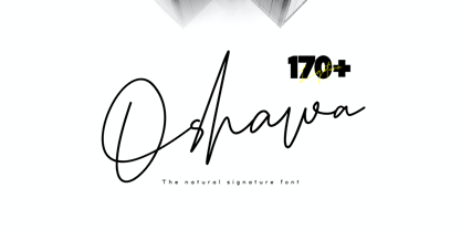 Oshawa is a signature font with a natural and professional style, ideal for creating handwritten style logos, wedding stationery, photographer watermark logos, modern websites, and more. Oshawa is equipped with 177 handwritten ligatures that add a natural angle.
 - Cintra by Graviton,
$12.00 Cintra font family has been designed for Graviton Font Foundry by Pablo Balcells in 2014. It is a sans serif, bold, geometric typeface with subtle rounded angles, which provides a soft, pleasent appearence. Cintra consists of 8 styles.
 - Poca by Type-Ø-Tones,
$40.00 Poca is made up of right angles and regular strokes. It is a De Stijl typeface provided by Peret. We devised the lower case letters and added some Peret dingbats. Fifteen years later we added a fun bitmap version.
 - Yodo by The Northern Block,
$12.80 A geometric typeface that combines elegant curves with precise angles. The contemporary nature of this font will compliment a wide variety of graphic design applications. Details include 3 weights, a full character set, manually edited kerning and Euro symbol.
 - Franie by That That Creative,
$50.00 Franie is a variable geometric sans serif font family with 72 styles. Fully customize the width, weight and italic angle. This modern clean typeface is perfect for contemporary layouts for print, magazines, posters, web, social media, branding logos, or whatever.
 - Hefeweizen by David Thometz Design,
$24.95 As seen on Typophile.com, DTD Hefeweizen is a contemporary take on the textura blackletter style. Comprised of straight lines and angles sloped at ratios of 1/2 or 2/1, Hefeweizen is a highly geometric design with extensive alternates and ligatures.
 - Ambie Skratch by Amber Phillips,
$15.00Ambie Skratch was inspired by grudge fonts, as well as rock music, and deconstructed art work. It was made by shacking a sharpie marker in a fast angled motion. Then these images were scanned and altered further on the computer. - Flared by Graphicfresh,
$25.00 A groovy, bold typeface that transports you back to the 70s and 80s. Its sleek curves and sharp angles evoke the spirit of neon signs and vintage design. Get ready to captivate with this striking font that exudes nostalgic coolness.
 - Black Bear by Match & Kerosene,
$25.00 Black Bear is a stylish angled monoline font family of twelve styles in six weights. Each font is fully loaded with OpenType stylistic and titling alternates to give the fonts a different feel and help with optics for smaller point sizes.
 - Agustonica by Rodigi,
$12.00 Agustonica is a geometric modern blackletter serif display font. An experimental mix between angled and straight lines makes this a unique typographic design. Easily access case-sensitive styles. Perfect use includes logo, poster, display, headline, t-shirt design and many more.
 - Shopping Basket JNL by Jeff Levine,
$29.00 The cover of the vintage sheet music for "This Little Piggie Went to Market" (from the 1934 film "Eight Girls in a Boat") features a hand-lettered sans serif with intermittent chamfered angles. This became the model for Shopping Basket JNL.
 - Cintra Slab by Graviton,
$12.00 Cintra Slab font family has been designed for Graviton Font Foundry by Pablo Balcells in 2014. It is a slab serif, bold, geometric typeface with subtle rounded angles, which provides a soft, pleasant appearance. Cintra Slab consists of 8 styles.
 - Rebar by Method & Craft,
$10.00 Consisting of 6 weights & 12 styles, Rebar is a geometric sans with harmonious curves and slightly angled framing which gives the typeface a foundation of balance and strength. Includes numbers, punctuation, some ligatures and diacritics for compatibility with many foreign languages.
 - Chiavettieri by Kostic,
$50.00 Chiavettieri draws inspiration from Humanist types, marked by low contrast between thick and thin strokes and the angle of stress in the bowls of letters. On the other hand, generous x-height, clean angled serifs and sharp cuts in the ball terminals suggest a more contemporary look. All these characteristics make it a robust, well balanced, legible typeface ideally suited for book text, editorial and publishing, as well as web and screen text. With distinct Italics, small capitals, complete set of superior lowercase (Latin), oldstyle and lining figures (each in tabular and proportional widths), ligatures, fractions, superior and inferior characters – Chiavettieri is equipped for proper typography.
 - Veotec by Hashtag Type,
$29.00 Veotec is a classic humanist sans that skilfully works for both screen and print due to its steep and precise angles enabling more negative space. Not only does this methodical approach improve legibility and readability at small sizes, it allows the bolder weights to feel harmonised and consistent without the compromise of this legibility. Angles are refined and considered with a balance between sharp and round curves adding a unique feature to this font. This also gives a modern and appealing feel at large sizes. Details include 6 well constructed weights, manually edited kerning, which is more open for on-screen devices, ligatures and alternatives.
 - F2F Shakkarakk by Linotype,
$29.99The Techno sound of the 1990s, a personal computer, a font creation software and some inspiration had been the sources to the F2F (Face2Face) font series. Thomas Nagel and his friends had the demand to create new unusual faces that should be used in the leading german techno magazine Frontpage"."