1,818 search results
(0.015 seconds)
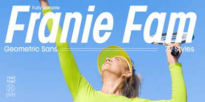
- Franie by That That Creative,
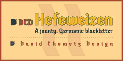
$50.00 - Hefeweizen by David Thometz Design,
$24.95 - Ambie Skratch by Amber Phillips,
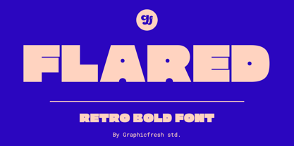
$15.00Ambie Skratch was inspired by grudge fonts, as well as rock music, and deconstructed art work. It was made by shacking a sharpie marker in a fast angled motion. Then these images were scanned and altered further on the computer. - Flared by Graphicfresh,
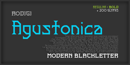
$25.00 - Agustonica by Rodigi,
$12.00 - Shopping Basket JNL by Jeff Levine,
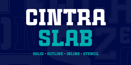
$29.00 - Cintra Slab by Graviton,
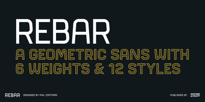
$12.00 - Rebar by Method & Craft,
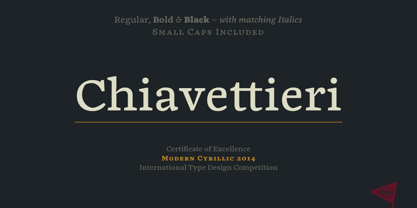
$10.00 - Chiavettieri by Kostic,
$50.00Chiavettieri draws inspiration from Humanist types, marked by low contrast between thick and thin strokes and the angle of stress in the bowls of letters. On the other hand, generous x-height, clean angled serifs and sharp cuts in the ball terminals suggest a more contemporary look. All these characteristics make it a robust, well balanced, legible typeface ideally suited for book text, editorial and publishing, as well as web and screen text. With distinct Italics, small capitals, complete set of superior lowercase (Latin), oldstyle and lining figures (each in tabular and proportional widths), ligatures, fractions, superior and inferior characters – Chiavettieri is equipped for proper typography. - Veotec by Hashtag Type,
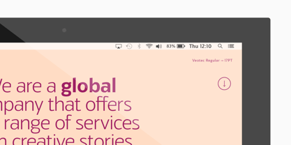
$29.00Veotec is a classic humanist sans that skilfully works for both screen and print due to its steep and precise angles enabling more negative space. Not only does this methodical approach improve legibility and readability at small sizes, it allows the bolder weights to feel harmonised and consistent without the compromise of this legibility. Angles are refined and considered with a balance between sharp and round curves adding a unique feature to this font. This also gives a modern and appealing feel at large sizes. Details include 6 well constructed weights, manually edited kerning, which is more open for on-screen devices, ligatures and alternatives. - F2F Shakkarakk by Linotype,
$29.99The Techno sound of the 1990s, a personal computer, a font creation software and some inspiration had been the sources to the F2F (Face2Face) font series. Thomas Nagel and his friends had the demand to create new unusual faces that should be used in the leading german techno magazine Frontpage"." - F2F Shpeetz by Linotype,
$29.99The Techno sound of the 1990s, a personal computer, a font creation software and some inspiration had been the sources to the F2F (Face2Face) font series. Thomas Nagel and his friends had the demand to create new unusual faces that should be used in the leading german techno magazine Frontpage"." - F2F Tyrell Corp by Linotype,
$29.99The Techno sound of the 1990s, a personal computer, a font creation software and some inspiration had been the sources to the F2F (Face2Face) font series. Thomas Nagel and his friends had the demand to create new unusual faces that should be used in the leading german techno magazine Frontpage"." - Tiza by Sudtipos,
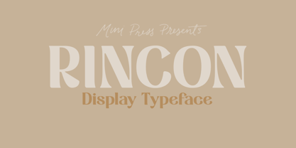
$39.00Tiza is a rough take on informal faces and handwriting, brought on by the recent demand for scripts and brush lettering. Its flow leaves traces simulating runny pen ink, which makes it very suitable for handwriting-like paragraphs as well as casual greeting card and invitation setting. The bold weight, Tiza Negra, fits very nicely on book covers as well as large signs. Tiza is the proverbial reminder that typefaces can sometimes be more human than they are normally perceived. Designed by lettering great Angel Koziupa, and digitized and completed for Sudtipos by Alejandro Paul. - Rincon by Rachel Kick,
$14.00Rincon is a serif font with 201 glyphs including ligatures and alternatives. It was designed by Rachel Kick in Los Angeles, California. Inspired by beautiful serif while maintaining a friendly and approachable feel, Rincon is perfect for branding, display, or marketing. Rincon has the ability to hold it's own as a single word headline, or in a paragraph form. It also works well with simple sans serif or script font compliments. The ligatures increase its legibility and adjust each character to work perfectly with the character next to it. - Cafelatte by Sudtipos,
$59.00It's not everyday that you want to have dark chocolate with your favorite latté. But sometimes, as out of the ordinary as it is, it can be just the ticket. Cafelatte's design offers a somewhat unpolished calligraphic concept, reminiscent of wooden type, but done with the unique brush of Angel Koziupa and Bezier wizardry of Alejandro Paul. The discerning packaging designer will certainly find it refreshing to be able to put a darker, unconventional touch on his or her design. And who says primal instincts can't express themselves elegantly? - Velvet by Reserves,
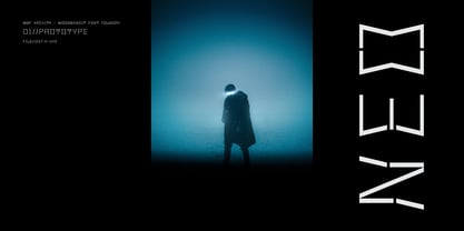
$39.99 - MBF Archita by Moonbandit,
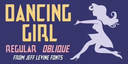
$17.00 - Dancing Girl JNL by Jeff Levine,
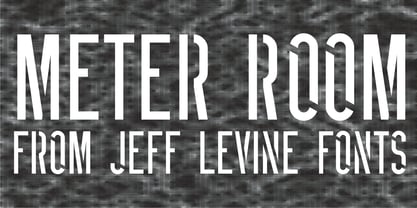
$29.00 - Meter Room JNL by Jeff Levine,
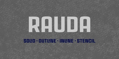
$29.00 - Rauda by Graviton,
$12.00 - Copacabana by Alan Meeks,
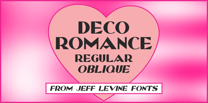
$45.00 - Deco Romance JNL by Jeff Levine,
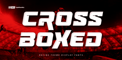
$29.00 - Cross Boxed by Namara Creative Studio,
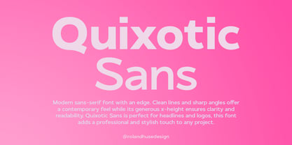
$14.00Bold modern sport font with rounded corners in consistent angles. A strong and unique style instantly adds power of movement to your creative projects. It's perfect for logotypes, headlines, game covers, sports events, posters, magazine covers, branding, product design, labels, and other suitable projects. - Quixotic Sans by Roland Hüse Design,
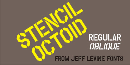
$25.00 - Stencil Octoid JNL by Jeff Levine,
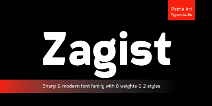
$29.00 - Zagist by Patria Ari,
$20.00 - ITC Whiskey by ITC,
$29.99Jochen Schuss, the Biedenkopf, Germany, designer who was most recently responsible for ITC Vino Bianco, has created in ITC Whiskey a condensed display face that's both angular and soft at the same time. While the letterforms of Whiskey are clearly roman, there's a slight reminiscence of blackletter in the face's narrow proportions, its dark weight, and its persistent internal angle - not quite the 45 degrees common in a classic German textura, but a gentler angle of 25 or 30 degrees. And the counters are all rounded, as are the ends of all the strokes, giving Whiskey a comfortable friendliness despite its severe structure. The character set includes an alternate z" and an "ft" ligature." - Doodlebears - Unknown license
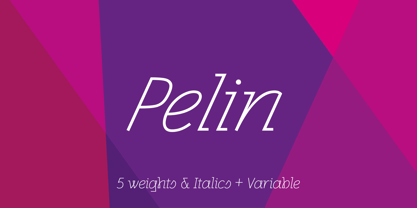
- Pelin by Koray Özbey,
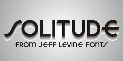
$9.00 - Solitude JNL by Jeff Levine,
$29.00 - LGF Besitos Square by LGF Fonts,
$18.00 - LGF Besitos Round by LGF Fonts,
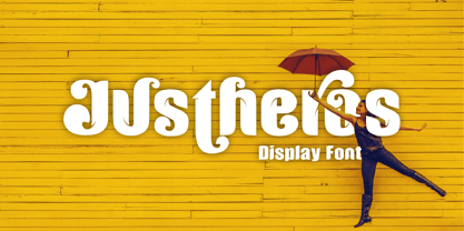
$18.00 - Justheros by ZetDesign,
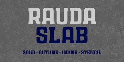
$15.00 - Rauda Slab by Graviton,
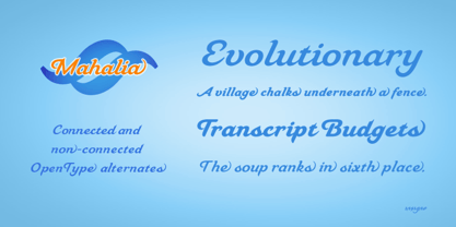
$12.00 - Mahalia by insigne,
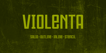
$24.99Mahalia draws inspiration from vintage hand-lettering, but adds a modern, European twist. Strongly slanted at a 25 degree angle, Mahalia draws immediate interest, but is still graceful. Mahalia includes many useful OpenType features, including a set of non-connecting and titling alternates, ligatures and end swashes. - Violenta by Graviton,
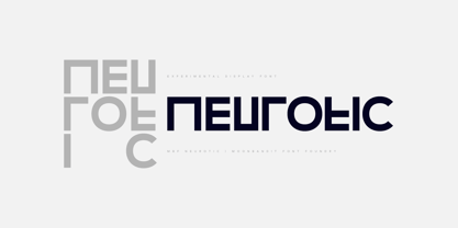
$12.00Violenta font family has been designed for Graviton Font Foundry by Pablo Balcells in 2015. It is a display, geometric typeface, with a condensed design and sharp angles that provides an aggresive and strong appearence. Violenta consists of 8 styles. Each containing glyph coverage for several languages. - MBF Neurotic by Moonbandit,
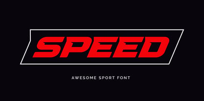
$18.00Neurotic is a geometric modern minimalist square sans serif display font. An experimental combination between angled and straight lines makes this a unique typeface design. Easily access the styles with uppercase and lowercase. Perfect usage includes logo, poster, display, headline, t-shirt design and many more. - Speed by Artyway,
$16.00 - Bellas Artes by Sudtipos,
$59.00Bellas Artes is what happens when the brush of Angel Koziupa and the technical expertise of Alejandro Paul go face to face with the Art Deco aesthetic. The recognizable Koziupa curves become players of a game of halves, where there is no such thing as a better half, but both sides complete each other like in that perfect romance you will never forget. Bellas Artes is an excellent choice not only for packaging design, but also for book and music covers meant for the feminine demographic, collateral of classical taste, and of course pre-WWII visuals.
